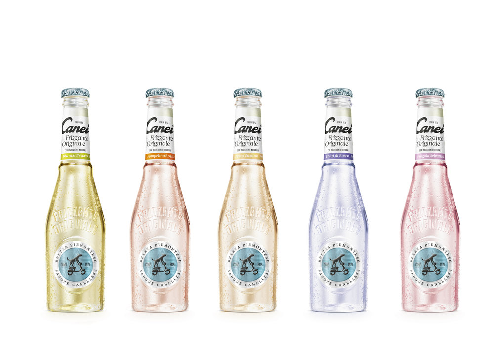
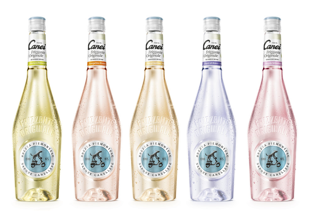
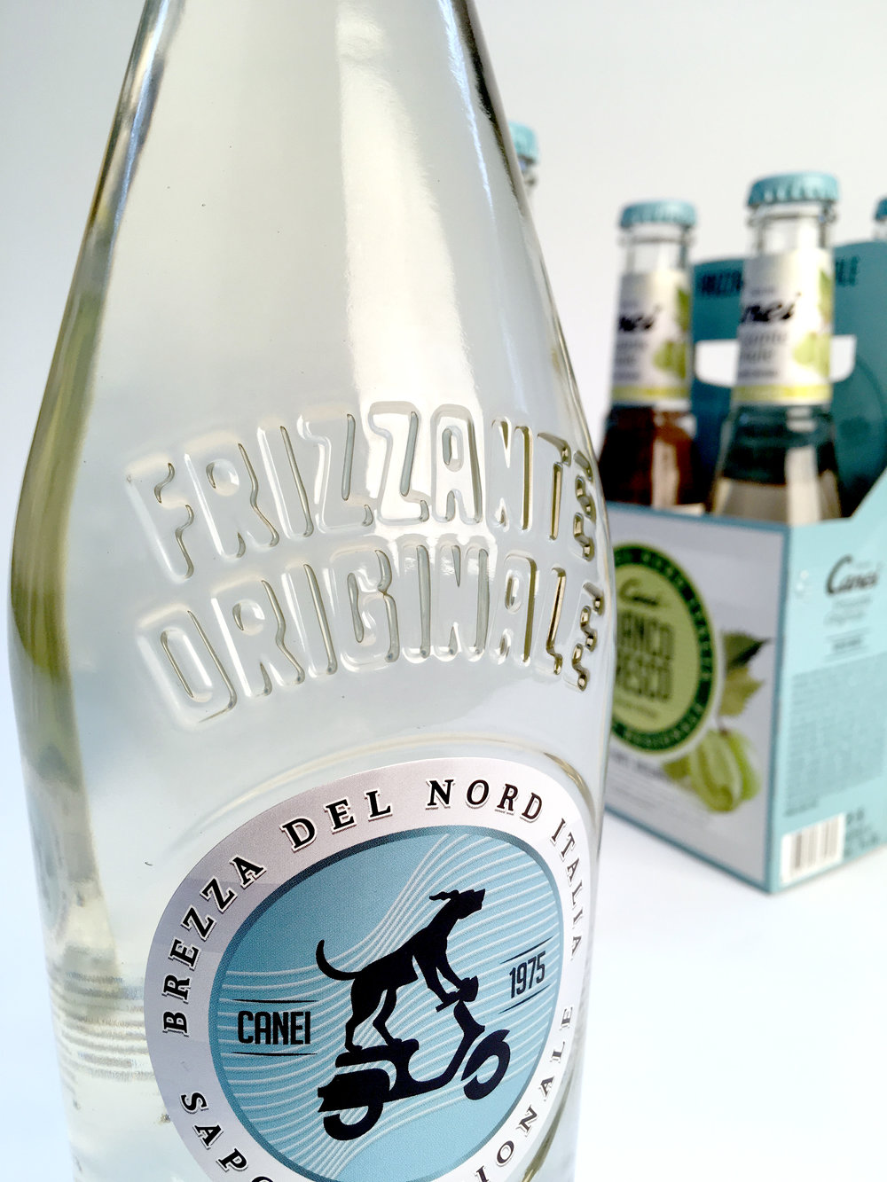
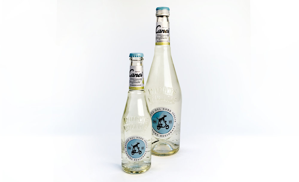
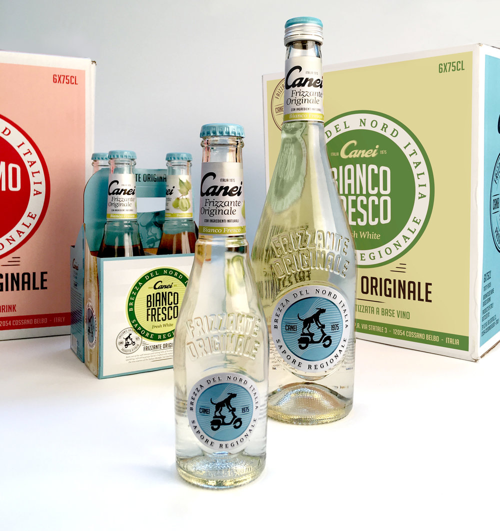
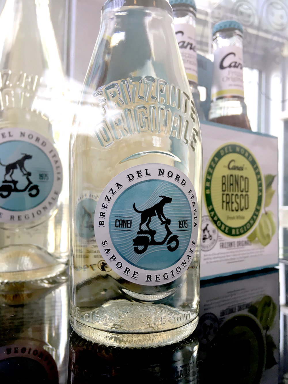
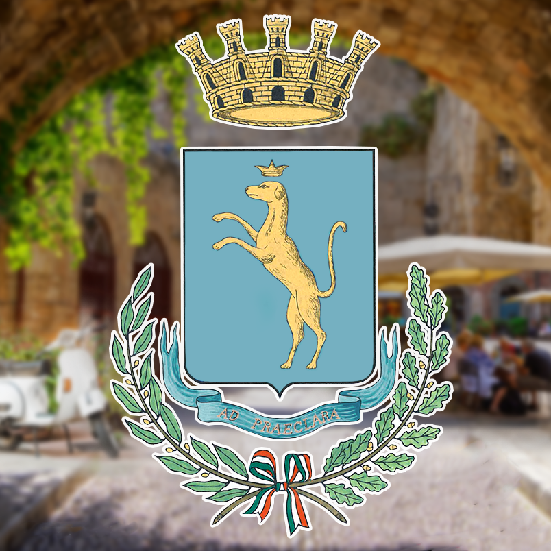
” Outset: The name of the brand had kept its strong equity over the years, however, Canei became increasingly associated with a sweet ‘starter wine’ for young people and the old-time favourite for a less discerning, older audience. The visual style of the brand had hardly any links into Italian Frizzante and appeared close to an RTD.Challenge: VBAT was asked to relink the brand name to a contemporary, fashionable world of Italian life style and original Frizzante. Canei’s ambition was not to imitate prosecco, but to become the pioneer and category default of Frizzante.Result: With a new, less sweet recipe for the product, Canei was given a new custom bottle profile, that is inspired by quality sparkling wine. The Mastiff dog inside the crest of the village Canelli, where Canei comes from, was taken as inspiration for the new brand icon.With a new twist on design, that VBAT calls ‘fluid branding’, the packaging was designed to embrace a fashionable style. ‘Fluid branding’ enables the brand to play with its elements on the different carriers, so that the brand is clearly recognisable without becoming rigid and repetitive.The final result is both attractive for the brand’s female audience as well as playfully challenging. With its new attire, Canei is extremely unique in the sparkling wine segment in bar’s and supermarkets alike.”