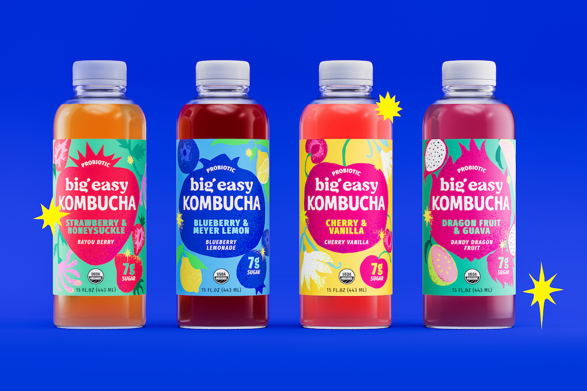
Vault49’s New York studio has overhauled the packaging for wellness beverage brand Big Easy’s kombucha range.
Big Easy is a part of Beliv, Latin America’s fastest-growing bevtech company, with 40 brands in 35 countries.
Taking a bold, illustration-led approach, this redesign is part of Big Easy’s growth strategy in the US.
Brand Experience and Packaging Design agency Vault49 is excited to share details of its New York studio’s latest project – redesigning Big Easy’s core line up of kombucha beverages.
“Kombucha is big business – in soft drinks and the health and wellness industry,” said Jonathan Kenyon, Co-Founder of Vault49. Jonathan continued, “Where most competitor brands focus on kombucha products only, Big Easy has an entire range of artisan, small-batch probiotic drinks that are just as delicious as they are good for you. Already established in parts of the US, Big Easy was primed for growth into new markets. To maximize this opportunity, the brand needed a new look for one of its ranges, with a firm emphasis placed on flavor.”
Vault49’s challenge was overhauling the kombucha range, Big Easy’s core product offering.
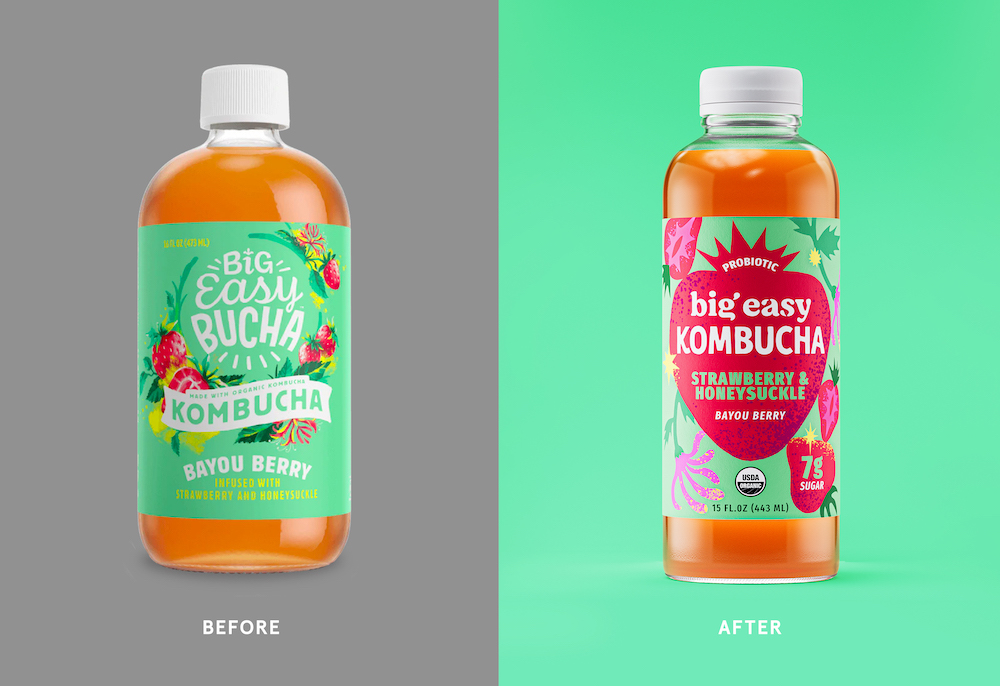
“The existing packaging design was complex and contained repetitive messaging, so this project was all about strategic design thinking.” explained Sam Wilkes, Creative Director at Vault49 New York. Sam continued, “Simplifying the name from ‘Big Easy Bucha Organic Kombucha’ to ‘Big Easy Kombucha’, we redefined the information and messaging hierarchy, creating a cohesive packaging design framework that heroes the products’ USPs and has real shelf stand out.”
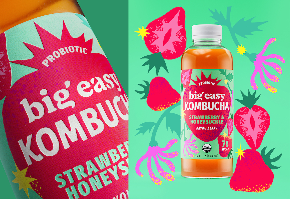
Taking the typeface used for the Big Easy masterbrand wordmark, Vault49 customized a secondary wordmark for ‘Kombucha’ by hand. Building personality into the brand, playful details include a kick on the leg of the K and angled crossbars in the H and A.
The two wordmarks now work together in harmony, sitting inside a new visual hero device at the heart of the design. Bespoke to each variant, these have been hand-illustrated in the shape of the product’s primary flavor ingredient.
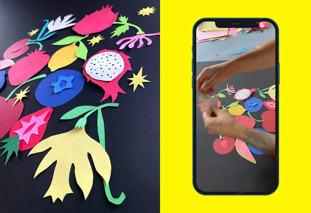
“Flavor can sometimes be compromised in probiotic ‘good for you’ drinks. Big Easy does not have this problem; the brand and products are easy drinking and about combining the joy of flavor with natural health benefits,” explained Sam Wilkes, Creative Director at Vault49. Sam continued, “Our design idea was ‘jam-packed with joy’, a creative expression that reflects the experience of every delicious sip. Taking a graphical illustration-led approach, we dialed up the flavor cues. Each ingredient has been hand-drawn with imperfect edges to represent that the drinks are 100% natural. Our addition of subtle textures makes the designs feel even more organic and artisan, just as the drinks are.”
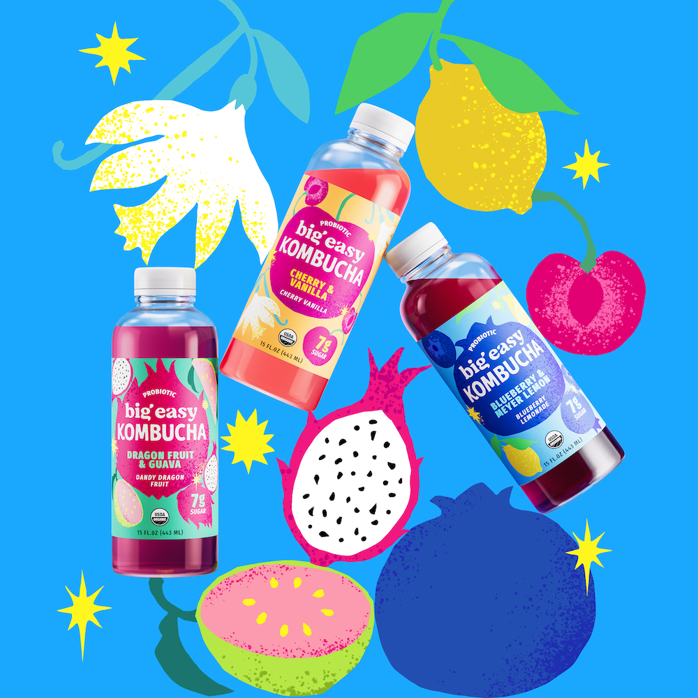
Each hero fruit is surrounded by additional hand-crafted illustrations. Whole fruits and cross-sections sit amongst flowers, roots, and leaves, all adding to the flavor stories of each drink. Joyful yellow ‘sparkles’ are juxtaposed against the flavor illustrations, representing the fermentation process and kombucha’s naturally-occurring fizziness.
For the color palette, Vault49 carefully balanced the vibrancy of fresh fruit with more muted ‘natural’ design cues. The result is bold enough to ensure that the bottles stand out on shelf but still feels organic and from nature, communicating its health and wellness credentials.
Ensuring consistency across the range, this new design framework gives Big Easy the flexibility to add new flavors in the future, setting the brand up for growth.
“With two new kombucha flavors debuting at Publix, Vault49 was the perfect partner to bring our core probiotic products to life. The Vault49 team combines strategic brand thinking with a dedication to design craft that aligns perfectly with our ethos, and they took our kombucha range to the next level with this reimagination. Bold and bright yet thoughtful, we’re thrilled to see these beautiful bottles live on the shelf.” – Alexis Korman, VP Marketing, Big Easy.
The new packaging for Big Easy’s kombucha beverages is rolling out in stores across the US now.
CREDIT
- Agency/Creative: Vault49
- Article Title: Vault49 Unveils Flavor-Forward Illustrative Packaging Redesign For Big Easy’s Kombucha Line
- Organisation/Entity: Agency
- Project Type: Packaging
- Project Status: Published
- Agency/Creative Country: United States
- Agency/Creative City: New York CIty
- Market Region: North America
- Project Deliverables: Craft, Creative Direction, Design, Graphic Design, Illustration, Packaging Design, Packaging Guidelines, Rebranding, Type Design, Typography
- Format: Bottle
- Substrate: Plastic
- Industry: Food/Beverage
- Keywords: drinks, beverages, beverage, kombucha, health & wellness, packaging, packaging design, illustration, flavor
-
Credits:
Brand Experience & Packaging Design Agency: Vault49


