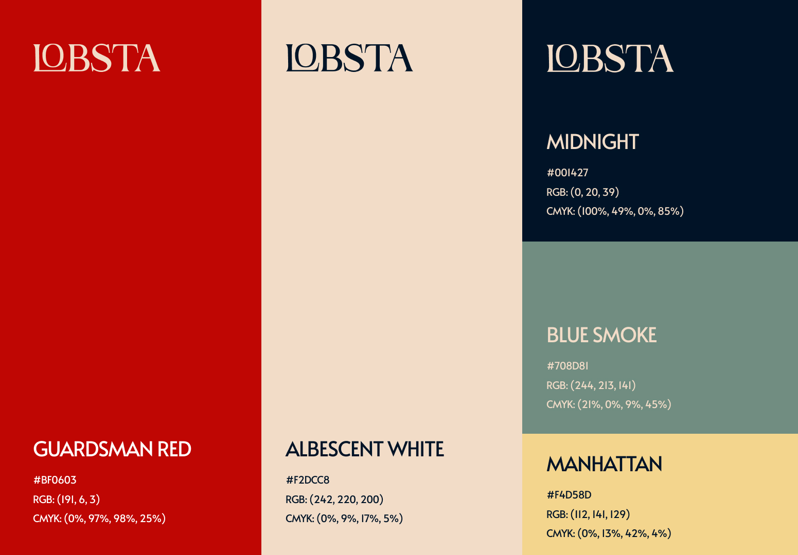
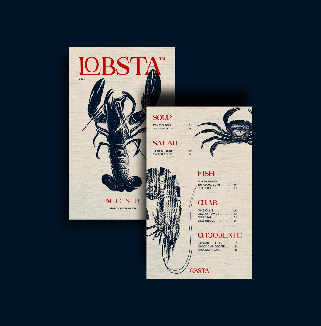
Inspired by the French Riviera, my design process for Lobsta’s brand identity began with thorough research into the region’s coastal charm and culinary heritage. Utilizing elegant serif typography and contemporary design elements, Icrafted each detail to exude grace and refinement. The secondary logo, featuring an engraved lobster, was carefully created to celebrate culinary tradition while adding timeless allure. Our color palette—midnight blue, Albescent White, and Guardsman Red—was selected to reflect the colors of the French flag, inviting guests to embark on a journey of culinary indulgence and coastal bliss.
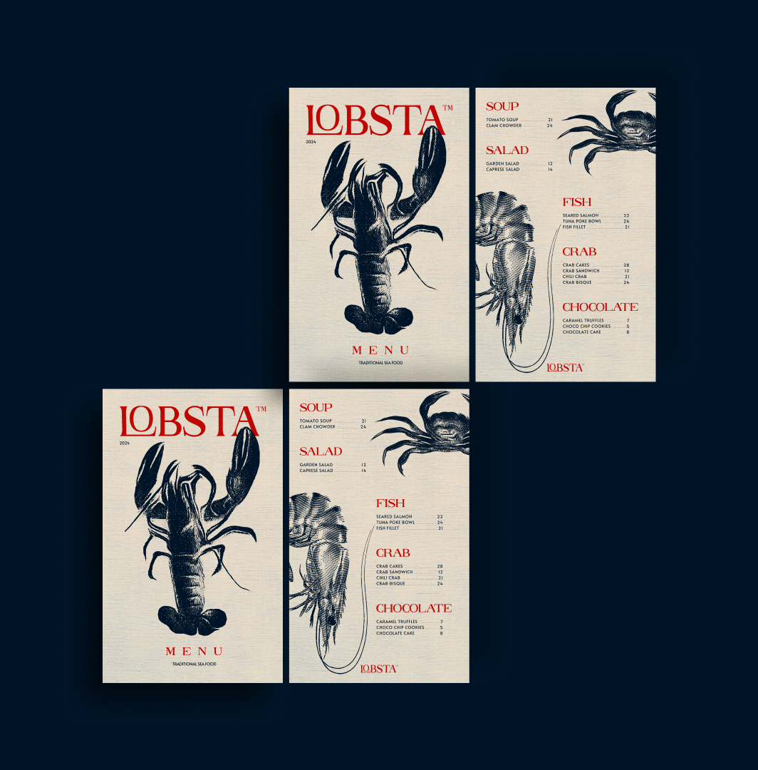
Every decision in the design process was made with the guest experience in mind. From the moment guests enter Lobsta, they are enveloped in the scent of the sea and the warmth of our hospitality. The menu, meticulously designed to complement the brand identity, showcases a curated selection of fresh seafood delicacies expertly prepared to tantalize the taste buds. With each bite, guests are transported to the sun-drenched shores of the French Riviera, where every meal is a celebration of coastal living.
Through a seamless integration of design and guest experience, Lobsta offers an unforgettable culinary journey that embodies the essence of seaside sophistication. Every element of the design process was crafted with the goal of creating a cohesive brand experience that resonates with guests and elevates their dining experience to new heights.
The process of developing Lobsta’s brand identity began with in-depth research into the cultural and culinary landscape of the French Riviera. I immersed myself in the region’s rich history, exploring its vibrant markets, picturesque landscapes, and renowned seafood delicacies. Drawing inspiration from the timeless elegance and coastal charm of the area, I set out to create a brand identity that would capture the essence of Lobsta’s seaside location and gourmet offerings.
With a focus on elegance and sophistication, I selected serif typography for the primary logo, evoking a sense of tradition and refinement. The sleek lines and classic curves of the typography were complemented by modern design elements, adding a contemporary twist to the brand identity. For the secondary logo, I incorporated an engraved illustration of a lobster, paying homage to Lobsta’s culinary heritage and adding a touch of whimsy and charm.
The color palette was carefully chosen to evoke the colors of the French flag, with midnight blue representing the sea, Albescent White symbolizing purity and elegance, and Guardsman Red adding a bold and vibrant accent. Together, these colors create a sense of unity and harmony, reflecting the brand’s commitment to quality and excellence.
Throughout the design process, I focused on creating a cohesive brand identity that would resonate with Lobsta’s target audience and set the restaurant apart in the competitive culinary landscape. By combining timeless elegance with modern sophistication, I crafted a brand identity that captures the essence of Lobsta’s seaside location and celebrates its commitment to culinary excellence.
In addition to the visual elements, I also considered the overall brand experience, ensuring that every aspect of Lobsta’s identity—from the logo design to the interior decor—aligned seamlessly with the brand’s values and vision. By creating a cohesive and immersive brand experience, I aimed to enhance the overall dining experience for Lobsta’s guests, inviting them to indulge in a culinary journey that transports them to the sun-drenched shores of the French Riviera.
Overall, the design process for Lobsta’s brand identity was a labor of love, driven by a passion for creativity and a commitment to excellence. Through meticulous research, thoughtful design choices, and a focus on the guest experience, I crafted a brand identity that captures the essence of Lobsta’s seaside location and celebrates its culinary heritage. From the sleek logo design to the vibrant color palette, every element of the brand identity reflects Lobsta’s commitment to quality, sophistication, and coastal charm.


CREDIT
- Agency/Creative: Vault Design Co.
- Article Title: Vault Design Co. Crafting Lobsta’s Branding Story
- Organisation/Entity: Freelance
- Project Type: Identity
- Project Status: Published
- Agency/Creative Country: Greece
- Agency/Creative City: Patras, Greece
- Market Region: Europe
- Project Deliverables: Brand Creation, Brand Design, Logo Design
- Industry: Food/Beverage
- Keywords: Seafood restaurant, lobster, branding, vintage
-
Credits:
Brand Designer: Vault Design Co.


