


Behind the Curtain: I personally liked the old design and I still do. When we first opened the discussion with the winery team I was much surprised about their decision to change it and I somehow tried to convince them that it wasn’t really necessary to do so. They were deeply decided for a change and this made the whole project for wine label restyle even more difficult as I was expected to change existing design which actually looked great for me – yes, maybe a bit ordinary, maybe lacking some more attention to detail, but it t was a good one anyway.
This is the story behind the curtain – I know Varna Winery’s team for many years, I love their wines and frankly I was happy and excited to start working on this project despite my first thoughts. I love challenges!
Next Level: I started to analyse the existing project trying to realise for myself what is really important in it in terms of graphic design and communication. Then I suddenly came up with the idea that I should be fully focused in my concept on the winery’s logo. It’s a stylized image of the famous lighthouse of Varna city – been there hundreds times when I was a kid with my father and I have some great memories about this place.
Starting with the logo was meaning one thing – to do some changes with it. No one has worked on this logo since the moment when it was created at least 15 years ago. It has excellent overall appearance but when you dig into details you meet plenty of problems. So I decided to fix these and preserve the look of the lighthouse.
I studied plenty of other lighthouse photos and I occasionally stumbled upon the light coming from it and how it spreads out in the environment.
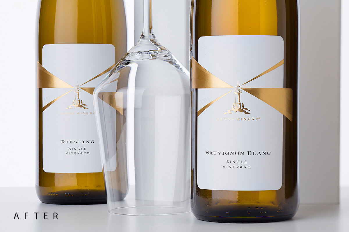
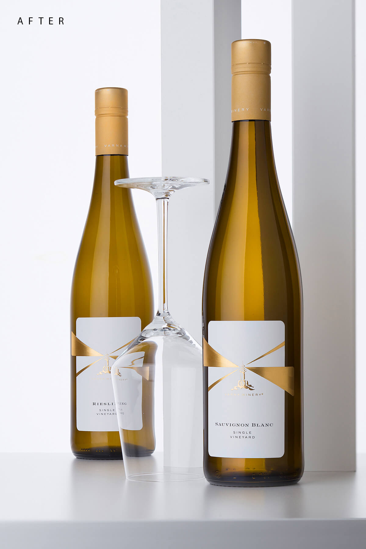
The light! Of course this was a breakthrough – I was 100% sure I have to restyle the lighthouse and make it really shine with its guiding light on the label. I had to draw some rays of light coming out of it and use certain embellishments to enhance their meaning. Going back and forth I finally decided to make the rays from solid gold hot foil but also used microembossing to change the light reflections from their surface. I also added secondary pair of rays that were printed with high build raised varnish – their function wast to complement the whole image and add some extra glittering details in this new wine label restyle. I also made these gold rays to spread out of the rectangular label shape which enhanced their presence even more – I somehow wanted to show that they go outside the frame. At the bottom of the label I left blank space for the variety and ‘Single Vineyard’ designation.
The Result: I always leave my audience to decide for themselves whether they like or not any particular design be it mine or not. So I will speak here only for myself. I was challenged with this new wine label restyle as I had to change something already looking good. It cost me a lot of time spent in thinking and experimenting on my computer and I think I really managed to evolve the existing label into a new one from a next level. One that is more recognizable and distinguished on the shelf and of course one, that really shines. I still have the feeling that the lighthouse spreads light throughout the sea waves!
Final Touches: A few details I forgot to mention to complete the whole picture. We used very nice paper for this wine label restyle covered with special soft-touch varnish. It was the perfect background for the gold doming effect we used for the lighthouse as well as for the gold rays. Last but not least – we used the Stelvin Lux premium cap to seal the wine and we also used same soft-touch finish to get excellent pairing between cap and label.

CREDIT
- Agency/Creative: the Labelmaker
- Article Title: Varna Winery Provide a Challenging Wine Label Redesign for the Labelmaker
- Organisation/Entity: Agency, Published Commercial Design
- Project Type: Packaging
- Agency/Creative Country: United States
- Market Region: Europe
- Project Deliverables: Brand Rejuvenation, Brand World, Branding, Graphic Design, Packaging Design, Photography, Rebranding
- Format: Bottle
- Substrate: Glass Bottle


