


Gozo was born as a global branding and strategic design project for a new range of extra virgin olive oils (EVOO).
Its founders— a grandfather passionate about the land and owner of several hectares of ancient olive trees, and his granddaughter, drawn to innovation— decided to create these three unique varieties of premium coupages, produced in limited quantities, sustainable and organic, sourced from thousand-year-old Spanish olive trees. The name Gozo is no coincidence: it evokes pleasure, joy, and enjoyment. In an oversaturated market, the brand responds to today’s consumer demands: personalization, sustainability, health, quality, and purposeful experiences. The comprehensive strategy spans from naming to brand activation, powerfully conveying this identity.
The central concept of Gozo is generational and temporal symbiosis: the vision of an experienced grandfather and the creativity of his granddaughter merge, materializing a conversation between generations. This approach places past and future in the same present. The result is a fusion of tradition and avant-garde. The resulting identity communicates pleasure, tradition, and natural well-being.
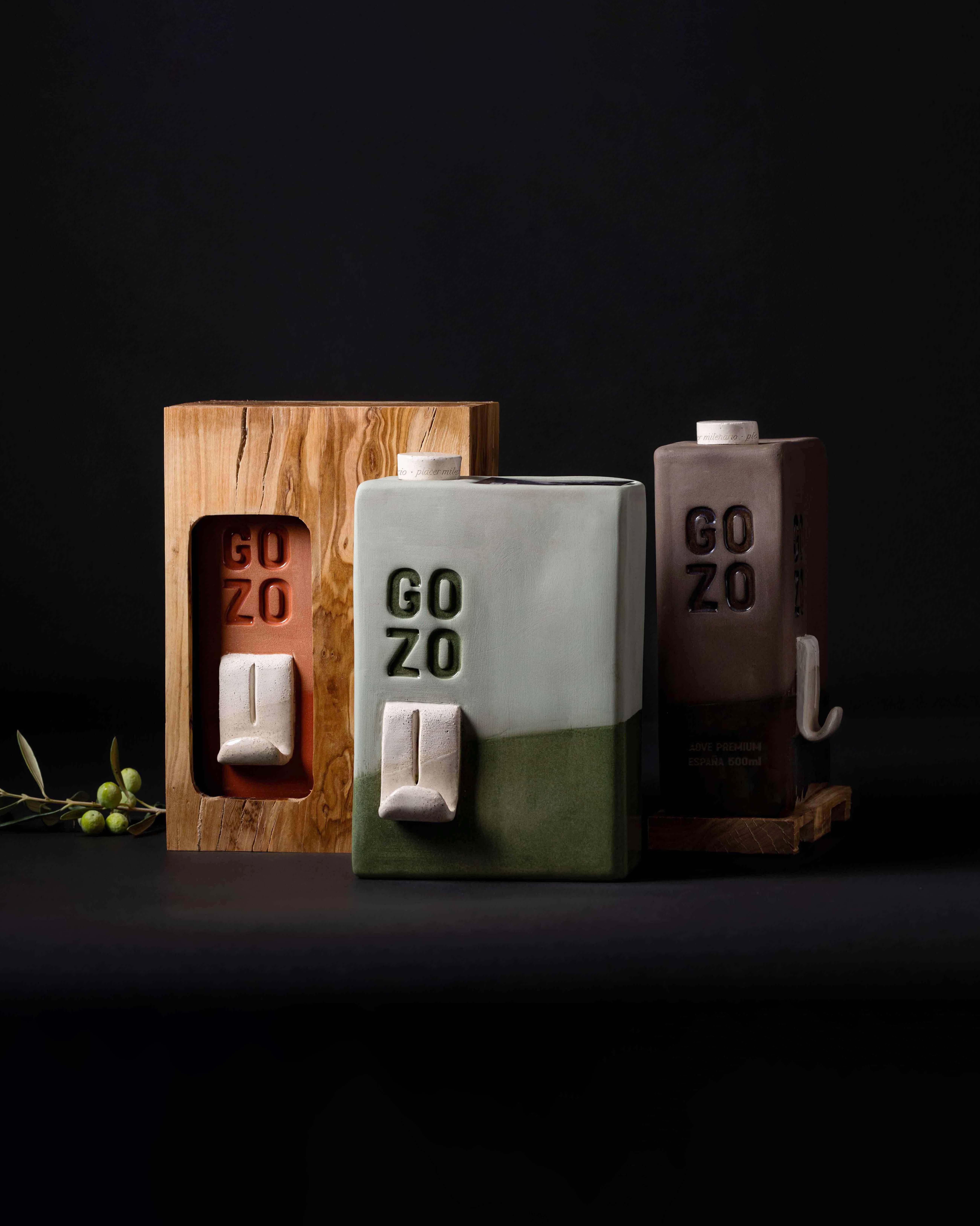
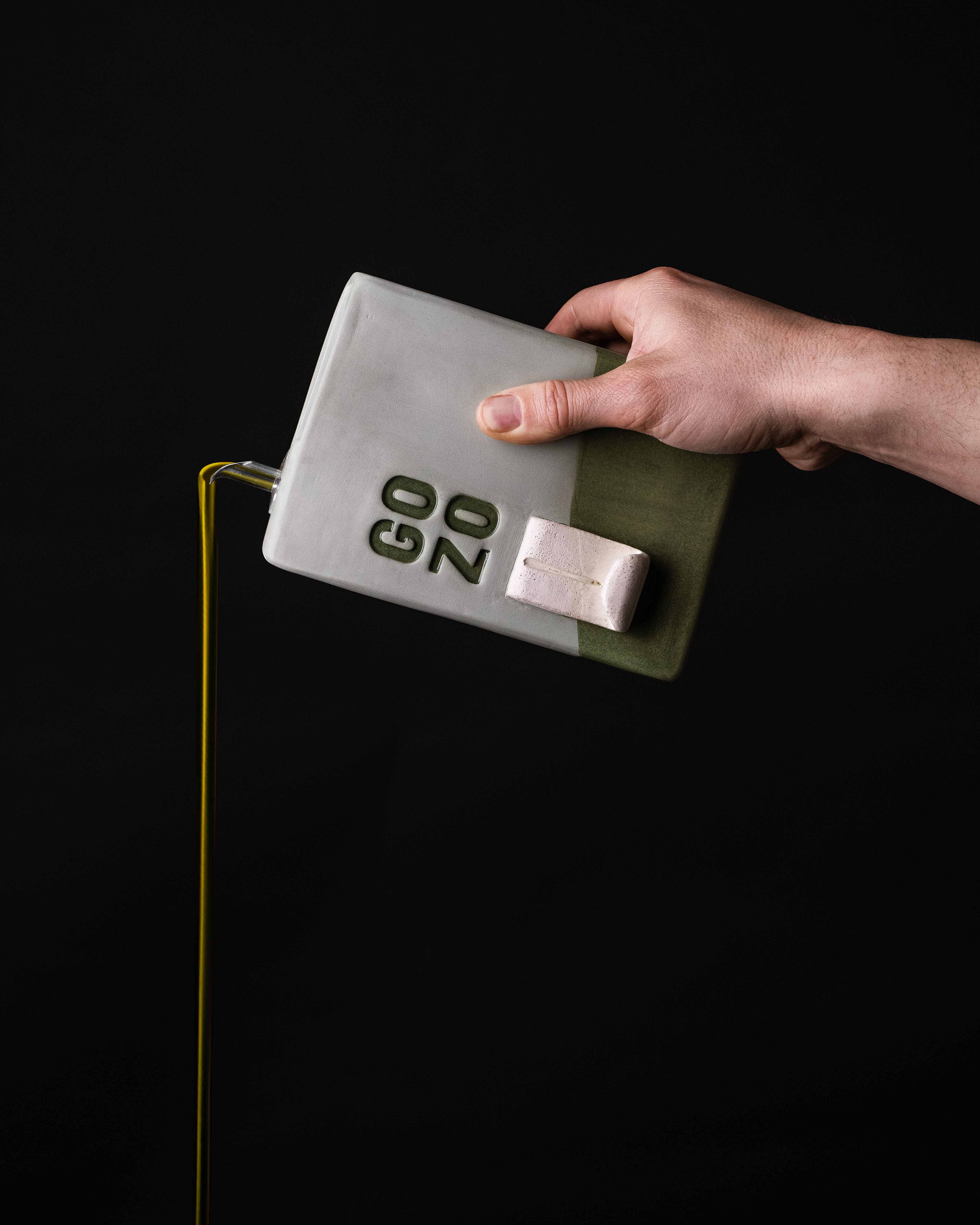
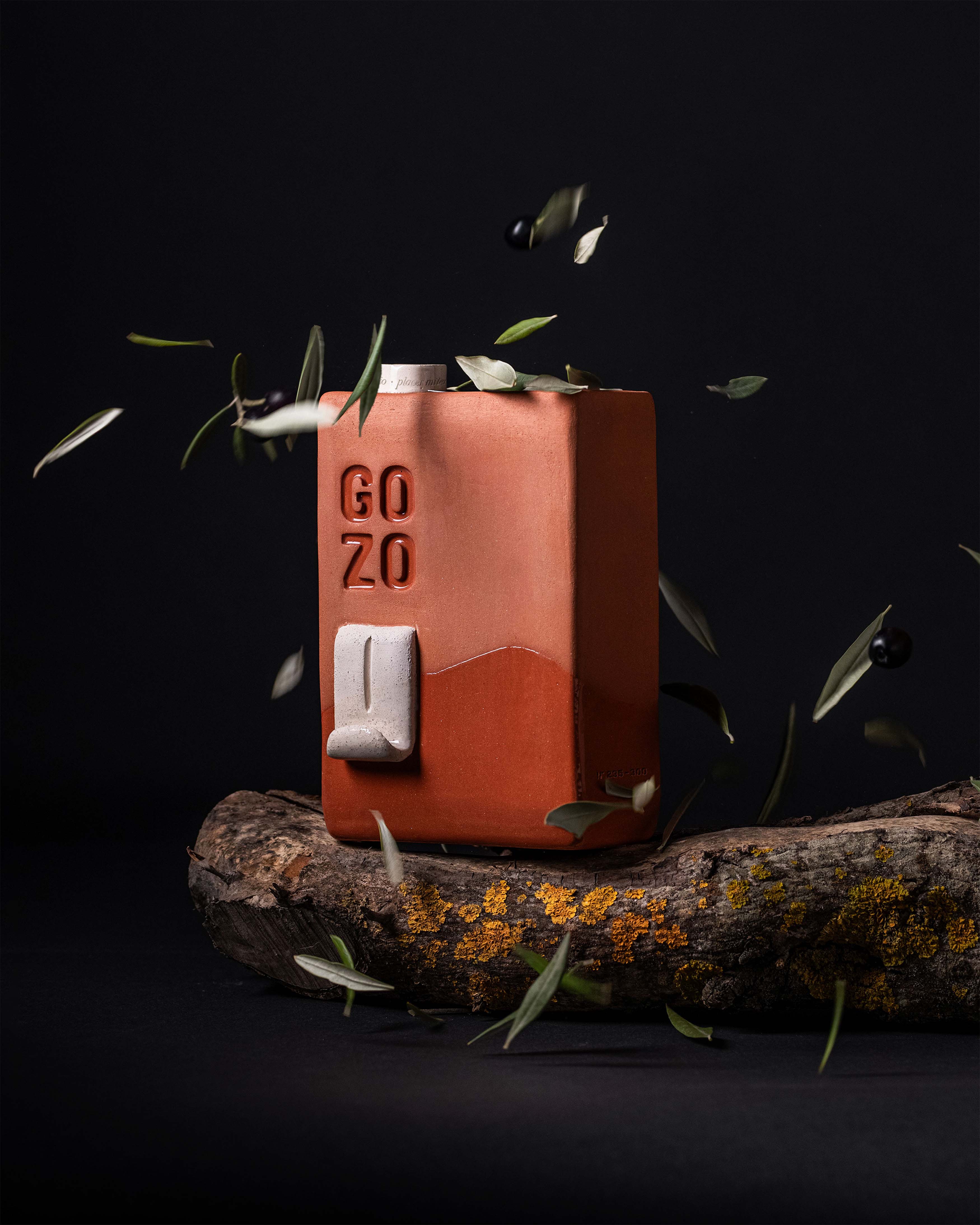
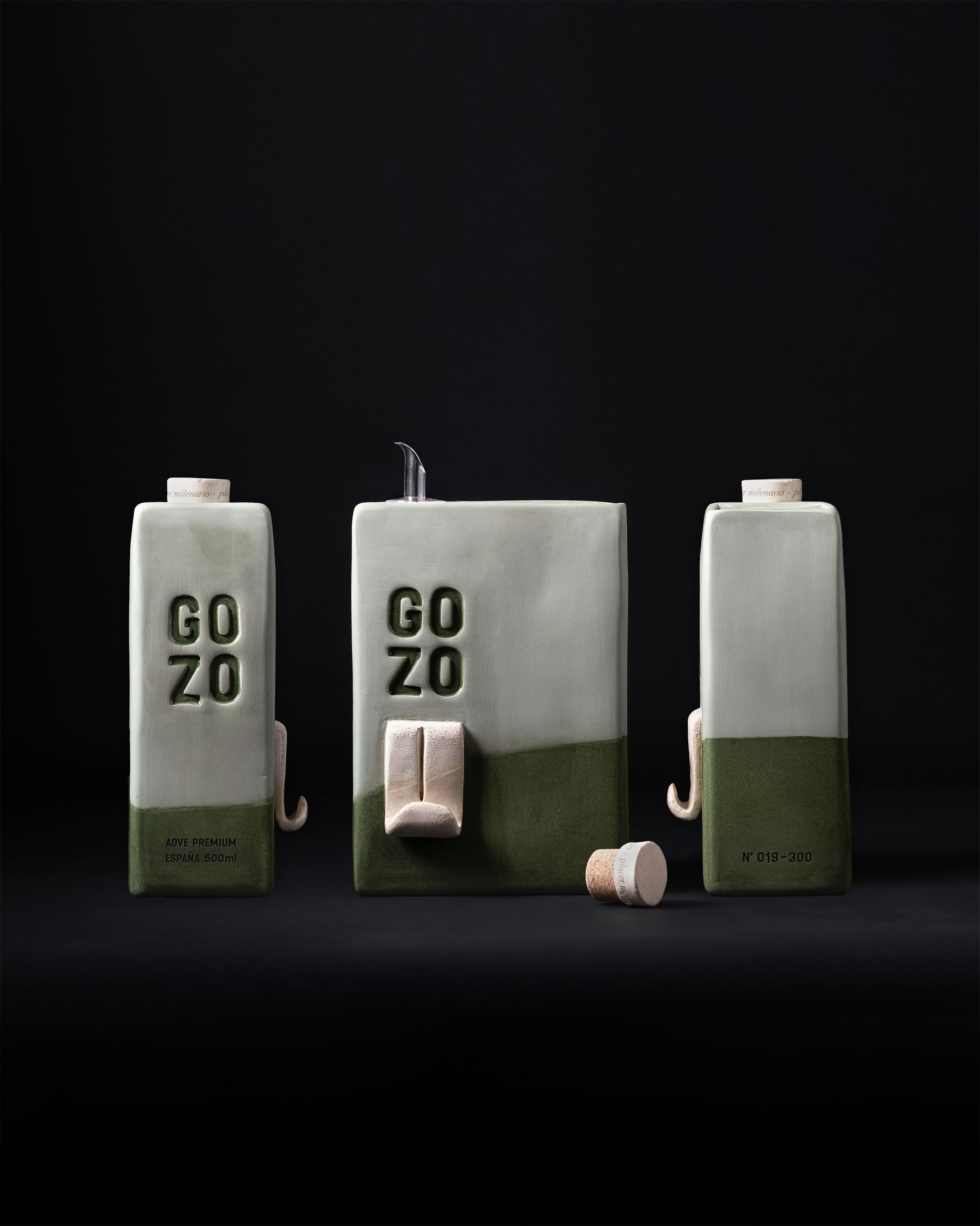
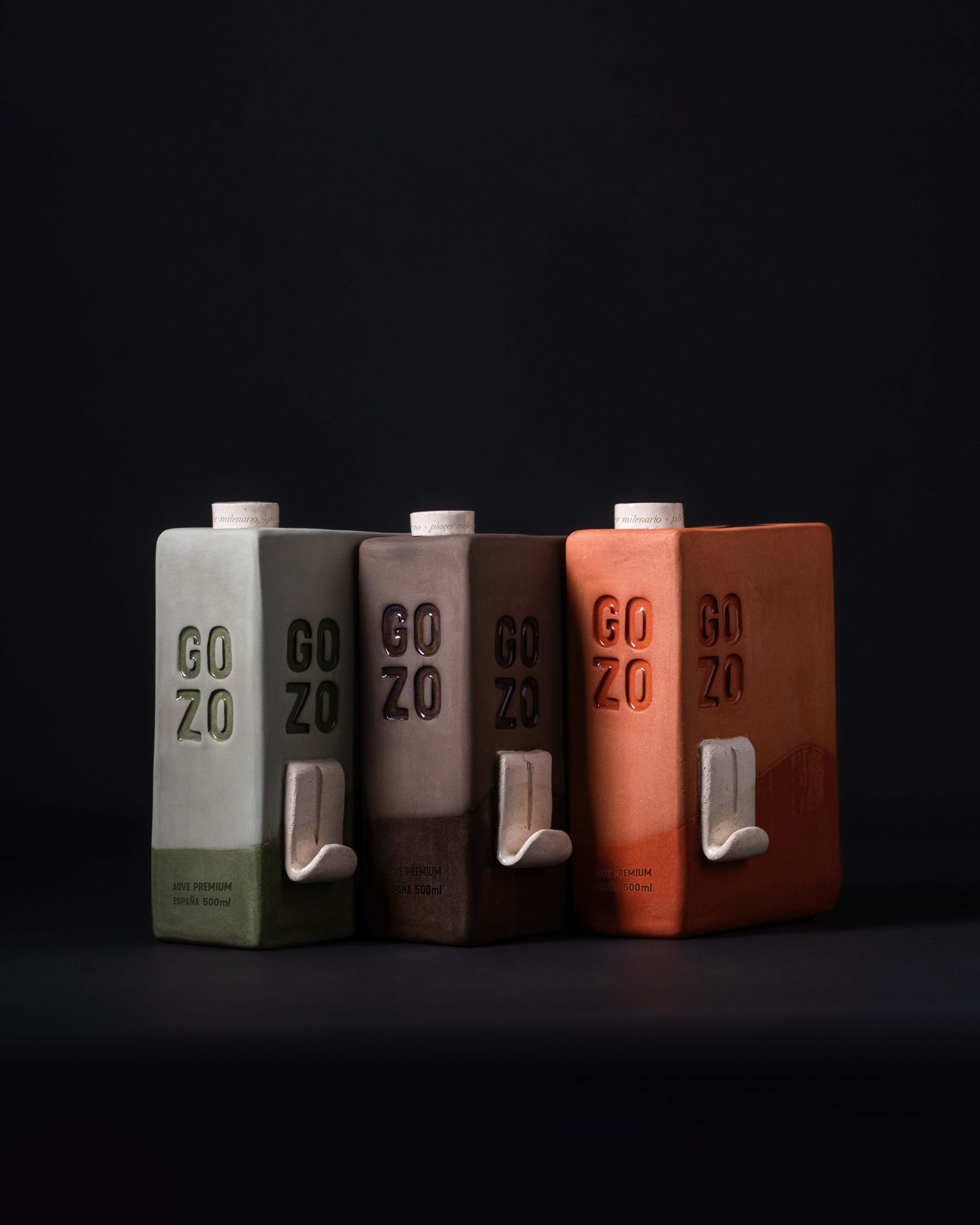
The packaging completely redefines how olive oil is presented. Inspired by old oil cans, each 500 ml bottle is handcrafted in eco-friendly clay, free from artificial dyes, using natural colors reminiscent of the earth. Its cubic, discreet, and robust geometry breaks away from the conventional glass or plastic bottle, while still feeling premium: it emphasizes exclusivity without falling into ostentation. In addition, each bottle is presented in a case made from recycled olive wood, reinforcing the product’s rustic authenticity and Mediterranean origin. Both the clay bottles and the wooden cases are real, functional prototypes.
The key visual element is the bottle’s three-dimensional “tongue, ” a sculptural detail that symbolizes freedom and the luscious pleasure of savoring this unique oil — the Millenary Pleasure. This ceramic spout acts as a powerful metaphor for the Gozo experience: a free, playful, and sensory gesture. In this way, the packaging simultaneously conveys pleasure, natural well-being, tradition, and innovation, playing an active role in the brand’s narrative. When handling the bottle, the consumer feels the texture of the clay and perceives its artisanal weight, inviting an intimate and contemplative gesture. This ritual reinforces the philosophy of slow living and conscious enjoyment. The minimalist design, free of superfluous labels, allows the raw material — the millenary oil — to be the absolute protagonist of the ritual.
Each container becomes a display piece: the logo, subtly embossed on the surface, emphasizes the brand’s identity with finesse. This allows the bottle to transcend its utilitarian function, reminding the user of the product’s origin and story. As a whole, this aesthetic approach turns the interaction with the container into a moment of visual and emotional discovery.
Behind the whispered luxury, clear values emerge: the project supports small local producers and artisans, promotes a circular economy, and cares for the environment. The choice of natural and reused materials reflects a genuine commitment to nature. It embraces the beauty of imperfection: each piece is unique and shows slight variations, highlighting the authenticity of manual craftsmanship. This wabi-sabi philosophy will resonate with those who seek honesty and authenticity in every step of the process.
Moreover, it meets the demands of modern consumers: it offers a fully sustainable and healthy proposition, free from plastic and artificial preservatives. In a highly competitive sector, it positions olive oil as a product with purpose. Every step is designed to generate memorable experiences.
The project reimagines the presentation of traditional EVOO by betting on differentiation. It proposes a sculptural object that invites the public to reconnect with the origin. By redefining the olive oil consumption experience, Gozo stands out not only for its beauty and authenticity but also for its solid strategic value in the market. This holistic and emotional design positions the brand as a pioneer and innovator in its category, capable of redefining the industry standards.
CREDIT
- Agency/Creative: Vanesa Garcia Estudio
- Article Title: Vanesa Garcia Estudio Elevates Gozo Olive Oil with Sculptural Packaging and Emotional Design
- Organisation/Entity: Freelance
- Project Type: Packaging
- Project Status: Non Published
- Agency/Creative Country: Spain
- Agency/Creative City: MURCIA
- Market Region: Europe
- Project Deliverables: Art Direction, Brand Creation, Brand Design, Brand Identity, Brand Strategy, Label Design, Packaging Design, Product Photography
- Format: Bottle, Box
- Industry: Food/Beverage
- Keywords: WBDS Creative Design Awards 2025/26 , gozo, packaging, branding,
-
Credits:
Concept & Design: Vanesa Garcia


