


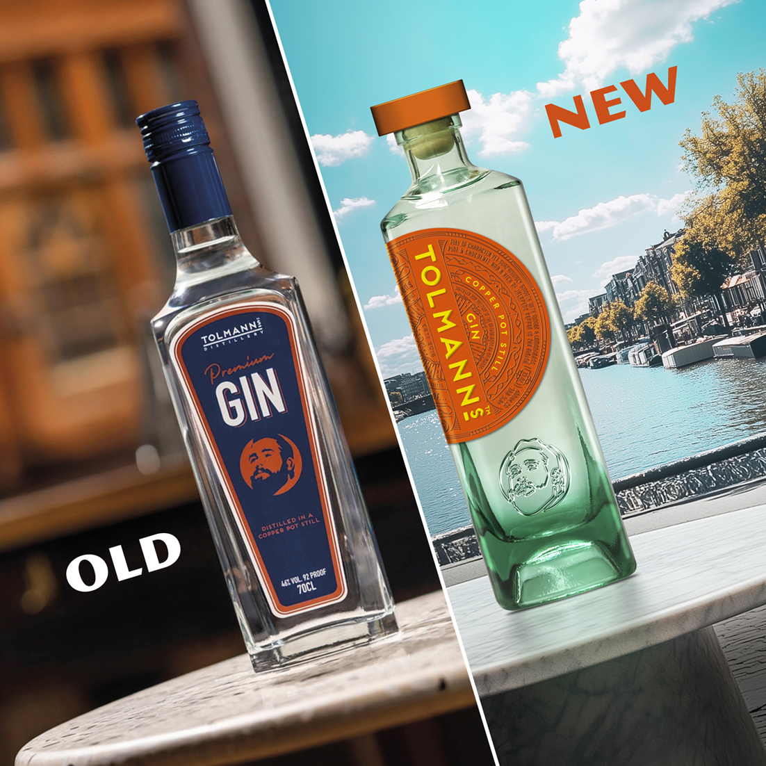
We are proud to present our redesign for Tolmanns Gin, that recently had its relaunch at the ProWein 2025. A redesign with a capital R. The gin category has been filling up the last years and to stand out you really must bring you’re A-game.
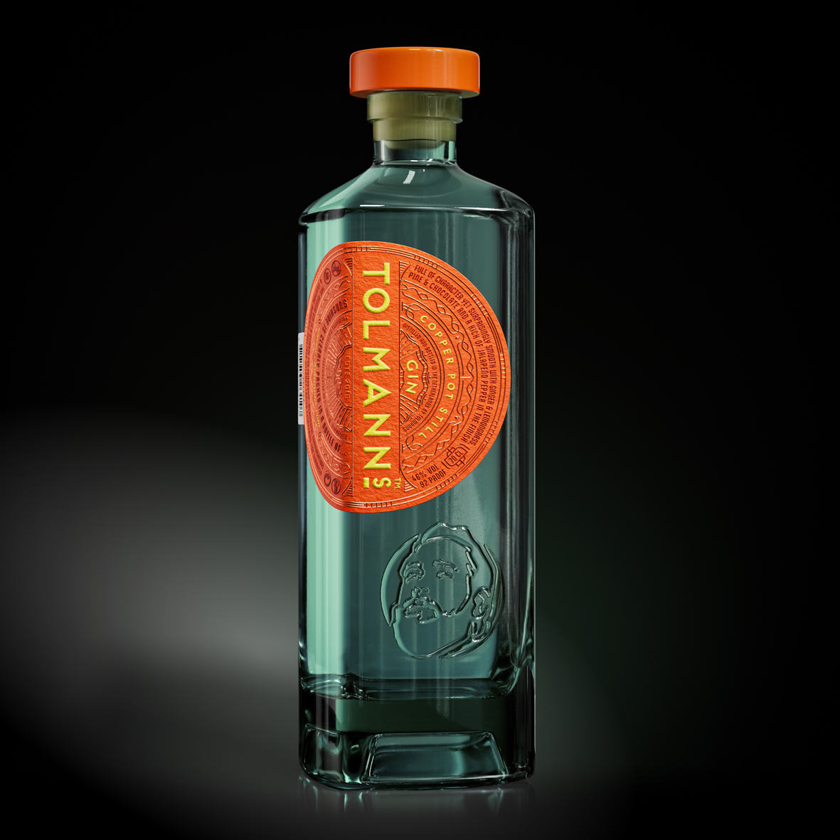
The task for us: to create a bottle that stands out in this chaotic segment, shines from the shelves, and expresses the essence of the Brand “a bottle full of sunshine”!
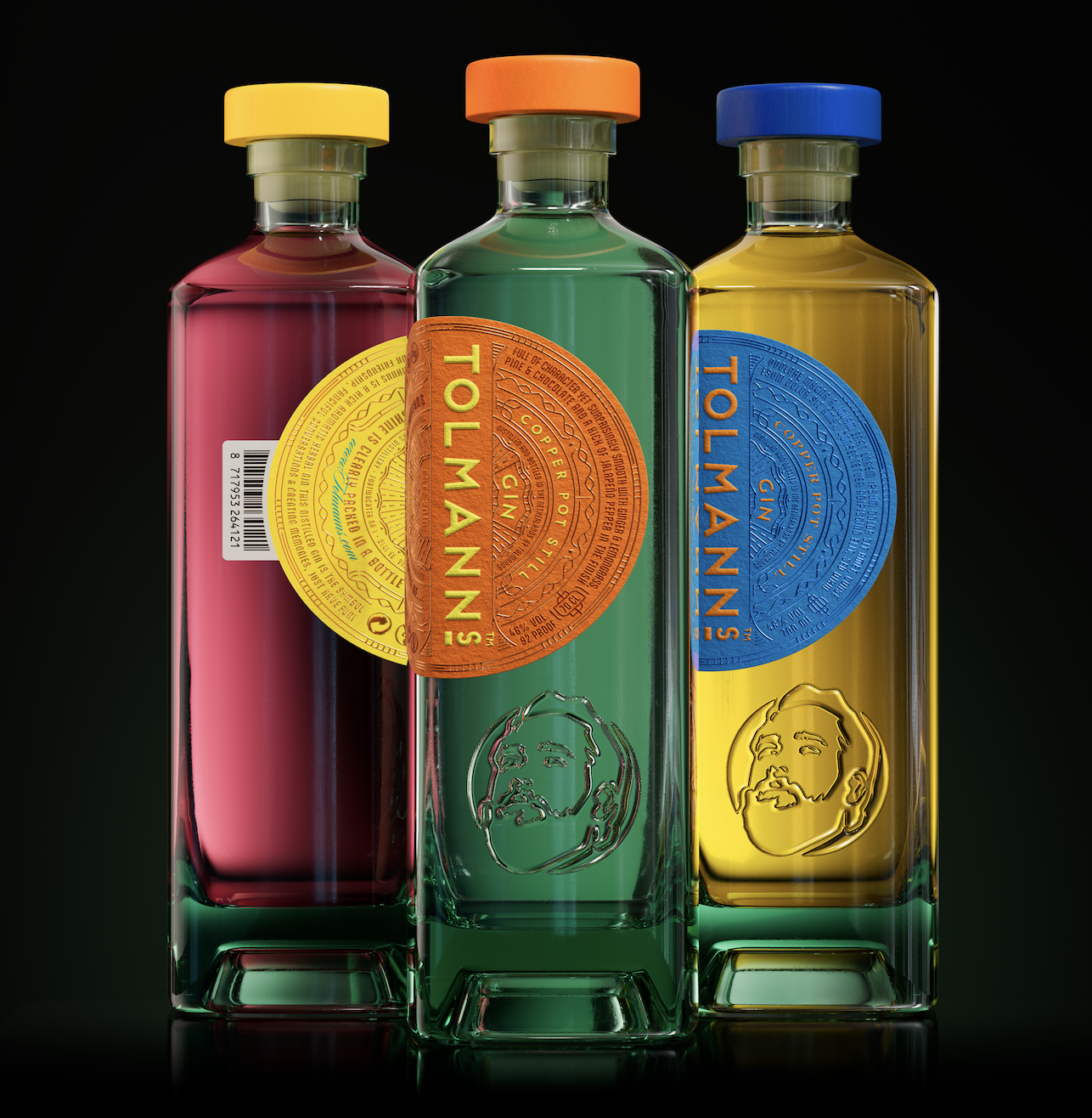
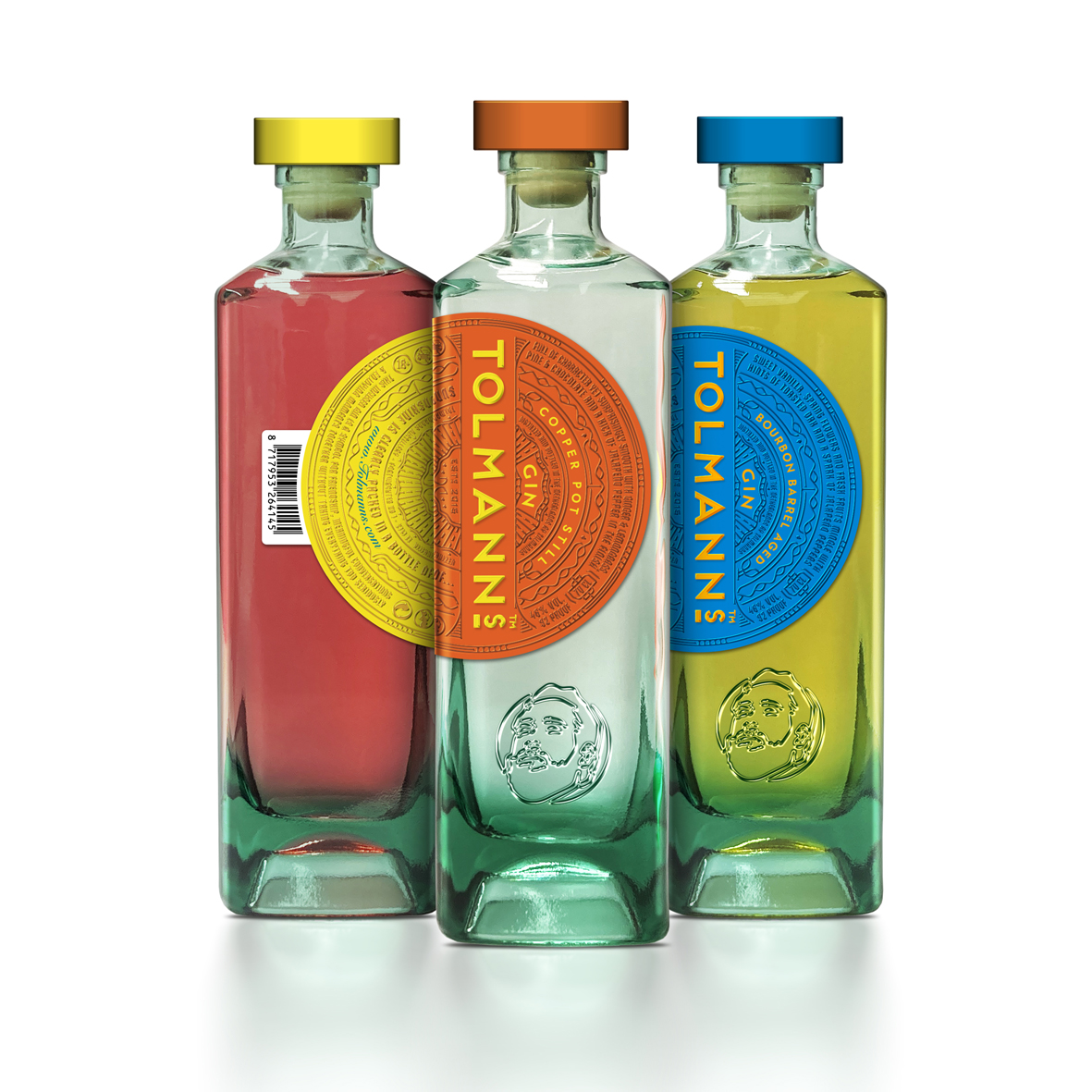
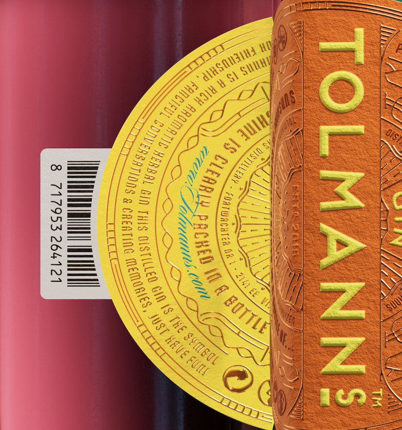
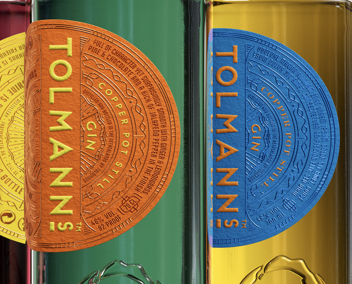
The sun literally was a big inspiration for our new design. We chose a new square shaped bottle, more sophisticated and stylish, from Wild Flint Glass (Estal). This because of sustainability and the greenish glow of the bottle, working perfectly with the spirit colors. A great starting pallet to work with bright colors and round shapes for the labels and closures, creating an exciting contrast with the square bottle. Our shining sun was born and as in real life where the sun appears from the horizon, on the bottle it appears from the left side on to the front. combining everything in 1 label, so no back label. Leaving nothing untouched we created the barcode as a sort of an attachment to the label for even more brand recognition.
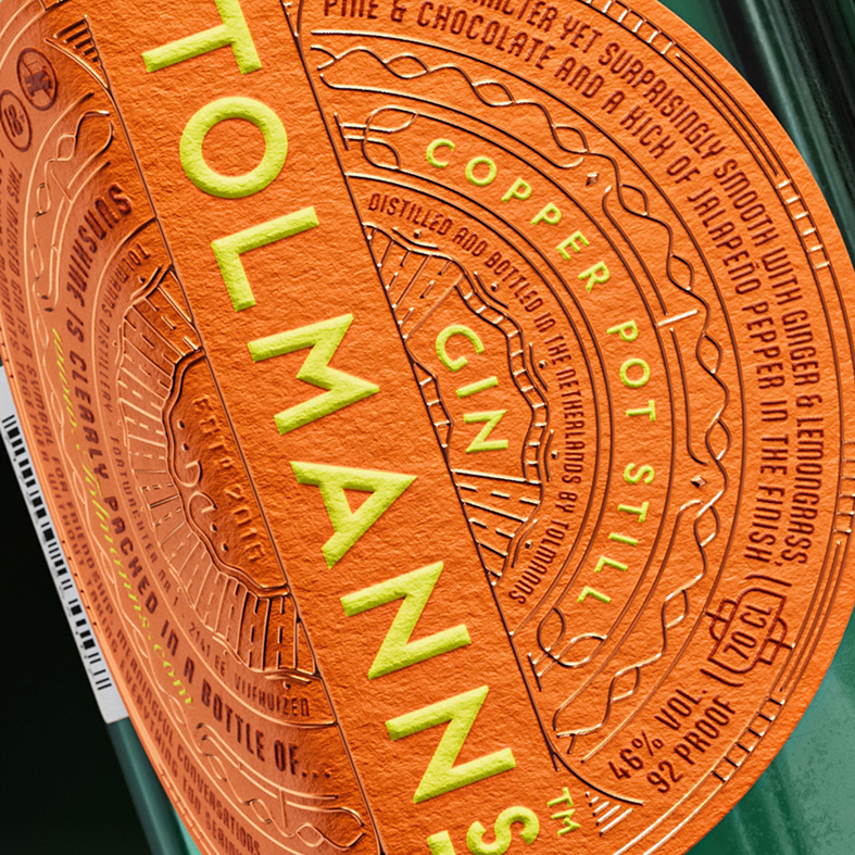
After creating a shining star on the shelves, we went into detail with the label design. Information on the many ingredients from all over the world, 16 botanicals, flavor notes and a touch and feel screaming craftmanship. Different height levels of illustration, text and hot foil stamping, all handcrafted like the spirit itself. It creates a top-notch in hand feel for the consumer, immediately representing the high quality of the spirit when they hold the bottle up-close.
To get the best result in the production of the labels the perfect paper must be selected. Always willing to help are our friends at Avery Dennison recommending their Artisan Extra White FSC, which keeps the shine through from the background out and has the best effect with bright colors.
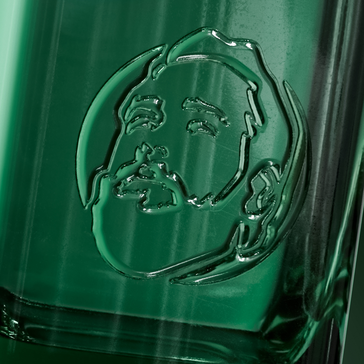
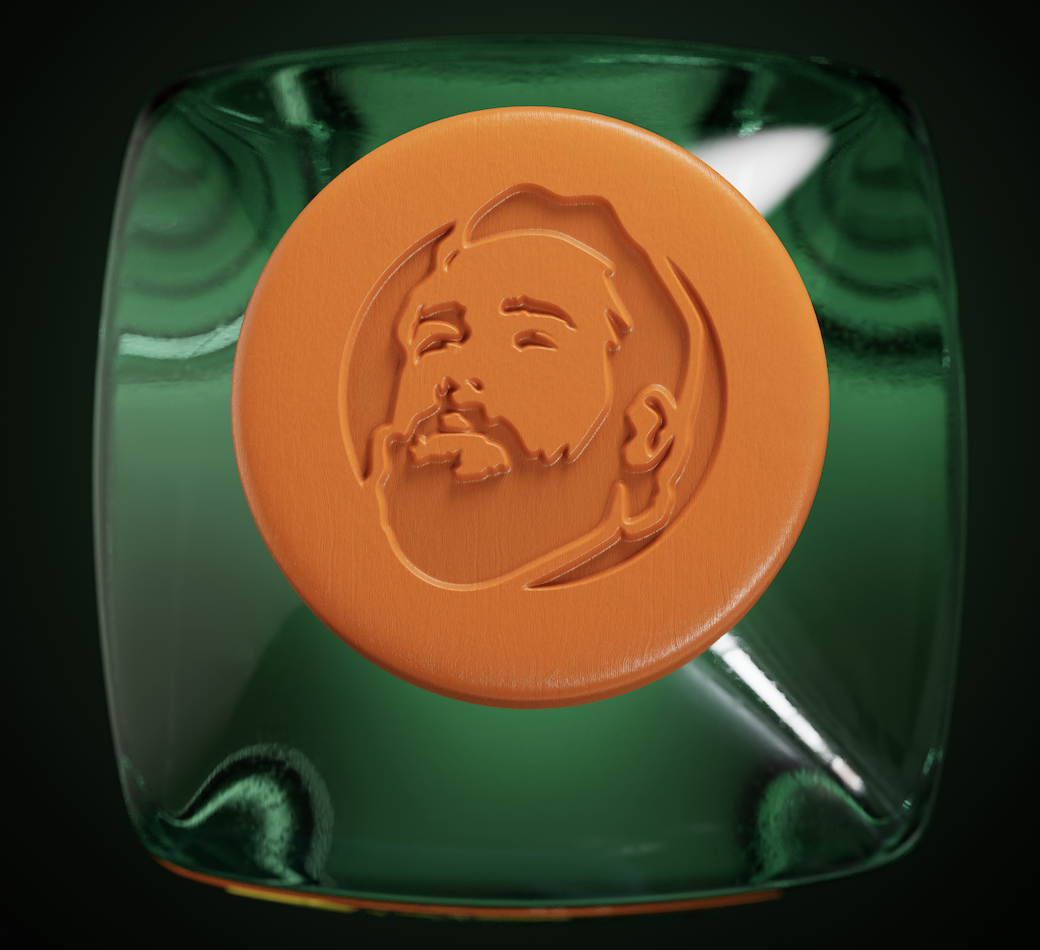
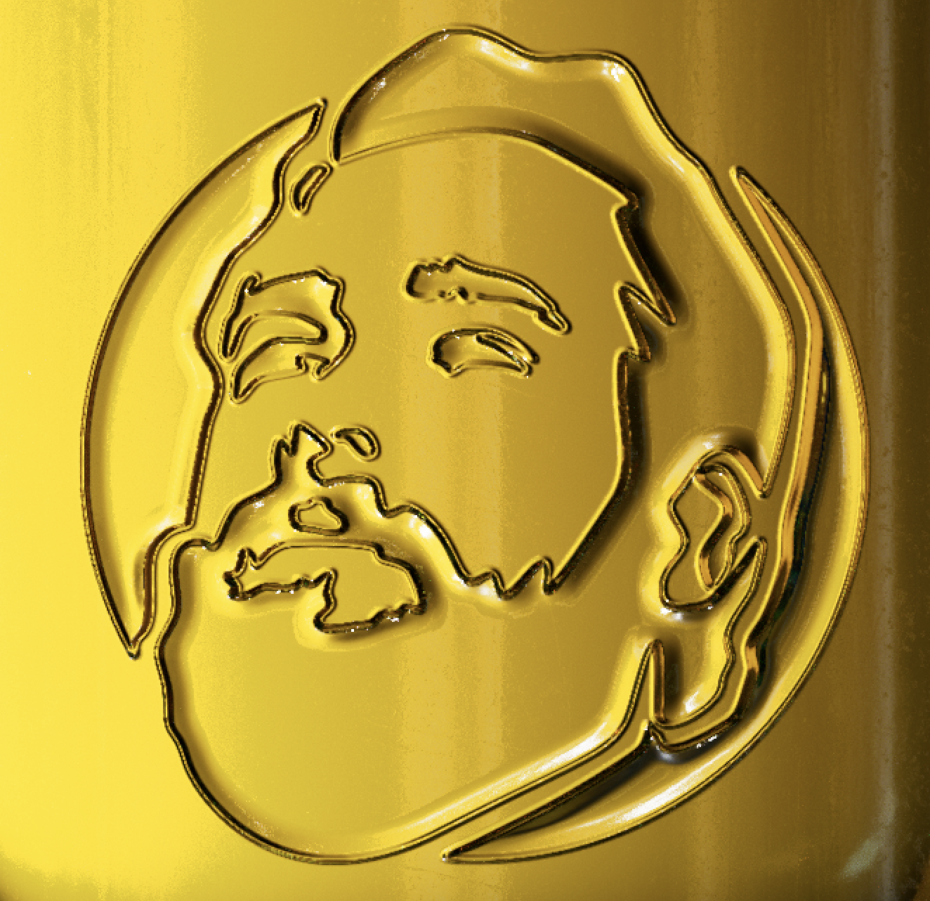
Last but not least we honor the Master Distiller on the bottle by an embossing on the front, created with the latest 3D printing techniques on the bottle. Proudly looking up at the sun and his own brand.
CREDIT
- Agency/Creative: Van Heertum Design VHD
- Article Title: Van Heertum Design VHD Elevates Tolmanns Gin with a Sustainable Bottle That Glows with Flavor
- Organisation/Entity: Agency
- Project Type: Packaging
- Project Status: Published
- Agency/Creative Country: Netherlands
- Agency/Creative City: Tilburg
- Market Region: Europe
- Project Deliverables: 3D Design, Graphic Design, Illustration, Packaging Design, Rebranding
- Format: Bottle
- Industry: Food/Beverage
- Keywords: bottle design, label desgin, spirit design, gin design, redesign
-
Credits:
Strategy Director: Rob van Heertum


