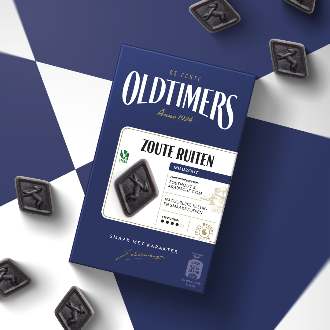
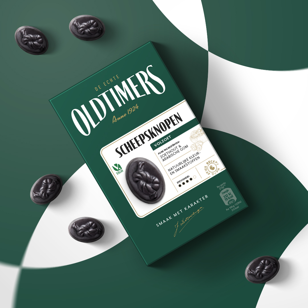
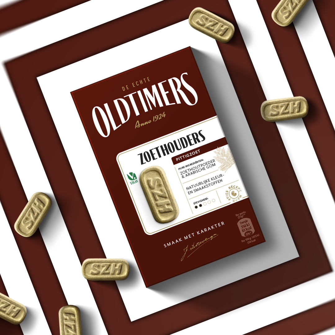
Oldtimers is a Dutch candy brand that has been around since 1924. It specializes in a typical Dutch candy, which can best be described as liquorish. Oldtimer asked Van Heertum Design VHD to redesign the existing packaging for a complete repositioning in the market. After extensive research, Oldtimers found out that liquorish is perceived as “candy for adults” and that craftmanship and premium quality in this category makes it acceptable to eat, in a world where candy and sugar are perceived as bad for you. Since the old packaging was to playful, it needed a complete makeover.
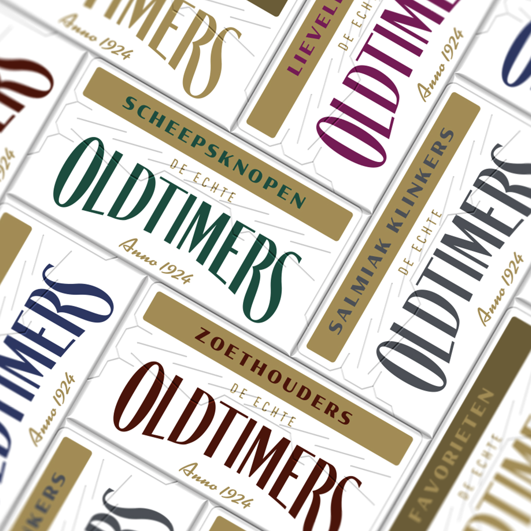
Everything has been changed, keeping the basic layout structure and color-coding the same for consumer recognition. The logo has been updated and the colors have been intensified to a more dark and intense sensation. As the old pack was mostly white, the colors have been used allover to get shelve impact. To give it a more premium vibe, a label was introduced onto the packaging where all the needed information is displayed, including some hand drawn illustrations linking to the ingredient. This label goes from the front around the side to the back of the pack. The major part of the pack is in color, except for the label. The opposite sides of the label (left side of the pack, top and bottom) are white to give the entire pack a modern sensation.
Next to the packaging the entire branding has been updated as well, suiting the new packaging design. Website, advertising, instore communications, etc. everything has been uplifted. Next to the existing line of candy flavors, also new products, like sugar free and bio are in the works, so the brand is totally up to date again and ready for the future.


CREDIT
- Agency/Creative: Van Heertum Design VHD
- Article Title: Van Heertum Design VHD Creates Oldtimers Packaging Redesign
- Organisation/Entity: Agency
- Project Type: Packaging
- Project Status: Published
- Agency/Creative Country: Netherlands
- Agency/Creative City: Tilburg
- Market Region: Europe
- Project Deliverables: Art Direction, Brand Design, Illustration, Logo Design, Packaging Design
- Format: Box
- Substrate: Pulp Board
- Industry: Food/Beverage
- Keywords: WBDS Agency Design Awards 2022/23
- Keywords: candy, liquorish, packaging, oldtimers, dutch, restyling
-
Credits:
Design Agency: Van Heertum Design VHD


