


For Friandries, creator of luxurious culinary chocolates, we created the design for a completely new packaging line. The design includes packaging structure, graphical design and branding, inlay design and chocolate placement inside all boxes.
At Friandries they don’t just make chocolates, they play with different ingredients, color and taste and create the ultimate chocolate experience for the adventurous chocolate lover.
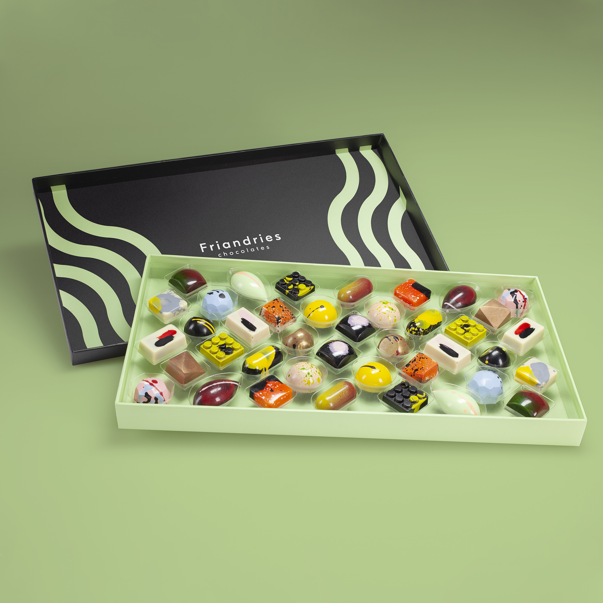
Chocolate is art. But instead of imitating the old masters, at Friandries they get their inspiration from the street. Bonbons, chocolate bars and truffles are no longer the stately portraits with classic techniques, but eye-catching shapes and colors. Modern art, industrial design, graffiti, the scents and colors of a city in motion.
They want to bring innovation to the traditional chocolate market and introduce people to the versatility of chocolate. Friandries stands for chocolate products with high quality, fresh ingredients, and pure flavors without unnecessary additives.
For us as designers a great challenge and a lot of fun to create the new look and feel for this explosion of impressions and high-quality products. The main goal was letting the chocolates be the hero in the packaging, since every chocolate itself is a piece of art. A great gathering of colors and impressions displaying the unique taste of every bonbon.
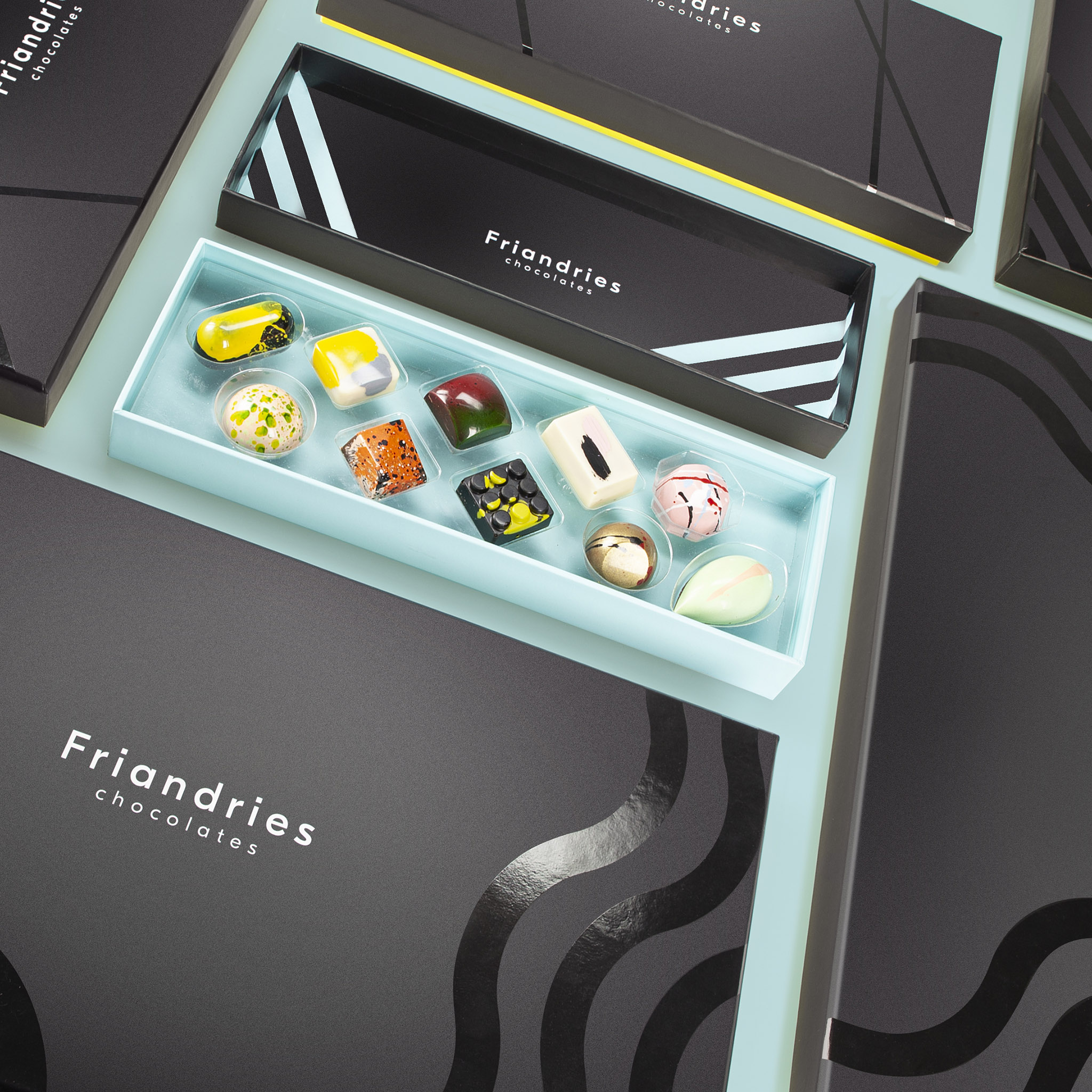
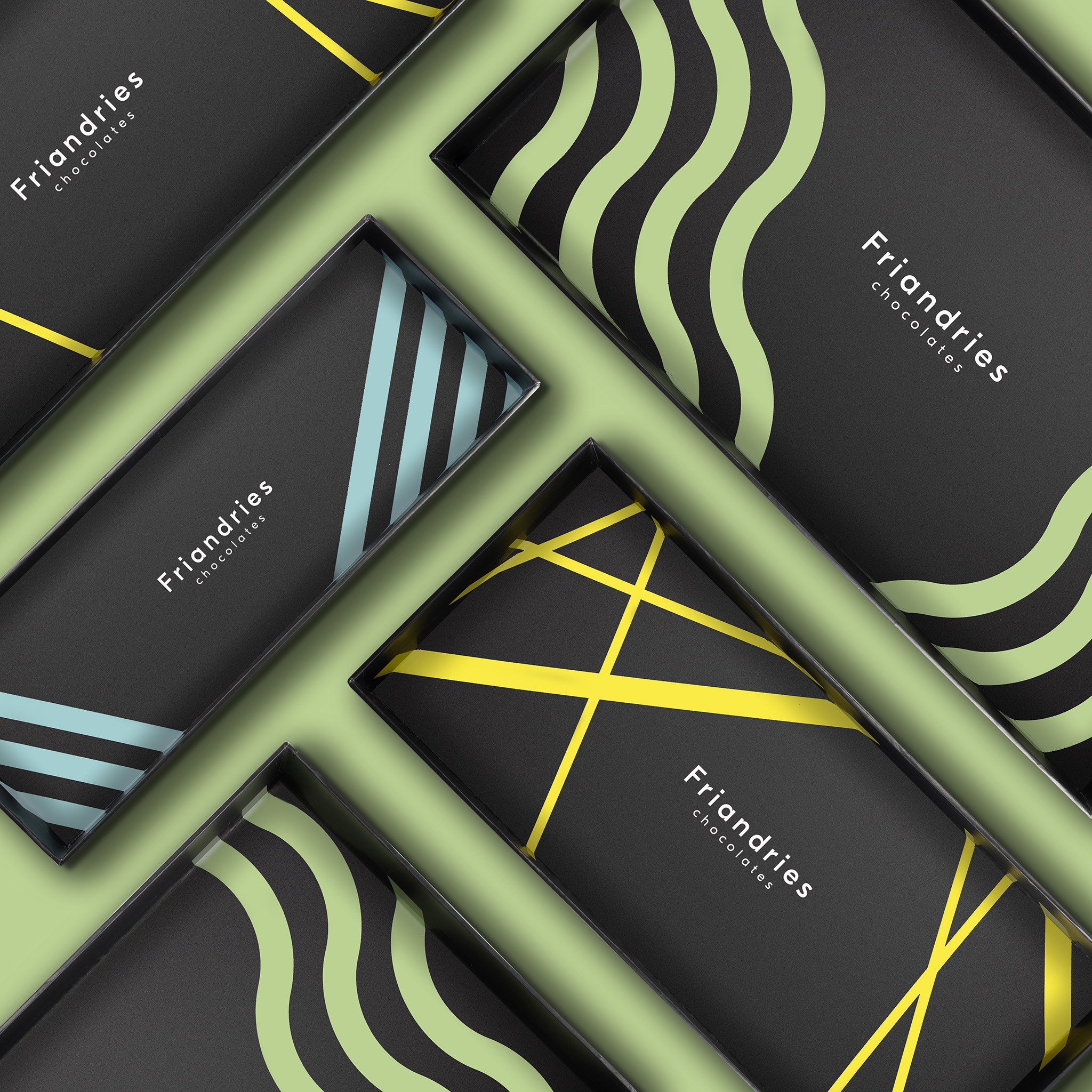
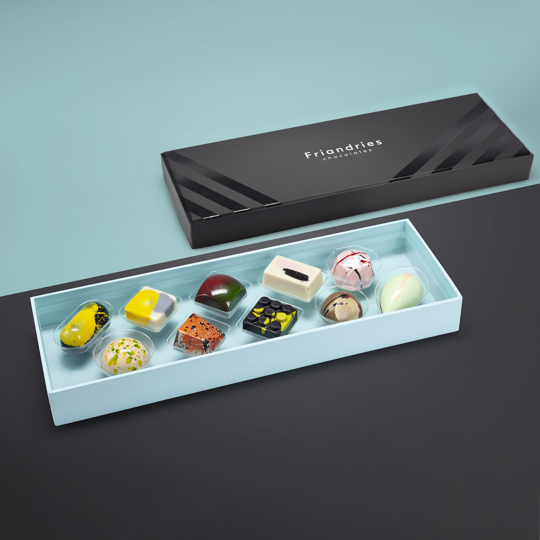
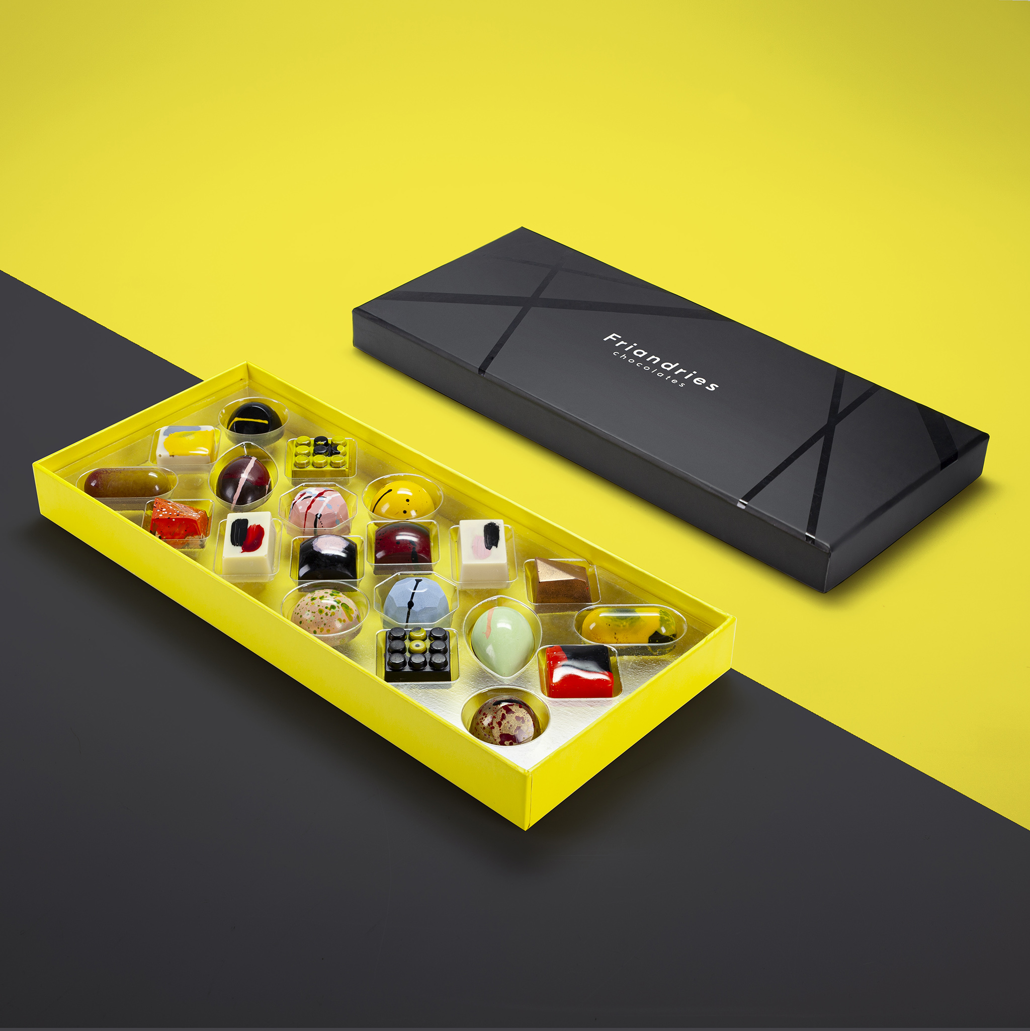
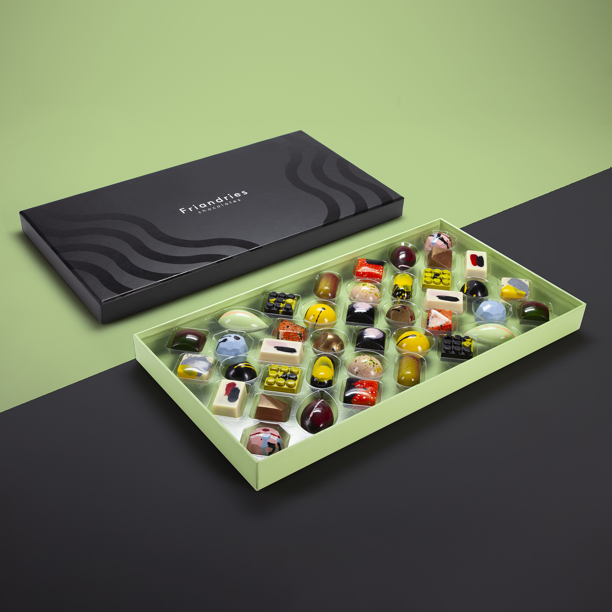
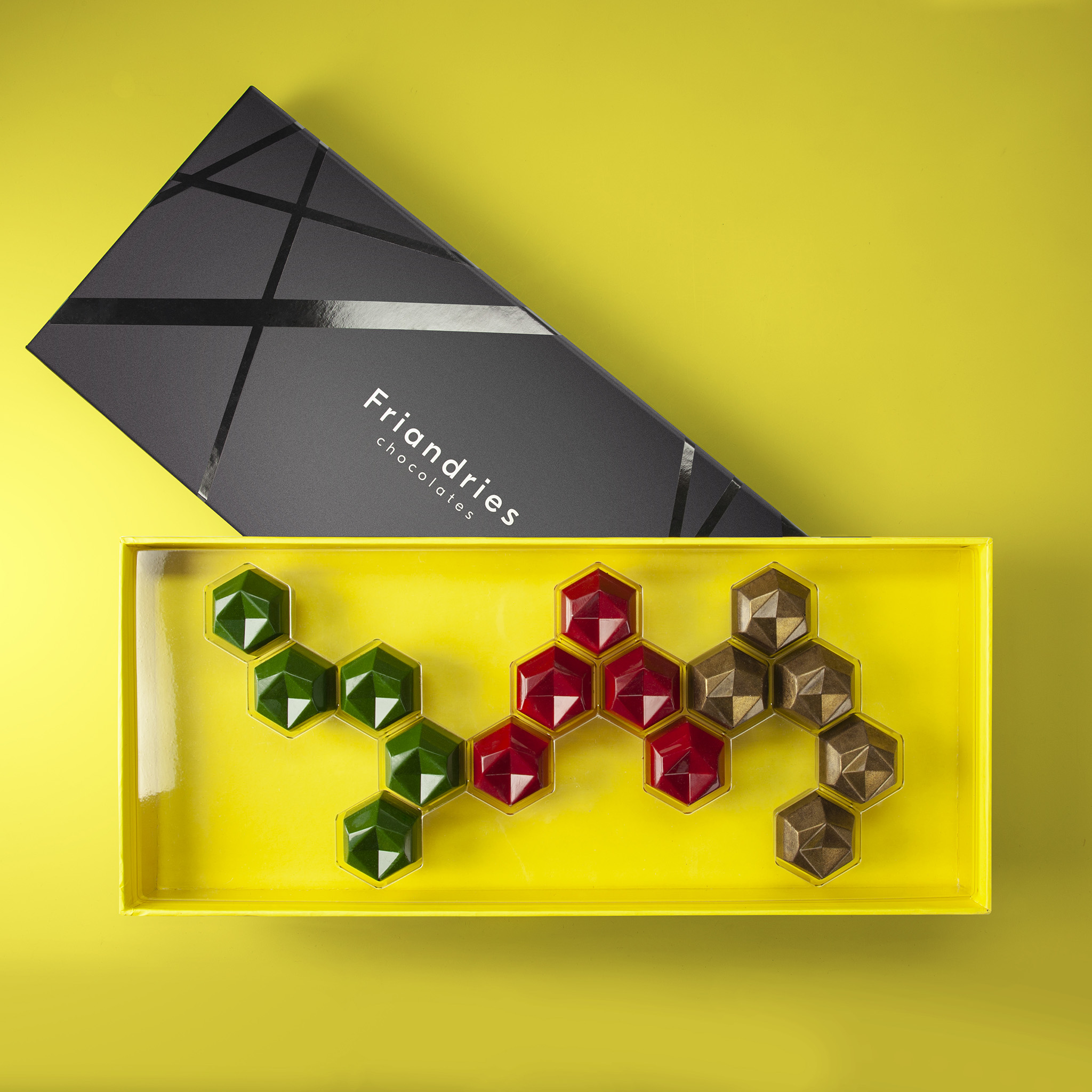
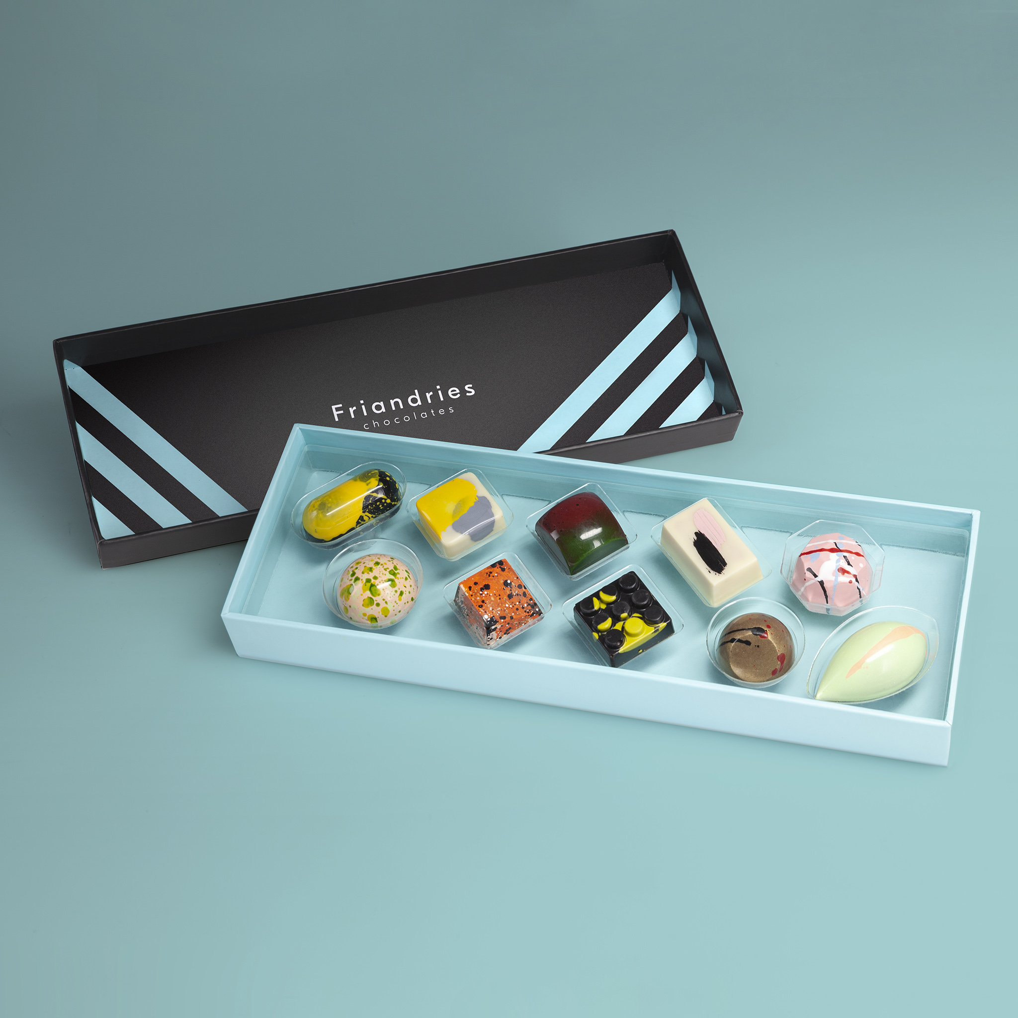
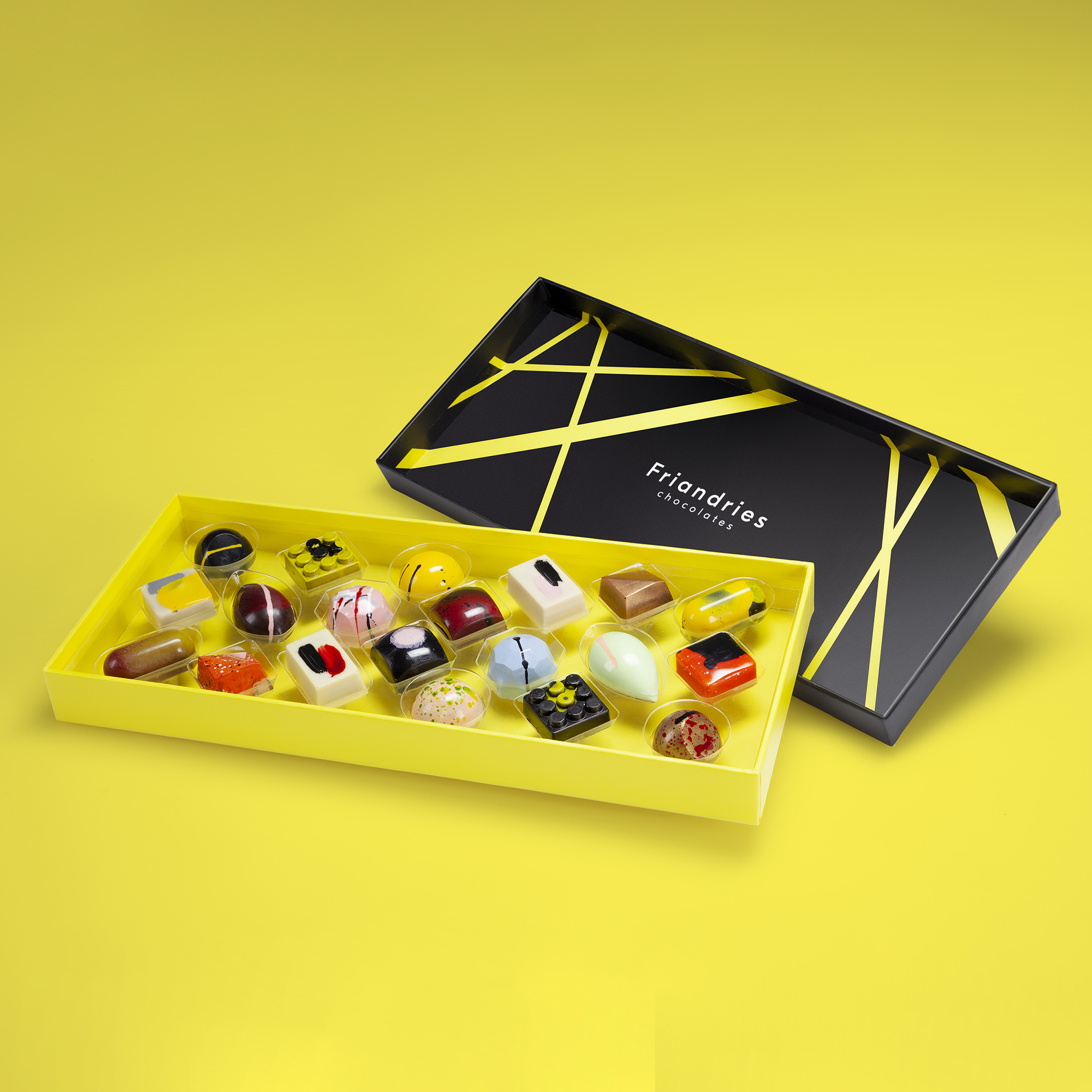
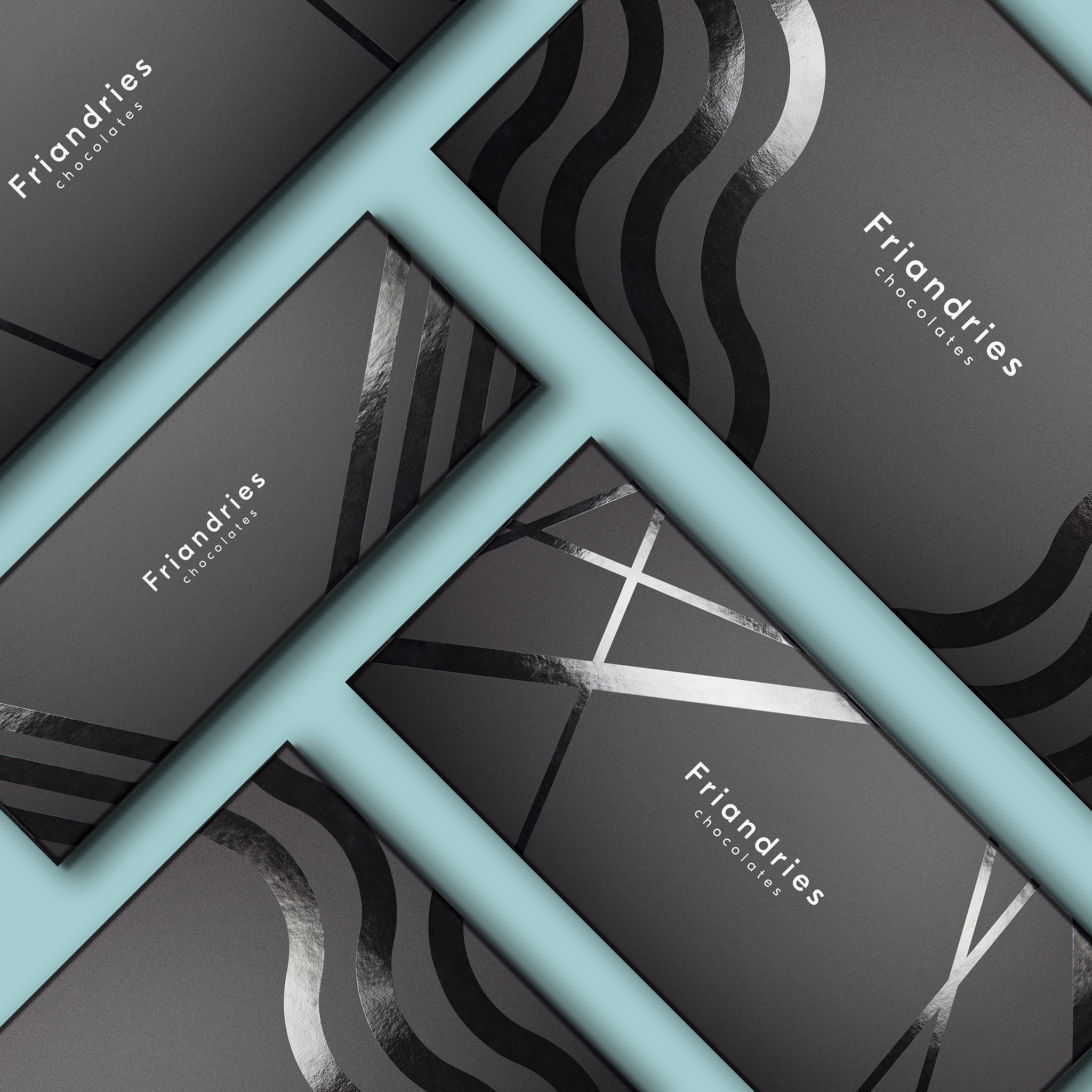
For the boxes we created a very classy neutral outside look with matt black and glossy graphical impressions. We made 3 box sizes, each for a different number of chocolates, which all have their own graphical pattern and color. All the box sizes can be filled with different inlays, that hold the chocolates in place. We designed these inlays and created several different patterns that lay out the chocolates in unique ways, to optimize the impact when you open the box. By using transparent inlays, the chocolates are visually floating in different patterns in the box and the colored bottom of the boxes really make a statement, complimented with the graphical colored pattern on the inside of the lid.
The outside of each chocolate is a piece of art, but when you taste it, you are hit with a taste explosion you did not expect. This is the same what we went for in the design… When you open the already beautiful box, you will be blown away when you open it, having your first great visual impression, which will only grow when tasting your first bonbon.
CREDIT
- Agency/Creative: Van Heertum Design VHD
- Article Title: Van Heertum Design VHD Creates New Branding and Packaging Design for Friandries Chocolates
- Organisation/Entity: Agency
- Project Type: Packaging
- Project Status: Published
- Agency/Creative Country: Netherlands
- Agency/Creative City: Tilburg
- Market Region: Global
- Project Deliverables: 2D Design, 3D Modelling, Art Direction, Brand Design, Creative Direction, Graphic Design, Packaging Design
- Format: Box
- Substrate: Plastic, Pulp Board, Pulp Paper
- Industry: Food/Beverage
- Keywords: chocolate, bonbon, chocolates, urban, art, culinary, graphic design, explosive, colourful, graphical
-
Credits:
Friandries: Dries Michels


