


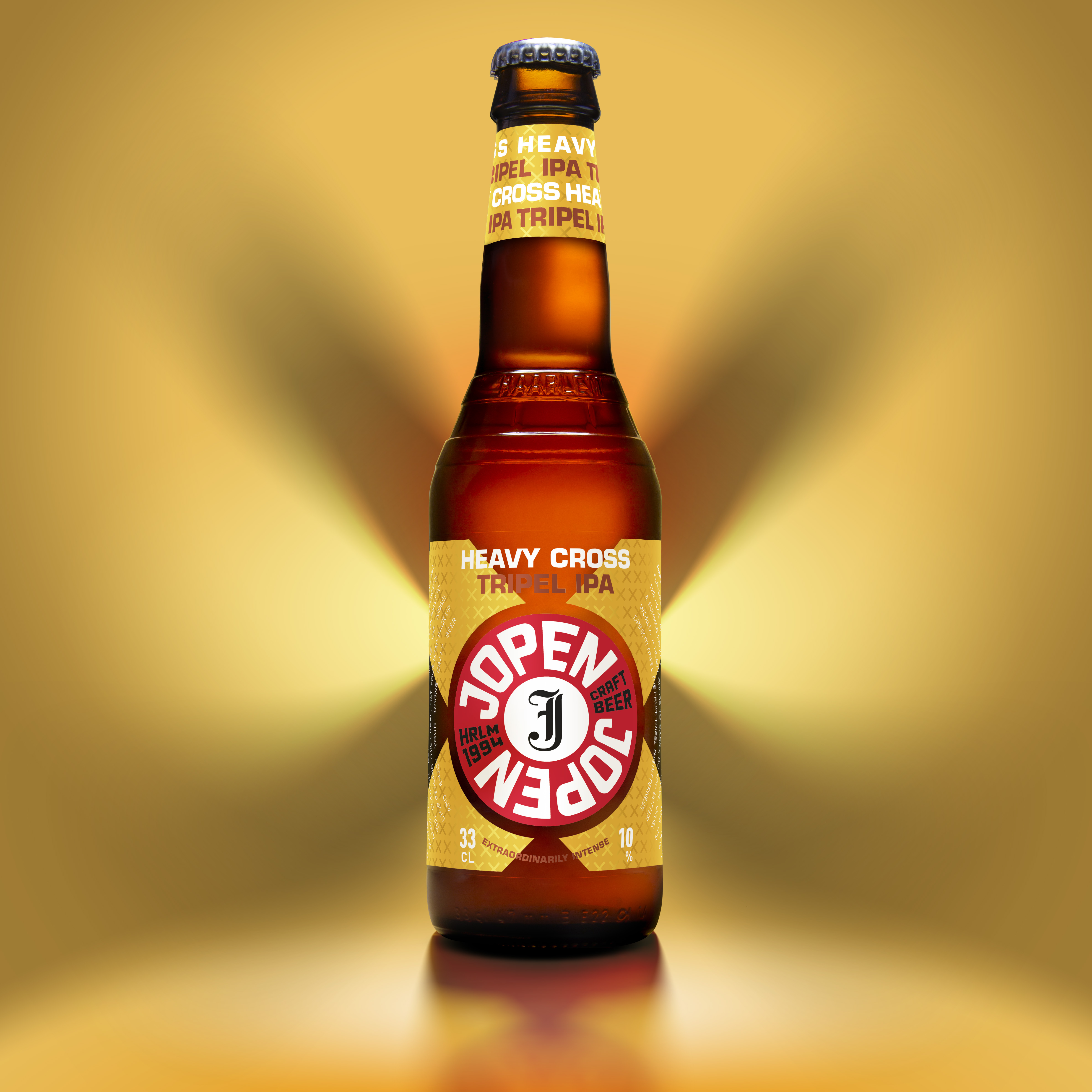
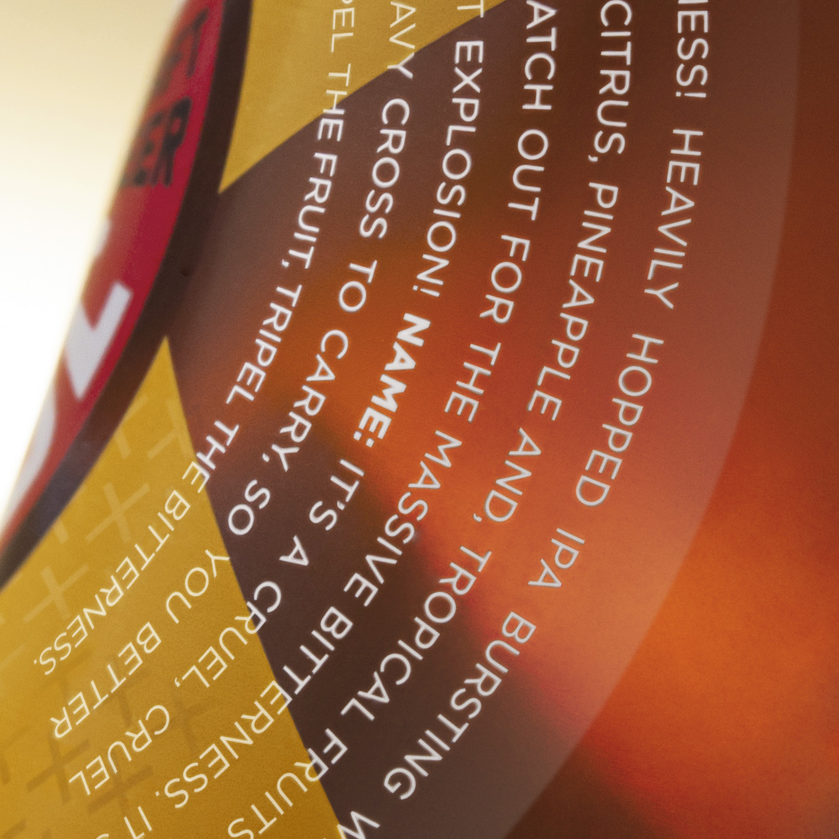
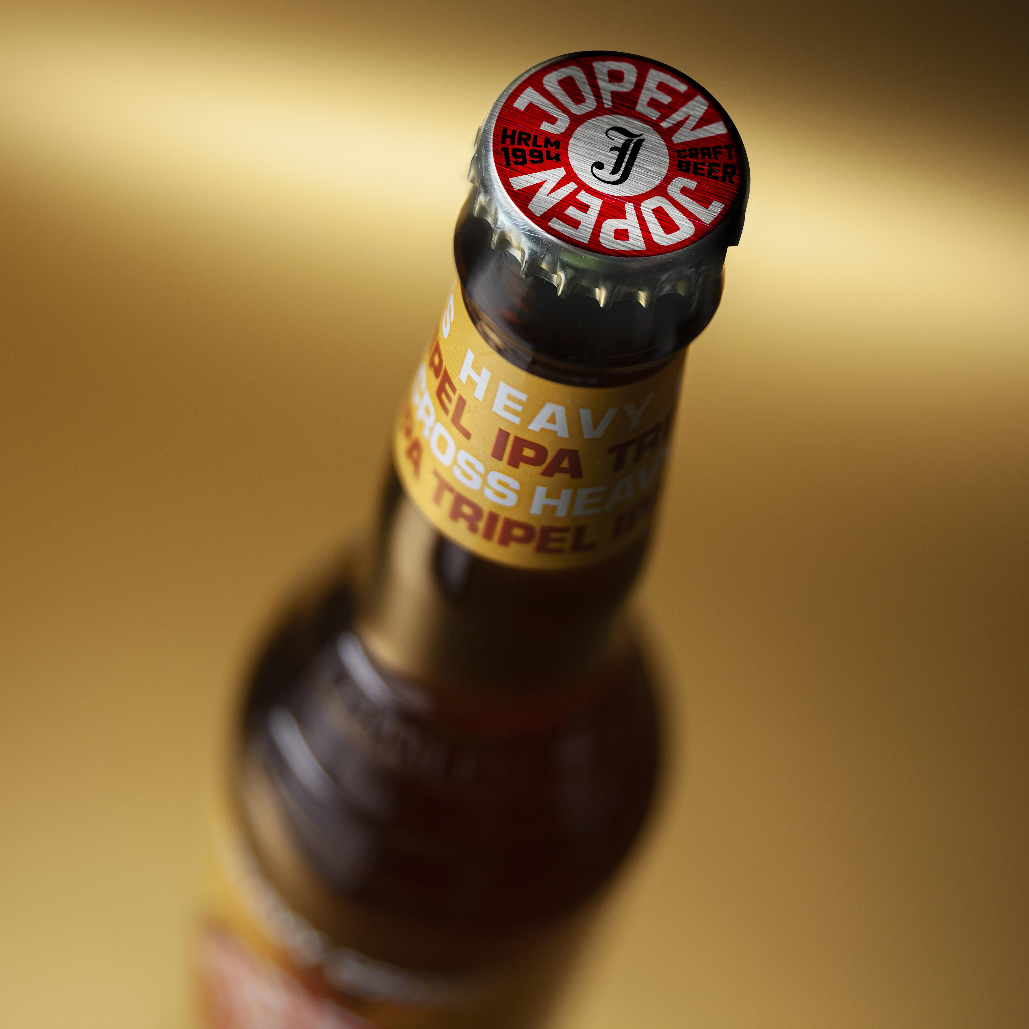
For this special beer we created a new look, which completely fits the core range design (we created earlier this year) but has its own identity. Playing with the name we created the design as a graphical backup for the product name, helping people remember the beers name and make repurchase easier.
A contemporary logo was developed that stands for Jopen’s mission and ambitions. The logo supports the leading and innovative role of Jopen within the craft beer landscape. It connects with a wider audience of (beer) drinkers, while naturally retaining the current, loyal Jopen beer lover.
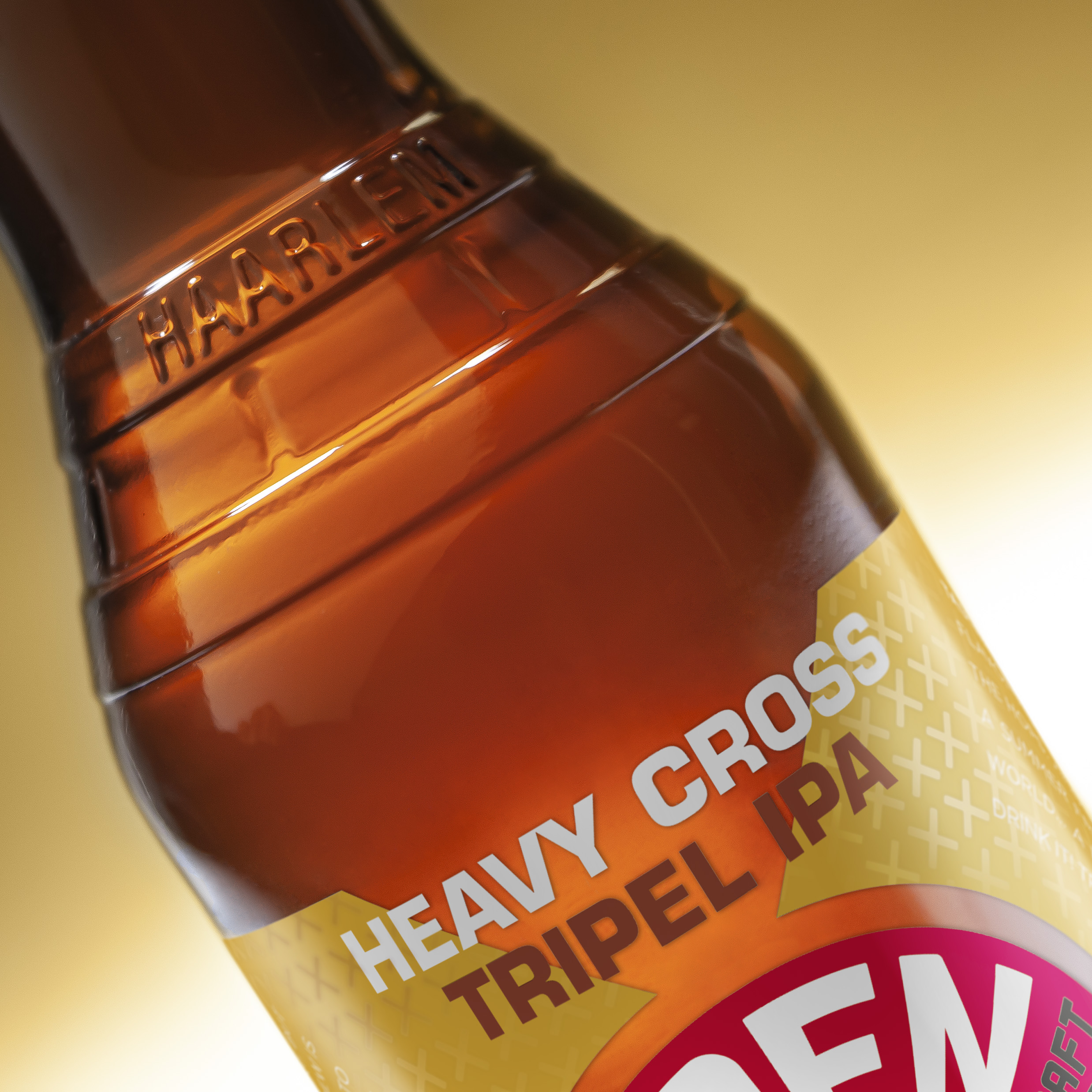
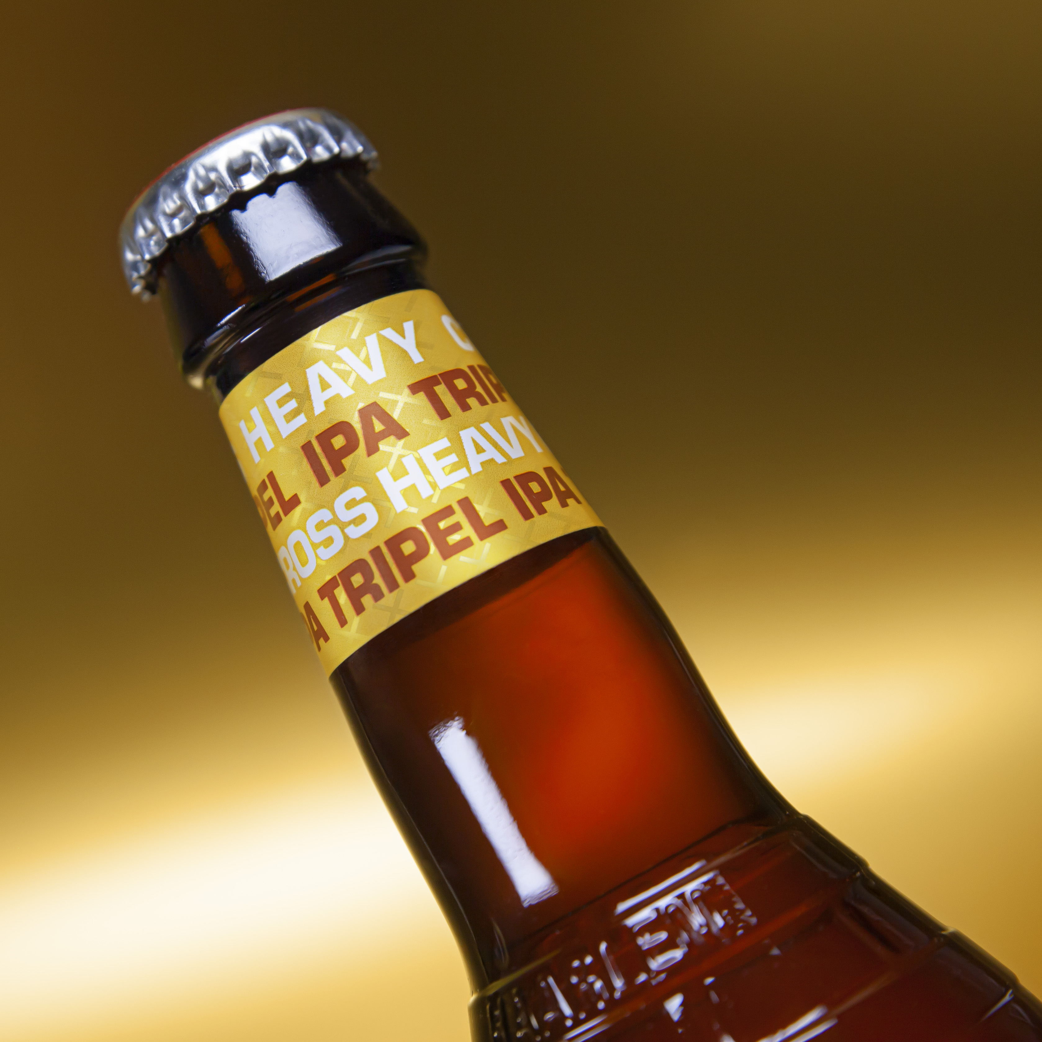
That is why we kept the logo in the same position and also keeping the surrounding circle in place, which gives the consumer more information about eh brand and the beer. The circle now is designed like a cross, underlining the products name Heavy Cross. As a quality item there is a pattern of crosses in high gloss covering the entire label. Very clean & “simple” it stands out of the crowd.
CREDIT
- Agency/Creative: Van Heertum Design VHD
- Article Title: Van Heertum Design VHD Creates Jopen Heavy Cross Craft Beer
- Organisation/Entity: Agency, Published Commercial Design
- Project Type: Packaging
- Agency/Creative Country: Netherlands
- Market Region: Multiple Regions
- Project Deliverables: Brand Architecture, Brand Creation, Brand Strategy, Graphic Design, Packaging Design, Product Architecture, Retail Brand Design
- Format: Bottle
- Substrate: Glass Bottle


