


Design Case BUS whisky – “the world’s most sustainable whisky”
We are proud to present our design for BUS Whisky, a brand that is all about sustainability from beginning to end. So, you can imagine this was a big influence on our design and material choices. How to get a perfect balance for this sustainable product and a luxurious design in this high-end segment.
In 2019, BUS Whisky proudly entered the Dutch whisky scene as a fresh and bold brand. In just three years, they grew from a modest Brabant start-up to the second largest whisky producer in the Netherlands, and they earned their place as one of the world’s most sustainable distilleries. Next to many sustainability awards, Bus Whisky is a Certified B Corporation.
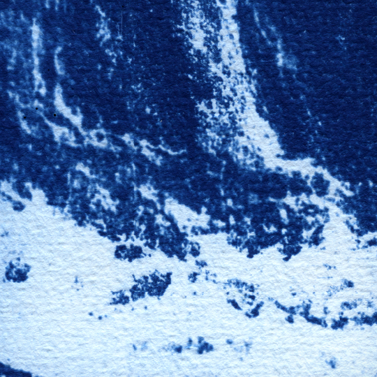
“BUS Whisky” is named after the distillery’s water source. For thousands of years, the “Peelrandbreuk” has formed a natural water source in eastern Brabant. In the hamlet of Bus in Nistelrode, the whisky distillery’s water source is located on the farm where the malting barley for BUS Whisky is also grown. Artist Sanne van den Elzen, made a cyan print of the layers of the water source (visual 2, which became the main inspiration for some of our design choices and the artwork is used on the back label.
– The main challenge was how we could keep the artwork as a hero in the design and in the back of our minds we even wanted to do more… how could we connect the artwork of the water source to the whisky in the bottle… how could we bring it to life?
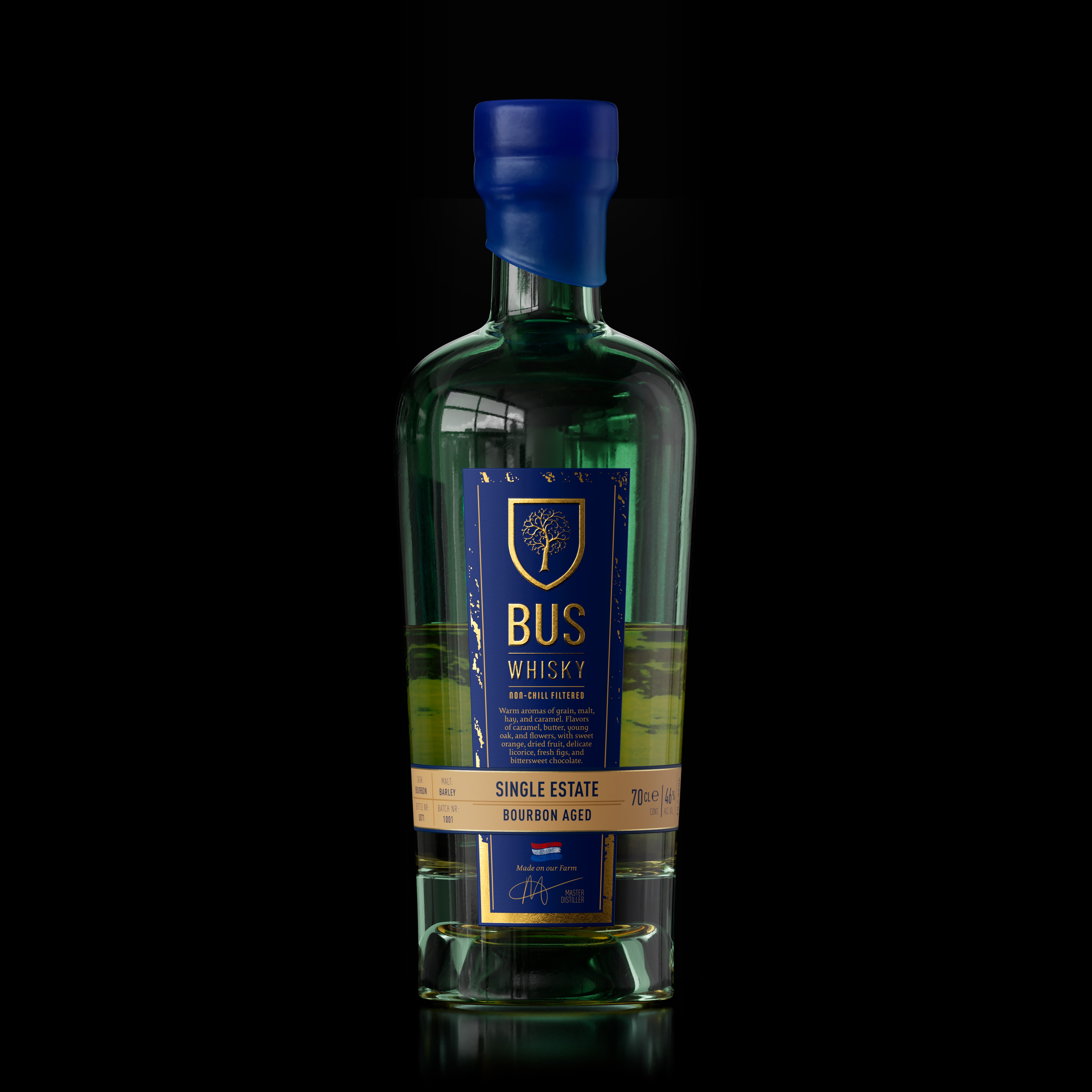
– We came up with the idea to use the natural magnifying effect, a liquid has in a bottle on any artwork that is used on the inside of the back label. We went for the minimal surface to keep the back label size in line with the front label size. A back label that would almost disappear behind the front label, in a front view, and only will expose the used artwork when it comes into contact with the whisky inside the bottle (than it will magnify the artwork across the entire front view). Really representing the connection between the spring water and the whisky.
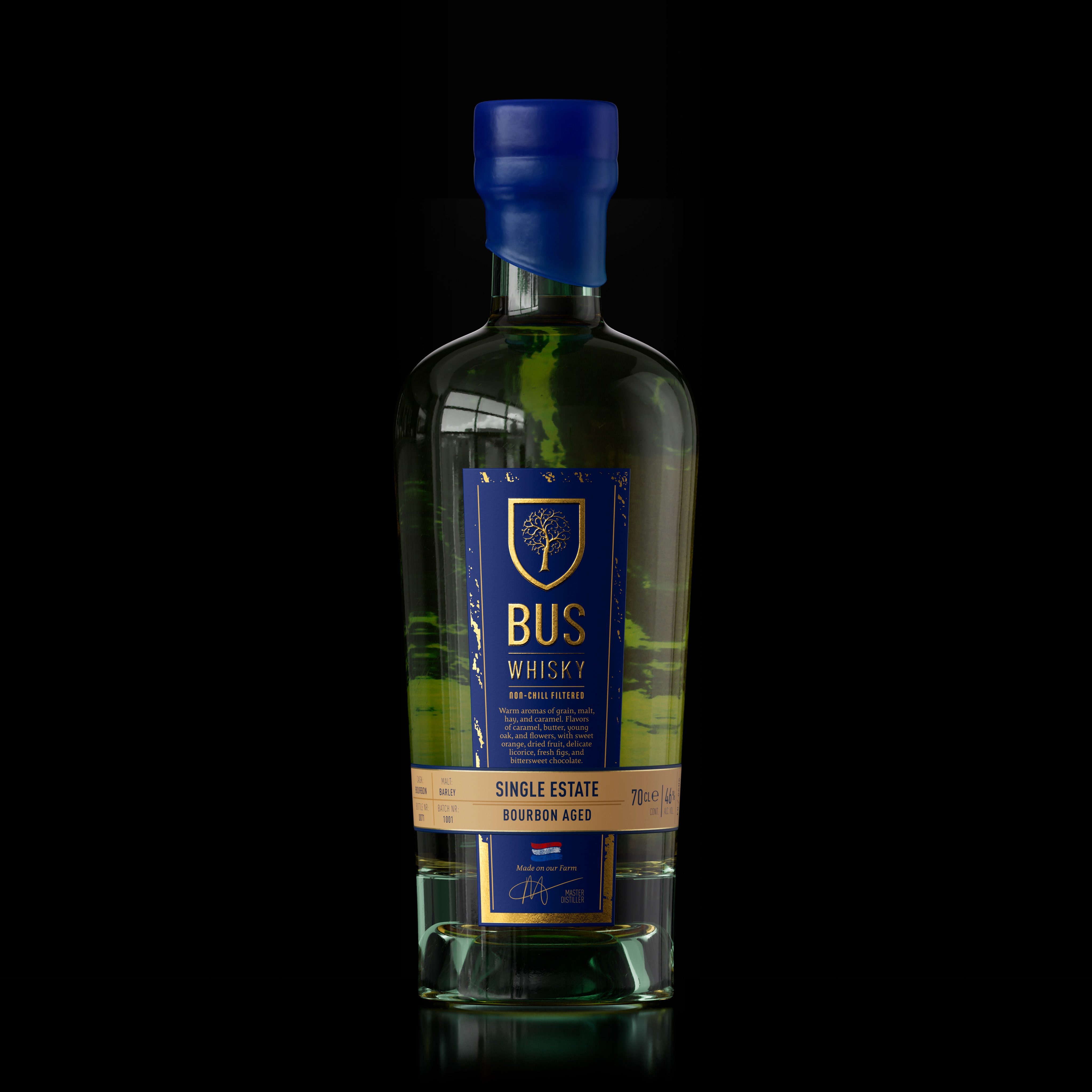
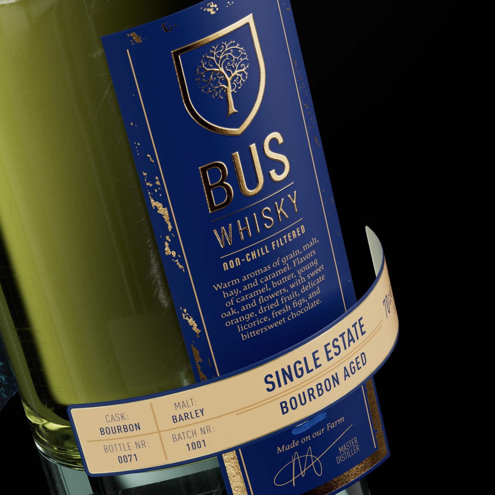
The front label was kept elegant and following the contour of the bottle. Across the main front label we used a small 2nd vertical label design, that would be put on the bottle by hand, to represent the craftmanship that went into the making of this whisky.
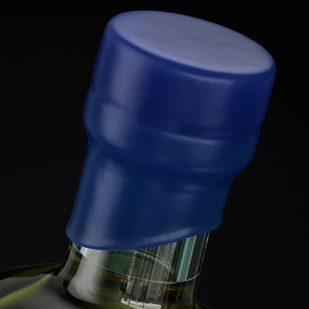
For the main color we chose a dark quality blue, fitting the artwork. Even the bottle color (made from wild recycled glass) suits the blue tones. It displays luxury in combination with gold and gold foil, with is used on the front label. On the sides you will find some parts of the artwork in gold foil as well. Connecting the front with the inside of the backlabel.
All worked out perfectly, making the design unique and telling the distillery’s story. To top it of, it was even decided to use the distillery’s bees (the distillery’s beehive) to close the bottle… not literally but using the biological bee wax as a seal.
CREDIT
- Agency/Creative: Van Heertum Design VHD
- Article Title: Van Heertum Design VHD Creates a Liquid Lens Identity for BUS Whisky’s Sustainable Narrative
- Organisation/Entity: Agency
- Project Type: Packaging
- Project Status: Published
- Agency/Creative Country: Netherlands
- Agency/Creative City: Tilburg
- Market Region: Europe, Global
- Project Deliverables: 3D Design, Design, Label Design, Packaging Design, Visual Effects
- Format: Bottle
- Industry: Food/Beverage
- Keywords: Whisky, sustainability, label design, bottle design, spirit design, luxury design
-
Credits:
Van Heertum Design VHD: Rob van Heertum


