


Van Heertum Design VHD – Bols Liqueur USA Packaging
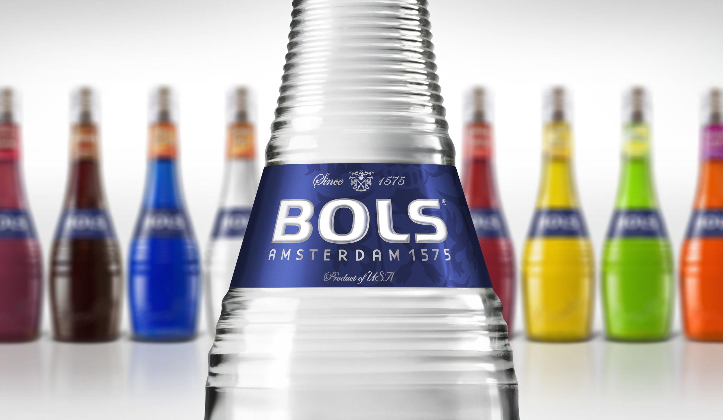
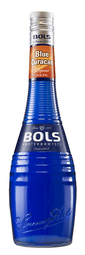
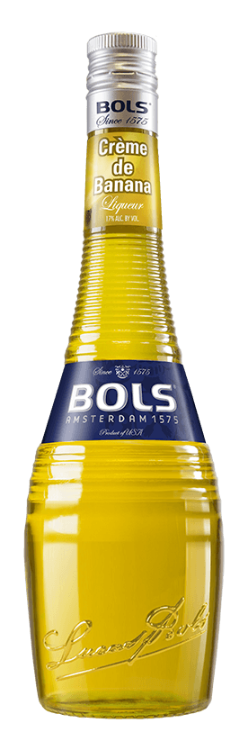
“Especially for the US market Van Heertum Design VHD revamped the entire iconic Bols liqueur range.
With this packaging upgrade Bols further premiumizes the brands image and celebrates their deep brand heritage, dating back to 1575.
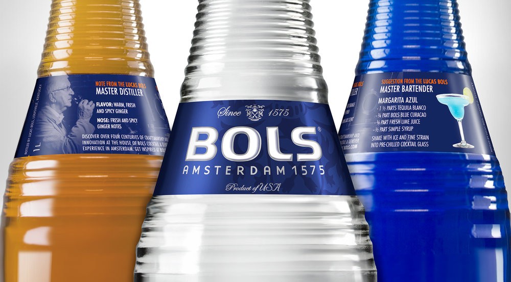
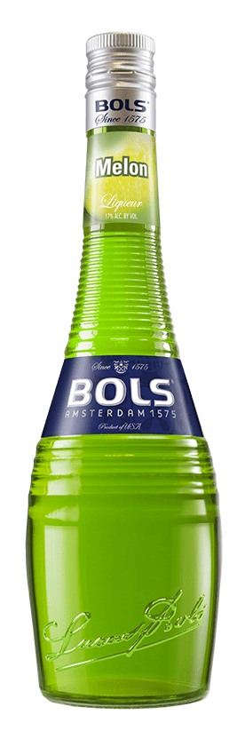
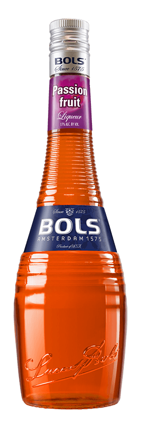
The bottle has a more premium closure, featuring traditional Amsterdam typography, enhancing their established date.
The government warning and UPC are now strategically located on the back of the neck label.
The iconic logo is crowned by the brand birth place ‘Amsterdam’, as well as the established date ‘since 1575’ and the Bols family crest.
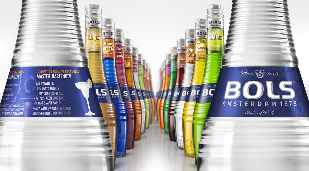
For the labels an improved metalized paper quality has been introduced, making the liqueur key ingredient more prominent and legible, also because of the use of UV reactive ink, helping bartenders to identify flavours behind the bar.
On the back we created more room to communicate with the bartenders and there is a liqueur description and cocktail guidance;
– Personal liqueur tasting notes from the Master distiller, to educate bartenders about the liqueurs profile.
– Featuring individual signature cocktail suggestion curated by the Bols master bartender.
– Visual showcasing the master distiller, the Lucas Bols distillery and the key signature cocktail.”
CREDIT
- Agency/Creative: Van Heertum Design VHD
- Article Title: Packaging Premiumisation – How to Revamp an Iconic Liqueur Range
- Project Type: Packaging
- Format: Bottle
- Substrate: Glass


