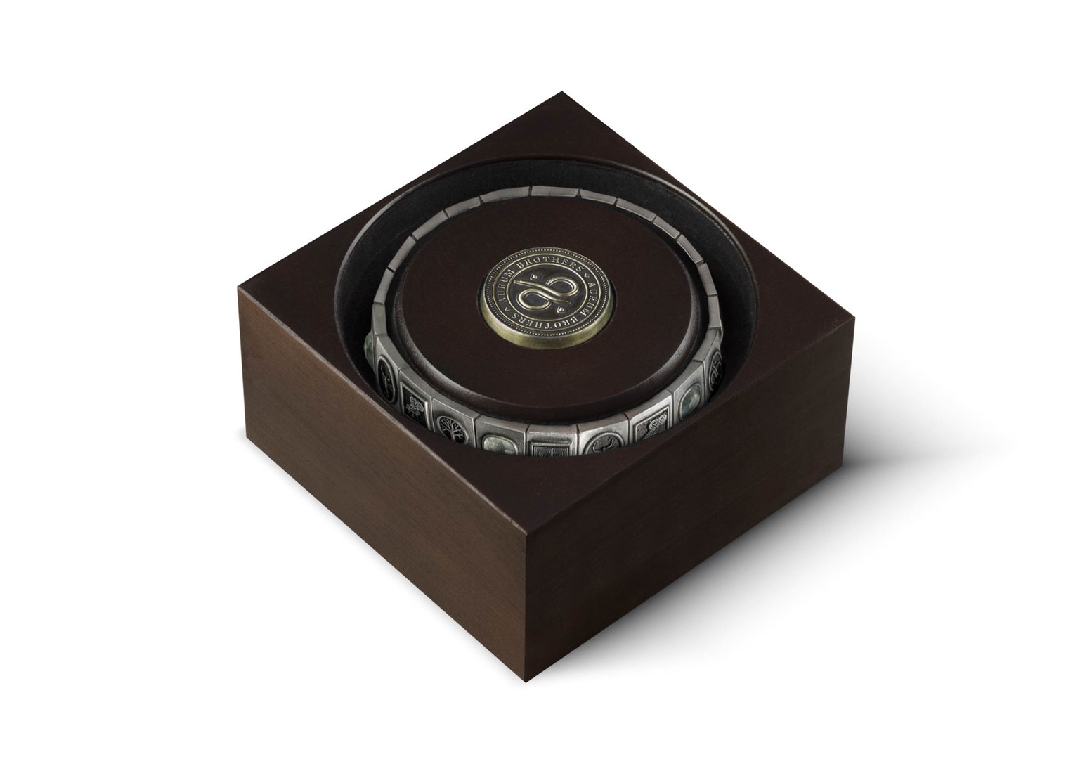
Aurum Brothers’ passion is providing men with custom luxury wrist-wear that is the perfect combination of style and comfort. They are on a mission to revive ancient crafting techniques, materials and stories the stones used to carry within them. So storytelling is one of the key missions at Aurum Brothers that we needed to translate into the packaging design.
For their new and most luxurious collection, named Varnos, we also needed to create added value with the pack design. Since the bracelets are expensive (around 2.500,- EUR a piece) the packaging also should give you the feeling that you are getting something special and opening the pack should be an experience.
Idea
At Aurum Brothers they use special gemstones in their products and every kind of gemstone has a different story. In ancient times, warriors used these gemstones and they believed it gave them special abilities, like strength and courage for example. Every kind of gemstone comes from a different part of the world, symbolizes a specific ability and suits a certain warrior.
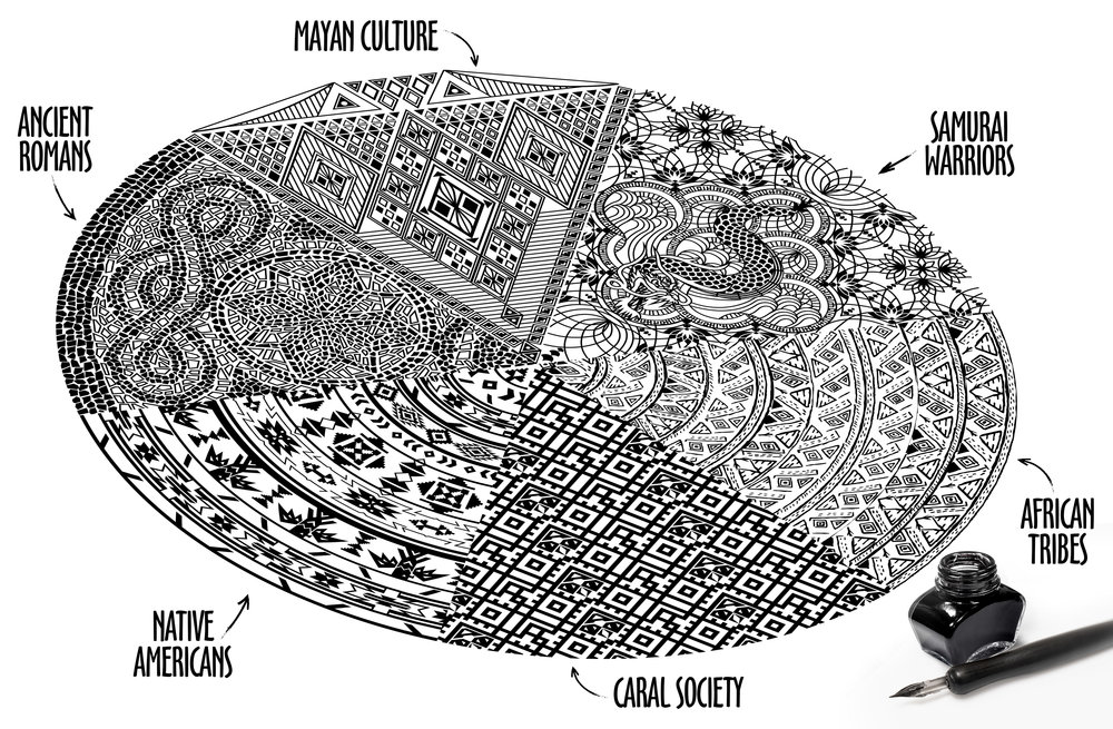
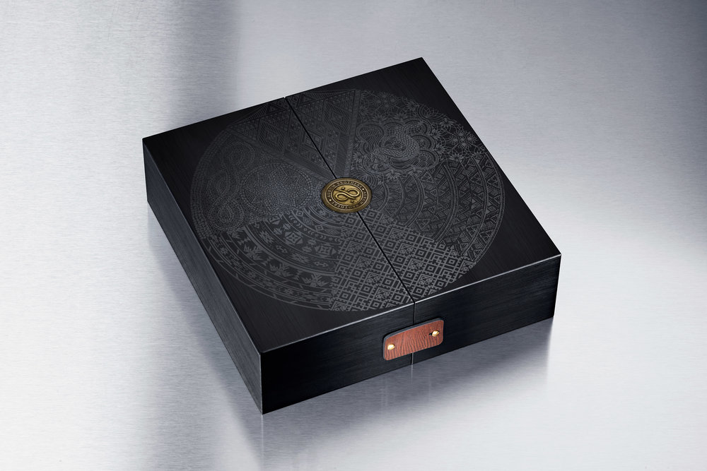
To symbolize this story we created the graphical “World of Aurum Brothers”. This consists out of 6 different types of illustrations (which we hand made). From these 6 different cultural and historically based illustrations we created 1 circle (world), shaped like a gemstone (with 6 cut surfaces). The main concept idea for the packaging was that this illustration should be the base on the packaging, and that by opening the packaging, you would open up the illustration (in other words, open up the “World of Aurum Brothers” and enter…).
The 6 different illustrations are based on the stones (and ancient warriors) that are mostly used in the bracelets of Aurum Brothers:
Hematite – Native American
Hematite – Romans
Obsidian – Mayans
Tiger Eye – African Tribes
Sodalite – Caral Society (Peru)
Obsidian – Japanese Samurai
With this main concept strategy fixed, we went on to the packaging construction and material. Most of the packaging is made of solid wood (giving it a really heavy feel, creating value) and for the finishing touch some items of leather and metal.
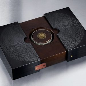
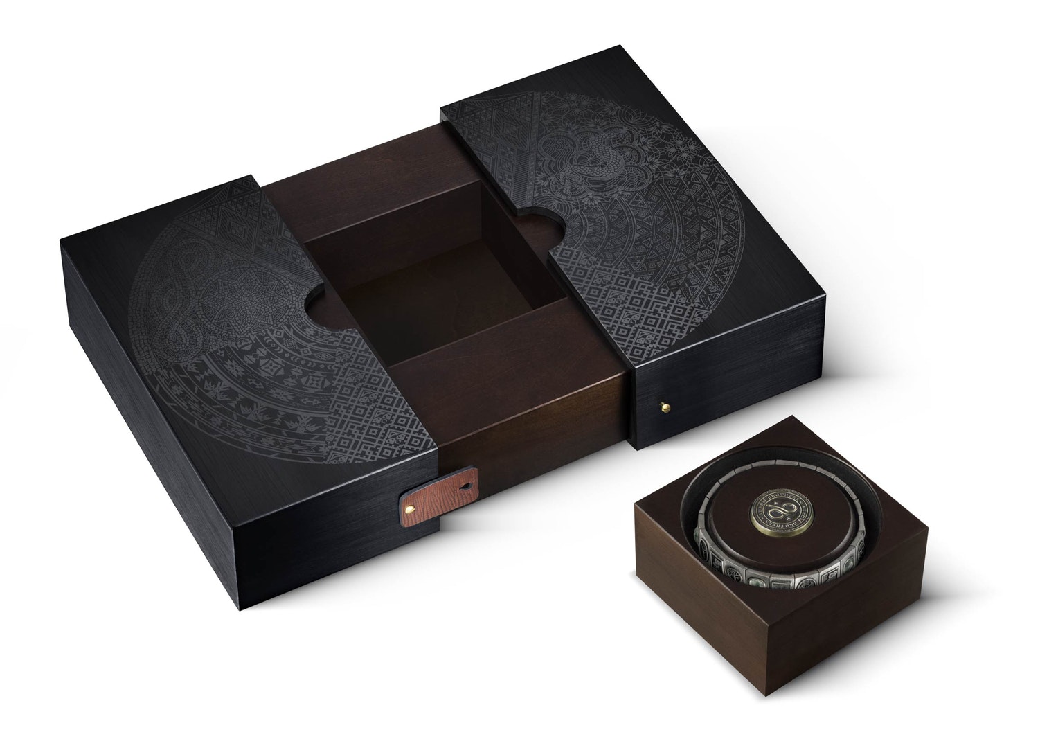
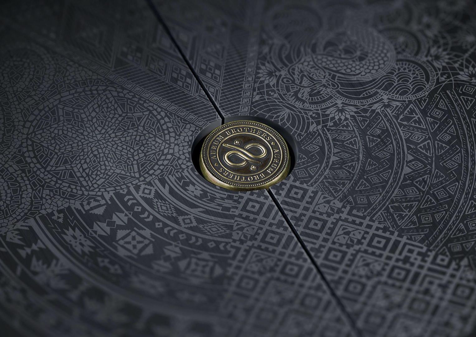
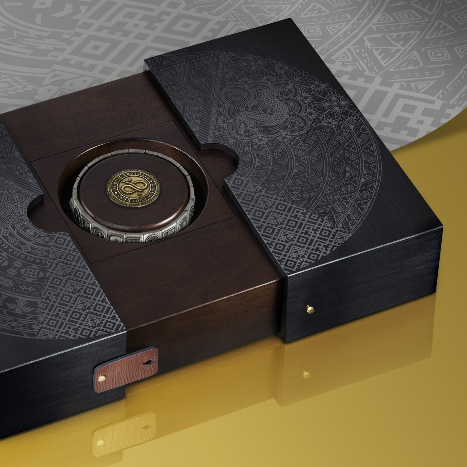
We developed a sliding packaging construction. When closed you see the beautiful illustration on top of the pack, with in the centre of it all the Aurum Brothers logo as a luxurious golden/metal coin (aurum brothers means “gold” brothers). You open the pack by opening the two leather locks on each side. Than you can slide open the outer shell, on which the illustration is printed. So opening the pack literally divides the illustration, taking you into the “world” of Aurum Brothers, with the luxurious bracelet presented as a centrepiece when opened.
When the packaging is opened you can take out the centre part (block), in which the bracelet is presented. This part can be placed on your nightstand for example, when going to bed and if you do not want to damage your bracelet.
CREDIT
- Agency/Creative: Van Heertum Design VHD
- Article Title: Van Heertum Design VHD – Aurum Borthers Jewellery Packaging
- Organisation/Entity: Packaging Design Creation
- Project Type: Packaging
- Project Status: Published
- Format: Box, Case, Sleeve
- Substrate: Metal, Wood
- Keywords: WBDS Agency Design Awards 2020/21


