


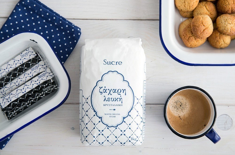

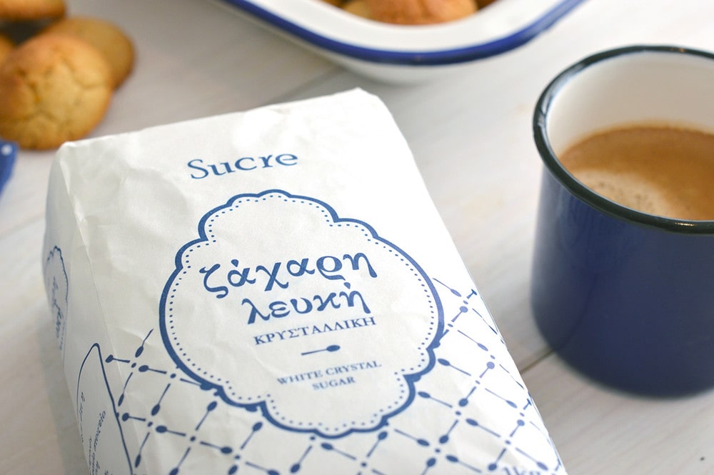
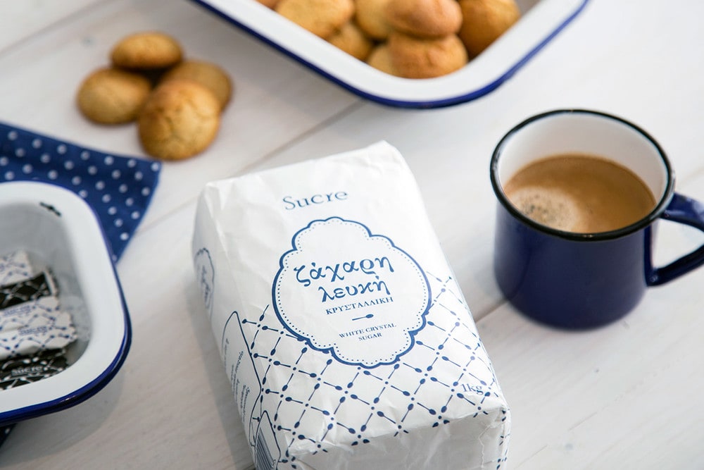
“The need for the design of this packaging resulted from the customer’s own passion. He trades an excellent product for which he wanted to make a step further by putting his own mark on it. The keywords were quality, tradition and Greek origin. A limitation … 1 color, and it had to be blue.
The whole design and the tools used (fonts, frames, etc.) were in line with the keywords. A pattern of spoons was created to accompany the packaging design. The research has shown that the spoon is an object, directly connected to the consumers’ mind with the use of sugar at different times of the day (from coffee to baking).
The same pattern was used for the sugar sticks.”
CREDIT
- Agency/Creative: Vagia Dagga
- Article Title: Vagia Dagga – Sugar packaging by Sucre ltd
- Project Type: Packaging
FEEDBACK
Relevance: Solution/idea in relation to brand, product or service
Implementation: Attention, detailing and finishing of final solution
Presentation: Text, visualisation and quality of the presentation


