This is rebranding project of USPS (United States Postal Service). USPS is an independent agency of the U.S. federal government responsible for providing postal service. The new USPS identity system was inspired by the core keywords: fast, connect, deliver, contain, systematic, and safety.
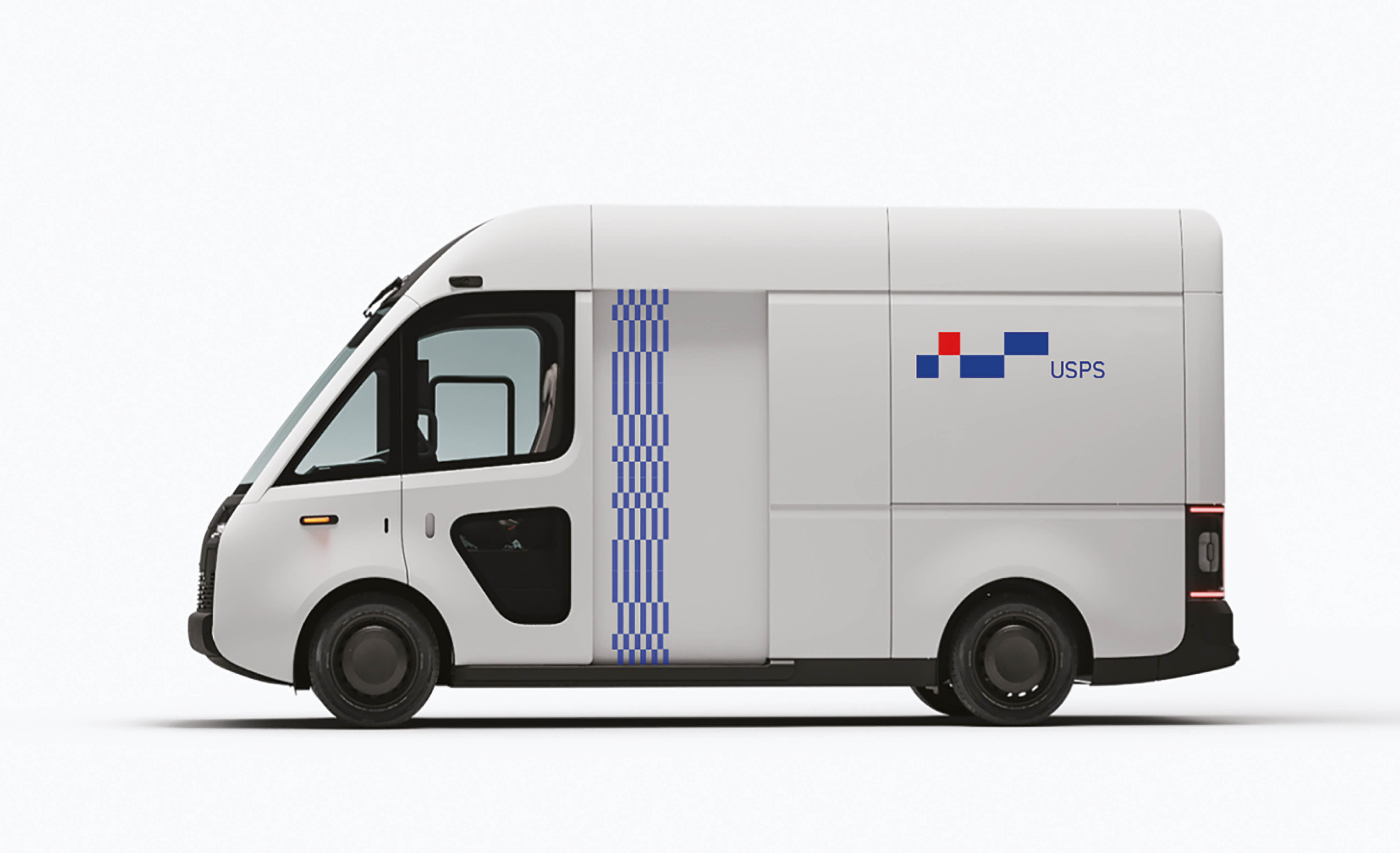
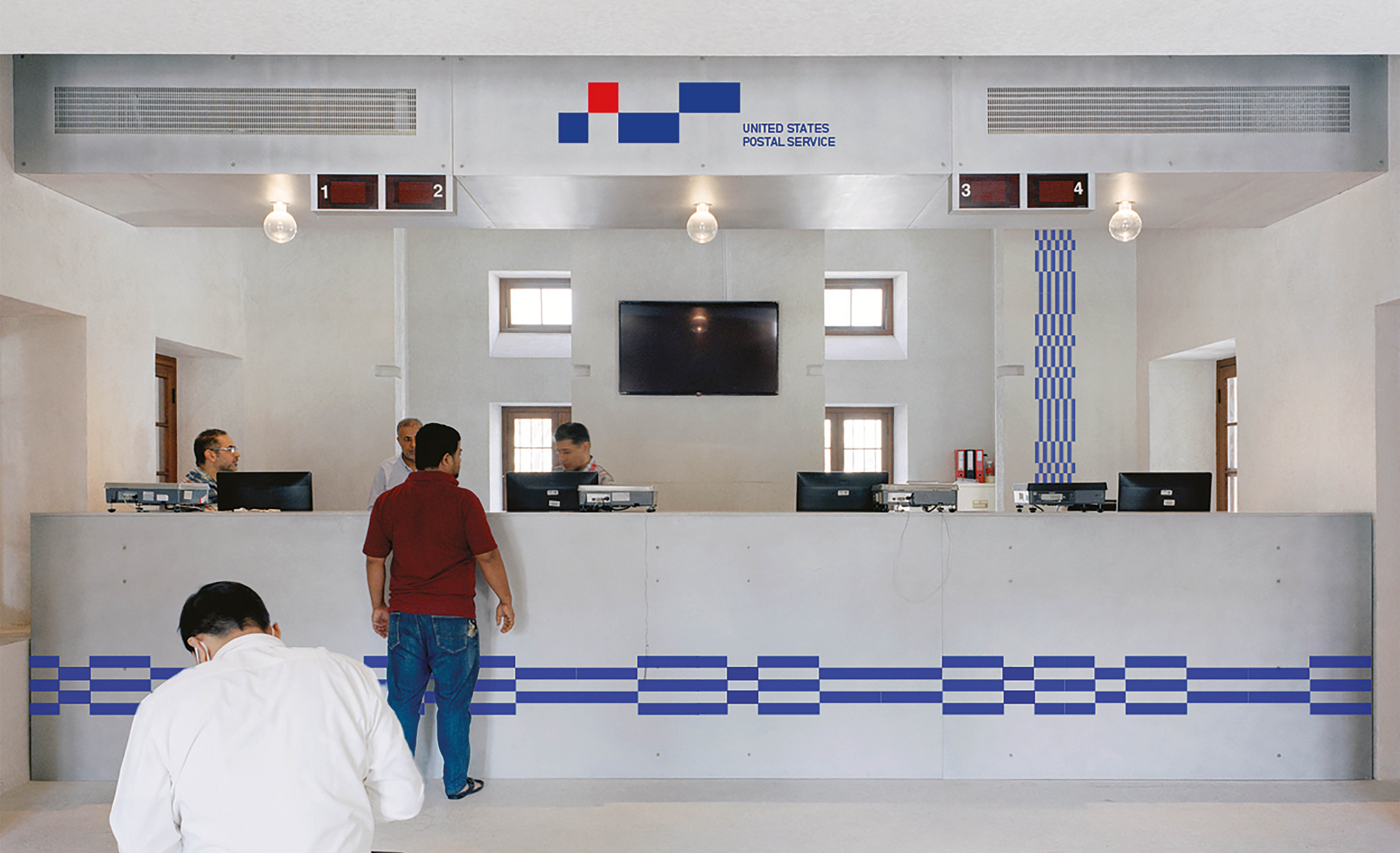
At the core of this project, the new logo, was redesigned to represent it at once based on the keyword journey, speed, packages, and system obtained by analyzing U.S. post office services. I aimed to represent the United States by incorporating the colors red and blue directly into the color palette. Starting with the basic shape of the square, it was made by connecting one in the same size and connecting two double-sized squares in a row. It tried to express speed by connecting two squares of different sizes, and the square was able to express a box-shaped package, and by connecting them, it was possible to express not only the system but also the journey of delivery.
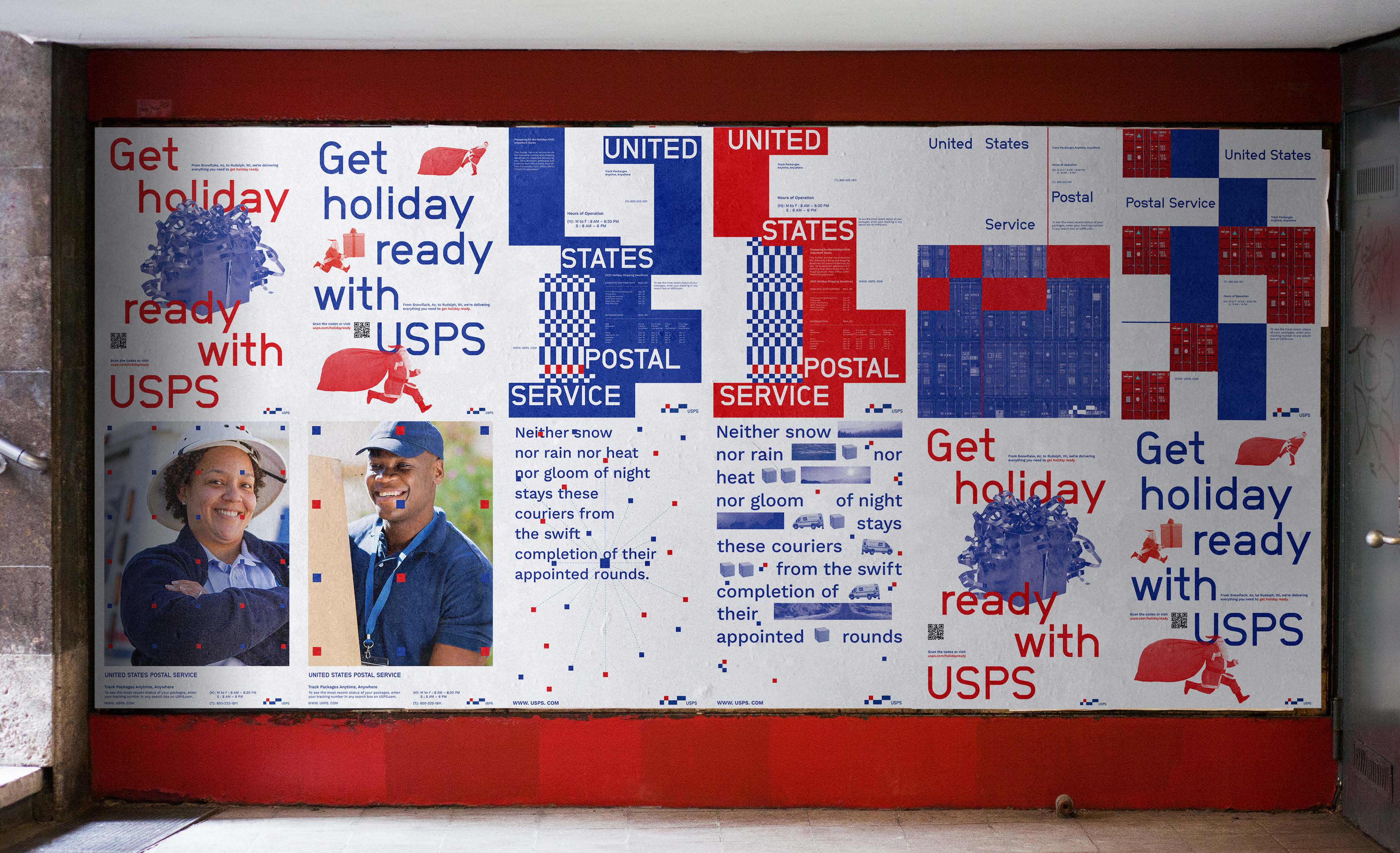
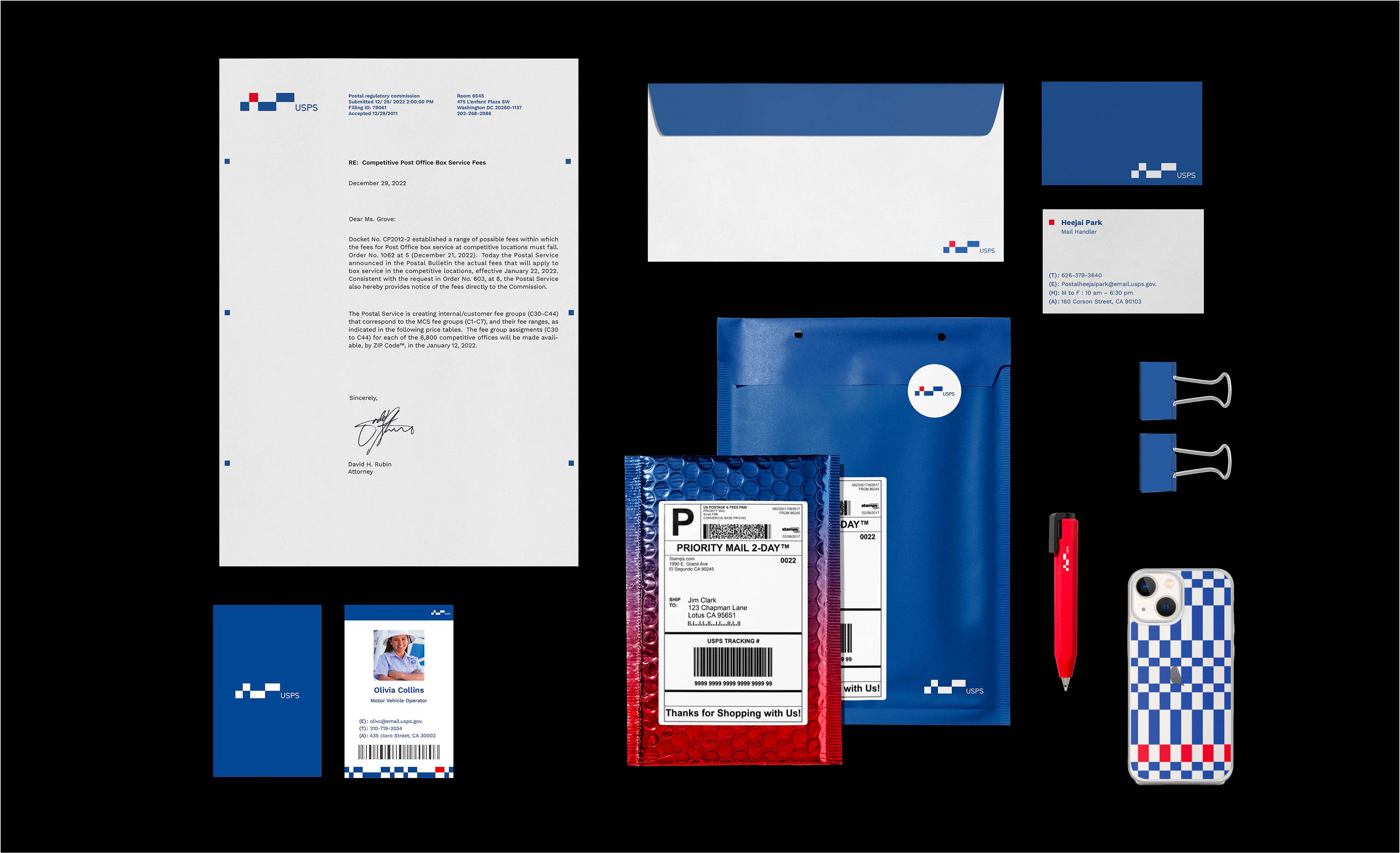
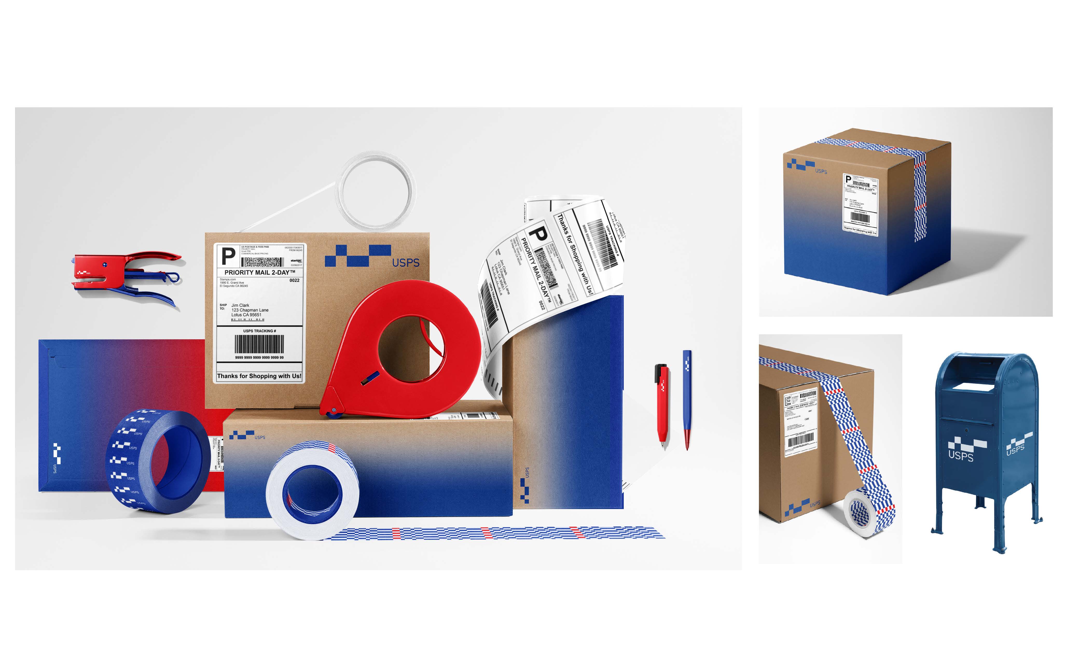
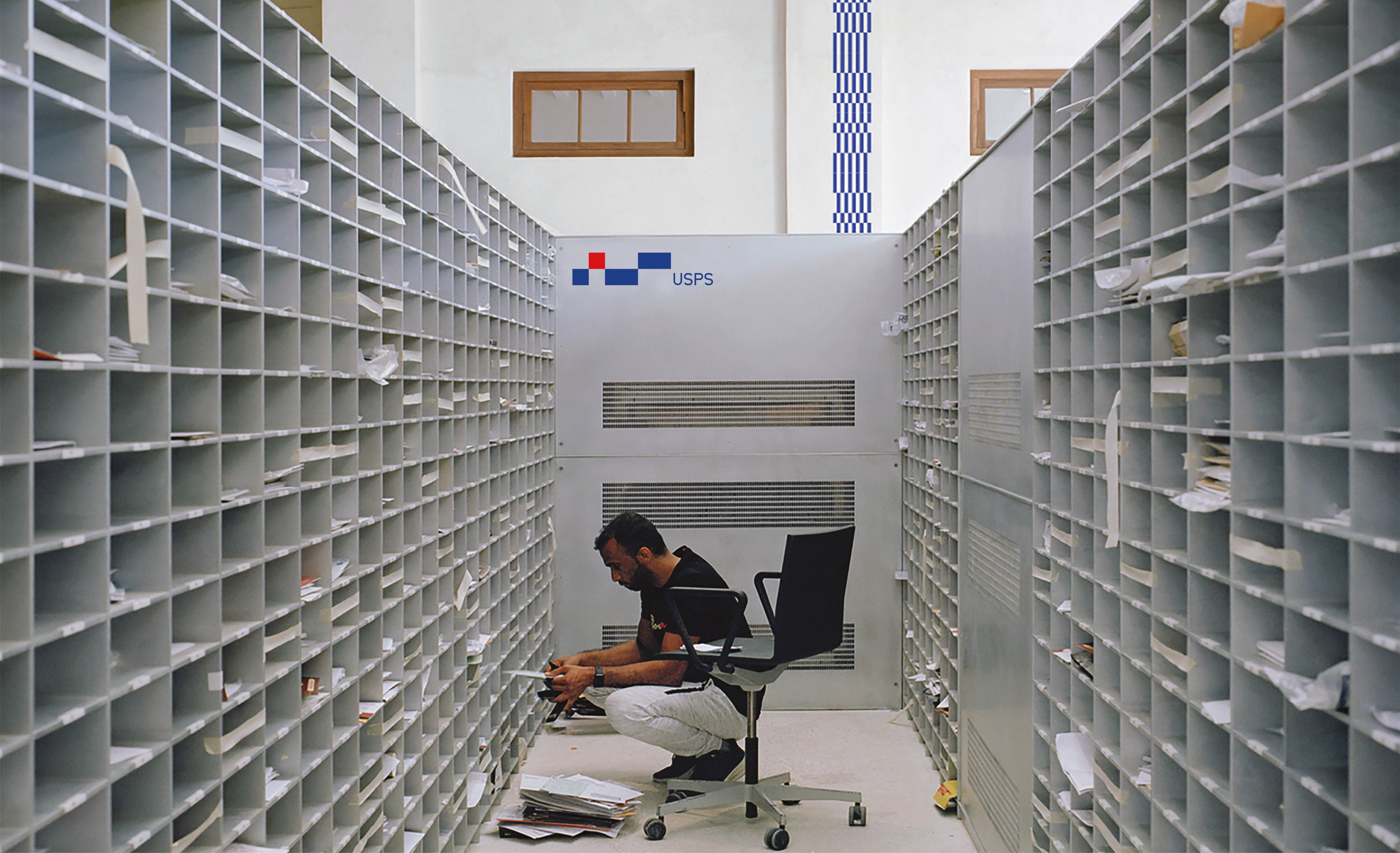
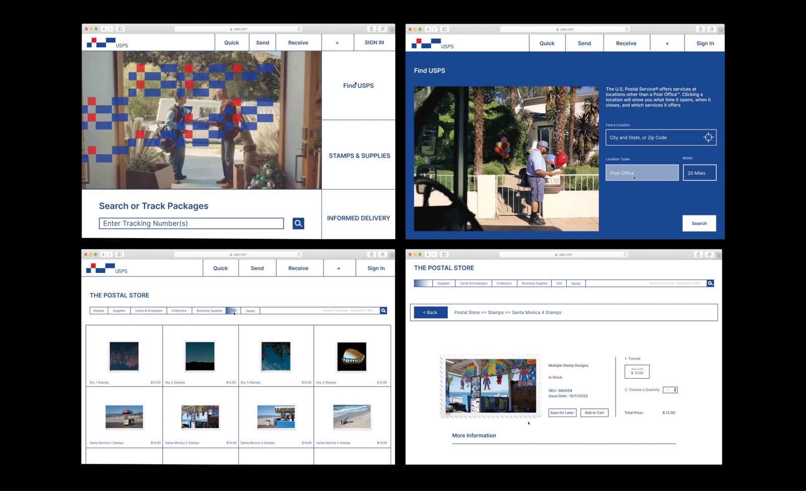
Based on this logo, I created a pattern that was applied across various applications, stationery, and environmental contexts. The square element in the logo became the central visual point to provide consistency in the brand system, serving as a primary element. Additionally, blue gradients were used as another visual layer, applied to boxes and the website for added visual appeal.
The goal of this project is to create a postal service brand with an adaptable system. This system is designed to seamlessly integrate across a diverse range of brand applicationsThis includes not only the logo, but also extends to web design, stationery, logo motion animation, guidelines book and even environmental contexts. This adaptability ensures that the USPS brand remains consistently impactful and resonant across a wide array of platforms and touchpoints, reinforcing its enduring commitment to excellence in postal services.




CREDIT
- Agency/Creative: Heejai Park
- Article Title: USPS Student Rebranding Concept
- Organisation/Entity: Student
- Project Type: Identity
- Project Status: Non Published
- Agency/Creative Country: United States
- Agency/Creative City: Pasadena
- Market Region: Global
- Project Deliverables: Brand Identity
- Industry: Public Utility
- Keywords: WBDS Student Design Awards 2023/24
-
Credits:
Educational Institution: ArtCenter College of Design - Graphic Design
Educator's Name: Simon Johnston


