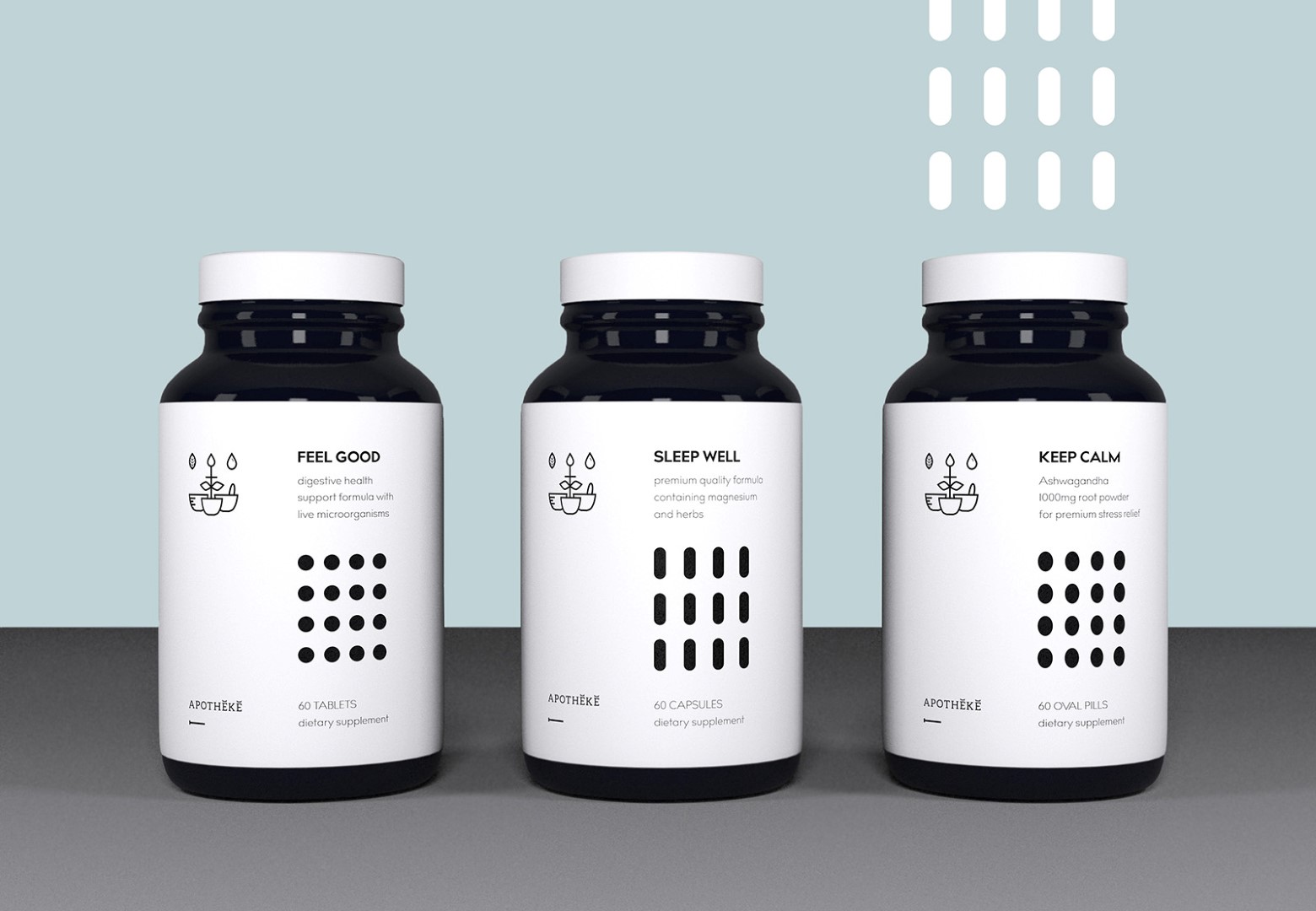
” Apotheke comes from Latin apotheca (“storehouse”),from Ancient Greek ἀποθήκη (apotheke, “storehouse”).
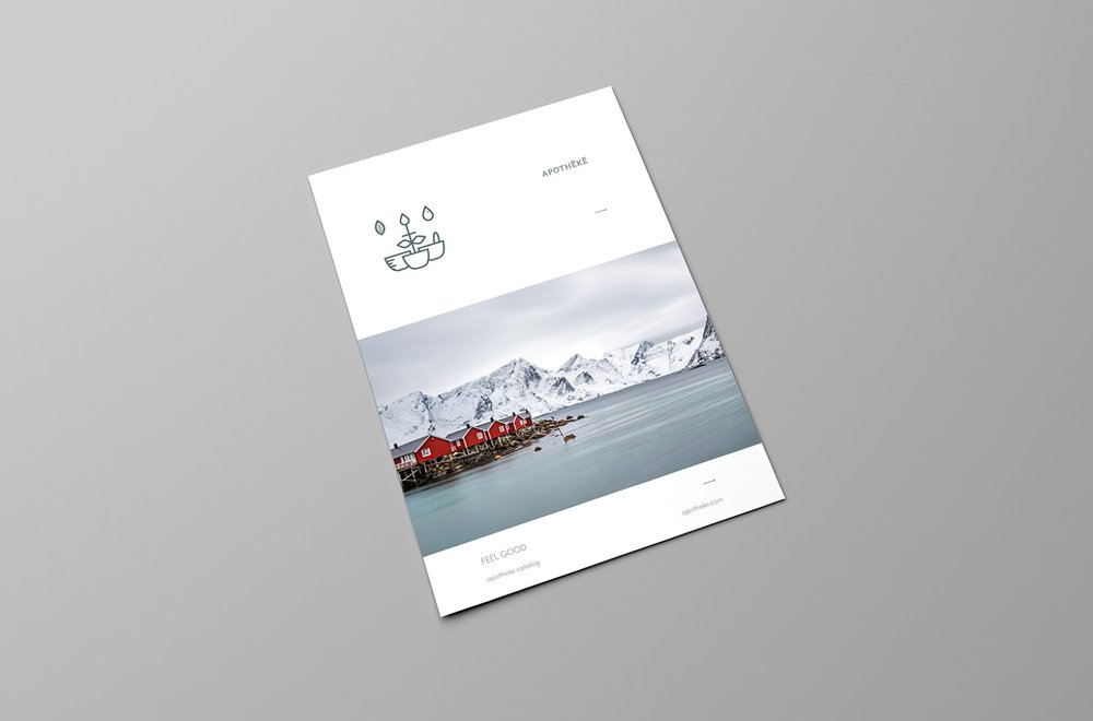
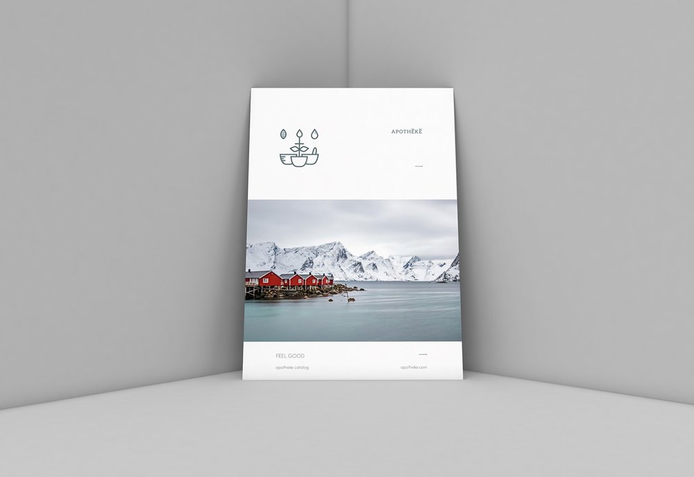
I wanted to create a contemporary look with a bit of nostalgia.
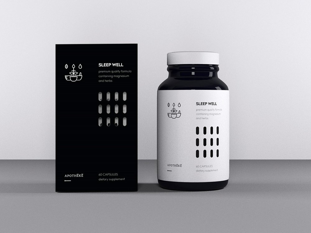
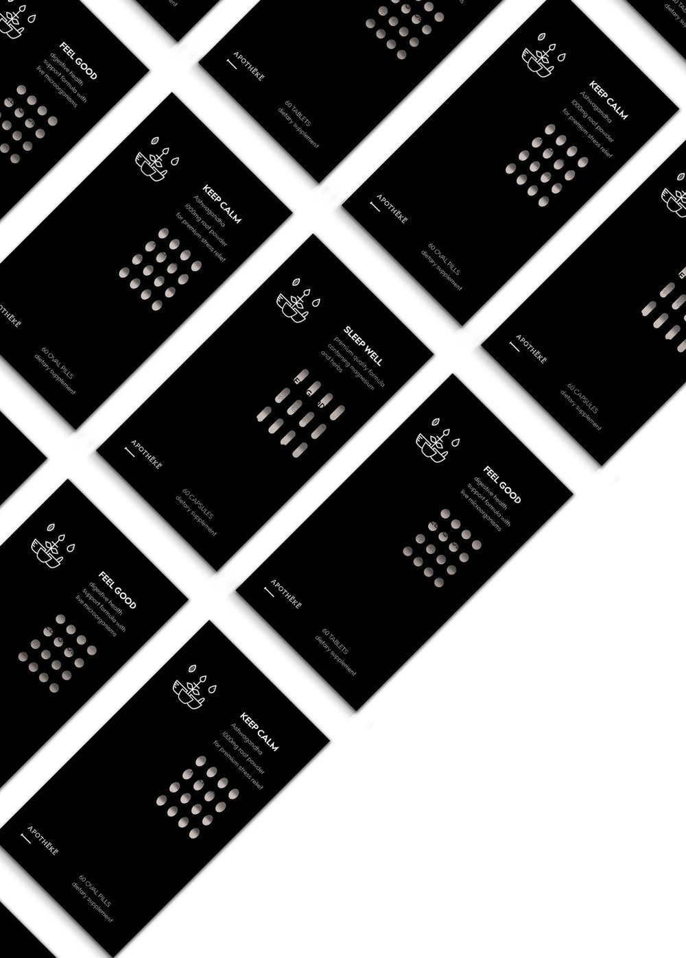
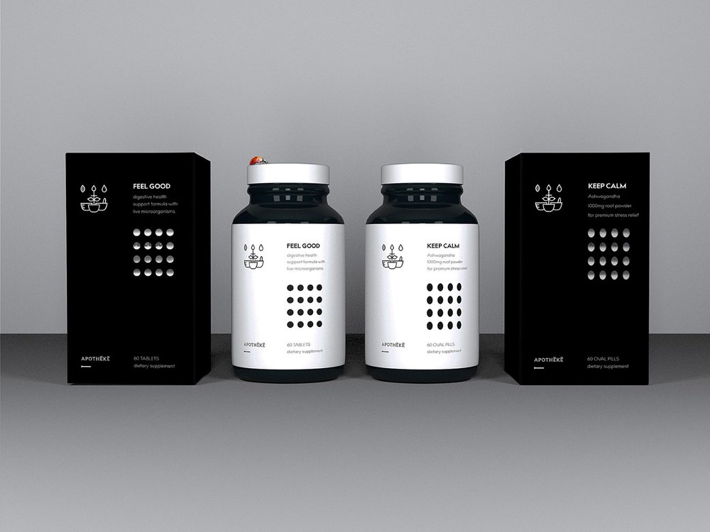
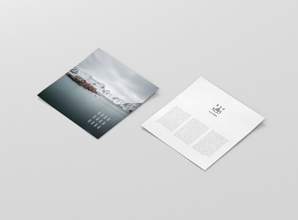
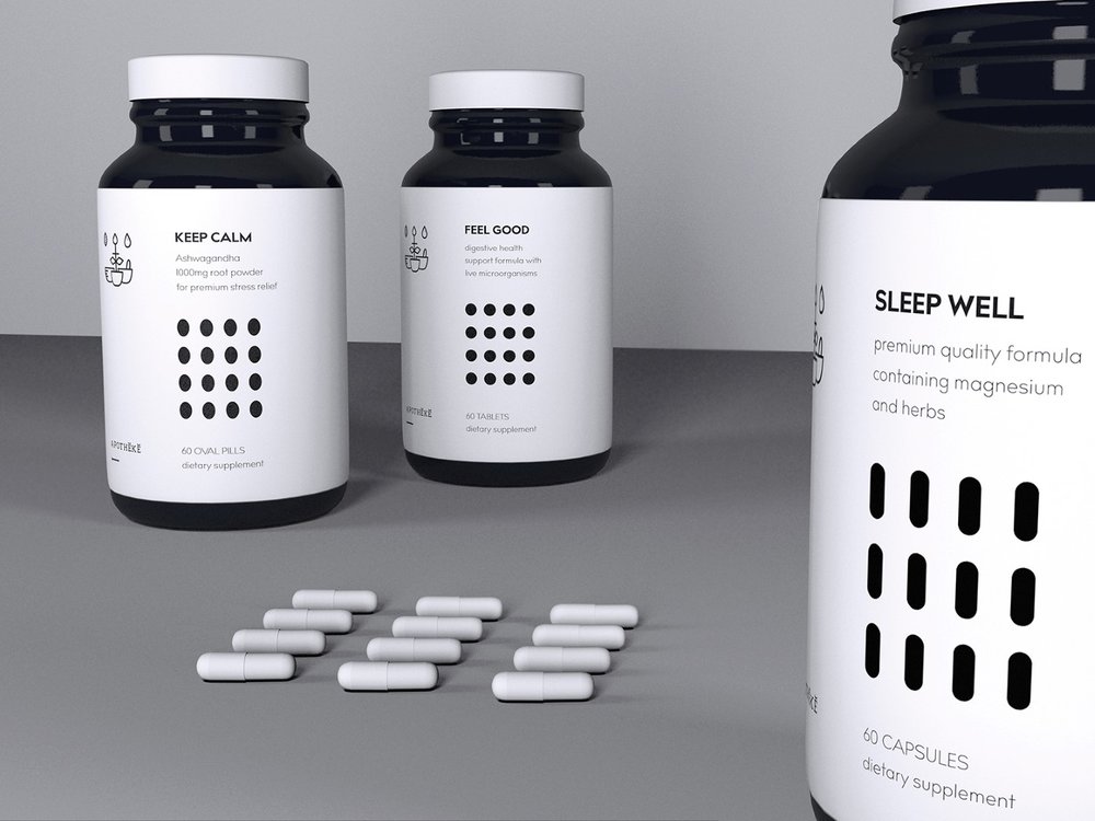
The design strongly bases on the composition. Each label has black elements shaped after pills, tablets and capsules. These elements are used for cut-through parts on matching boxes.”

CREDIT
- Agency/Creative: Urszula Krasny
- Article Title: Urszula Krasny – Apotheke (Concept)
- Project Type: Packaging
- Format: Box, Sleeve
- Substrate: Pulp Paper
FEEDBACK
Relevance: Solution/idea in relation to brand, product or service
Implementation: Attention, detailing and finishing of final solution
Presentation: Text, visualisation and quality of the presentation


