


About the Brand
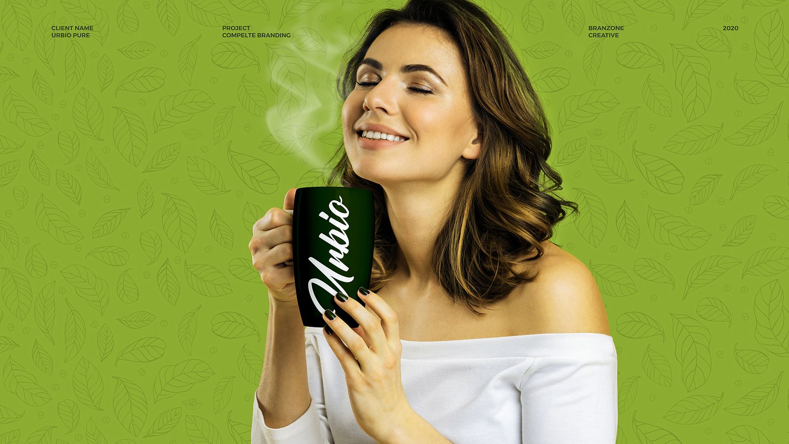
Urbio Pure is a tea brand created to reflect the freshness and authenticity of natural tea. The brand focuses on delivering a product that feels close to nature while maintaining a modern and appealing presence in the competitive tea market.
The goal of the packaging was to communicate purity, freshness, and natural origin at first glance. Since tea is strongly associated with nature and wellness, the design language needed to visually express these qualities while remaining attractive on retail shelves.
The concept was developed to create a package that immediately connects consumers with the essence of natural tea through simple, clean, and recognizable visual elements.
Design Process
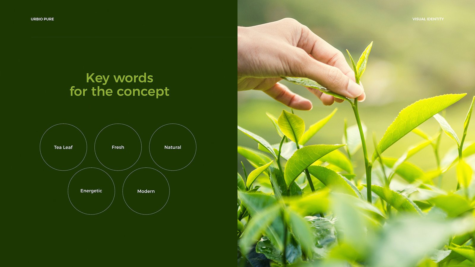
The design process began with understanding how tea brands compete visually in retail spaces. Many tea packages rely on traditional imagery, so the challenge was to create something that felt natural yet visually distinctive.
The design approach focused on three main ideas:
• Nature and freshness
• Shelf visibility
• Modern simplicity
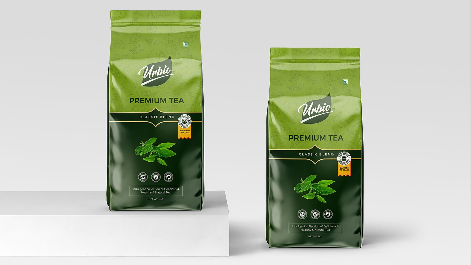
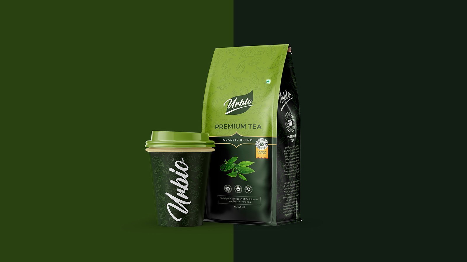
A color palette centered around green tones was selected to reinforce the natural character of the tea. Green is widely associated with freshness, leaves, and organic ingredients, making it an effective visual cue for consumers.
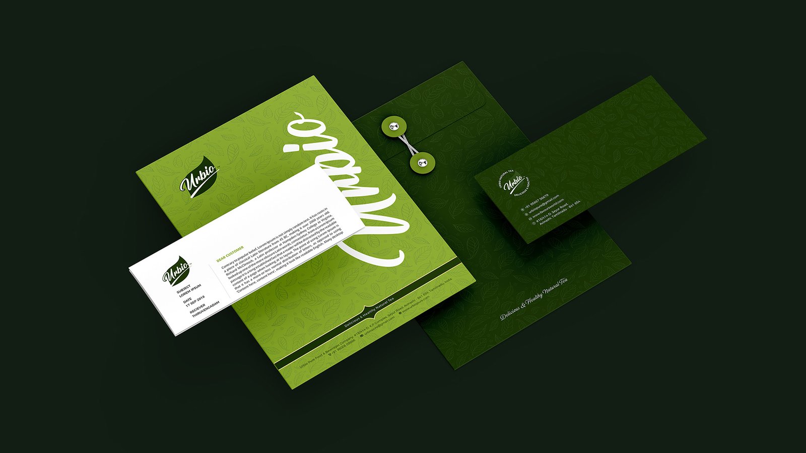
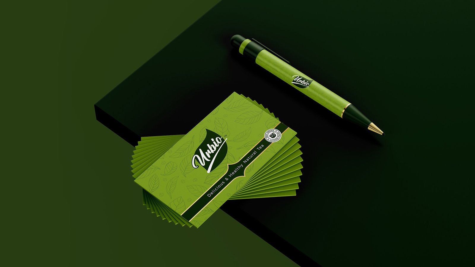
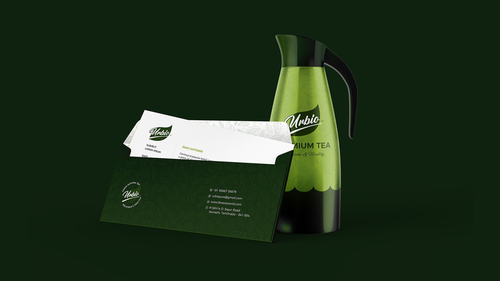
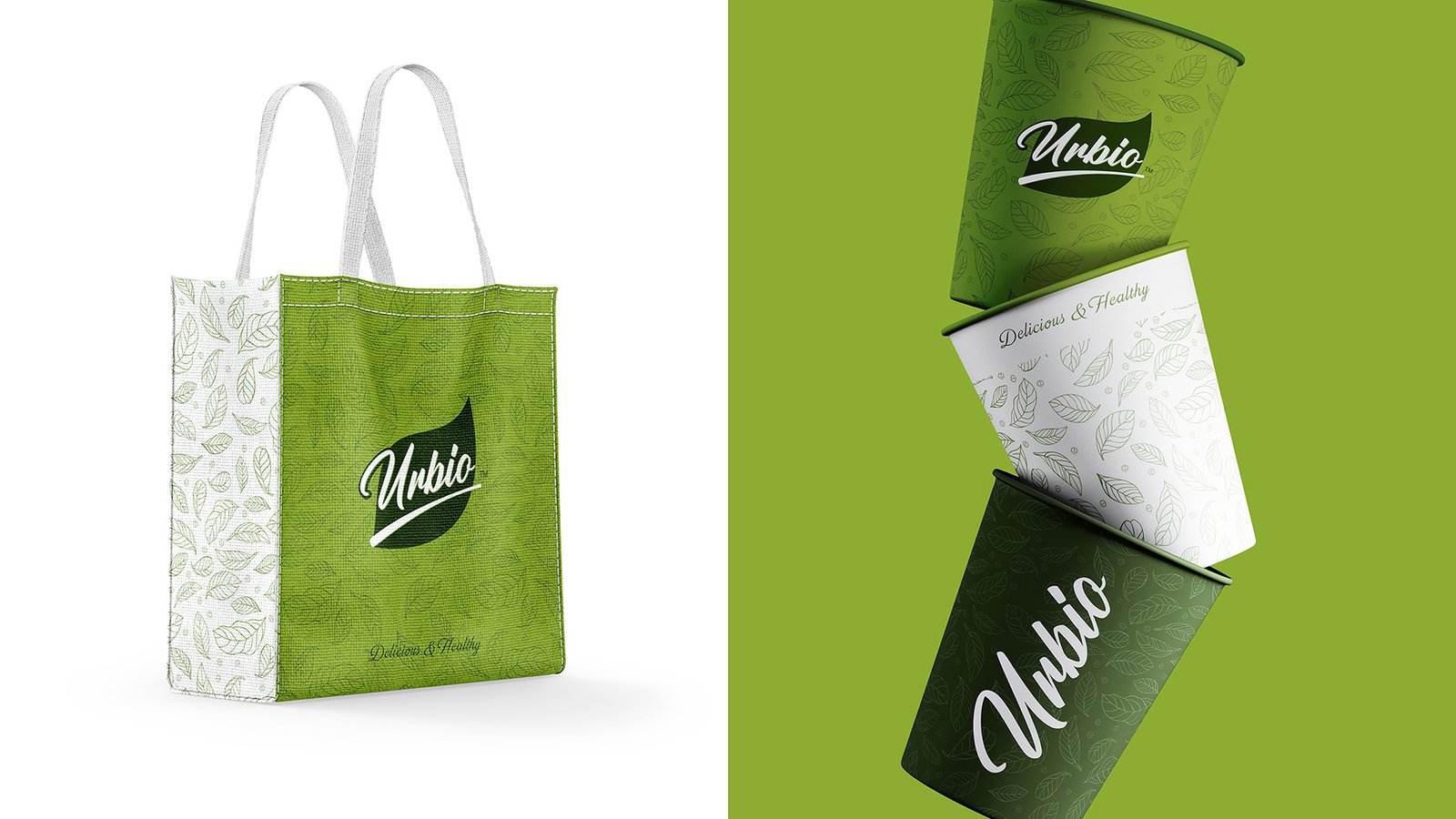
To strengthen the natural identity of the brand, the design incorporates tea leaf elements, helping customers instantly understand the product’s origin and quality. Typography was carefully chosen to balance a modern feel with a subtle classic character, ensuring the packaging feels both contemporary and trustworthy.
According to the project description, the packaging was designed to reflect “nature’s essence” and create a recognizable identity using leaf elements and green color.”
Visual Identity
The visual identity of Urbio Pure centers on simplicity and natural storytelling.
The dominant green palette communicates freshness and energy while helping the product stand out in a crowded tea market. The leaf element serves as the core visual symbol, reinforcing the idea of natural ingredients and authentic tea leaves.
The typography complements the organic concept by maintaining clarity and balance. It avoids overly decorative styles and instead focuses on a clean, modern presentation that supports readability and shelf recognition.
The final packaging uses a flow-pack format, suitable for tea products and convenient for both storage and distribution.
Together, the colors, typography, and natural graphics create a cohesive packaging system that aligns with the brand’s promise of purity and freshness.
Outcome
The result is a packaging design that communicates the brand’s natural values while maintaining strong shelf presence. The design balances simplicity and visual impact, allowing customers to quickly recognize the product and associate it with freshness and quality.
By combining natural elements with a modern design approach, the Urbio Pure packaging successfully creates a recognizable identity that connects emotionally with tea consumers.


CREDIT
- Agency/Creative: Branzone Creative
- Article Title: Urbio Pure: A Fresh and Natural Tea Packaging Identity by Branzone Creative
- Organisation/Entity: Agency
- Project Type: Packaging
- Project Status: Published
- Agency/Creative Country: India
- Agency/Creative City: Chennai
- Market Region: Asia
- Project Deliverables: Brand Design, Logo Design, Packaging Design
- Format: Pouch
- Industry: Professional Services
- Keywords: packagin designer, Brand identity design, modern package design
-
Credits:
Creative Director: Suman


