


Upland Studio: A Visual Identity Rooted in Local Culture
Odder Kulturforening works to create space for ideas, community, and cultural initiatives of all sizes – from small grassroots projects and workshops to larger public events that bring the city together. The new visual identity needed to unite these many expressions under one shared framework, while still feeling open, local, and intentionally unpretentious. It had to reflect an organisation shaped by participation rather than formality, and by diversity rather than a single defining narrative.
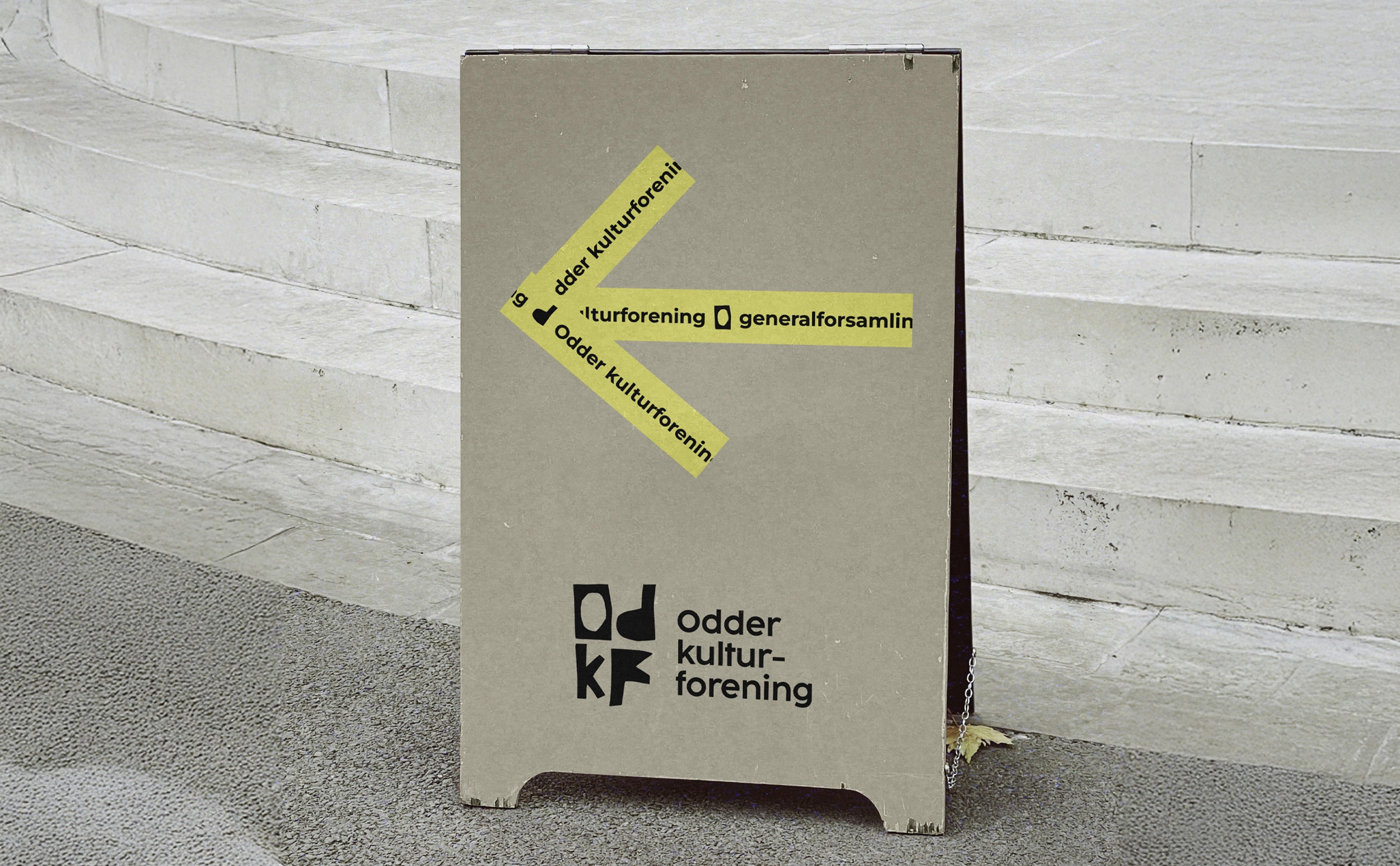
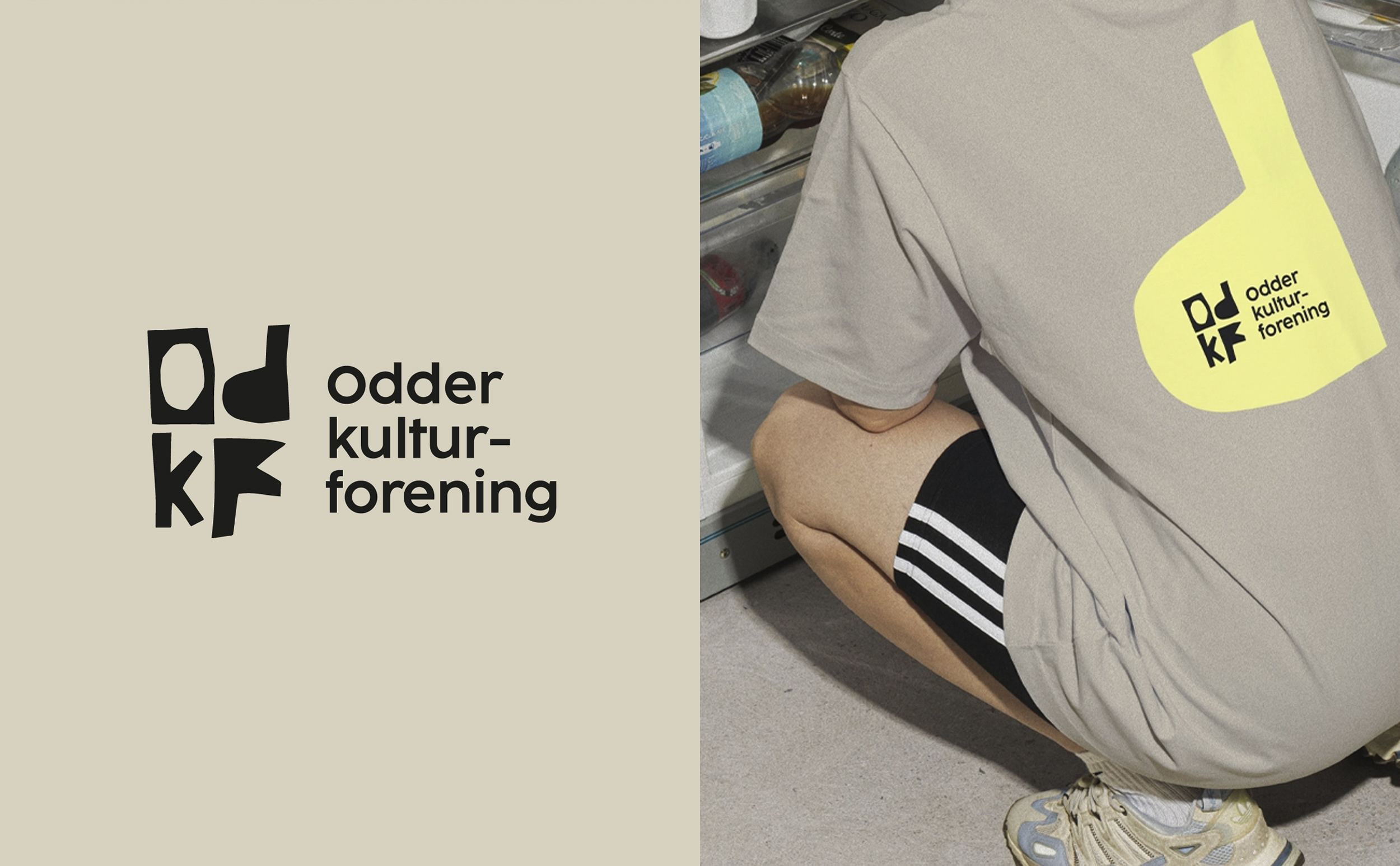
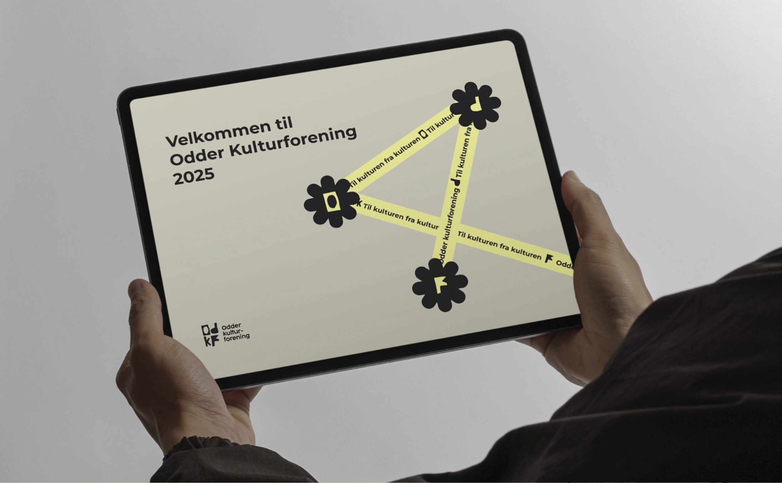
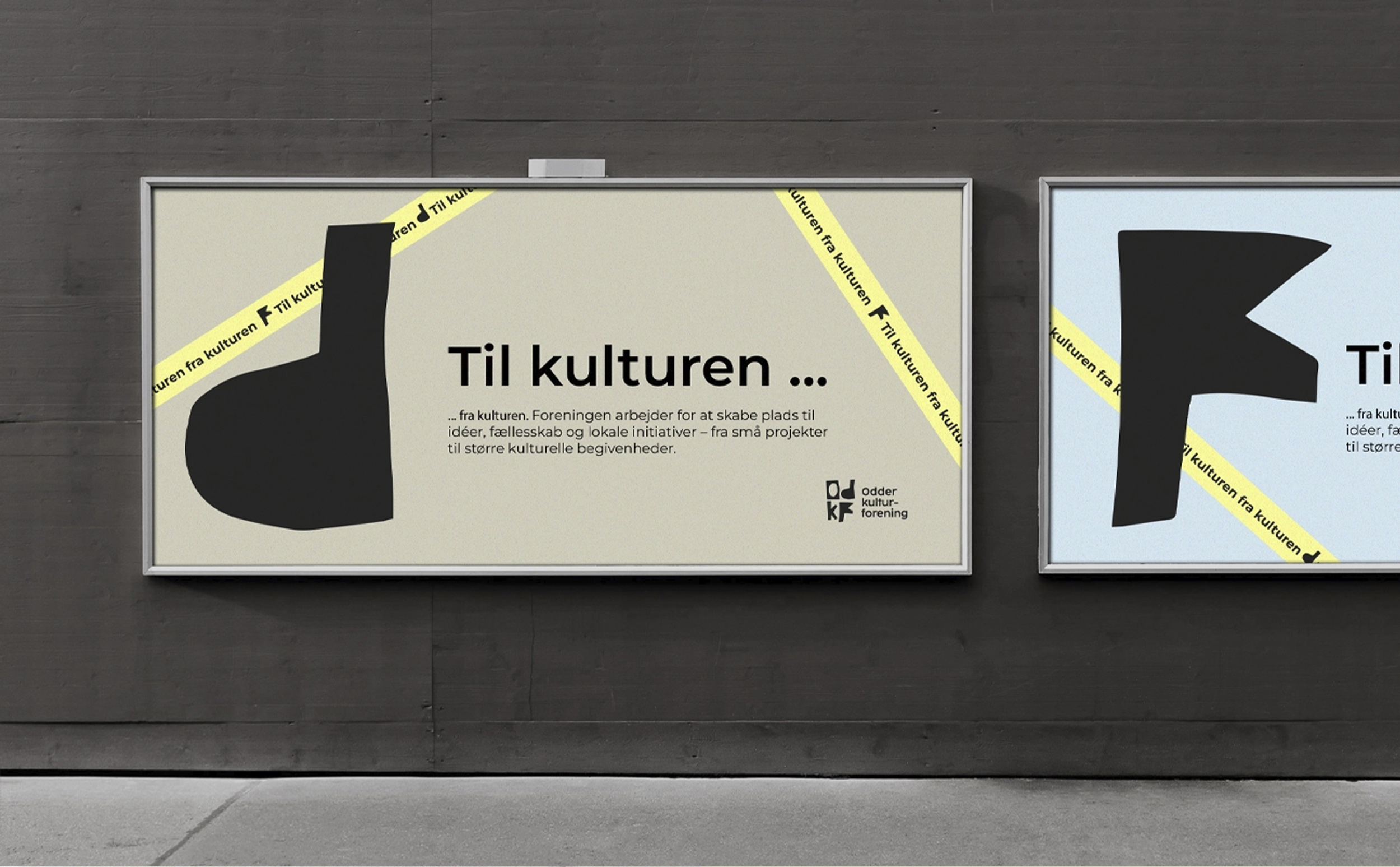
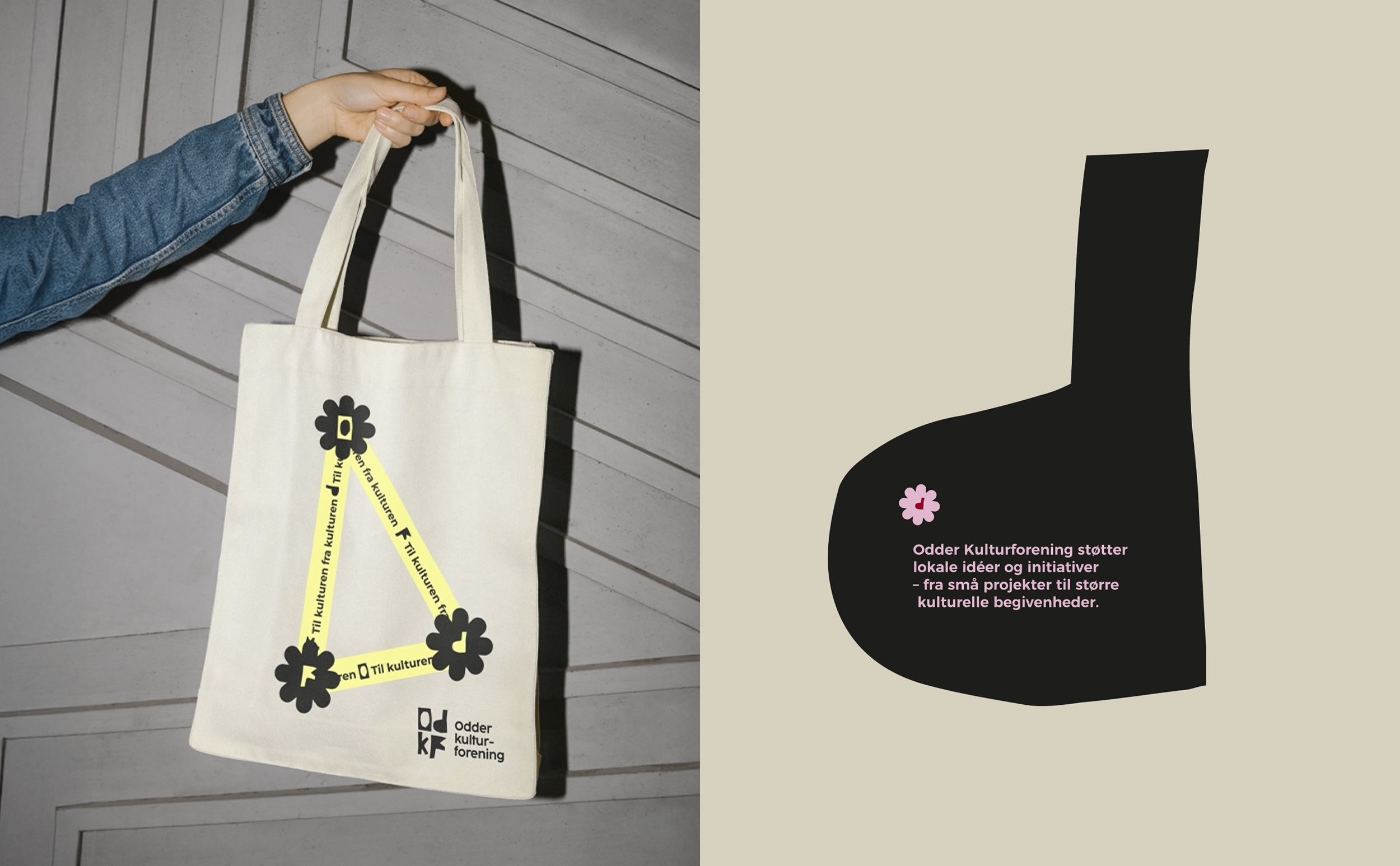
The design is rooted in the association’s role as a connector within the city’s cultural landscape. Odder Kulturforening does not simply organise activities; it links people, associations, and ideas. This idea of connection became the conceptual foundation for the identity. The logo, built from the letters O, D, K, and F, forms a simple yet distinctive mark. It is intentionally open to interpretation: a monogram, a symbol, or simply a playful form with its own rhythm. Rather than pointing in one direction, it creates space for the many cultural voices that shape Odder.
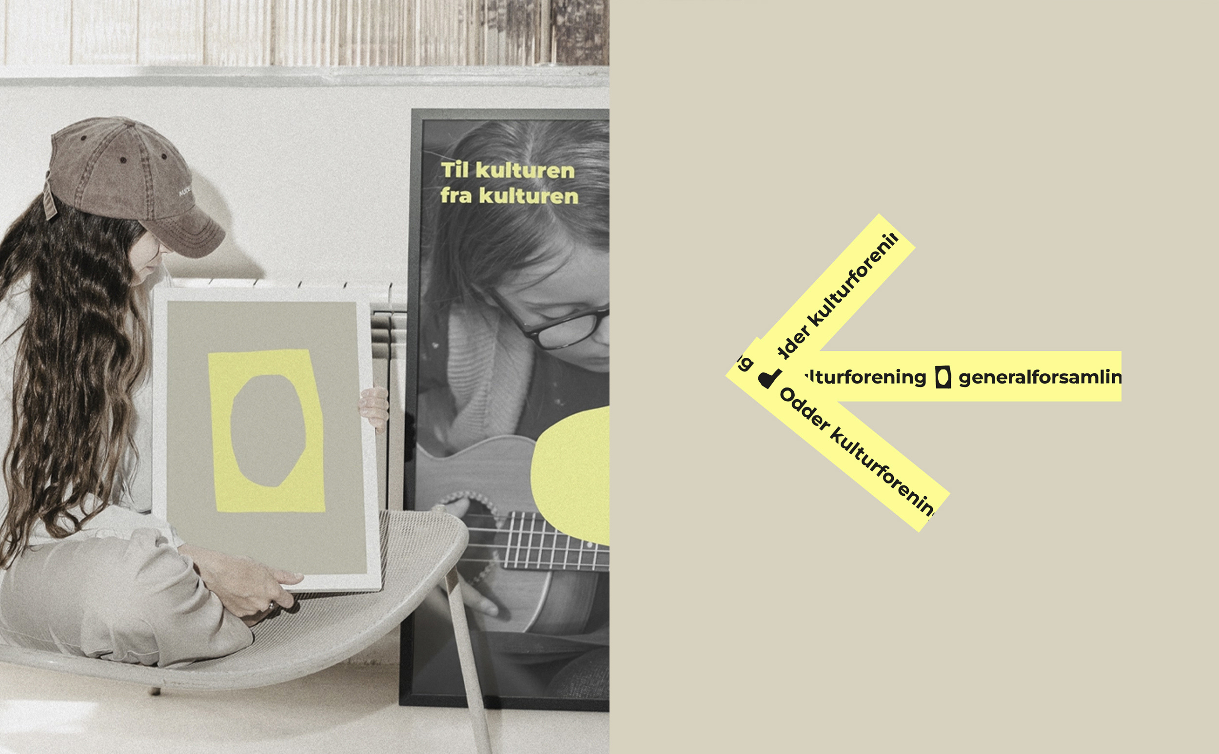
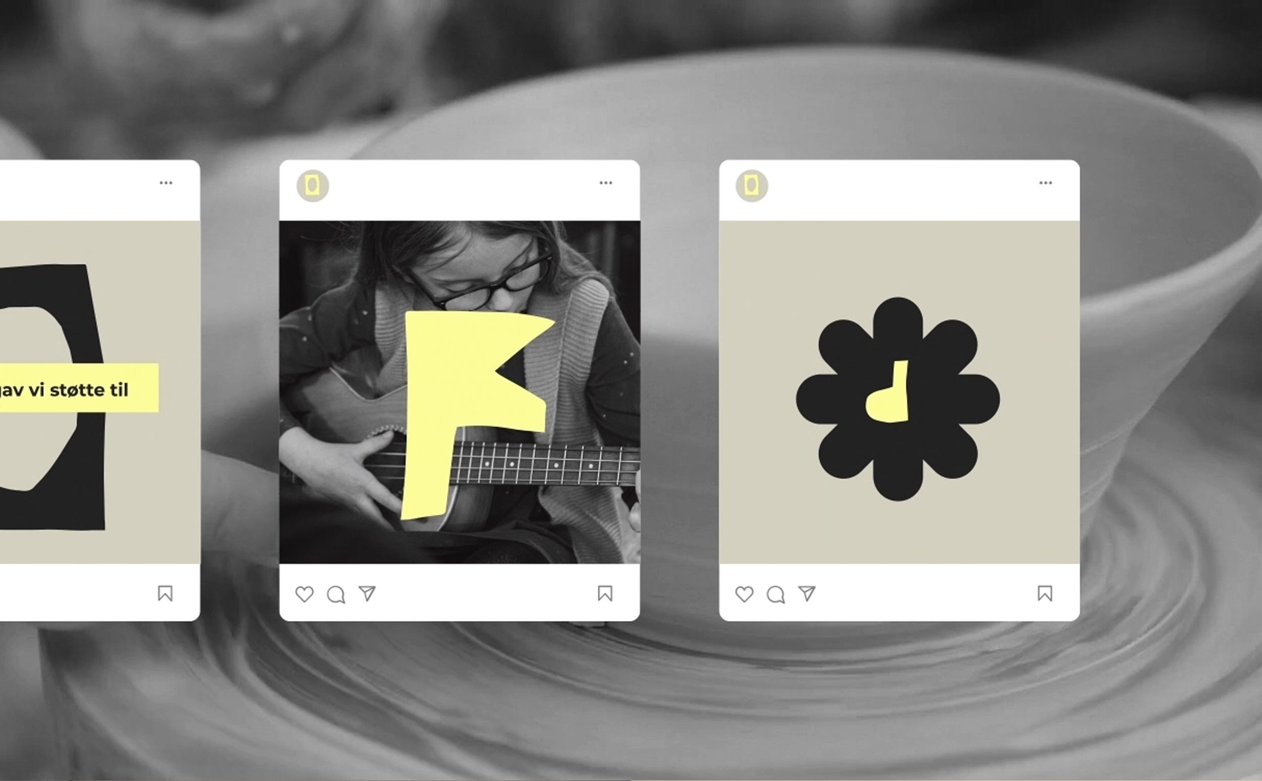
This approach continues throughout the visual universe. The system is deliberately flexible, designed to work for both calm, informative communication and energetic, event-based content. Typography provides structure without becoming rigid. The colour palette supports clarity but leaves room for expression, making it possible to shift tone depending on the project, the audience, or the scale of the activity. The result is a visual identity that adapts easily while remaining recognisable.
A key requirement was that the identity should be easy to use across different hands. Odder Kulturforening collaborates with a wide network of local partners, volunteers, and cultural actors, and not all communication materials would be created by designers. The solution was a modular system that prioritises clarity, accessibility, and visual consistency. Templates and simple design principles allow posters, announcements, and digital graphics to maintain coherence without limiting creativity. This ensures that the identity feels alive — capable of evolving with the community that uses it.
The visual language also reflects the organisation’s cultural values. It feels approachable, warm, and unpretentious, echoing the atmosphere of local culture in Odder. There is room for personality without noise, and for experimentation without losing structure. The identity supports both the intimate and the collective: a workshop in a small venue and a major cultural event in the park. It communicates clearly but always leaves space for the human element that defines local culture.
In essence, the identity is designed not to dominate but to enable. It gives Odder Kulturforening a strong, contemporary foundation while allowing each initiative to express its own character. It captures the spirit of a cultural community shaped by many contributors — and invites even more to join.
CREDIT
- Agency/Creative: Upland Studio
- Article Title: Upland Studio Introduces a Community-Driven Identity for Odder Kulturforening
- Organisation/Entity: Agency
- Project Type: Identity
- Project Status: Published
- Agency/Creative Country: Denmark
- Agency/Creative City: Odder
- Market Region: Europe
- Project Deliverables: Brand Identity
- Industry: Non-Profit
- Keywords: Brand identity, logo, graphic design, visuel identity
-
Credits:
Art director: Janus Mikkel Jørnaa


