Understanding the Future Through the Past.
Petalo is an iconic Danish furniture brand that, since 1950, has been synonymous with high quality and classic design within classroom furniture. Today, Petalo marks a new chapter with a comprehensive redesign that strengthens the brand’s mission to deliver the perfect furniture for future learning environments.
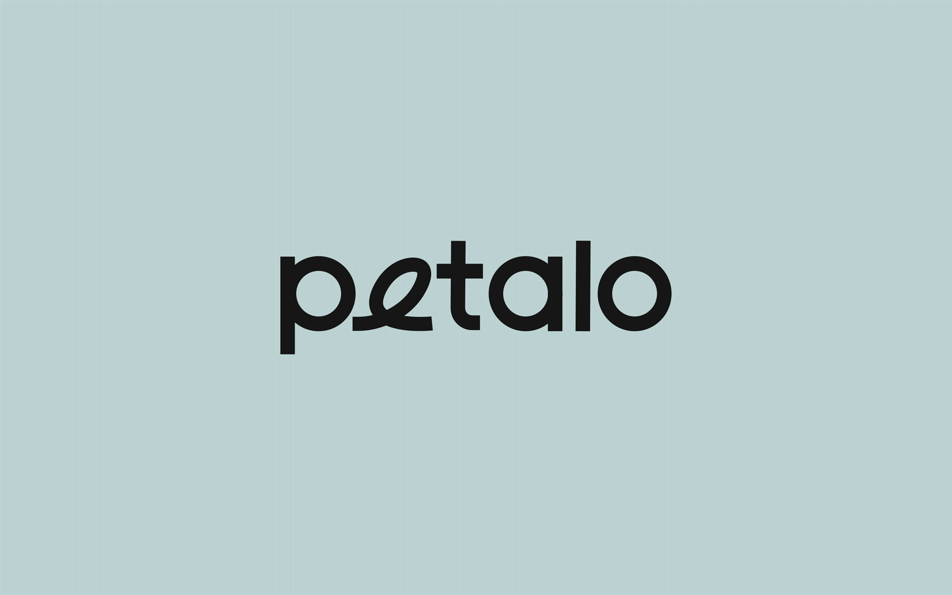
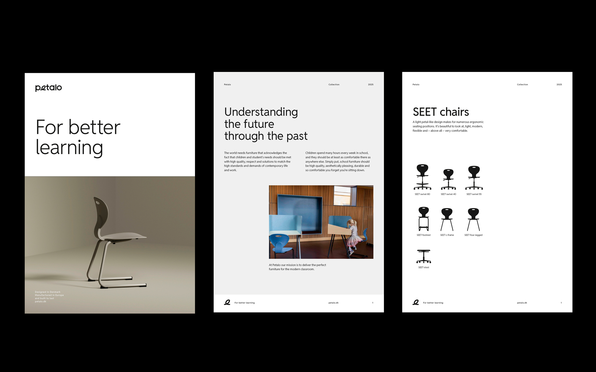
The rebranding not only involves a new name and logo but also a complete visual revitalization that bridges the gap between past craftsmanship traditions and future demands for modern design. The name Petalo, meaning “petal,” is carefully chosen to reflect the organic shapes and light aesthetics of the furniture. The petal symbolizes natural growth and elegance – just like the furniture Petalo creates to inspire learning spaces.
A Visual Identity with Nordic Elegance
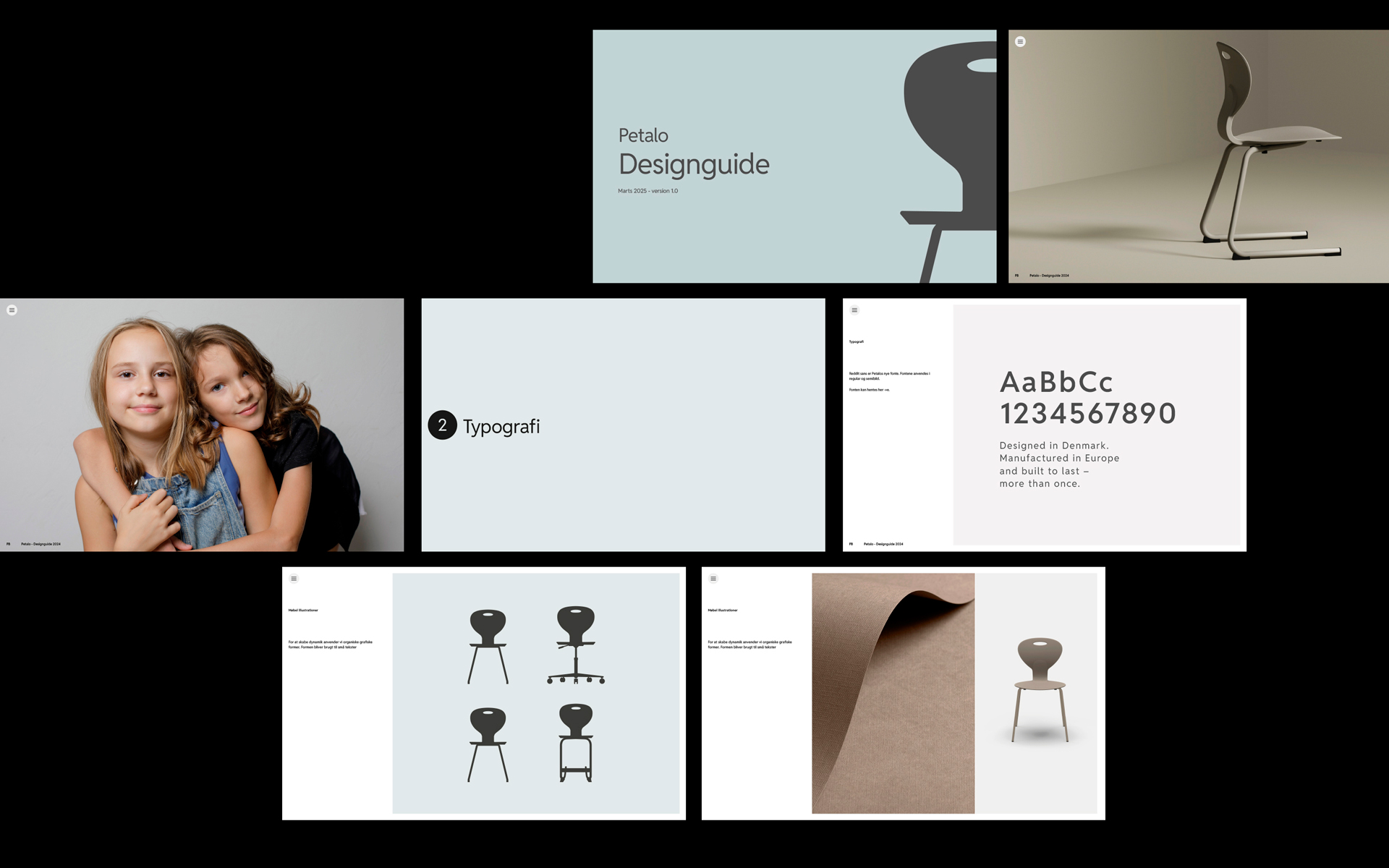
The graphic identity is designed with a focus on simplicity, minimalism, and Nordic aesthetics. The logo combines geometric shapes with soft lines, creating a modern and timeless expression while maintaining a clear reference to Danish design tradition. The typography is simple and streamlined, making the logo easily recognizable and adaptable across various platforms.
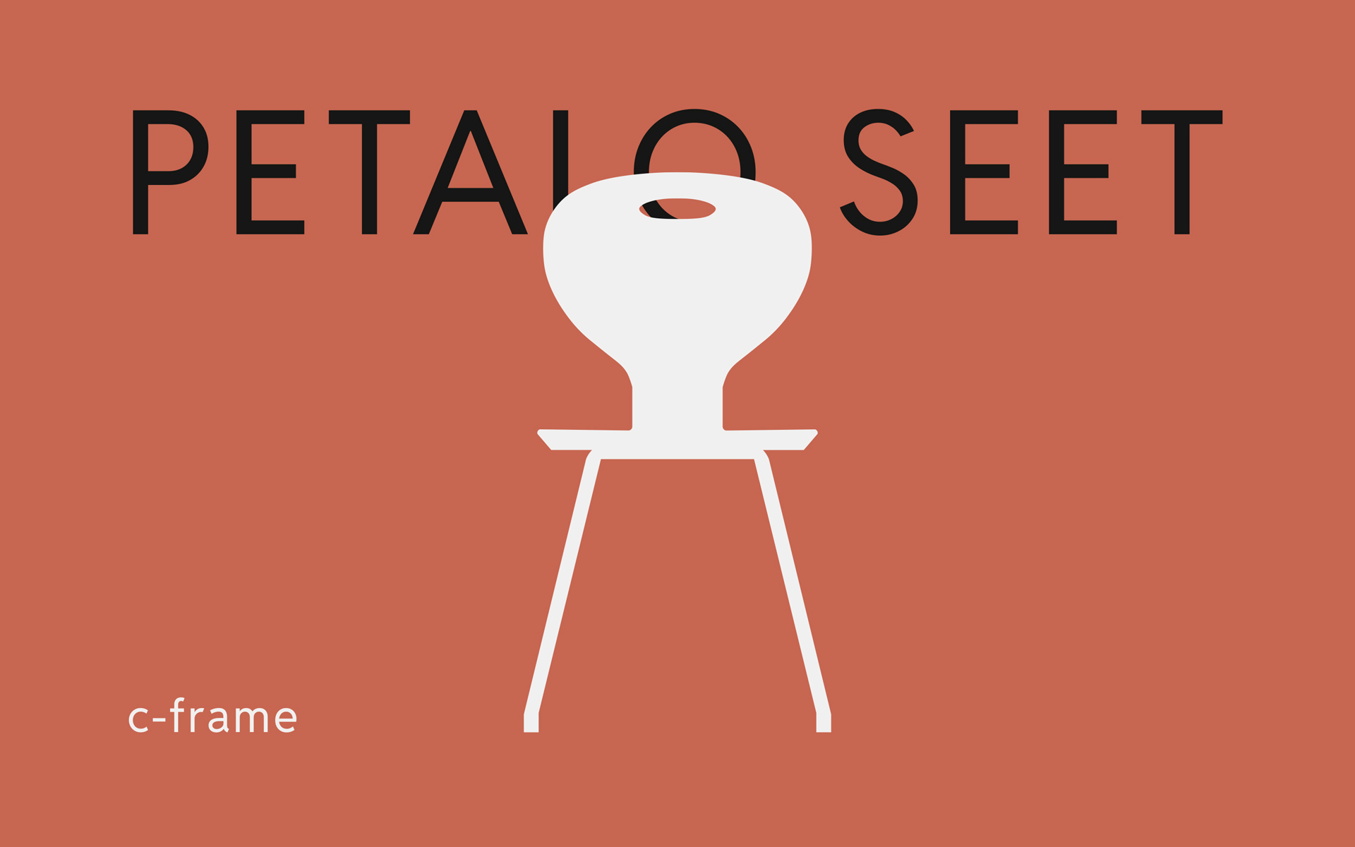
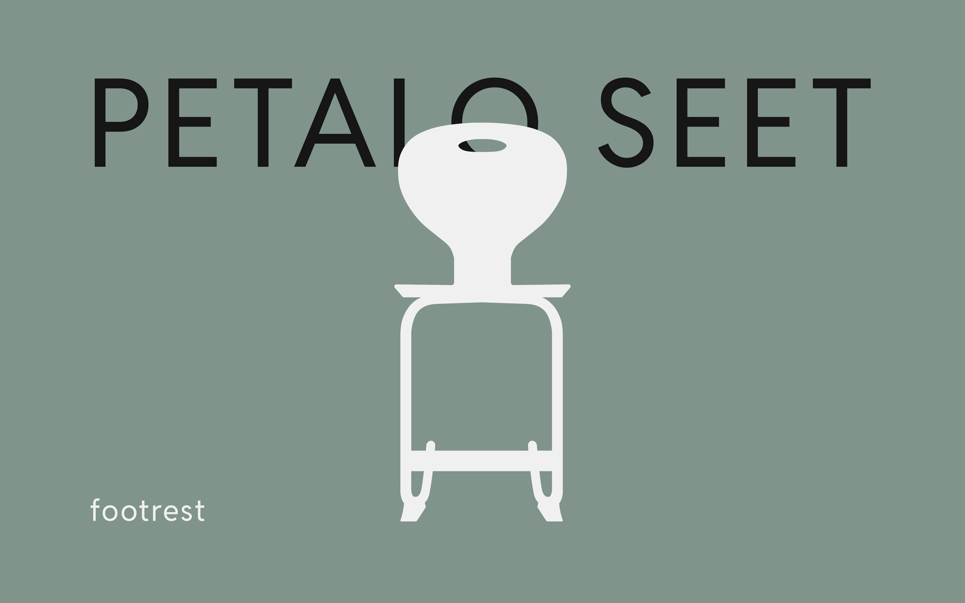
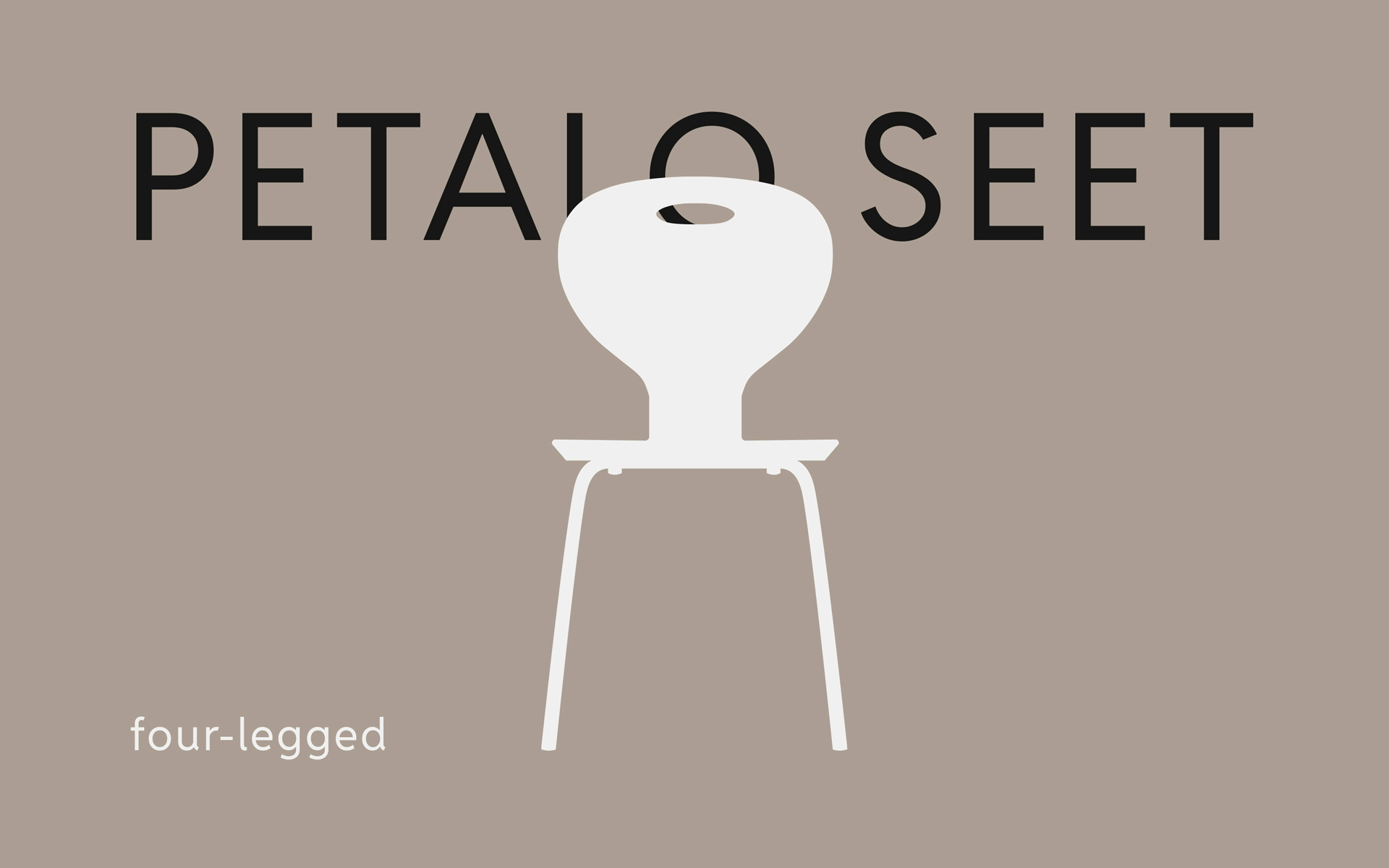
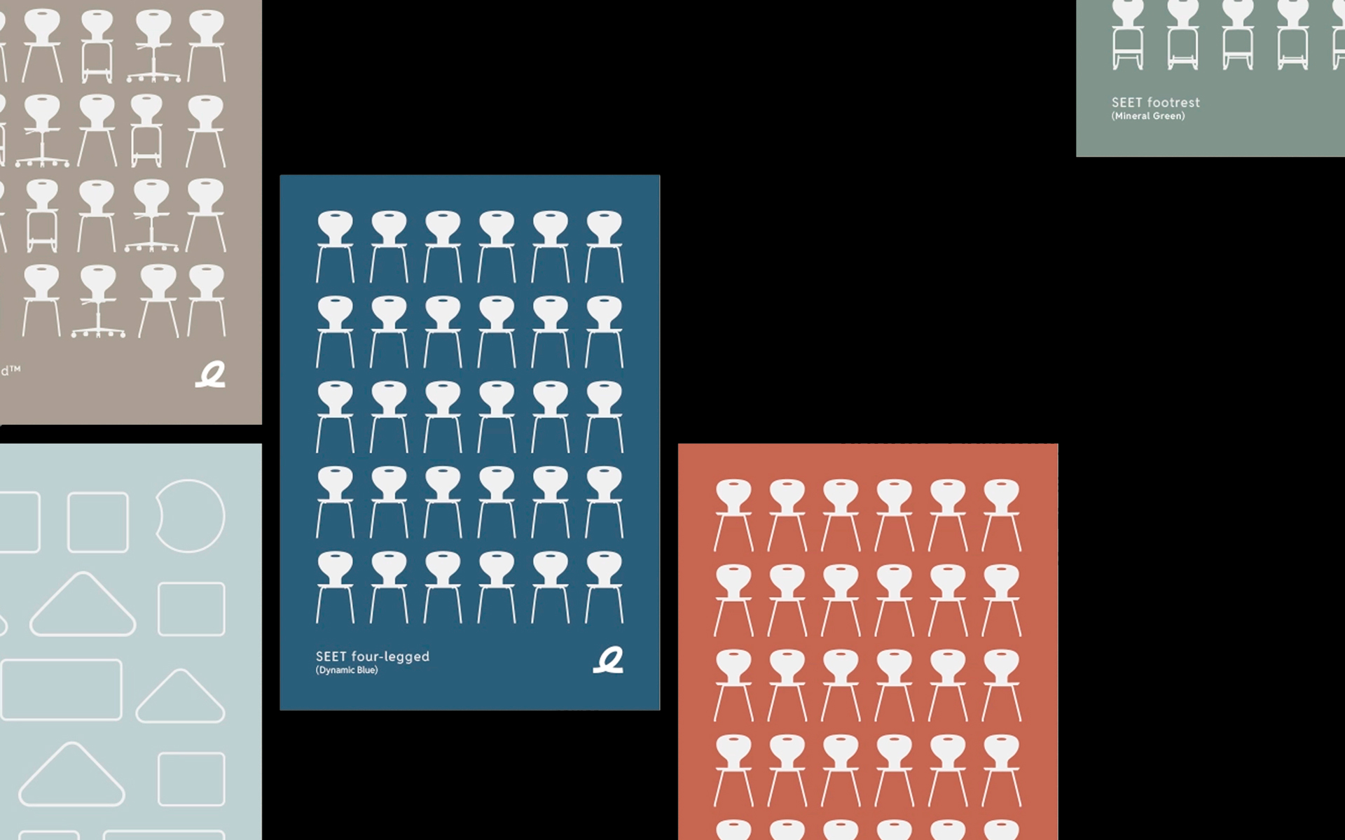
The color palette is inspired by nature’s subdued hues – earthy tones combined with warm shades – emphasizing both stability and renewal. This color philosophy creates a visual calm that harmonizes with the spaces the furniture is designed to enrich. At the same time, the palette provides flexibility for use across both digital and print media, enhancing brand consistency and recognizability.
Furniture Shaping the Learning Spaces of the Future
With a sharp visual identity that remains true to both tradition and innovation, Petalo cements its position as a key player in learning furniture. The rebranding is not just an aesthetic upgrade but a strategic effort to ensure the brand remains relevant and inspiring in a time with increasing focus on modern learning environments.
The new expression supports Petalo’s ambition to deliver furniture that is not only functional and ergonomic but also inspires creativity and well-being. The design is modern, airy, and easy to integrate into different room types, making it the ideal choice for schools and educational institutions that seek to invest in both quality and aesthetics.
CREDIT
- Agency/Creative: Upland Studio
- Article Title: Upland Studio Blends Danish Tradition and Modern Strategy in Petalo’s Rebranding
- Organisation/Entity: Agency
- Project Type: Identity
- Project Status: Published
- Agency/Creative Country: Denmark
- Agency/Creative City: Aarhus
- Market Region: Europe
- Project Deliverables: Art Direction
- Industry: Manufacturing
- Keywords: Visual identity
-
Credits:
Art director: Janus MIkkel Jørnaa


