


The Institute for Nonprofit News (INN) was founded in 2009 to strengthen and support a national network of small, independent news organizations. Committed to nonpartisanship and dedicated to serving the public interest, their efforts ensure that all people have access to trustworthy reporting from credible sources. Through their investigative journalism—a crucial component to maintaining a healthy and functioning democracy—INN reporters earn the confidence, trust, and respect of their readership by disarming disinformation and holding the powerful accountable. From local events to in-depth reporting on pressing global issues, members help connect communities by focusing on the stories that matter most, but often go untold.
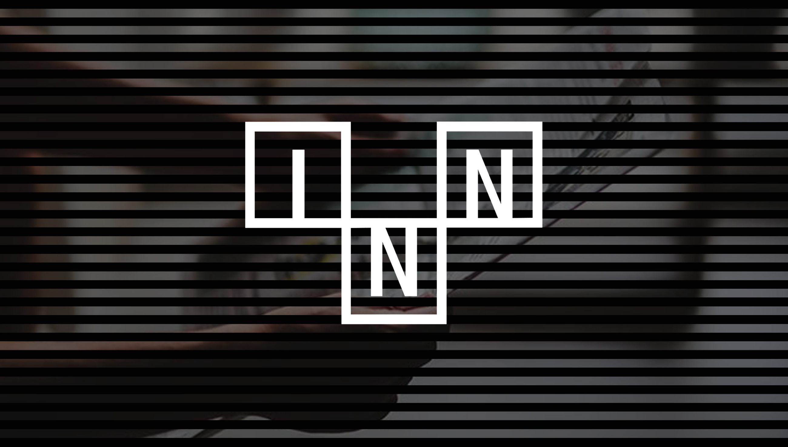
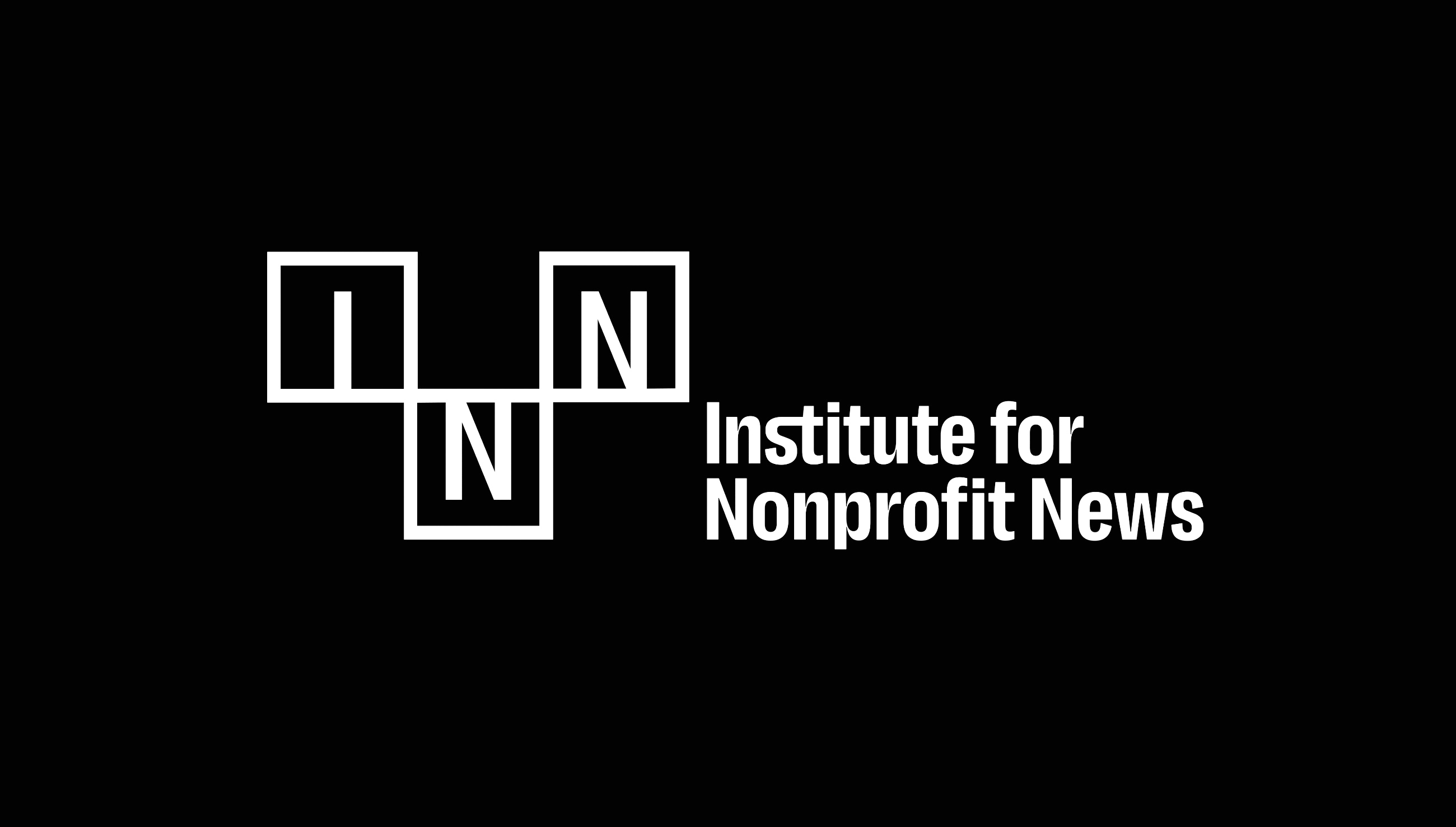
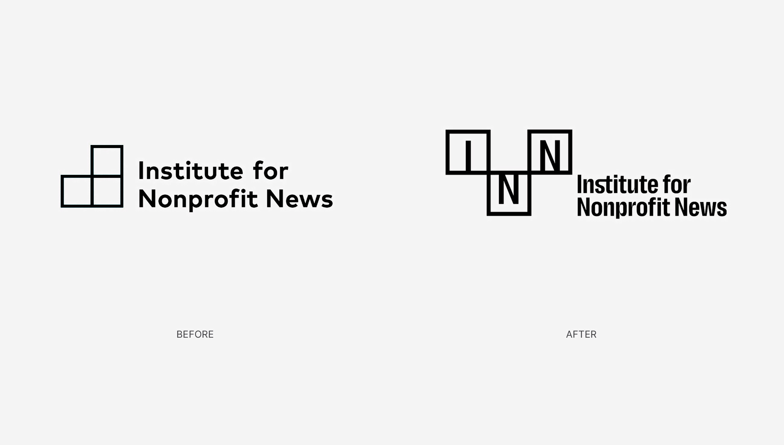
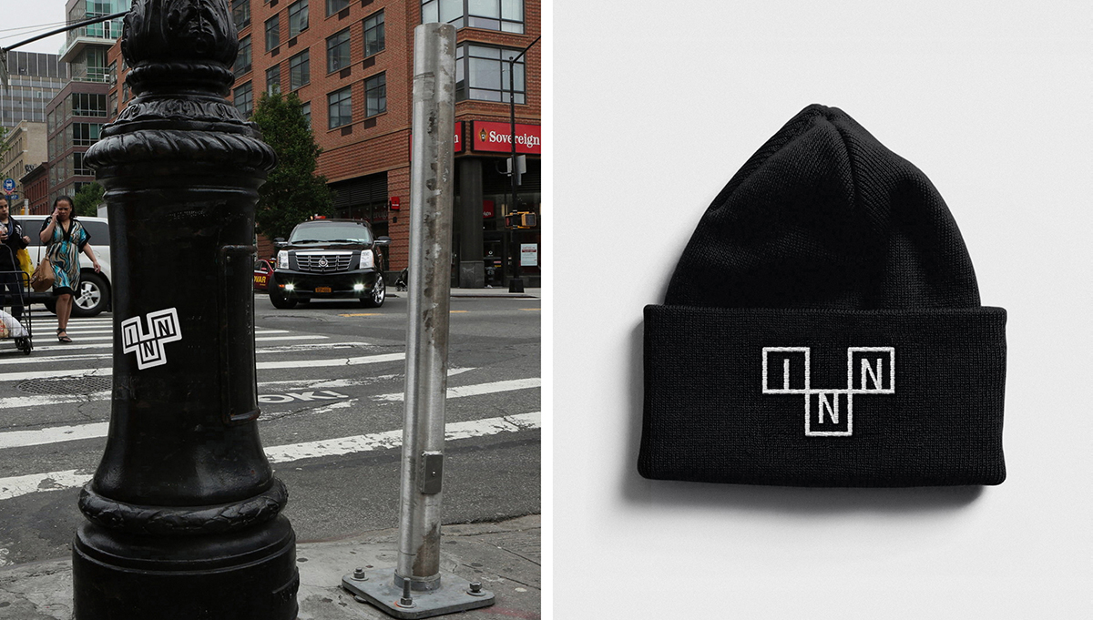
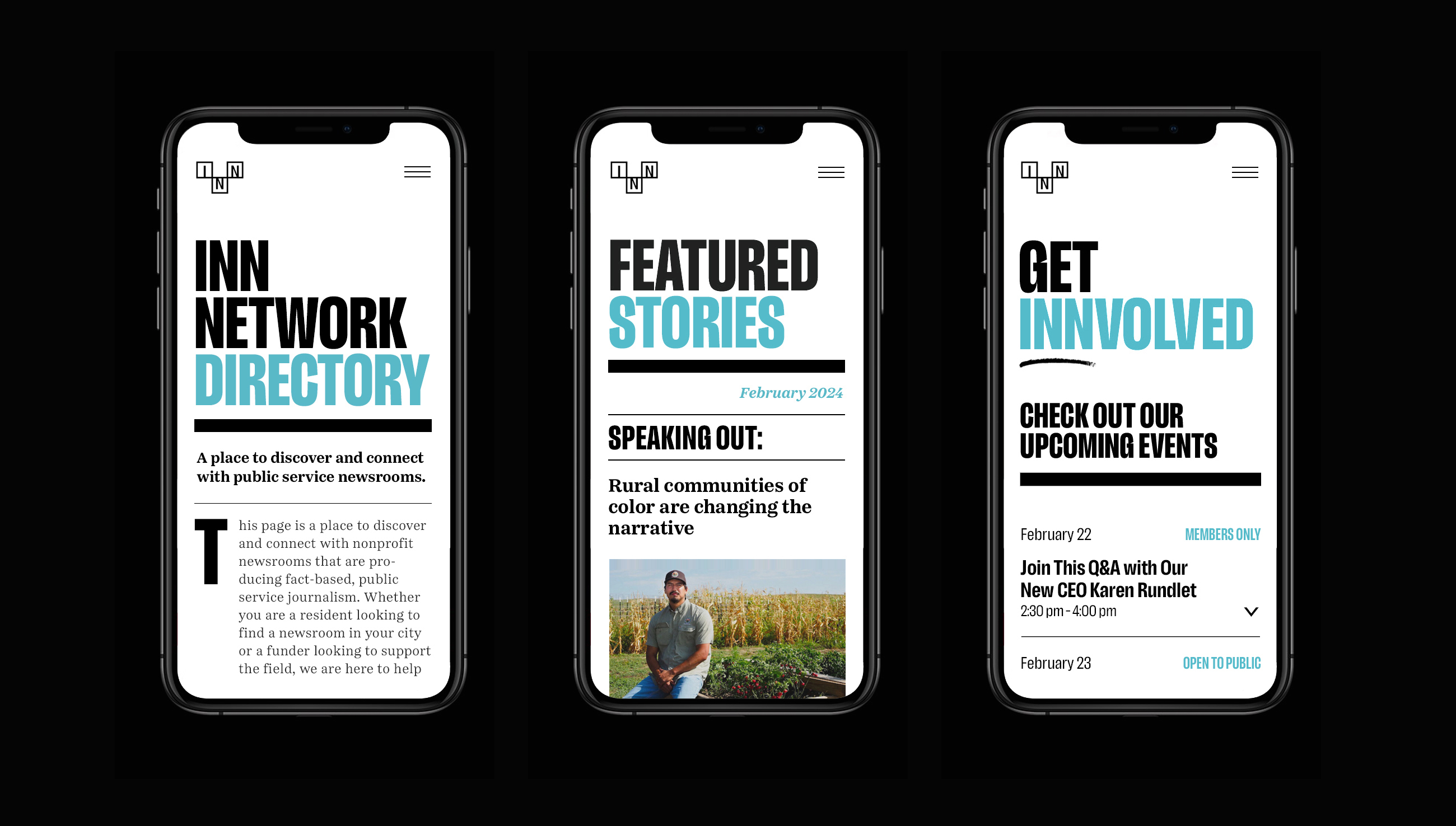
The new identity reinvigorates the brand, and better reflects the beliefs and bold ambitions of INN. The call letters, which are how other leading news and media outlets identify themselves (e.g. CNN) and were a key visual element missing from the previous design, have now been added to the logo. By introducing the call letters I-N-N, not only do the name and logo become mutually reinforcing, but INN has a new tool in their toolbox: a unique signature that can be separated from the text and used independently with confidence. The predominant use of blue and black maintains an appearance of reliability, honesty, and professionalism.
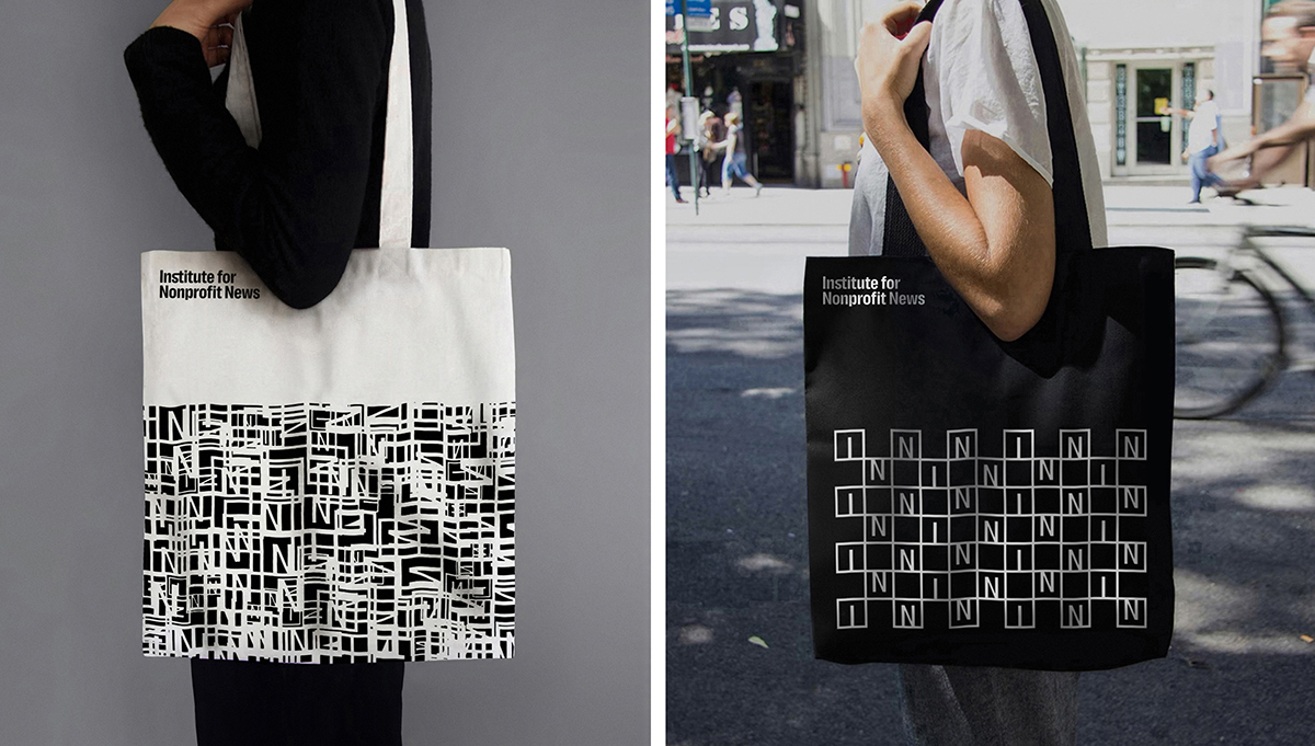
The three squares from the original design have been rearranged to highlight the first “N” and call attention to the organization’s most important descriptor: Nonprofit. This new configuration is, serendipitously, reminiscent of a crossword puzzle which, like a good investigative journalist, requires mental fortitude, deductive reasoning, logical thinking, and the ability to connect seemingly disparate clues. Their continued use in the logo is both conceptually and graphically appropriate, and gives an obvious nod to the previous design. The resulting lockup (name + logo) is distinct, memorable, and versatile.
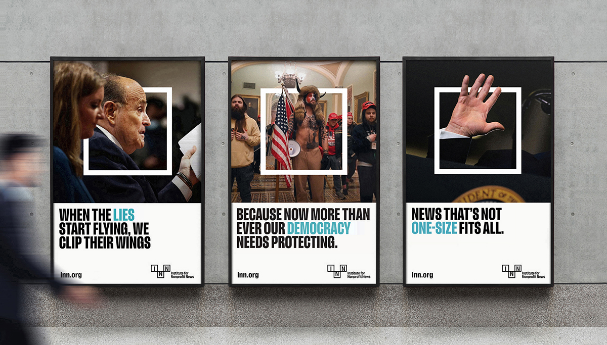
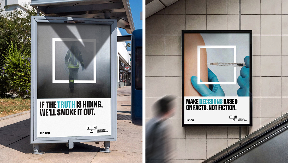
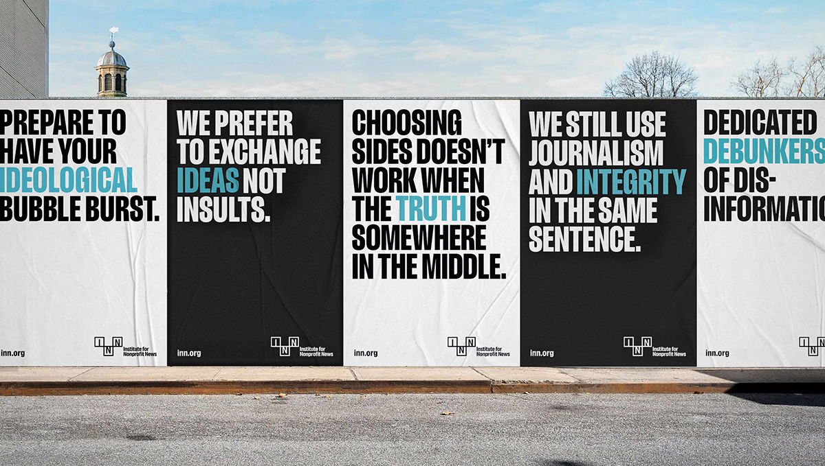
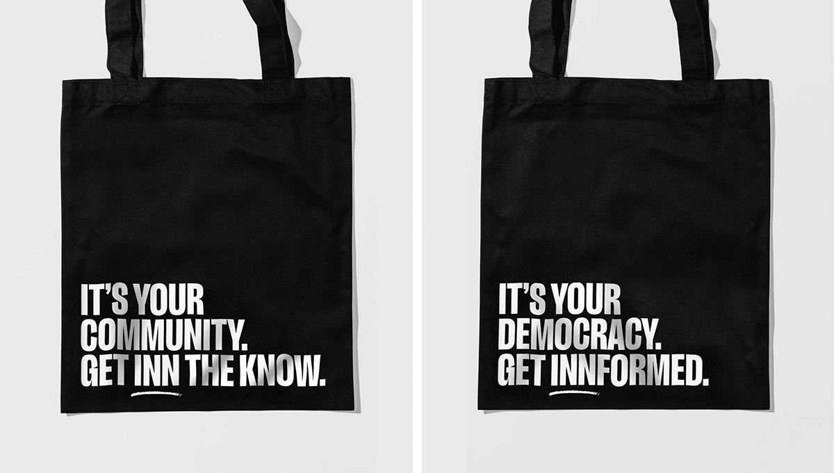
Messages communicating INN’s approach and perspective are presented in the spirit of social and political protest posters: bold typography, captivating imagery, and minimal use of color. The designs are direct and deliberately loud, expressing the urgency of their mission, and amplifying their resilience and unwavering commitment to excellence, equity, inclusion, and the financial health of news. Today, their membership exceeds 425 and is growing annually.
CREDIT
- Agency/Creative: Niedermeier Design
- Article Title: Unveiling the New INN a Brand Refresh for this Growing Network of News Pioneers
- Organisation/Entity: Freelance
- Project Type: Identity
- Project Status: Non Published
- Agency/Creative Country: United States
- Agency/Creative City: Tacoma
- Market Region: North America
- Project Deliverables: Brand Identity
- Industry: Mass Media
- Keywords: news, nonprofit, network, media,
-
Credits:
Designer: Kurt Niedermeier


