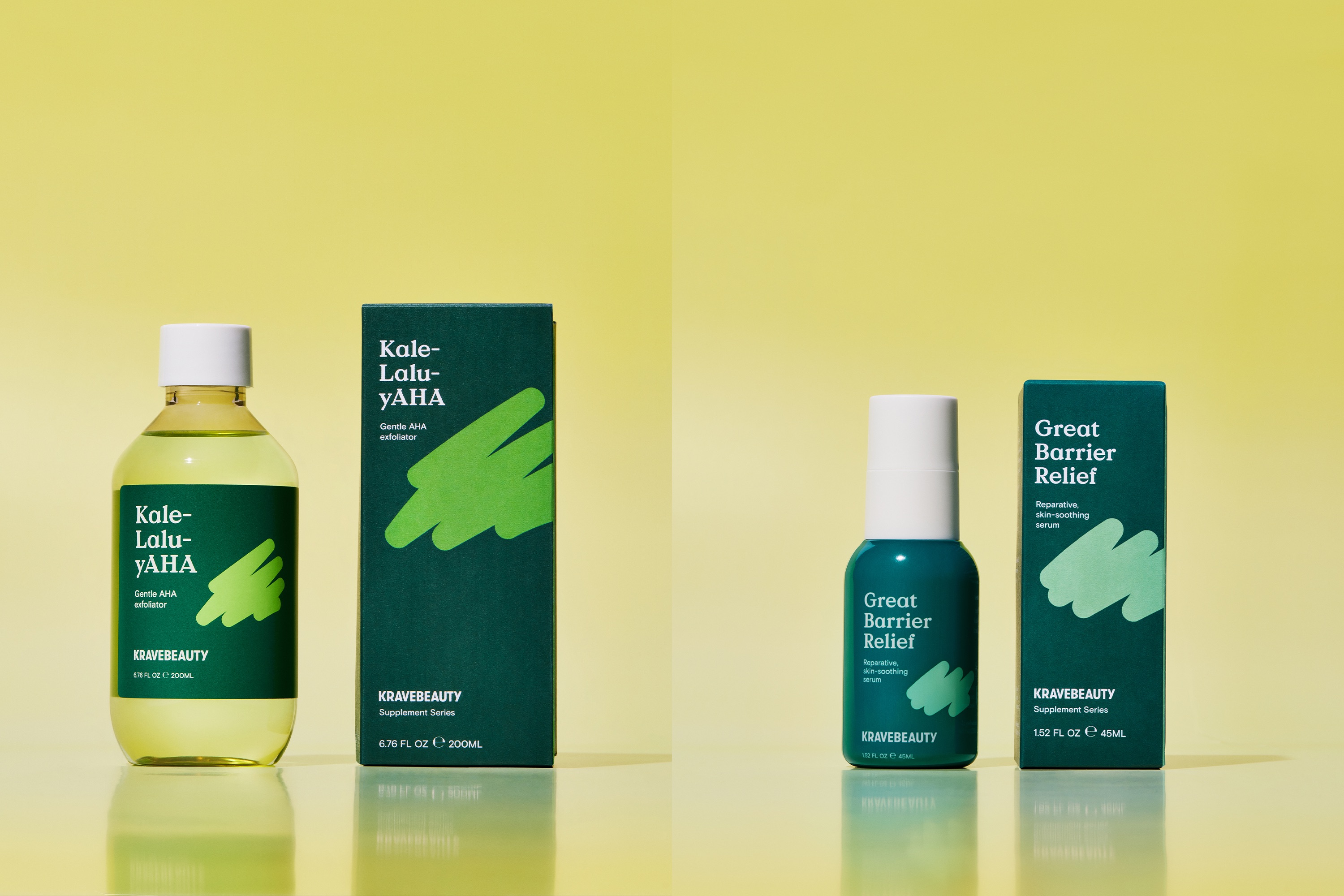
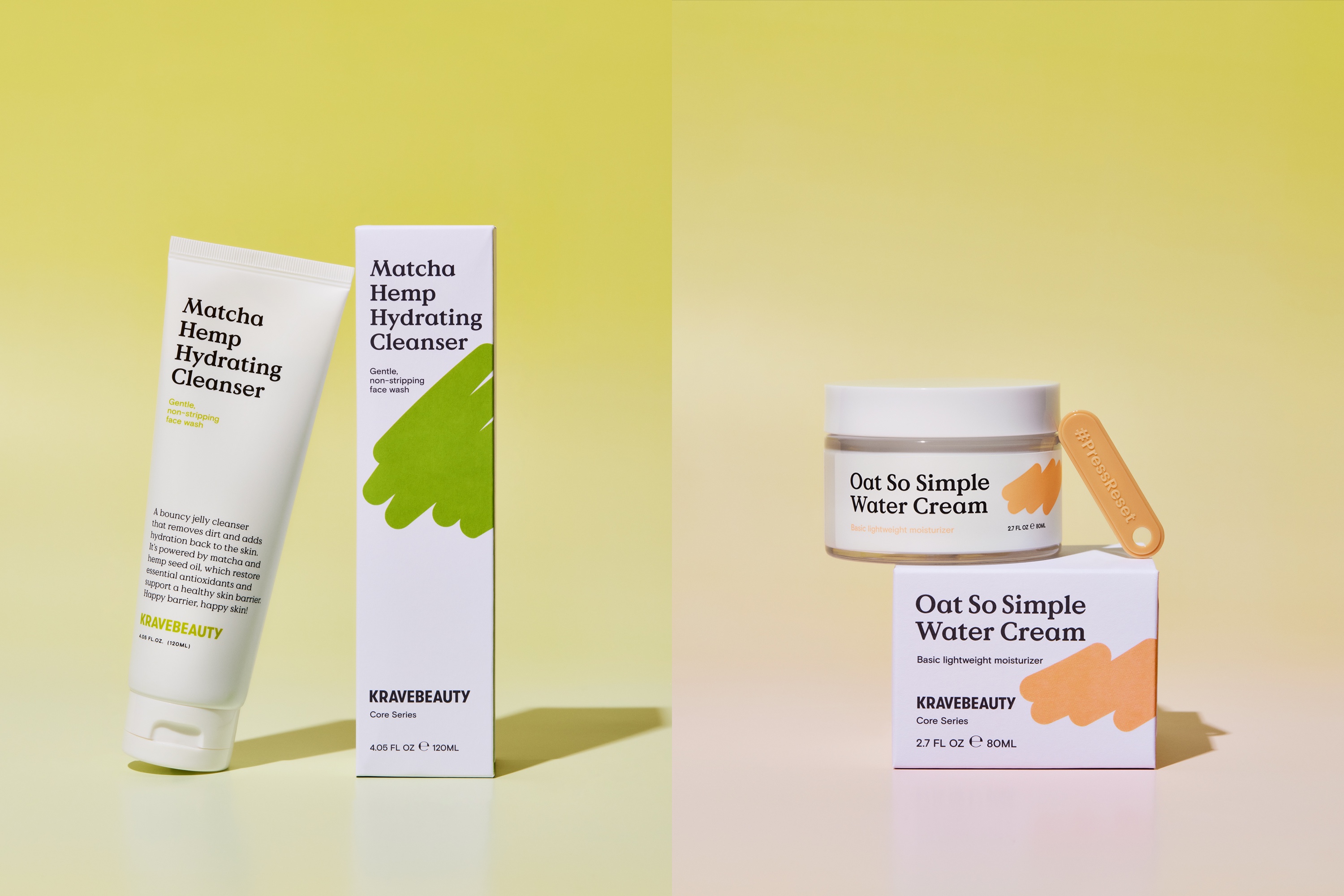
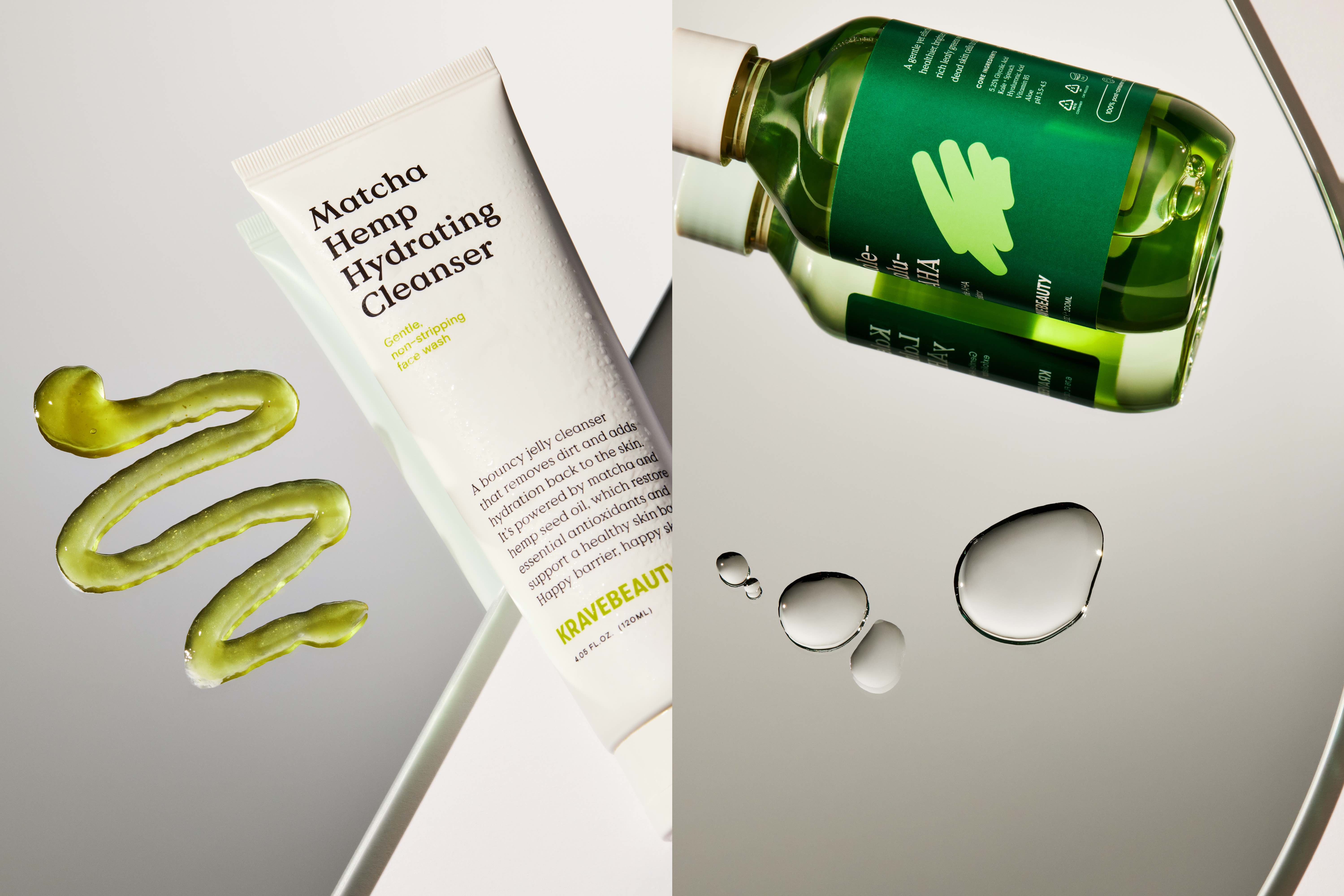
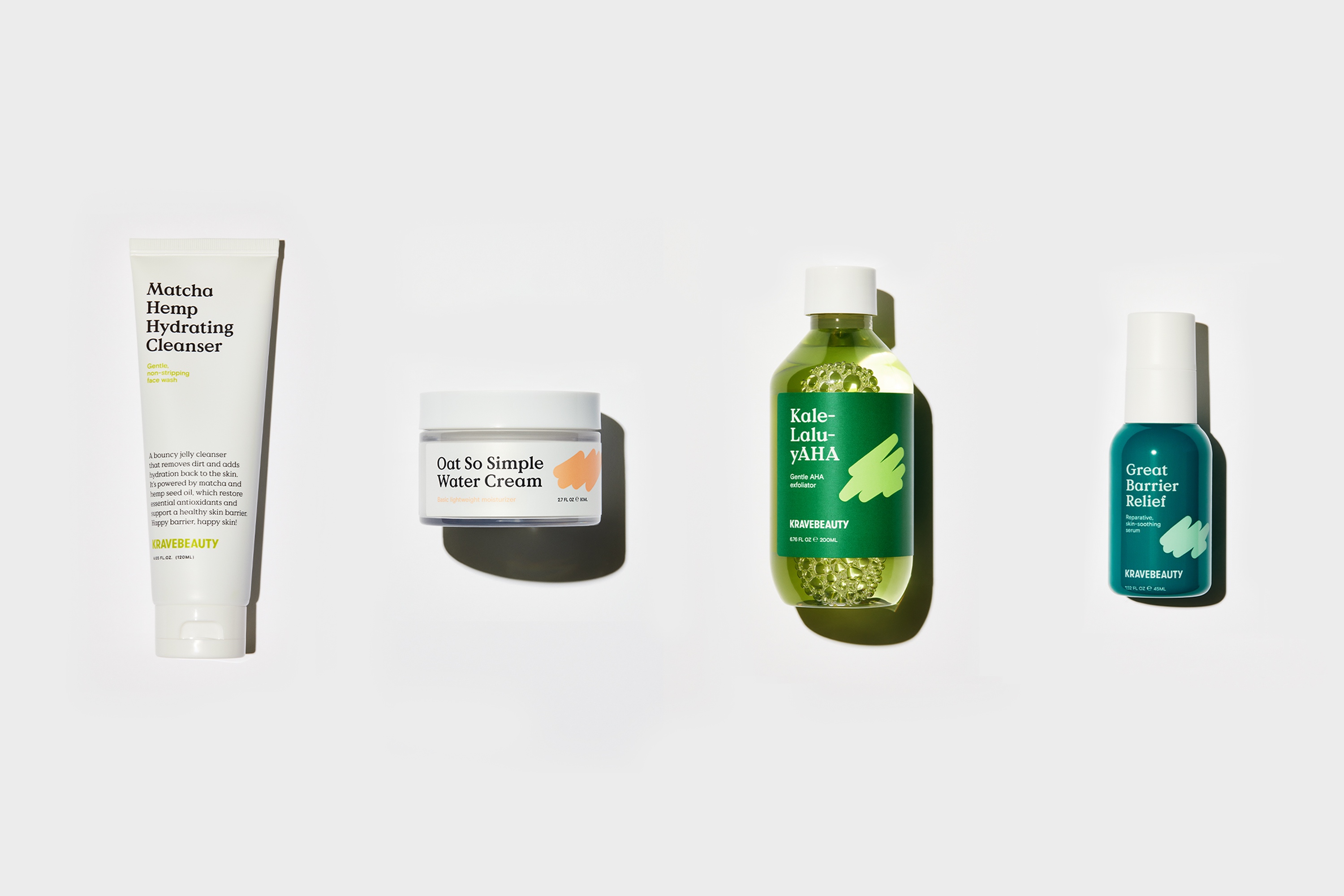
Sydney-based studio Universal Favourite partnered with beauty influencer Liah Yoo for the rebrand of her skincare brand KraveBeauty. Universal Favourite chose to represent the brand’s mission to cut through the noise of the industry and
encourage consumers to press reset on their skincare routine – for the benefit of both their skin and the environment.
Cutting through the noise of an overwhelming skincare space.Based on the “KB” initials, Universal Favourite developed a distinctly simple yet memorable logomark or “scribble” that flexes to form multiple shapes and graphic uses. Each one represents the way the brand cuts through the noise while also giving a literal nod to a squeeze of skin cleanser cutting through dirt. The logo’s soft edges sit comfortably in contrast with the confident, condensed sans of the KraveBeauty wordmark.
In addition to a flexible “scribble” system, the design studio developed an extensive suite of illustrated icons. They’re hand-drawn and approachable, emphasising the human touch of the brand and helping to differentiate it from the cold and clinical tropes of the beauty industry.
With Roze Hooij taking the reins on styling and Anna Pogossova and Benito Martin on the lenses, Universal Favourite also helped to direct a tactile shoot that showcases the bright, optimistic nature of the brand. “We kept the shots intentionally minimal and clean, the simple use of colourful sculptural elements cuts through to create texture and give KraveBeauty a suite of fun and vibrant images that they could use across the brand” explains Dari Israelstam, Founder and Creative Director at Universal Favourite.
The website design is visually vibrant and clean while also feeling calm — a stark contrast to the noise and loudness of other skincare brands. The shop page is separated into core and supplement ranges to help simplify the decision-making process for the user. Bringing the brand in line with their sustainability mission. In 2019, there were more than 3,000 skincare products launched in the US alone and the global cosmetics industry produces 120 billion units of packaging annually. The industry is creating more products than our skin or the earth can handle and it’s doing significant harm to both. KraveBeauty partnered with Universal Favourite at a time when they were updating their sustainability credentials.
The studio worked with Think Packaging to create a structural concept tied to the idea of cutting through the noise. Each box has a tear strip and, once torn, opens to reveal a sustainability spiel that speaks to each item’s sustainability credentials and the best way to dispose of its packaging. Each product has its own hero colour, the core range of products (a moisturiser and cleanser) are set on a white background and the supplement range (a serum and AHA exfoliator) are set on colour, to help customers easily differentiate
between the two. For every product, bold typography highlights its name, purpose and key benefits.
“To really highlight the brand’s commitment to the environment, each product also has its own unique KraveBeauty scribble except for Matcha Hemp Hydrating Cleanser. It became apparent during the design process that its inclusion on this particular product would reduce its recyclability, so a conscious decision was made to only feature it on the outer box” explains Dari. He adds “On the website, bringing the sustainability page in line with KraveBeauty’s updated ethos was a key focus of the redesign. While the simple,
approachable design of the rest of the website thoroughly serves its purpose here, we also helped to break up the density of information with fun, interactive moments such as the sustainability quiz”.


CREDIT
- Agency/Creative: Universal Favourite
- Article Title: Universal Favourite’s Inviting Identity for KraveBeauty Reframes the Conversation Around Skincare
- Organisation/Entity: Agency
- Project Type: Identity
- Project Status: Published
- Agency/Creative Country: Australia
- Agency/Creative City: Sydney
- Market Region: North America
- Project Deliverables: Brand Design, Identity System, Packaging Design, Web Design
- Industry: Health Care
- Keywords: Skincare
-
Credits:
Brand Writer: Cat Wall
Photography: Anna Pogossova
Photography: Benito Martin
Stylist: Roze Hooji
Packaging Solution: Think Packaging
Portrait Photography & Community Images: KraveBeauty


