What’s all this then?
Since it all began with two determined women in a Sydney-side backyard shed in 2007, The Dinner Ladies has been filling the freezers, bellies and hearts of thousands of busy Australian families with their ready-to-heat comfort meals. Born from a deep understanding of dinner time chaos, and the desire to bring some ease back into this routine, The Dinner Ladies’ commitment to delivering meals worthy of mum’s tick of approval remains unwavering.
Any insights?
The market for pre-prepared meal delivery is an oversaturated landscape steeped in clichés and same-same messaging that claims to be the most healthy, convenient or delicious dinner time solution. They not only lack a distinct personality but also relatability to their customer — time-poor people who just want simple, genuinely good, homemade meals that help take the pressure off when it’s needed most. This is where The Dinner Ladies shine. A flavour-stacked service that takes care of dinner, so you can focus on doing life.
So what seems to be the problem?
The brand had become known and loved for their unexpected, no nonsense and slightly audacious approach. This was not only refreshingly real but a reflection of both their wholesome offering and the founding ladies. However, over seventeen years of brand iterations their look had become diluted, lost its attitudinal punch, and needed a big serve of reinvigoration. Our vision was to bring back the best from their history and turn up the heat across the board to let the nation know they mean (meal delivery) business.
New look, Same heart
We fully immersed ourselves in The Dinner Ladies story, from taking a deep dive through past website designs and hand drawn logos on a napkin, to visiting the shed where it all began and the factory where it now thrives. This helped us draw out the strongest existing brand elements, like their early trad-tattoo-esque illustrations and counter-”mumsy” stereotype, and turn them into a modern evolution. Driven by ‘Food from the Heart’, each component of the visual identity communicates the brand essence and no-BS confidence of a service that truly helps take the stress out of dinnertime.
A conscious uncoupling
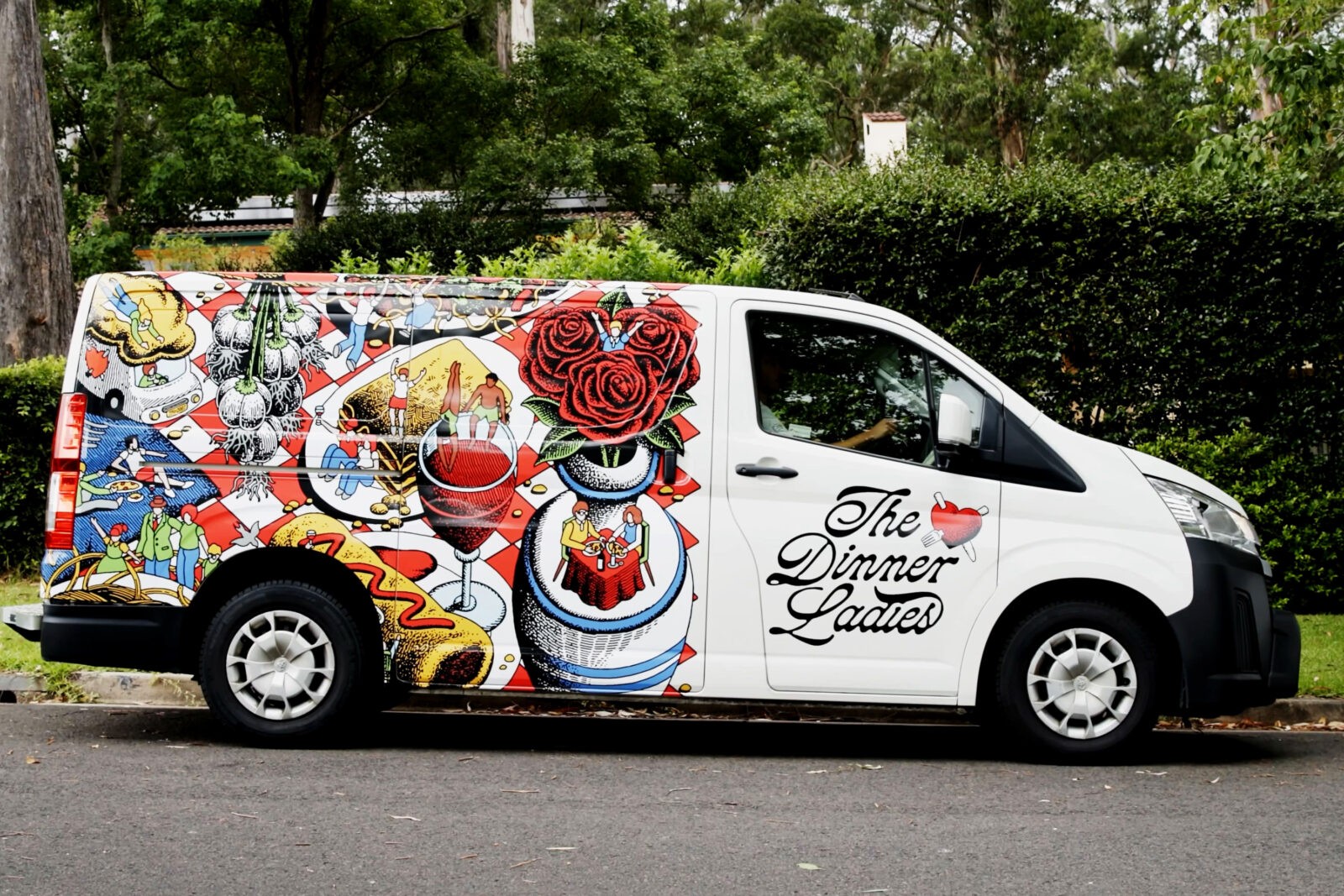
The first step was the refinement of the logo. By decoupling the heart and the script, we gave it flexibility, made it easier to read at every touchpoint and allowed it to scale as needed. The custom heart logo was designed by us and then, alongside the wordmark, handed to illustrator Jake Foreman to redraw and personalise with his iconic texture and gritty stipple.
Ladies in red
The Dinner Ladies’ existing red already had distinct brand attribution in the category so we just refined it with a bright and modern twist. The secondary palette supports our hero red with a balance of warm, approachable and slightly retro hues. When united, the system unlocks a number of interesting and vibrant combinations that are particularly useful across hard-working digital applications.
The no-nonsense type
We used the typeface ‘Denim’ by Displaay Type Foundry to show off the brand’s confident personality yet retain practicality. Denim Wide’s used in headings and CTA applications to command attention, while its regular cut counterpart rounds out the system with a friendly, clean and legible option for subheadings and body copy. With its subtle details, the typeface can be an attention-grabbing hero element that showcases the bold tone of voice but also work alongside more expressive moments.
Saying it with confidence
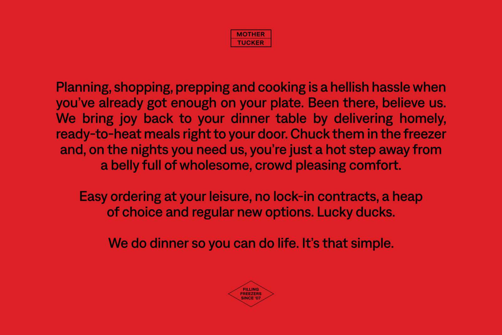
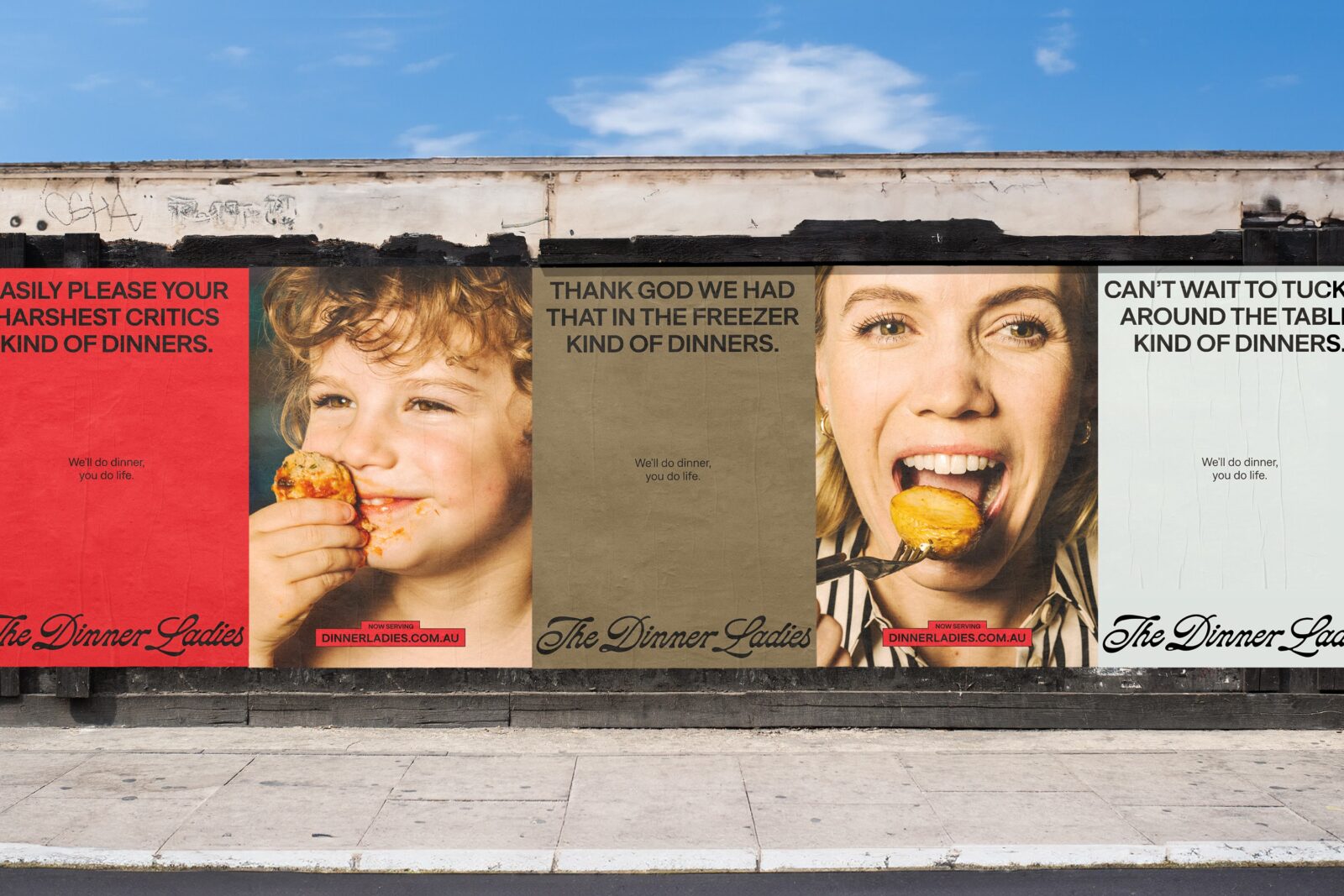
The TOV needed to capture the brand’s joyful, cheeky yet comforting personality, while steering clear of any patronising “mumsy” tropes and stereotypes. We worked with copywriter Cat Wall to develop a verbal identity that balanced the empathetic caregiver with the charmingly rebellious tone of the ladies themselves. In a category saturated with over-sincerity and fake friendliness, the tone offers a refreshing sprinkle of irreverence with a straight-forward, bull-free reflection of the audience and their needs.
Capturing the real life chaos
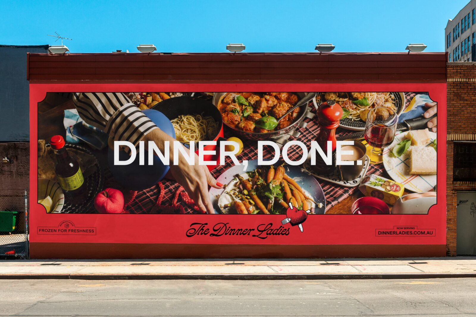
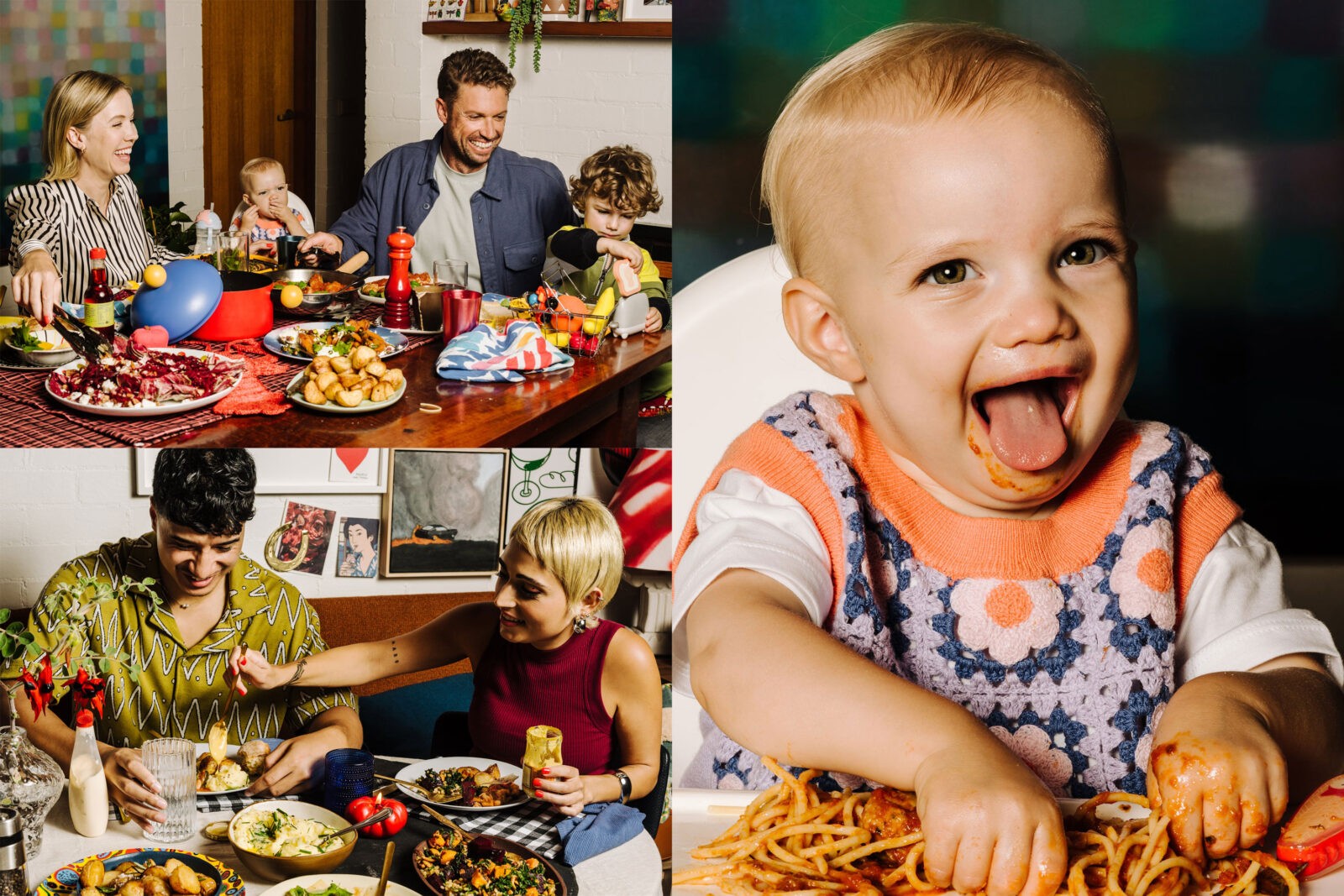
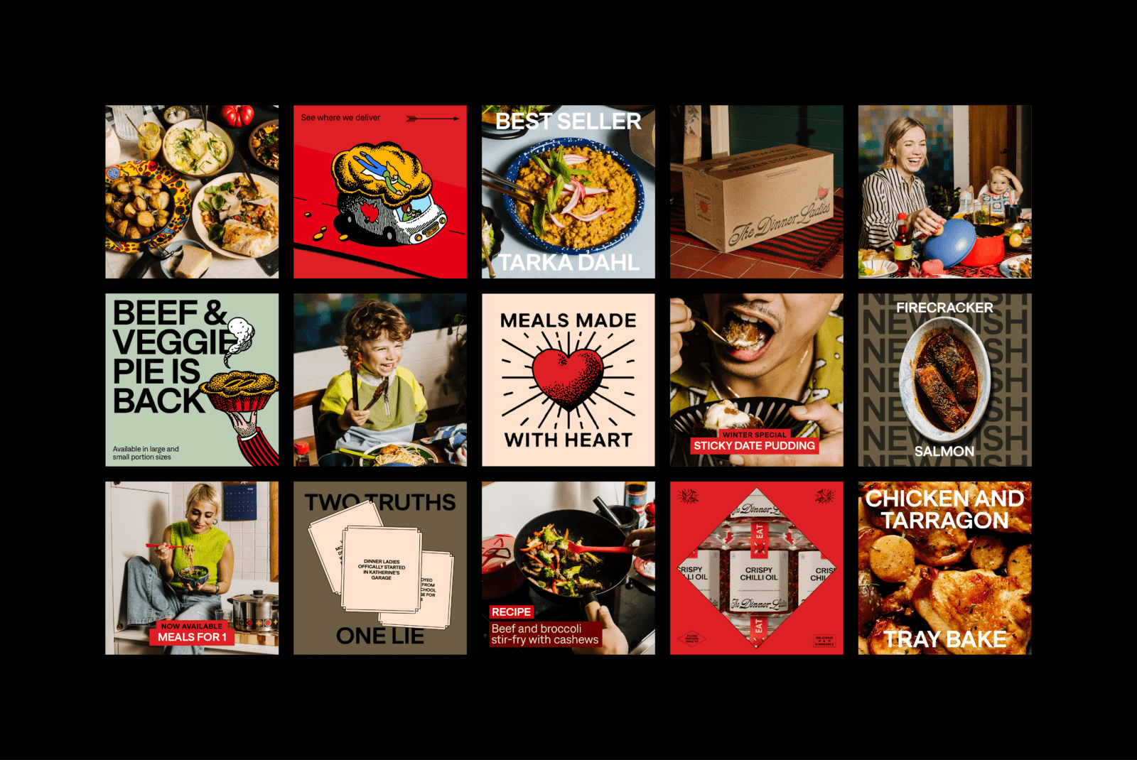
The photography celebrates the authentic messiness of real life dinnertime. A reflection of the brand’s tell-it-like-it-is attitude, the shoot didn’t shy away from capturing raw moments — the remnants of a great dish alongside a new one being served or a bolognese-faced baby — mixed with the joy of sharing generous, mouth-watering food.
With Alana Dimou behind the lens, Jerrie-Joy Redman-Lloyd on styling, Oriana De Luca on wardrobe, Gavin Anesbury with a hair and makeup brush in hand, and Michaela Le on production, the brand came to life. Warm, natural lighting, combined with quirky styling choices, pops of colour or pattern and intentional (and encouraged) chaos set a homely and inviting scene with a pinch of rebellion.
Show and tell
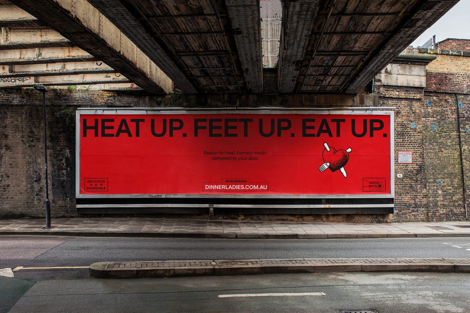
In a world of microwaveable meals and ingredient boxes, it’s easy for consumers to get confused with what exactly it is they are receiving when they hear “ready-to-heat”. Driven by the line “Heat Up. Feet Up. Eat Up.” we worked with director and producer Hugh O’Brien to create a series of videos that highlight The Dinner Ladies unique positioning — a no-fuss, no prep meal delivery service you can throw straight from the freezer, into the oven and onto your dinner table.
Sketching the story of the brand
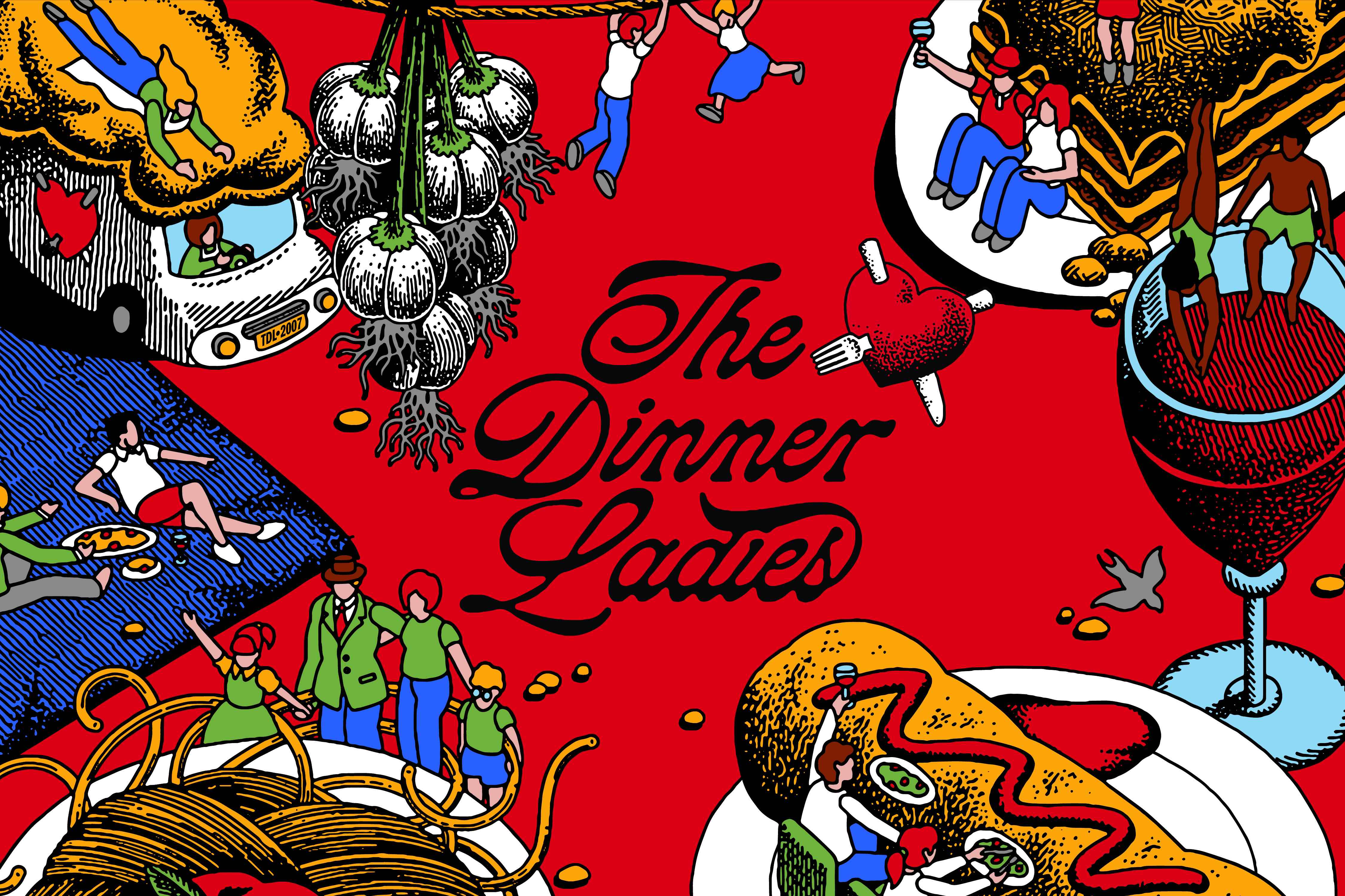
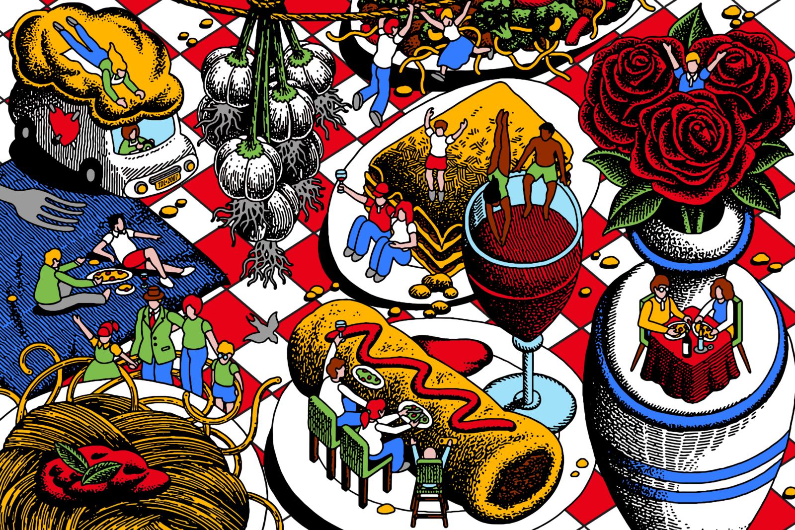
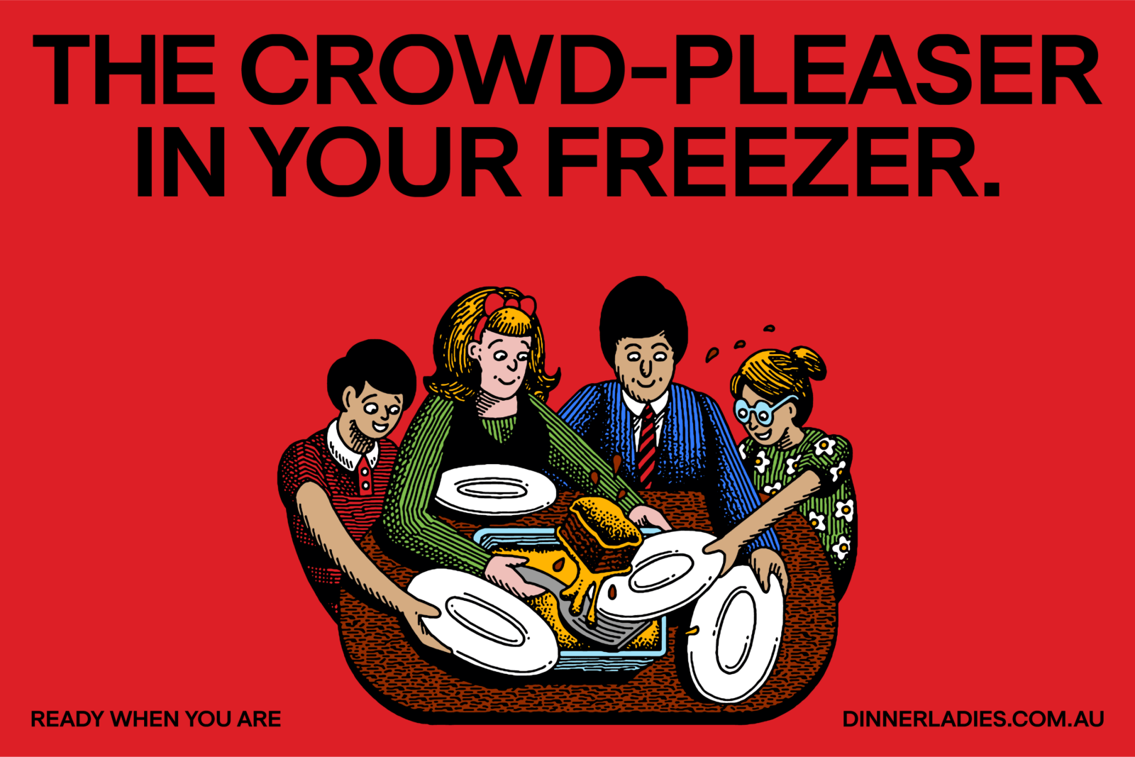
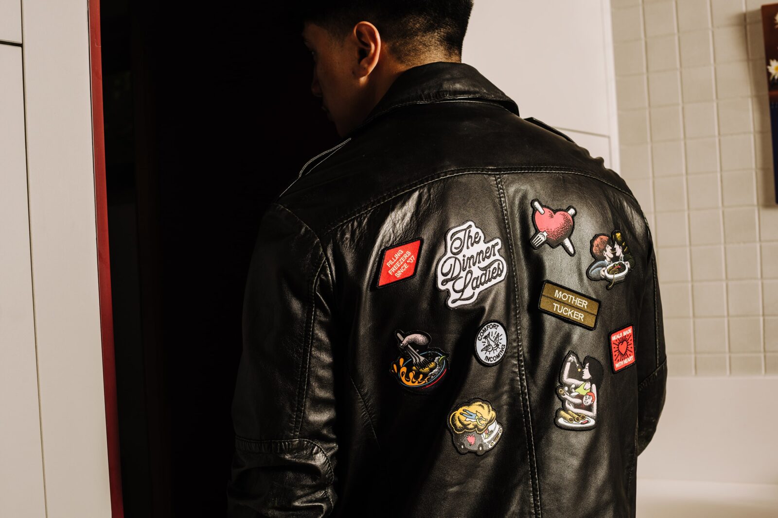
Illustration has always been a major piece of The Dinner Ladies’ brand so we wanted to bring it across to the rebrand. The original illustrations’ punk and rough-around-the-edges flair drew us to references of traditional trad tattoos.
Collaborating with illustrator Jake Foreman, we crafted a suite of illustrations that served as both personality-rich storytelling pieces and functional devices. While the small scenes and spots speak to specific offerings of the brand, the hero illustration speaks to the love behind every Dinner Ladies dish and the comforting shared experiences created around the table.
These illustrations are supported by our suite of type-furniture elements that not only support the main design elements but add character to any layout.
Functionality focused packaging
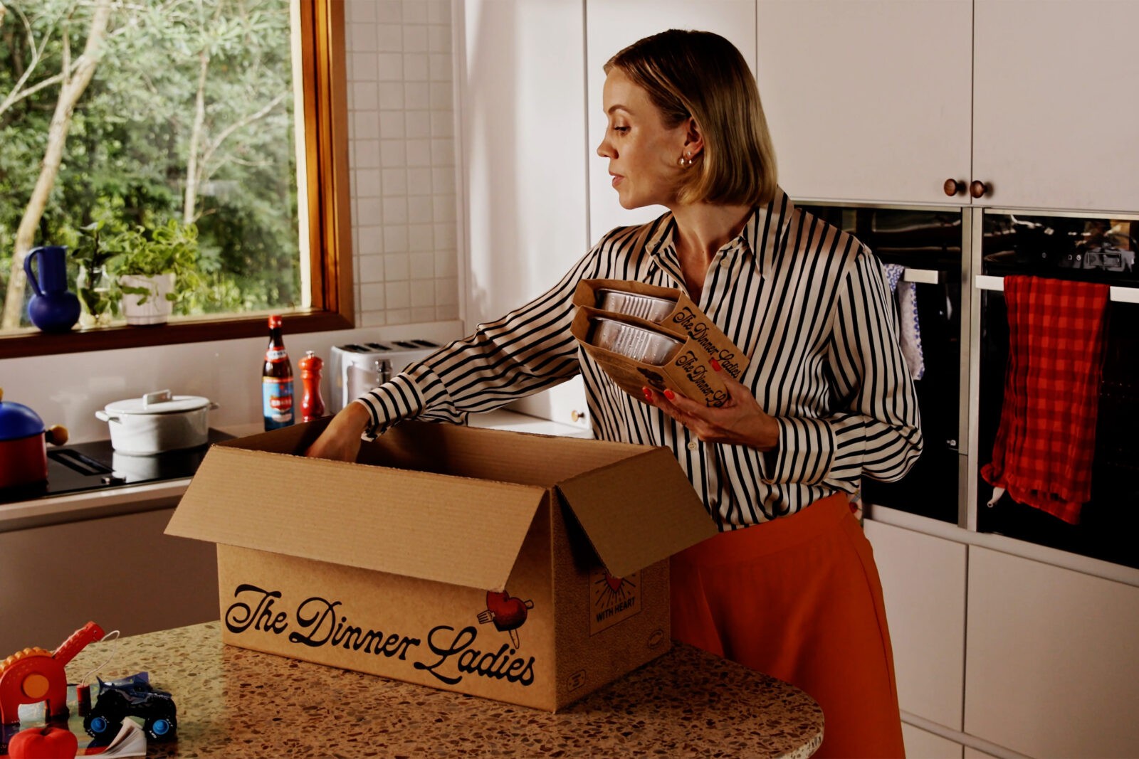
As a product that’s often shoved into the freezer and then reached for in a rush, legibility and easy differentiation were priorities for designing the packaging. A simple colour-coded system helps to distinguish between protein groups at a glance, making it quick and effortless to find the crowd-pleasing meal that’s ready to save the day.
Curating the key customer experience
Onto the digital user experience. Focusing on the main touchpoints, we took a look at wireframes and design across the homepage, product pages, about us page and cart functionality. We upgraded and introduced new features such as quick filters and a bookmarking tool to help customers more easily navigate through the extensive menu, jump to their favourite meals or refine by dietary needs (because it’s already hard enough being gluten-free).
And the end result?
The Dinner Ladies now have a brand that not only celebrates their seventeen year legacy but gives them the tools for future decades of success. The flexible design system and punchy tone of voice pays tribute to their tenacious past, the founding ladies behind the service and their wholesome mission put joy back into dinner time. Now The Dinner Ladies can stand loud and proud with a brand that reflects their readiness to dish up delicious dinners to an entire nation.
CREDIT
- Agency/Creative: Universal Favourite
- Article Title: Universal Favourite Launches a Full Rebrand for The Dinner Ladies
- Organisation/Entity: Agency
- Project Type: Graphic
- Project Status: Published
- Agency/Creative Country: Australia
- Agency/Creative City: Sydney
- Market Region: Oceania
- Project Deliverables: Art Direction, Brand Identity, Brand Redesign, Brand Tone of Voice, Branding, Illustration, Packaging Design, Photography, Web Design
- Industry: Food/Beverage
- Keywords: Universal Favourite, rebrand, The Dinner Ladies
-
Credits:
Universal Favourite: Universal Favourite


