


Dove Haircare – A Bold Global Reinvention, Delivered at Speed
This project marks Dove’s most significant haircare transformation—replacing a 15-year-old legacy design with a modern, premium pack that reflects Dove’s new identity as an expert in damage repair. Designed entirely by the Beauty & Wellbeing in-house design team, the North America range achieved full design lock for pilot tooling in just 12 weeks—an extraordinary milestone that now sets the blueprint for global rollout.
This shift to in-house design has redefined how we create packaging: working collaboratively, moving faster than ever before, and delivering consumer-centric, supply chain–ready solutions without compromising quality. The new pack blends prestige beauty cues with functional innovation—ergonomic forms, skincare-inspired closures, and sustainable materials—creating a desirable, purposeful, and future-fit design that elevates Dove’s brand and delights consumers worldwide.
In under two years, over 500 million units were delivered globally; one global vision executed through multiple regionally tailored solutions. This extraordinary feat to deliver consistent beauty and desirability at scale was only made possible by experienced teams working seamlessly.
An essential packaging transformation to support Dove’s repositioning.
The old design no longer reflected the brand’s evolved purpose or consumer expectations in the damage repair category. As Dove moves into a more premium and expert space, the packaging needed to visually and functionally communicate this shift—both on shelf and in use.
The new design is not just a cosmetic update; it is a strategic tool to:
• Reinforce Dove’s expertise in damage repair
• Align with consumer expectations of premium haircare
• Support brand storytelling through form, material, and finish
A ‘Fit for Purpose’ design for Dove’s reinvention
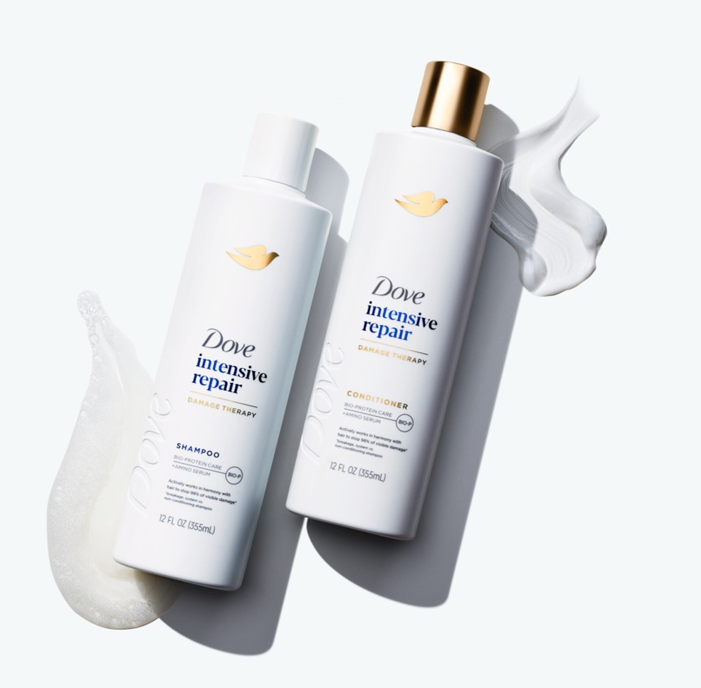
Visually, it aligns with prestige beauty cues—white and gold, minimal typography, and refined silhouettes.
Functionally, it introduces screw-thread necks, pumps, and disc top caps that enhance usability, support refill and reuse, and improve recyclability.
Emotionally, it creates a sense of trust, efficacy, and indulgence—key drivers in the damage repair category.
By combining aesthetic elevation, consumer-centric functionality, and sustainability-led innovation, the new design is a powerful embodiment of Dove’s new brand vision.
The pack design is unmistakably contemporary and elevated:
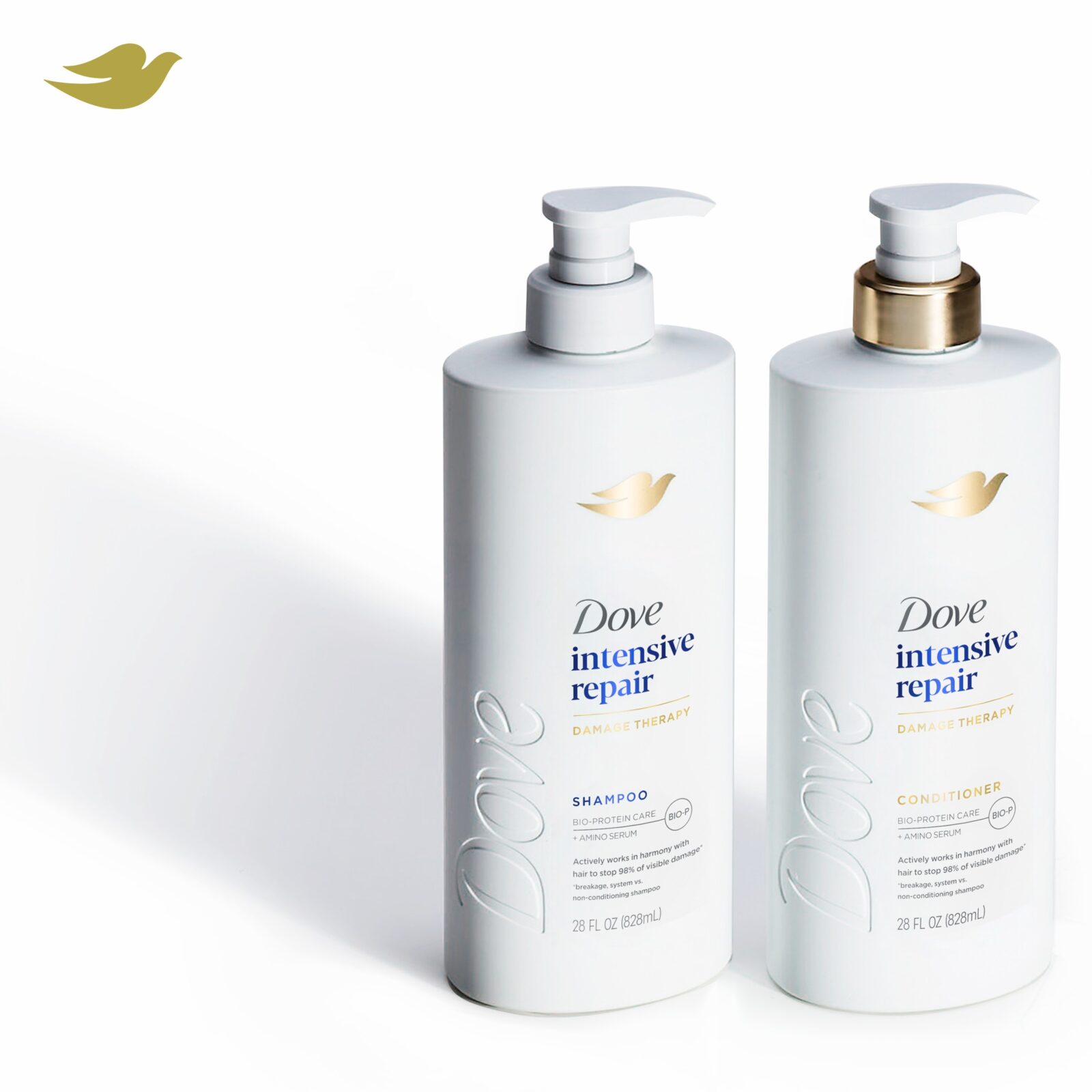
• Monochromatic white base: This is a hallmark of modern skincare packaging, often used by prestige brands to signal purity, minimalism, and clinical efficacy.
• Gold accents: These are not just decorative—they evoke luxury, indulgence, and high value. Metallics denote premium positioning but also nod to the Kintsugi, the Japanese art of repairing broken pottery by mending the breakage with powdered gold lacquer. The use of gold accents communicates the science behind the product using the Kintsugi metaphor that ‘no matter how much something is damaged, it can be reborn stronger and more beautiful’ to consumers in a visual way; Dove’s formulation refills what is lost in the hair’s structure due to damage, making hair 10x stronger.
• Soft curves, clean lines, sharp shoulders: The bottle shapes feels both elegant and approachable—again echoing skincare norms where form is designed to soothe and invite touch. The balanced silhouette feels refined and uncluttered.
• Typography and layout: The restrained use of text, with clear hierarchy and generous white space, mirrors the editorial style of high-end skincare, where less is more and clarity equals confidence.
Creating desire and trust; driving intent to purchase through design
The pack is designed to emotionally resonate with consumers who are seeking efficacy with elegance:
• Visual codes of care and repair: The white and gold palette, combined with the term “Intensive Repair,” creates a clinical-meets-luxury impression—like a treatment you’d find in a salon or dermatology clinic.
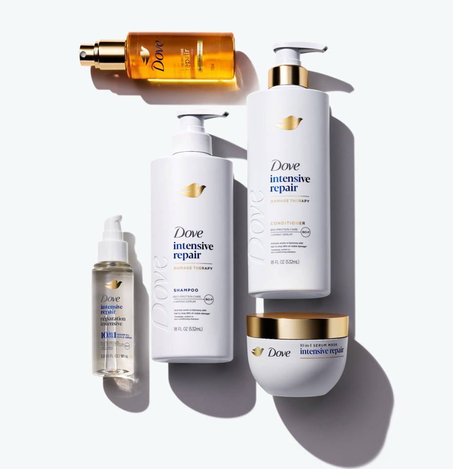
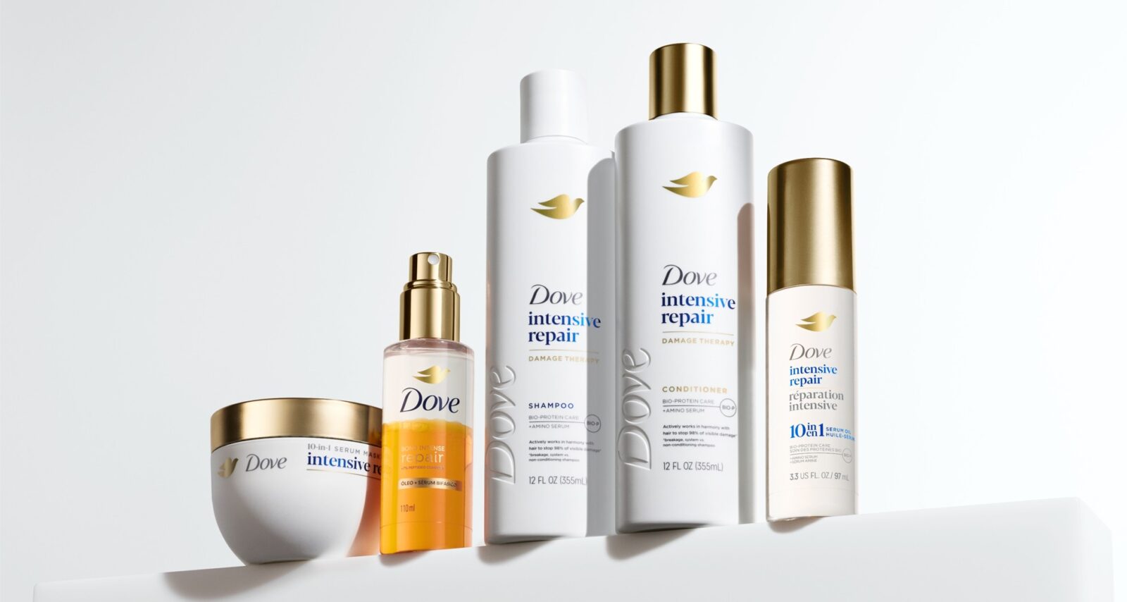
• Unified system design: Seeing the shampoo, conditioner, serum, and mask together reinforces the idea of a complete regimen, which is a strong cue from skincare—encouraging consumers to commit to the full experience.
• Subtle prestige cues: The understated branding and lack of clutter suggest confidence and quality. The product doesn’t need to shout, because it knows it works; a psychological trigger often used by premium brands to build trust and desire.
The form isn’t just beautiful—it’s intelligently executed:
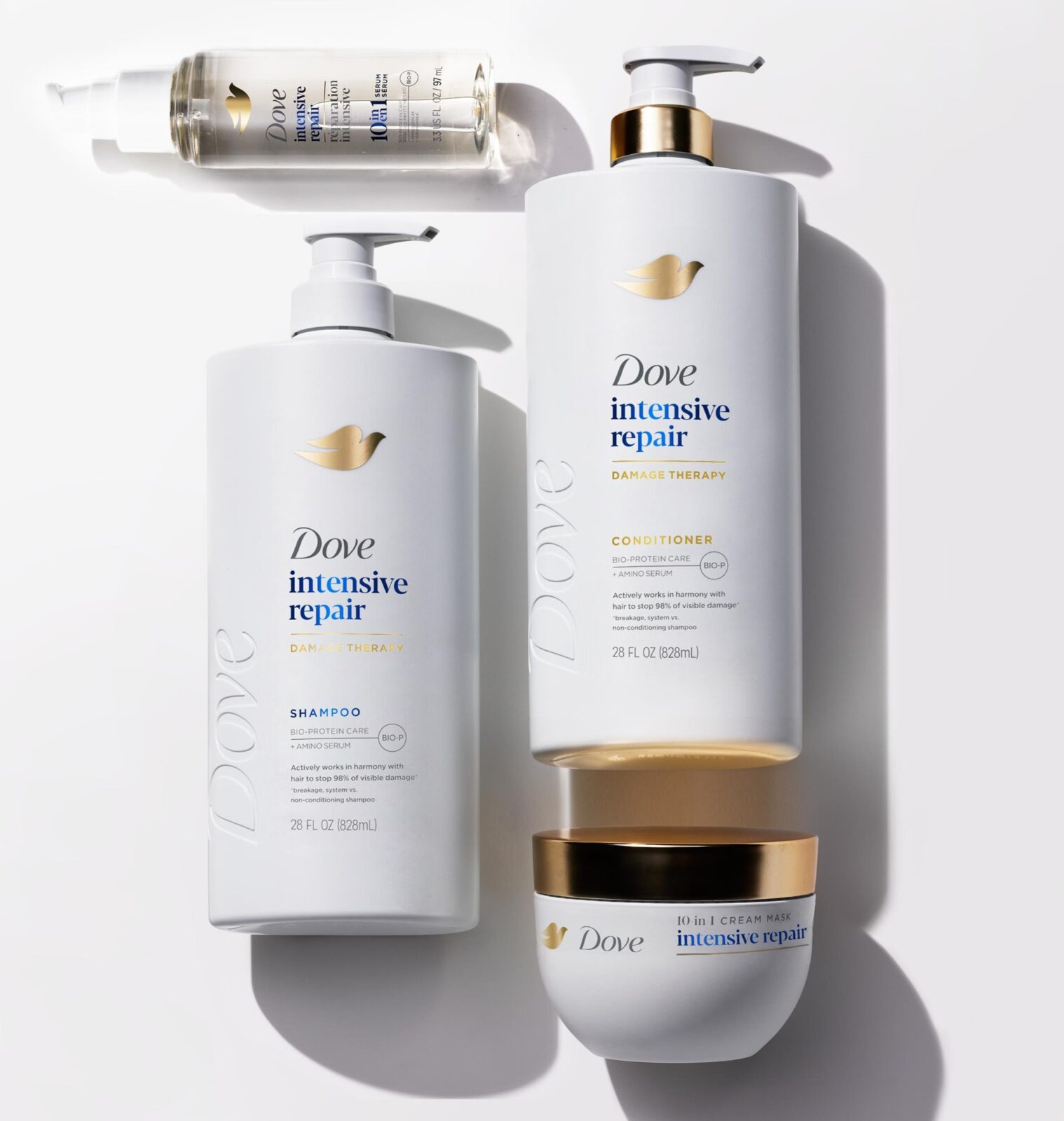
• Pump dispensers: These are not only ergonomic but also elevate the experience, making the product feel more like a skincare serum or lotion than a basic haircare item through controlled dose delivery.
• Tactile appeal: The smooth, matte finish and rounded contours invite handling and the debossed logo creates intrigue, enhancing the sensory experience—a key factor in desirability and repeat purchase.
• Shelf impact and bathroom presence: The pack looks beautiful on display, whether in-store or at home. It’s designed to be attractive and draw the eye, reinforcing the idea that this is a product you’re proud to own and show off.
Beautiful yet efficient and easy to use
The new pack design introduces a refined oval bottle with a sharp shoulder profile and screw-thread neck, delivering a modern and premium aesthetic. The oval form is ergonomically optimised to fit securely and comfortably in the hand, ensuring a confident grip during use.
Two closure systems are employed across the range: disc top caps for smaller formats and pumps for larger packs. This replaces the previous snap-on flip-top closures, which were prone to hinge fatigue and limited consumer access to residual product. The new screw-thread neck enables easy removal of the cap, allowing consumers to fully empty the pack and supporting future refill and reuse propositions.
The disc top caps offer improved durability while remaining intuitive to open and close. Their hinge-free design allows for metallisation, enhancing shelf appeal and enabling clear visual differentiation between shampoo and conditioner variants.
Pumps are now featured more prominently across the range, drawing on skincare category cues to elevate the consumer experience. They provide precise dosage control and a seamless in-use experience, particularly beneficial for larger formats that may be more difficult to handle with wet hands.
As with the disc top caps, conditioner pumps are metallised to deliver a more premium finish compared to the previously used gold masterbatch. The reflective surface not only enhances aesthetic value but also improves on-shelf navigation and in-use identification between product types.
Differentiation driven through innovation
The old design relied on blue accents and a blue cap, with the product name enclosed in a blue box. This visual language was consistent with Dove’s traditional daily care identity—clean, simple, and familiar. While recognisable, it lacked standout features on shelf and was visually similar to other mass-market haircare products.
Whereas, the new pack introduces a white and gold palette, with gold caps and a more prominent gold Dove logo. The product name is now displayed in clean blue text directly on the bottle, removing the coloured box for a more minimalist and modern look. Overall, the new design is visually elevated, creating stronger shelf impact and clearer differentiation from competitors and from Dove’s previous identity.
The new pack design reflects a strategic shift from functional daily care to premium damage repair expertise.
Material and structural upgrades include:
• Screw-thread necks for easier product access, refill, and reuse.
• Disc top caps and pumps replacing flip-top closures, improving durability and user experience.
• Metallised closures (enabled by hinge-free designs) enhance premium cues and support visual differentiation between shampoo and conditioner.
• The inclusion of skincare-inspired pumps aligns with prestige beauty norms, offering controlled dosage and a more refined in-use experience.
These changes are not just aesthetic—they support Unilever’s sustainability goals by enabling recyclability, reuse, and clearer disposal guidance.
The new design supports the brand vision and proposition; marking a bold reinvention of Dove’s haircare identity.
The use of gold and white draws on prestige skincare codes, elevating Dove’s perception from mass-market to premium care.
The cohesive system design across shampoo, conditioner, serum, and mask reinforces Dove’s expertise and authority in hair damage solutions.
By aligning with luxury and skincare aesthetics, the new pack supports Dove’s ambition to be seen not just as a trusted brand, but as a leader in advanced haircare.
Sustainability
Dove is one of the most trusted and beloved beauty brands globally, recognised for its commitment to care—not only for people but also for the planet. As plastic waste continues to pose one of the most pressing environmental challenges, Dove is taking decisive action to eliminate virgin plastic use and embrace alternative materials and packaging innovations wherever possible.
Our latest pack design has been purposefully crafted to support a circular economy and contribute meaningfully to Unilever’s sustainability goals, which include:
• Reducing our virgin plastic footprint by 30% by 2026 and 40% by 2028 (vs. 2019 baseline)
• Using 25% recycled plastic in our packaging by 2025
• Ensuring 100% of our rigid plastic packaging is reusable, recyclable, or compostable by 2030
The new design delivers against these commitments through a series of considered material and structural choices:
• Bottles are made from HDPE resin, a material widely accepted in recycling streams globally
• Where regionally available, bottles use up to 100% post-consumer recycled HDPE, significantly reducing reliance on virgin resin
• White masterbatch is used to ensure compatibility with NIR (Near Infrared) detection systems in recycling facilities, aiding efficient sorting
• Screw-thread necks enable easy removal of closures, allowing consumers to fully empty the pack and facilitating refill and reuse
• Component separation at end-of-life is simplified through the screw-thread design, supporting recyclability
• Region-specific recycling guidance labels are applied to packs to help consumers dispose of packaging correctly and direct materials into the appropriate waste stream
This design not only elevates Dove’s sustainability credentials but also empowers consumers to participate in responsible consumption—without compromising on beauty, performance, or ease of use.

CREDIT
- Agency/Creative: Unilever Research & Development
- Article Title: Unilever Research & Development Redesigns Dove Haircare With a Premium Global Packaging System
- Organisation/Entity: In-House
- Project Status: Published
- Agency/Creative Country: United Kingdom
- Agency/Creative City: Wirral
- Project Deliverables: 3D Design, 3D Modelling, 3D Motion, Animation, Augmented Reality, Brand Redesign, Design, Industrial Design, Packaging Design, Packaging Guidelines, Product Design
- Industry: Beauty/Cosmetics
- Keywords: WBDS In-House Design Awards 2025/26 , Packaging, redesign, innovation, desirability, premium, expert, sustainability
-
Credits:
Senior Vice President Global Dove: Berengere Loubatier
Beauty & Wellbeing Packaging Design Director: Chris Weir
Beauty & Wellbeing Senior Packaging Design Engineer: Joseph Gibbins
Beauty & Wellbeing Packaging Manager: Lee Dewson
Beauty & Wellbeing Senior Packaging Technologist: Rhian Burrows
Beauty & Wellbeing Senior Packaging Technologist: Bernardo Perillo-Marcone
Beauty & Wellbeing Packaging Technologist: Kathryn Norris
Beauty & Wellbeing Packaging Technologist: Conor Greenwood


