


Taxi Studio – Carlsberg
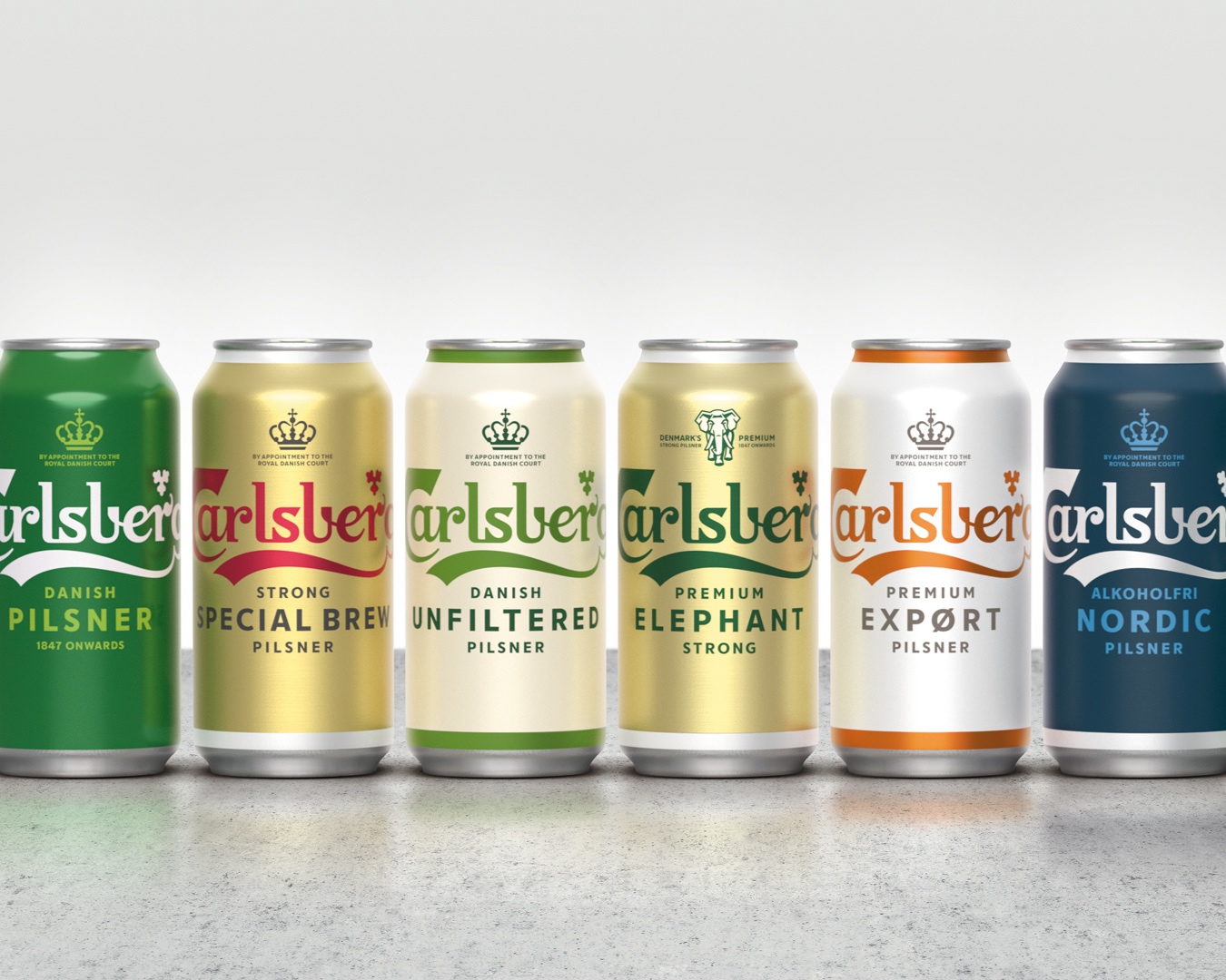
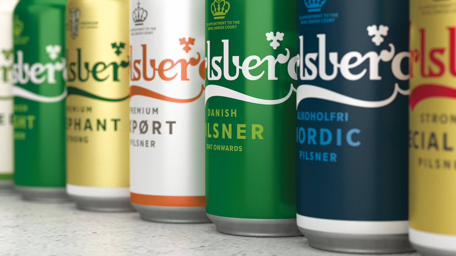
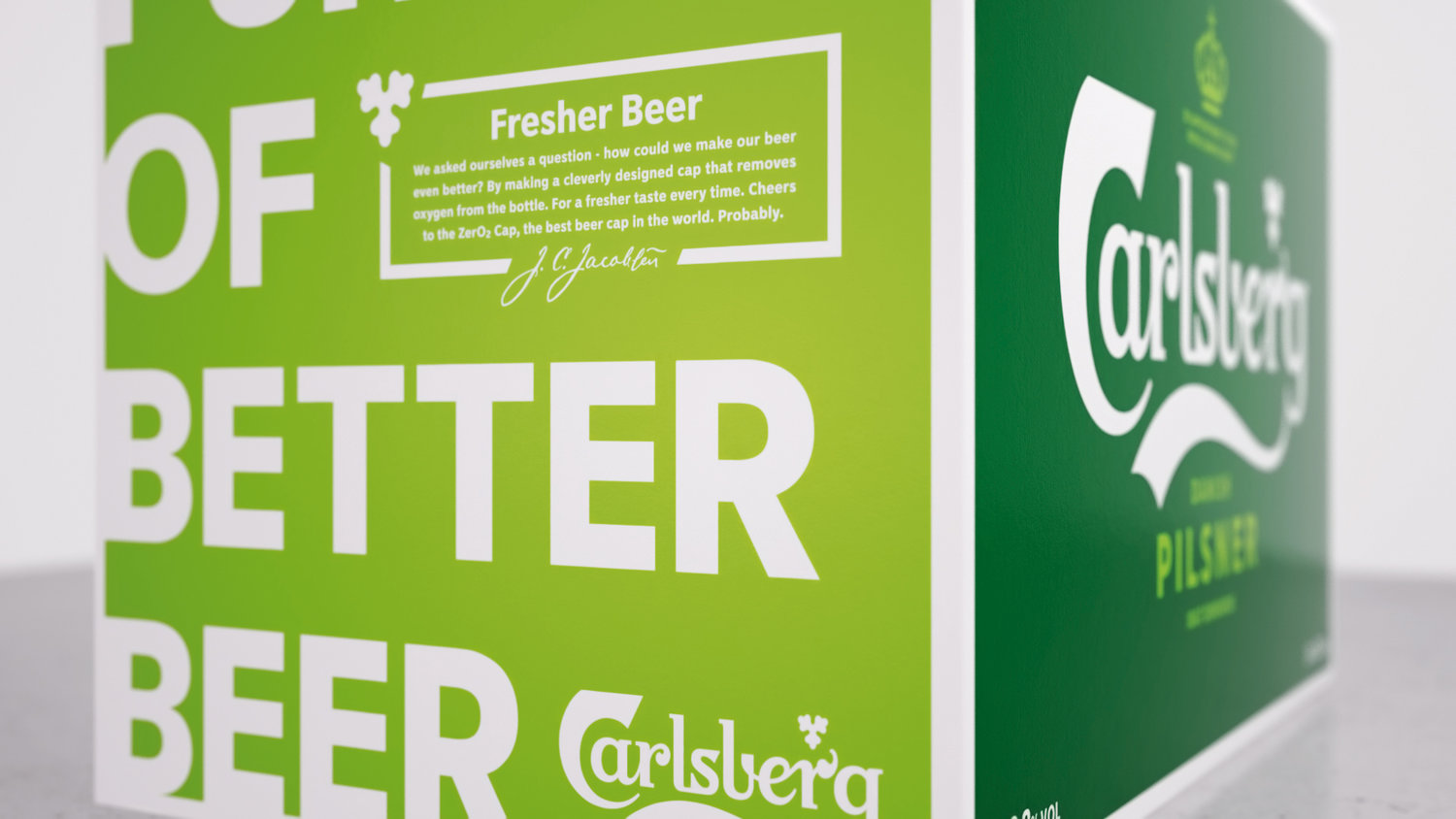
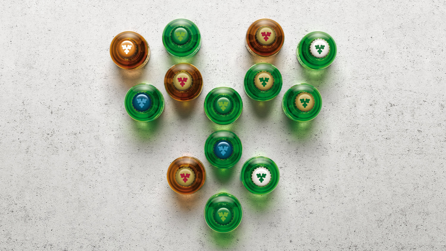
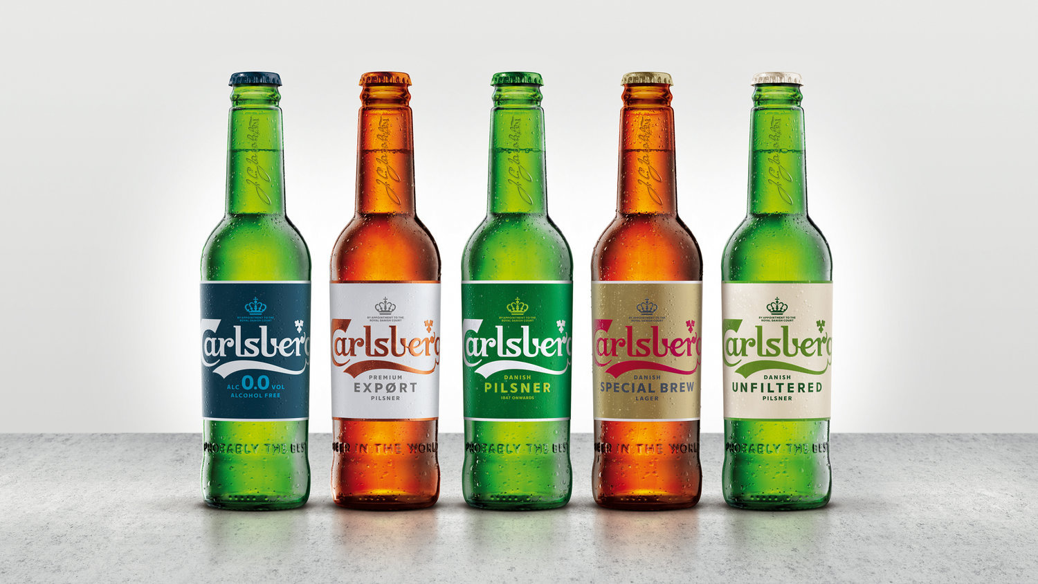
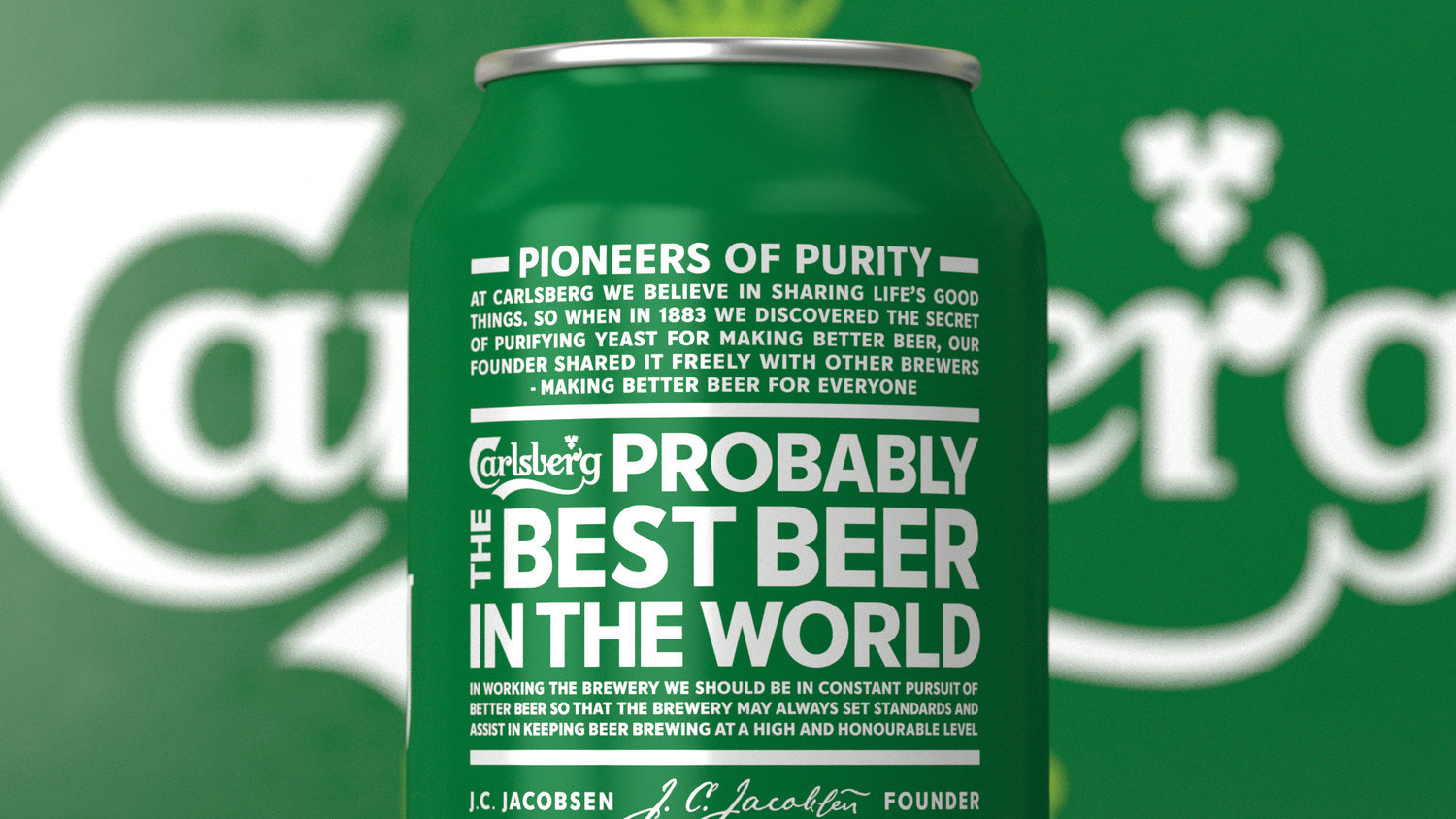
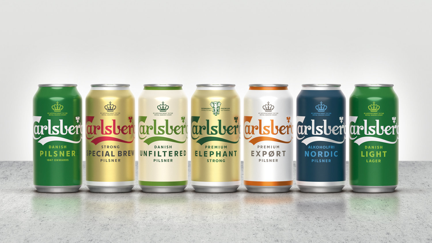
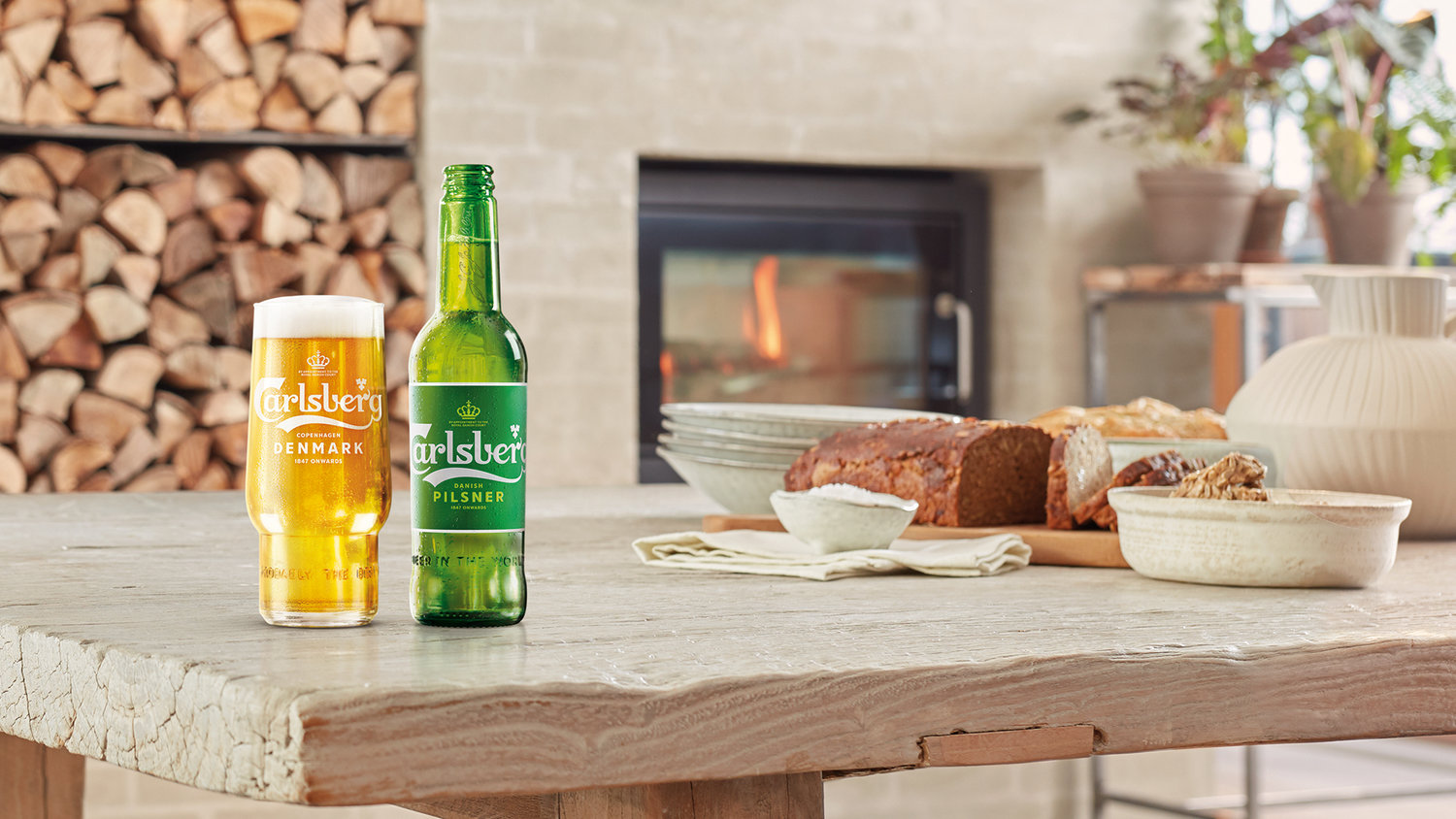
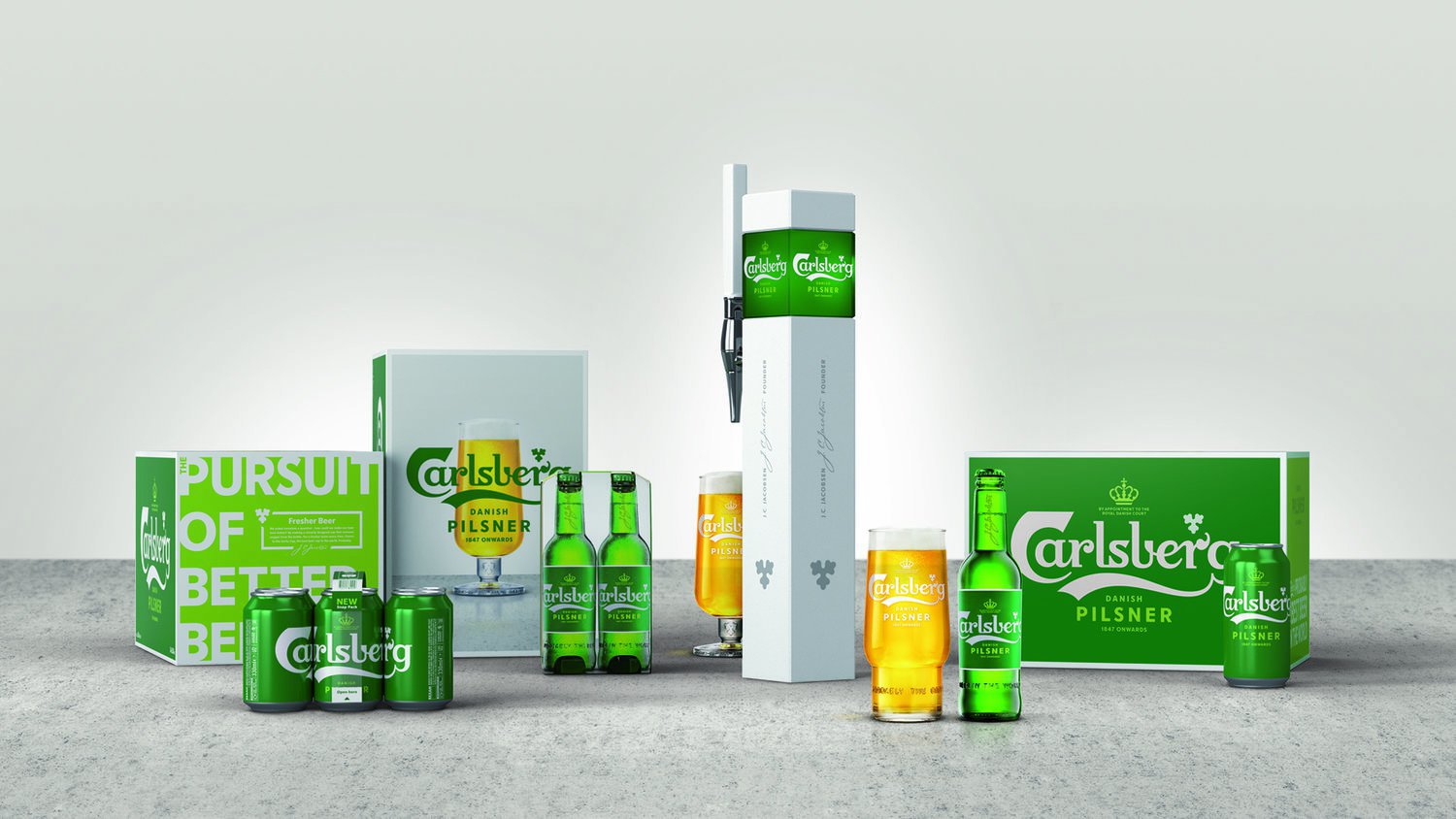
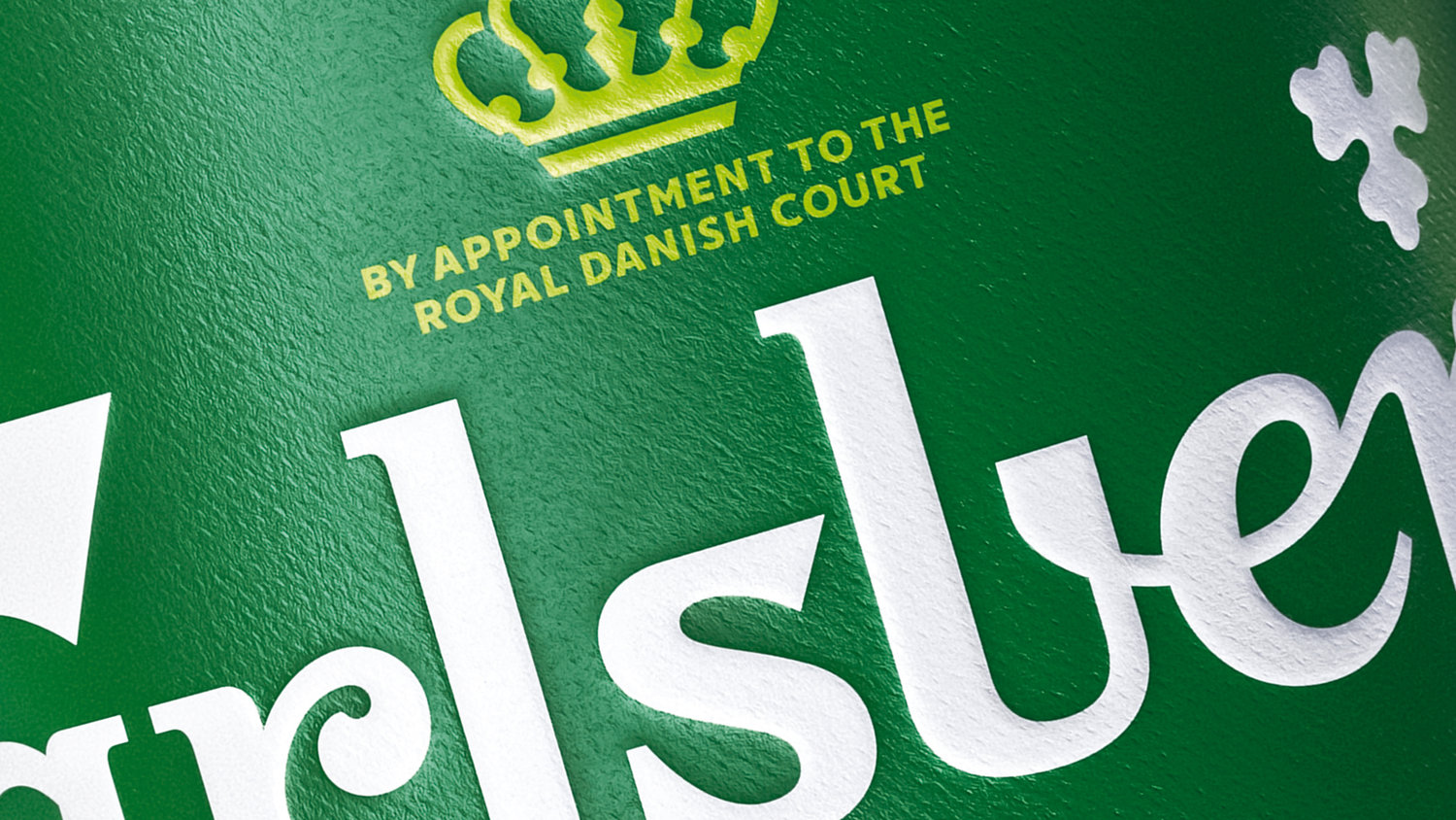
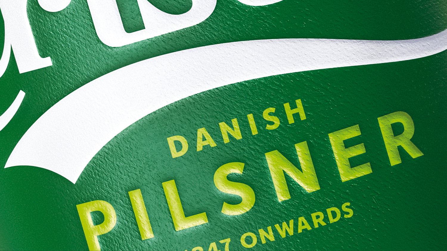
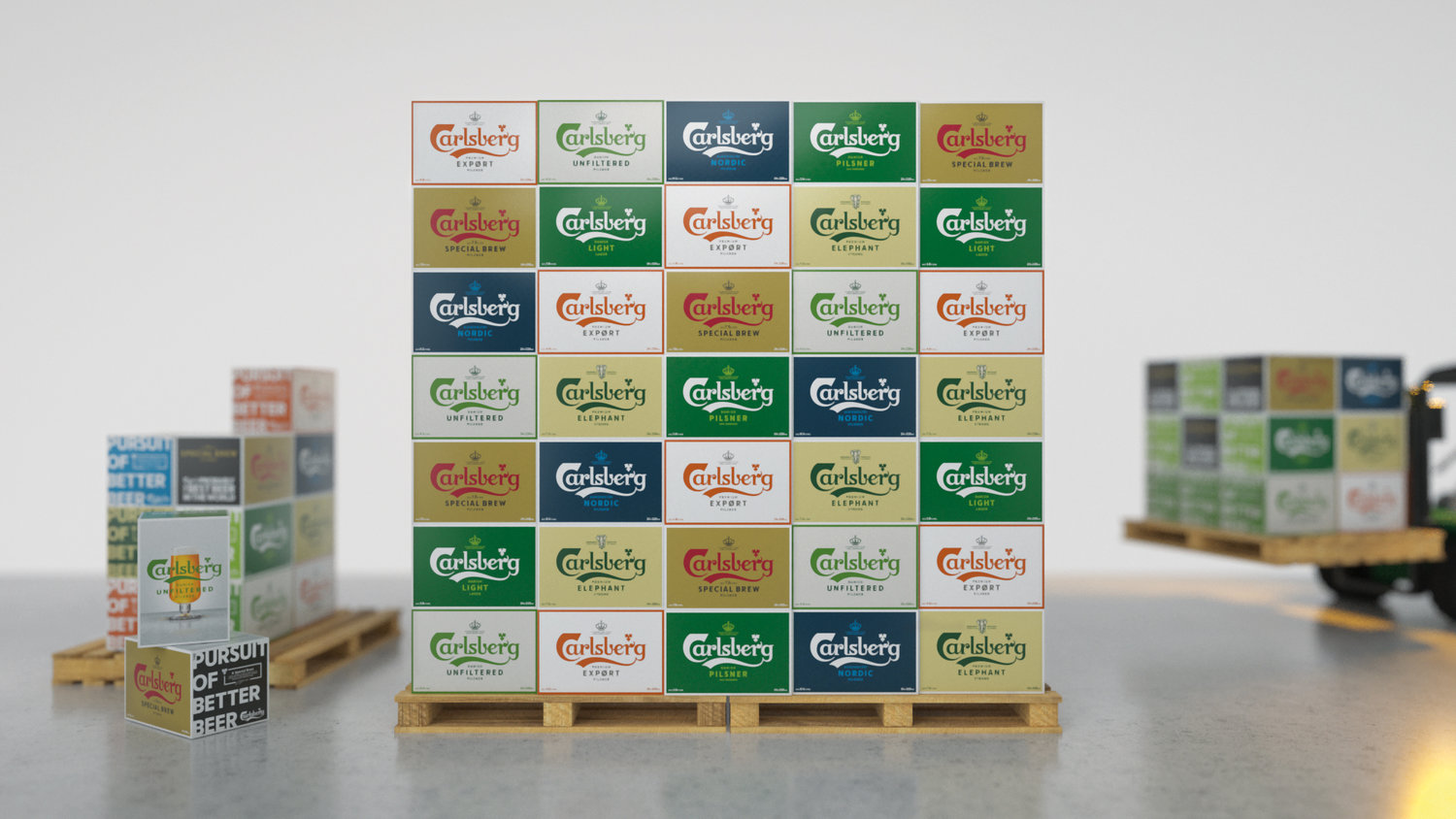
This versatile brand toolkit is crafted to last, bucking the trend for obsolescence. At the heart of our global Carlsberg rebrand is a simple phrase: “In constant pursuit of better.” Drawn from the so-called ‘Golden Words’ penned by Carlsberg founder JC Jacobsen, this pledge drives everything from the quality of the brew, to the company’s sustainability credentials, to how its brand is presented to the world.One of the challenges that we had to overcome was that Carlsberg was perceived very differently in its various markets. In the UK, for instance, its reputation was poor compared to markets such as India and Malaysia, where it’s considered premium.With no holistic look and feel to tie the different regional variants together, or clear set of rules to govern how different assets were used, the Carlsberg brand was also presented inconsistently from market to market. Accordingly, another challenge was to unify all expressions of it as part of a coherent, master brand-led system.Spencer Buck, creative partner at Taxi Studio, says: “We created three design principles that are the guardrails for the Carlsberg brand, and its visual manifestation. First is crafted authenticity: each element is designed with care, thought and purpose. Second is Danish by nature, which encapsulates how Danish modernity and functionality is reflected in the brand. And third is progressive ingenuity, which combines Carlsberg’s pioneering mindset with a dose of the brand’s wit.”Carlsberg’s sustainability agenda was baked into the heart of the brief, which meant designing the system for longevity rather than obsolescence in a few years. As part of a root-to-branch overhaul, every aspect was carefully re-crafted, striking the perfect balance between form and function – the cornerstone of great Danish design.We brought designer and lettering artist Tom Lane on board to agonise over the finer details. Drawing on Carlsberg’s 2.5km of archives for reference, Lane helped craft a set of brand assets that remained faithful to the brand’s heritage, while being timeless enough to be fit-for-purpose long into the future.Jessica Felby, design director on the project for Carlsberg, adds: “We wanted it to be so beautiful that you wanted to hang it on the wall, but it also needed to work in all kinds of practical situations.”While it retains the brand DNA of its predecessor, the new logo is more streamlined and elegant. Key refinements include a wider, more natural inner space for the first ‘r’, and a more organic terminal for the second ‘r’; a more fluid transition between the ‘b’, ‘e’ and ‘r’ of ‘berg’; a more balanced, evenly-weighted ‘s’; and the reintroduction of a curved end for the distinctive swoosh underneath.The shape and placement of the swoosh was also carefully considered so that typography could sit centrally beneath the logo for the first time in its history. Buck adds: “When we re-crafted the Carlsberg logo, we enabled something that wasn’t previously possible – locking elements up with it, to create a visually balanced holistic system.”For the core master brand, three lines of text sit beneath the logo: ‘Danish / Pilsner / 1847 onwards’. This three-deck lock-up is consistent across the whole range – incorporating, for instance, ‘Danish Unfiltered Pilsner’, ‘Smooth Draught Pilsner’ and ‘Strong Special Brew Pilsner’, as well as being adapted to suit market-specific variants such as extra-strong Elephant (India) and the alcohol-free Nordic (Scandinavia).In keeping with JC Jacobsen’s Golden Words, the narrative of ‘betterment’ is weaved throughout the product hierarchy. The variants are divided into three categories – ‘good’, ‘better’ and ‘best’ – with visual cues, such as a progressively darker bottle colour, identifying the increasingly premium nature of the brews with the same unifying brand language.Colour is also a crucial part of the master brand-led identity system. Inspired by the natural greens of the buds and mature leaves of the hop plant, two core brand colours were developed – a dark ‘Leafy Green’, with a light, zingy ‘Hoppy Green’ as an accent. But the coherent brand language also enables a broad range of different palettes to be introduced across the global portfolio.Alcohol-free variants invert the palette, using a green logotype on white with a soft grey accent, while Nordic replaces Rich Green for a navy blue. Special Brew combines beige and maroon and has been totally repositioned as a desirable premium offering in the ‘better’ tier. At the ‘best’ end of the scale, 1883, uses a maroon logotype on a soft grey background, to complement its rich, dark-brown bottle.Other core brand elements have also been re-crafted as part of the wider holistic vision. The Carlsberg hop leaf had become increasingly stylised over the years, and its natural origins had been lost. Tom Lane helped develop a more organic and realistic leaf shape, echoing the ‘C’ curve in the logo to tie the brand elements more closely together, as well as increasing the space between segments to aid legibility at small sizes.Previous versions of JC Jacobsen’s signature had encountered conflicting issues of either being too spindly and illegible, or too ‘vectorised’ and fake-looking. The re-crafted asset encapsulates that perfect Danish balance of form and function, maintaining an authentic ‘signature’ feel without sacrificing legibility in application.Both elements are used on pack to signpost stories of betterment, ranging from Carlsberg’s pioneering heritage – such as the development of a pure strain of brewer’s yeast, gifted to the world by Jacobsen in the interests of better beer for all – to modern-day innovations, such as the Snap Pack, which reduces the plastic required in multipacks of can by up to 76%.The final part of the versatile brand toolkit is a bespoke brand typeface. Developed in partnership with type foundry LucasFonts, using a character set designed by Tom Lane, it perfectly complements the re-crafted logotype. Combined with the full complement of new Carlsberg assets and a strong, coherent brand language, this new typeface will help ensure consistency of application across the global portfolio for decades to come.The rejuvenated Carlsberg brand launched in Scandinavian markets in September 2018 and will be rolled out globally during 2019.
CREDIT
- Agency/Creative: Taxi Studio
- Article Title: Unifying Carlsberg’s Global Markets With a Holistic Design System
- Organisation/Entity: Agency, Published Commercial Design
- Project Type: Packaging
- Agency/Creative Country: United Kingdom
- Market Region: Global
- Format: Bottle, Box, Can, Cup, Sleeve, Tin, Wrap
- Substrate: Glass, Metal, Plastic, Pulp Board, Pulp Carton


