


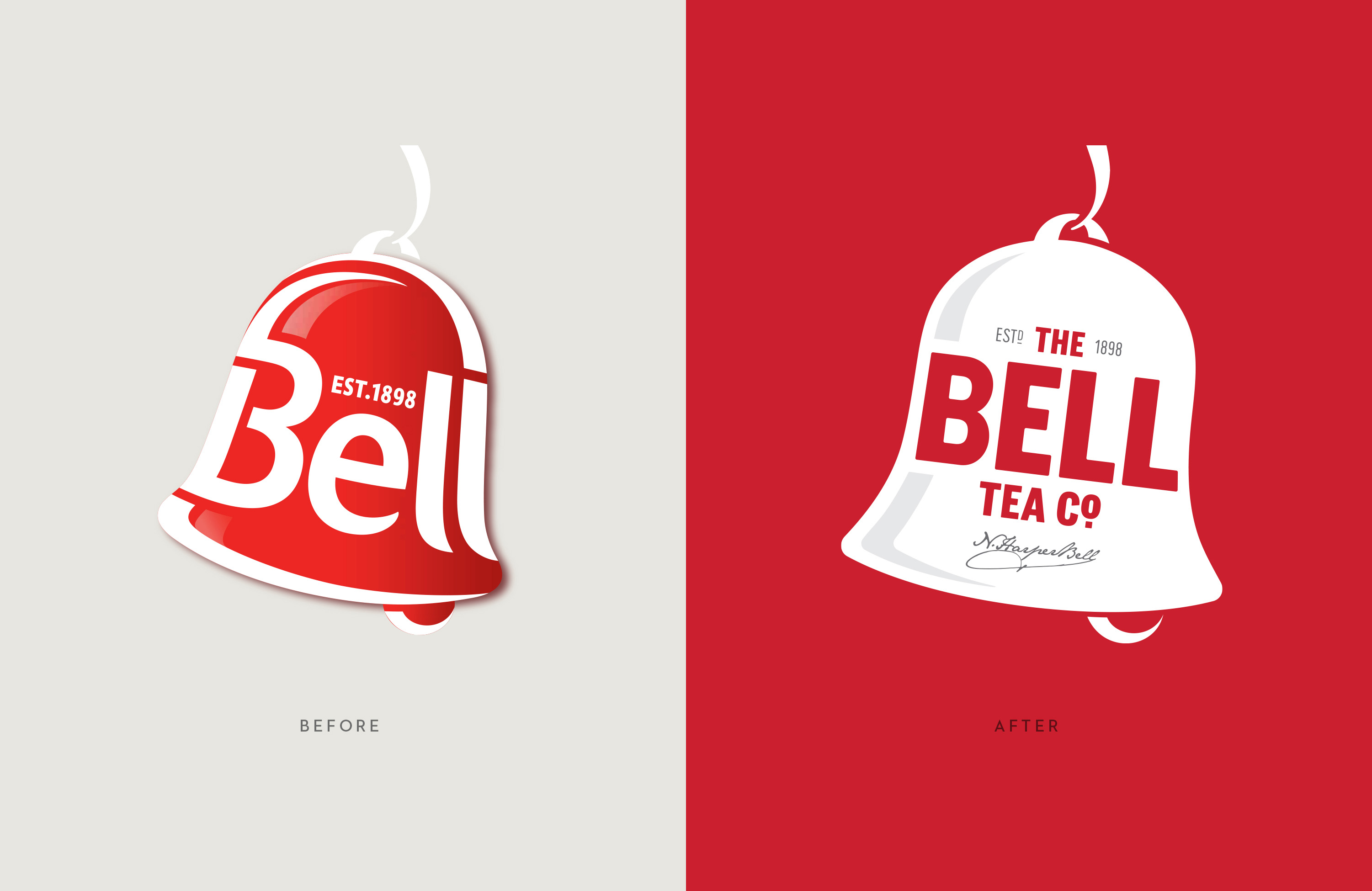
Bell Tea is an iconic Kiwi brand with a long, proud history. However over time Bell lost its way and was in real trouble. It became known as a gumboot tea brand and was losing relevance in the modern retail landscape.
We worked with JDE and The Enthusiasts, to reinvent and refresh the Feel Alive Flavour proposition that was long associated with the brand. This proposition injected life and flavour through movement and energy, something that was sorely missing in the category where everything felt low energy and genteel.
Our solution was to develop a semiotic that captured the ‘Feel Alive Flavour’ proposition while modernising and premiumising the brand. With tea being a very traditional category and Bell, a classic big FMCG brand – the task was going to be a challenge.
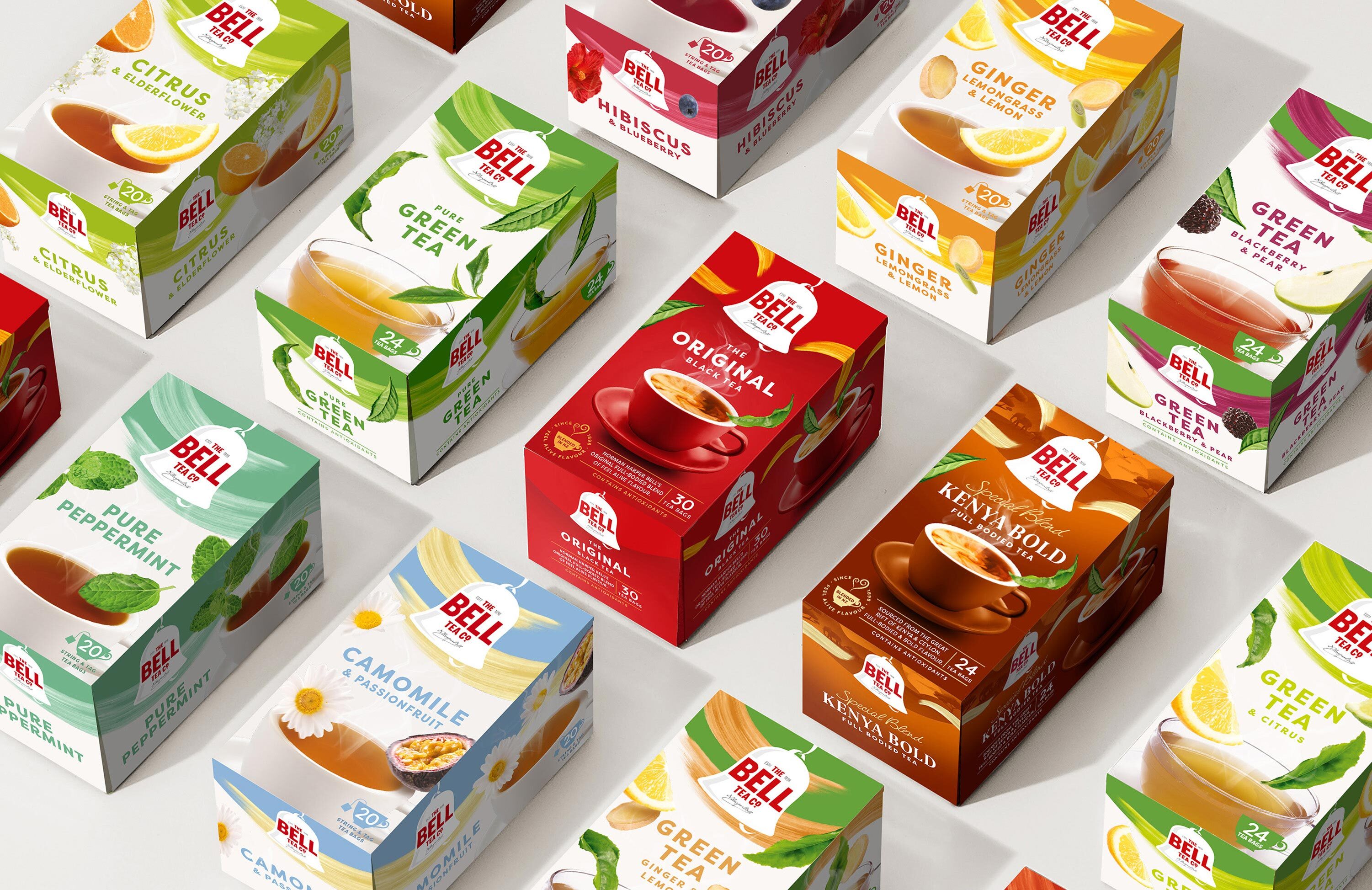
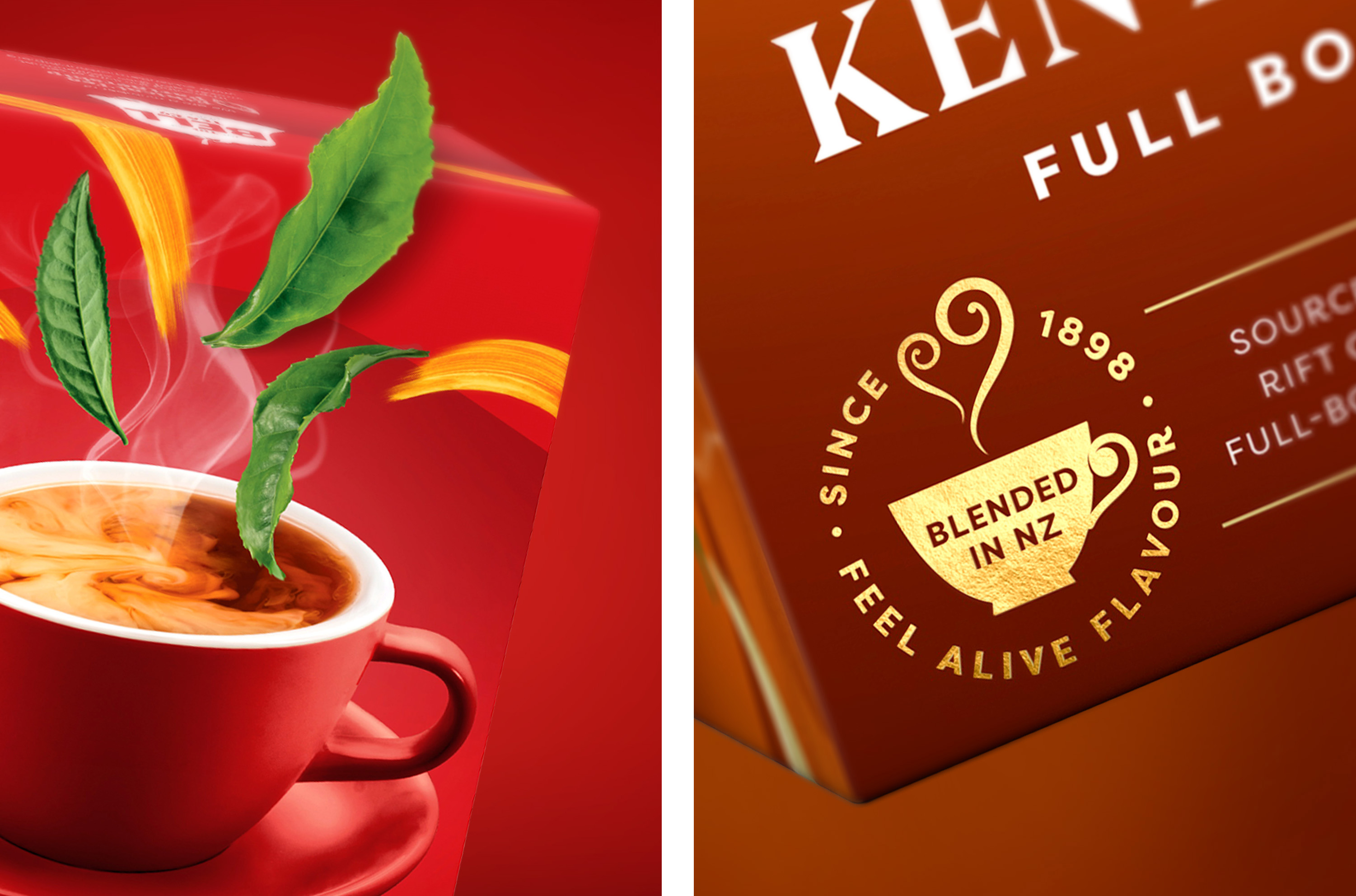
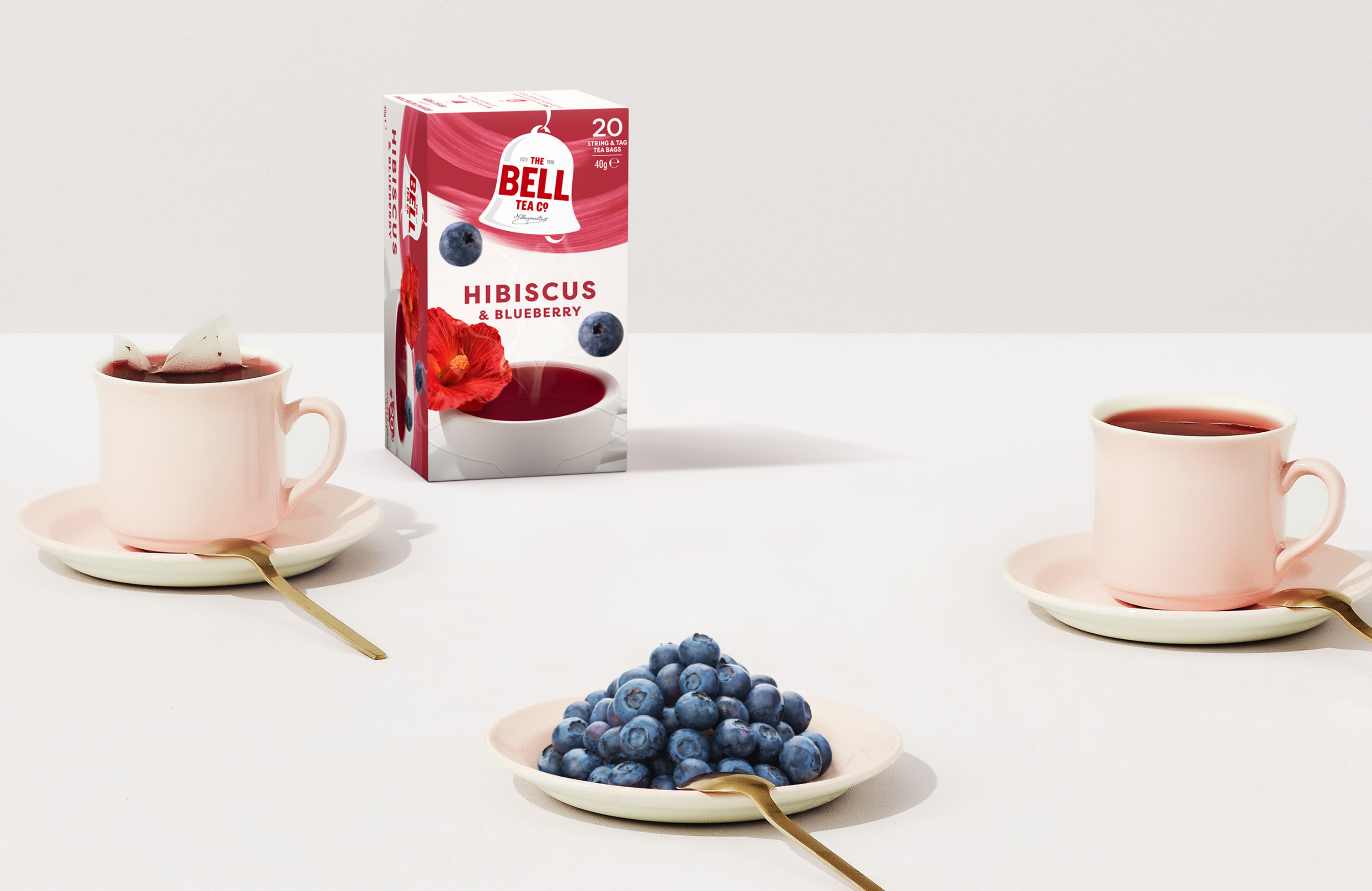
We utilised our validation process to understand the Bell consumer and how they decode the Bell Tea design language. Keeping people’s cups of tea on pack was a must. They loved seeing depth, shadows and ingredients – anything ultra contemporary and simplified wasn’t right.
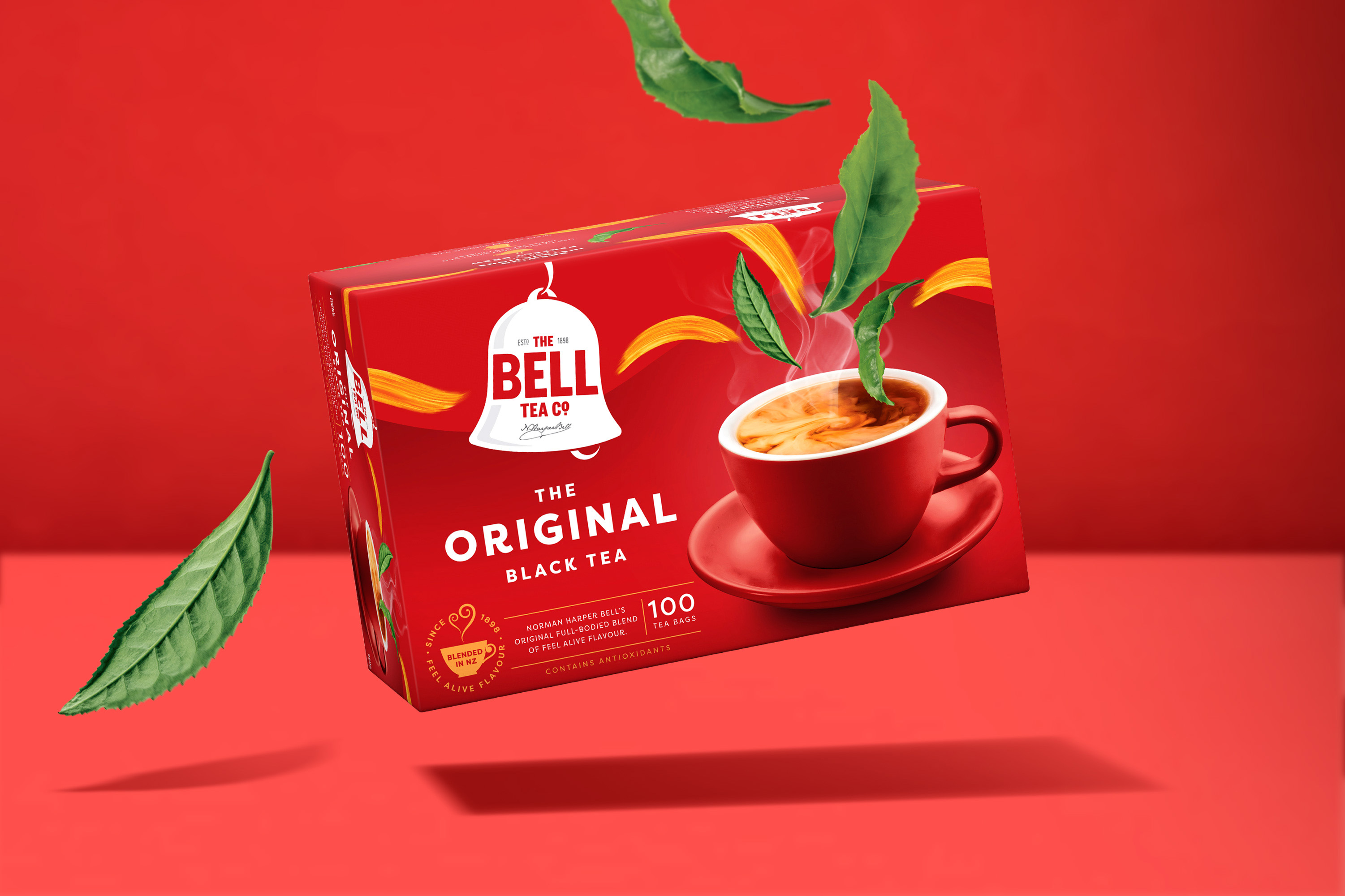
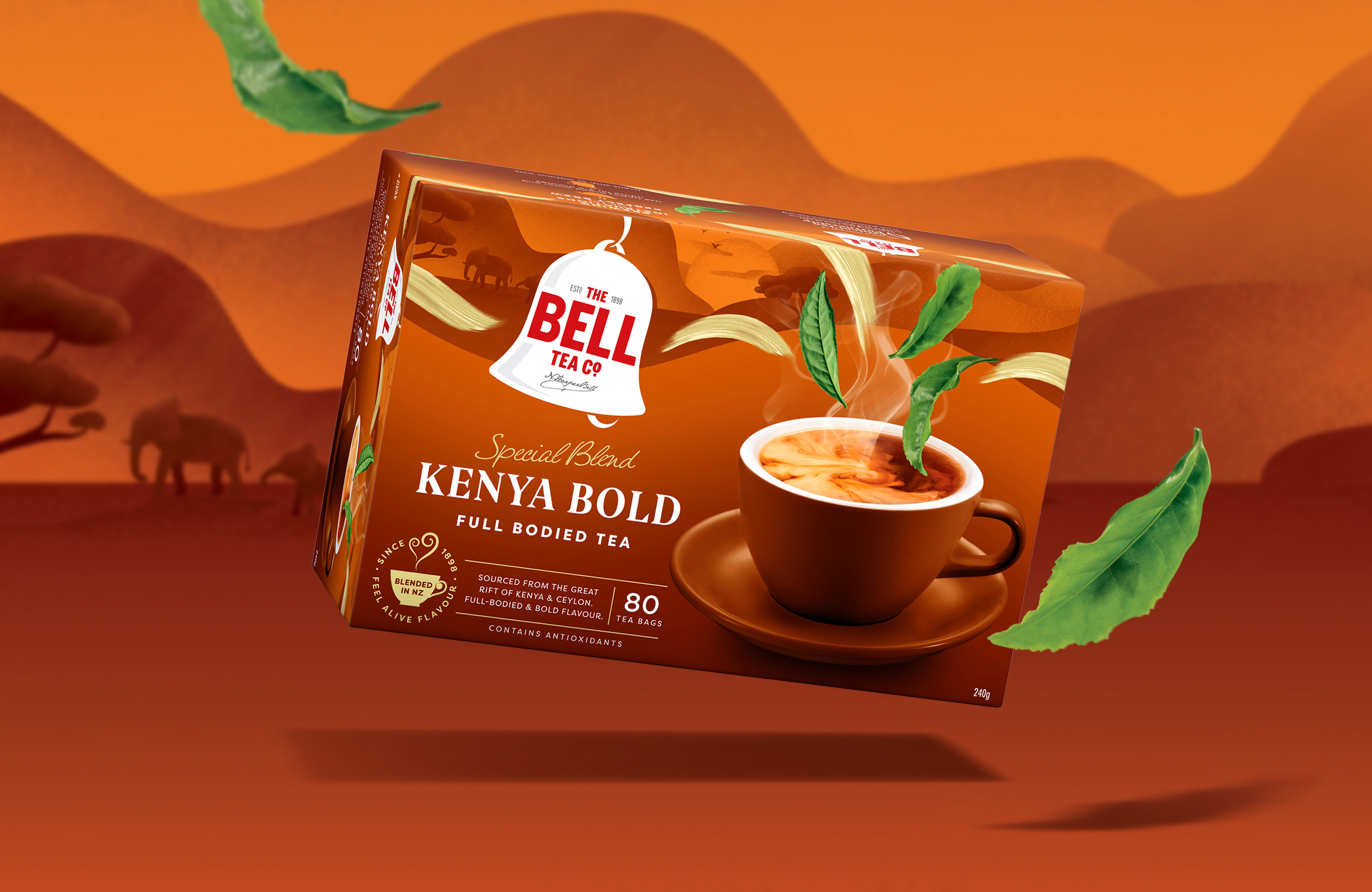
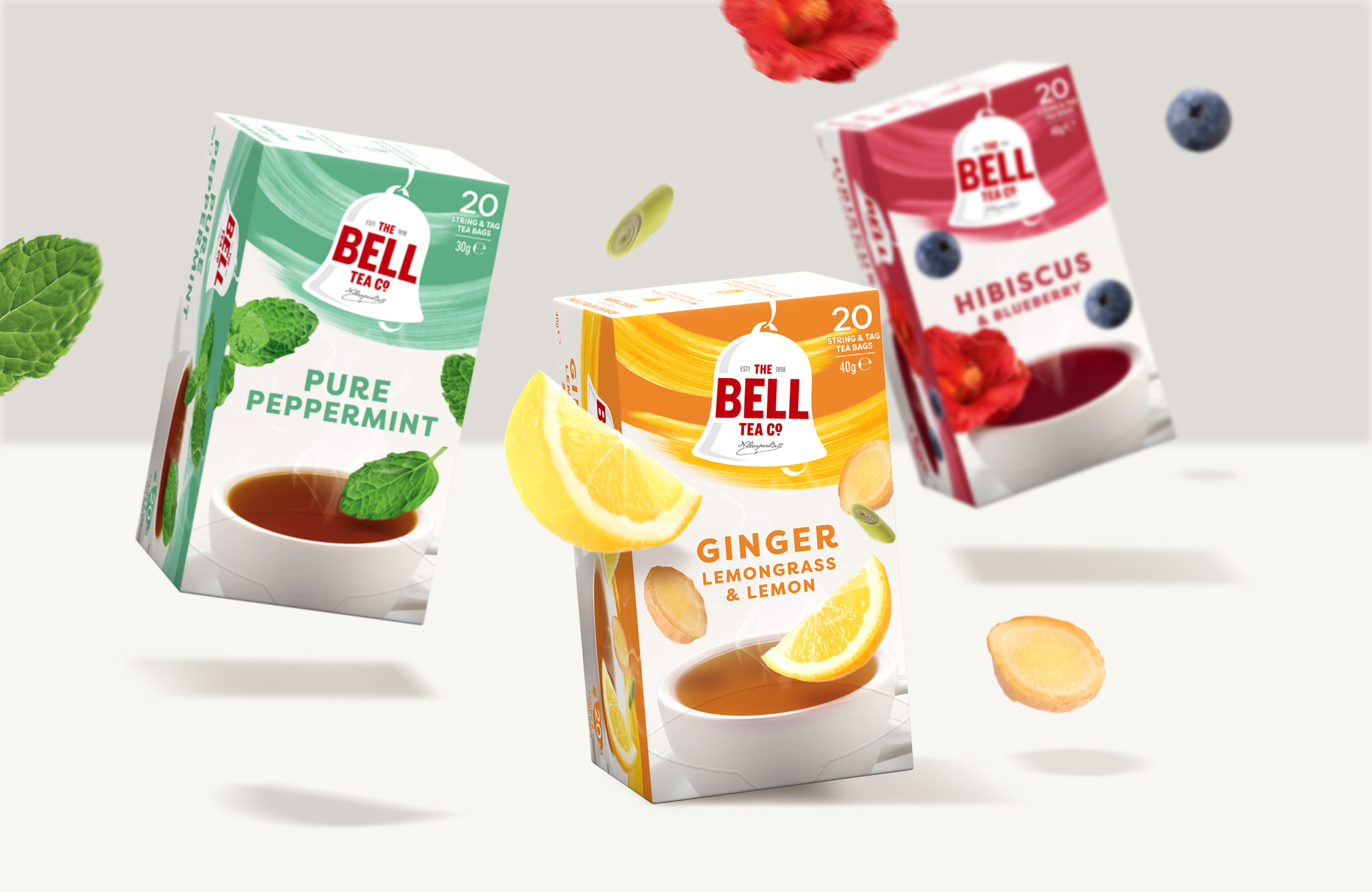
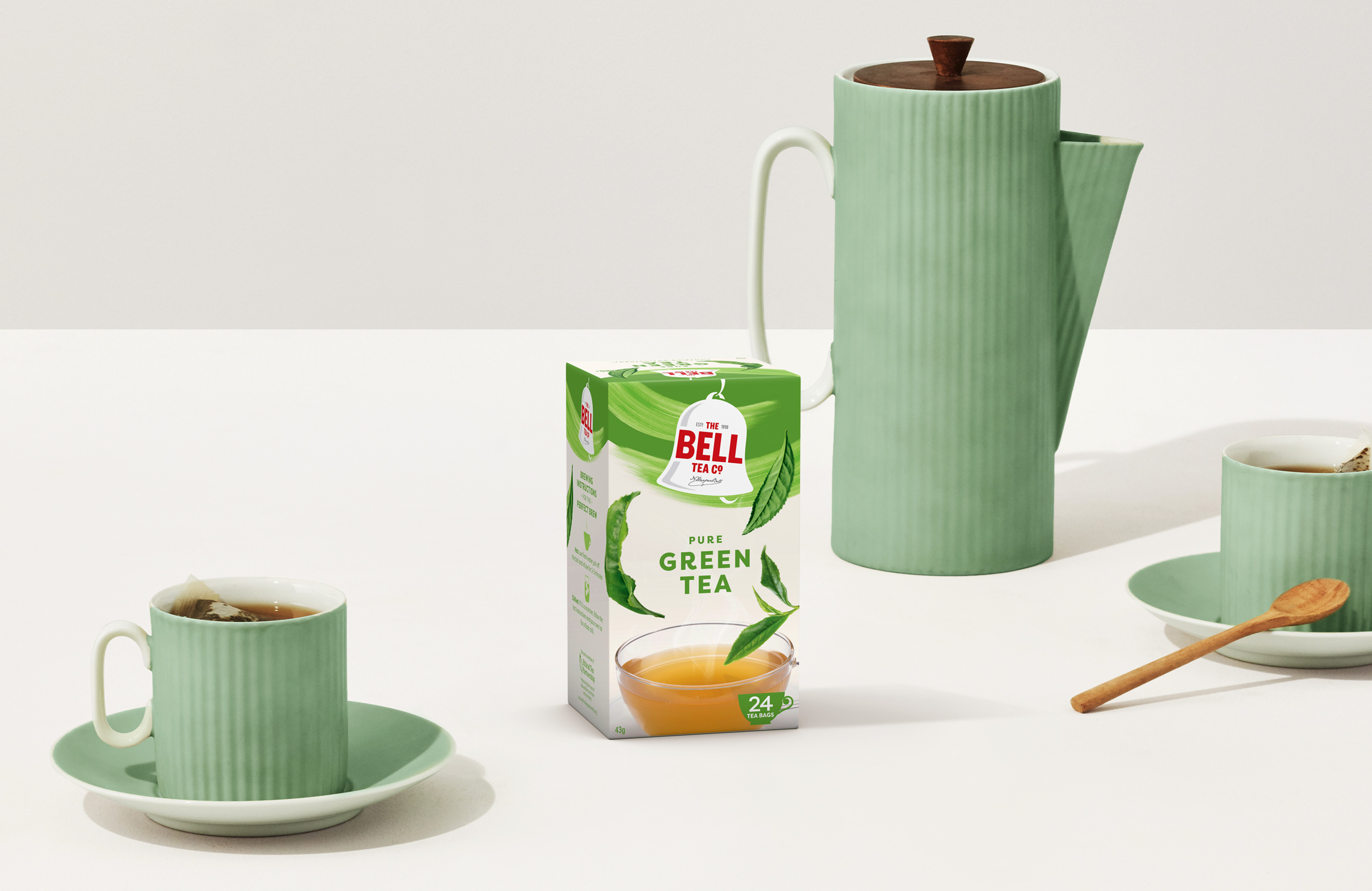
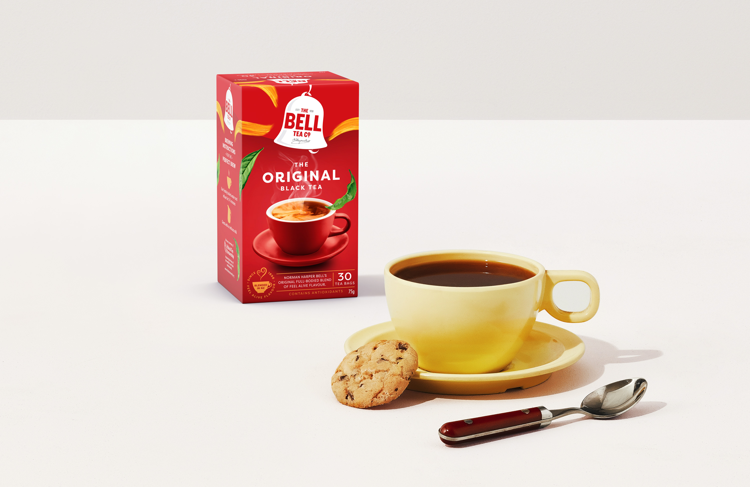
The solution evolved the logo and assets while introducing a flowing flavour device which was energetic and uplifting within the context of the tea category. The beloved cup was heroed with a tone-on-tone execution and pinch of drama, making it more unique to the brand. The tea leaves compliment the flow of the pack and beautifully levitate around it, giving us taste appeal.
Ensuring that the ‘Feel Alive Flavour’ story is brought to life in a retail environment with our new design, the packs are designed to tessellate, connecting into a continuous flow while delivering on strong shelf-blocking.
The inherent Kiwiness in the brand was also key, but it had to be done in a subtle, non-stereotypical, non-kitsch way that felt genuine and true to the brand.
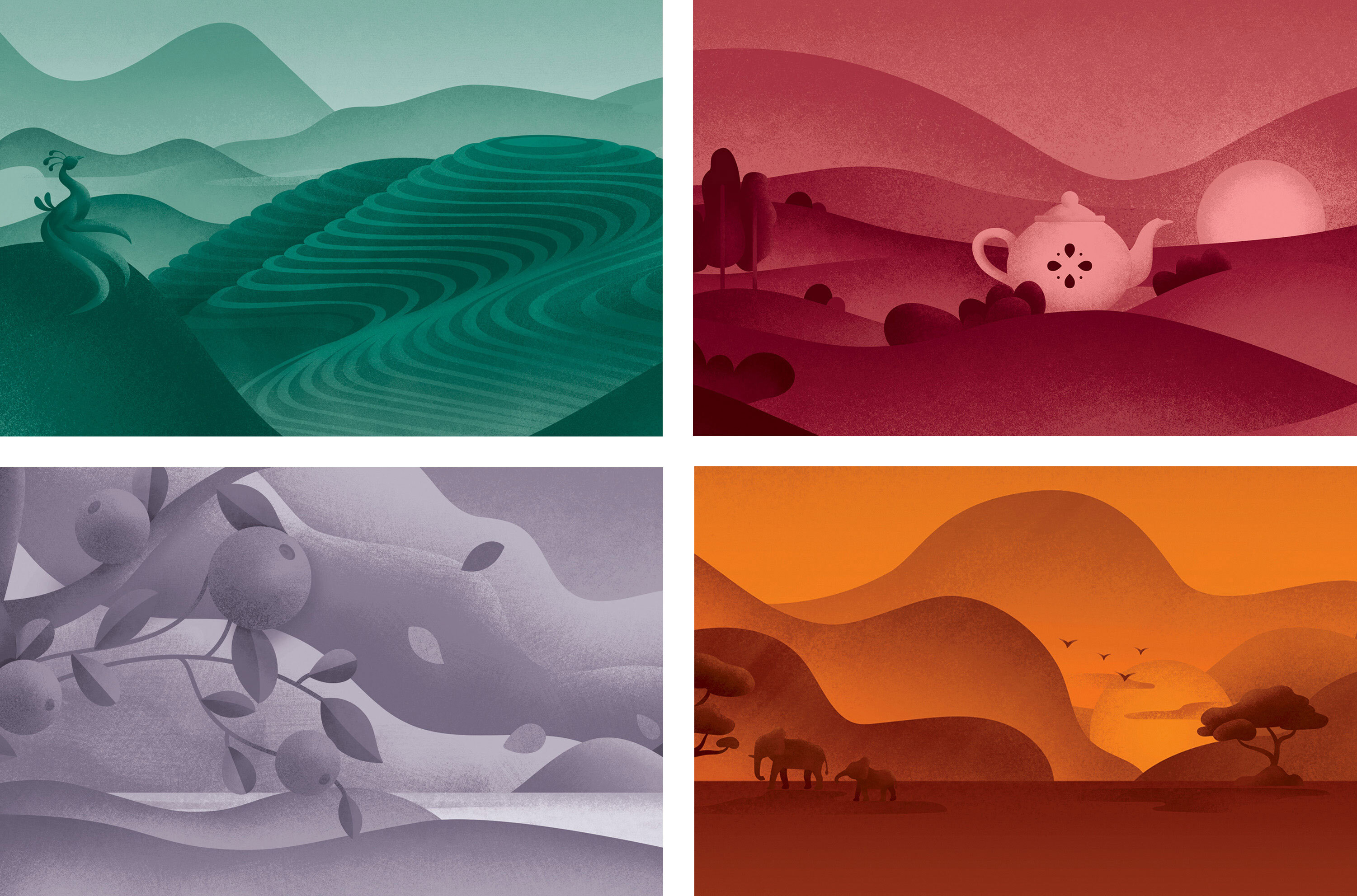
The design became a framework for three different tea ranges – each one with its own personality. The original core black teas were kept clean and simple, whilst the newly introduced Special Blend range was premiumised with rich flavour-led landscape illustrations and the use of gold. Fruit and herbal teas on the other hand, brought some freshness and lightness into Bell’s portfolio whilst dialing up flavour cues with ingredient photography.
A simple design solution that feels truly alive with flavour.
CREDIT
- Agency/Creative: Unified Brands
- Article Title: Unified Brands Restages New Zealand’s Iconic Bell Tea
- Organisation/Entity: Agency, Published Commercial Design
- Project Type: Packaging
- Agency/Creative Country: New Zealand
- Market Region: Oceania
- Project Deliverables: Brand Architecture, Brand Guidelines, Brand Identity, Brand Redesign, Branding, Graphic Design, Illustration, Packaging Design, Rebranding, Research
- Format: Box
- Substrate: Plastic, Pulp Carton


