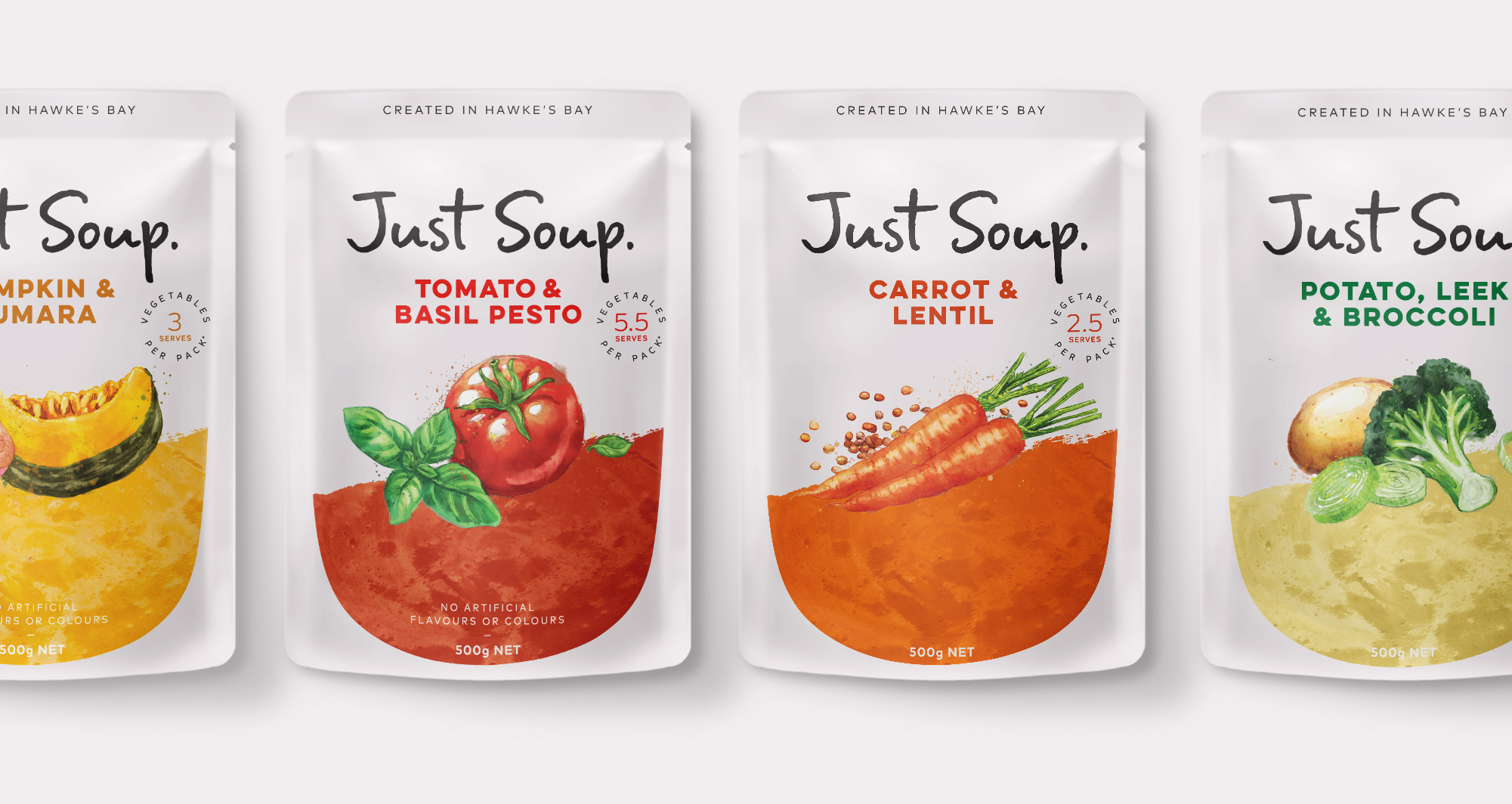
Originating as a flavoured hummus brand that made simple ingredient products convenient, the Just brand wanted to expand. We were approached by the brand team to re-stage its packaging and visual identity, whilst helping expand it into a soup range and introduce Just Smash, an exciting chunky dip range, to the market.
Today ‘convenience’ food doesn’t have to mean ‘fast’ food. People are looking for something that says simple and wholesome, that takes away the clutter and noise. Something convenient that nurtures and restores. We wanted to deliver to this insight with the proposition ‘simple wholesomeness’, however the current packaging and identity wasn’t living up to that.
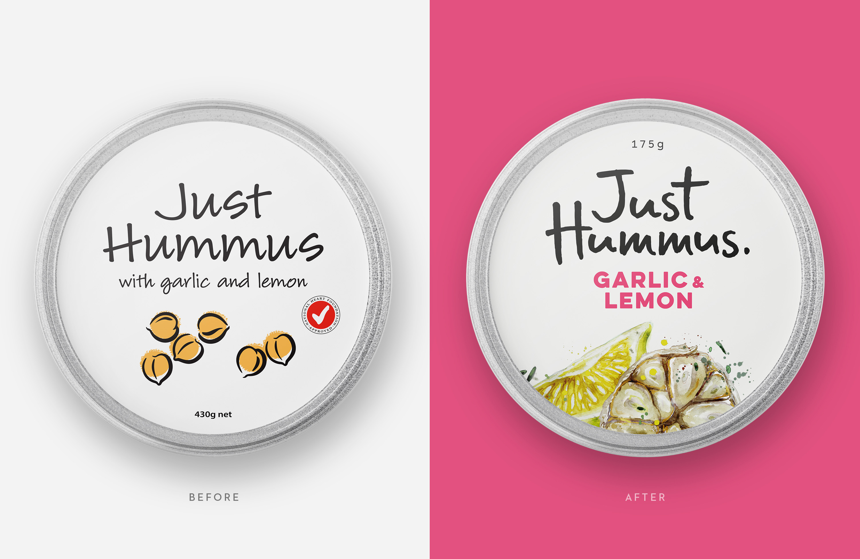
The dated packaging lacked appetite appeal and embodied reductive qualities of simplicity, resembling a more of a value or essentials range. The idea of ‘simple wholesomeness’ needed to be brought to life.
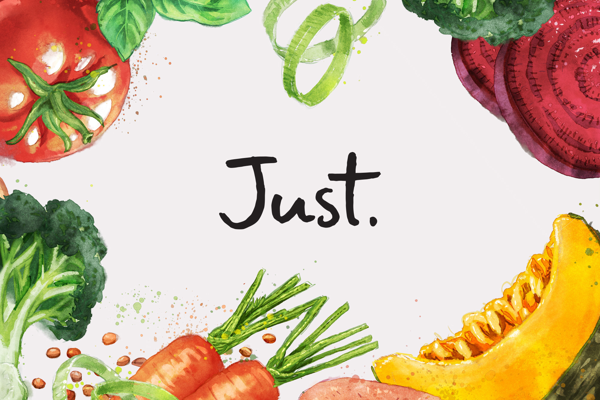
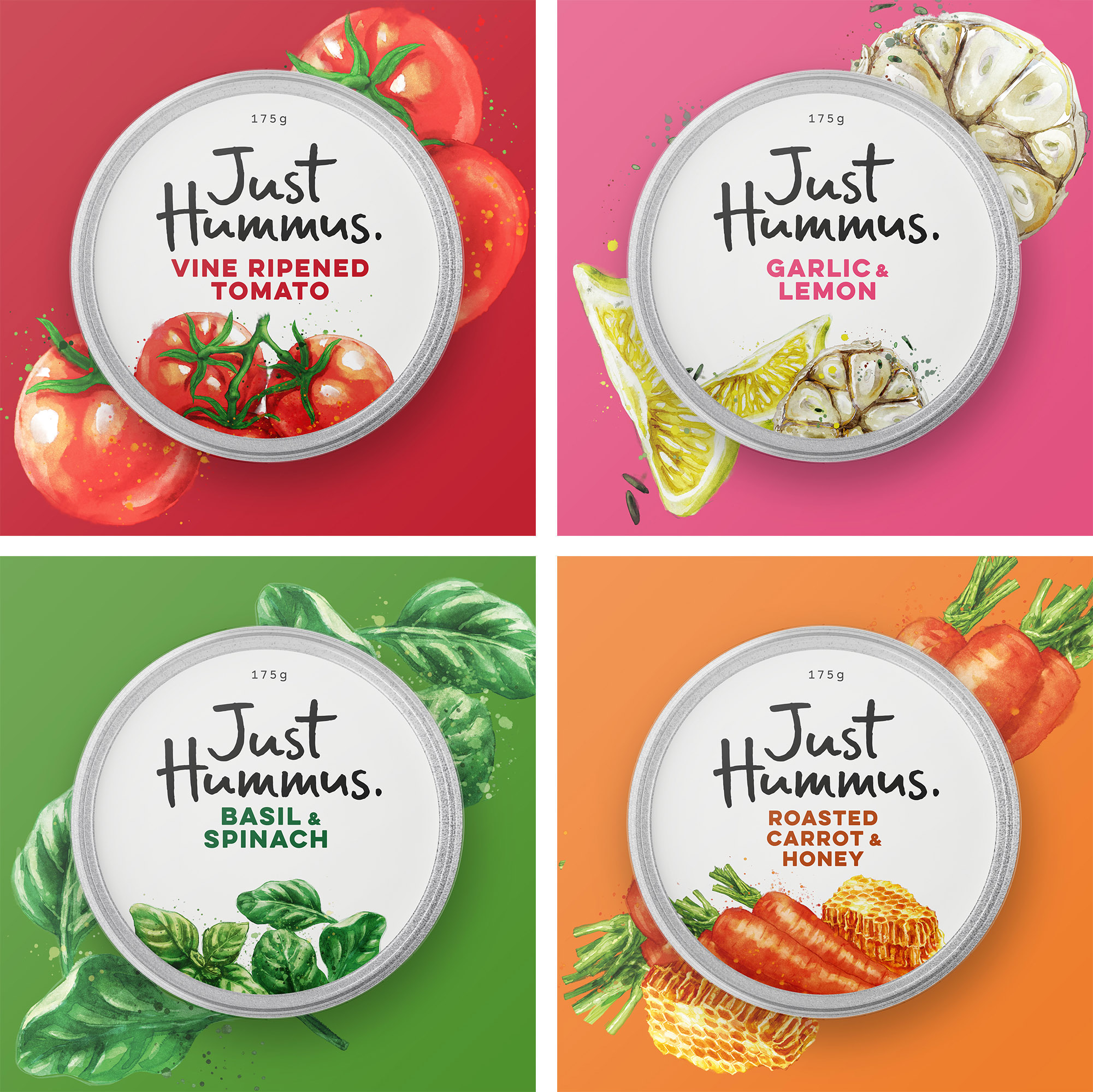
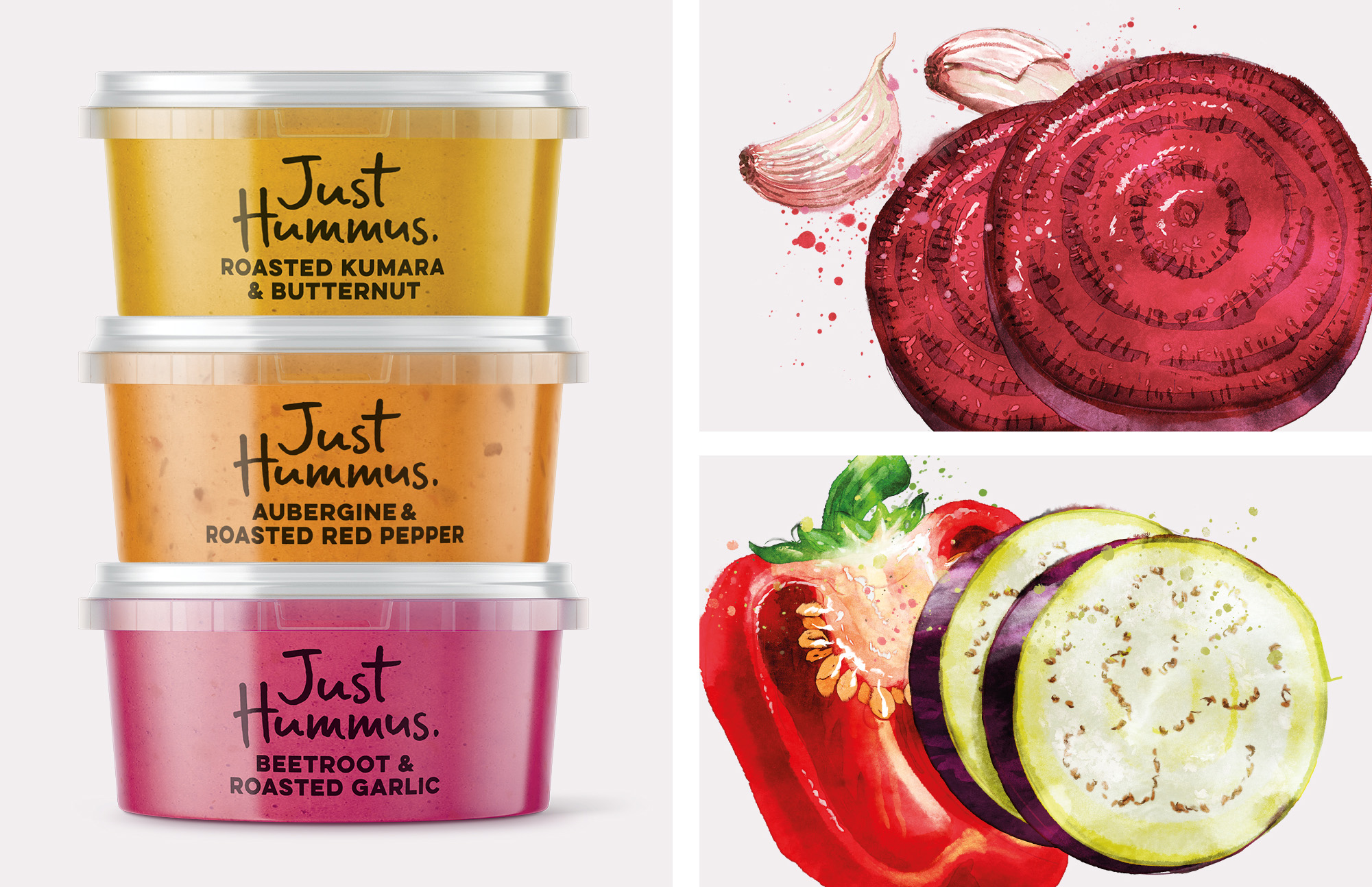
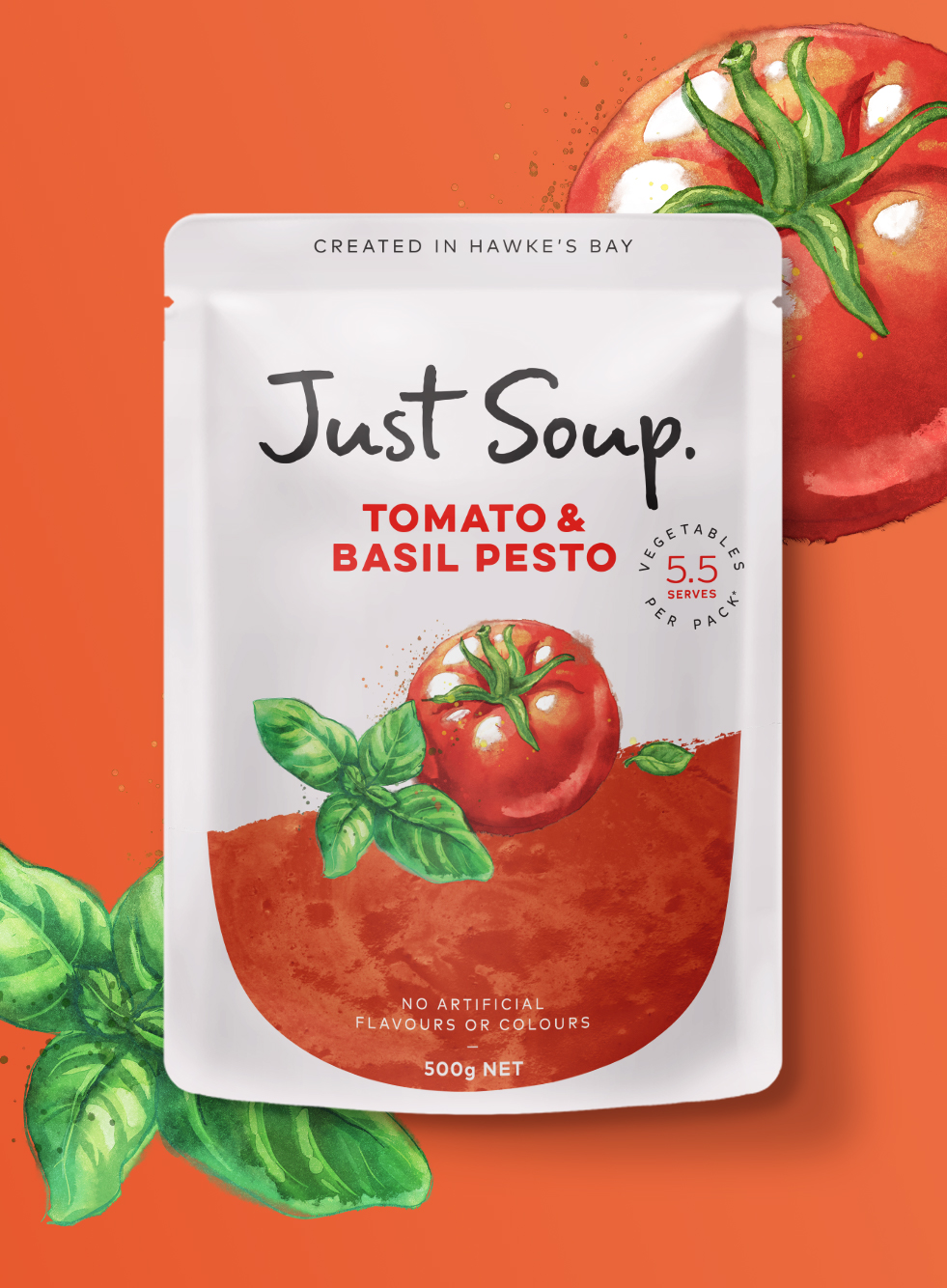
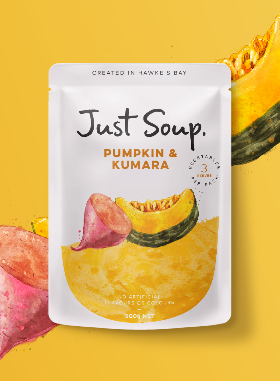
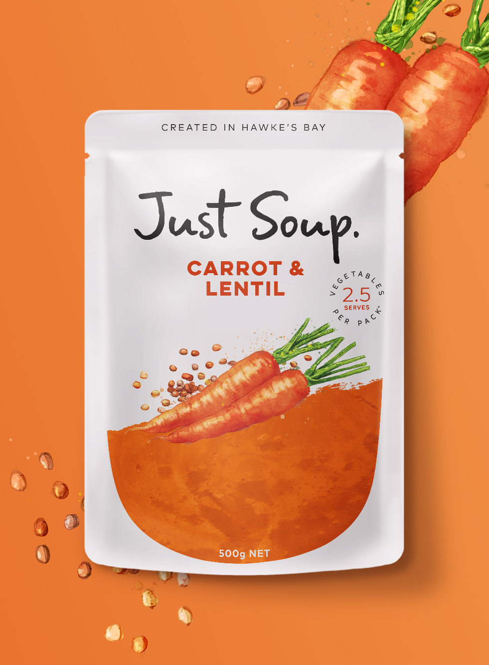
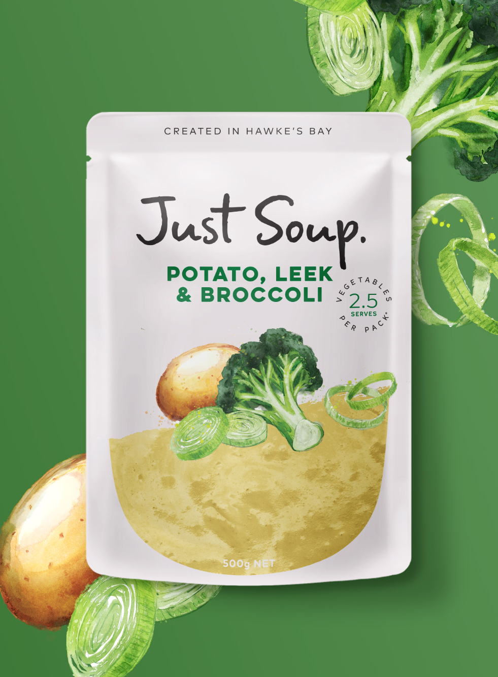
We started with redefining how the brand showcases its simple ingredients, creating beautiful watercolour illustrations in collaboration with Phillip Small of Watermark Creative. These, together with the abundance of white and transparency of the product, helped us define an honest and genuine look and feel.
To further reinforce the brand’s ‘simply wholesome’ proposition, we applied a human touch to the logo and branded typography of Hummus and Soup, creating a consistent easy-to-navigate range of products.
Making sure that the entire pack is hand-crafted, we have connected all brand elements and woven the idea of ‘simple wholesomeness’ into the brand DNA.
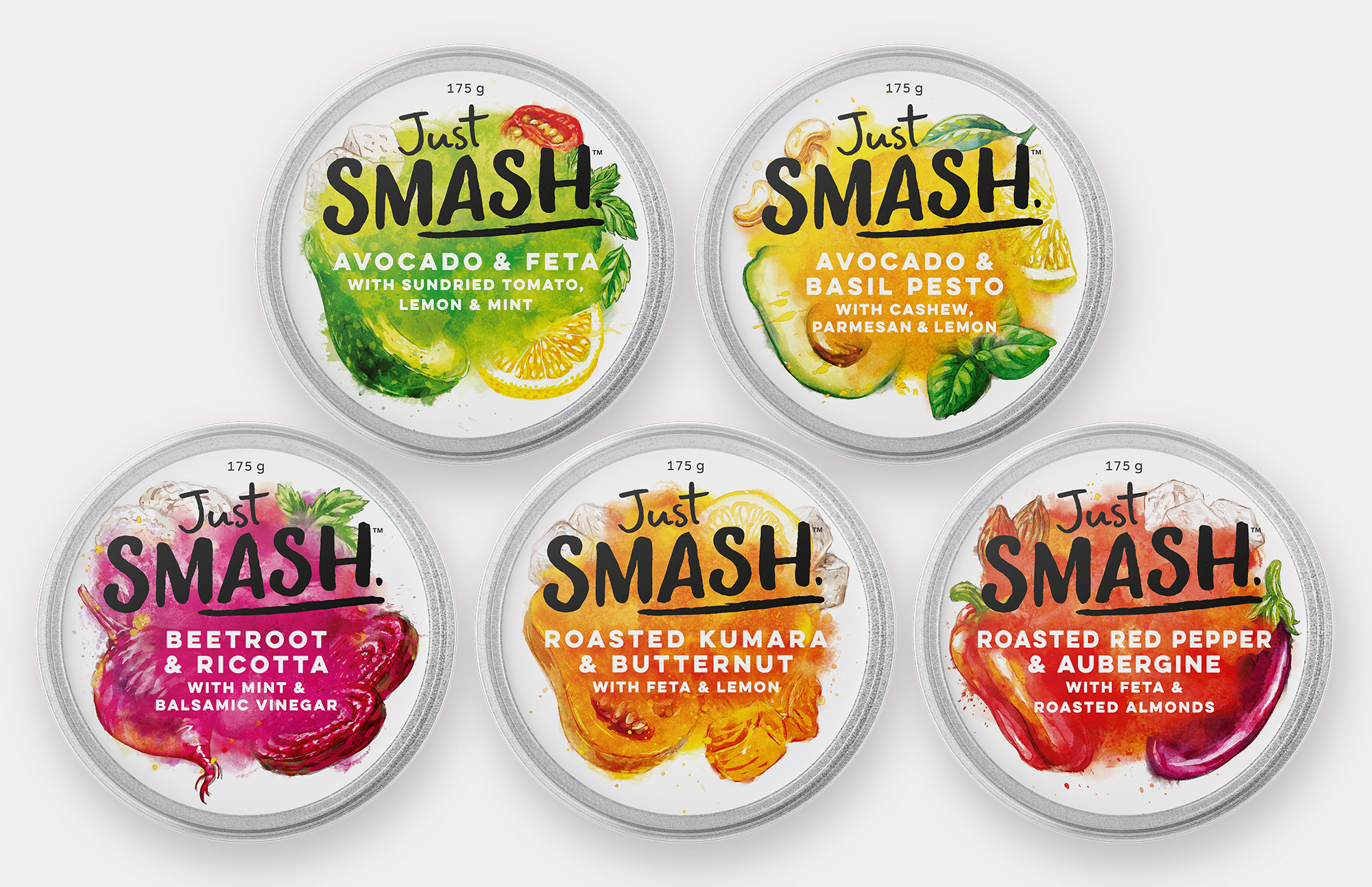
Just Smash allowed us to explore how our newly designed Just identity could confidently stretch into a sub-brand. The illustrations of wholesome ingredients being smashed together created cut-through pops of naturally vibrant colour, which brought energy and excitement both into the brand and the dip category. With the introduction of Just Smash, we have created a different brand expression that still feels part of the new, simply wholesome and delicious-looking Just family.
CREDIT
- Agency/Creative: Unified Brands
- Article Title: Unified Brands Re-Stages Packaging and Visual Identity for Just
- Organisation/Entity: Agency, Published Commercial Design
- Project Type: Packaging
- Agency/Creative Country: New Zealand
- Market Region: Oceania
- Project Deliverables: Brand Architecture, Brand Identity, Brand Redesign, Brand Rejuvenation, Branding, Graphic Design, Identity System, Illustration, Packaging Design, Product Architecture, Rebranding
- Format: Pot, Pouch
- Substrate: Plastic


