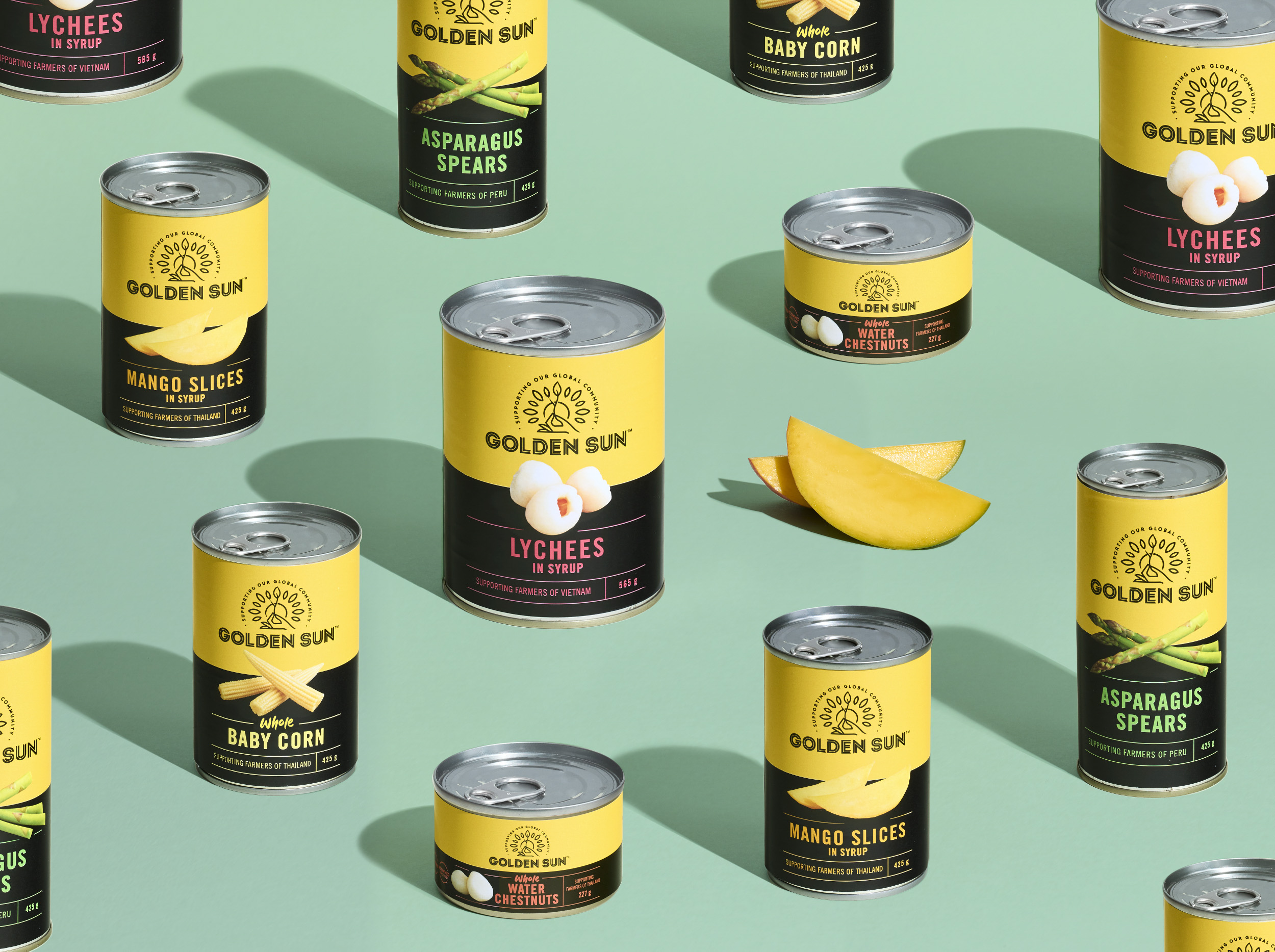
Golden Sun is a brand that was born from a desire for travel and more adventurous eating in a time when meat and three boiled vegetables was the order of the day. Ray Thomas searched the world for the new and exciting, becoming one of the first to introduce soy sauce to the New Zealand palate. Something for which we are eternally grateful.
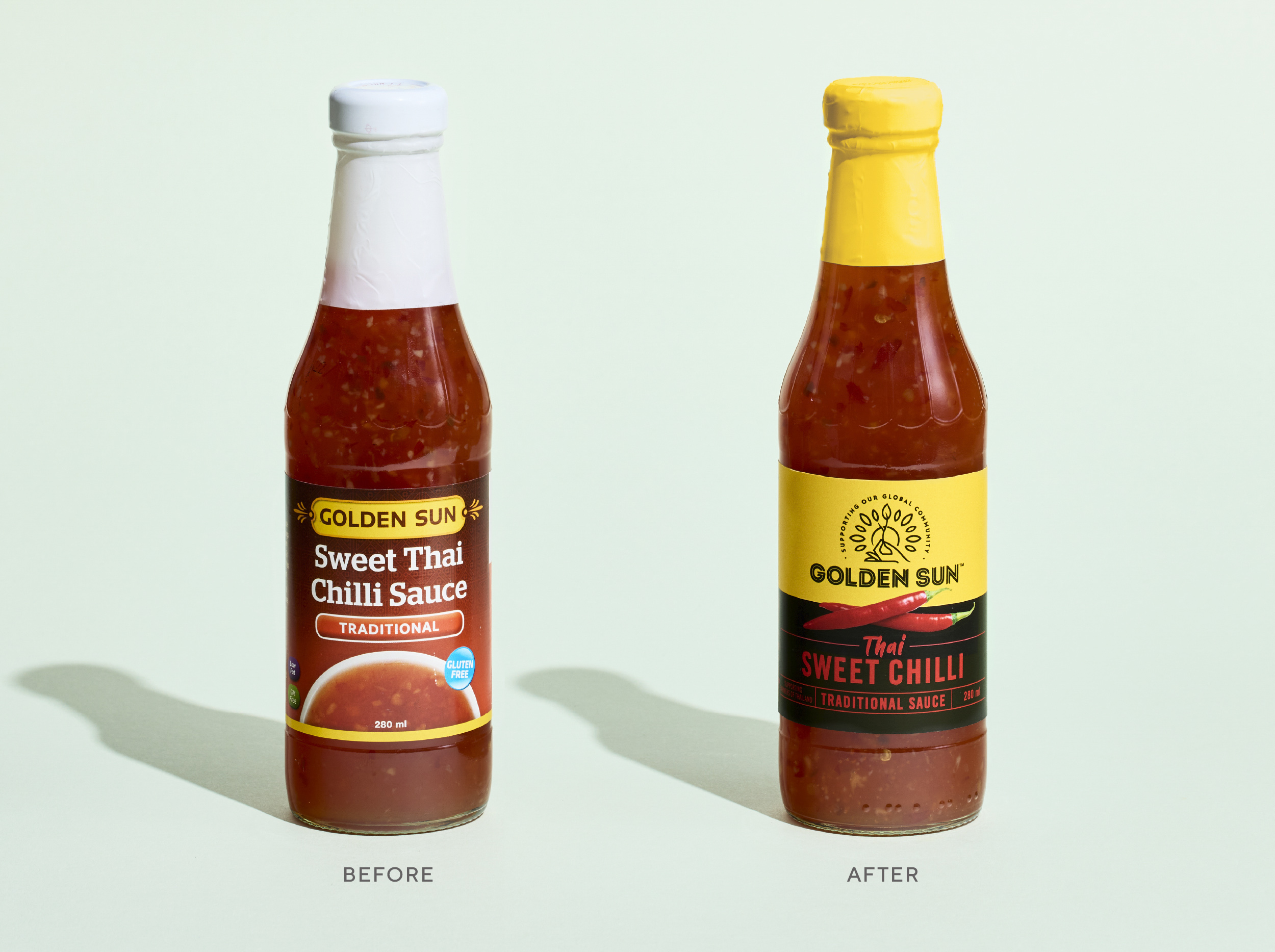
The brand was in decline and was fragmented across a number of mature categories. Now run by the second generation, the family wanted to invigorate the brand for a bright future. The business had worked across a number of agencies who had not been able to find an insight to truly help take the brand forward and, just as importantly, was acceptable to the founding Father.
Working with Acton, Unified delved into the brand’s history and hypothesised a platform that celebrated the founder’s passion for travel and adventure. This was married with the second generation passion for sustainability and consumer insights into modern global cooking trends. Acton and Unified developed the proposition ‘Global Cuisine with Integrity’. This talked to the exotic and adventurous range, but also to the fact that the product was of quality while being delivered in a sustainable and responsible way.
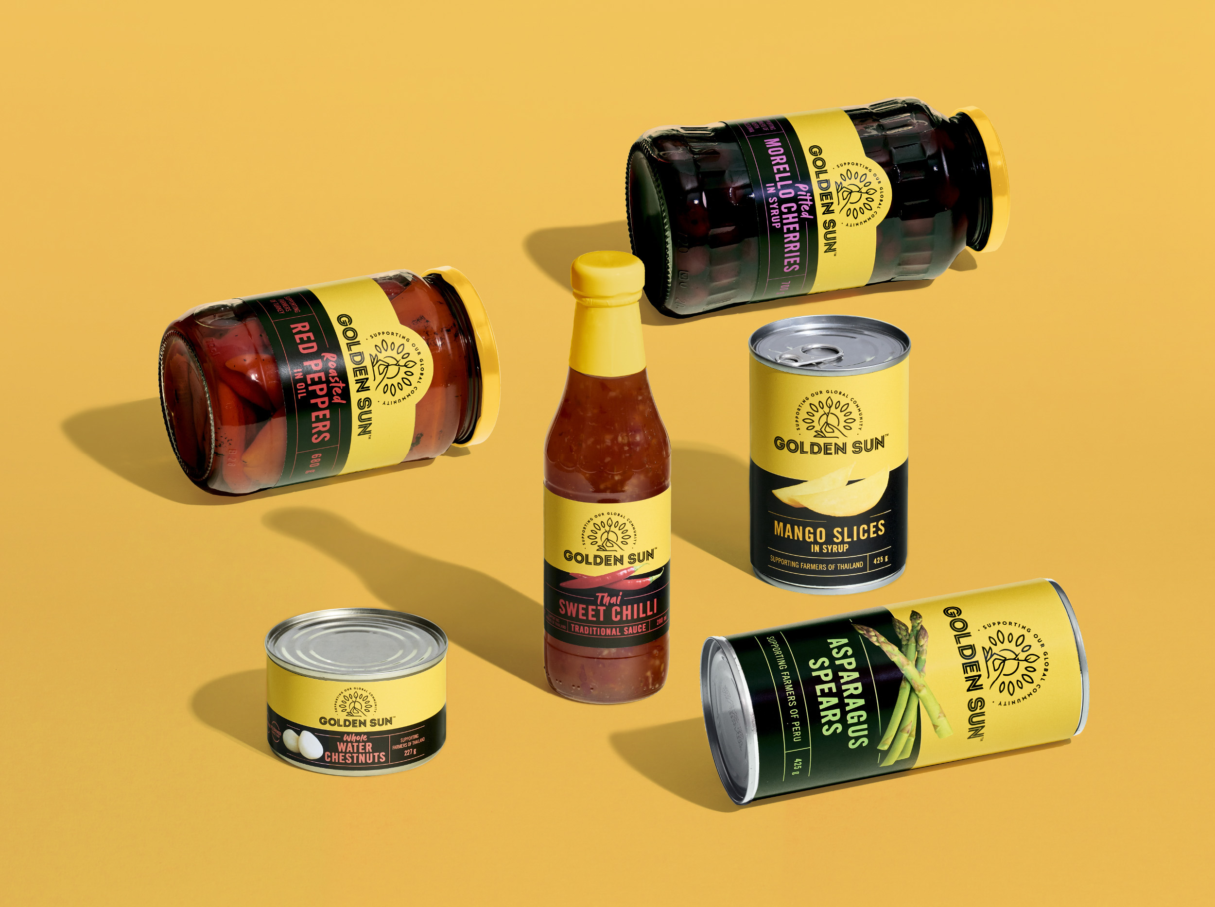
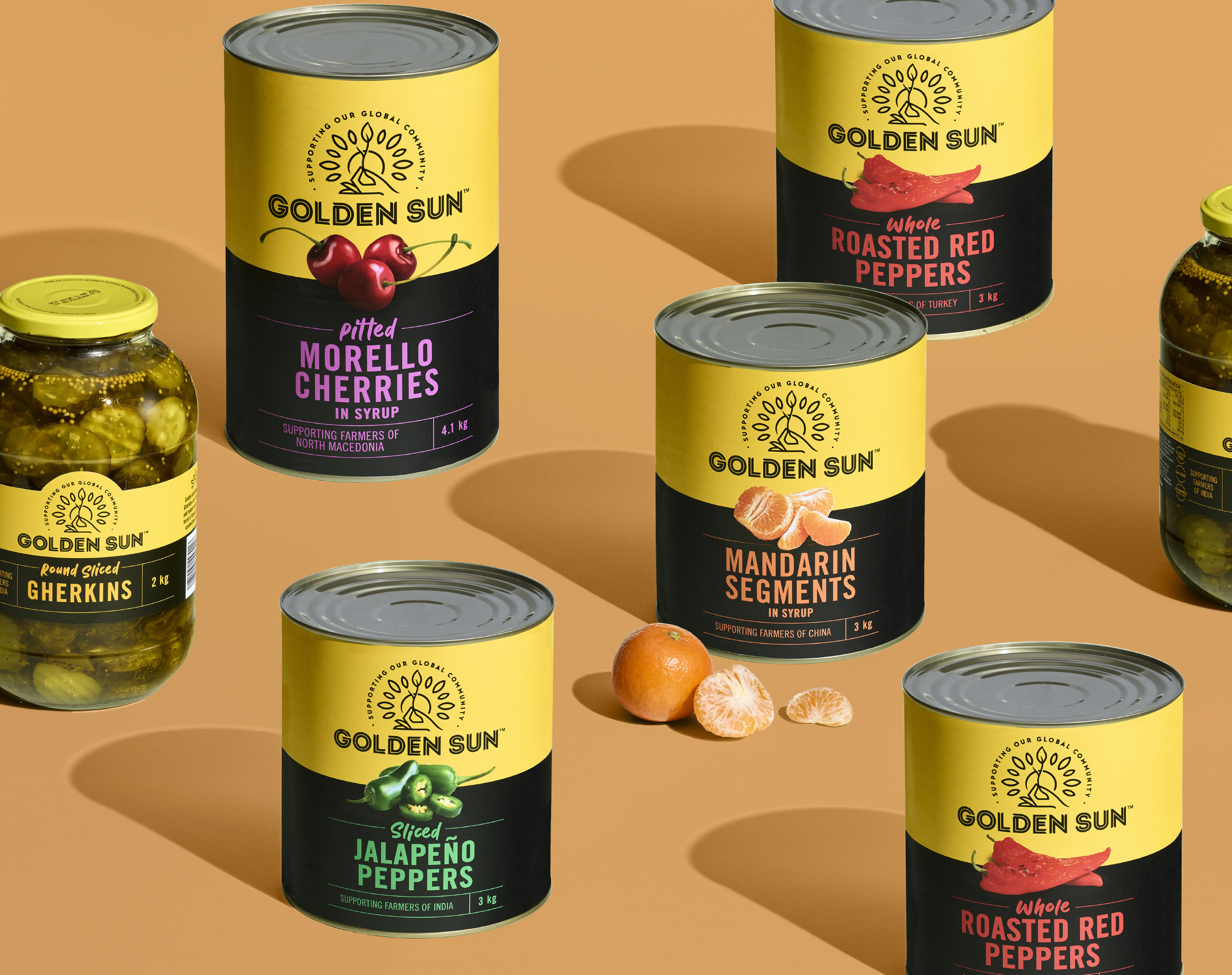
The proposition was tested with consumers and a visual language was developed that built on existing equities, but provided striking brand assets.
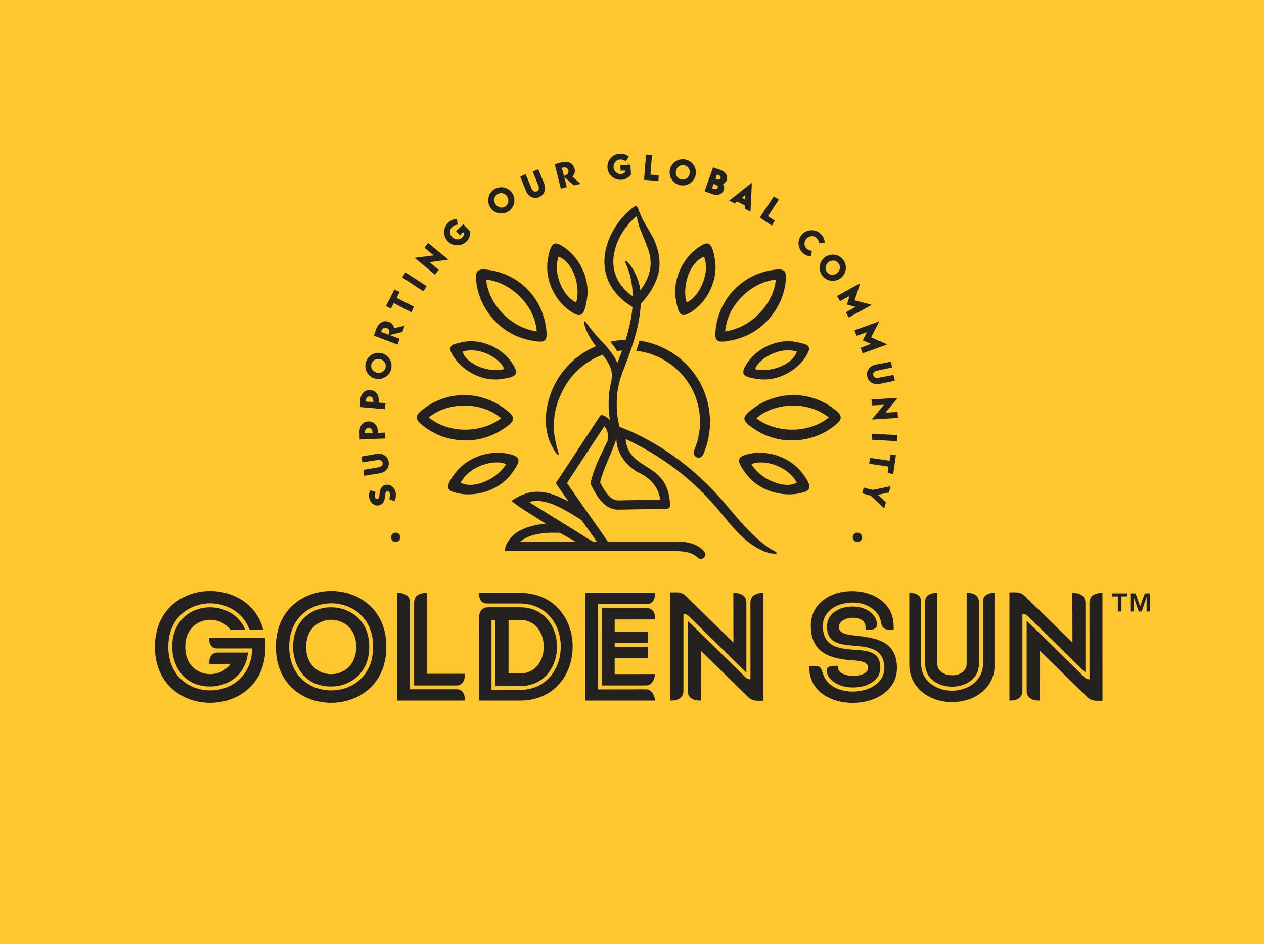
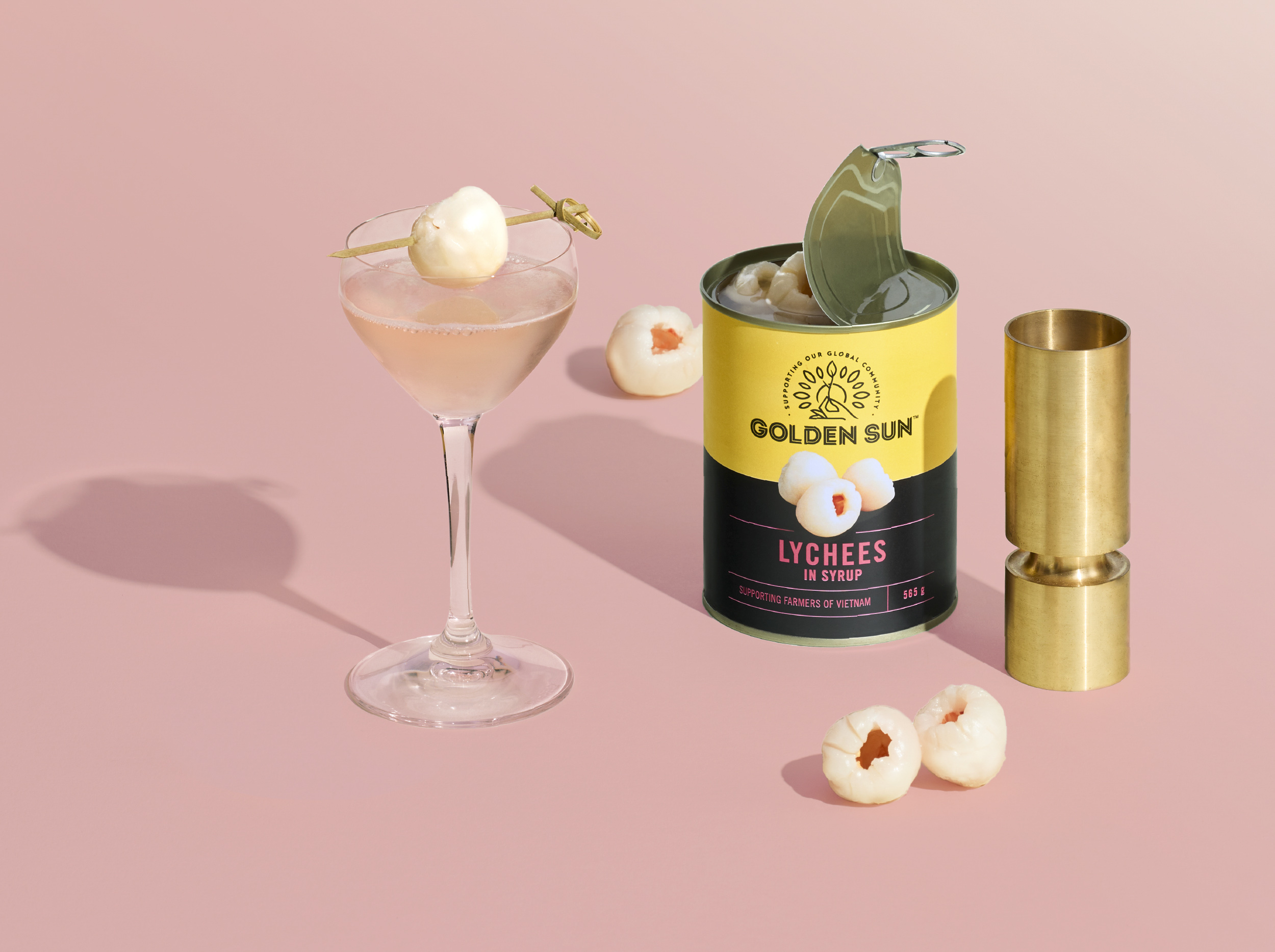
The logo captured the idea of nurturing communities while retaining the sun that sat in the name. Simplification of colour palette created an opportunity to really own the golden yellow sunshine colour and make a bolder statement both on and off shelf.
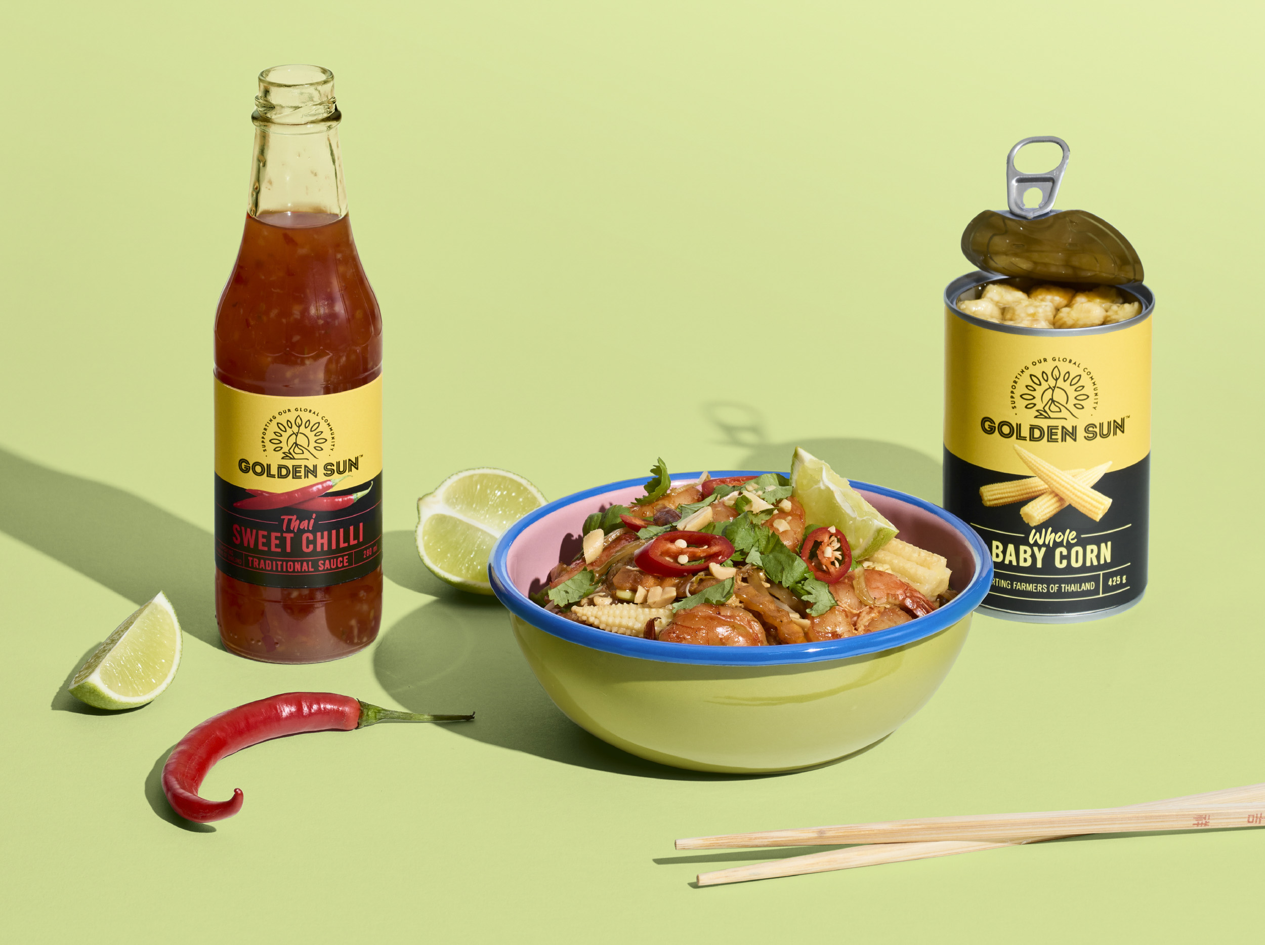
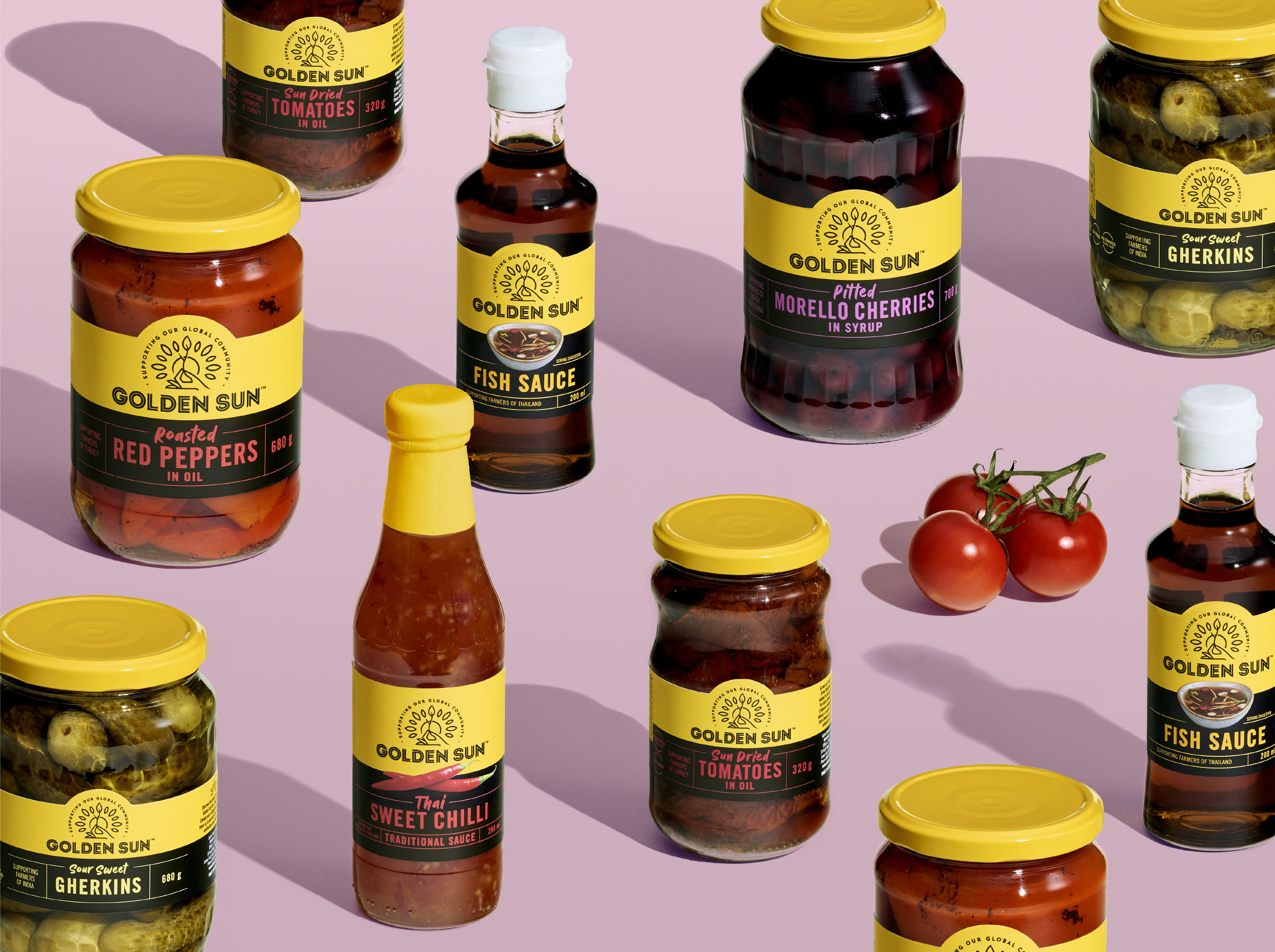
Unified also successfully moved the brand away from the stereotypical and dated ‘Asian’ cues, which allowed Golden Sun to talk to their wider global portfolio and expand into exciting new products. The result was a shift to a more contemporary look and feel in the category that’s filled with traditional provenance.
The restaged brand has been embraced by the retailers and consumers alike. It is now experiencing strong growth and there is a full NPD programme in place. There is a suite of brand assets developed without losing sight of the original brand equities which has incredible shelf stand out. And guess what? Dad loves it.
CREDIT
- Agency/Creative: Unified Brands
- Article Title: Unified Brands Creates a New Fresh Visual Language for Golden Sun
- Organisation/Entity: Agency
- Project Type: Packaging
- Project Status: Published
- Agency/Creative Country: New Zealand
- Agency/Creative City: Auckland
- Market Region: Oceania
- Project Deliverables: Brand Guidelines, Brand Identity, Brand Redesign, Packaging Design, Packaging Guidelines
- Format: Can, Jar
- Substrate: Glass, Metal
- Industry: Food/Beverage
- Keywords: Golden Sun, New Zealand, Kiwi, Packaging Design, Visual Language, Brand Identity, Yellow, Pantry, Canned Goods, Global Cuisine, Integrity
-
Credits:
Creative Director: Alex Butenko


