


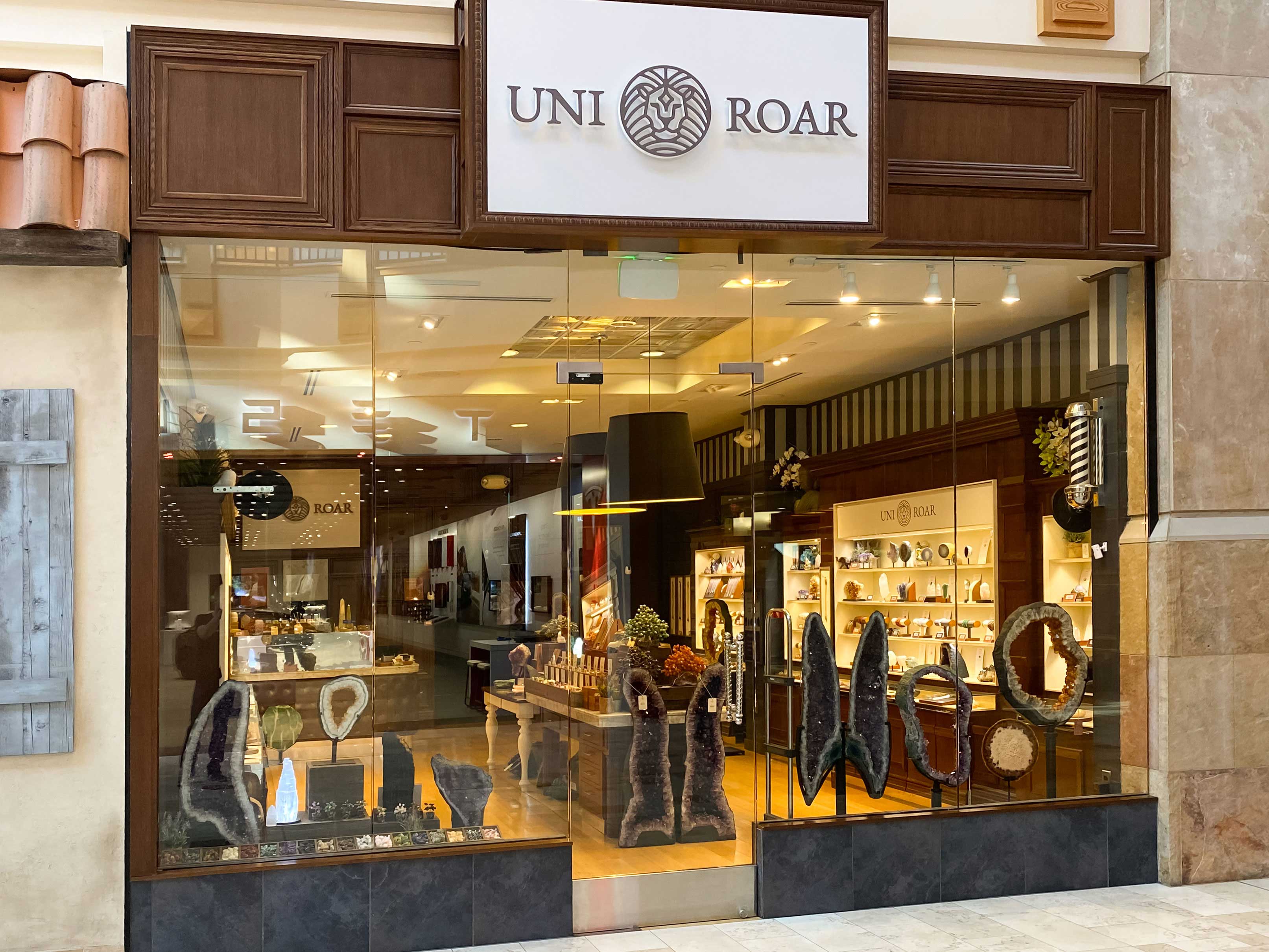
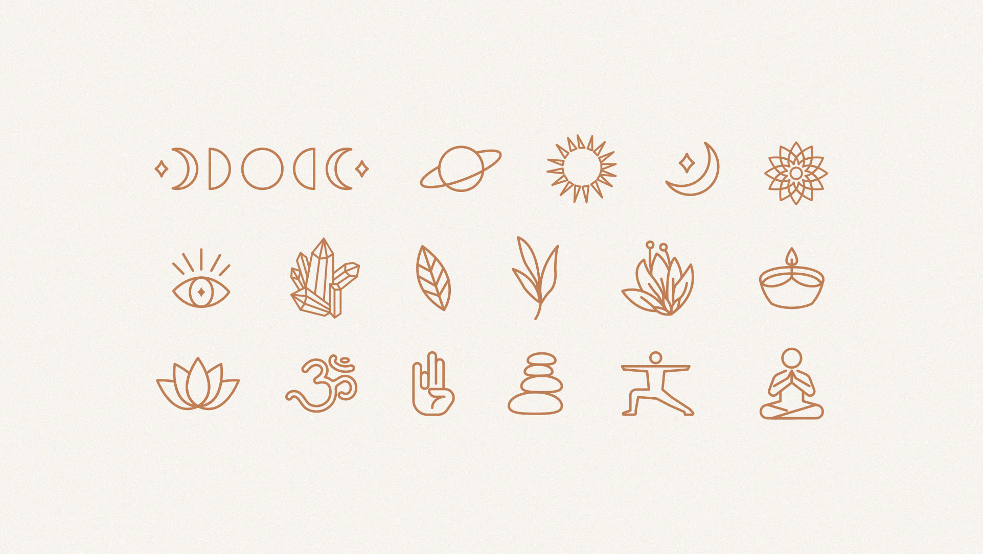
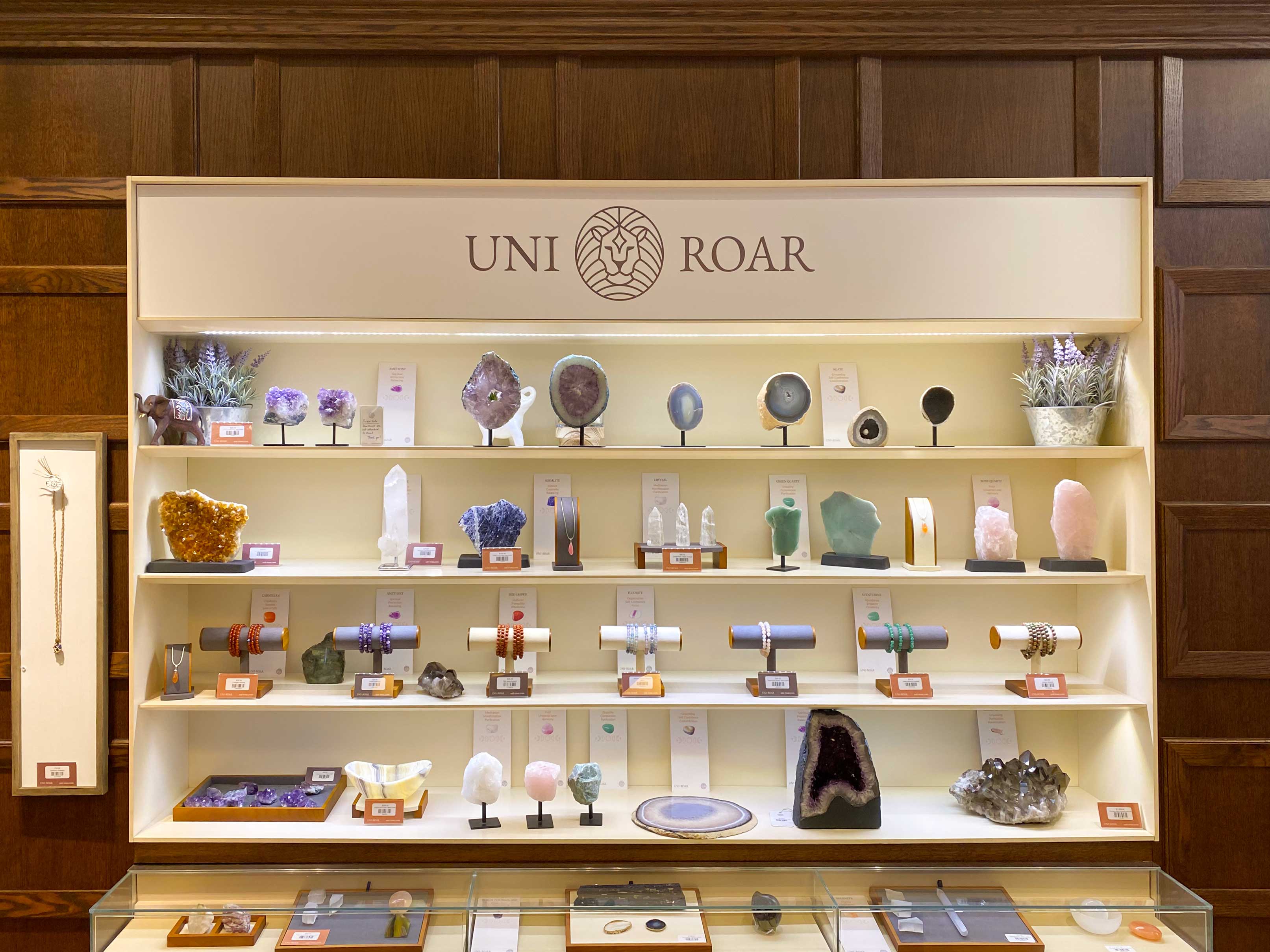
Uni Roar is a company focused on curating stones, minerals and real jewels that help people of all ages to find spiritual healing, expanding these benefits sometimes to physical and psychological healing. Natural stones and crystals have energies and capacities known since ancient times. They can be used for therapies, energy protection, spiritual uplift and are able to help attract prosperity and awaken higher capacities.
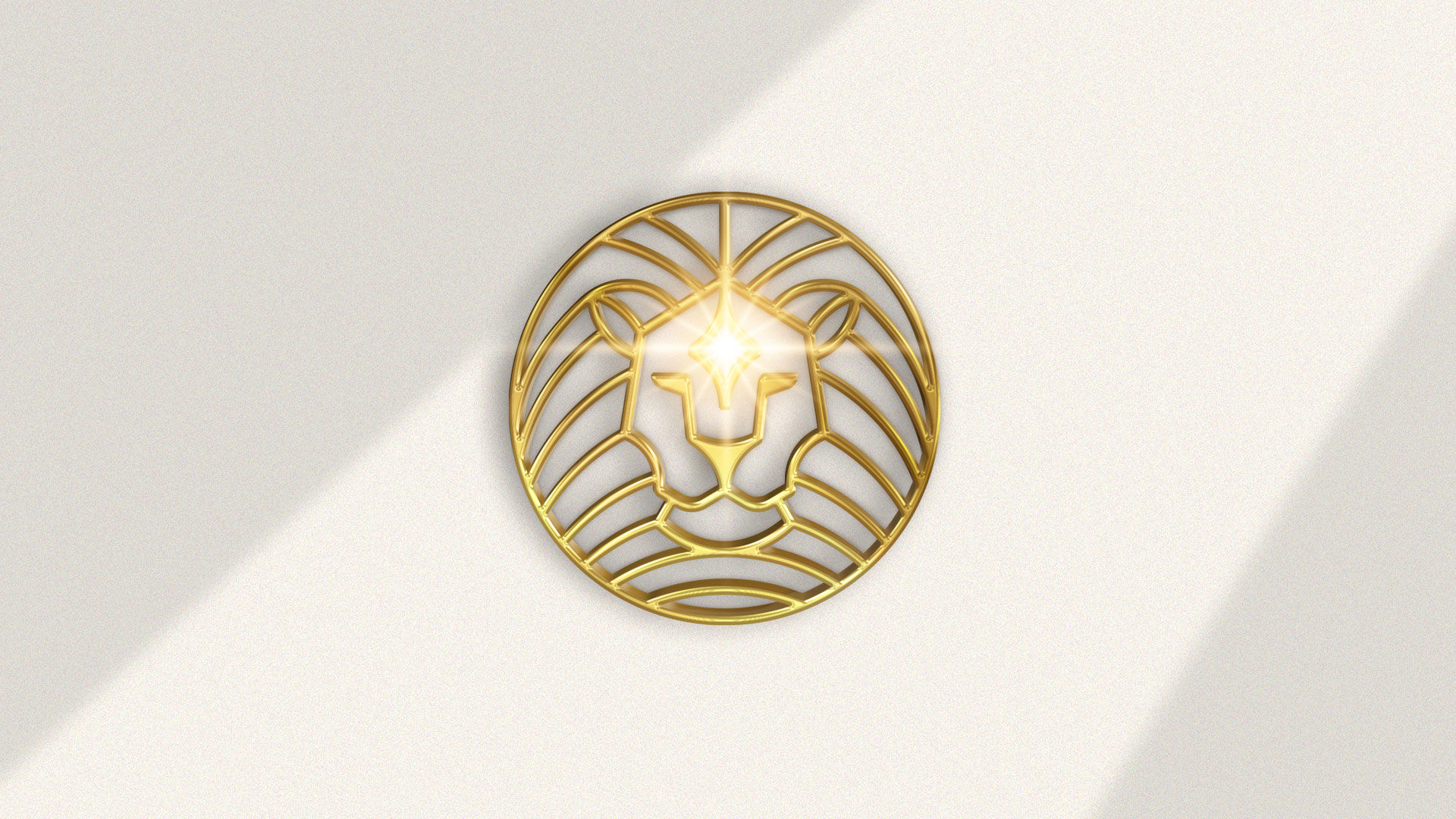
Creative Solutions: 1. Symbolically represent sovereignty and the lion’s self-control and also making an analogy the very meaning of the brand name; 2. Assign strong expressions and elements that have connection with geometric shapes present in nature and in the universe; 3. Highlight in the symbol the power attributed to minerals found in nature, matter that is offered by the company.
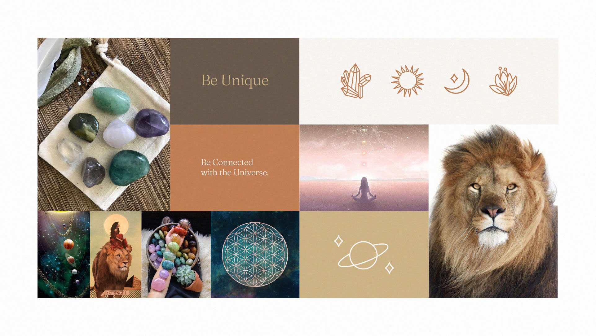
Brand voice: Helping people of all ages to find alternative ways to unlock and rebalance energies and emotions with the help of minerals and precious stones, relieving negative sensations and activating good ones. Making room for the inner voice that seeks answers, healing and balance in life.
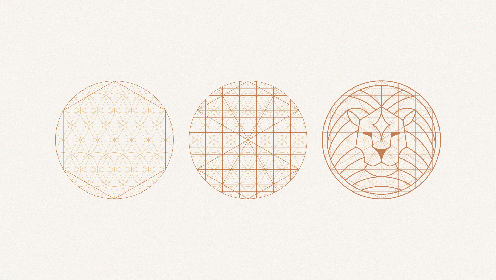
Based on the idea of a defined symbol, the grid construction process was initiated using the grid of the well-known “the flower of life” as a base. Horizontal and vertical lines were also added at the intersections of the grid to arrive at a pleasant and visually harmonic symbol. Through the study of forms and gestalt, we are able to perfectly see the face of a lion with a precious stone on its forehead, which can also represent the connection with the universe.
The lion symbolizes power, royalty, wisdom, authority, youth, resurrection, security, protection and justice. Associated with lust and pride, in addition to being a combative animal but it can suggest healthy aggressive impulses.
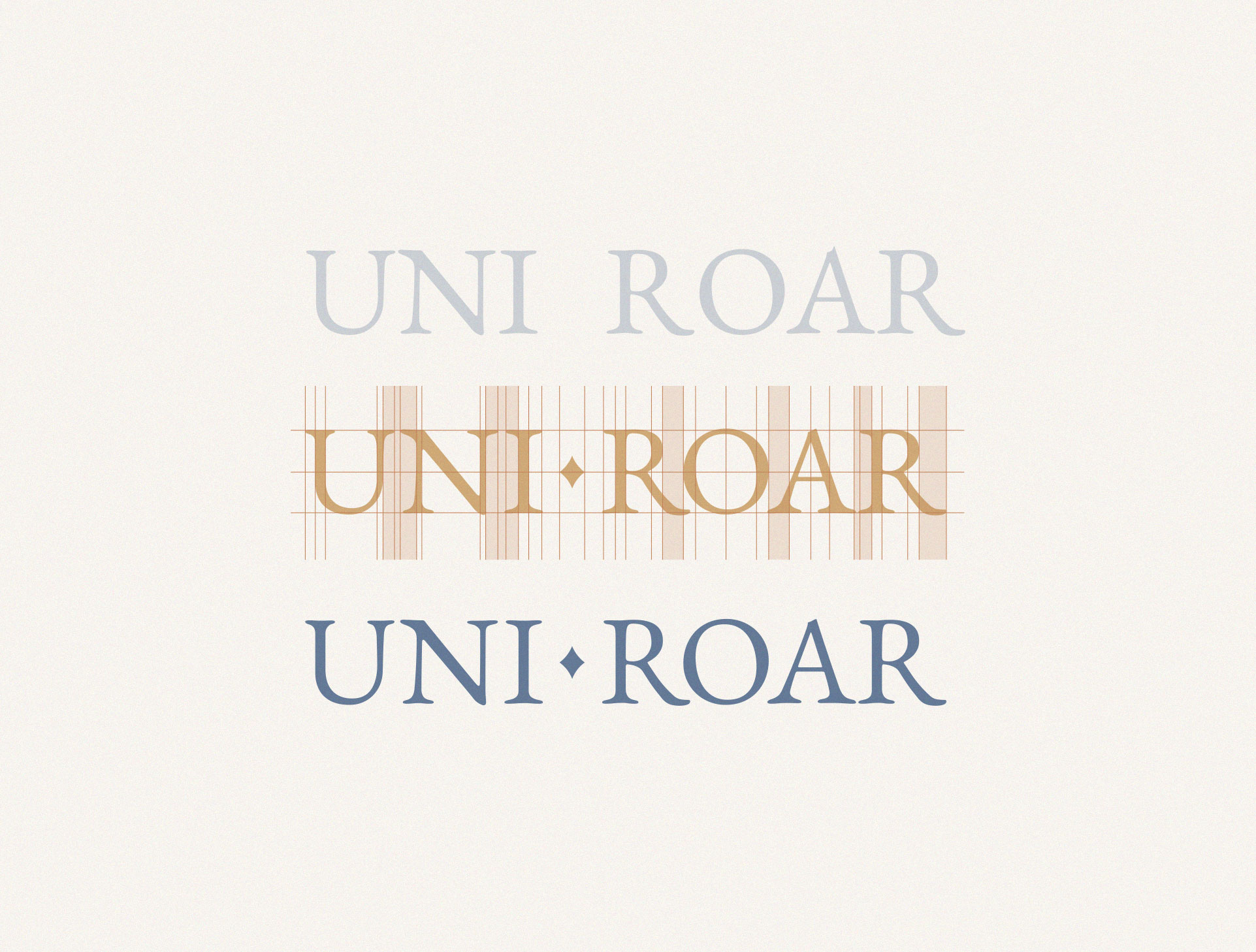
The typography chosen to compose the logo is a serif called “EB Garamond”. A font that was modified in order to keep shapes that represented the idea of a more elegant, mystical and delicate brand. The optical adjustment was applied visually forming a fit between them and making the reading more pleasant. Many luxury brands use capital letters to show their grandeur and also empower their users.
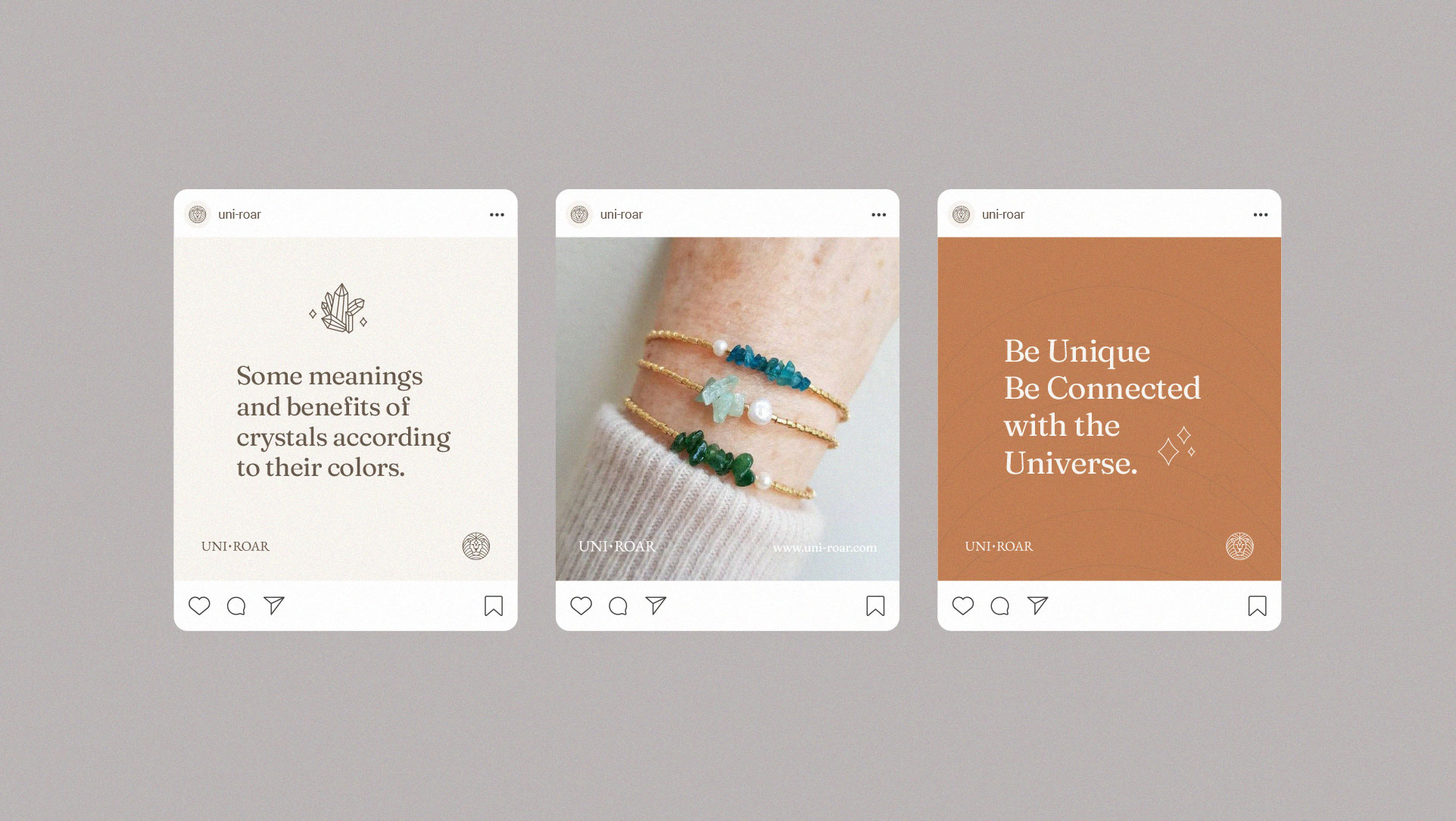
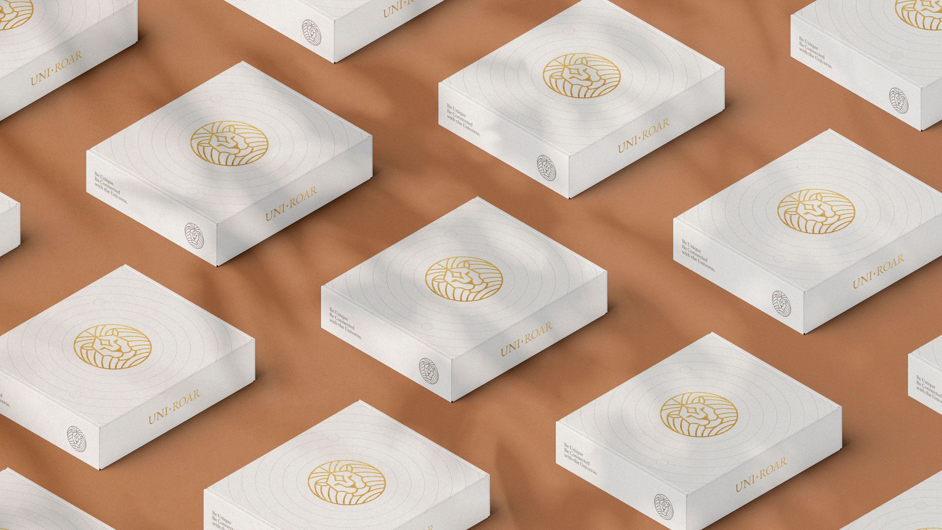
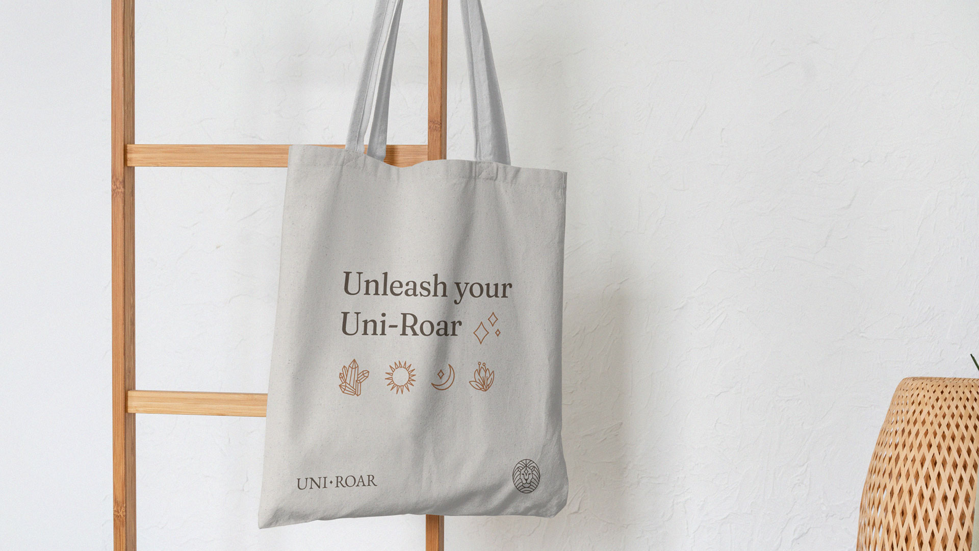
The main palette chosen to compose the brand is accompanied by earthy tones, such as beige, brown and gold. These are colors that convey simplicity and peace, but we also have the feeling of something valuable, wise and spiritual. A secondary palette was also defined, which serves as a support to compose the application of visual identity, especially in digital media.
CREDIT
- Agency/Creative: Studio Vitor Linhares
- Article Title: Uni Roar Brand Design By Vitor Linhares
- Organisation/Entity: Freelance
- Project Type: Identity
- Project Status: Published
- Agency/Creative Country: Brazil
- Agency/Creative City: Suzano/SP
- Market Region: South America
- Project Deliverables: Art Direction, Brand Experience, Brand Guidelines, Brand Identity, Brand Mark, Creative Direction, Identity System, Logo Design
- Industry: Health Care
- Keywords: Visual identity, symbol, lion, visual brand, logotype.
-
Credits:
Designer: Vitor Linhares


