Branding Concept: Your data is far from boring. It’s actually beautiful.
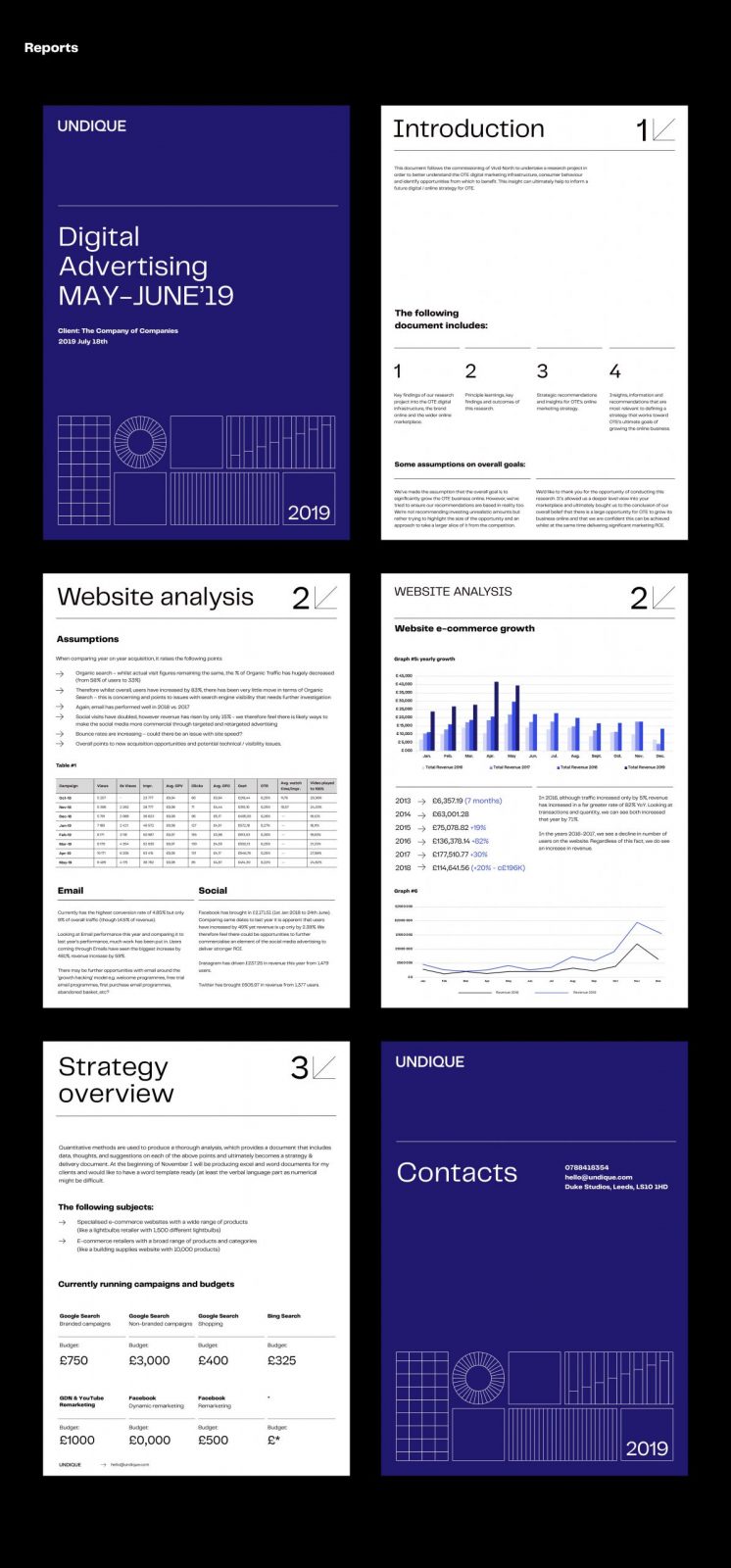
Problem: The main language Undique uses is numbers, even the infographics & charts usually come from none other than MS Excel. So yes, no actual pictures or stock images, just pure data & numbers. And those can often seem pretty boring.
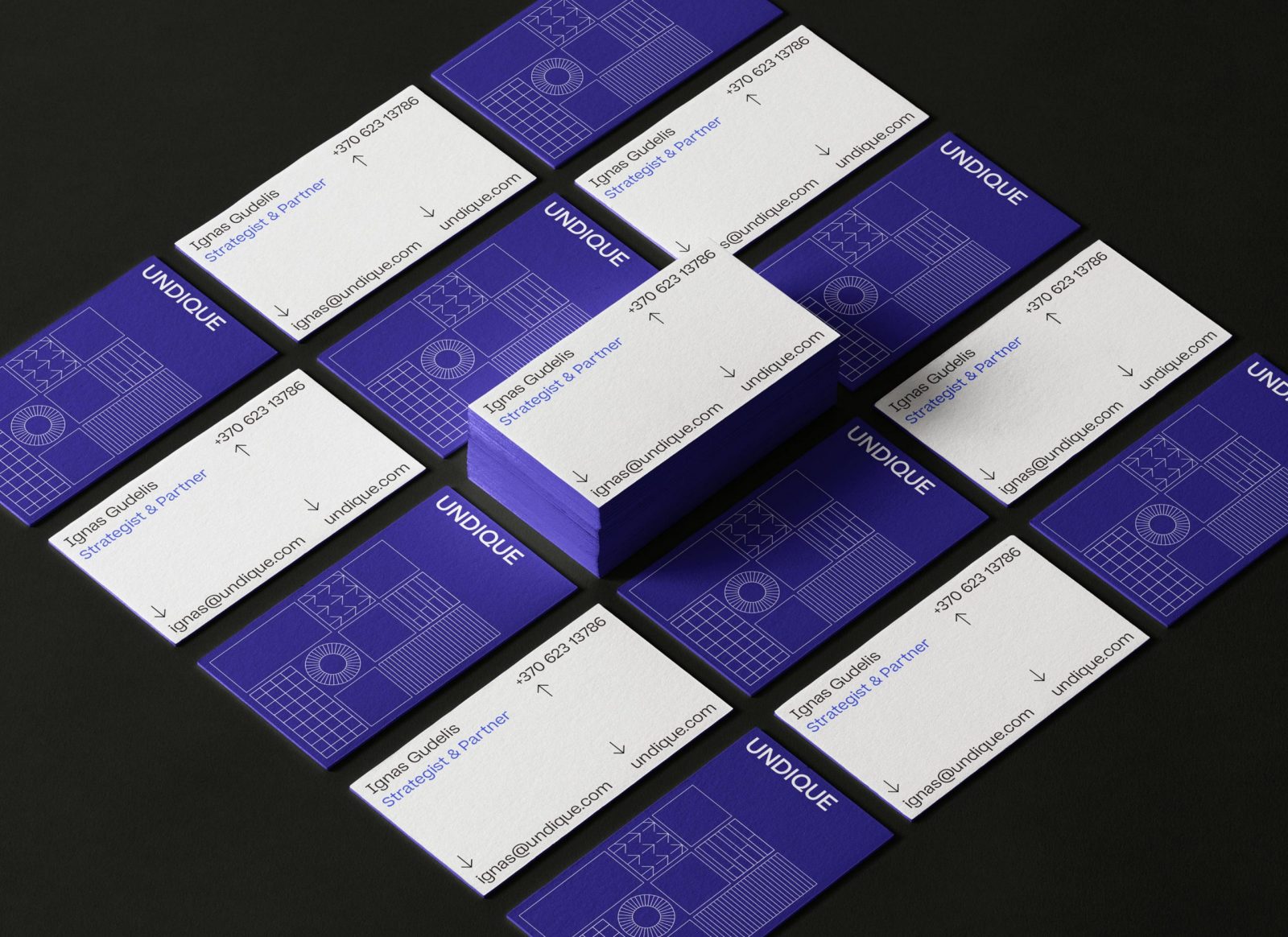
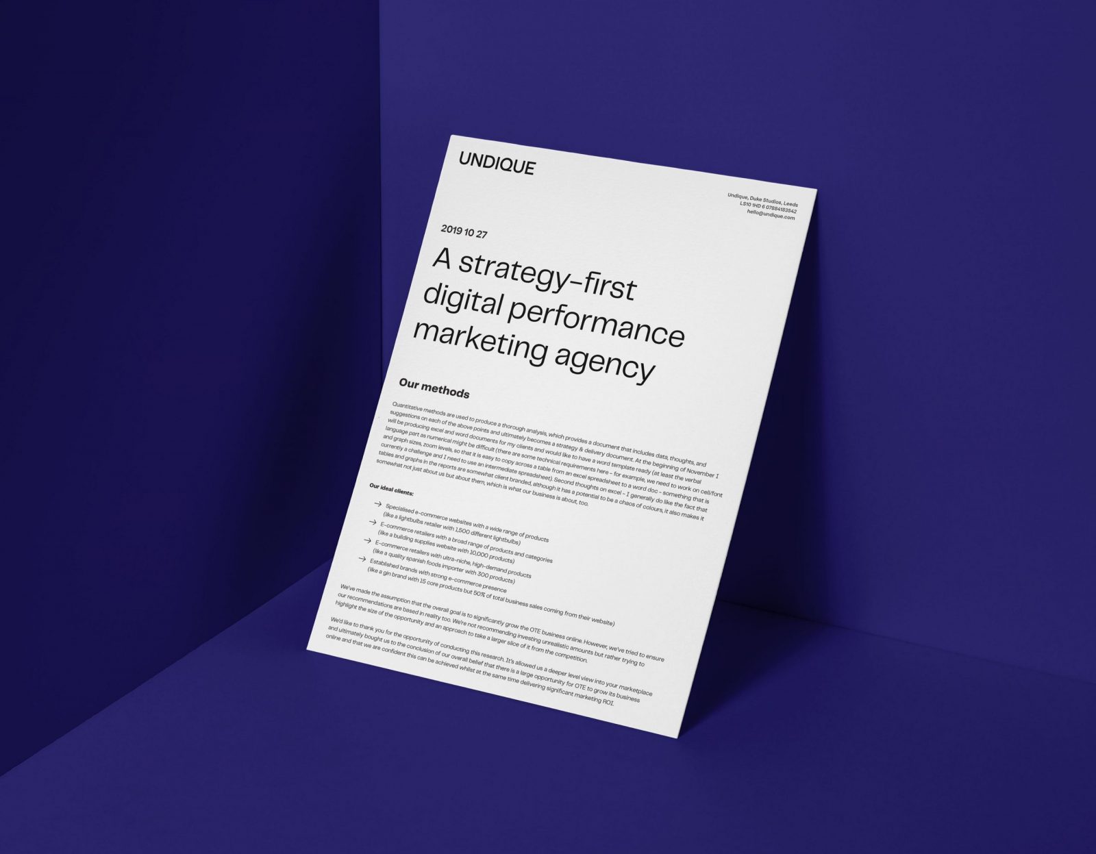
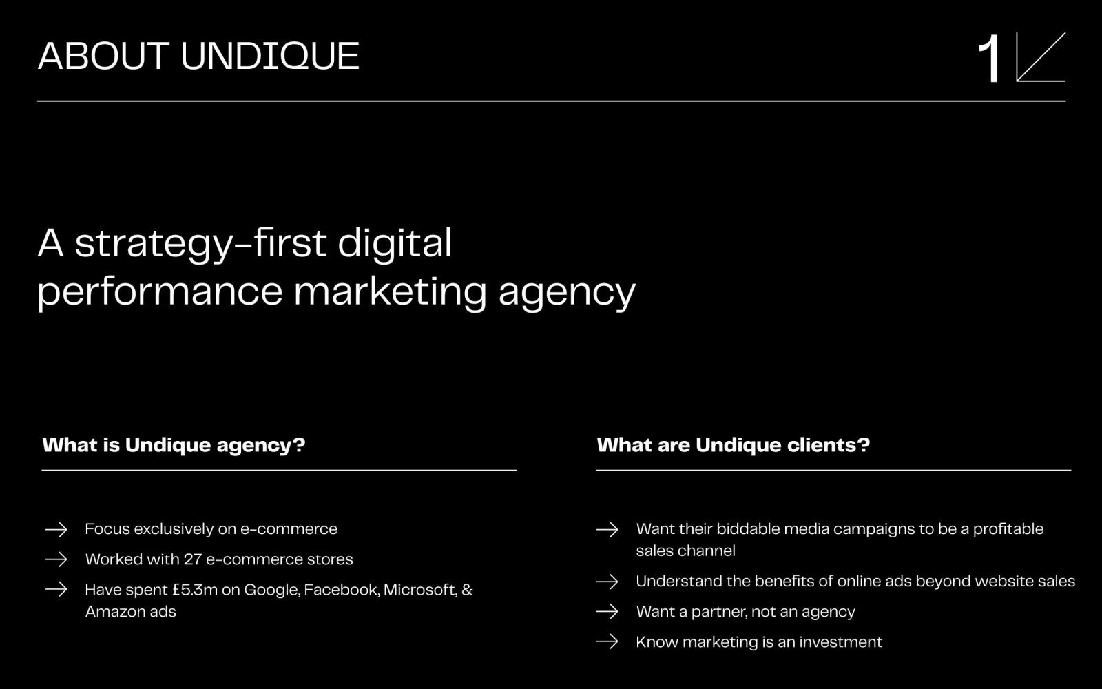
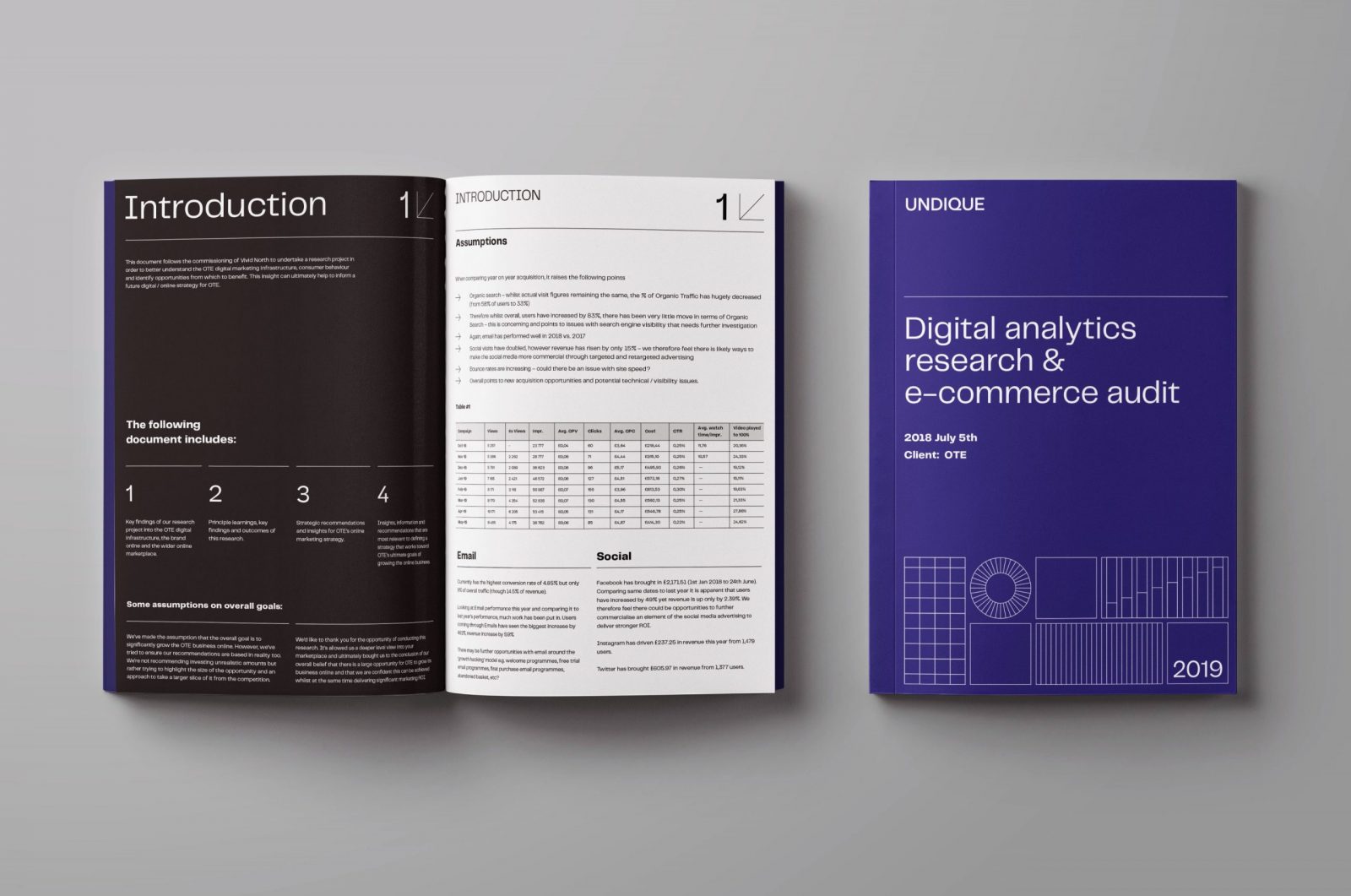
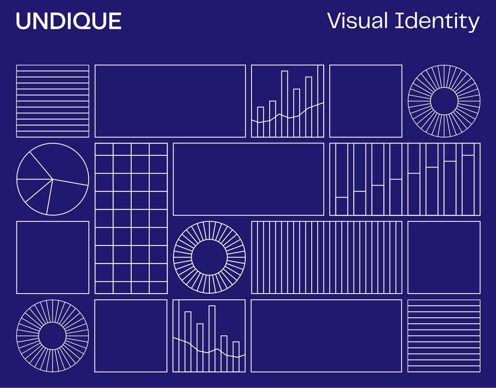
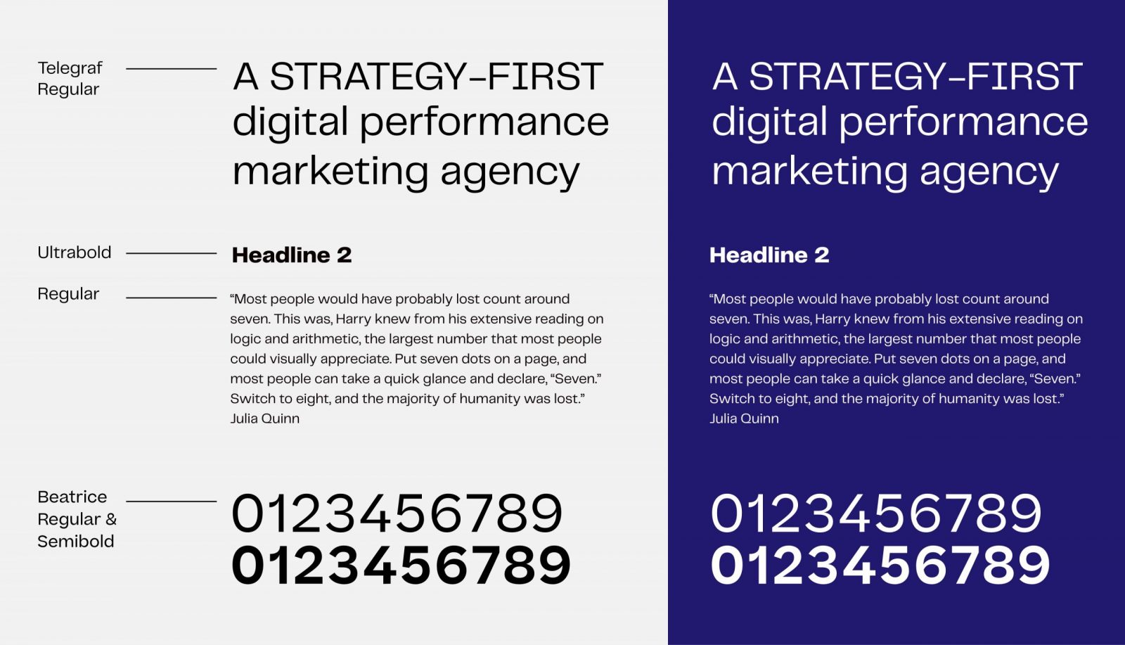
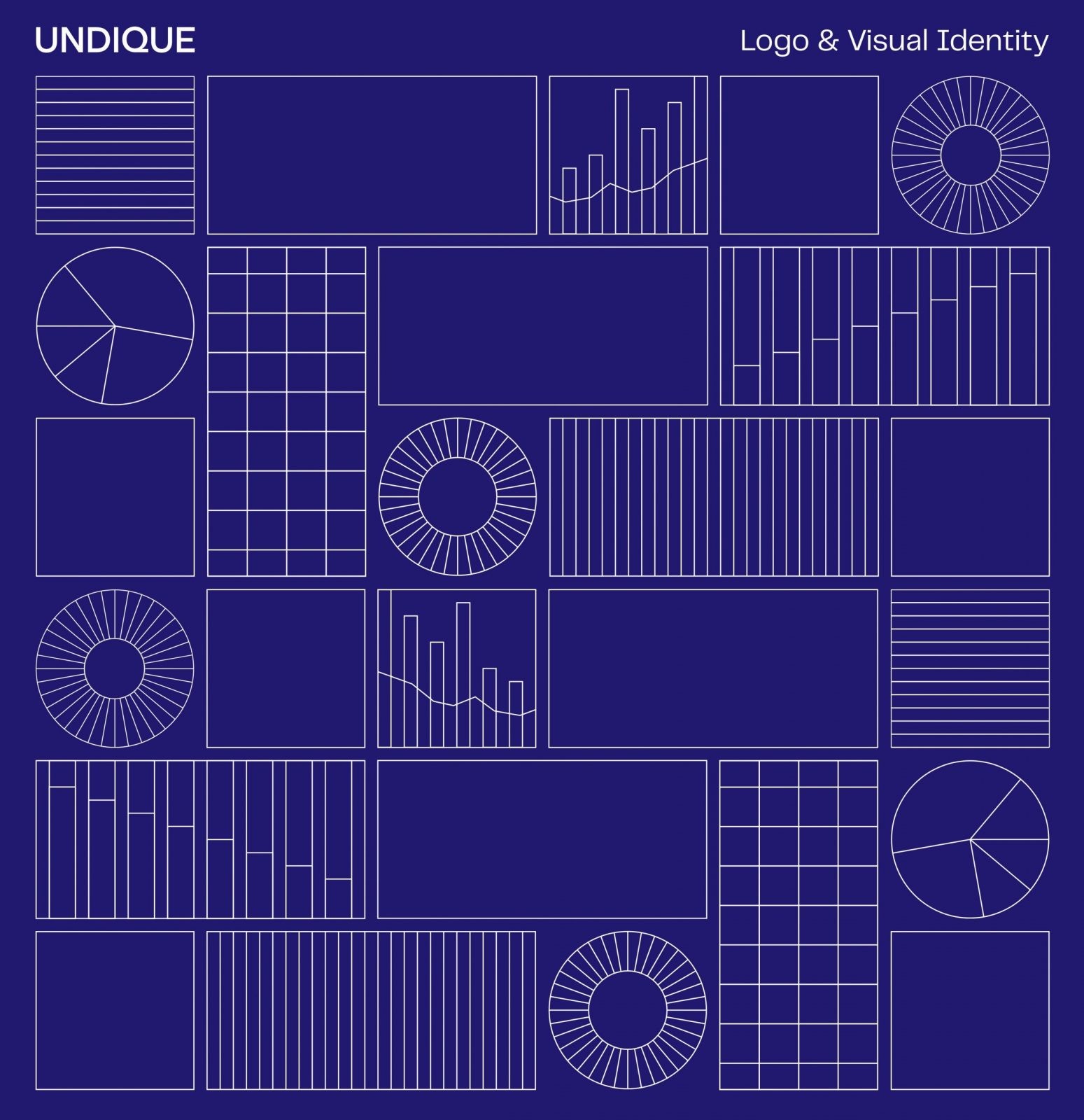
Solution: The Undique branding is based on a strict visual system, created by combining a variety of stylized forms usually found in the world of statistics, mathematics and data science. The main focus was on choosing the right fonts and creating such a hierarchy as well as a layout system so that the analytic research papers and reports would be really easy to follow. A strict yet dynamic visual language was created by using additional illustrations such as infographic elements and math symbols, and combining them into a seamless grid system.


CREDIT
- Agency/Creative: Imagine Branding Studio
- Article Title: UNDIQUE – Branding for Digital Marketing Agency
- Organisation/Entity: Agency, Published Commercial Design
- Project Type: Identity
- Agency/Creative Country: Lithuania
- Market Region: Europe
- Project Deliverables: Brand Architecture, Brand Creation, Brand Guidelines, Brand Identity, Branding, Graphic Design, Identity System, Packaging Design
- Industry: Technology


