Underground, a multi-niche ice cream brand based in Denmark, draws its inspiration from the vibrant and rebellious New York underground scene of the 1970s. This rich cultural heritage is woven into the fabric of the brand, influencing its ethos and identity. The brand offers customers a unique product experience with its low-calorie, high-protein ice cream, catering to those who seek healthier alternatives without compromising on taste. The company’s innovative approach to product development is backed by decades of experience, with its journey beginning in 1977 and continuing to the present day. This deep-rooted history in the industry allows Underground to craft niche products that stand out in the competitive market, offering a blend of nostalgia and modernity.
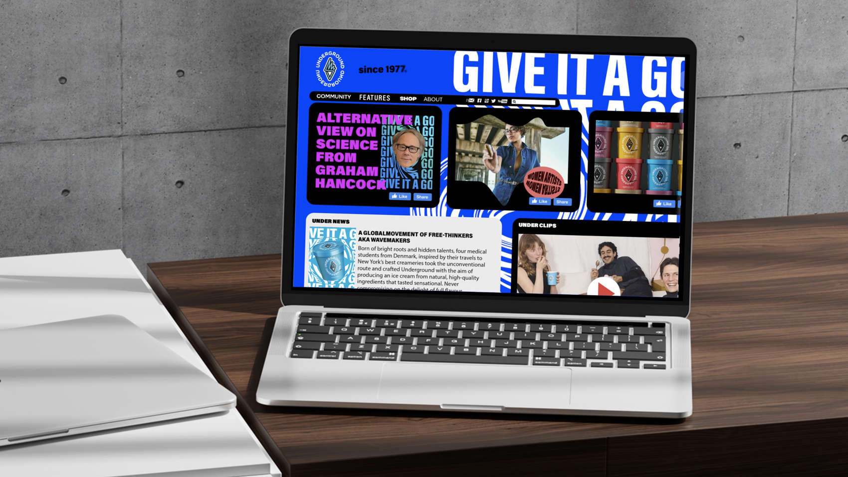
The collaboration with the Food Union private label brand marketing team marked a significant step in the evolution of Underground. Together, we are created a flexible and bold brand system that not only adapts to various marketing tools but also thrives on creativity. This system is designed to illuminate and strengthen the connections between the Underground brand and various creative collaborators, reinforcing its position as a brand that is both innovative and deeply rooted in cultural expression. The brand system is not just a marketing tool but a creative platform that bridges the gap between the brand and its audience, fostering a community of like-minded individuals who appreciate both the product and the culture it represents.
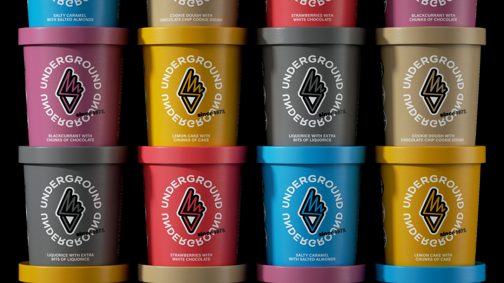
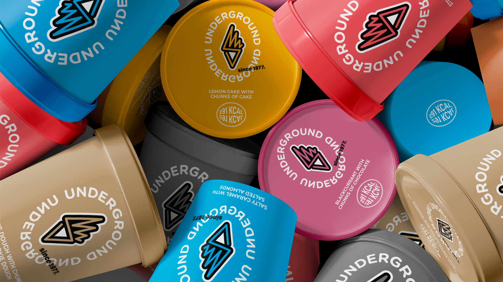
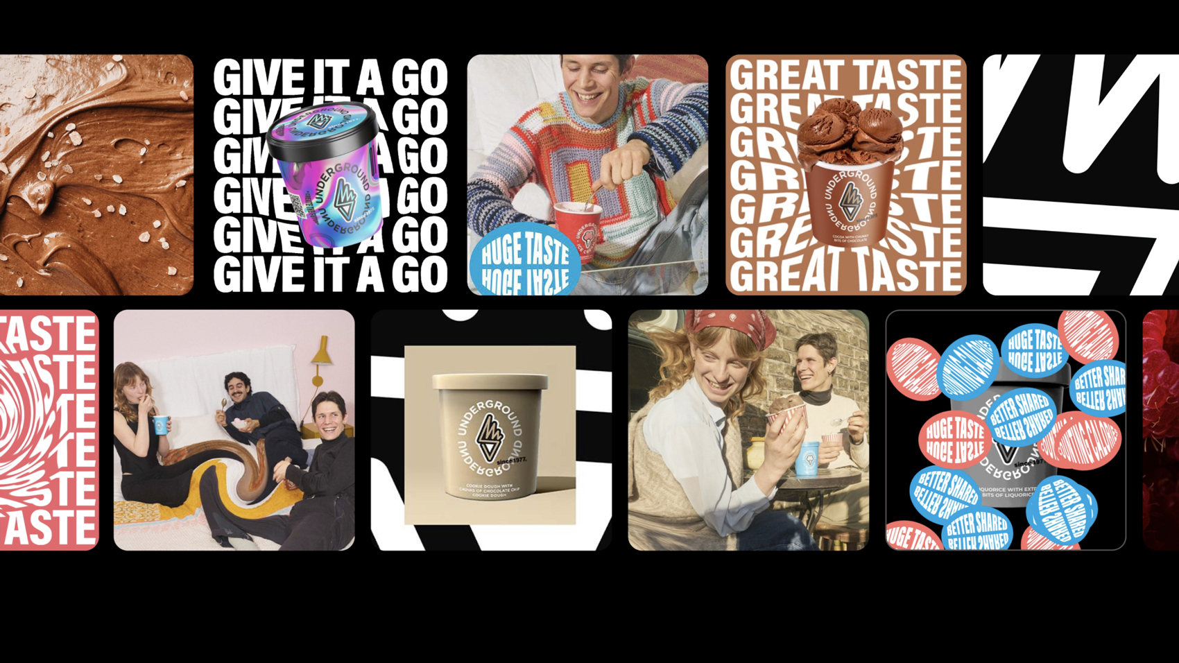
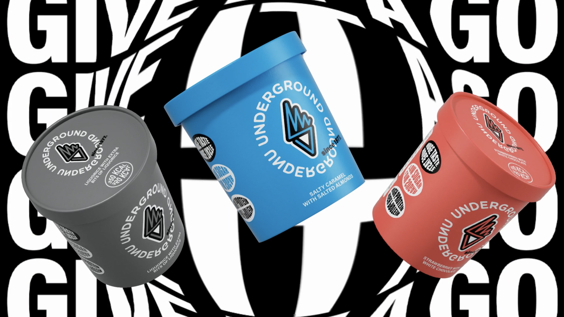
As part of this rebranding effort, a new brand identity was meticulously crafted. This identity extends beyond mere visual elements, encapsulating the brand’s essence and translating it into a cohesive and engaging customer experience. The packaging design, a critical component of this identity, was developed to align seamlessly with the brand’s new direction. It features a modern aesthetic that reflects Underground’s commitment to quality, innovation, and sustainability, while also being visually appealing and functional. The packaging not only attracts attention on the shelves but also communicates the brand’s core values and reflecting the creative spirit of the brand to the consumer.
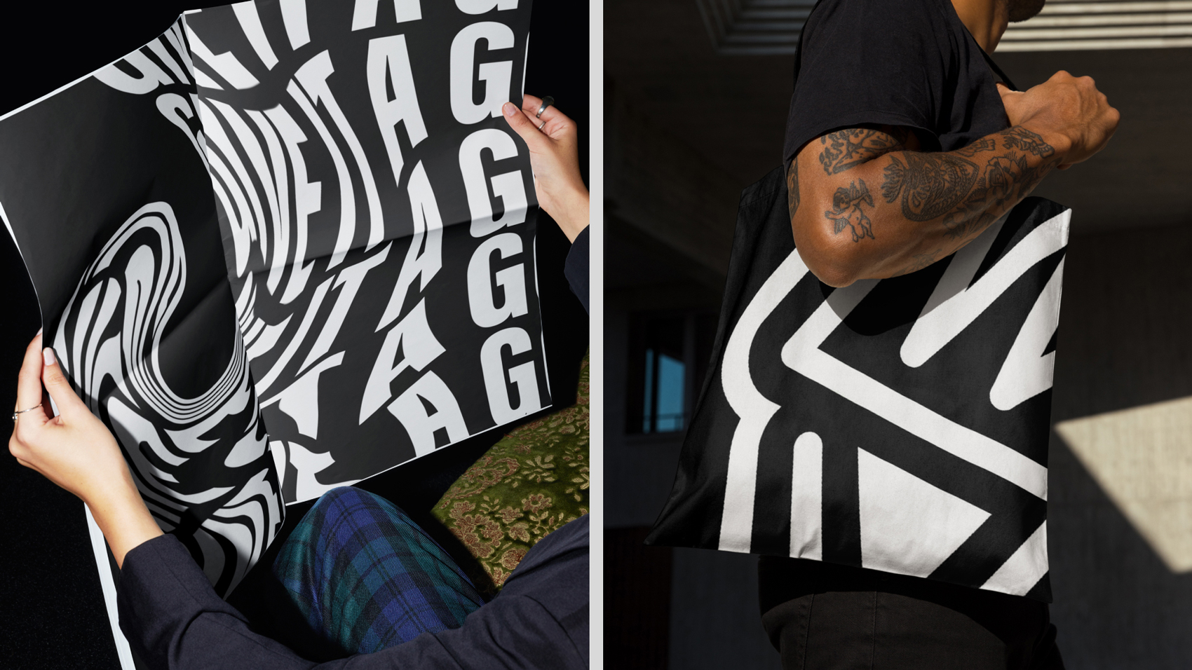
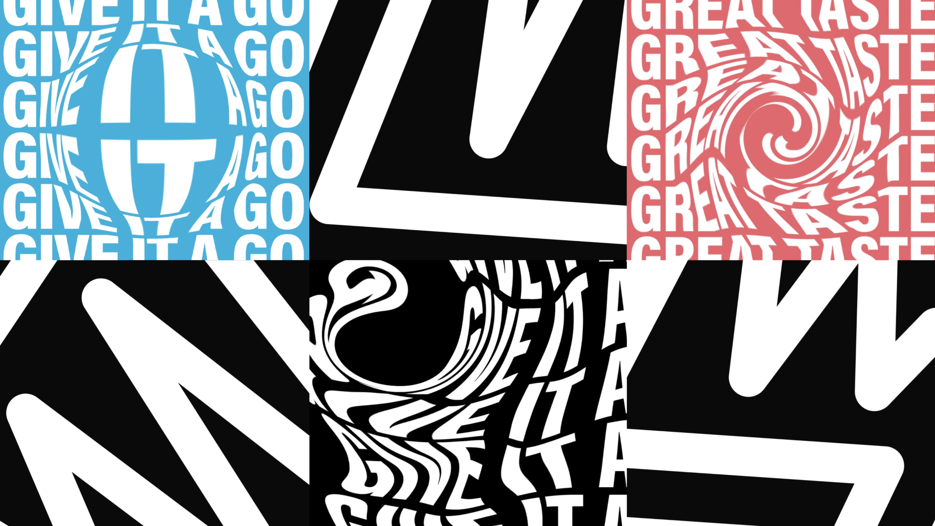
To ensure that the brand’s identity remains consistent across all touchpoints, detailed guidelines and templates were developed. These resources serve as a blueprint for applying the brand identity across various media, ensuring that every interaction with the brand is cohesive and true to its core principles. The guidelines cover all aspects of the brand’s visual language, including typography, color palettes, motion design, and packaging applications. They are designed to be a comprehensive toolkit for the marketing team and any creative partners, providing clear and precise instructions to maintain the brand’s integrity across all platforms.
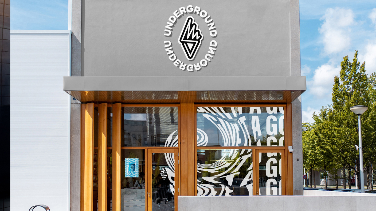
The brand’s sign, a symbiosis of an ice cream cone and fire pennant symbols, is a powerful representation of its philosophy. The fire pennant symbolizes freethinking and a desire for change, reflecting the brand’s commitment to challenging the status quo. The mirrored Underground logotype further reinforces this by symbolizing a nonstandard, unique perspective embedded in the brand’s positioning. Together, these symbols create a distinctive and memorable brand mark that captures the essence of Underground.
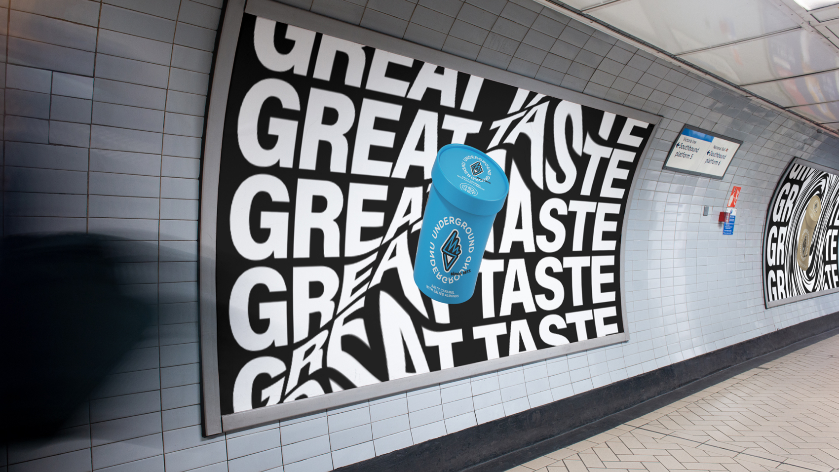
The visual brand identity of the iconic ice cream product is designed to be both exclusive and authentic. It is built on a foundation of laconic yet expressive branding, where bright, dynamic colors meet bold typography. This is complemented by an ultra-appetizing food style and a photo style that incorporates the effect of movement, bringing the product to life in a visually engaging way. The original combination of these elements ensures that the identity is not only visually striking but also deeply resonant with the brand’s values.
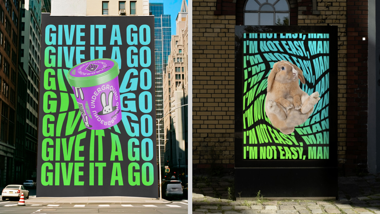
The development of the identity for creative collaborations is a key aspect of the brand’s strategy. This involves the expansion of tools and design techniques to facilitate effective interaction with various creative authors, platforms, events, and initiatives. The design for these collaborations is intentionally bolder and more expressive, with dynamic principles of layout, typography, and colors coming together to create a visually cohesive identity. This approach ensures that the brand remains fresh, relevant, and aligned with the creative vision of its partners, fostering a culture of innovation and collaboration.
CREDIT
- Agency/Creative: Holistic Brand Lab
- Article Title: Underground Ice Cream Brand and Packaging Design Created by Holistic Brand Lab
- Organisation/Entity: Freelance
- Project Type: Identity
- Project Status: Published
- Agency/Creative Country: Serbia
- Agency/Creative City: Novi Sad
- Market Region: Europe
- Project Deliverables: Brand Design, Brand Identity, Creative Direction, Graphic Design, Packaging Design
- Industry: Food/Beverage
- Keywords: New Underground brand identity
-
Credits:
Creative Director: Anastasia igolnikova
CMO: Oleg Beriev
Director of Strategy: Anna Teslenko
Project lead: Maxim Zhurovich, Boris Beriev
Tech lead: Vitaliy Samartsev
Motion & 3d: Pavel Gubin, Evgeniy Nikitin


