Curious Design – The Cool Gardener
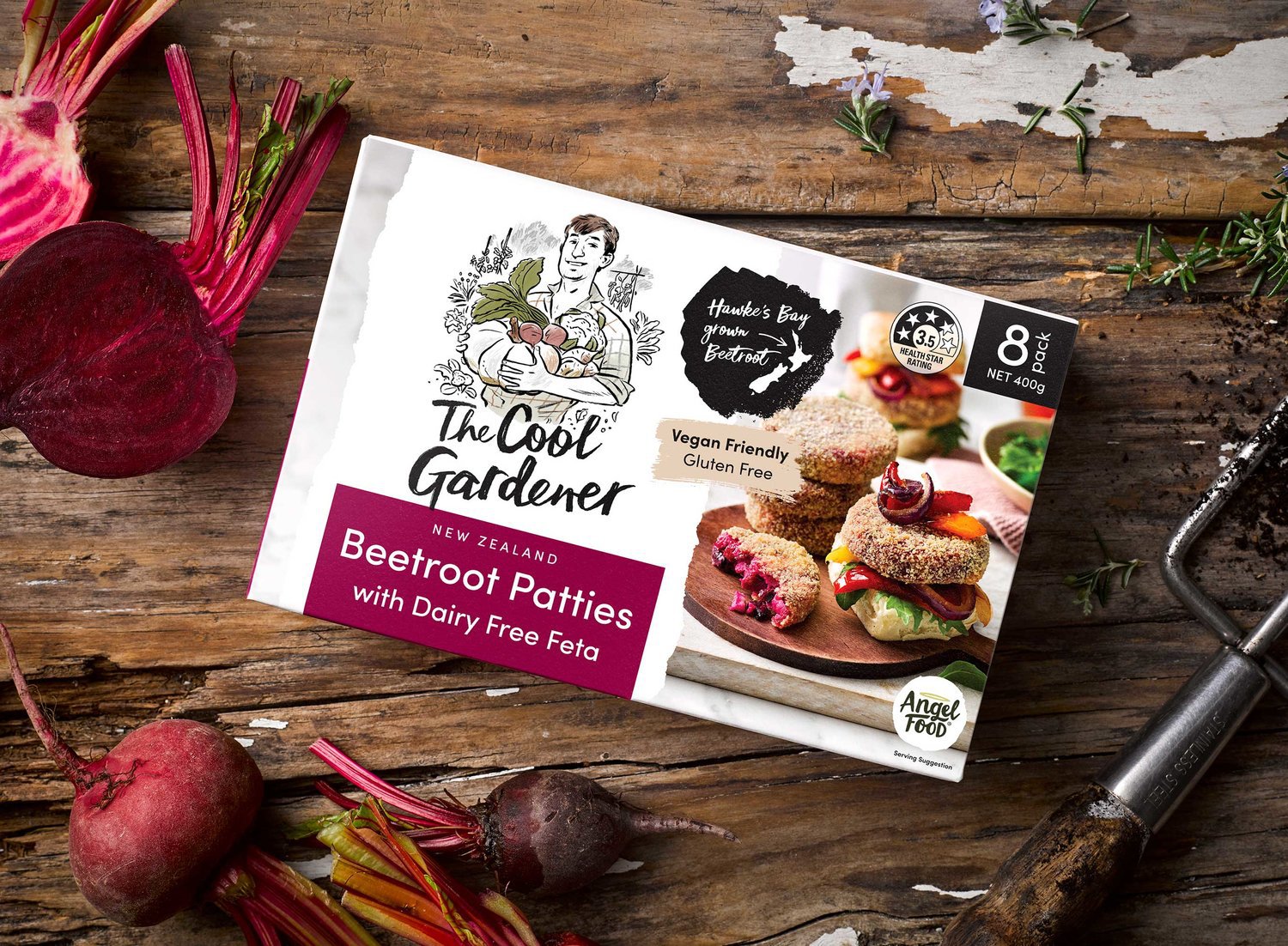
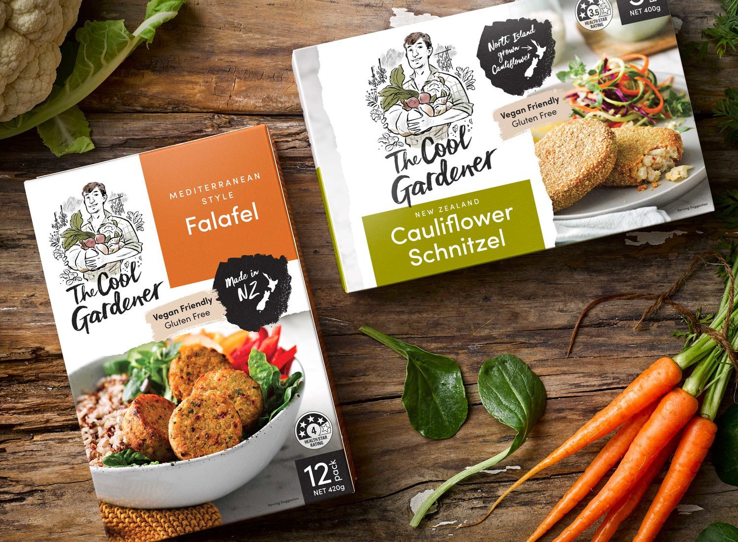
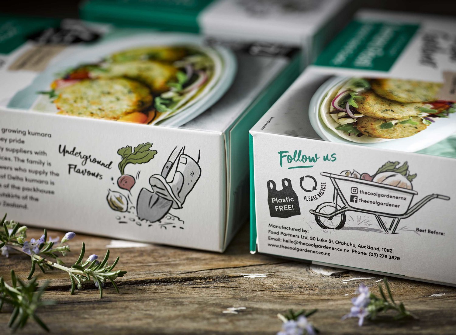
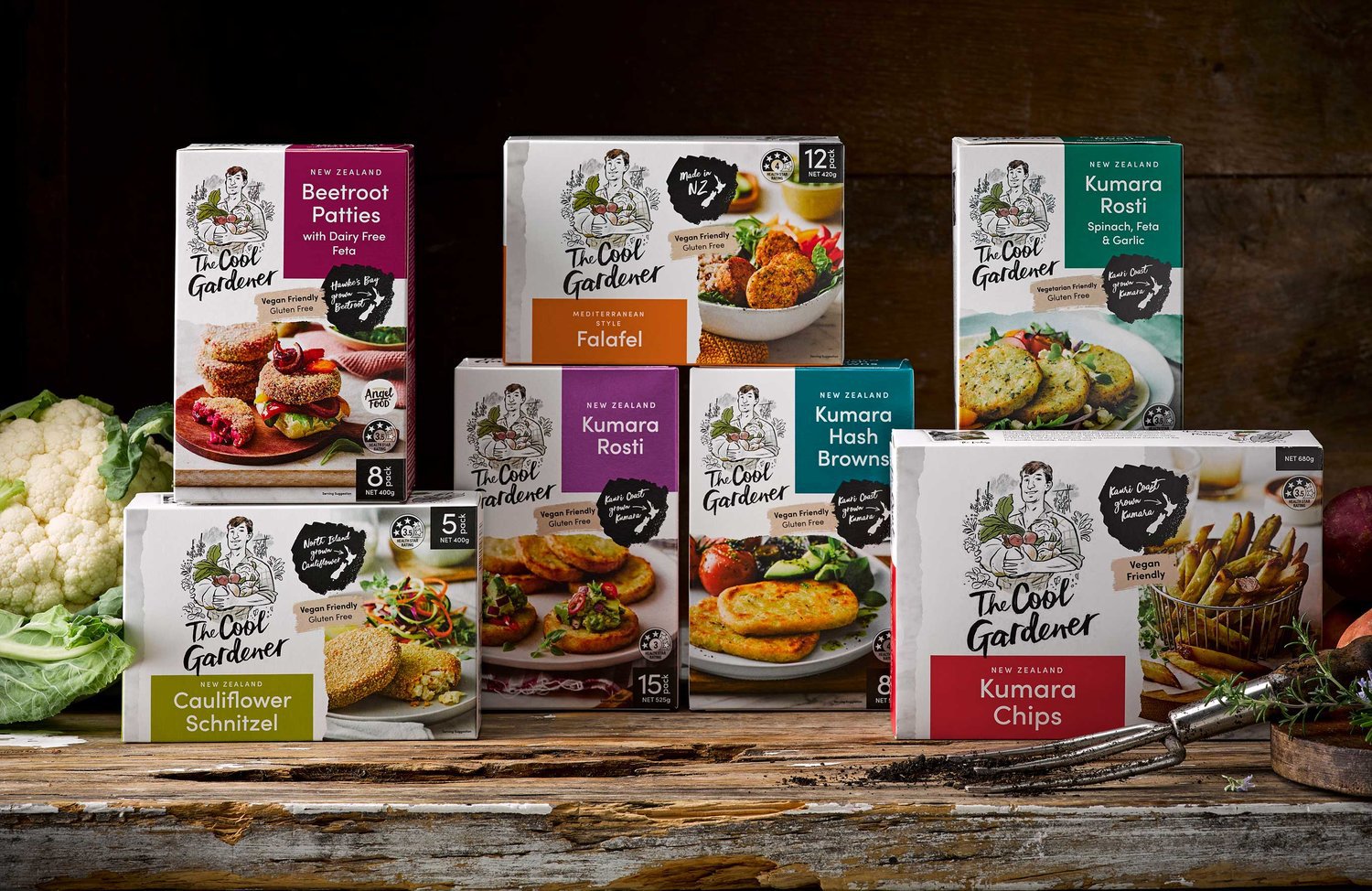
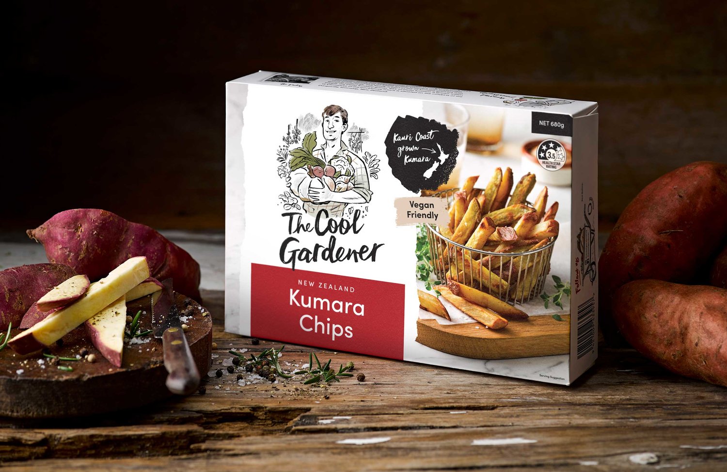
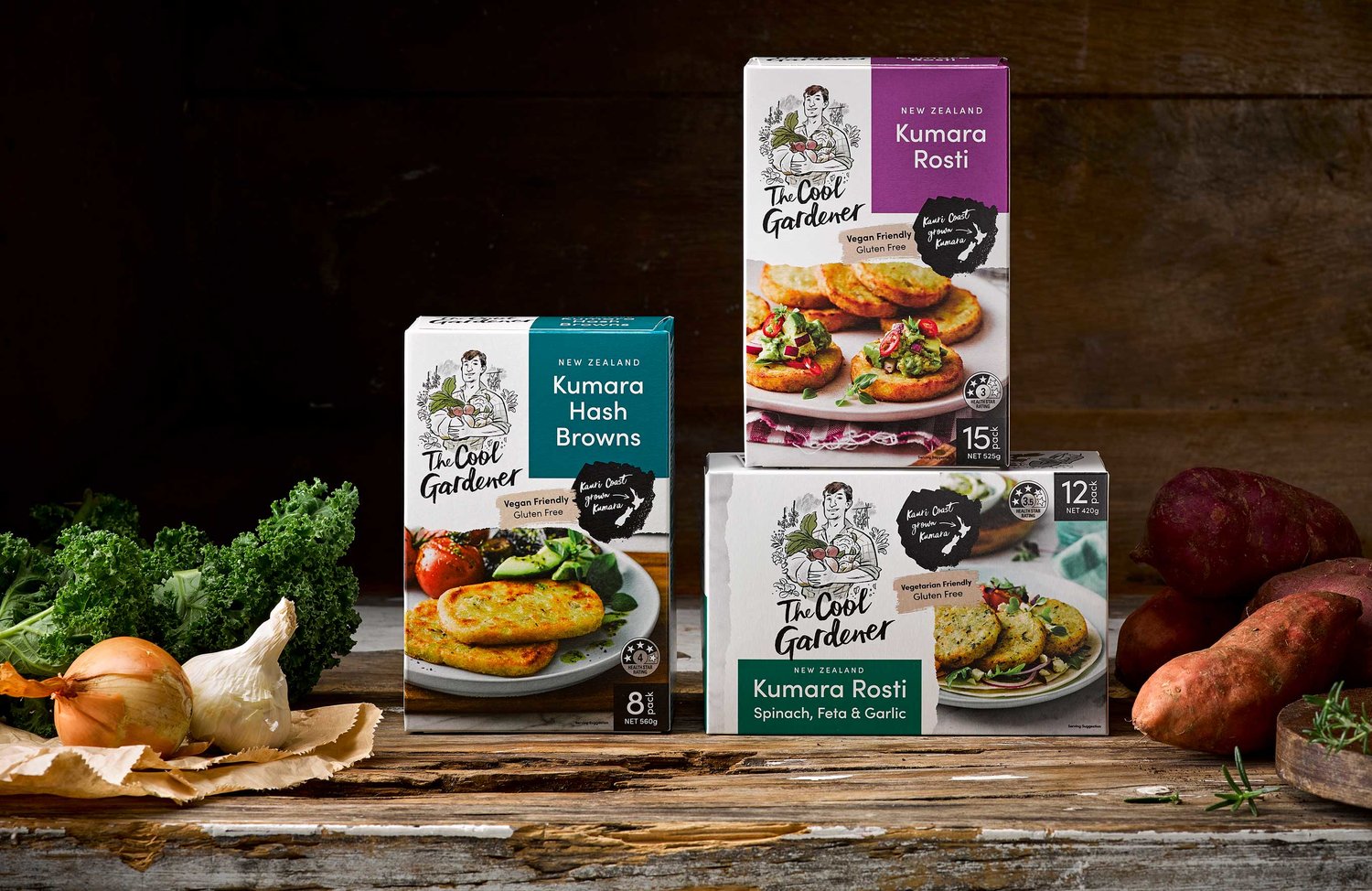
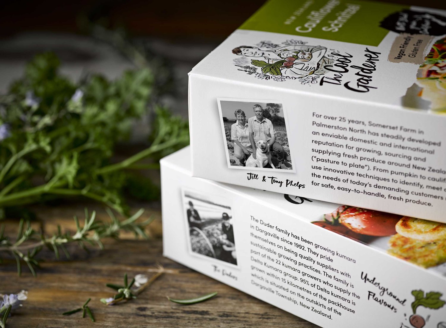
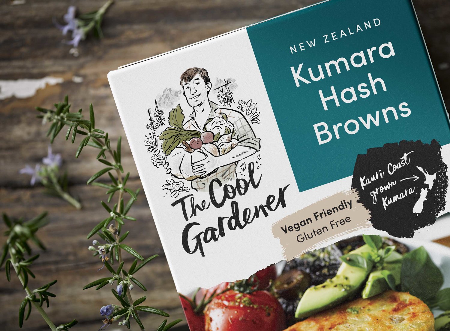
At The Cool Gardener they want to make it easy for everyone to enjoy nutritious, delicious plant-based meals—whether you’re vegan, vegetarian or flexitarian, dairy or gluten free.From garden to table, they do all the hard work for you, picking the best New Zealand produce and combining it with natural ingredients for fast, flavourful food the whole family can enjoy.From Kauri Coast kumara to Hawke’s Bay beets, their veges are grown with care and harvested by hand. They’re then combined with delicious hearty flavours, hand packed and snap frozen, ready to go whenever you need them.Curious was commissioned to create a complete brand and communications strategy for our client that specifically reached out to the rapidly emerging flexitarian and millennial food trend savvy consumers.The process started with us fashioning a name that encapsulated the mood and essence of the brand. Many options were explored and short listed, but The Cool Gardener was the perfect solution. It has a contemporary vibe, it represents the ‘grown with care and harvested by hand’ USP and the ‘Cool’ word is a subtle nod to the product being snap frozen.Once the name was established, we then began to build a marque that visually personified it. The character was the key component, as we wanted it to have an authentic New Zealand gardener feel to represent the provenance of the ingredients and a connection to the land. Daron Parton from Watermark was selected as the illustrator and through his beautiful, evocative linework he has created a personality that is both engaging and genuine. A hand crafted piece of typography by Jo Tronc was then introduced to seamlessly integrate with the imagery.The next stage of the project involved us exploring how we could also assimilate the actual vegetable growers and their stories on the packaging. Consumers want to create a ‘real’ link with the food and brands they’re buying. They want to know where their food comes from, how it was made and by whom. They want the transparency that is required to know its source. They’re even willing to pay a little more for the confidence that their food purchases help to create jobs and promote local economies and safeguard the environment. This objective was achieved by dedicating a full side panel on each pack to showcase the families involved, the regions in New Zealand where they are located and also feature some of the growers own words that sum up their commitment and passion. The individual narrative was then linked with the clever ‘underground flavours’ positioning statement for the brand and visually brought to life with another delightful cameo image by Daron Parton.This simplicity and clarity of message inspired us to build the overall packaging architecture around it. Large areas of white space have been utilised to give a clean, fresh feel and ensure maximum stand out in a cluttered freezer environment. A strong product colour identification system has been introduced to help with consumer navigation and striking food photography add those all important appetite cues. Partnering these touch points with The Cool Gardener memorable brand name and contemporary iconography has allowed Curious to create a brand with a unique New Zealand personality.
CREDIT
- Agency/Creative: Curious Design
- Article Title: Underground Flavours
- Organisation/Entity: Agency, Published Commercial Design
- Project Type: Packaging
- Agency/Creative Country: New Zealand
- Market Region: Oceania
- Format: Box
- Substrate: Pulp Carton


