Brief: Imagine trying to establish yourself in a market sector so saturated such as Fast Food – or QSR. Now imagine doing the same in the market of Dubai, where dining options are countless and consumers have at their disposal dozens of Fast Food alternatives coming from every corner of the Earth.
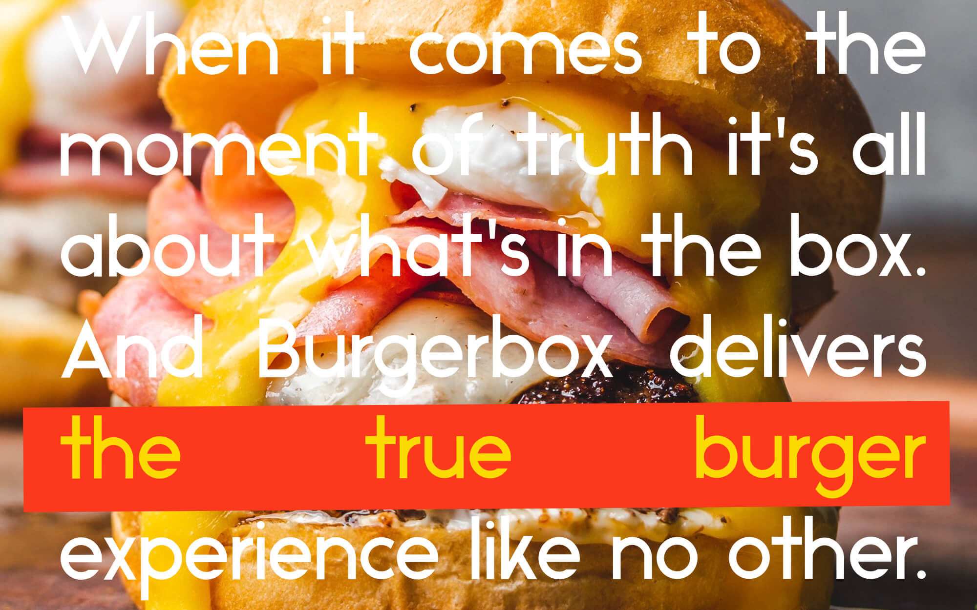
The people behind Burgerbox were very well aware of the challenges. Against a flood of competitors that pushed increasingly flamboyant offers, their approach was based on simplicity. They wanted to celebrate the great taste of the archetypical burger without bells and whistles. For them, it was all about what’s in the box. This is where we started.
Target Group: Quick Service Restaurant customers in Dubai, UAE with a rich mix of customers from a multitude of nationalities, age groups and socioeconomic backgrounds.
Concept: Since the core idea behind the brand was the glorification of the burger itself, we decided to focus on the same thing avoiding design noise that would probably carry across the wrong messages. We wanted something simple and direct, warmly familiar, Inviting and approachable. The concept of the ”box” should also somehow be depicted.
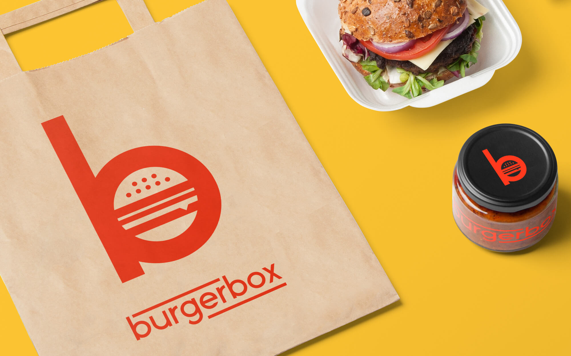
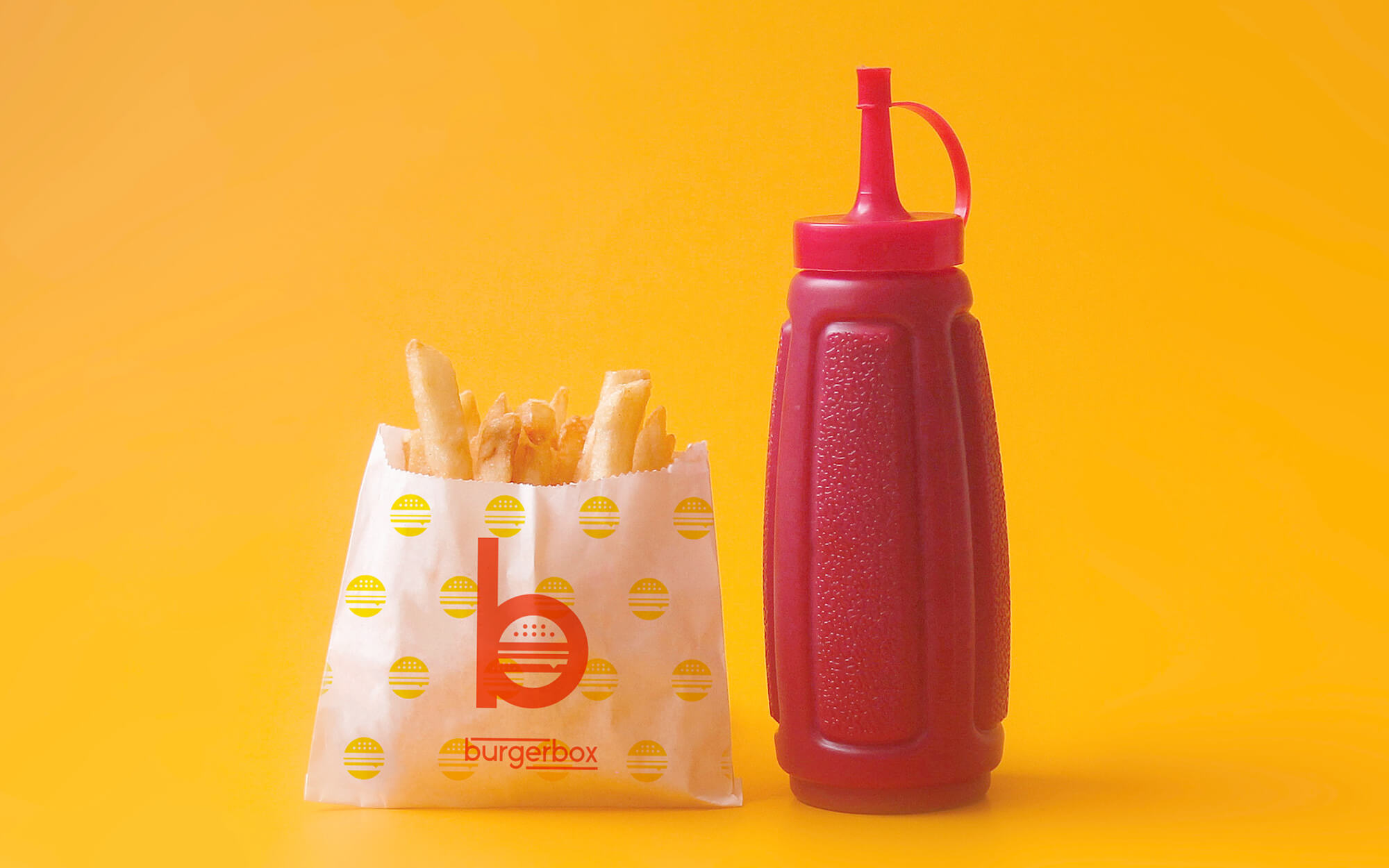
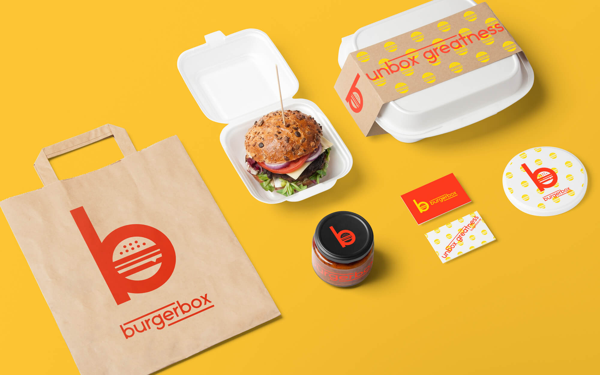
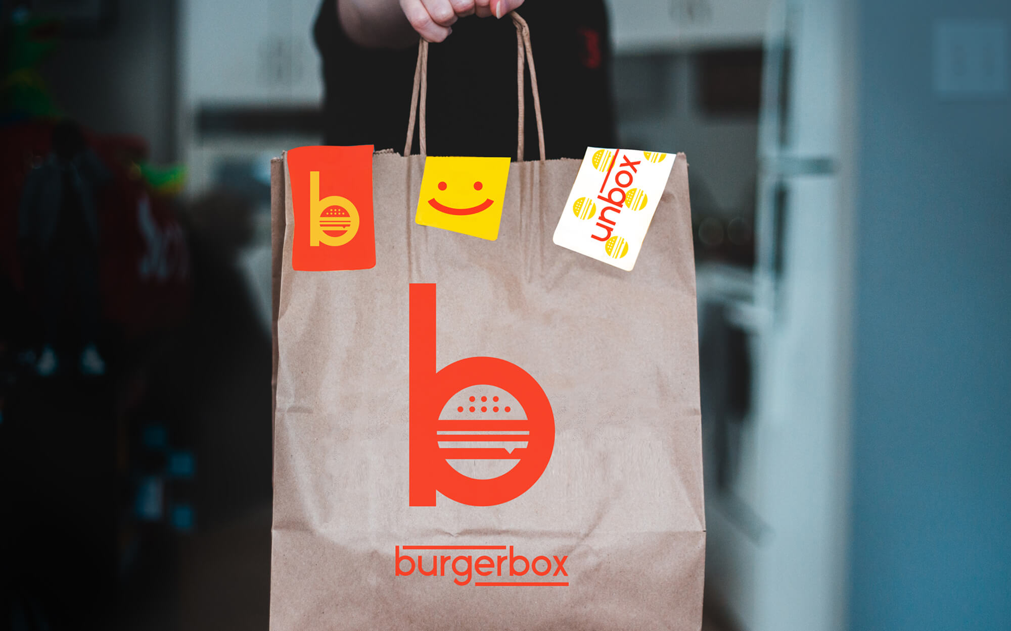
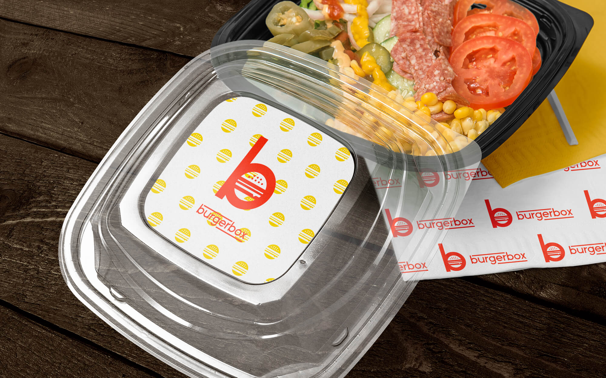
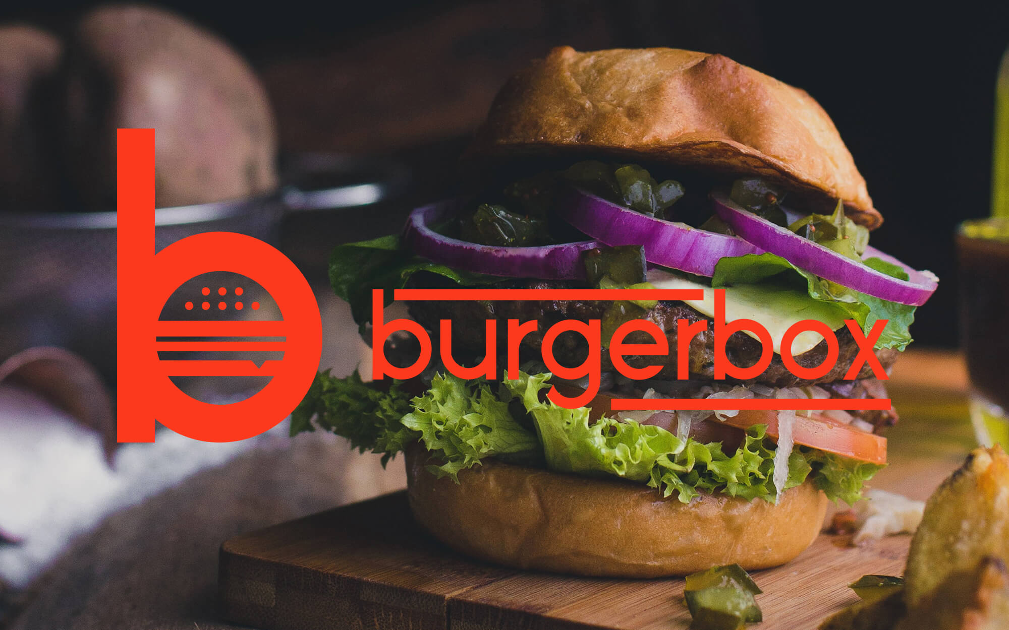
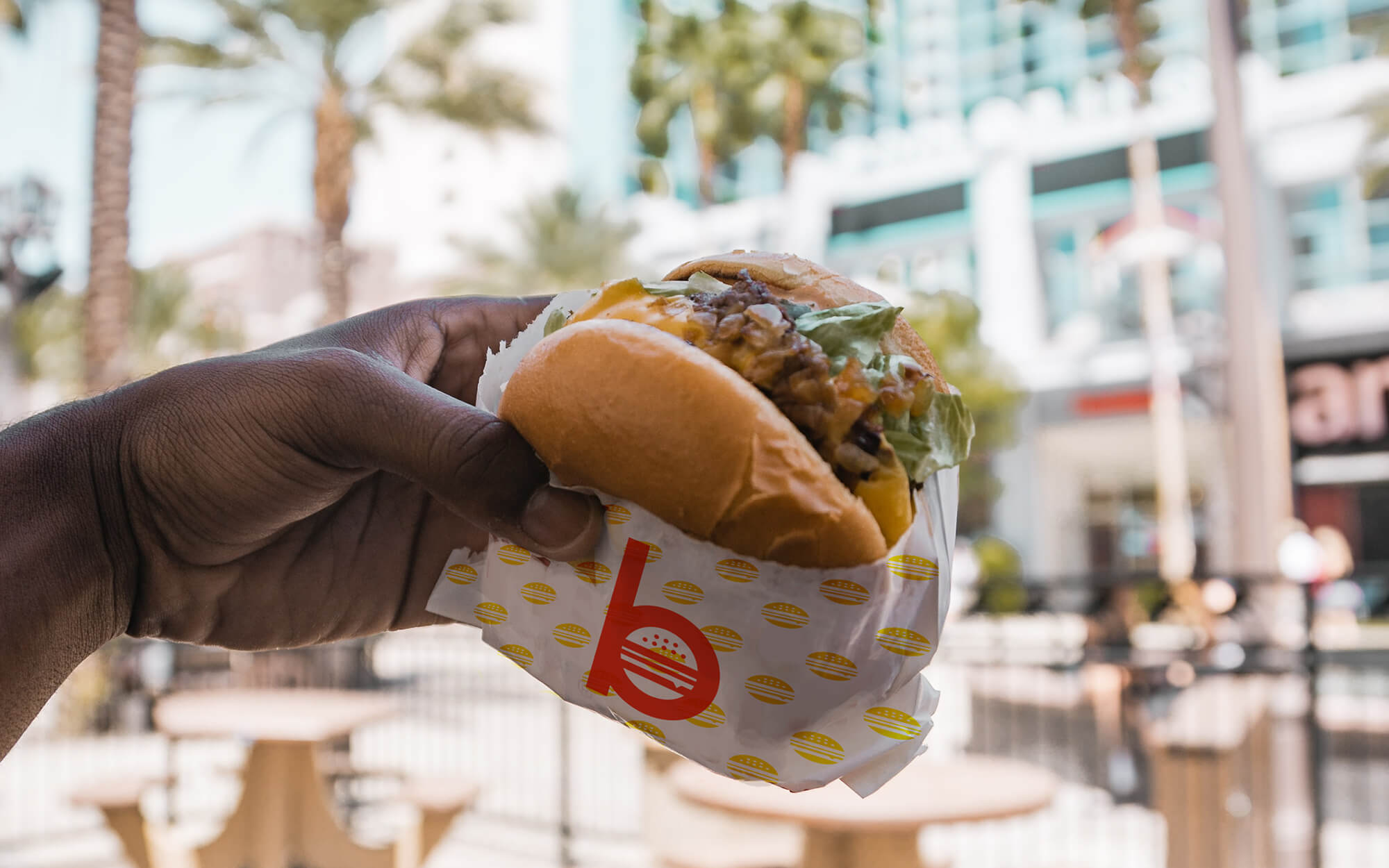
Design Approach: The brand’s logo consists of a clear and loud “b” that contains (pretty much like a box does) the classic shape of a burger inside. The brand name appears in lower case, pushing the point of everyday approachability and fun. It is in turn enclosed between two lines, in a box-like manner. Bright, happy red and yellow, established and well-recognised fast-food colors were the colors of choice, pushing subtly the point of the archetypical burger with no experiments and novelties in the mix. At the end of the day, its all about what’s in the box – and now this is clear to all.
CREDIT
- Agency/Creative: Sophia Georgopoulou | Design
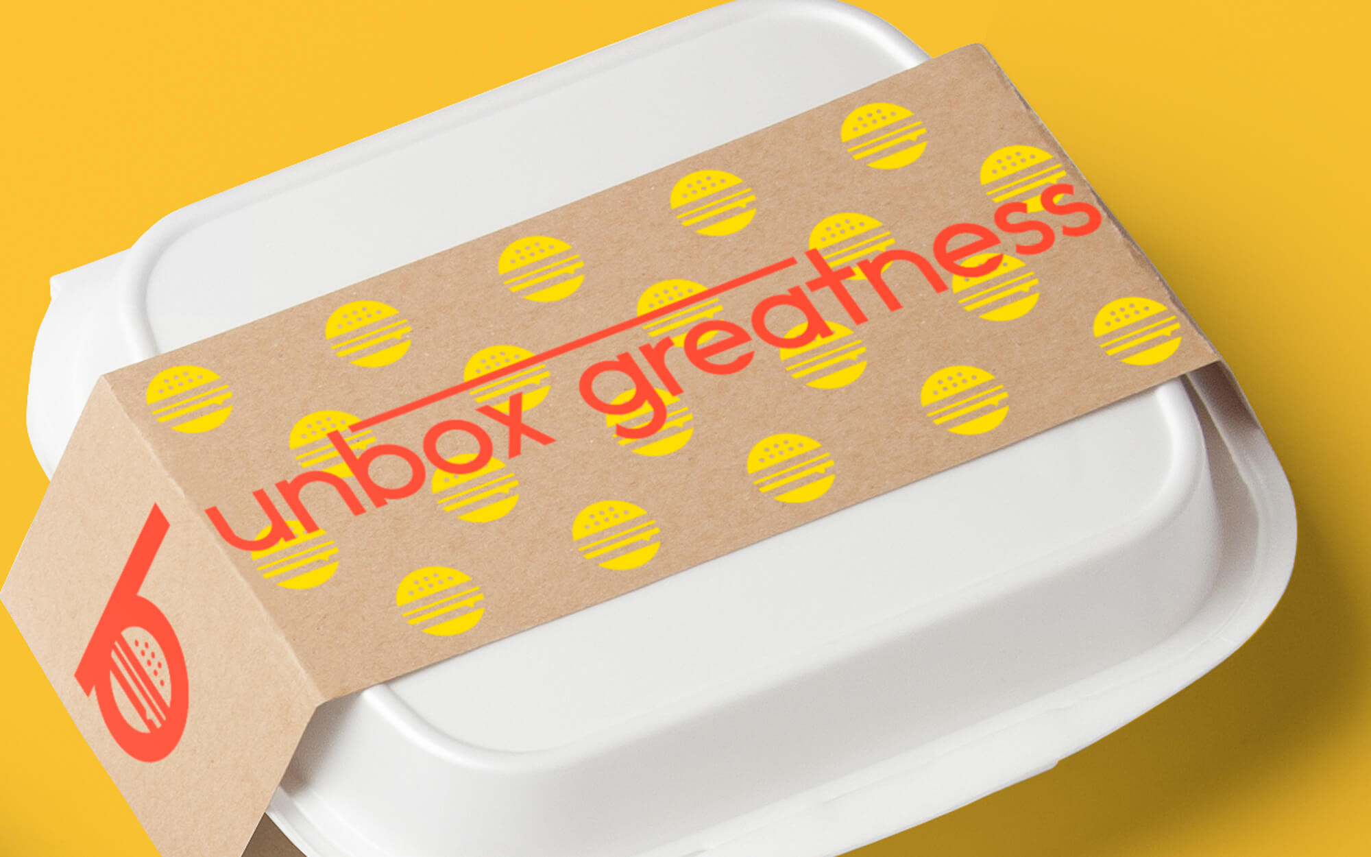
- Article Title: Unboxing Burgerbox Success Through Takeaway Packaging Design
- Organisation/Entity: Freelance, Published Commercial Design
- Project Type: Identity
- Agency/Creative Country: Greece
- Market Region: Middle East
- Project Deliverables: Brand Creation, Brand Guidelines, Brand Identity, Brand World, Branding, Graphic Design, Identity System, Packaging Design, Retail Brand Design, Tone of Voice
- Industry: Food/Beverage
- Keywords: burger, box, restaurant, burger box, fast food, quick service restaurant, united emirates, dubai, food, meat, letter b, pop, graphic design greece, athens, sophia georgopoulou design, logo, brand, branding, red, logo designer


