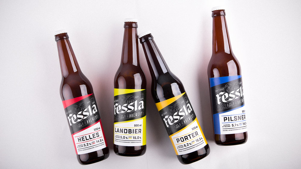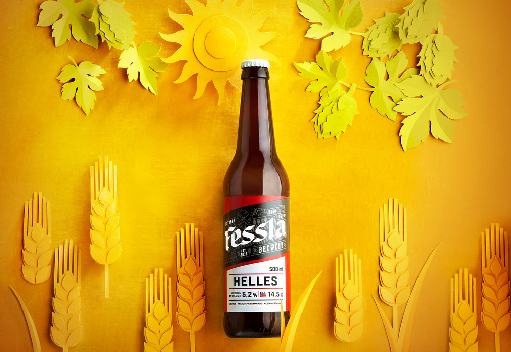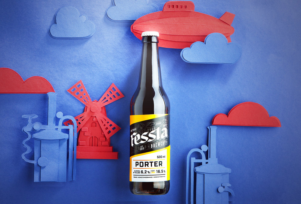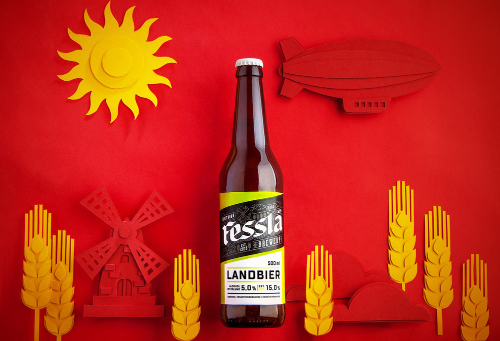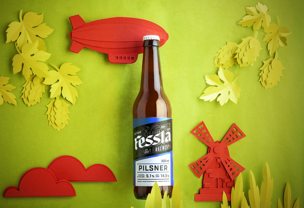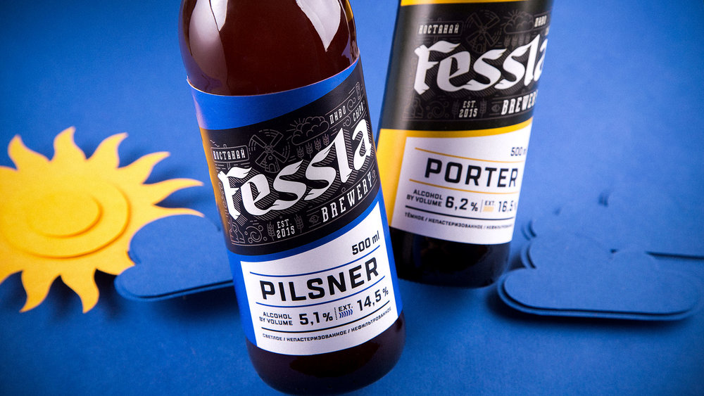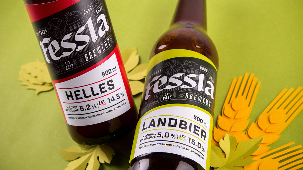
” Today we are going to talk about a famous place in Kazakhstan. It is a big beer restaurant representing also hotel, pub and brewery. Locals can easily guess that it is about “Fessla”.In “Fessla Bräuhaus” more than ten sorts of beer are brewed from German and Austrian hop, raged from classical Chech, Belgian and Bavarian up to modern North American sorts, which have been coming into fashion during last years. For a long time beer “Fessla” was available only at the pub and restaurant, and this fact tells that the owners have been sharpening their skill. But a while ago restaurateur Dmitriy Kireev has made a decision to bottle brewery products for those who are outside of Kostanay and Kazakhstan. As you may guess the task of packaging was delivered to our company.What is easier: to make one label or ten? If we are talking about ten different products, then it is much harder to produce one overall label for every sort. So the task was to develop a multipurpose label which could easily be varied depending on supplement of collection of sorts nearly without any limitations.We used the present logo, which has its own history and recognizability on the area where the brand was established, and left it practically without any changes. The label is made up in such a way that the name of the sort is brightly accentuated and can be easily changed up to any other sort we know. Besides such a universal label can’t stand without colour differentiation. That’s why during the first stage we selected ten colours supposed to reflect the nature of different sorts of beer.The labels turned out to be bright and good-looking, counterbalanced with strict typography and classical black and white text block. Antithesis of backlight and readable message let us to get identity of each bottle in the range and wide recognizability of the brand.”

