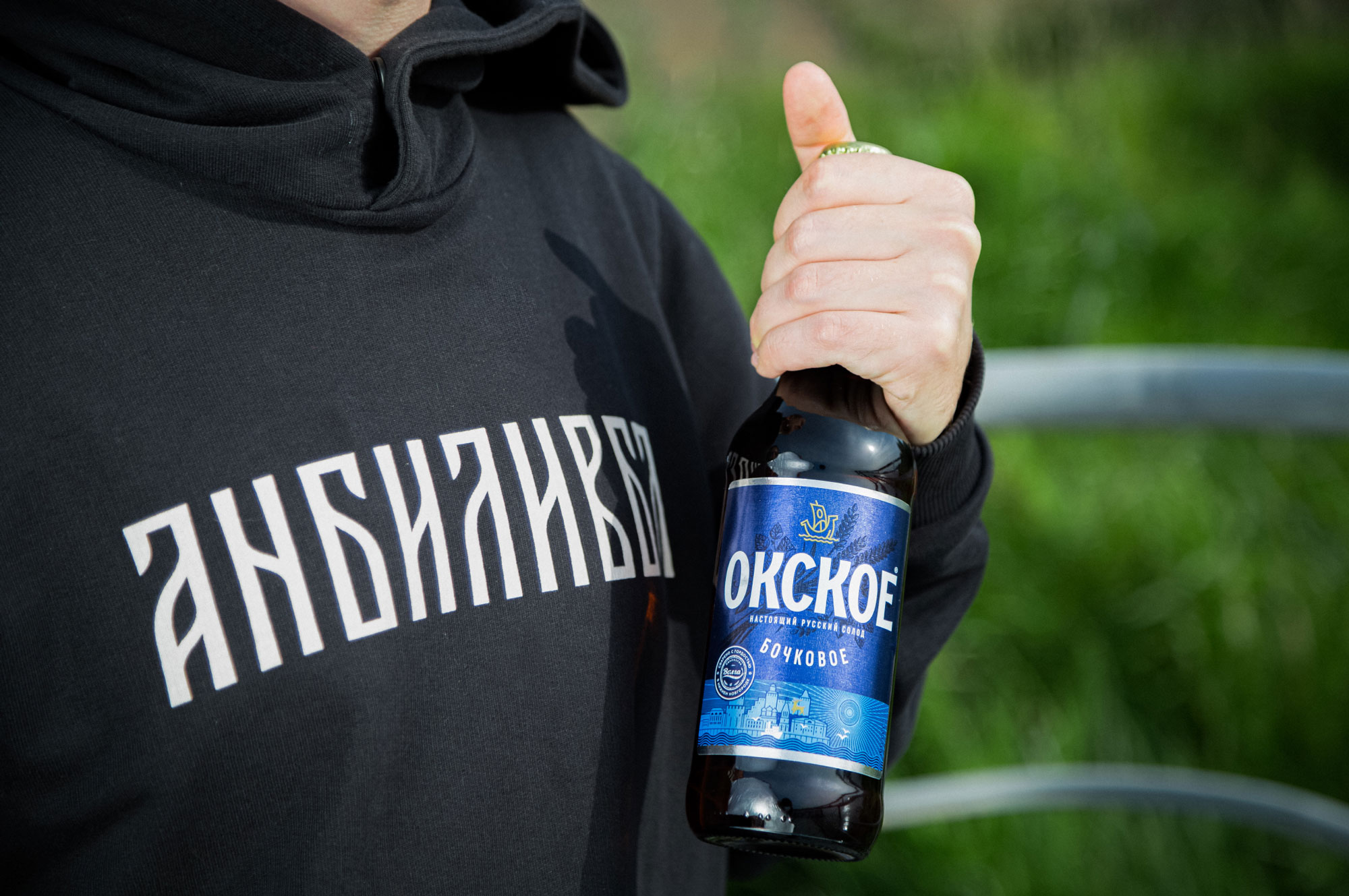
In the Nizhny Novgorod region we have a lot of long-present beer brands and on this local level of the market we can say that the “Okskoye” beer has the full right to be called one of the most recognizable brands. It doesn’t lose its popularity through the time and keeps its front going today. In other words, we can even easily associate the brand with its distribution city.
In spite of its long-term existence, the last few years there a marginalization of a brand is being observed. The natural wearout of a brand image and moderate prices within the local market have made a significant impact on the brand representation.
Thus, our primary task was to refresh it and to give a new meaning to it, something that relates to modern life, to actual tendencies and to today’s customer expectations.
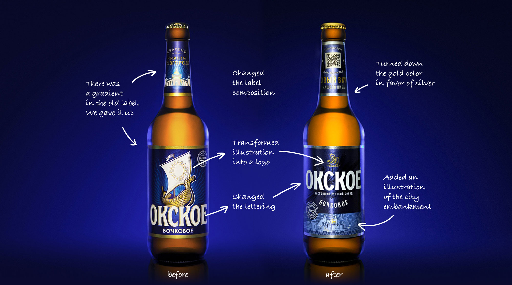
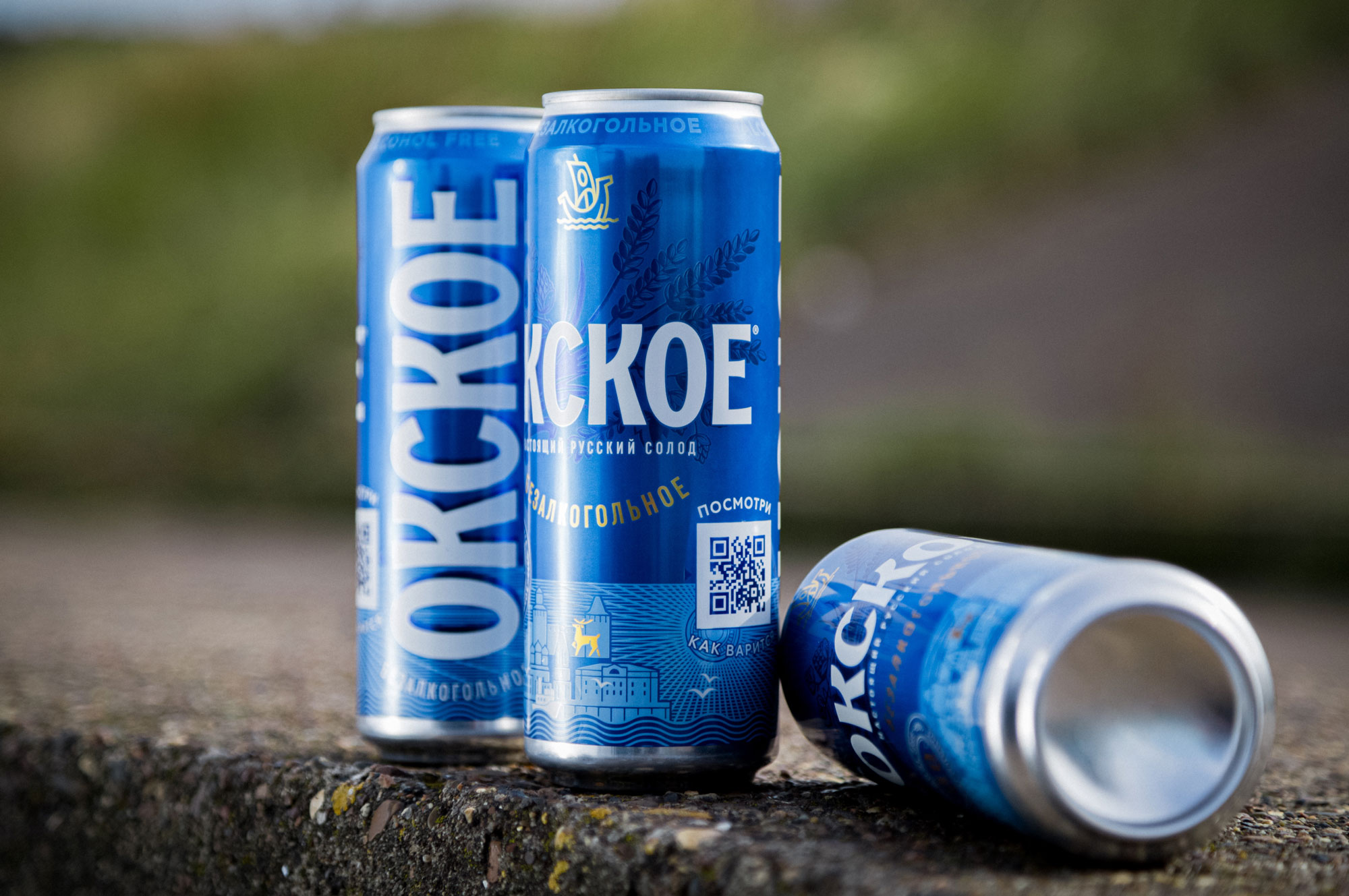
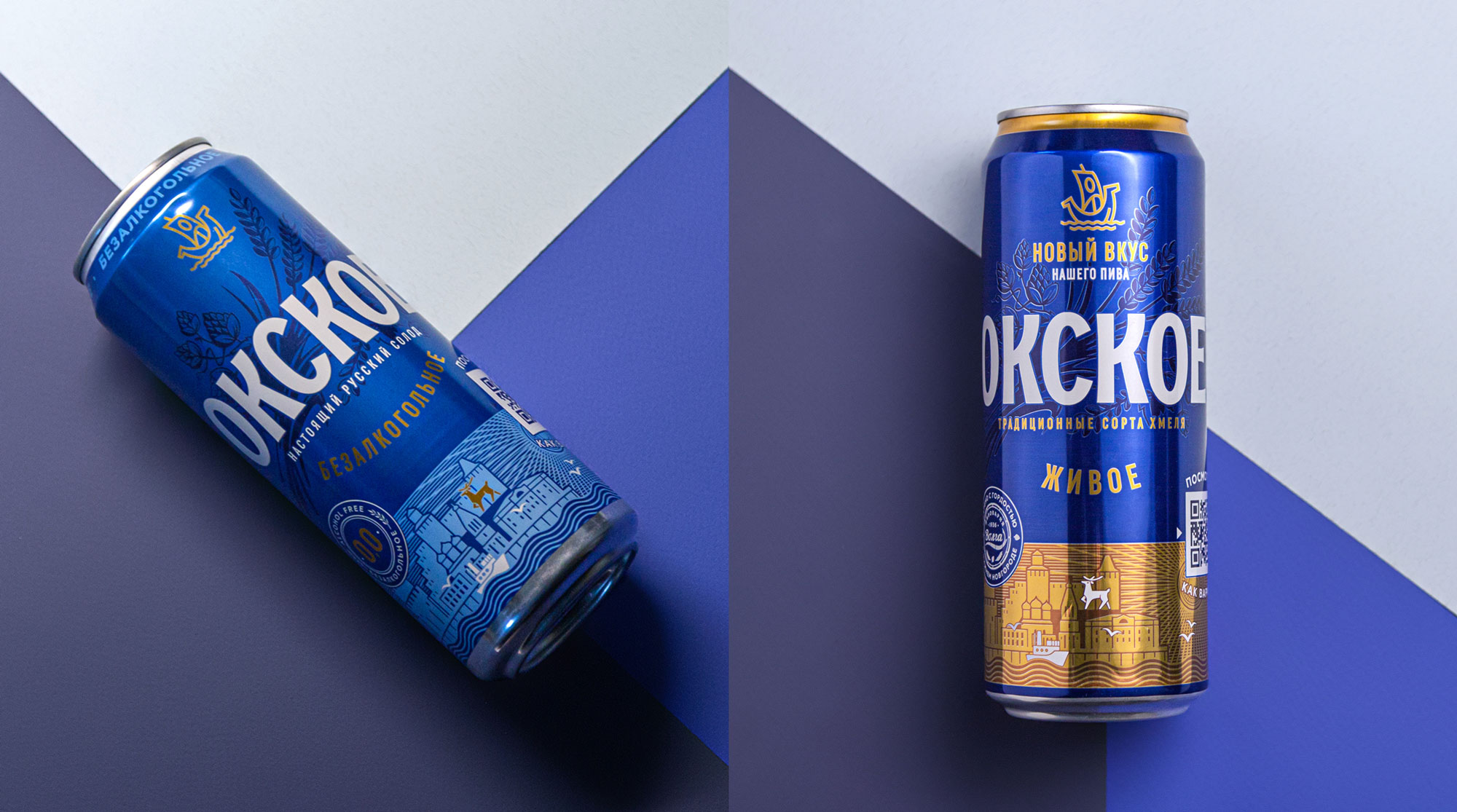
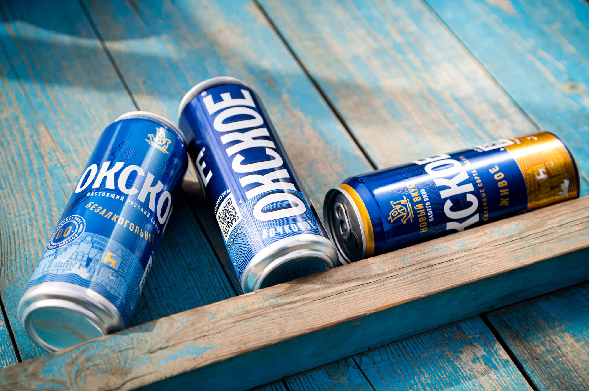
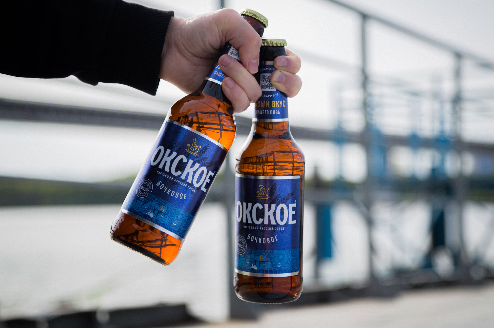
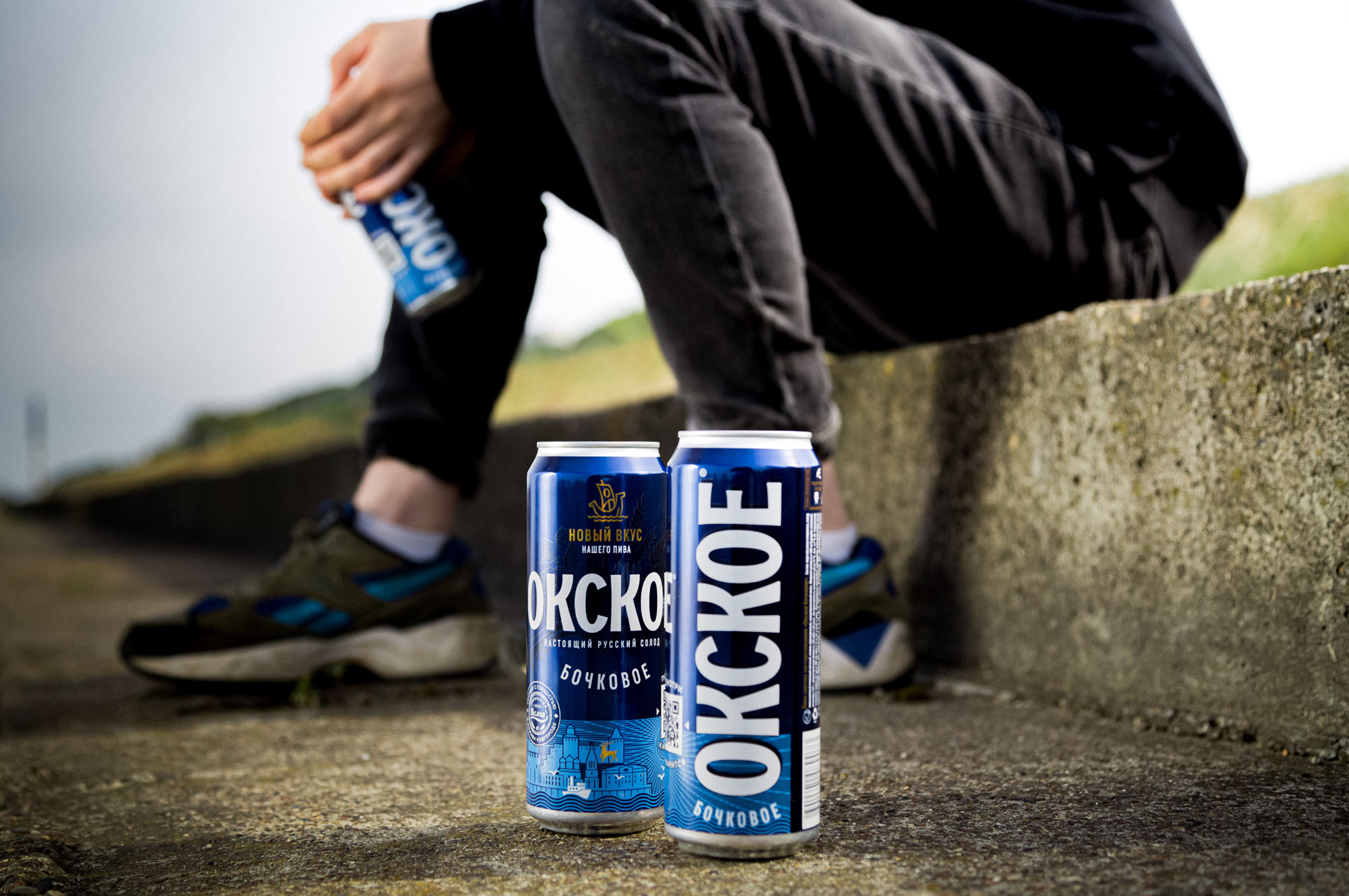
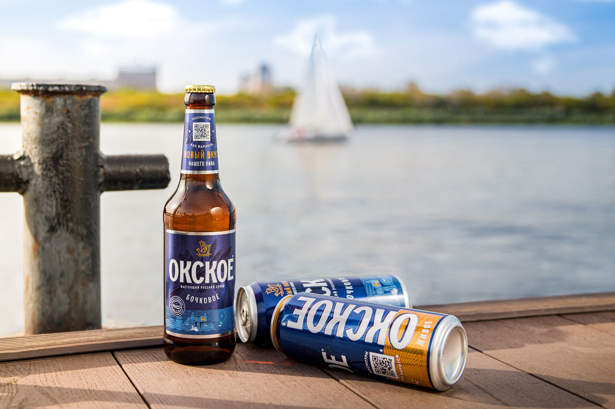
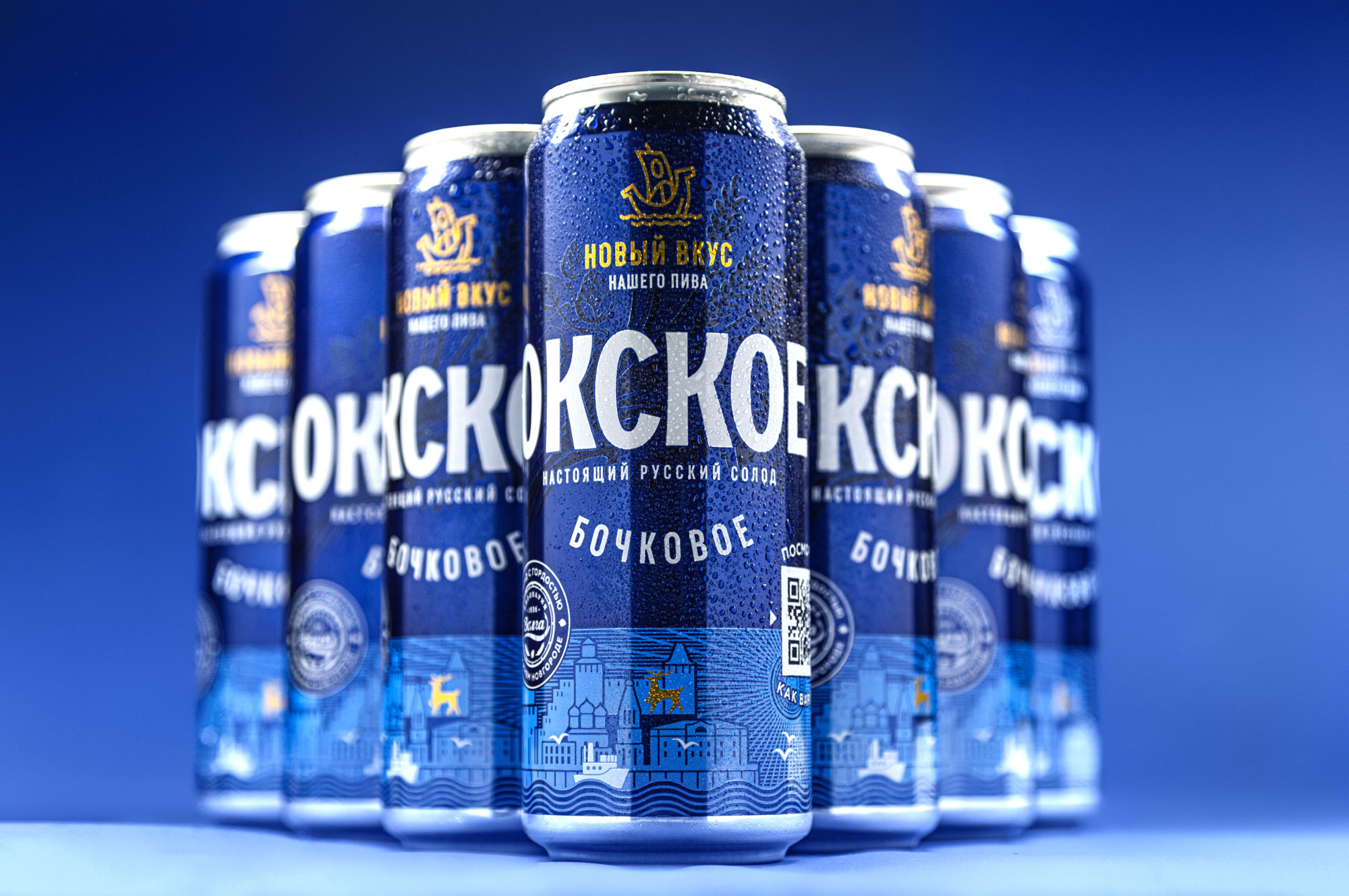
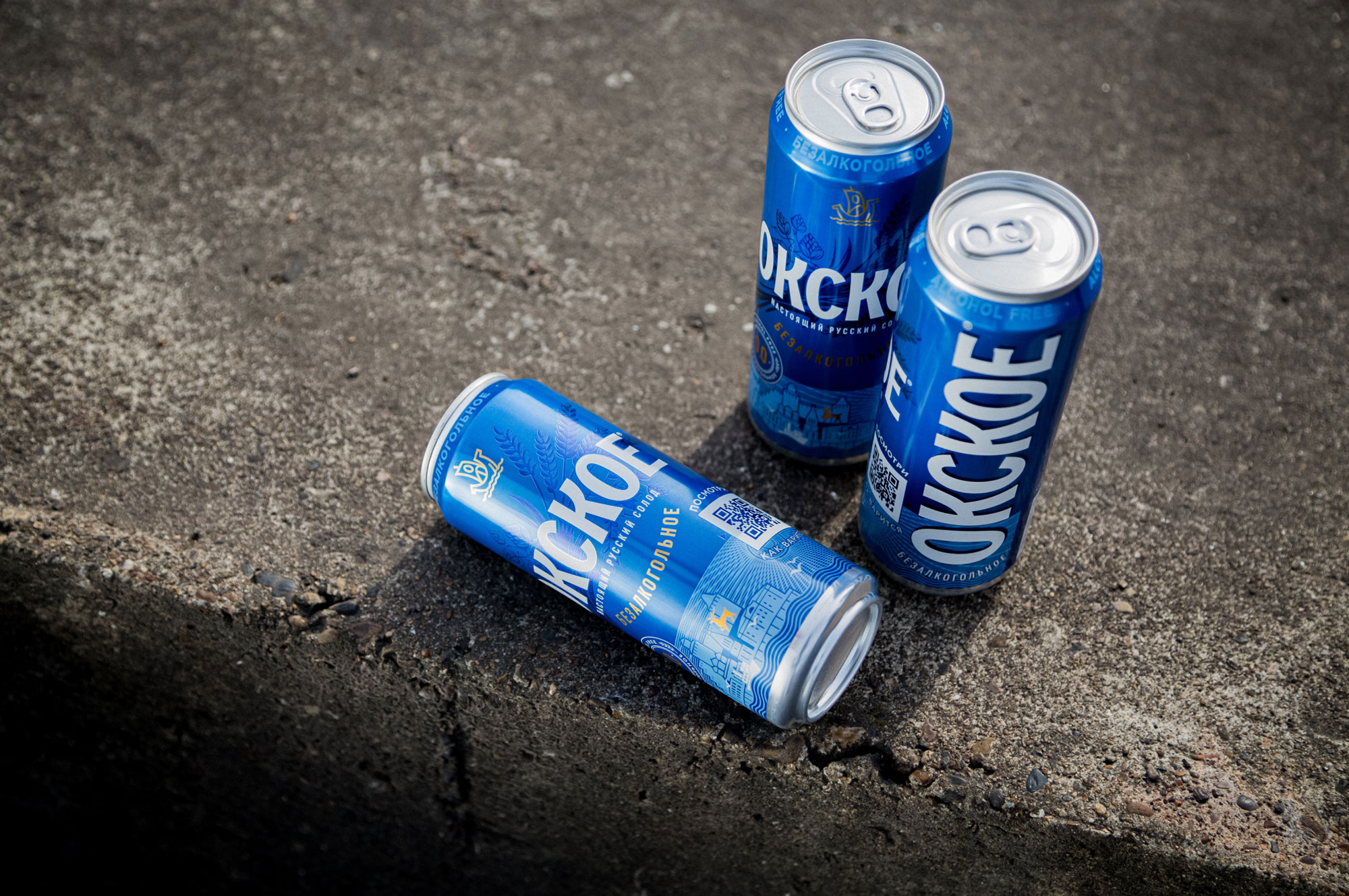
First of all we have made a radical decision and gave up on the original illustration in favor of putting a sign instead of the rowing boat.
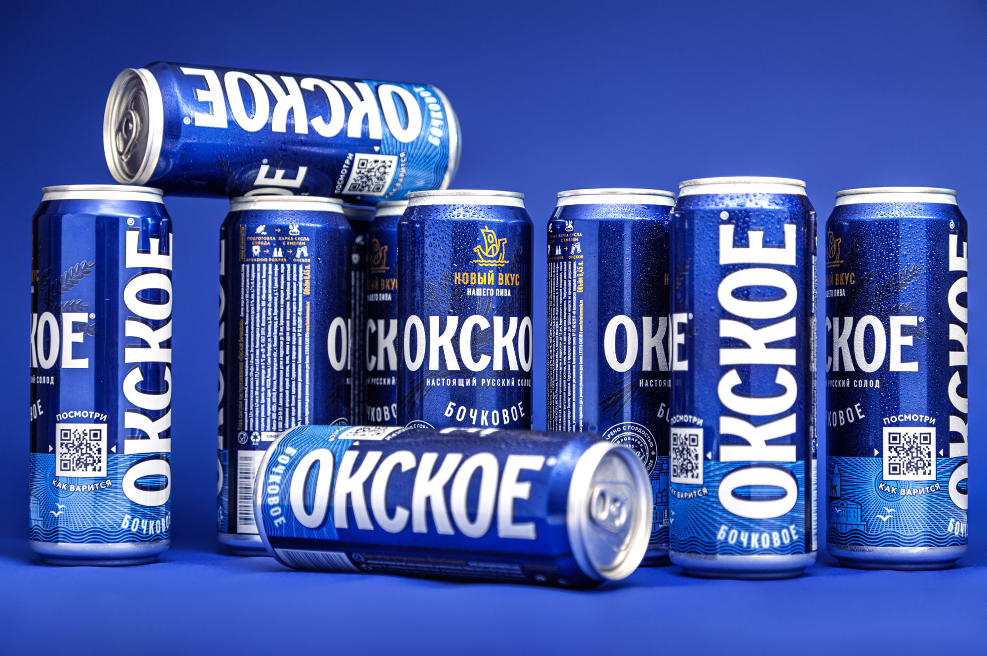
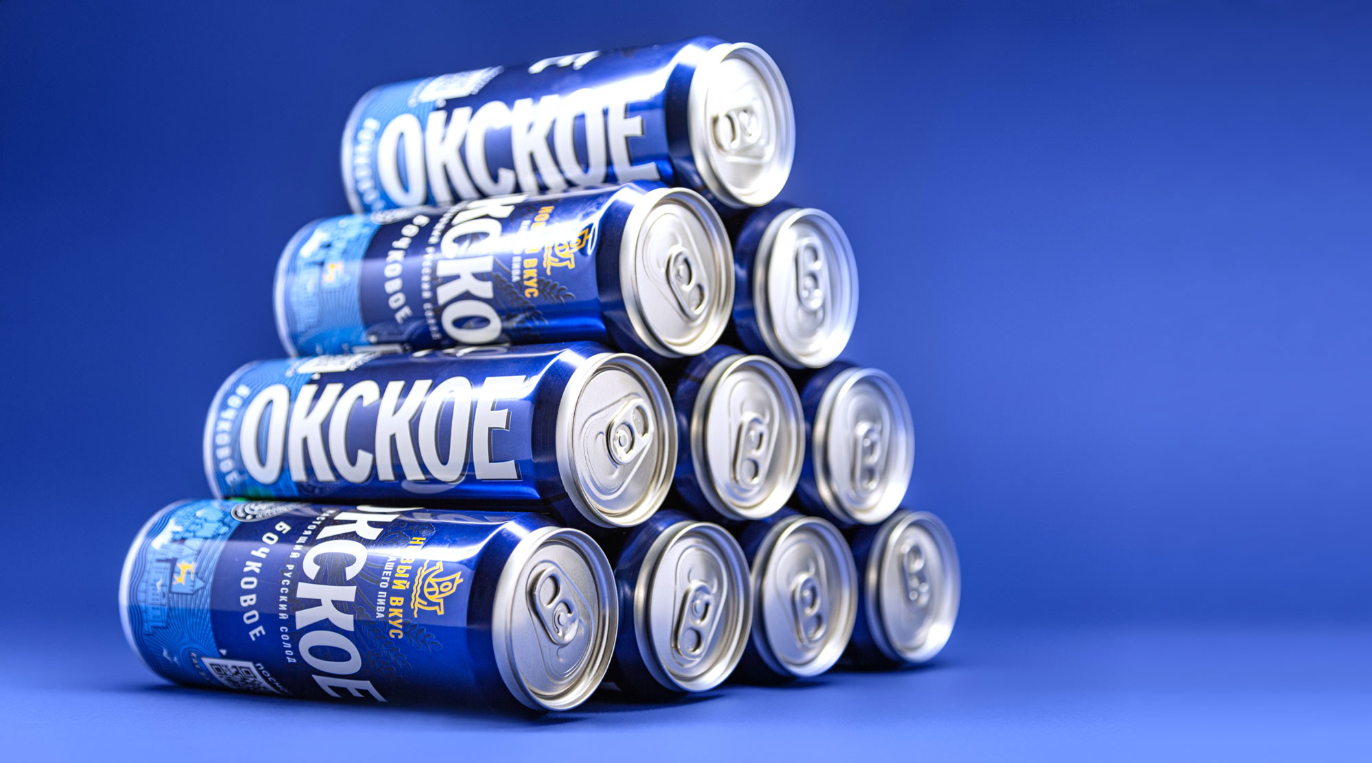
The next step was the typographics actualization: we turned down the gold shadows and trying to save the brand awareness made a move to a quite ambitious renovation.
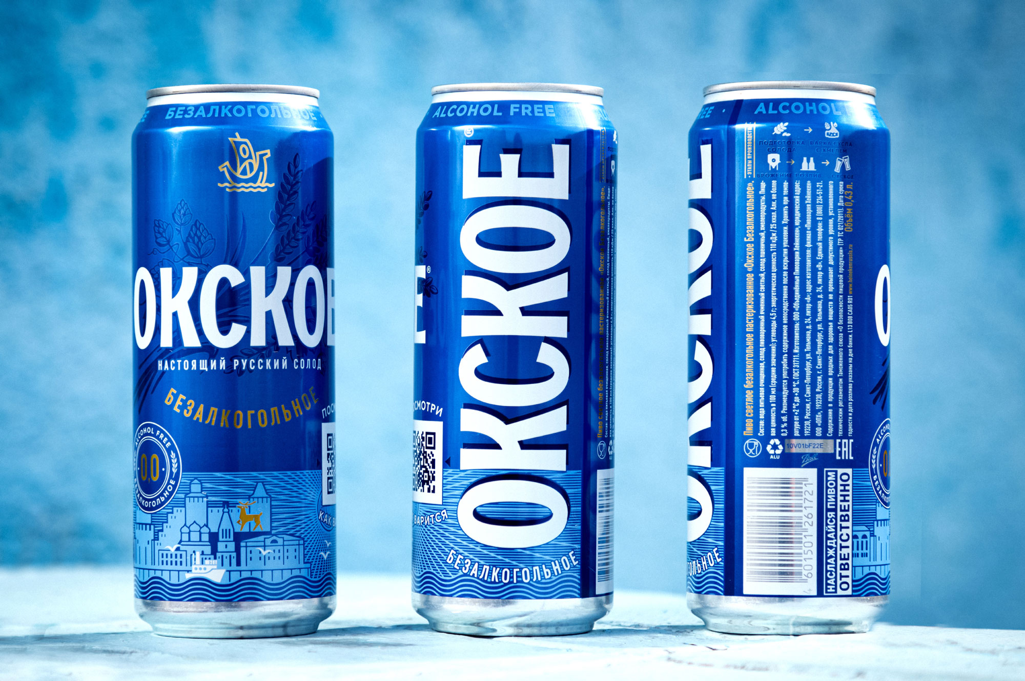
At the bottom we put the illustration having bright colors and easily recognizable symbols of the city. The shapes of the spikes at the top are reminiscent of previous versions of the brand’s representation, helping to perceive it not as something completely unfamiliar, but as something renewed. The performance in blue colors is also made to show the connection with the Nizhny Novgorod region, which originated at the confluence of Oka and Volga.
We assume that everyone has his or her own personal stories and thoughts about this product because we all encountered it more than once. For us this beer is associated with the whole process of coming-of-age, of evolvement and represents an integral part of our generation, a concept attributed to its culture. Okskoye beer represents a symbol of the city where we grew up and experienced many things that connect us. This brand reminds us of things that we have in common.
It doesn’t matter who you are today, beergeek or a sportsman, a road runner — if you are from Nizhny Novgorod, then the first beer that you have tried most probably was “Okskoye”.
CREDIT
- Agency/Creative: Unblvbl Branding Agency
- Article Title: Unblvbl Branding Agency Create New Rebranding for Heineken Okskoye Beer Brand in Russia
- Organisation/Entity: Agency, Published Commercial Design
- Project Type: Packaging
- Agency/Creative Country: Russia
- Market Region: Europe
- Project Deliverables: Graphic Design, Packaging Design, Photography, Rebranding, Tone of Voice
- Format: Bottle, Can
- Substrate: Glass Bottle, Metal, Plastic


