


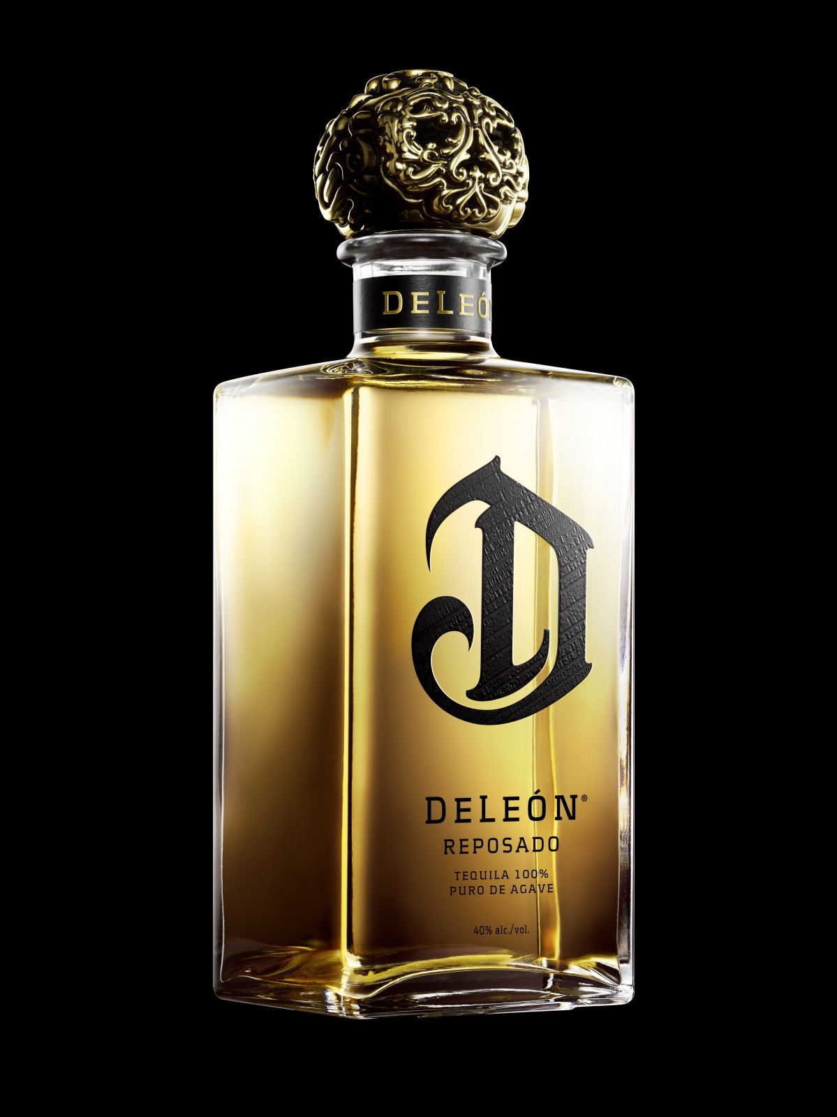
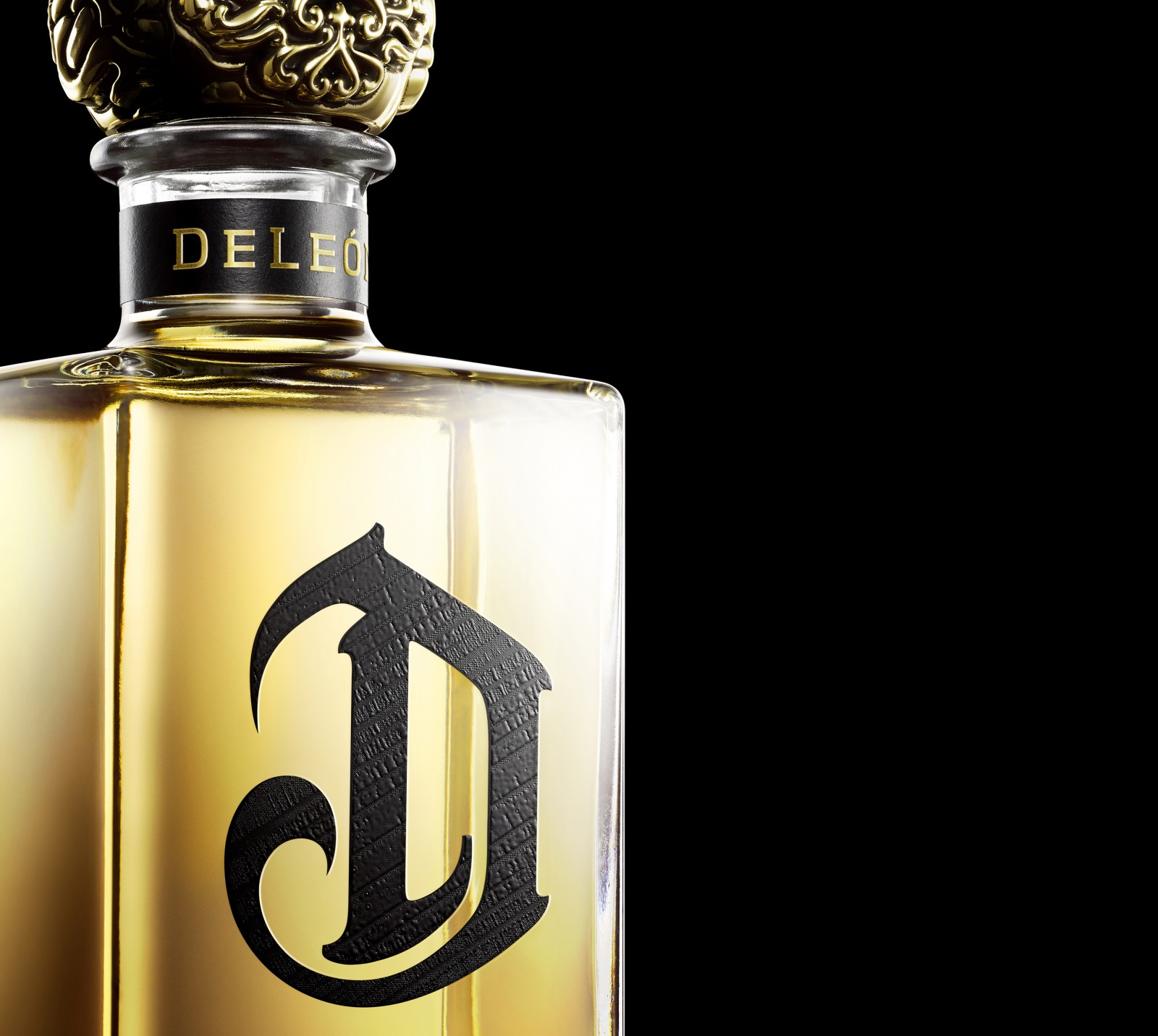
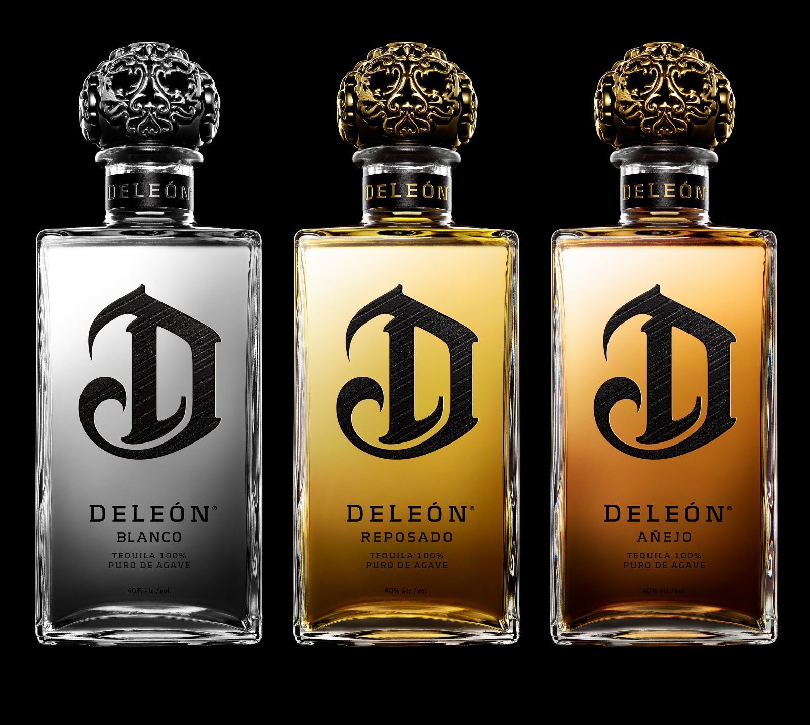
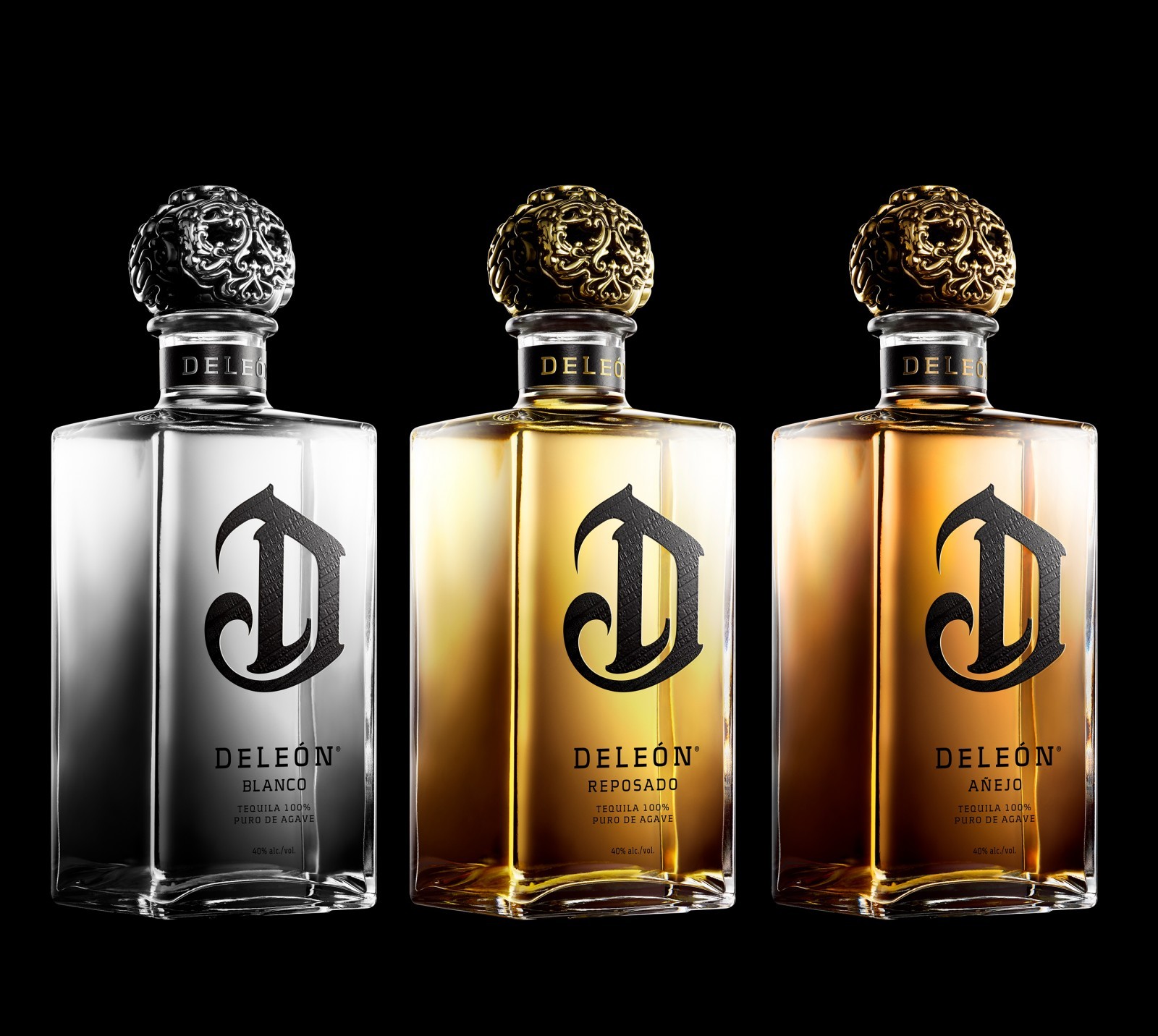
DeLeón Tequila offers a range of tequilas to suit different occasions and price points. In the previous design, there was no clear hierarchy amongst the different offerings, which made it difficult for consumers to understand the difference between the variants, apart from the subtle color shifts of the closure and the color of the liquid. We sized the opportunity to better differentiate between the Ultra-Premium and Luxury ranges using a new glass bottle for the Ultra-Premium range of Blanco, Reposado, and Añejo tequilas along with updated graphics. We increased its presence and impact of the iconic ‘D’ mark, making it black, and adding subtle and sophisticated graphic texture within. At first glance, you see the striking icon. Upon closer inspection, you see inviting, intricate details within the “D”, inviting the consumer to pick the bottle up on shelf and explore the details. The DeLeón branding was added to the front label and the neck label for stronger brand recognition.
The team partnered very closely with the Diageo Innovation Marketing and R&D teams along with key brand stakeholders on the DeLeón brand to identify the appropriate design strategy and bring the redesign to life. Through many collaborative workshops, the team took inspiration cues from categories outside the spirits world (fashion, cosmetics, etc.) to identify the appropriate texture and pattern for the premium ‘D’ icon.
The new, taller bottle for the Ultra Premium DeLeón range evokes fragrance cues and brings more elegance, and inclusivity, but also approachability to the brand. The previous square bottle is luxurious but too masculine, and this new bottle along with the elegant new graphics appeals to a wider target consumer. The accessibility of the new graphics appeals to more mid-tempo occasions where consumers can connect and relate, and is not anymore thought to being reserved for special occasions.
At first glance, you see the striking icon. Upon closer inspection, you see inviting, intricate details within the “D”, inviting the consumer to pick the bottle up on shelf and explore the details. With this new design for DeLeón, we created a true family for the Ultra Premium range, that shines on shelf. The design is simple, but timeless and is not overly branded to let the liquid see throught. The consistent treatment of black brings the family to live on the shelf with a strong branded block. The monochromatic approach avoids the classic color segmentation in the Tequila category. DeLéon stands out on its own with the pioneering, sophisticated treatment of the branding.
The texture of the ‘D’ icon is the artistic soul of the new redesign. The rest of the graphic layout is effortless, chic, and timeless. The texture brings a sense of emotion and provenance that is treated with attention and style. We worked closely with the Diageo team and other key stakeholders to bring more grit to the brand to set it apart from other luxury tequilas and aligns better with the distinctive skull-like closure.
CREDIT
- Agency/Creative: forceMAJEURE Design
- Article Title: Ultra Premium Packaging Design for DeLeón Tequila Relaunch
- Organisation/Entity: Published Work
- Project Type: Packaging
- Agency/Creative Country: United States of America
- Format: Bottle


