


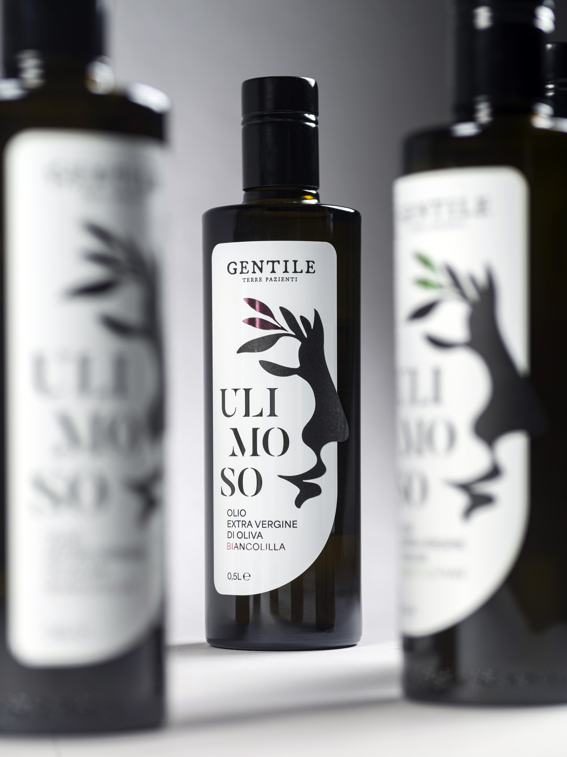
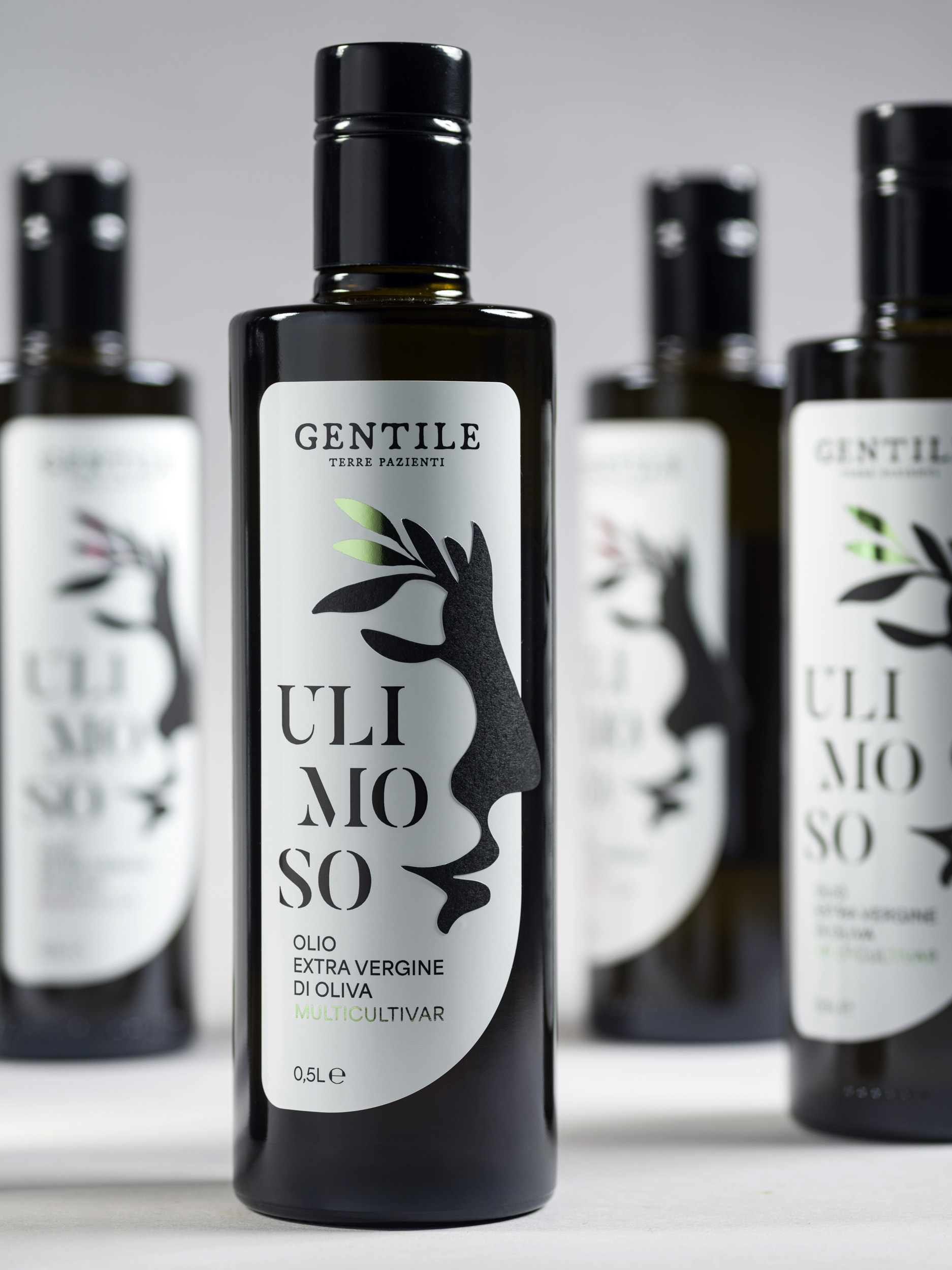
ULIMOSO:[u-li-mó-so]*adj.*Fragrant,scented.
Aname that immediately evokes the idea of scent—a subtle and intimate perception that accompanies every oil, anticipating its character even before tasting.
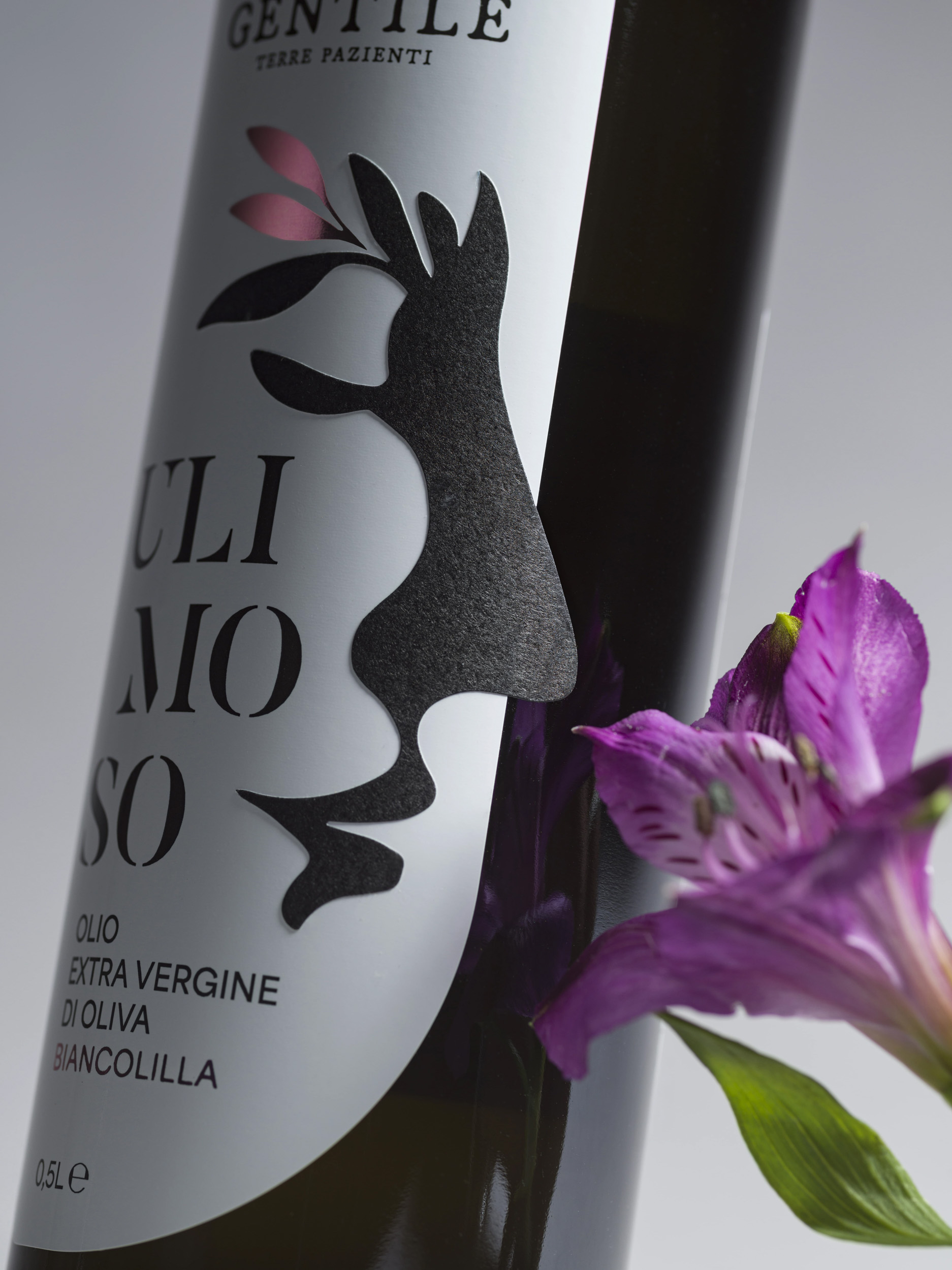
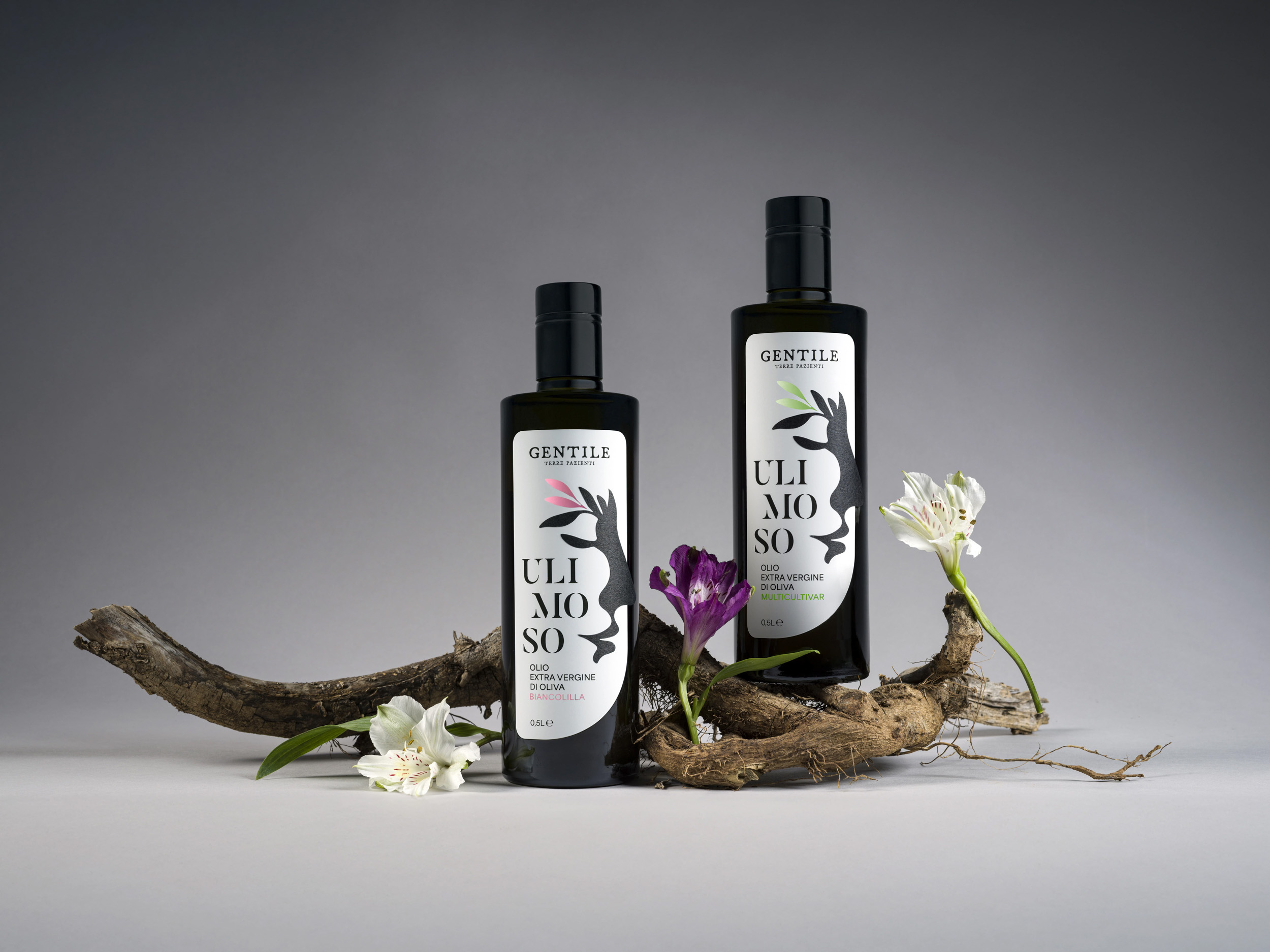
The label translates this sensory dimension into a visual language. At its core is a feminine silhouette that gently guides the eye. Drawn with a single, continuous line, her profile opens into olive leaves that gradually become part of her form, dissolving the boundary between human perception and natural origin. The image suggests a quiet moment of attention, where scent, matter and memory coexist in balance.
Material choices play a central role in reinforcing this concept. The use of laminated paper allows the silhouette to physically rise from the surface, adding depth and a tangible three-dimensional quality to the label. This relief gives presence to the graphic sign, transforming it into an element that invites touch as much as observation.
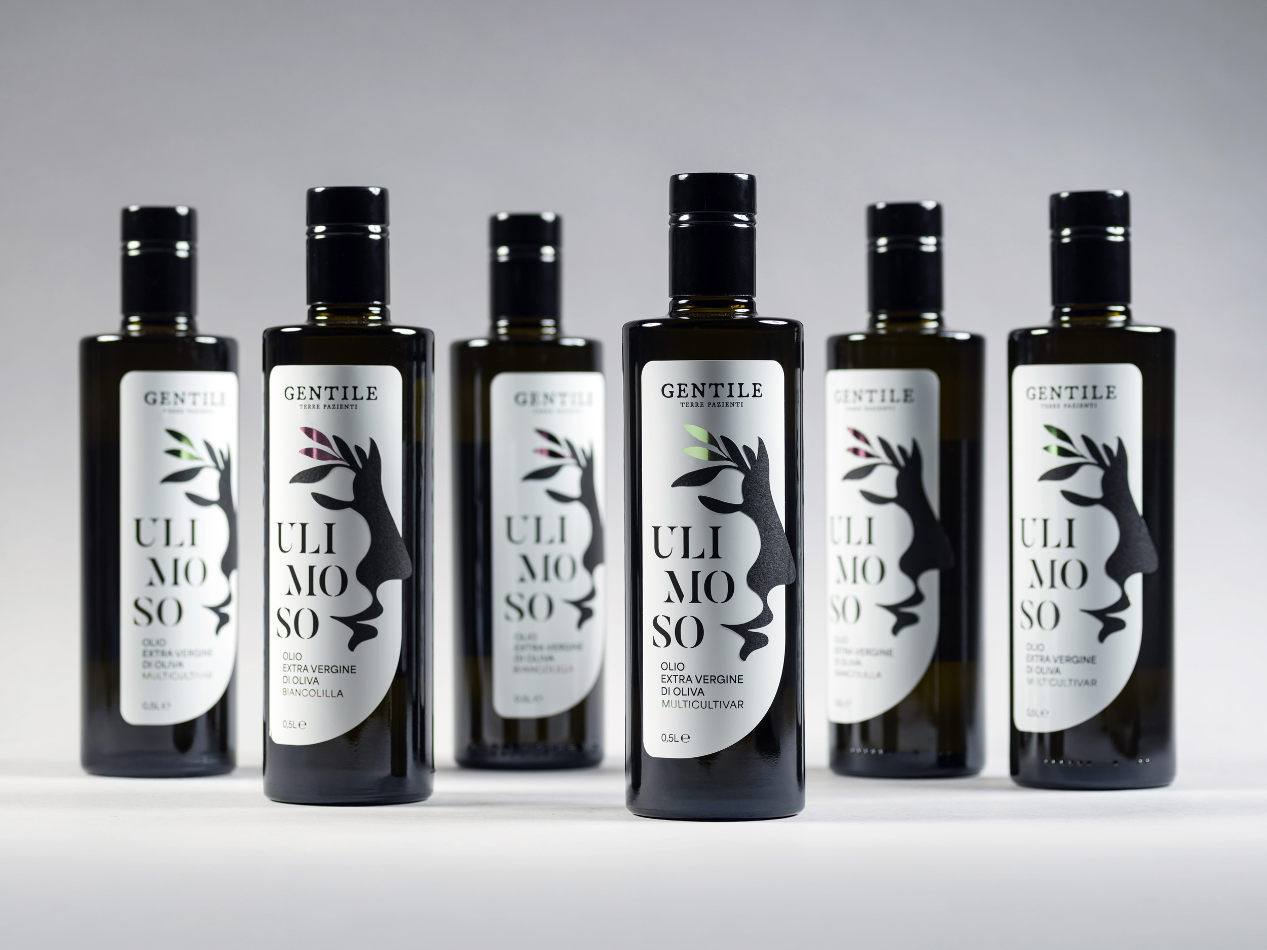
Hot foil stamping introduces an additional sensory layer. Its color varies according to the cultivar or type of oil, creating a luminous accent that distinguishes each reference while preserving a coherent visual identity across the range. Light interacts with the surface, activating the label and subtly changing with the viewing angle.
Ulimoso is conceived as a “living” label:sensory,tactile and radiant—a design that anticipates the essence of the oil and tells the story of what’s inside before the bottle is even opened.

CREDIT
- Agency/Creative: Rosario Lo Iacono design
- Article Title: Ulimoso Packaging Design by Rosario Lo Iacono Design
- Organisation/Entity: Agency
- Project Type: Packaging
- Project Status: Published
- Agency/Creative Country: Italy
- Agency/Creative City: Gela
- Market Region: Europe
- Project Deliverables: Packaging Design, Photography Styling
- Format: Bottle
- Industry: Food/Beverage
- Keywords: extravirgin olive oil, label design
-
Credits:
Still life ph: Alessandro Castagna
Still life ph: Valentina Di Mauro


