


Tiago Sampaio is the young viticulturist and winemaker of Folias de Baco, the project he founded in 2007. As the grandson of Douro winegrowers, he has had wine-related memories since his childhood. It was on his grandfather’s shoulders that he had his first contact with agriculture and the world of wines, learning to understand a craft that was born out of pure curiosity and childhood play.
It was this insatiable fascination that led him to study agriculture in Santo Tirso, followed by five years of university studies in Vila Real. Completing his degree in agricultural engineering opened the doors to the subsequent doctoral studies in Oregon, specializing in Viticulture and Enology. It was there that Tiago learned the most modern philosophies of wine production, never forgetting his roots in the cooler slopes of the Douro Valley. He returned to start his own project with the old vineyards belonging to his family.
Since then, he has been dreaming bigger and pushing the limits of his curiosity, focusing on sustainable viticulture and the production of natural wines. It is the intersection of the winemaking traditions of the Douro – one of the oldest demarcated wine regions in the world, a naturally preserved land with rugged landscapes shaped by a temperamental river and the hard work of men – and his studies and research that gives rise to an irreverent and unique range of white, red, sparkling, and sweet wines known as Uivo.
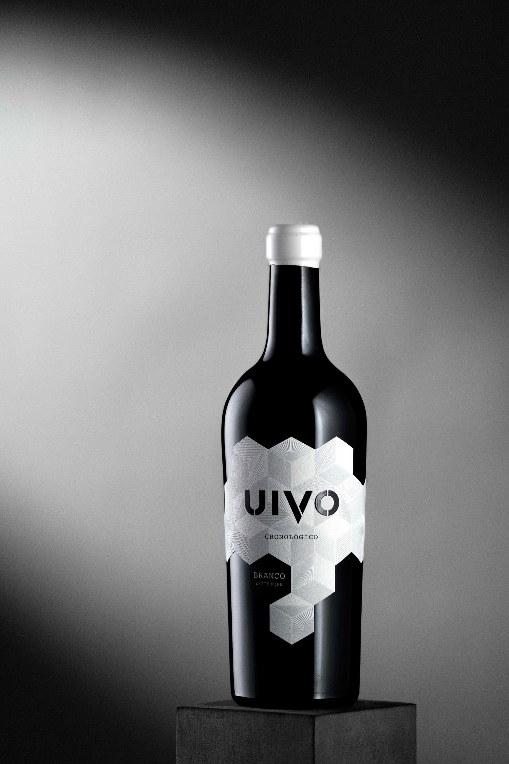
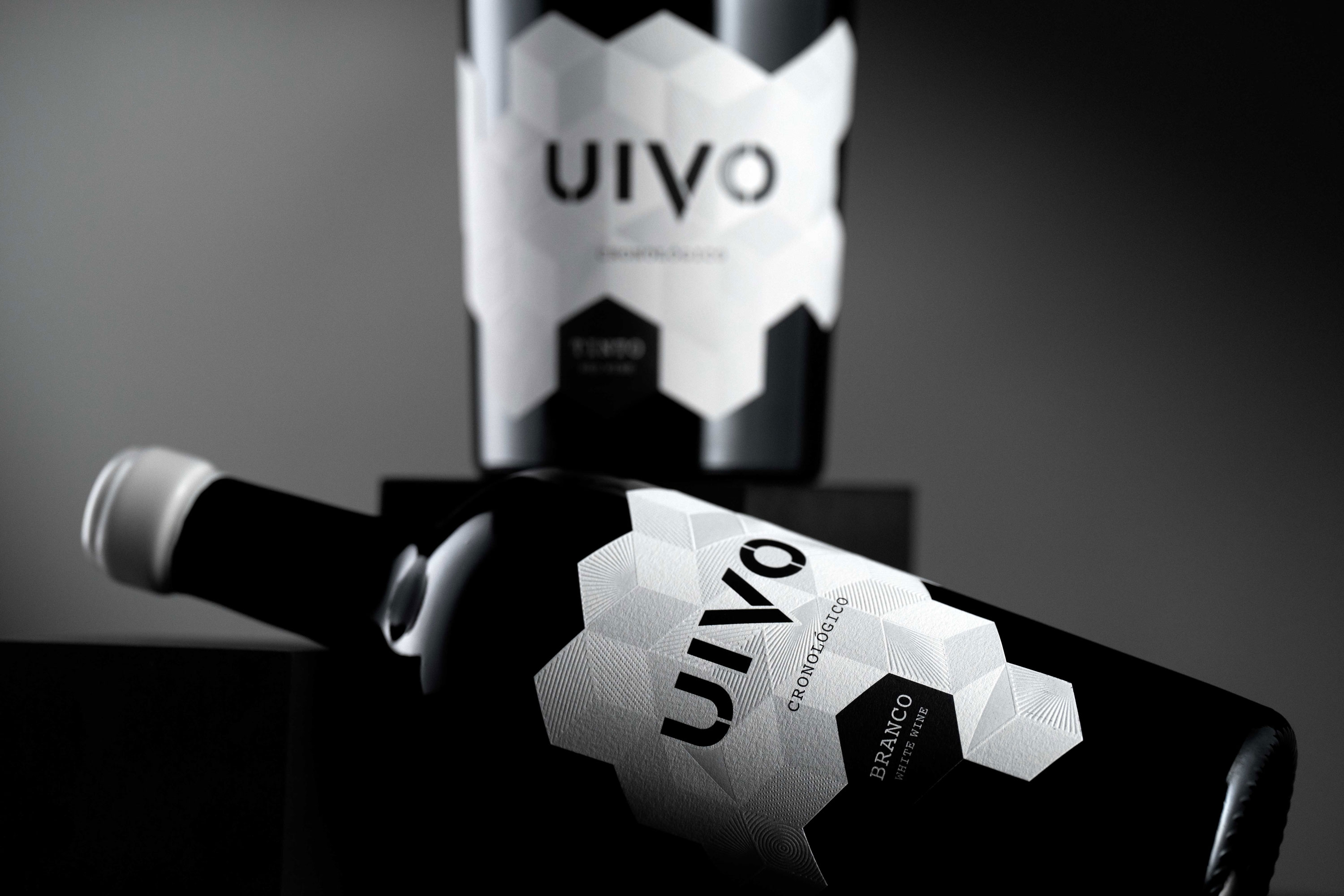
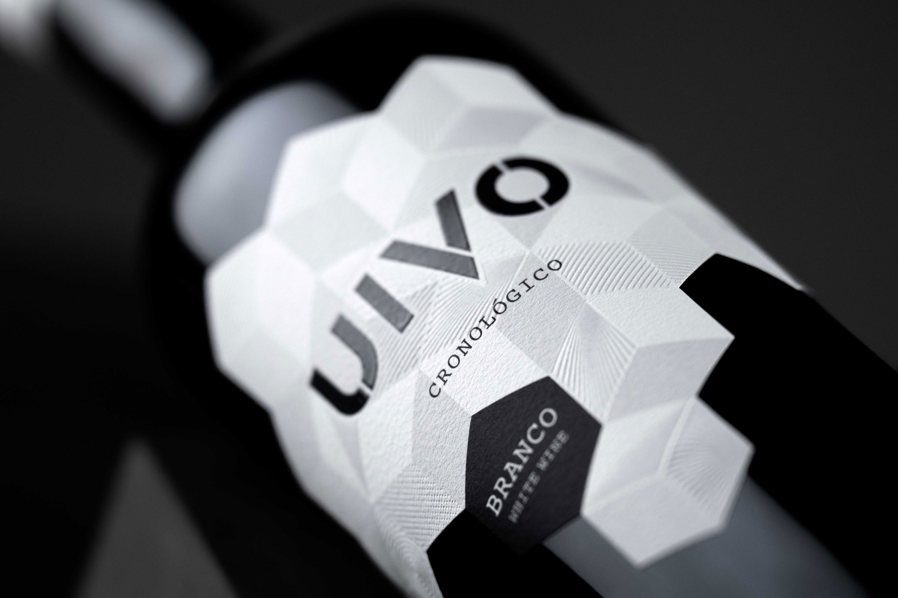
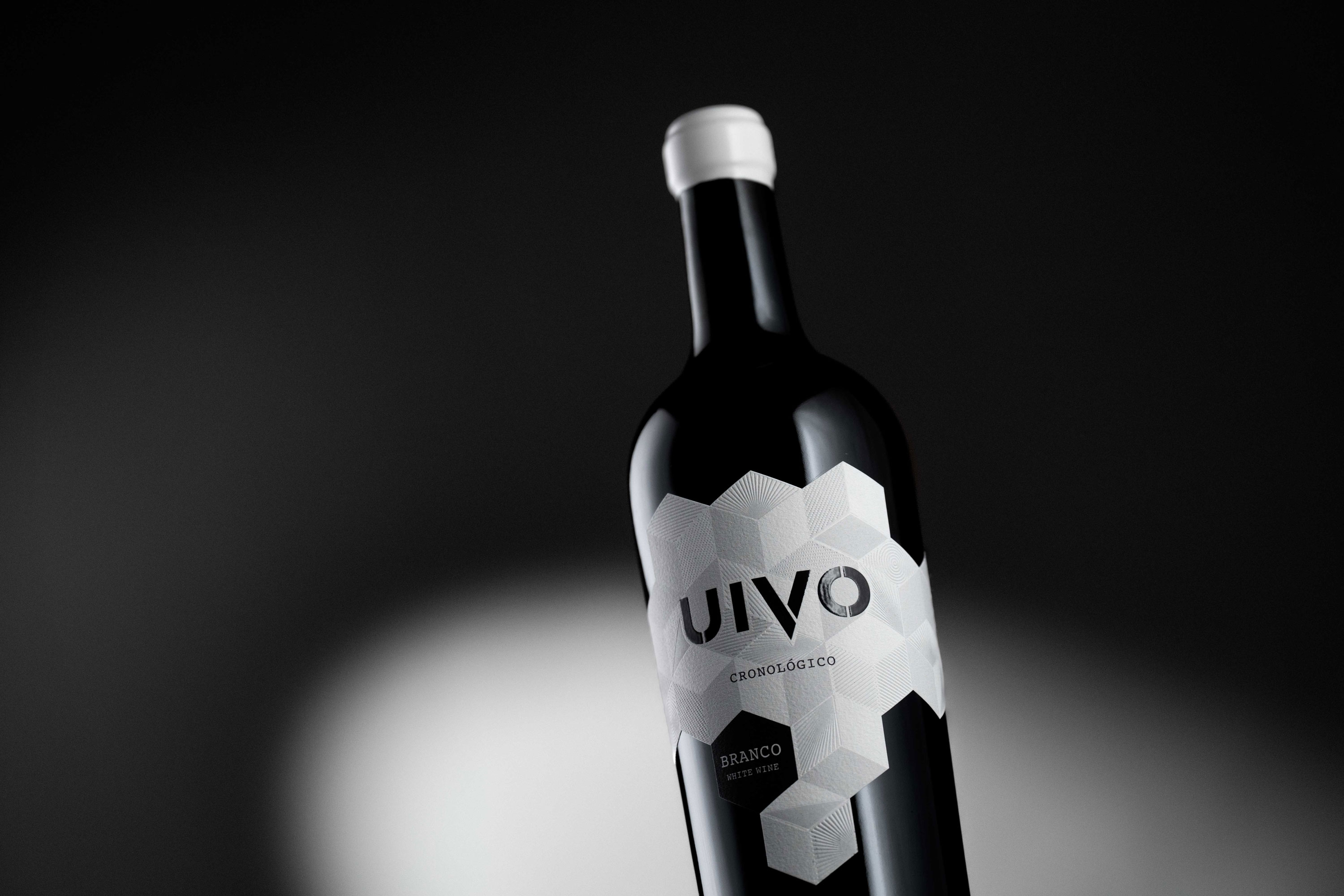
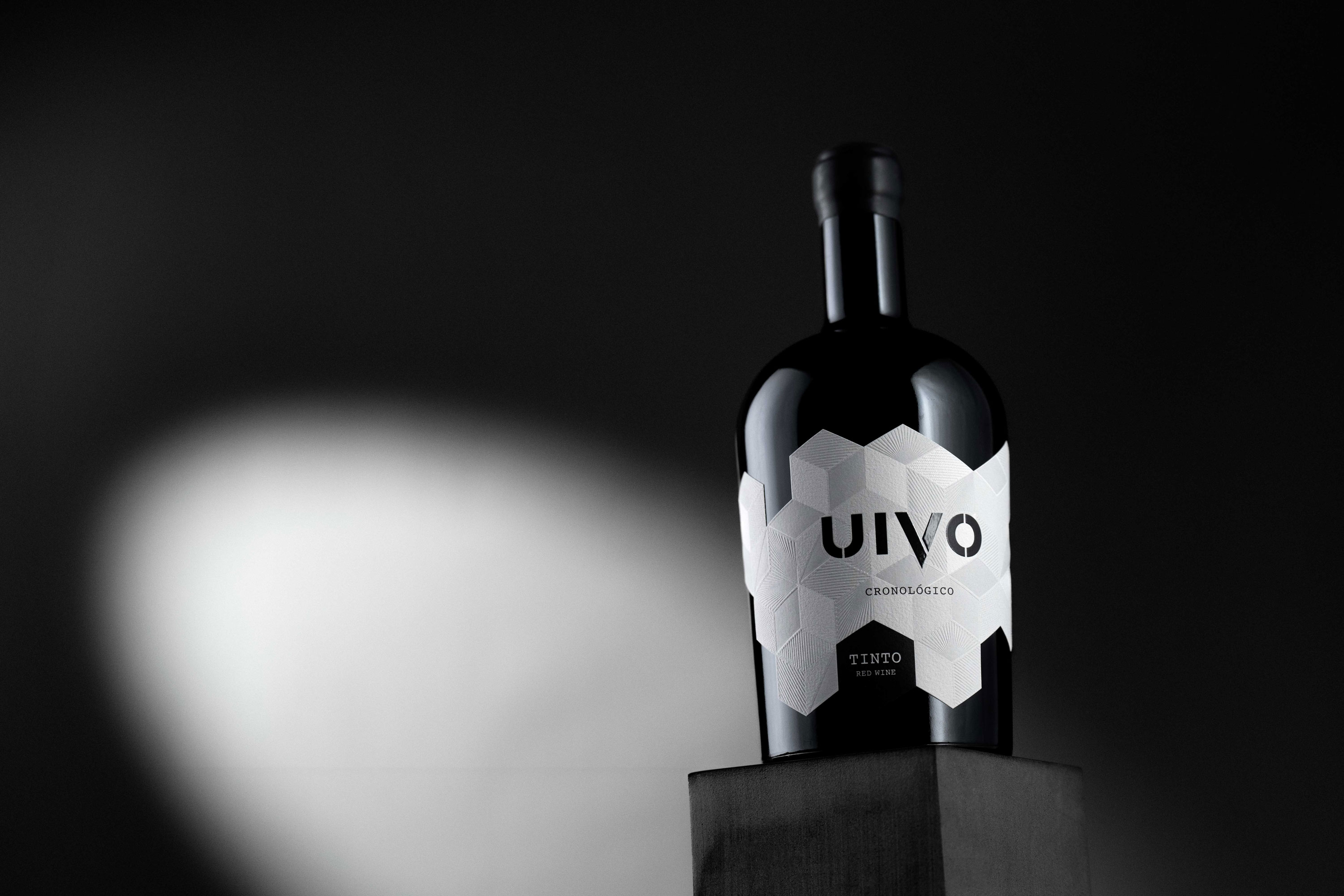
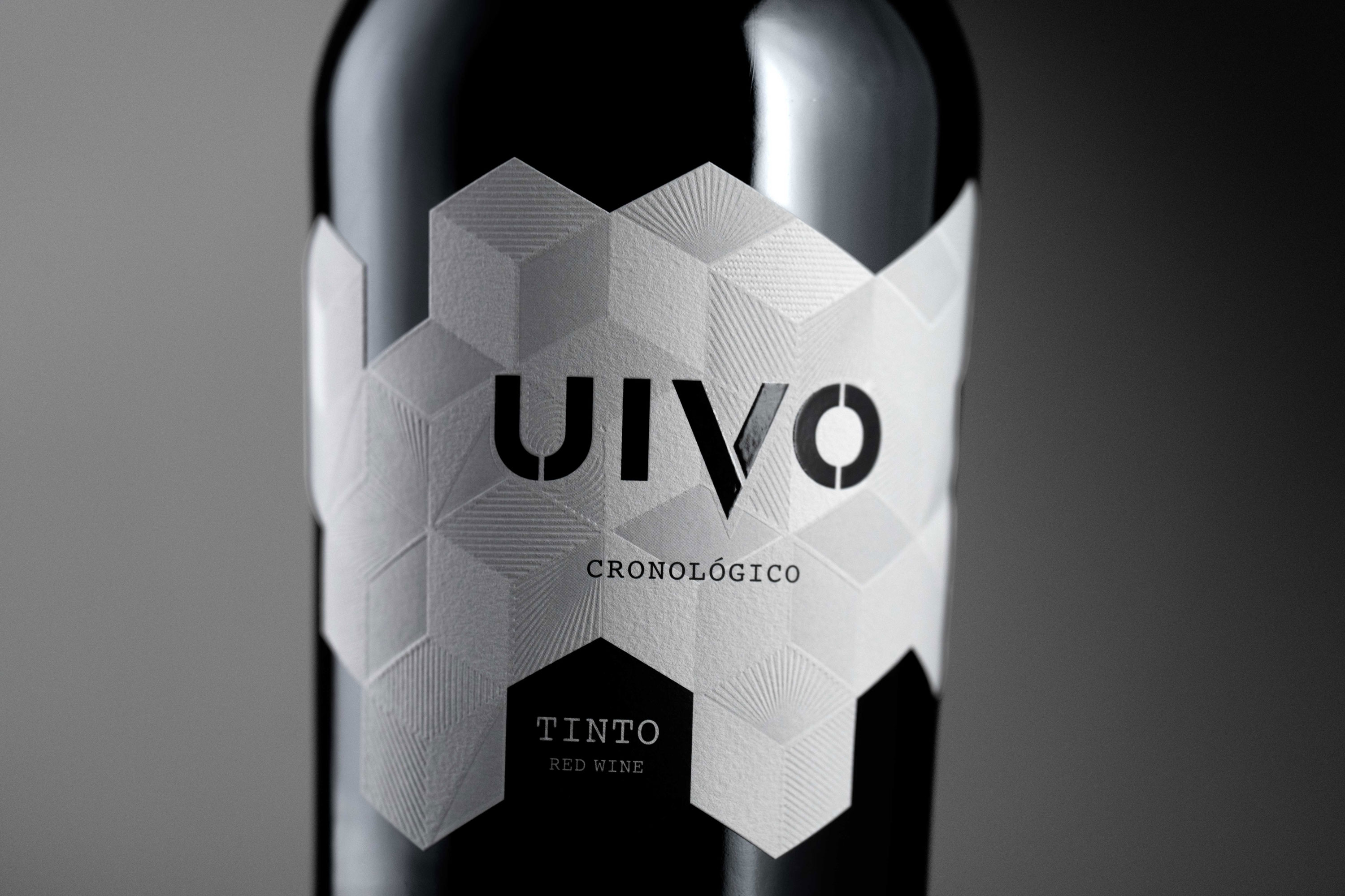
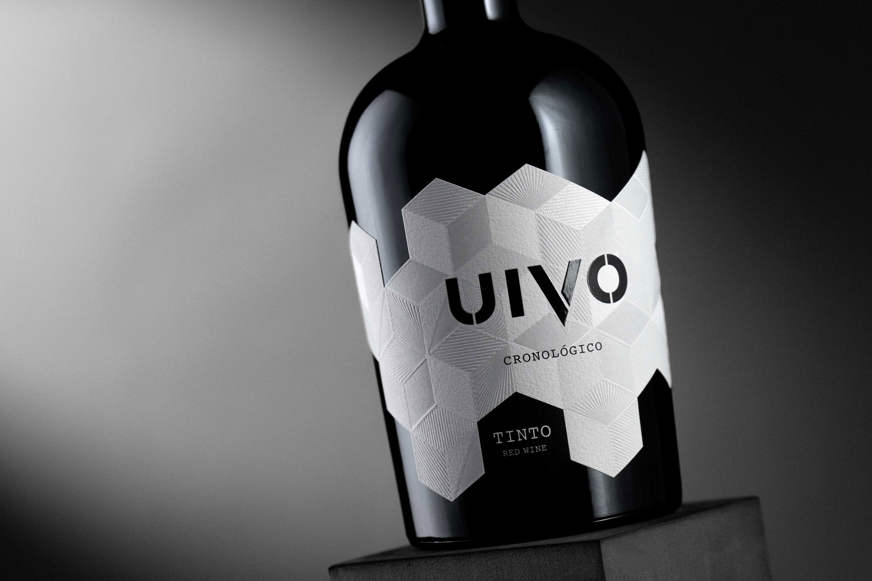
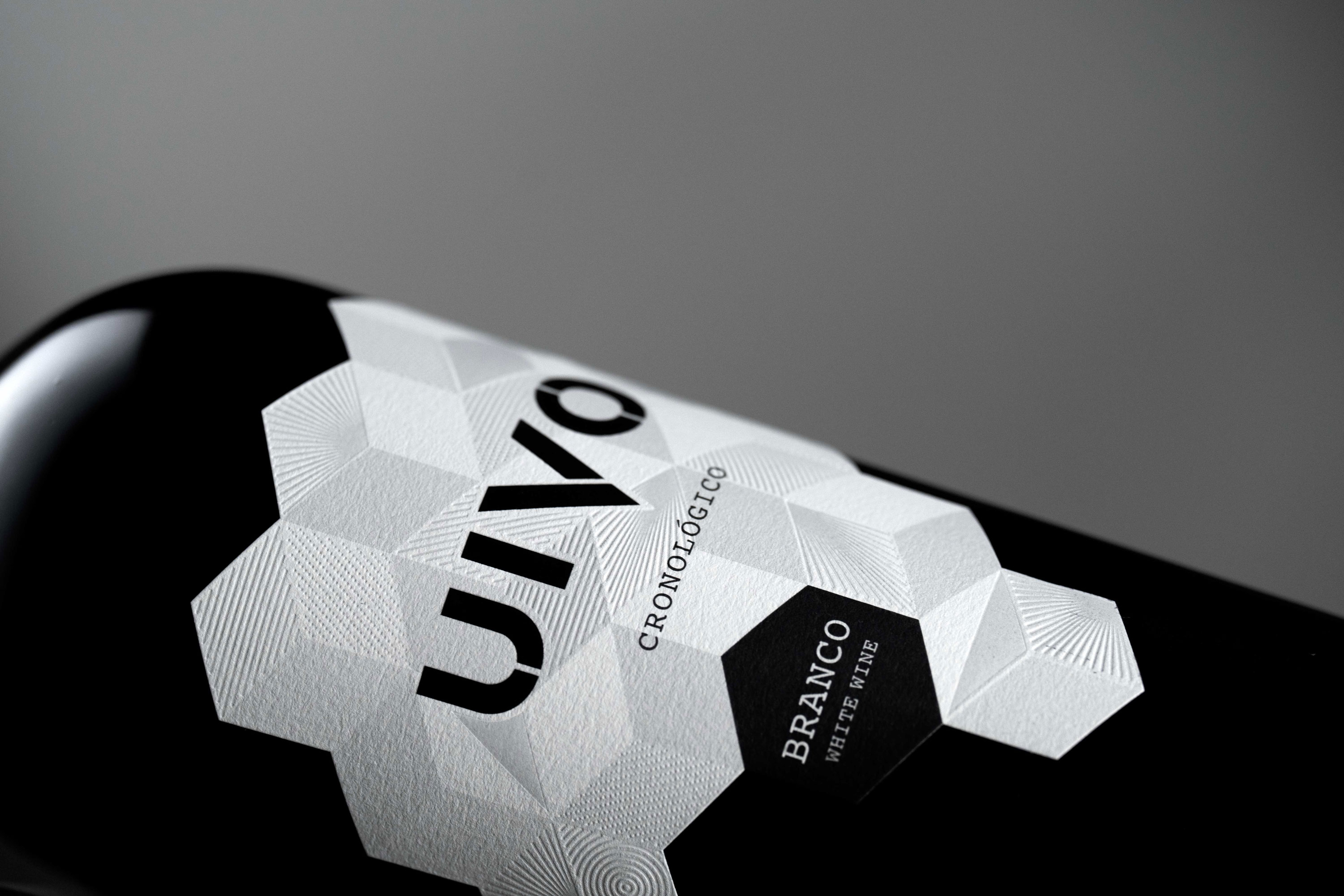
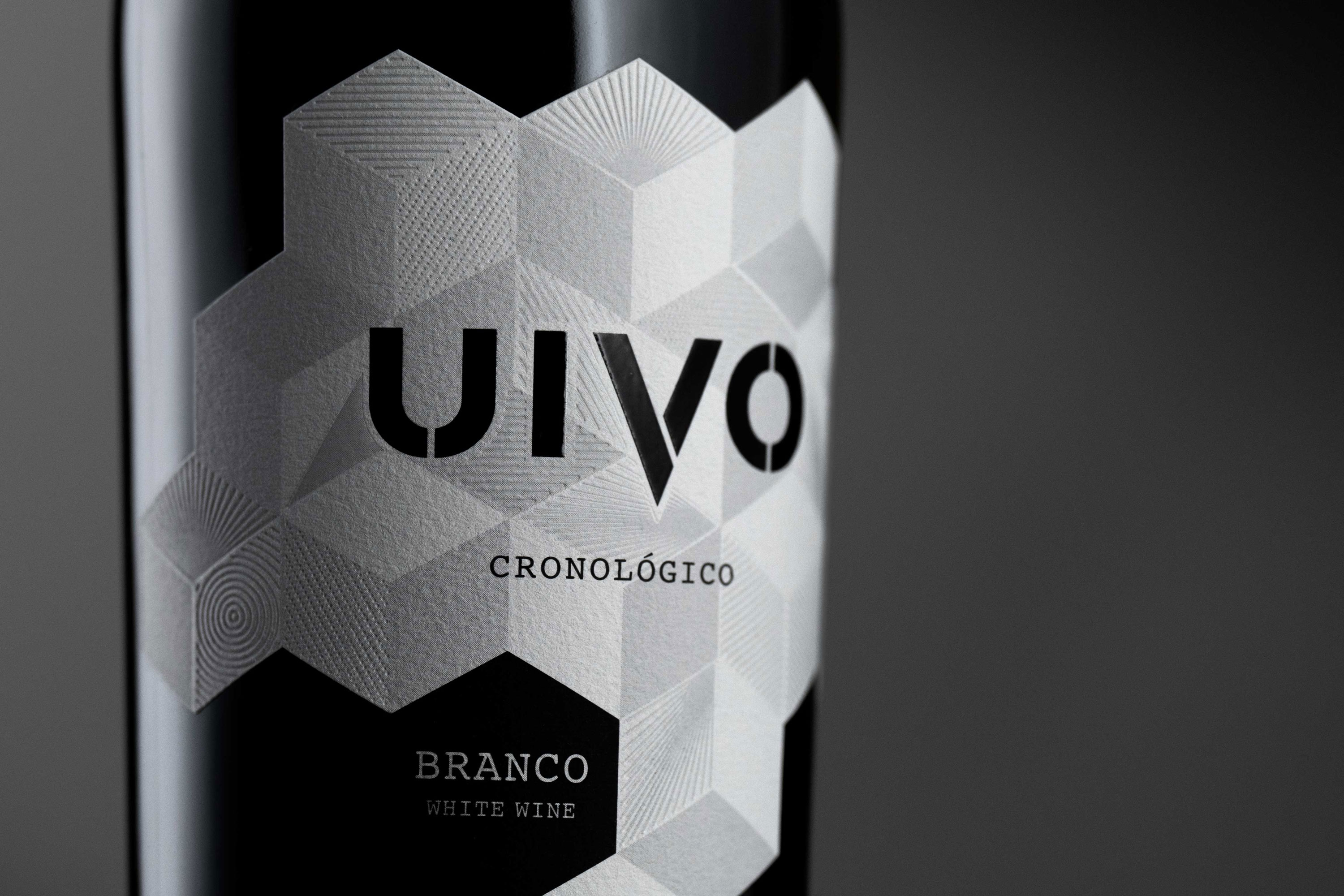
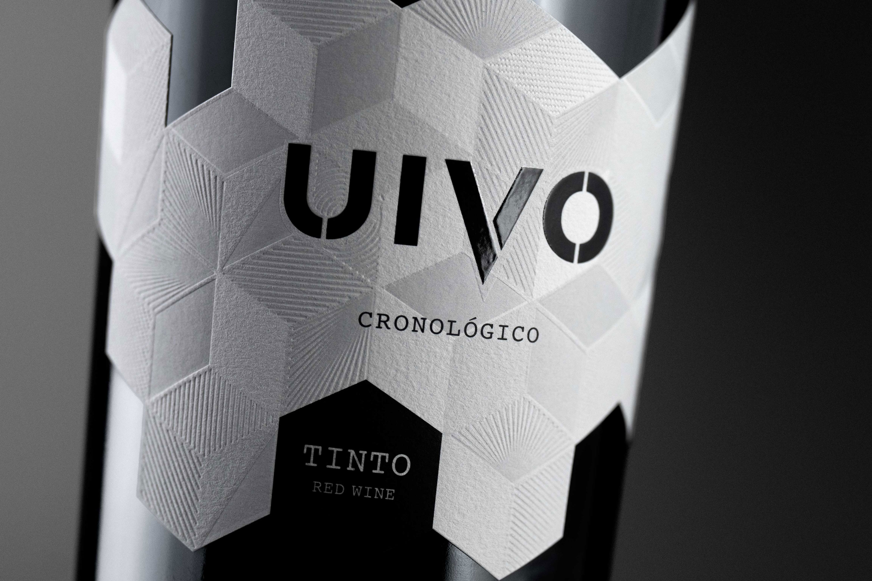
Uivo is a collection of different types of wine, including Uivo Cronológico Red and White. These wines result from the selection of the best grapes from Old Vines, with more extraction and without destemming, with the aim of creating a wine capable of evolving over decades. With geometric shapes, these labels bring a new image to these wines.
This label, based on an existing one, in turn, presents us with an assembly of textures achieved through low relief, adding a sense of three-dimensionality. It maintains a sober palette with shades in the grayscale, making it easy for an objective reading of the wine, standing out with the black tone. The paper used was Cotton Extra White.
CREDIT
- Agency/Creative: Bisarro Design Studio
- Article Title: Uivo Cronológico Wine Packaging Design
- Organisation/Entity: Agency
- Project Type: Packaging
- Project Status: Published
- Agency/Creative Country: Portugal
- Agency/Creative City: Vila Real
- Market Region: Europe, North America
- Project Deliverables: Label Design
- Format: Bottle
- Industry: Food/Beverage
- Keywords: Wine label, Portuguese Wine, Douro wine, geométrico, geometric label, vinho, wine
-
Credits:
Client: Folias de Baco
Photos: André Macedo/ Look Closer


