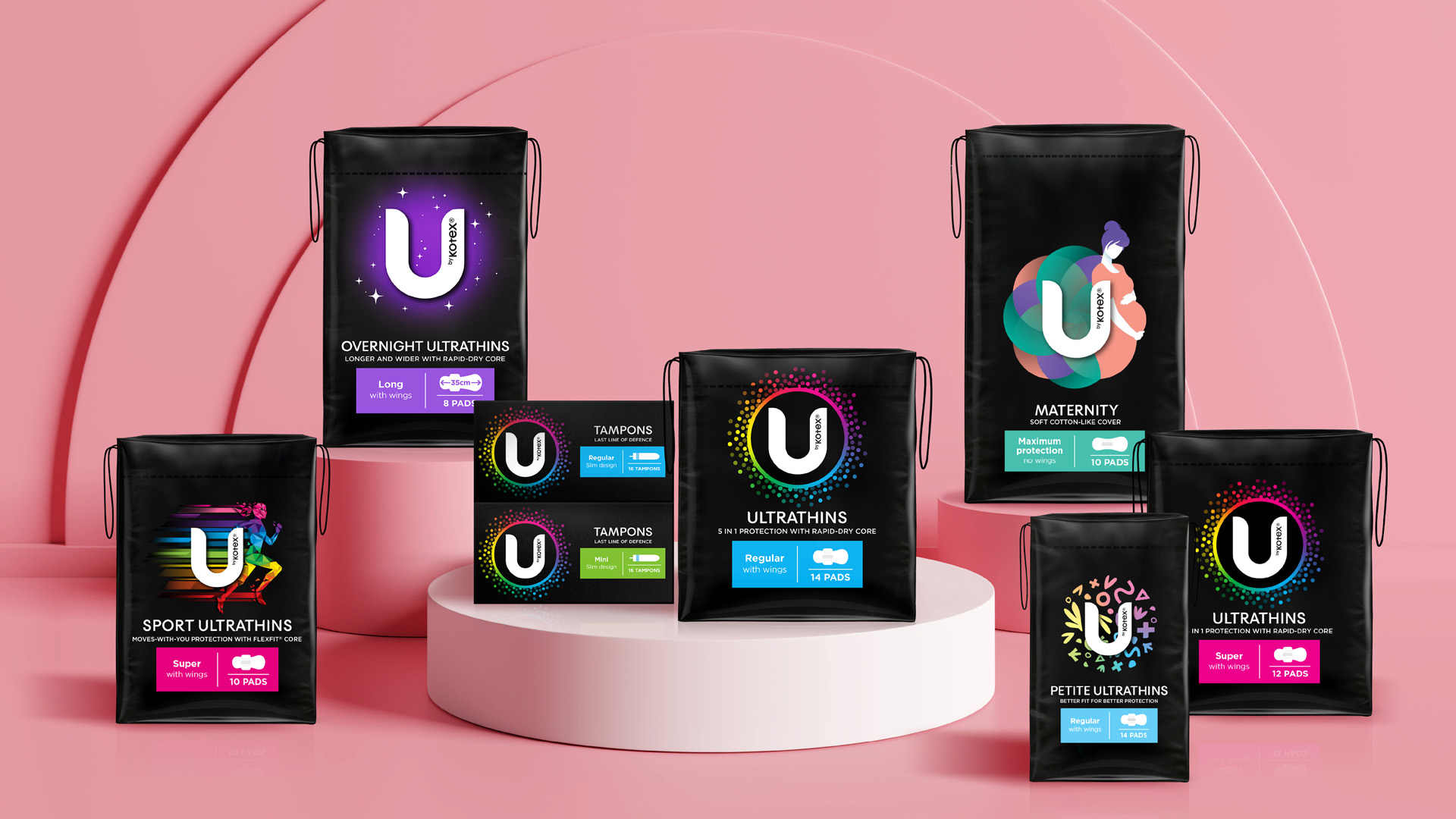
Independent, international award-winning brand and design agency Hulsbosch has completed a brand and packaging refresh for Kimberly-Clark Australia’s period care U by Kotex brand. The U by Kotex brand was the first to bring meaningful packaging innovation to the category and is the leader in period care products in Australia. Since U by Kotex’s last brand and packaging refresh in 2016 there has been significant changes and ‘better for the planet’ advances in the category. A fresh new look by Hulsbosch has been released in-store and online, across the entire U by Kotex portfolio bringing a bold, modern design into market that elevates the brand to standout from competitors and in the category, and appeals to a younger audience (16-25-year-olds).
Mikey Hart, Creative Director at Hulsbosch said, “U by Kotex has always been a big selling brand that resonated with consumers. However, it was time to start an exciting next phase in U by Kotex’s brand evolution to re-establish the brand and bring a new energy to the packaging portfolio. We have revitalised all U by Kotex’s assets and developed a more dynamic expression of the iconic products. The range is renowned for being bold, brave and cutting-edge and the result is eye-catching packaging with a personality for each product that speaks to Gen Z’s.”
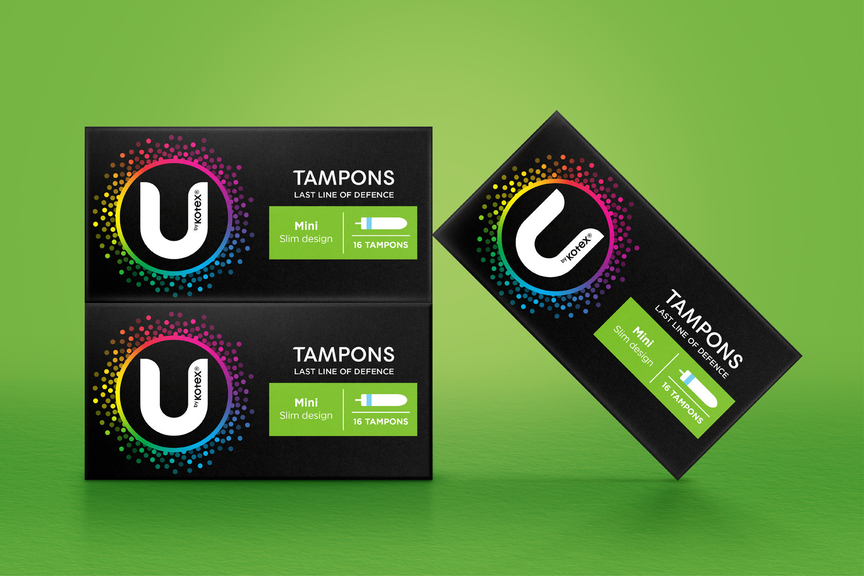
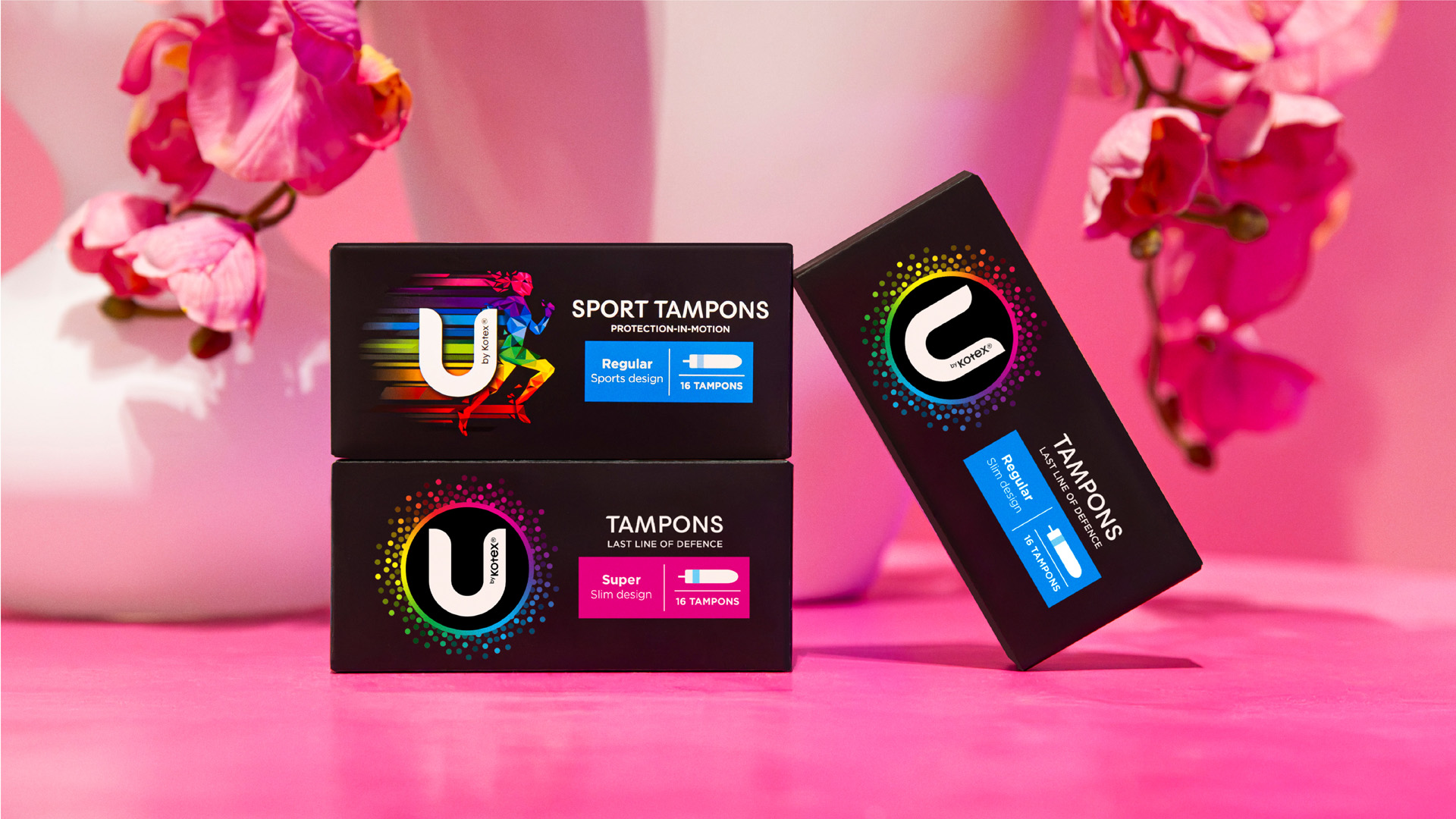
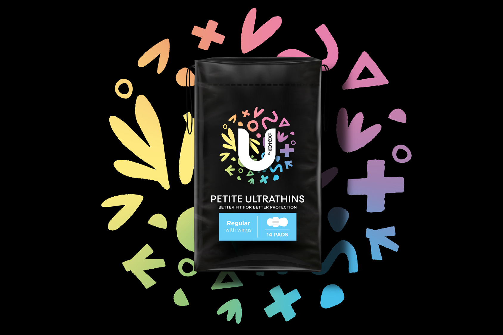
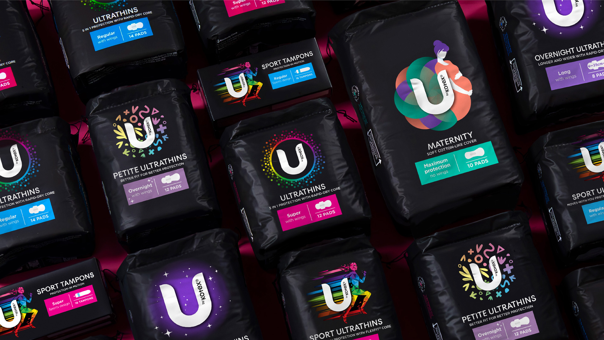
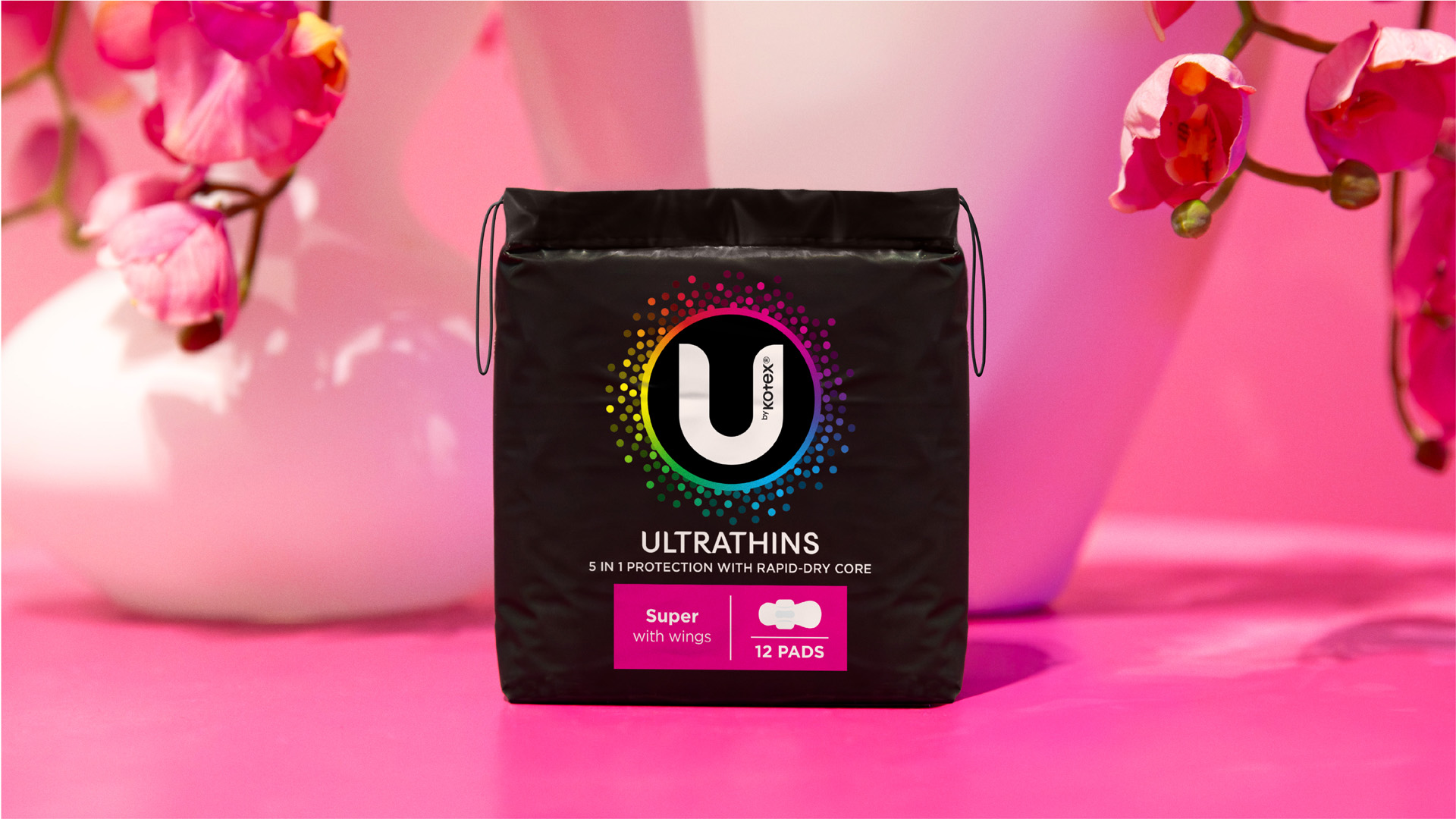
The U by Kotex packs by Hulsbosch features a reframed ‘U’ logo for a prominent on-pack presence and delivers maximum value for its definition and as a symbol to be noticed. For six brand variants, larger name callouts and new decorative illustrations provide clearer navigation across the range. With a well-defined heritage, U by Kotex has several recognisable and distinctive visual brand shortcuts, black packaging and multi-coloured ‘rainbow’ wrappers which are key design elements retained and produced with a simplicity and consistency to enhance preference and support for the range.
Elise Smith, Senior Brand Manager at Kimberly-Clark said, “What we love about the Hulsbosch creative work for U by Kotex is its ability to continue a dialogue with Gen Z’s in a fun and friendly way so that our products are accessible, reiterating that we are a brand they can trust. The expert team at Hulsbosch have extensive brand and design knowledge and enormous amounts of enthusiasm which has brought about a transformation for the U by Kotex range.”
The U by Kotex brand and product range packaging executions have been updated for each product in the range including Pads, Liners and Tampons and for the preferred format and absorbency level sub-brands including Core, Sport, Overnights, Designer, Maternity and Petites.The outer polybags now contain 30% recycled plastic content, a key step in Kimberly-Clark’s ambition to safeguard natural systems and reduce their environmental footprint.
The U by Kotex refreshed brand and packaging by Hulsbosch has been evolved and revitalised, leveraging the Turner Duckworth global identity for Kimberly-Clark, and localised for Australian and New Zealand markets. The range is currently available at Coles and Woolworths, as well as other leading supermarket and retail stores around Australia.


CREDIT
- Agency/Creative: Hulsbosch
- Article Title: U by Kotex Brand and Range Redesign
- Organisation/Entity: Agency
- Project Type: Packaging
- Project Status: Published
- Agency/Creative Country: Australia
- Agency/Creative City: Sydney
- Market Region: Oceania
- Project Deliverables: Architecture Concept, Architecture Visualisation, Brand Architecture, Brand Design, Brand Guidelines, Brand Identity, Brand Redesign, Brand Rejuvenation, Design, Graphic Design, Illustration, Logo Design, Packaging Design
- Format: Flow-Pack, Pouch, Sachet
- Industry: Health Care
- Keywords: Brand and packaging design
-
Credits:
Creative Director: Mikey Hart
Design Director: Grace Brown
Senior Designer: Olivia Walton
Senior Finished Artist: Andrew Norris
Managing Director: Jaid Hulsbosch
Senior Account Director: Eils Robertson
Account Executive: Ella Heffernan
Studio Manager: Vivienne Buls


