


Spine Typeface: Inspired by the Backbone and Leaf Spine
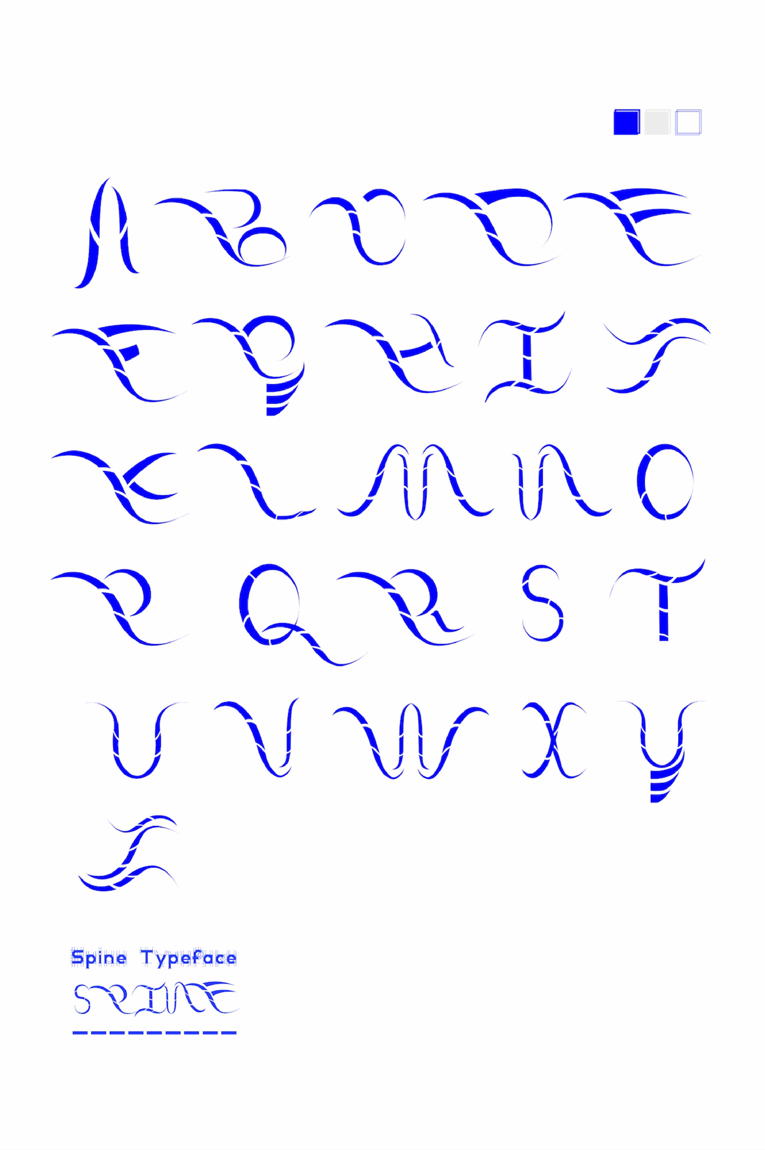
The Spine typeface is a thoughtfully designed font inspired by the intriguing combination of the human backbone and the spine of a leaf. This unique theme emerged somewhat randomly but proved to be a rich source of creative potential upon deeper exploration. The concept of the spine, both in human anatomy and in botanical forms, offered a compelling duality: the backbone symbolizes strength and rigidity, while the leaf-spine represents flexibility and organic elegance. This juxtaposition informed the entire design process, resulting in a typeface that embodies both robustness and adaptability.
The idea for the Spine typeface originated from an interest in exploring structural elements that convey both stability and grace. The backbone, a critical component of human anatomy, is synonymous with support and strength. It serves as the central structure that holds the human body upright and protects the spinal cord, playing a vital role in our ability to move and function. This element of the design symbolizes the core, unyielding strength necessary in many typographic applications, where clarity and readability are paramount.
In contrast, the spine of a leaf introduces a softer, more organic element to the design. Leaves, with their intricate vein patterns and delicate structures, suggest flexibility and natural beauty. The leaf spine’s role in supporting the leaf and facilitating the transport of nutrients adds a layer of functionality and grace. This botanical inspiration brings an element of fluidity and elegance to the typeface, balancing the rigidity of the human backbone with a sense of movement and growth.
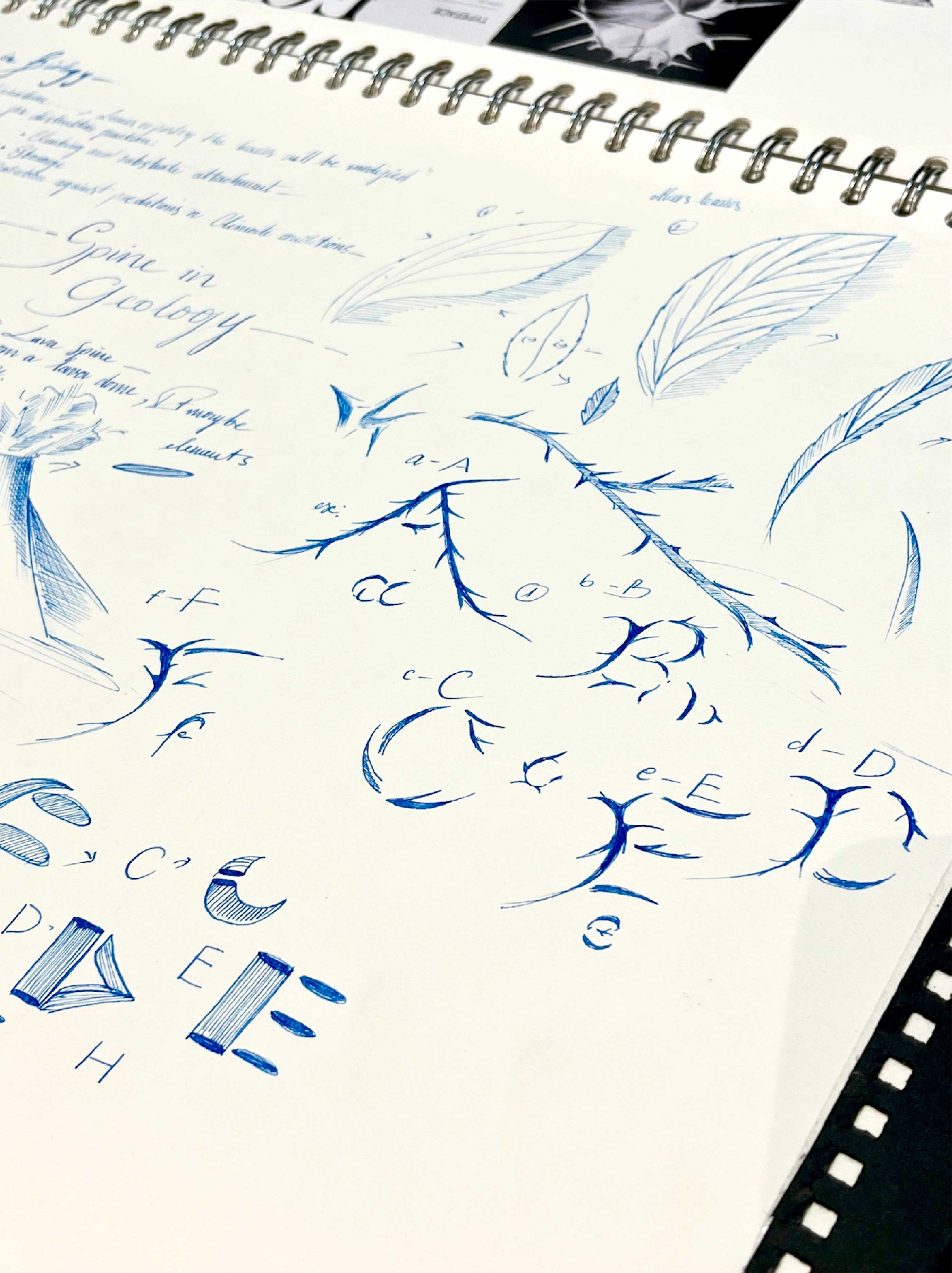
The research phase for the Spine typeface involved an in-depth examination of both anatomical and botanical structures. This dual focus was crucial in understanding how to blend these seemingly disparate elements into a cohesive design. The rough and rigid nature of the human backbone required careful consideration to avoid a typeface that felt too harsh or inflexible. Meanwhile, the leaf spine’s delicate and intricate patterns offered a counterbalance, suggesting ways to incorporate elegance and versatility.
To achieve this balance, extensive studies were conducted on the forms and functions of both spines. Anatomical illustrations and models of the human backbone were analyzed to understand its structural components and how these could be abstracted into typographic elements. Similarly, botanical studies of leaves, particularly their venation patterns and spine structures, provided insights into how to integrate organic curves and flexibility into the typeface design.
The design process began with sketching initial concepts that attempted to merge the rigidity of the backbone with the fluidity of the leaf-spine. Early iterations focused on finding a harmonious balance, ensuring that the typeface did not lean too heavily towards either extreme. The goal was to create a typeface that could convey strength without appearing overly rigid, and elegance without sacrificing readability and usability.
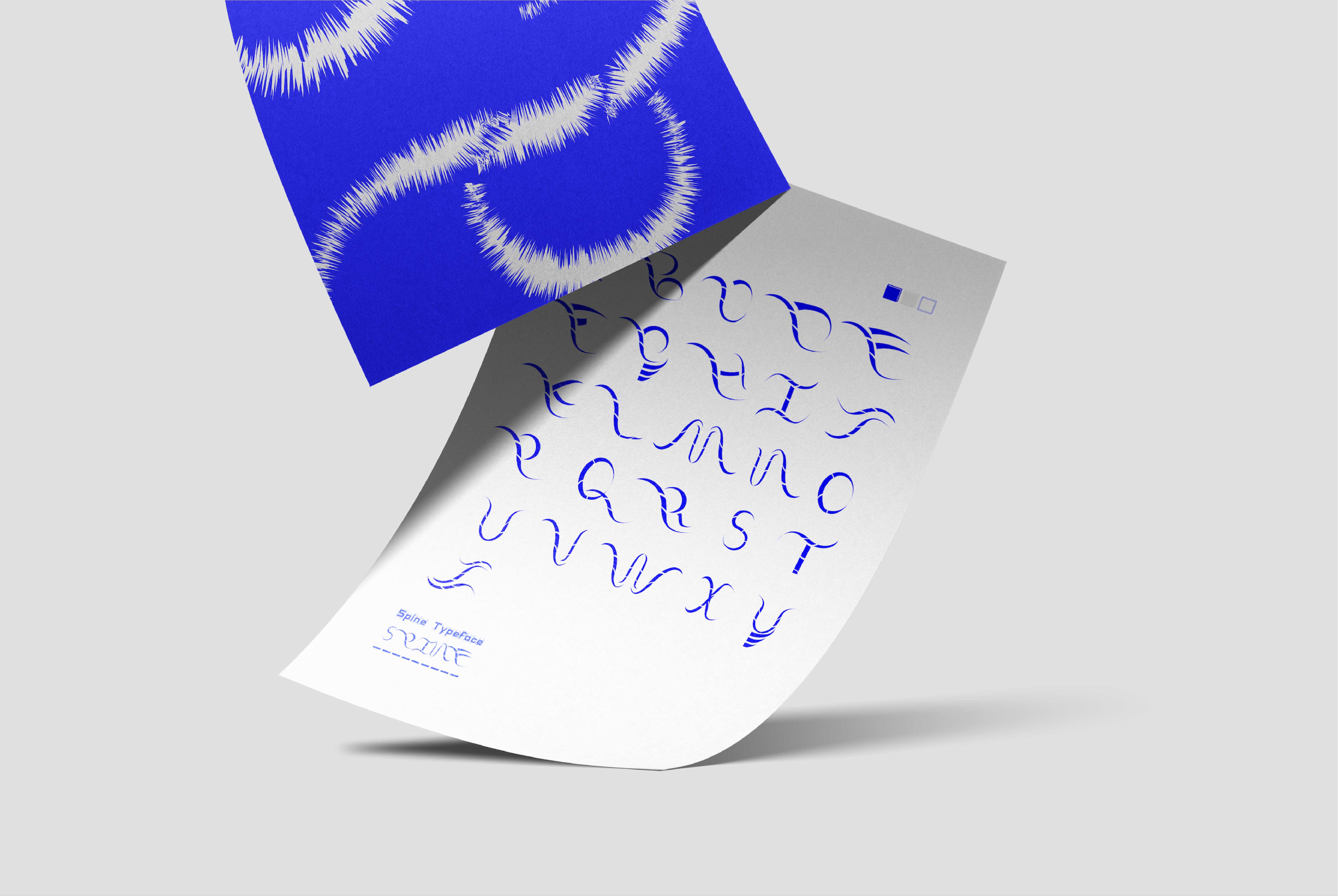
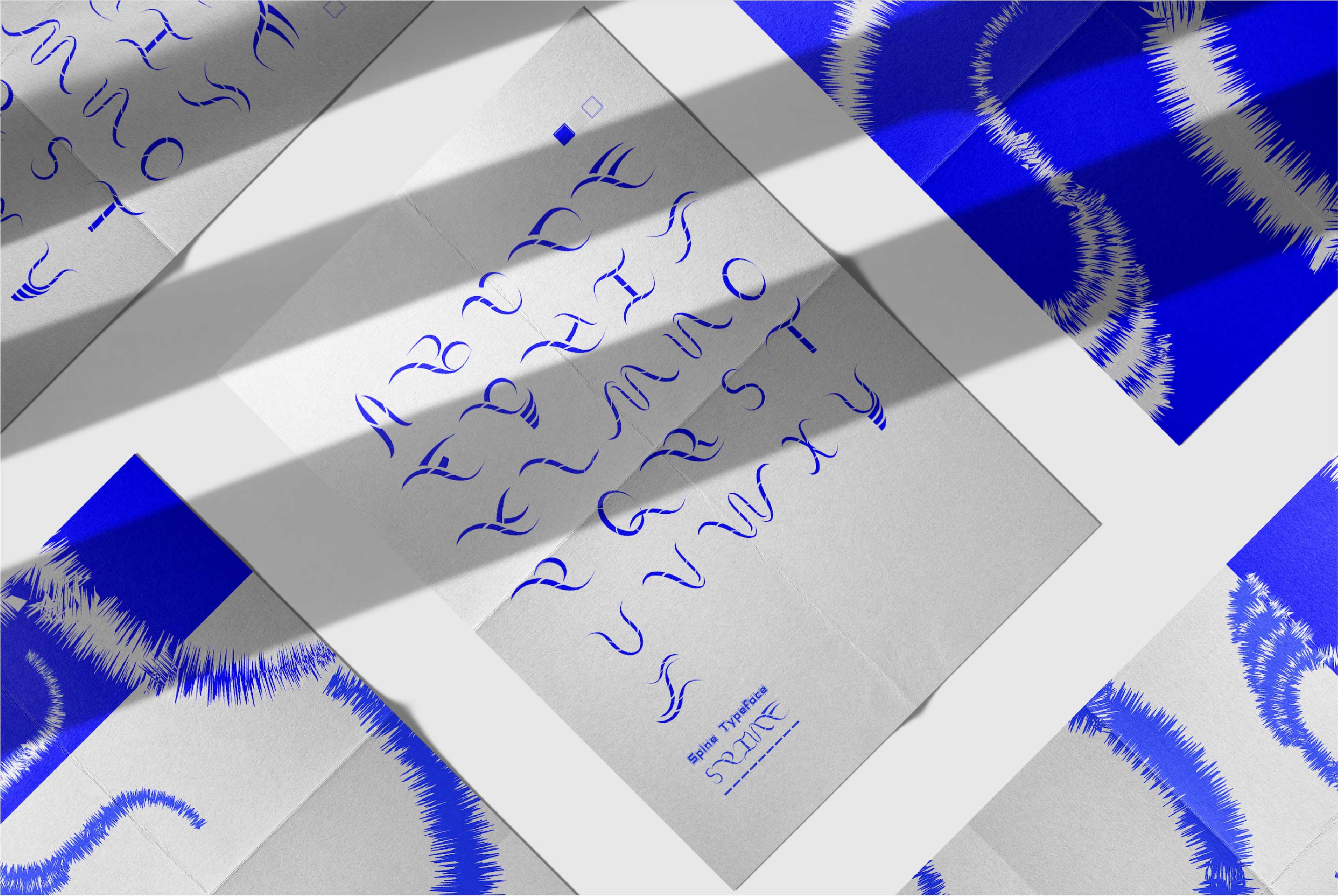
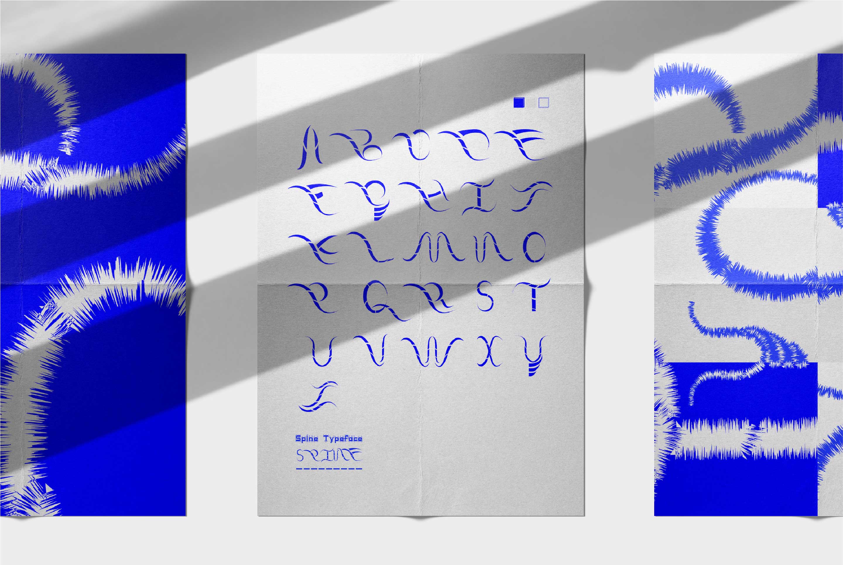
Digital renderings followed the initial sketches, allowing for more precise adjustments and refinements. Each character was carefully crafted to reflect the core principles of the design: a strong, supportive structure with a touch of organic elegance. This involved fine-tuning the weight and proportions of each letter, ensuring consistent alignment and spacing that would enhance readability while maintaining the typeface’s distinctive aesthetic.
Key Features
The resulting Spine typeface boasts several key features that set it apart:
Structural Integrity: The backbone-inspired elements provide a solid, reliable structure to each character, ensuring clarity and legibility even at smaller sizes.
Organic Elegance: The influence of the leaf-spine introduces subtle curves and delicate details that add a sense of grace and movement to the typeface.
Versatility: By balancing strength and flexibility, the Spine typeface is suitable for a wide range of applications, from headlines and titles to body text and branding materials.
Usability: The typeface is designed to be highly readable and functional, making it a practical choice for designers who need a font that performs well in various contexts.
CREDIT
- Agency/Creative: Trang Ma
- Article Title: Typography Reimagined: The Botanical and Anatomical Inspiration Behind Spine Typeface
- Organisation/Entity: Student
- Project Type: Typography
- Project Status: Non Published
- Agency/Creative Country: United Kingdom
- Agency/Creative City: Nottingham
- Market Region: Europe, Global
- Project Deliverables: 2D Design, Animation, Graphic Design, Typography
- Industry: Agriculture
- Keywords: Spine Typeface | Spine Inspiration | Botanical Inspiration | Leaf Modification | Leaf Spine | Spine Typo | Backbone + Leaf Spine
-
Credits:
Undergrad Student: TrangMa


