


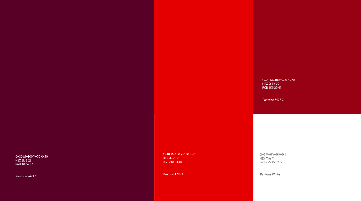
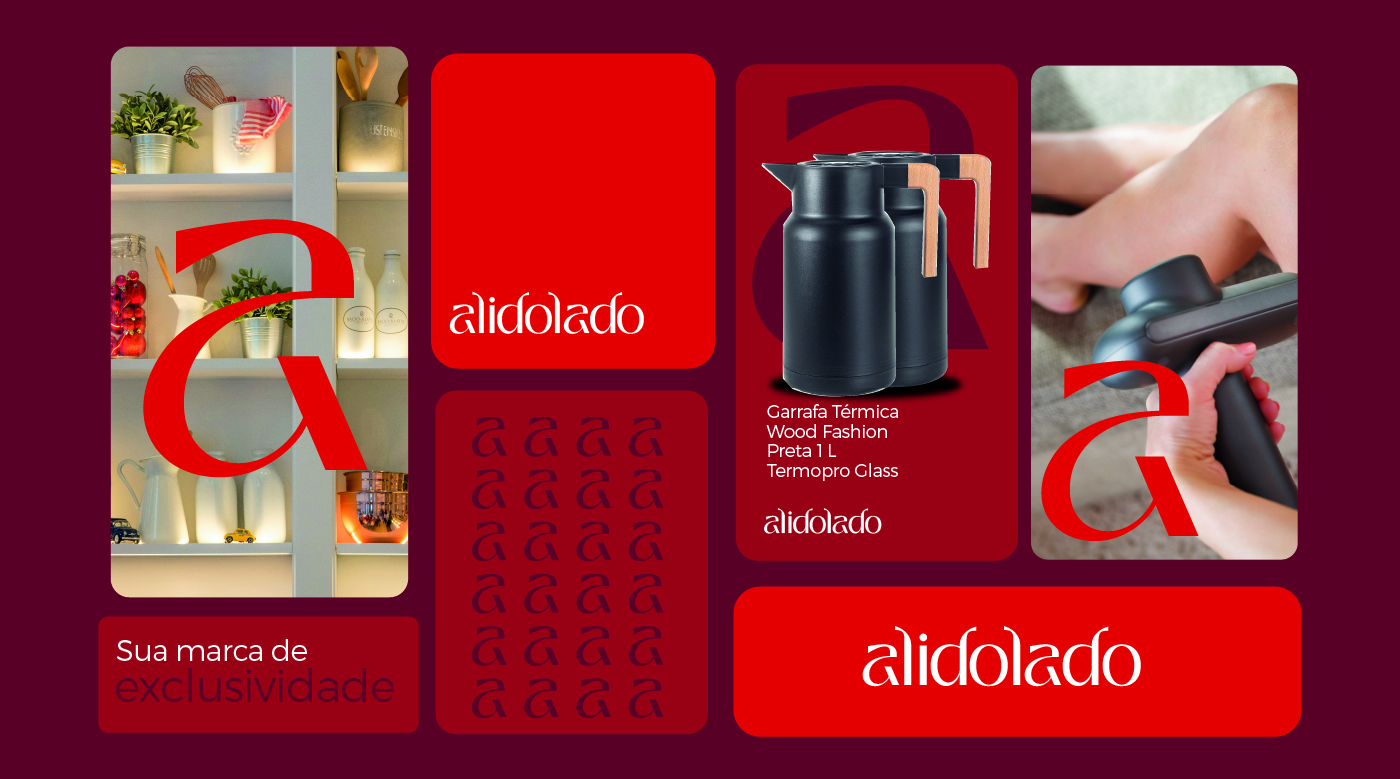
Alidolado is an e-commerce platform dedicated to everyday products, with a strong focus on offering exclusivity in each item it provides. The brand has made a name for itself through its distinctive and vibrant color palette, with a particular emphasis on the color red. This choice is not accidental; red is a color that universally evokes feelings of energy, passion, and emotion. By incorporating red into its visual identity, Alidolado aims to create a strong emotional connection with its customers, making their shopping experience more engaging and memorable.
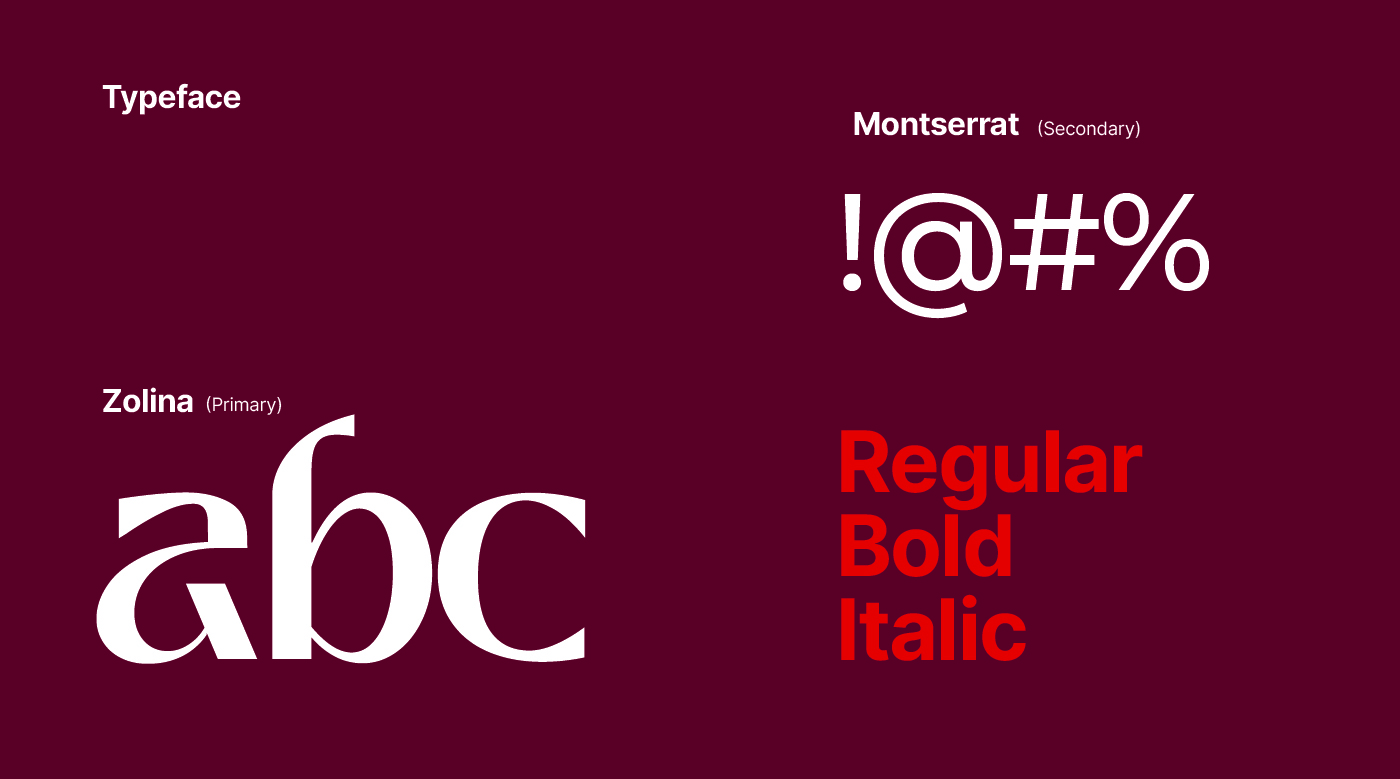
The typography selected to represent Alidolado is a result of careful consideration and design expertise. The brand chose a modern and welcoming aesthetic for its typeface, opting for lowercase letters and organic shapes. This choice reflects the brand’s unique personality and helps to convey a sense of approachability and harmony. The rounded, softer edges of the typography not only make the brand name visually appealing but also enhance readability, ensuring that customers can easily recognize and remember the brand.
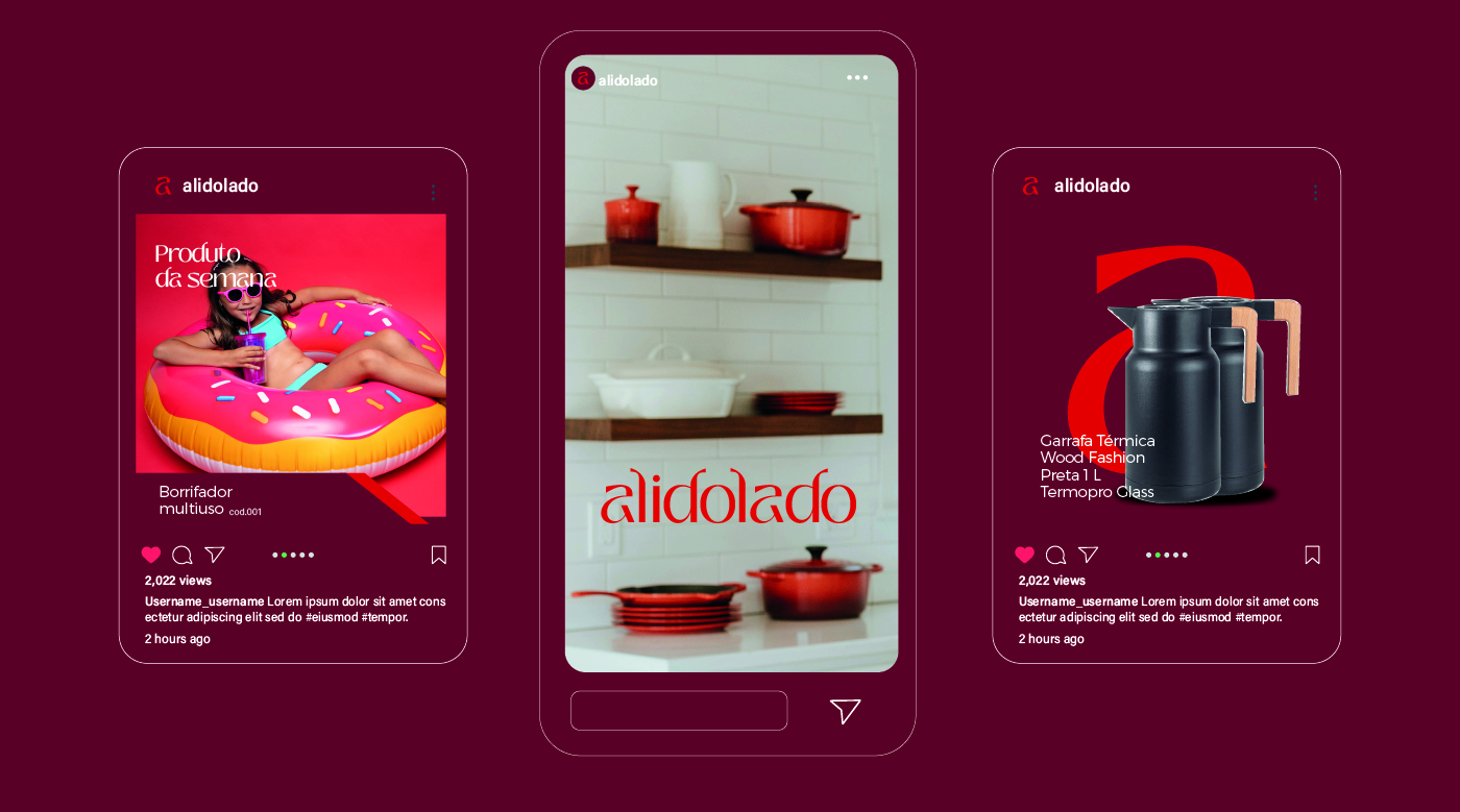
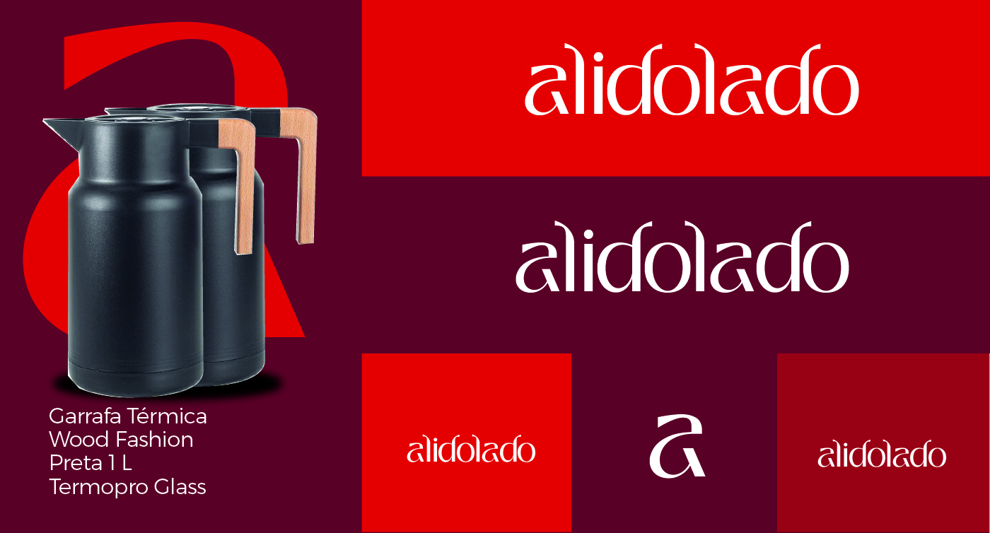
One of the strategic moves in Alidolado’s branding is the use of the letter “a” as a reduced form of the brand name. This decision is both smart and effective, reinforcing the brand’s recognition and visual identity. The letter “a,” being the first letter of the name, serves as a powerful and easily recognizable symbol. It simplifies the brand’s representation without losing its essence, making it a memorable and distinctive icon. This minimalistic approach in logo design ensures that the brand remains visually striking and easily identifiable, which is crucial in the crowded e-commerce market.
Additionally, the strategic emphasis on exclusivity in everyday products sets Alidolado apart from its competitors. Each item in their inventory is chosen with great care to ensure that it meets the brand’s standards of uniqueness and quality. This approach not only attracts customers looking for something different but also builds a loyal customer base that values the brand’s commitment to providing exclusive products.
In summary, Alidolado combines a vibrant and emotionally charged color palette, a modern and approachable typography, and a clever use of the letter “a” to create a strong, recognizable brand identity. The focus on exclusivity and quality in everyday products further enhances the brand’s appeal, making it a standout choice for customers seeking both uniqueness and reliability in their purchases. Through these thoughtful and strategic branding decisions, Alidolado successfully creates a memorable and engaging shopping experience for its customers.


CREDIT
- Agency/Creative: Bass. Estúdio Gráfico
- Article Title: Typography Branding Solution for Alidolado’s E-Commerce Platform Dedicated to Everyday Products
- Organisation/Entity: Agency
- Project Type: Graphic
- Project Status: Published
- Agency/Creative Country: Brazil
- Agency/Creative City: Piracicaba
- Market Region: South America
- Project Deliverables: Brand Design, Branding, Graphic Design, Logo Design
- Industry: Retail
- Keywords: Design, graphic design, logdesign, branding
-
Credits:
Marcos Basseto: Marcos Basseto


