About Typography 02
Typography 02 is the title of both the final project and the Graphic Design specialization course itself that I completed at the end of my second year in university.
The mentioned assignment include 3 separate tasks:
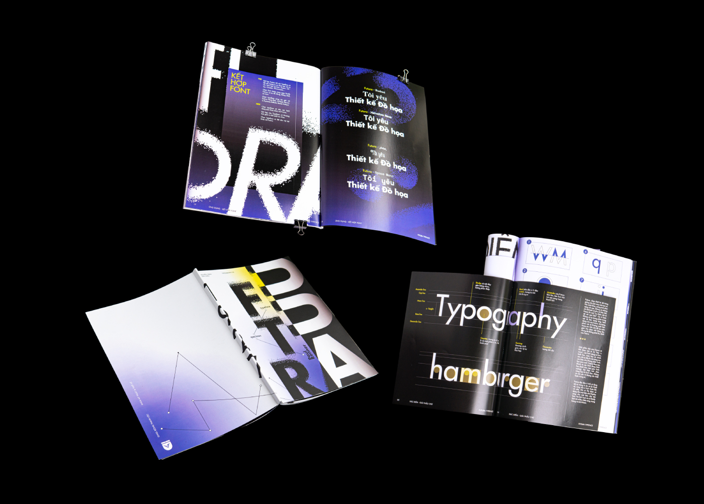
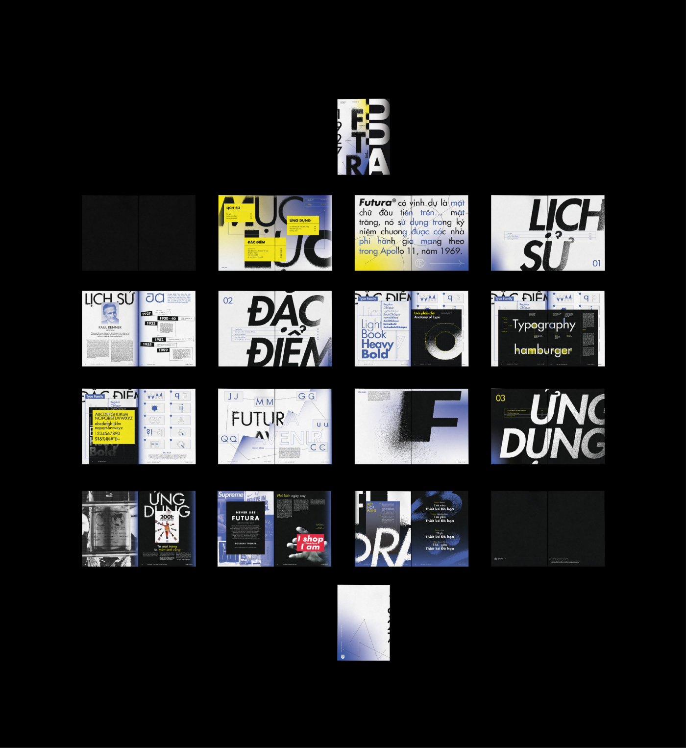
1. Futura Specimen Brochure
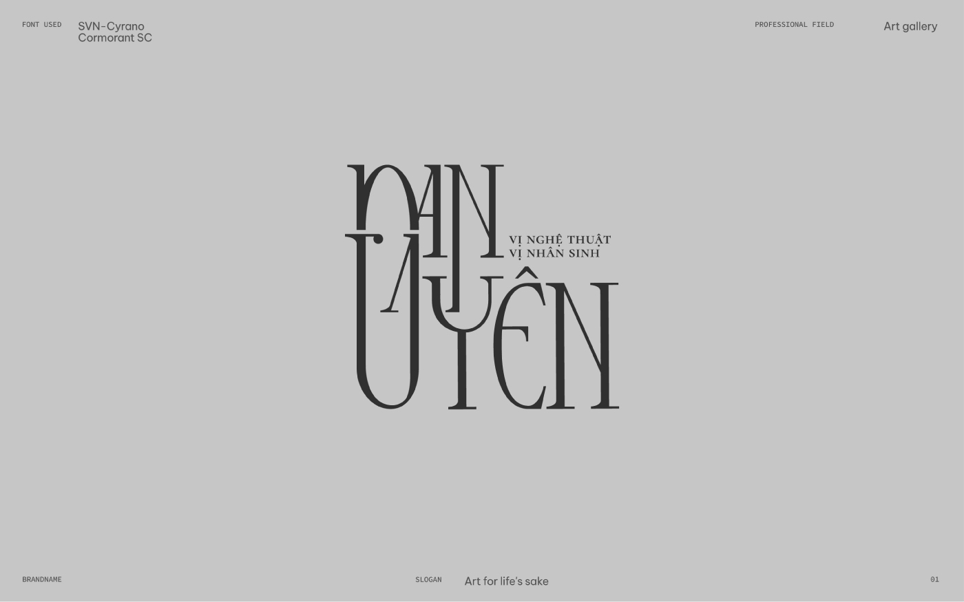
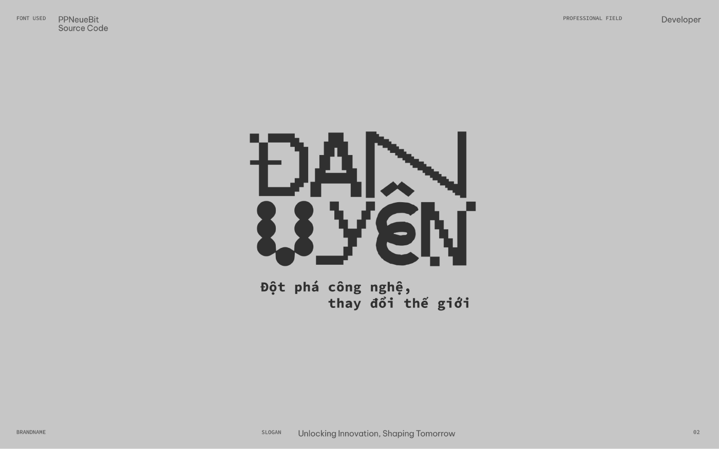
2. Brandname
3. Lettering Quote
The subject aims to provide students with a professional understanding of a genre of graphics closely tied to the commercial aspects of businesses. It focuses on imparting foundational knowledge of typography within the context of layout design, as well as a comprehensive understanding of the evolution of typography trends worldwide.
Furthermore, the subject fosters the development of students’ observational skills and instills a strong awareness of effective typography usage in design. It also emphasizes the importance of a serious and dedicated approach to learning and researching within the field.
1. Futura speciment brochure:
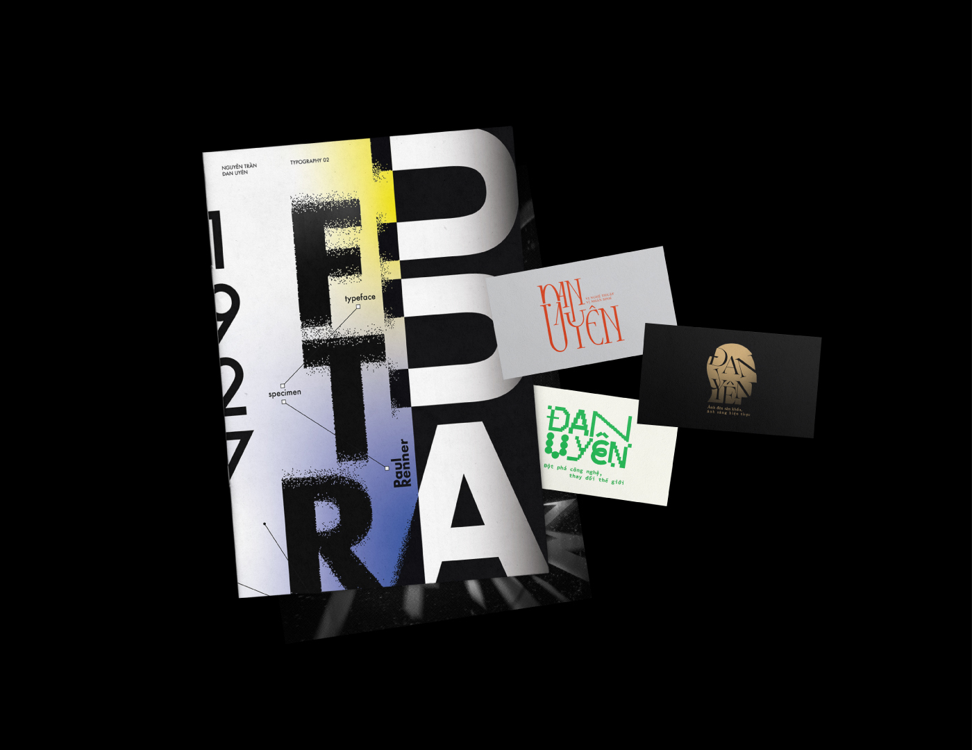
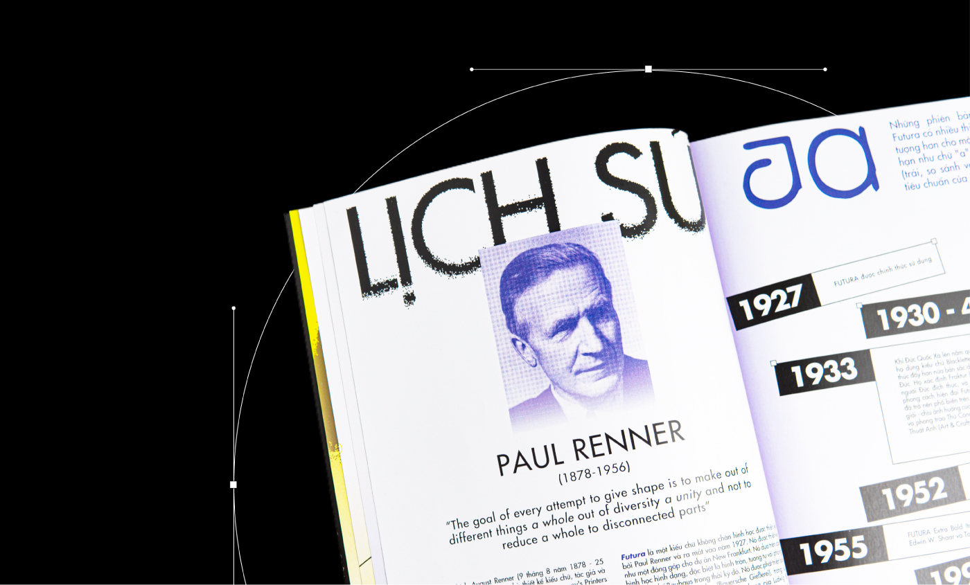
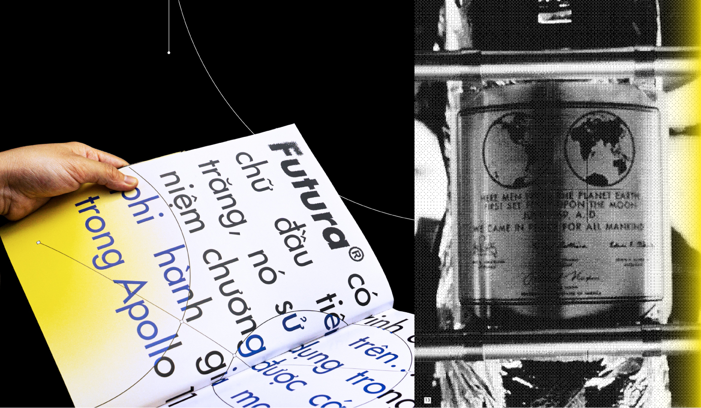
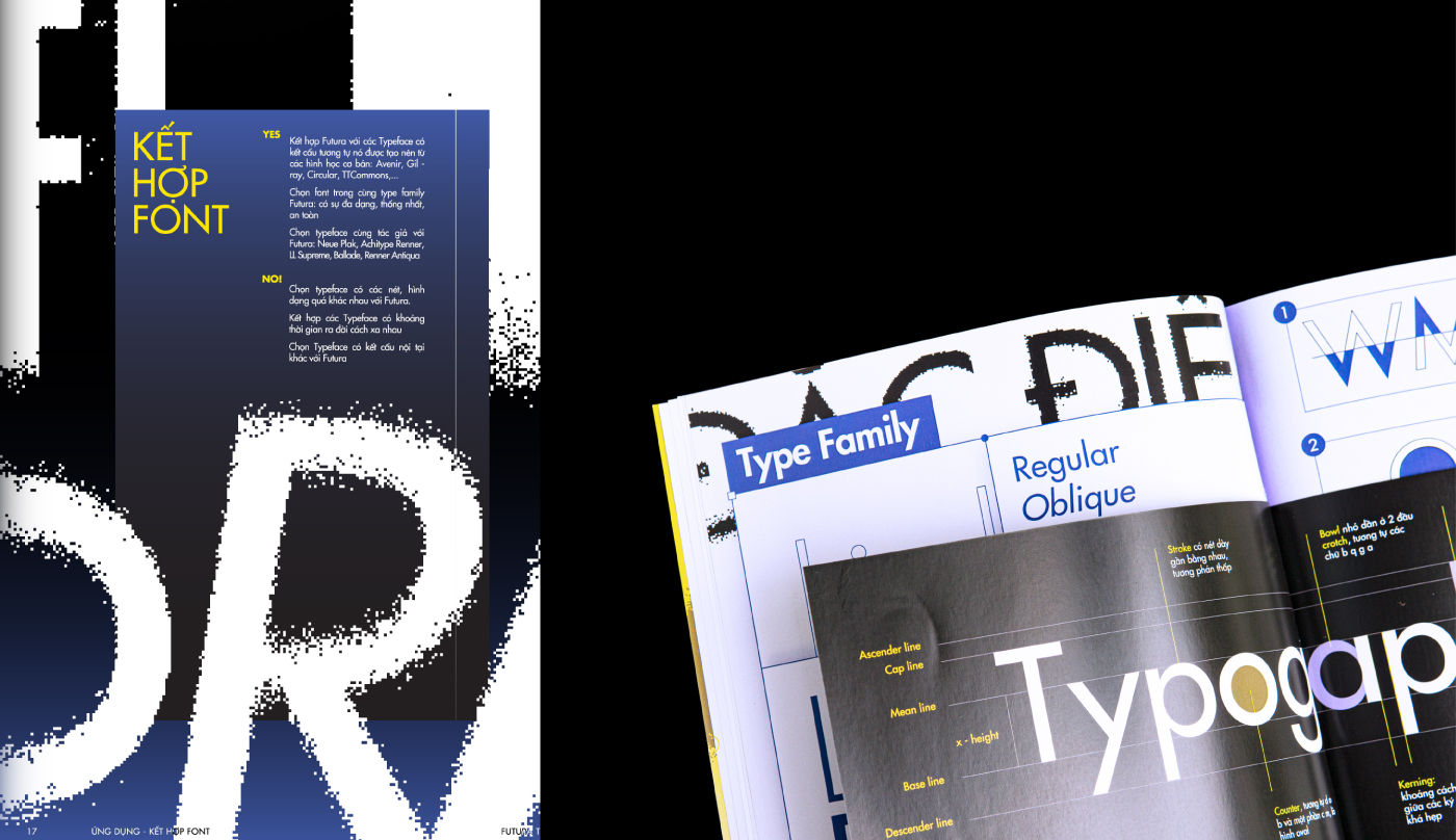
The brochure’s key visual offers a straightforward take on Furura’s widely acknowledged symbolism: a font that embodies the future, yet reimagined through the lens of the 2020s.
We are living in an era of perpetual technological advancement, where each day brings forth the introduction of new innovations. Drawing inspiration from this inevitable reality, the visual elements employ bitmap dots, symbolizing the foundational unit of every mechanical creation, complemented by end cap lines to guide the viewer’s gaze. Additionally, the layout of the applications is intentionally designed with a slight break from the conventional grid, in order to emphasizing the out-of-the-box concept. The color scheme, consisting of a deep purple-blue tone with a hint of yellow and subtle gradients, serves to stimulate the luminous highlights on mechanical devices while also evoking a vibrant sense of the future.
2. Brandname:
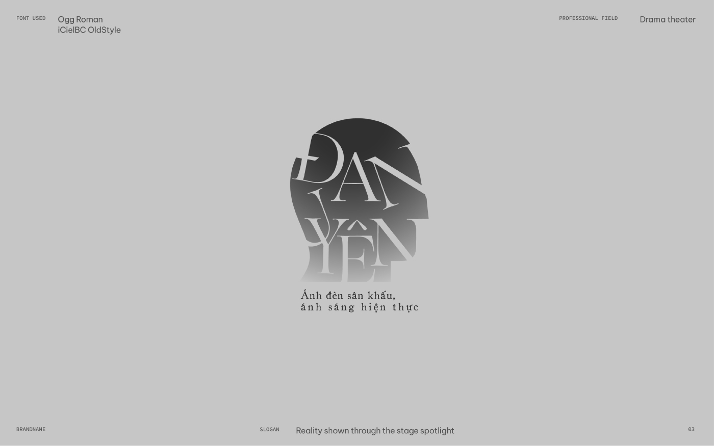
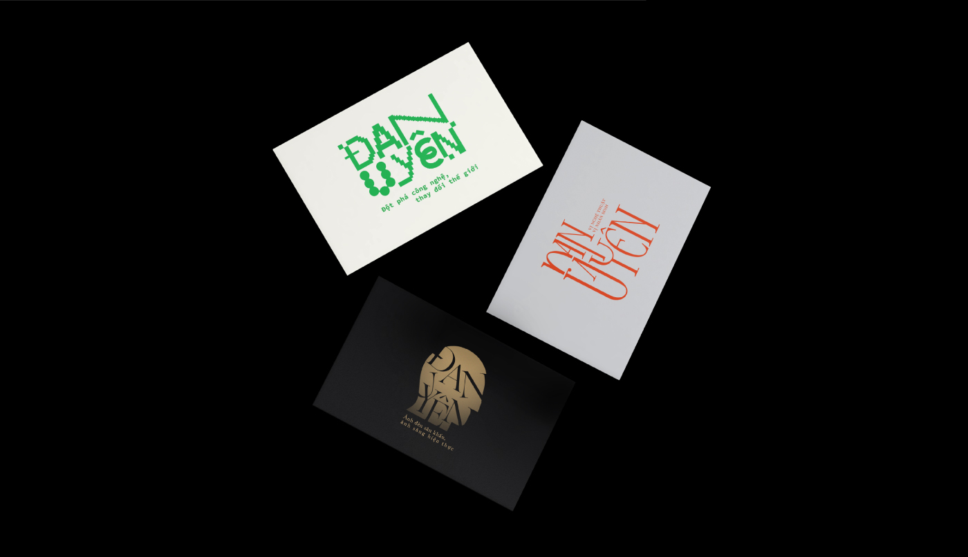
In this minor task, students are required to generate visual representations for 3 fictional brands using his/her own name.
My selected professional fields with their slogans:
– Art gallery / Art for life sake
– Developer / Unlocking Innovation, Shaping Tomorrow
– Drama Theater / Reality shown through the stage spotlight
3. Lettering Quote:
“Giây phút em gặp anh là em biết em see tình” is a lyric from the single ‘See Tình’ by Hoàng Thùy Linh. In this context, ‘see’ signifies ‘notice’ or ‘perceive with the eyes,’ us Vietnamese pronouns it as ‘Si’ in ‘Si mê’ – or specifically ‘See Tình’, which translates to ‘lovesick’. Consequently, the sentence can be rendered as ‘The moment I met you is when I realized I found love’ or ‘The moment I met you is when I realized I was lovesick.’
CREDIT
- Agency/Creative: Uyên Nguyễn
- Article Title: Typography 02 Graphic Design Student Project
- Organisation/Entity: Student
- Project Type: Typography
- Project Status: Published
- Agency/Creative Country: Vietnam
- Agency/Creative City: Ho Chi Minh
- Market Region: Asia
- Project Deliverables: Brand Naming, Editorial Design, Lettering, Typography, Visualisation
- Industry: Information
- Keywords: editorial design, brandname, logotype, brochure, typography 02, lettering, vietnam
-
Credits:
Designer: Uyen Nguyen


