


PURGE is a team of demolition contractors based in Singapore. The brandname reflects the company’s ability to get rid of the unnecessary elements within a space, before any possible construction can occur.
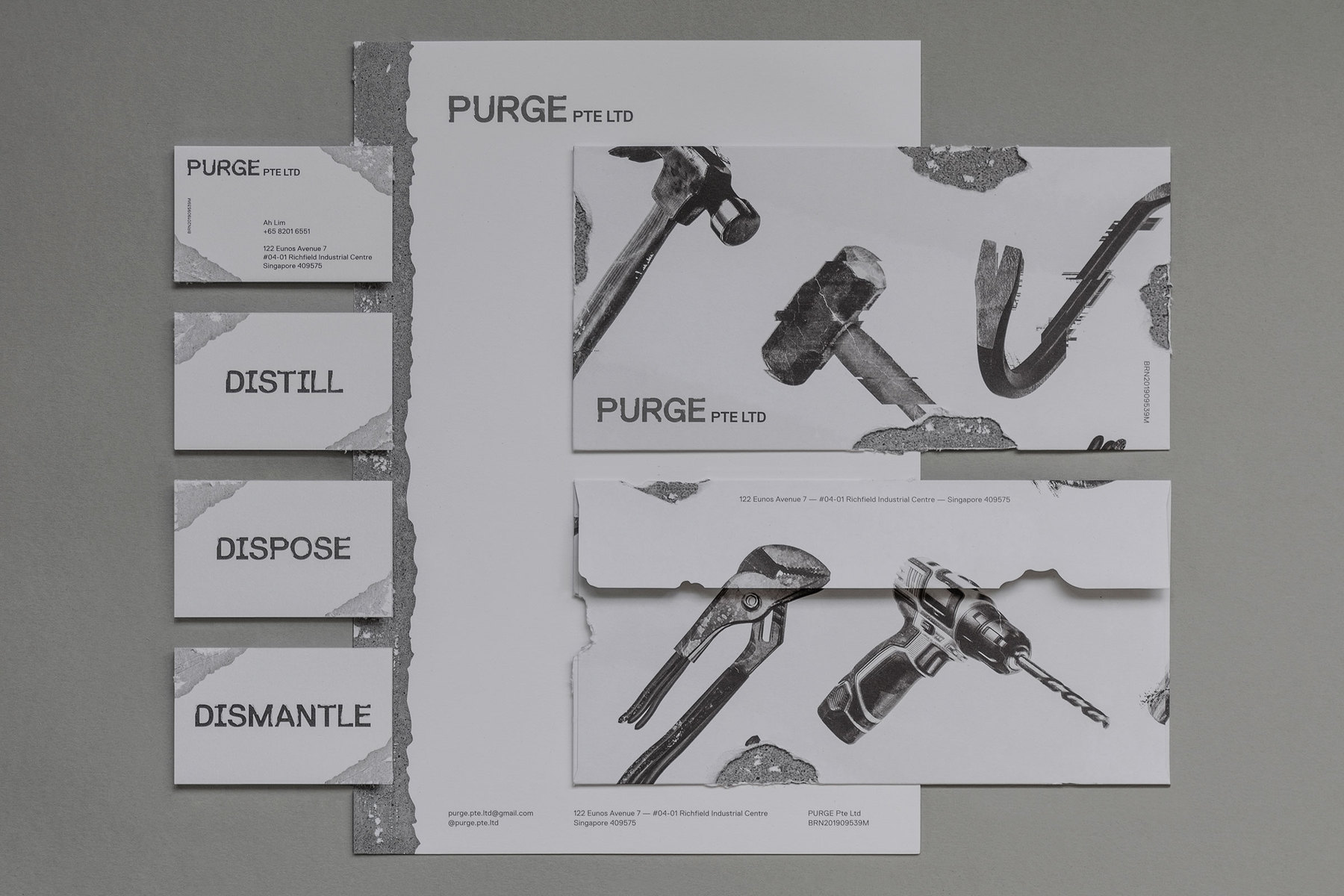
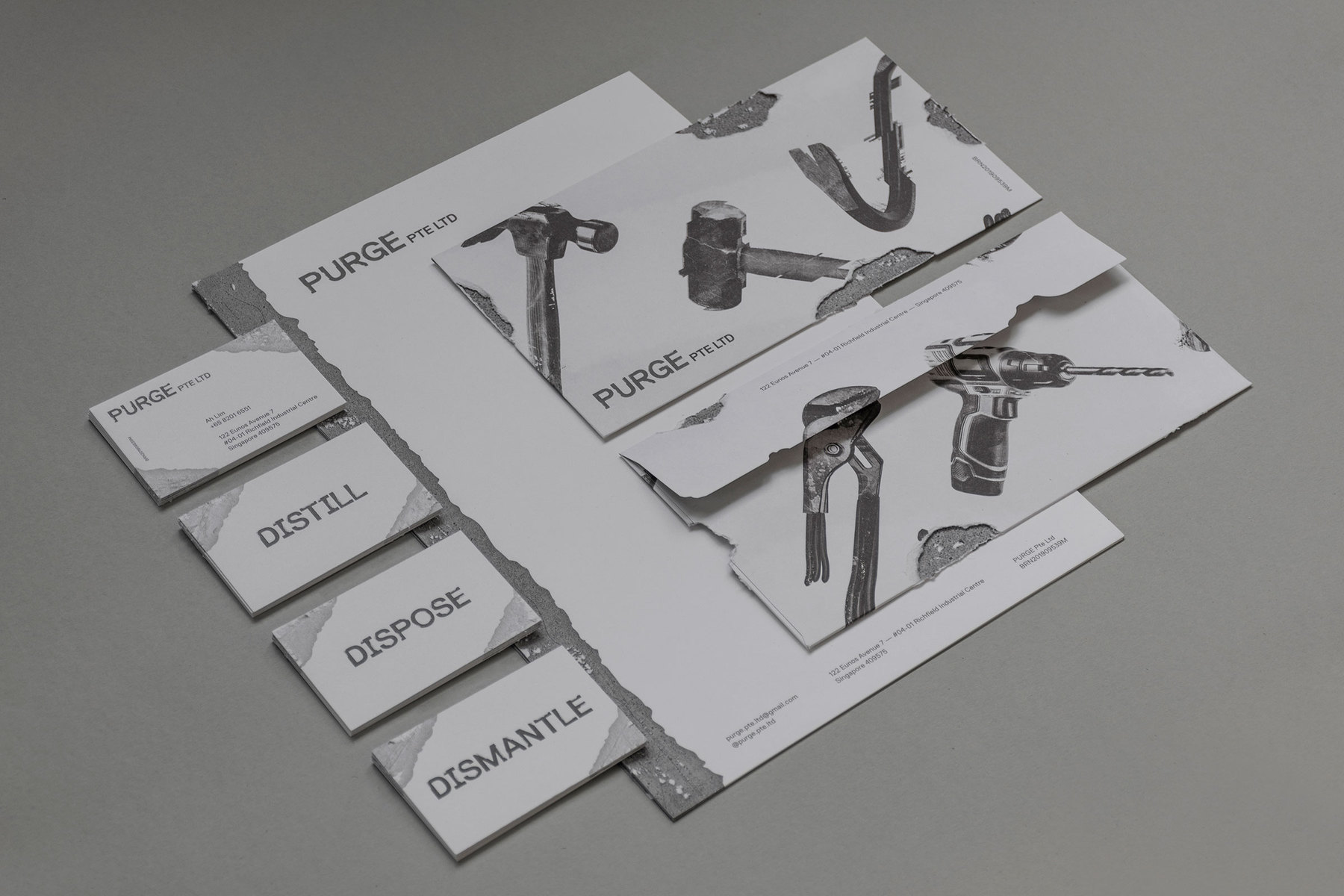
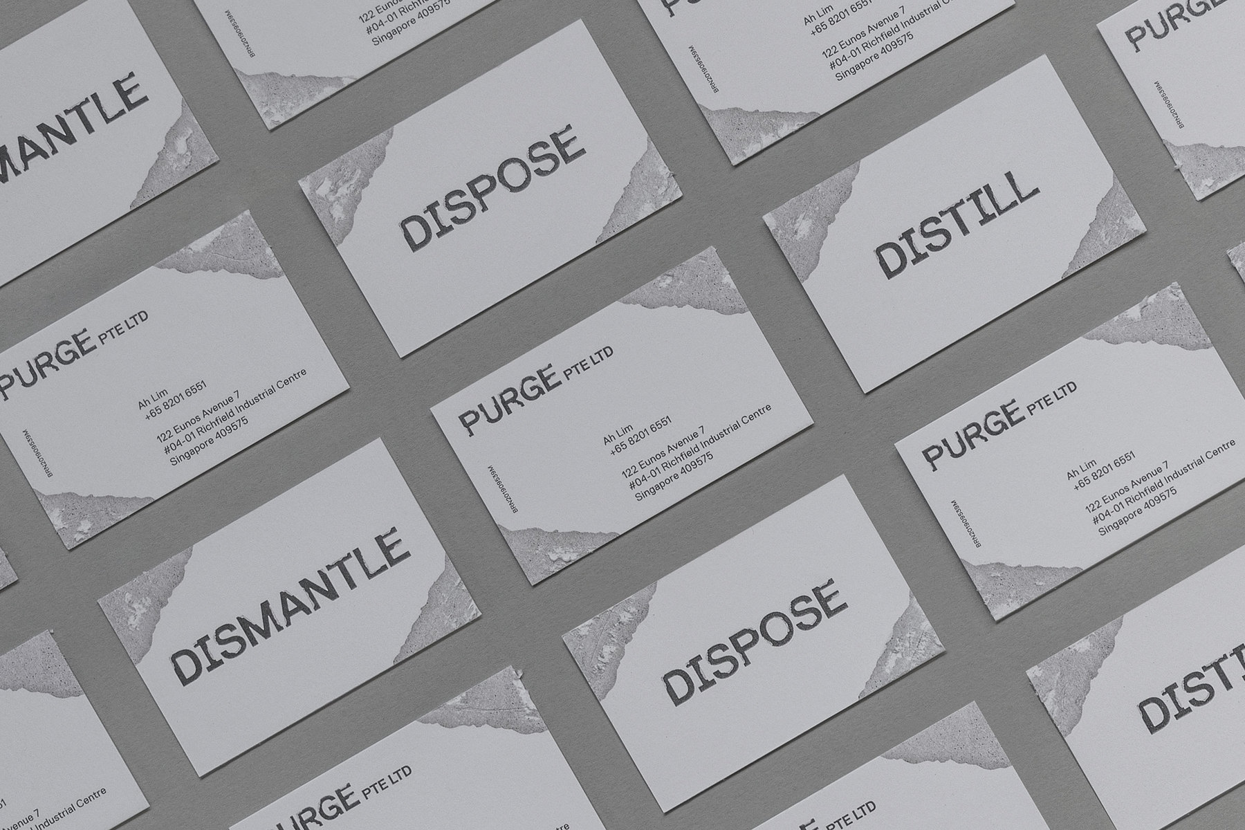
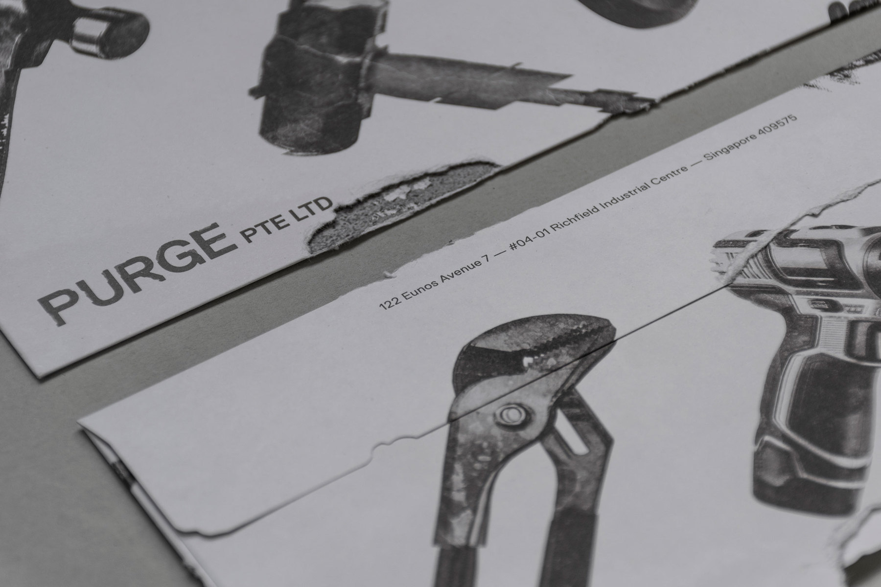
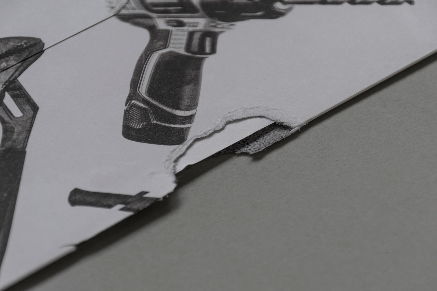
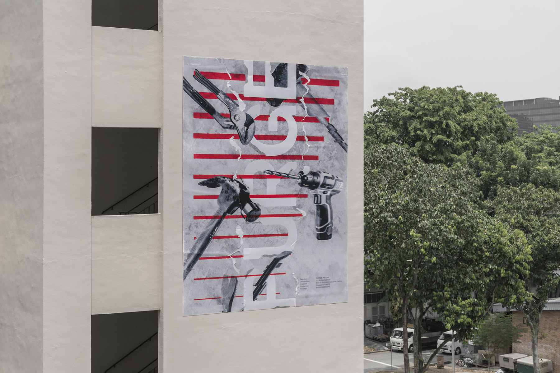
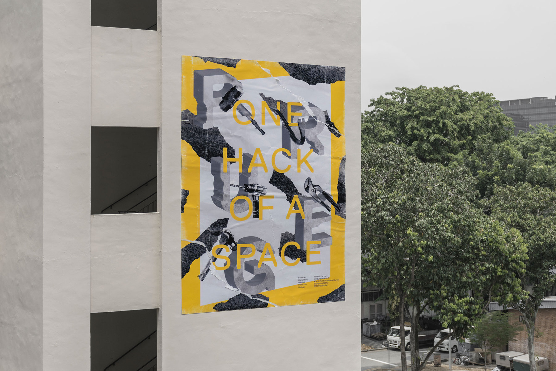
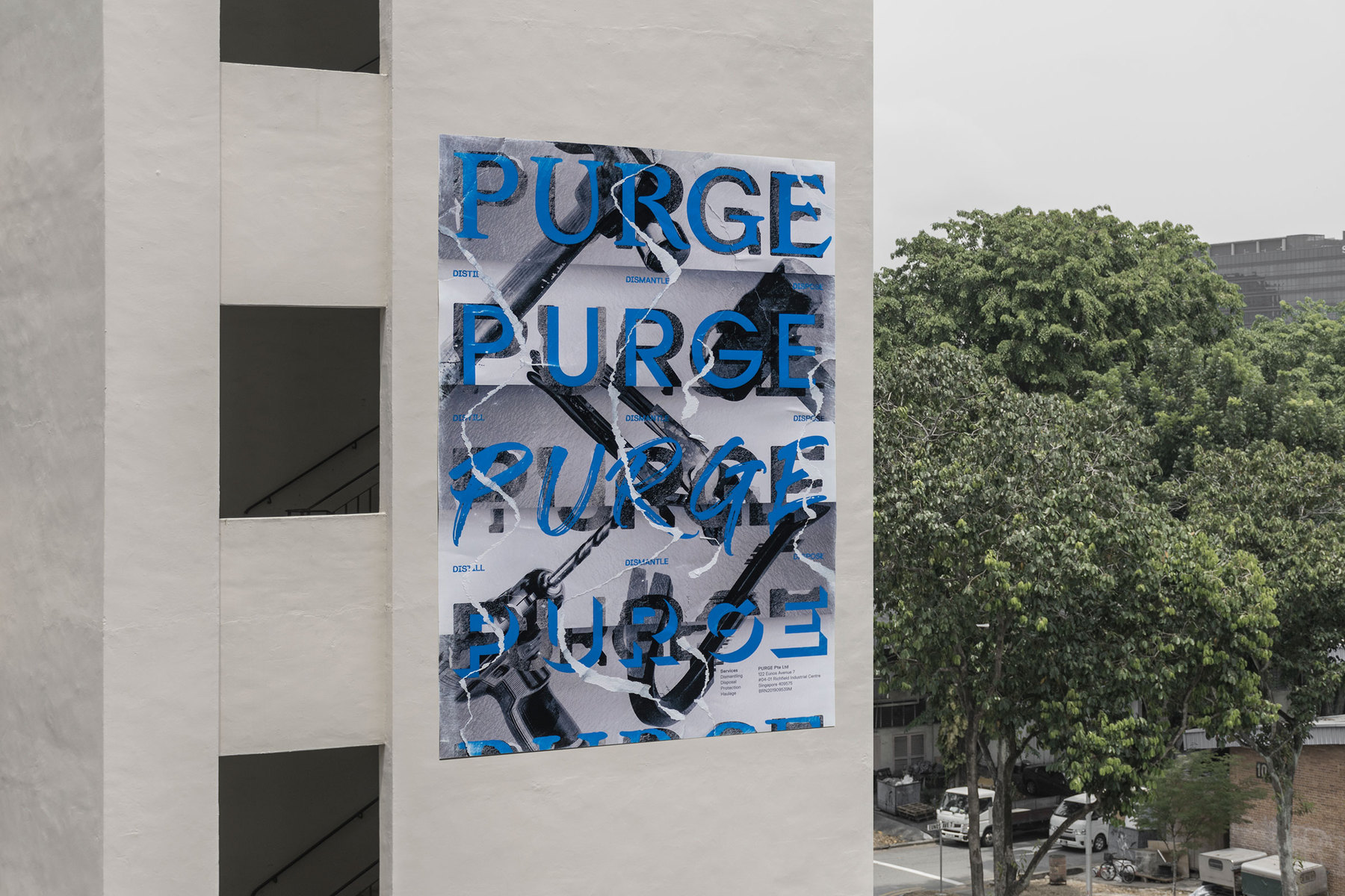
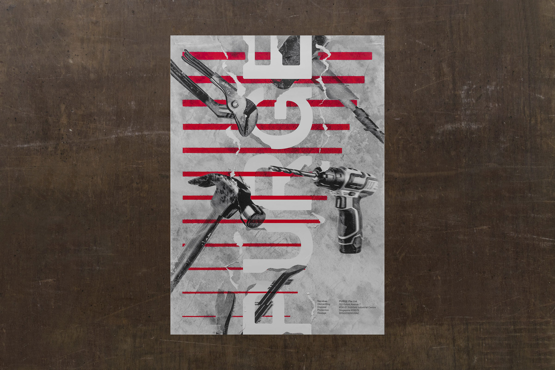
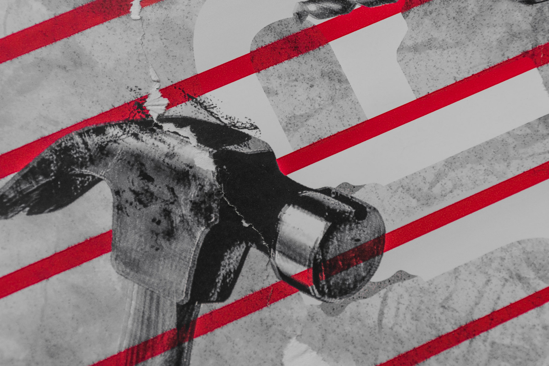
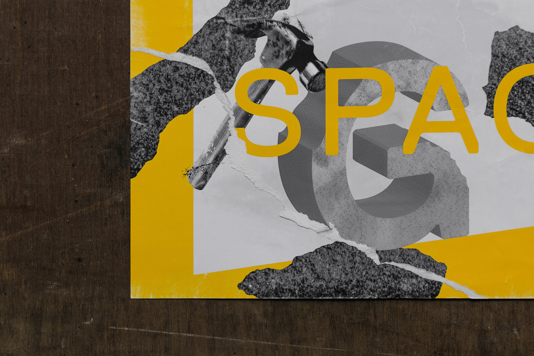
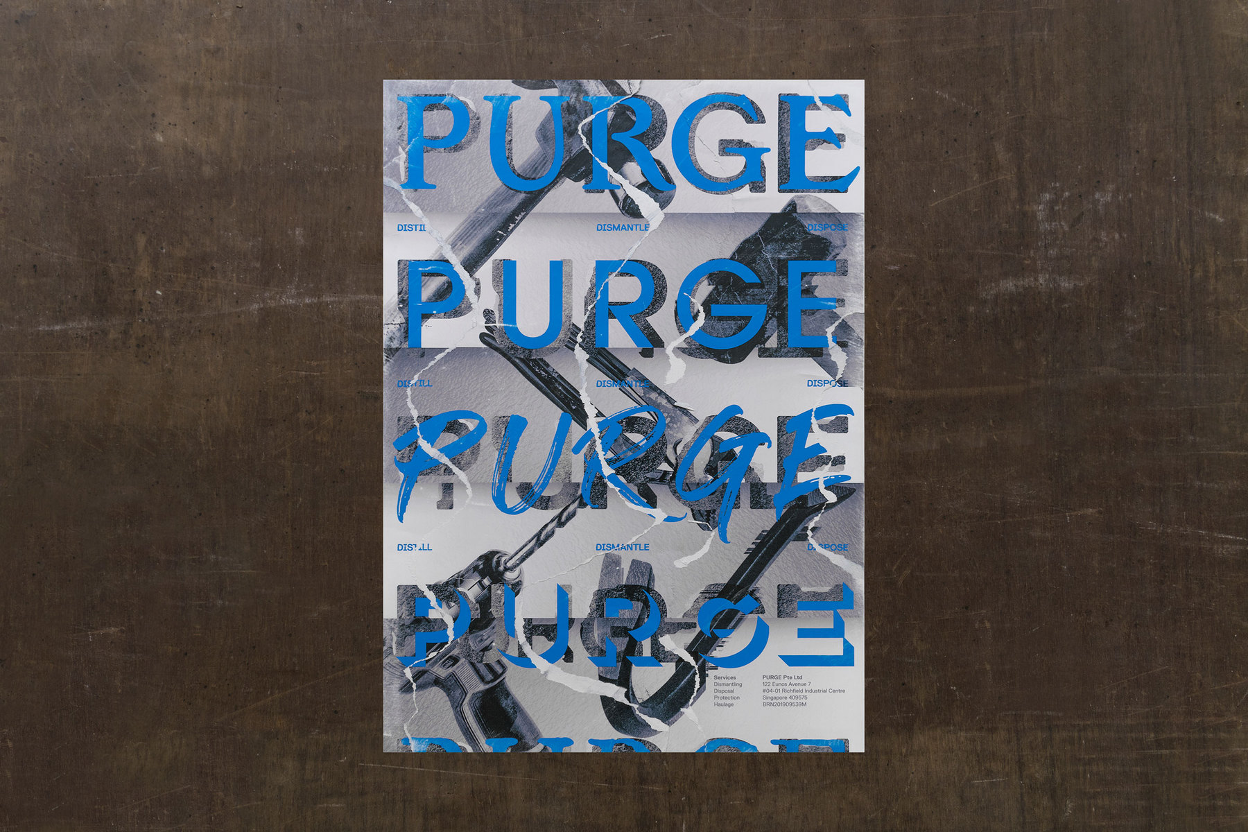
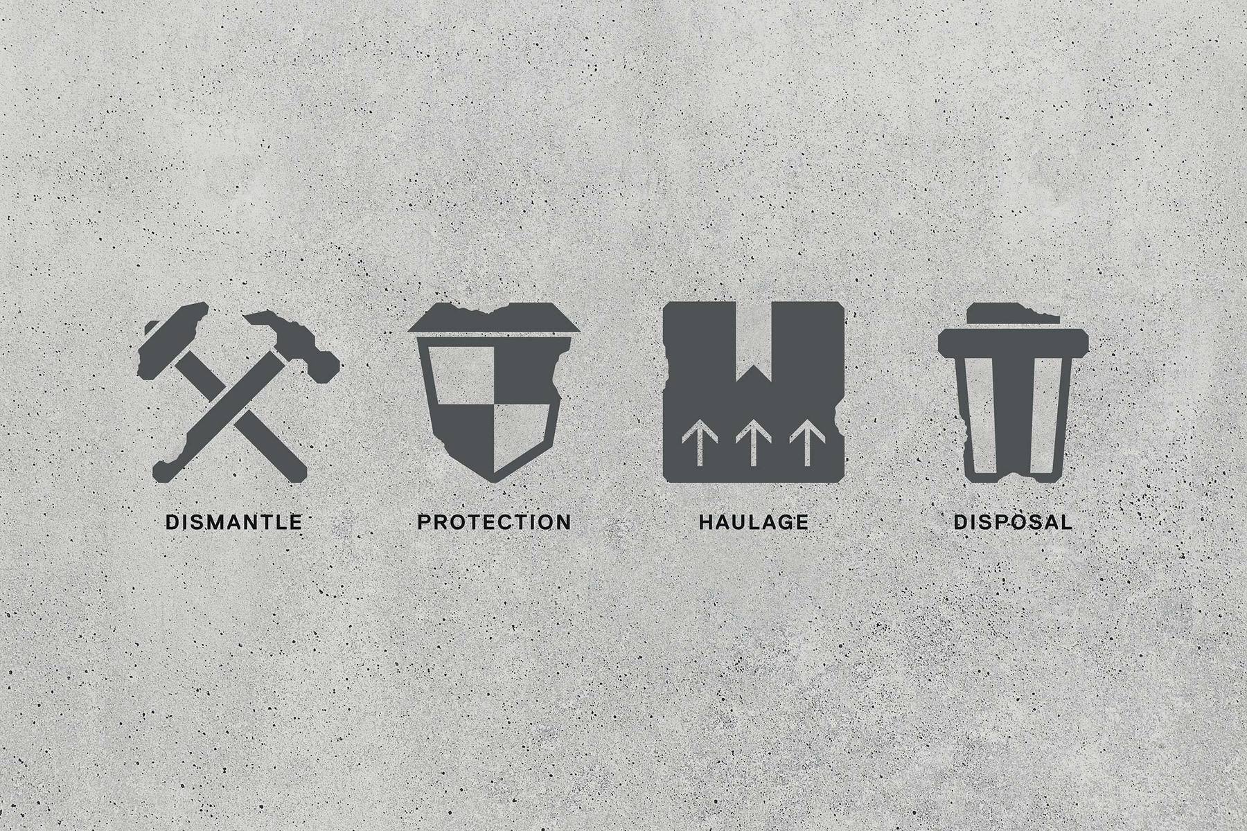
Their scope of services include dismantling of objects, spatial protection, haulage of articles, and disposal of junk — these meant that work can potentially become messy, unrefined, and dishevelled. Taking reference from these key thoughts, PURGE’s identity is designed to embrace and appreciate the authenticity of this process. The portrayal of knocked-down walls became the idea for its graphical language, creating a demolished, work-in-progress visual state. A series of demolition tools are chosen and treated extensively to further express the brand’s character.
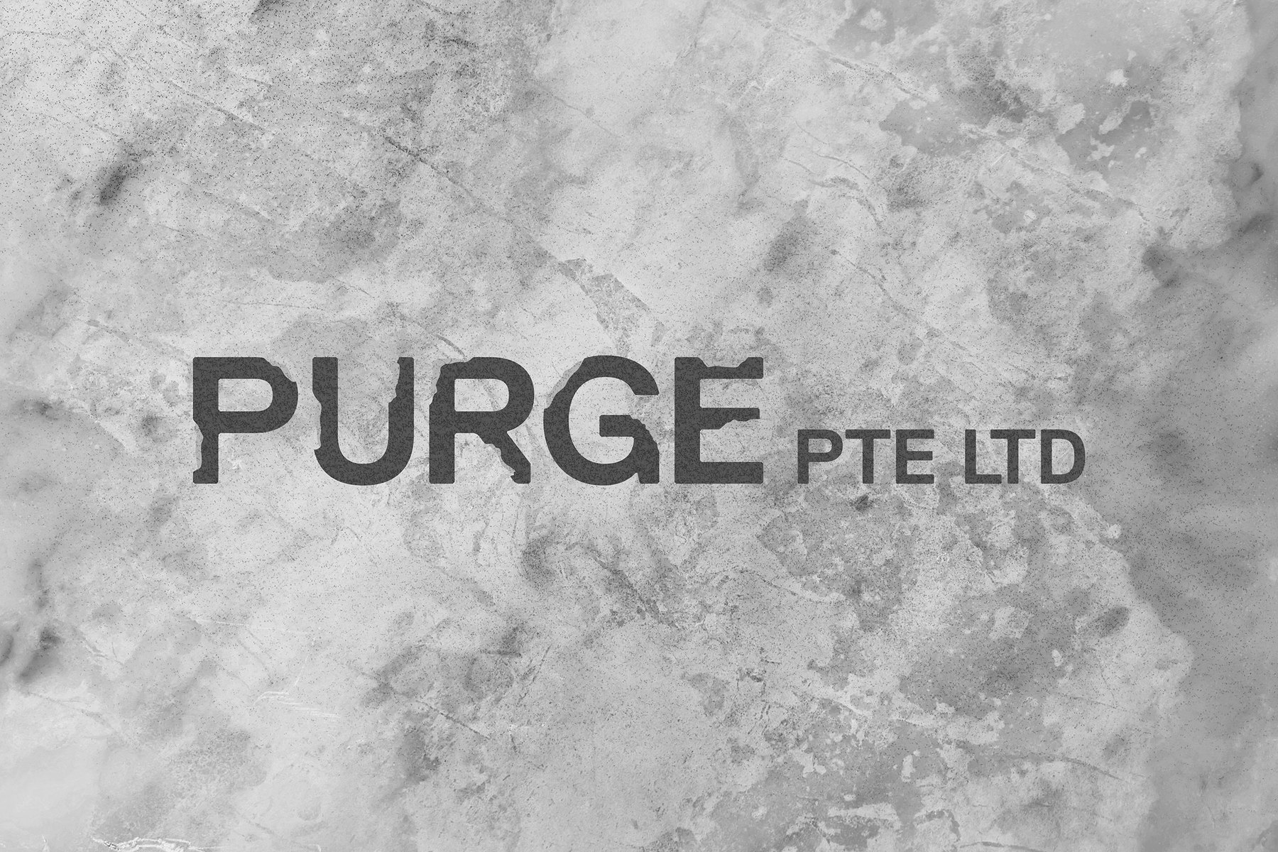
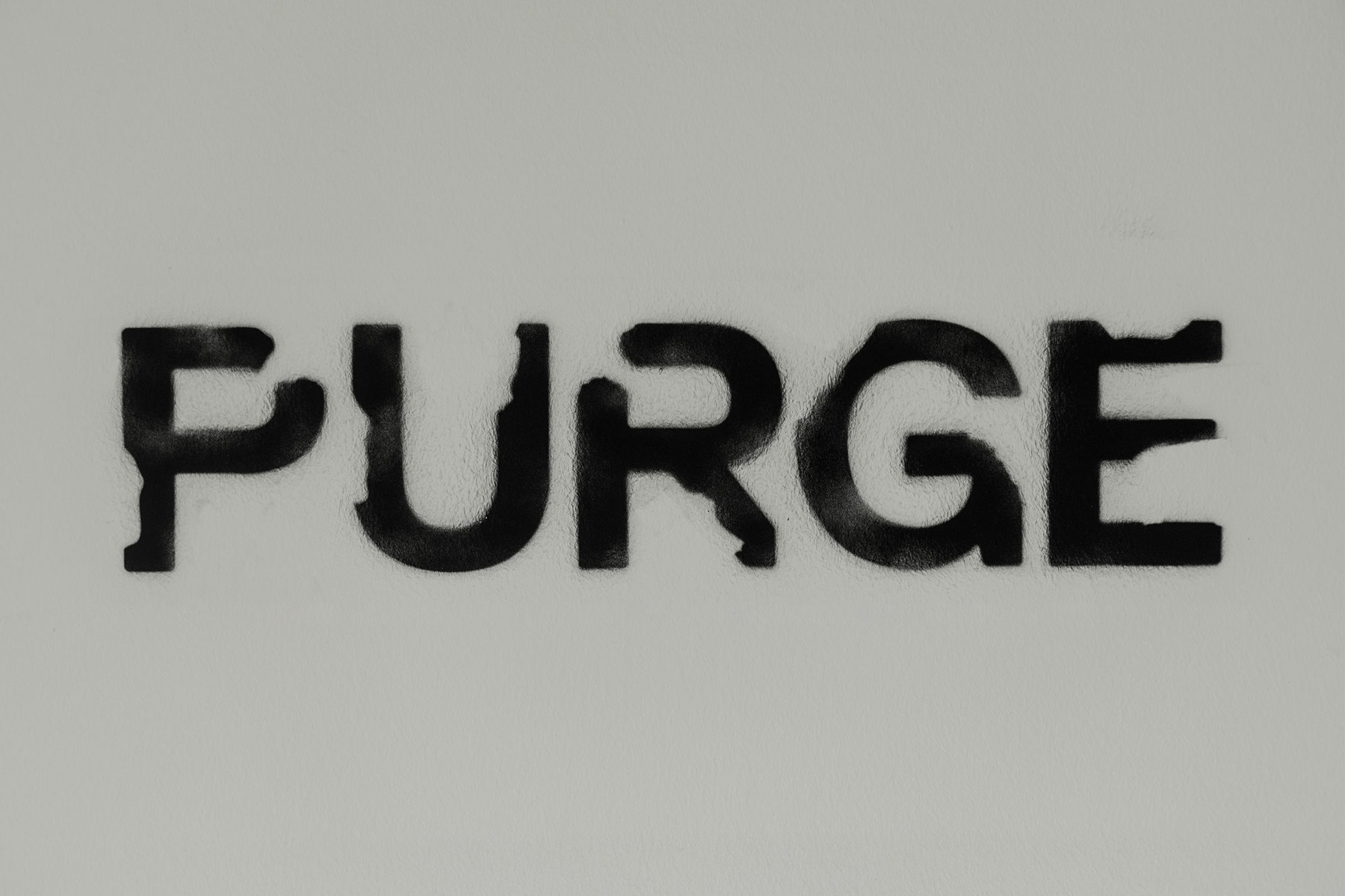
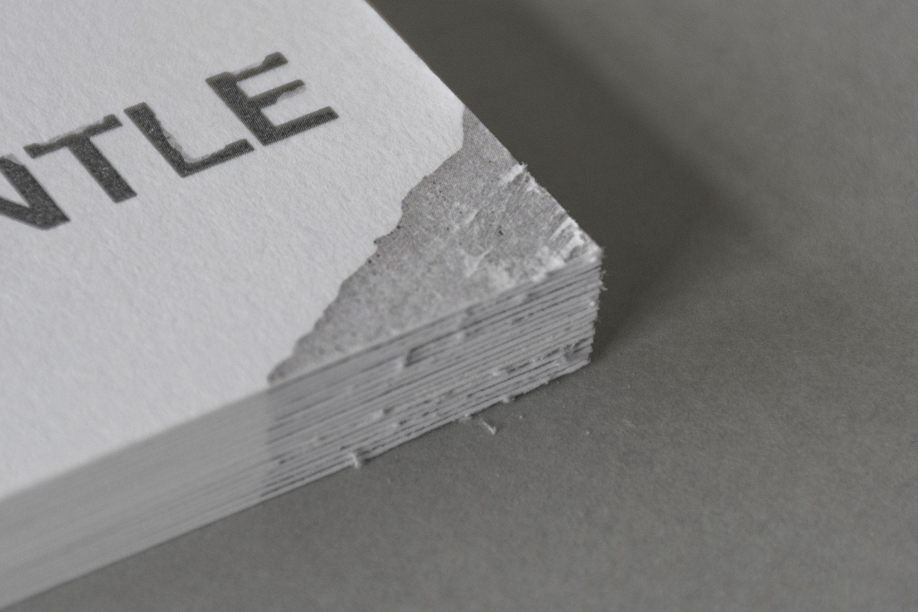
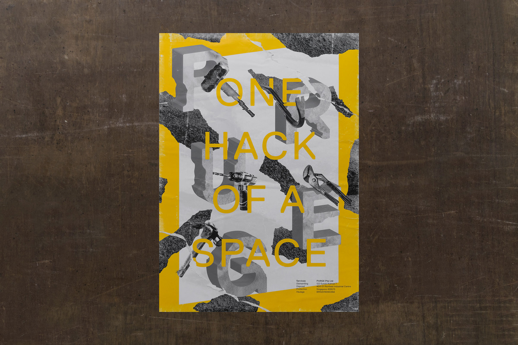
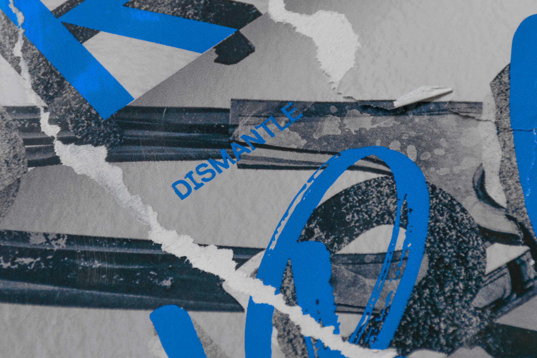
Intricate ‘knockings’ are applied onto an industrial type form to reveal its ‘inner’ concrete underneath, establishing the logo. The result of this effect formed a militaristic, camouflaged-like application that extended across an entire suite of the typeface.
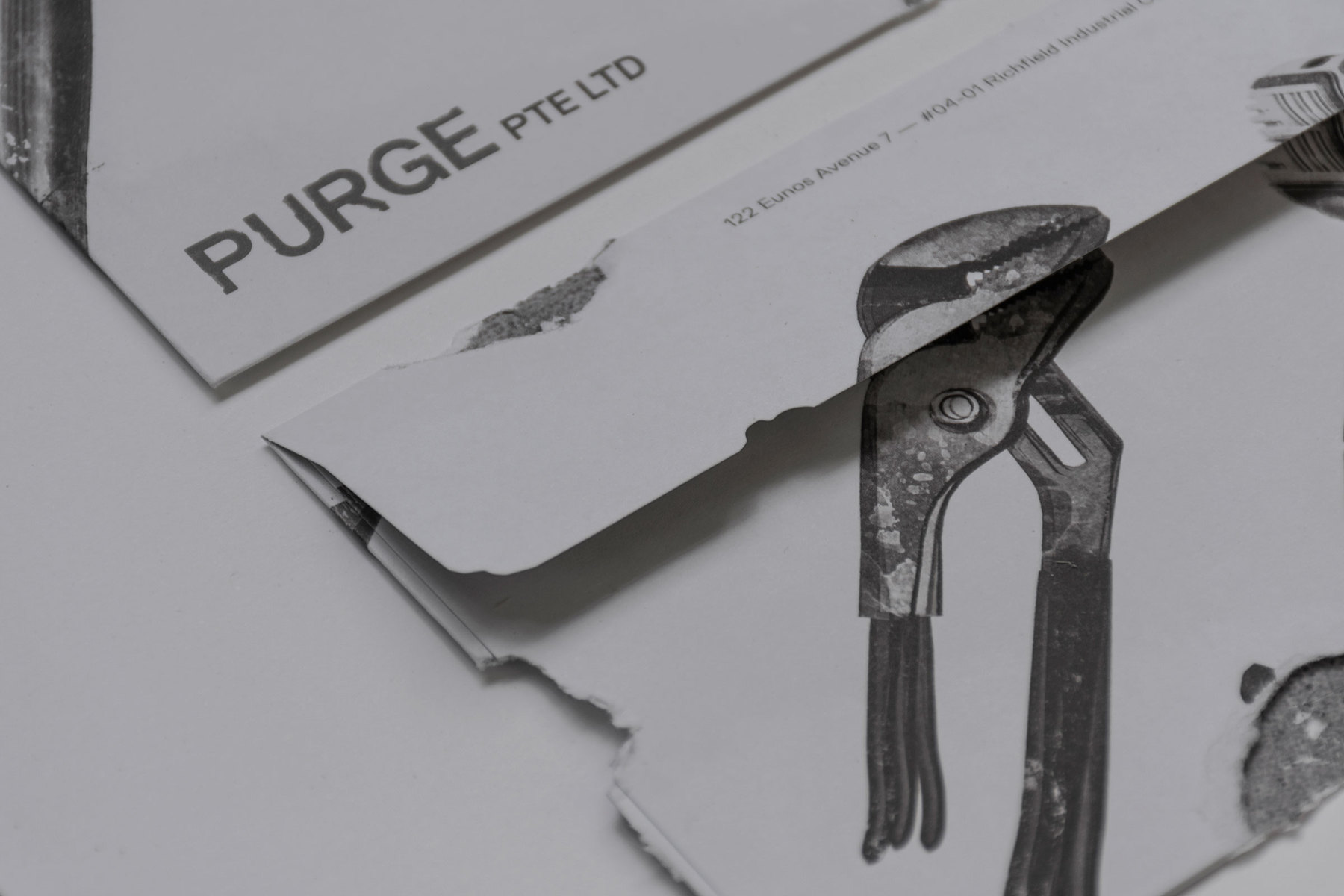
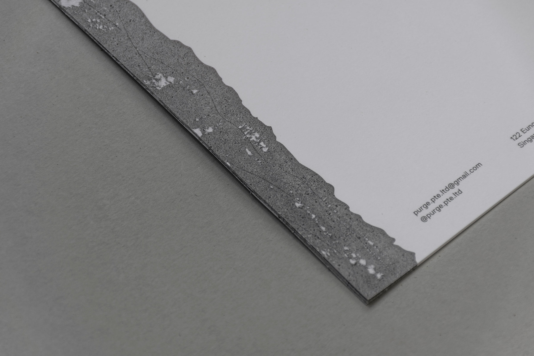
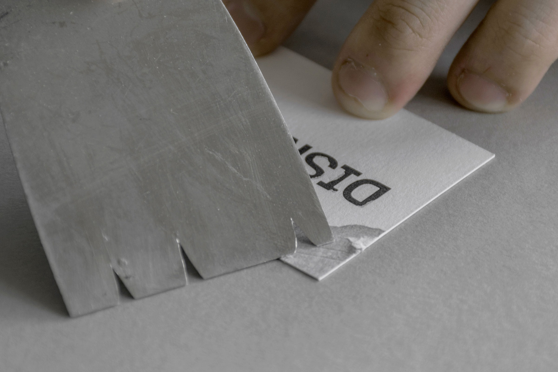
Extending the same thought across the stationery, the revealed portion of concrete texture is distressed by hand, making every piece unique and aesthetically delicate. The envelopes are manually dismantled as well to reveal intricate portions of its content, similarly utilising the ‘knocks’ to present the layers underneath. Huge typographic posters are designed to showcase its attention to details and mailed to prospective industry collaborators.
Refined paper swatches that mimic wall textures are carefully selected and paired with offset-printing to reflect the high quality of output that the brand delivers. PURGE — Providing one hack of a space.
CREDIT
- Agency/Creative: JAY-L
- Article Title: Typographic Knockings for Demolition Contractors Branding in Singapore
- Organisation/Entity: Freelance, Published Commercial Design
- Project Type: Identity
- Agency/Creative Country: Singapore
- Market Region: Asia
- Project Deliverables: Brand Architecture, Brand Creation, Brand Identity, Brand Strategy, Branding, Graphic Design, Identity System, Tone of Voice
- Industry: Construction
- Keywords: Demolition, Contractors, Singapore, Knockings, Distress, Concrete, Hacking, Distill, Dispose, Dismantle


