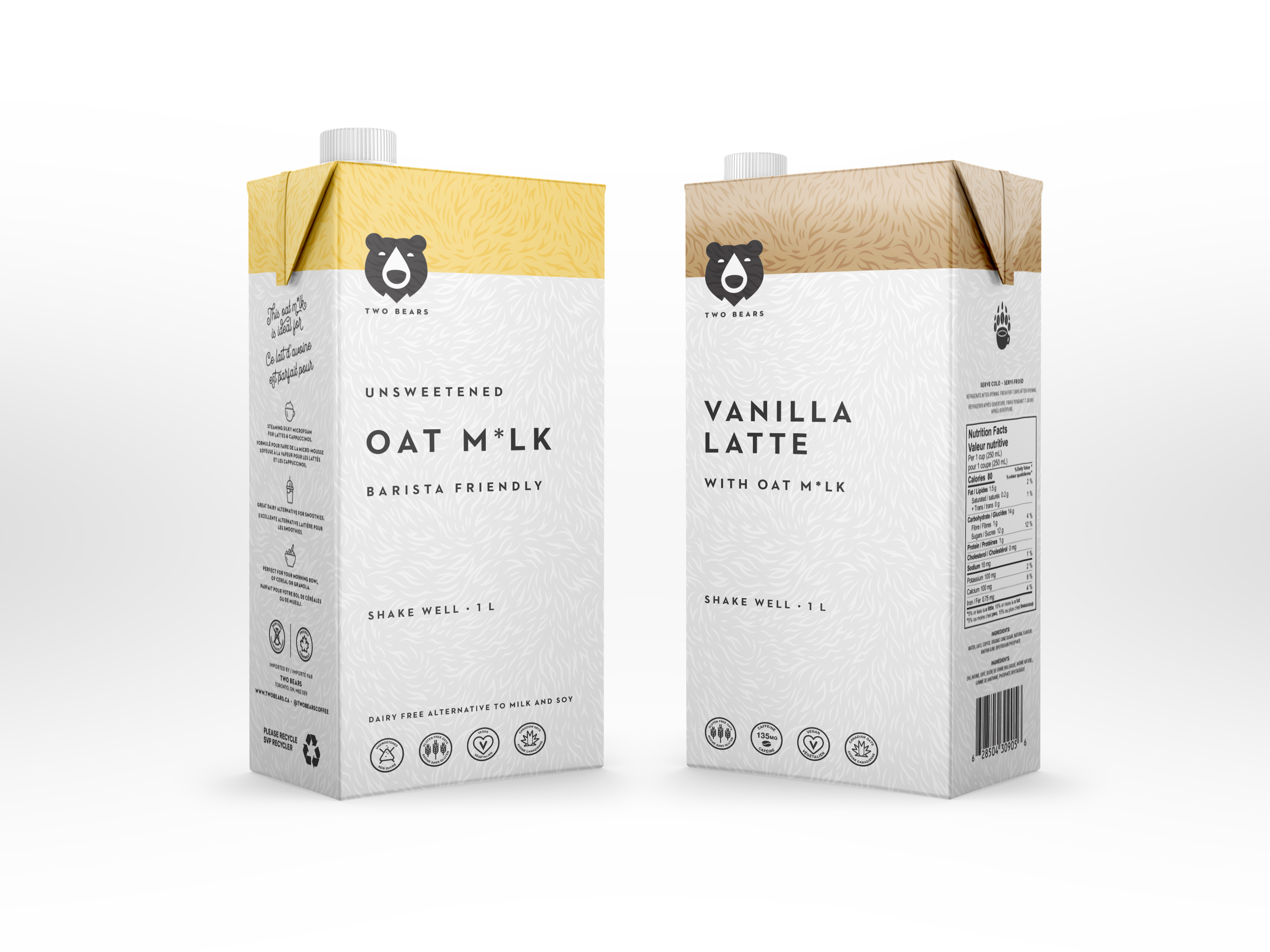
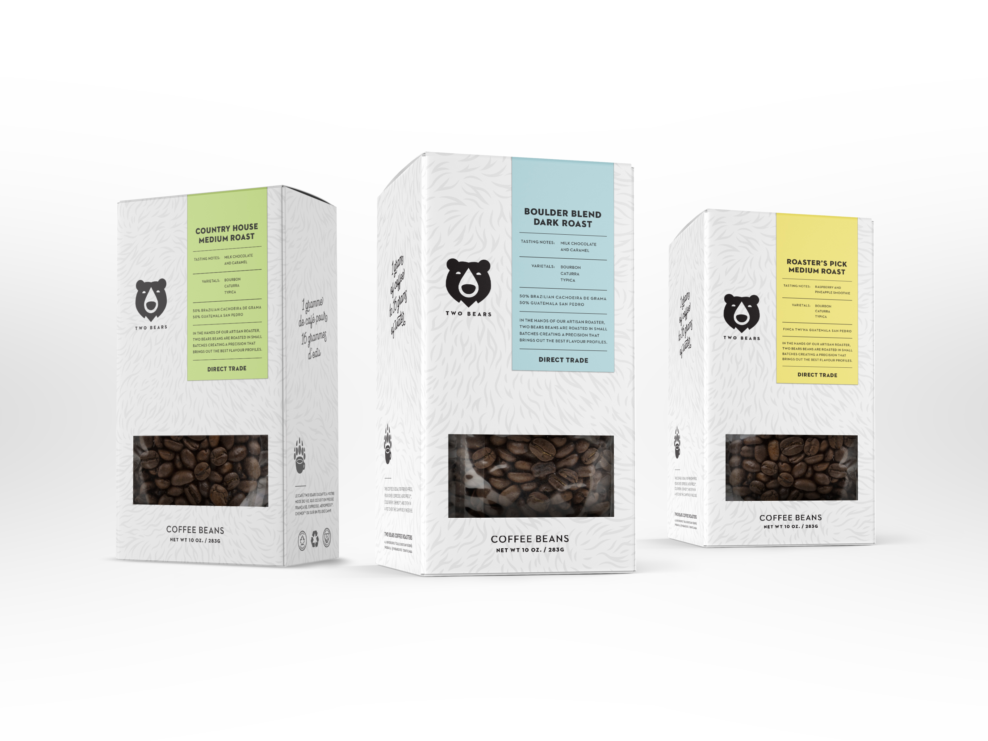
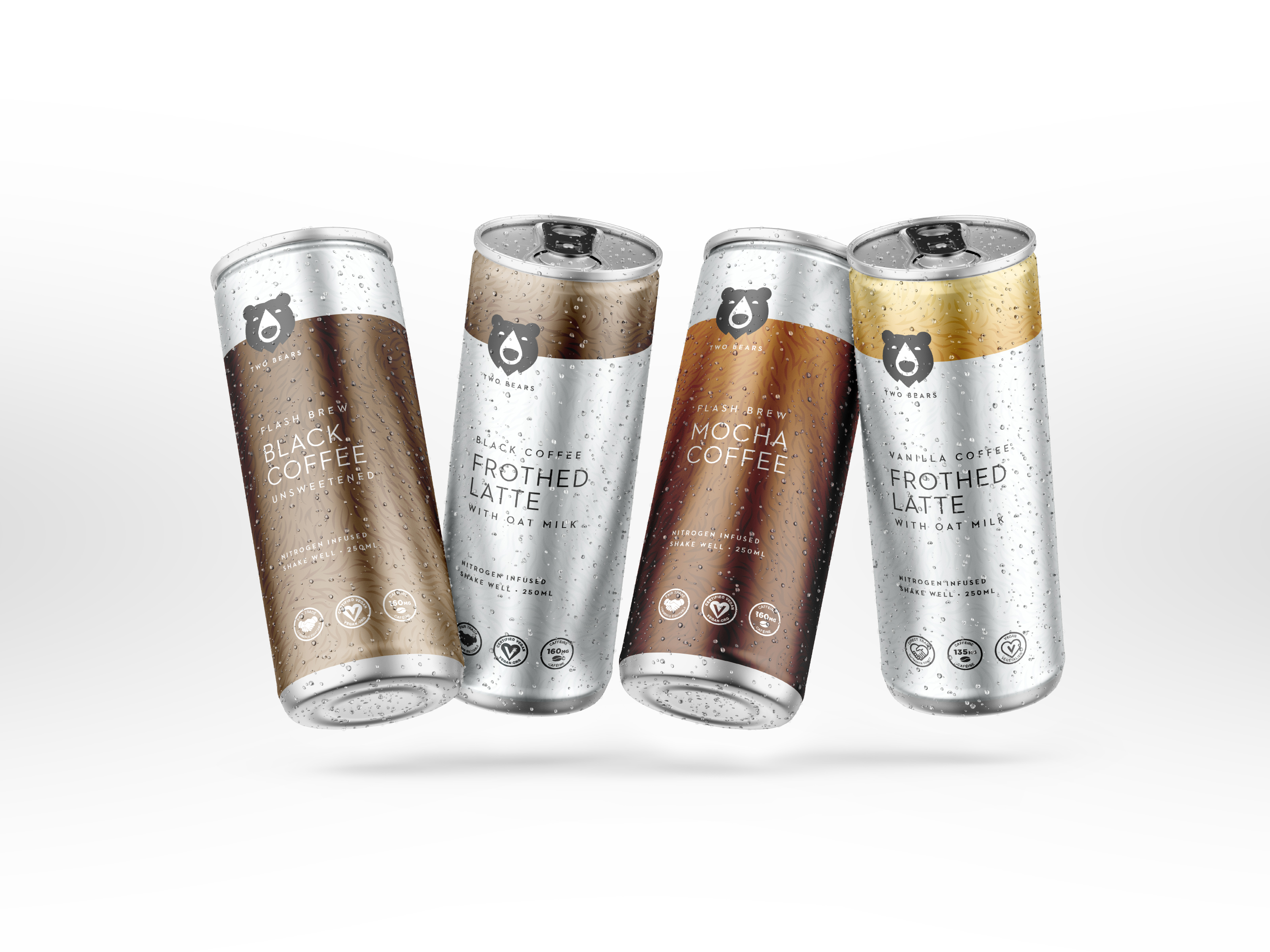
Central Station evolved the @twobearscoffee’s brand positioning and rolled out multiple packaging designs. (The glossy spot varnish on the fur pattern is our personal fav.)
Two Bears started as a local cold brew coffee brand that grew tremendously because of their superior product. So, to gain some respect within the marketplace, Two Bears needed a new look that competed with the other brands. We created a few options with two bears, but they all felt forced. So, we simplified it. We used a single bear icon with a coffee drip as its nose. It was a modest nod to the product but with a solid element of the brand.
Now it was time to bring the new look into a new package design to help them stand out on the shelf. We started with a clean, minimalist design, which is typically not seen in the cold brew category. Then, we added a touch of the dramatic by using two contrasting textures. We used a spot varnish to highlight our bear fur design that made it really pop against the matte finish of the packages.
This redesign has been getting rave reviews from the owners and from their suppliers. Not only is the product fantastic, but we feel the design is just as tasty.

CREDIT
- Agency/Creative: Central Station
- Article Title: Two Bears Coffee Co.
- Organisation/Entity: Agency, Published Commercial Design
- Project Type: Packaging
- Agency/Creative Country: Canada
- Market Region: North America
- Project Deliverables: Brand Identity, Brand Redesign, Brand Refinement, Branding, Graphic Design, Identity System, Packaging Design, Product Architecture, Rebranding, Tone of Voice
- Format: Box, Can, Flow-Pack
- Substrate: Metal, Pulp Carton


