


Pretzels are a notoriously boring snack. Why do you think they’re always left at the bottom of the Munchies bag? Only grandparents and people who enjoy being thirsty buy pretzels, but Twigz aims to change all that.
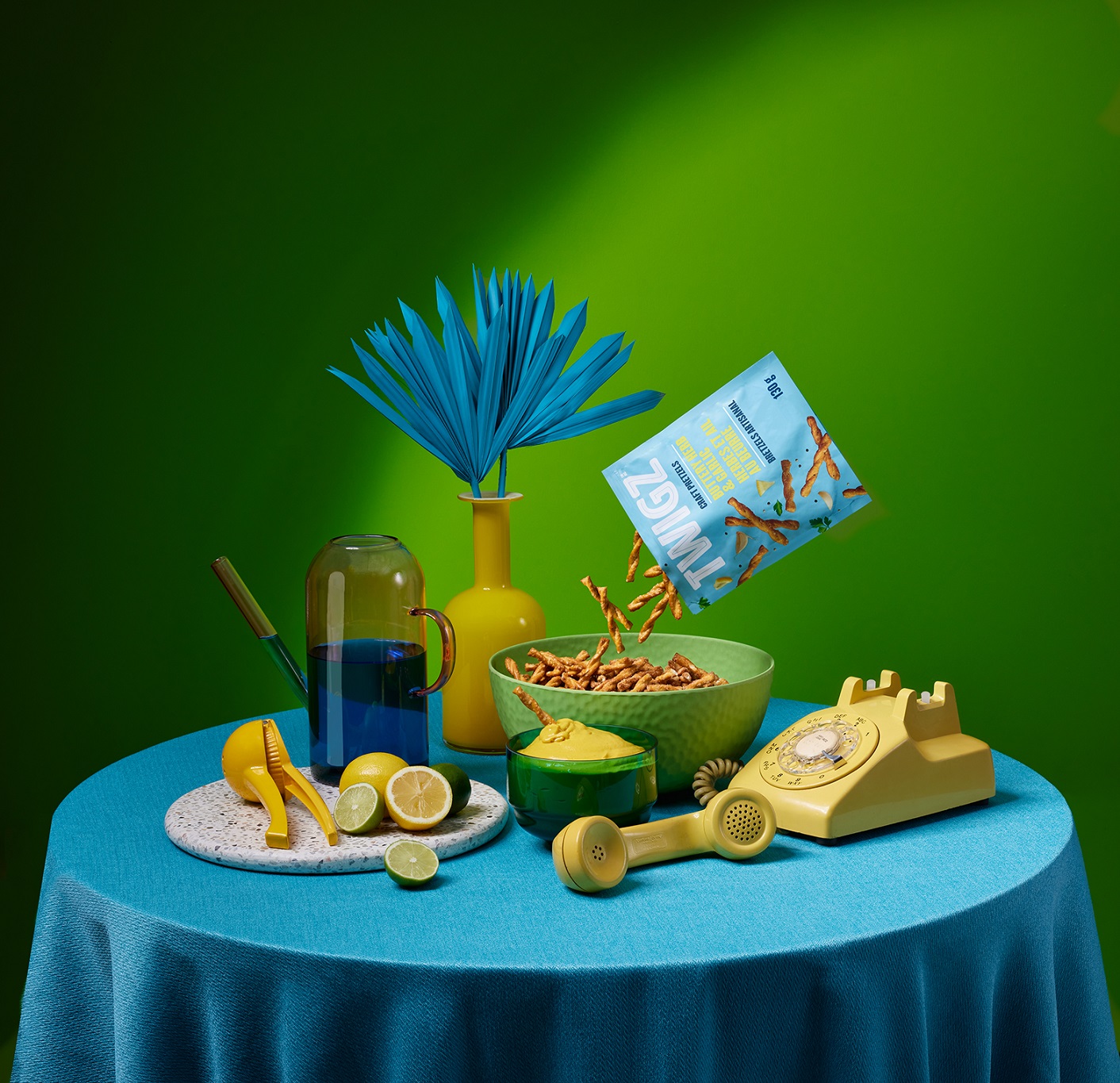
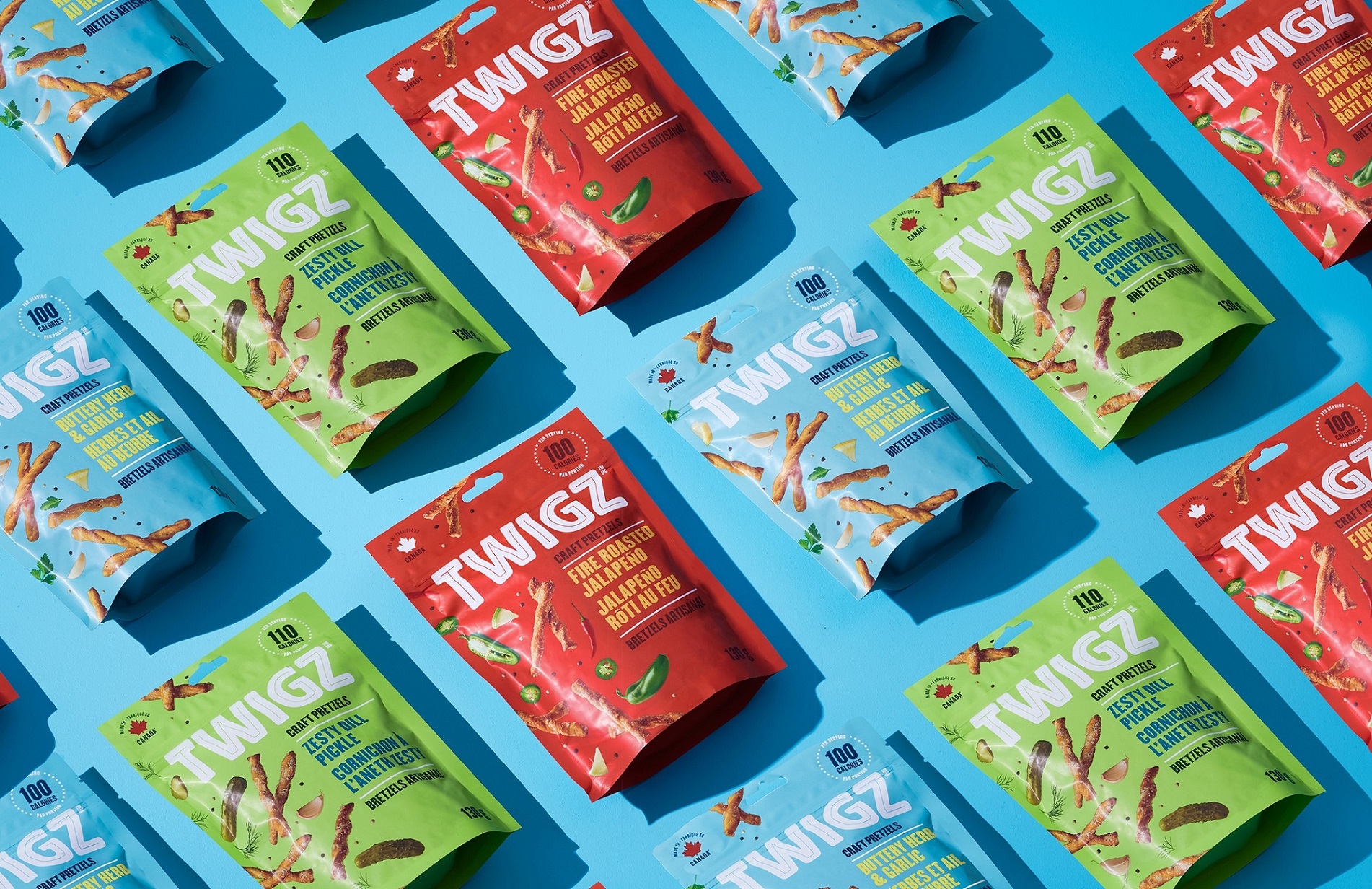
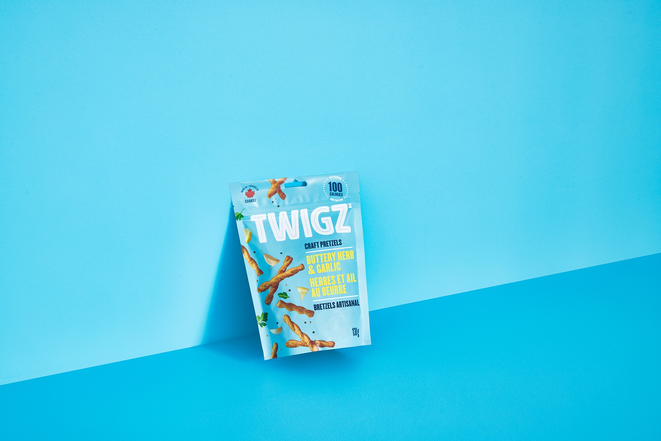
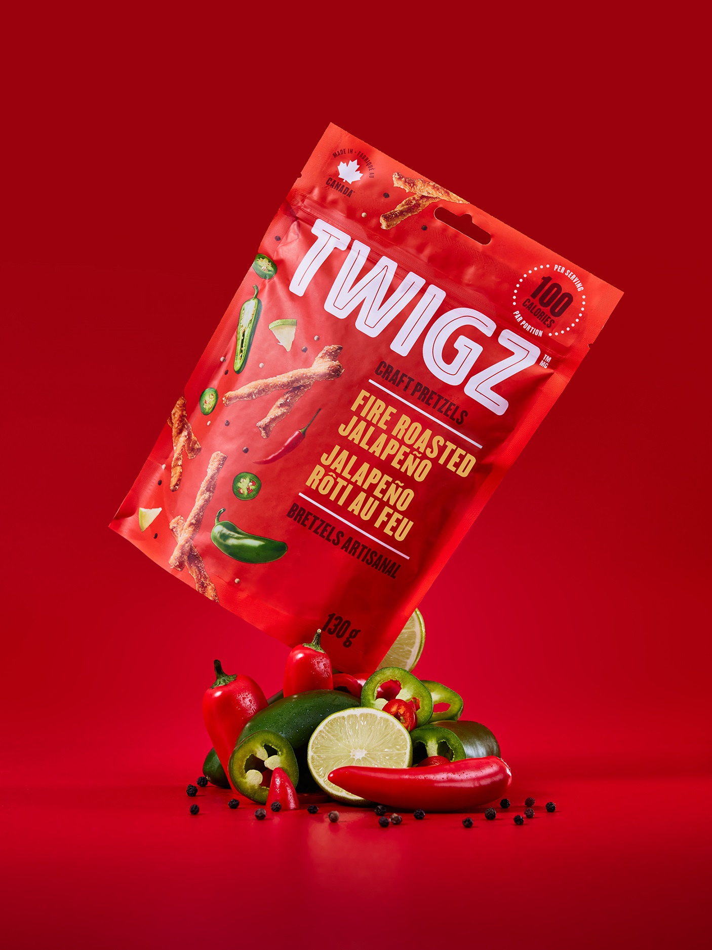
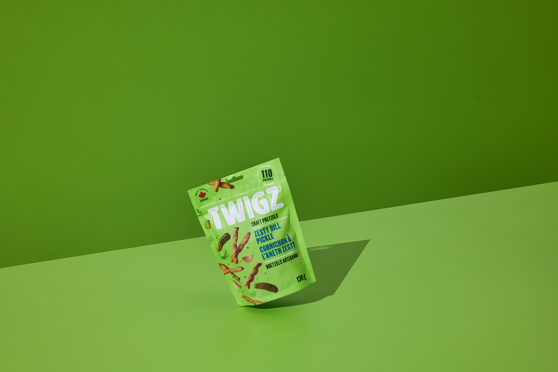
The story starts with a small pretzel loving family out of Alberta, Canada. They had one goal: to transform pretzels from a boring snack into something far more exciting and delicious. They cracked an awesome recipe, but they needed an un-boring brand to help tell their story. That’s where we stepped in. The first thing we did was create an entirely new category for them to carve out more space on the shelf. We gave Twigz a worthy descriptor: Craft Pretzels. Now that we’d created this elevated positioning for the brand, we needed to make the packaging look and feel premium. We used floods of bold, fresh, and taste-enticing colours to distinguish between flavours, and vibrant flavour names that contrast against those beautiful colours.
To emphasize the flavours even more, and amp up the excitement, we treated the product photography like confetti to illustrate the celebratory energy that’s packed into each bag. This isn’t your grandpa’s pretzel, so we made sure to use a modern, condensed, in-your-face typeface to clearly show the evolution of this classic snack. Since our design was now jam-packed with flavour and energy, we decided to keep the logo as a simple, yet strong wordmark. We simplified the existing logo and kept the keyline to give it a retro, familiar vibe.
The combination of colour, food photography and typeface are hard to ignore on the shelf. And the flavour that these little Twigz bring to the table just as tasty and un-boring as the packaging you’ll find them in.
CREDIT
- Agency/Creative: Crew Food & Beverage Marketing Partners
- Article Title: Twigz Craft Pretzels Designed by Crew Marketing
- Organisation/Entity: Agency
- Project Type: Packaging
- Project Status: Published
- Agency/Creative Country: Canada
- Agency/Creative City: SURREY
- Market Region: North America
- Project Deliverables: Branding, Packaging Design
- Format: Bag
- Substrate: Pulp Paper
- Industry: Food/Beverage
- Keywords: Snack, Food, Beverage, Pretzels, Packaging, Brand Identity
-
Credits:
Chief Creative Officer: Gerald Schoenhoff
Associate Creative Director: Daniel Ryu
Writer: Ian Bray
Account Manager: Jayme Donohoe
Photographer: Merzetti Studios, Nick Merzetti


