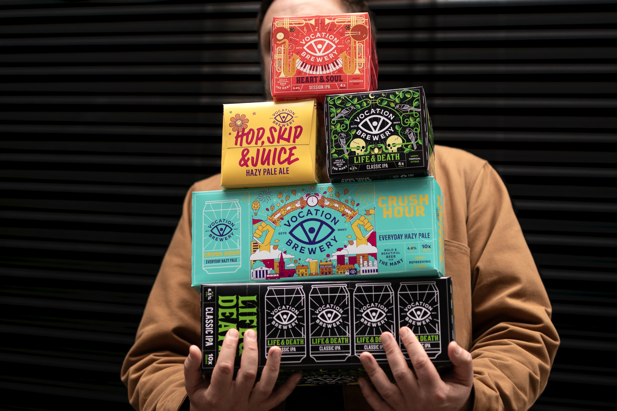
Turner Duckworth has created a new visual identity and packaging system for Vocation Brewery in line with its newly-defined brand essence ‘The single-minded pursuit of crafting exemplary beer’, reinstating the brand’s loved but latent ‘eye’ mark.
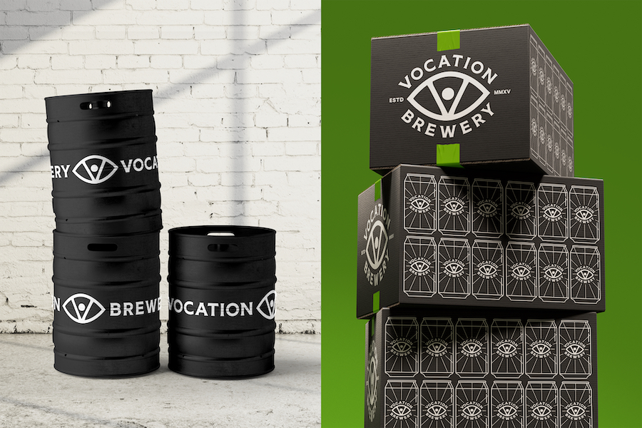
Vocation Brewery trusted Turner Duckworth to strengthen and optimise its place in an increasingly fragmented and competitive market to set it up for its next stage of growth. As such, Turner Duckworth looked to bring about cohesion and consistency to the visual identity across all pack formats and channels to build saliency.
Tom Holmes, Head of Marketing at Vocation Brewery, says: ‘Thanks to our partnership with Turner Duckworth, our new identity drives awareness of our brand, and our packaging now communicates our relentless focus on brewing bold and beautiful beer. Capturing our ethos as a brand to make exemplary craft beer accessible to everyone, the creative direction distinctly expresses who we are today, and confidently positions us to achieve our future ambitions.”
“Vocation Brewery has a spirit of independence and collaboration and is driven by making craft beer more accessible, and for every occasion. Its central belief is that great beer should be for the many – but that wasn’t coming through in all its branding,” says David Thompson, Creative Director at Turner Duckworth’s London studio. “The visual identity and packaging design wasn’t working hard enough to convey the equity that Vocation Brewery had worked hard to build.”
Turner Duckworth identified that while there was “deep love” for the Vocation Brewery brand, it needed to become more relevant to keep up with the business’s pace of growth. “As a brand, Vocation Brewery was punching below its weight: it needed to build meaning, be brand-first, distinctive and dimensional,” says Tim Owen, Head of Strategy at Turner Duckworth. “It needed, and hadn’t yet found, a truly unmistakable mark.”
An all-seeing icon
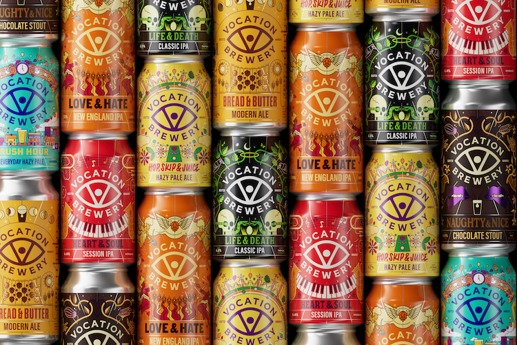
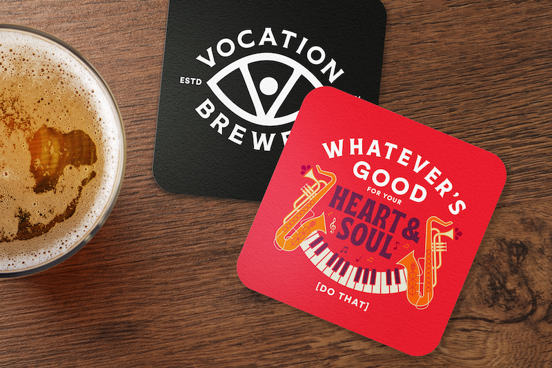
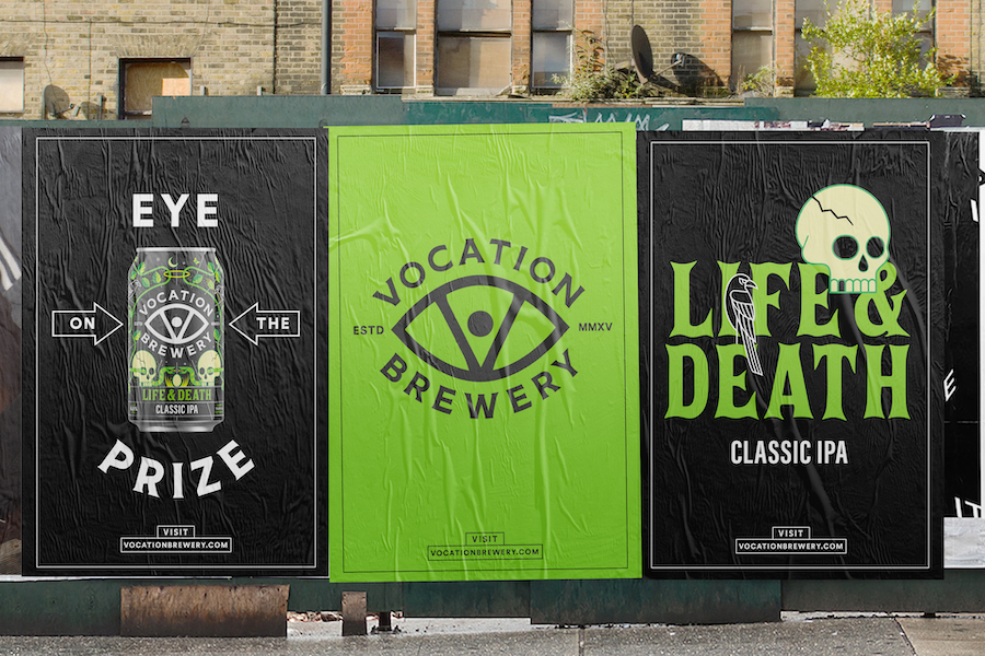
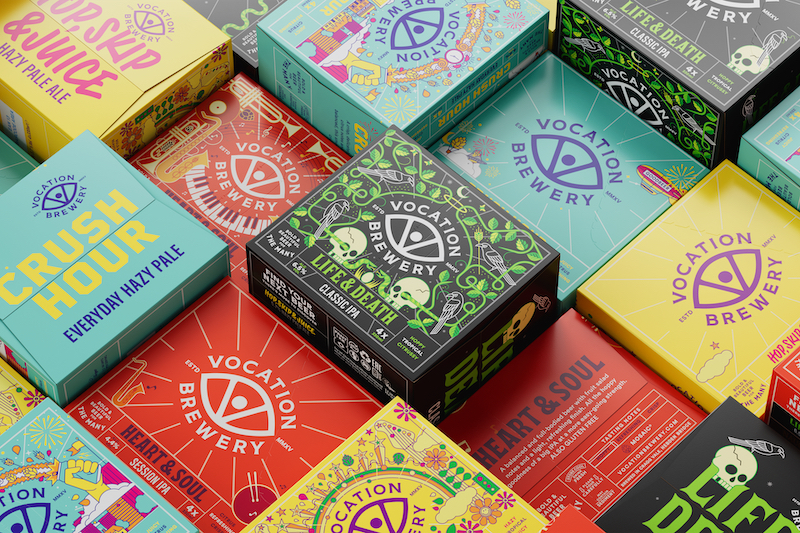
The new visual identity brings Vocation Brewery’s eye asset to the fore within the visual identity and packaging system, to increase on-shelf and in venue standout while building a distinctive, recognisable brand. “As a brewery using traditional methods combined with modern technology, Vocation Brewery beers are crafted with care, by many hands – no cutting corners,” says Thompson.
“The eye represents their eye for detail and their passion, or ‘vocation’ – it’s a symbol of their focus on and love for brewing real, proper beers of substance.” The device was developed further to have additional meaning: “Vocation Brewery is based on top of a hill, so they have a great perspective on the world. The eye becomes an all-seeing icon,” Thompson adds.
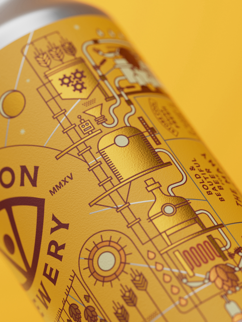
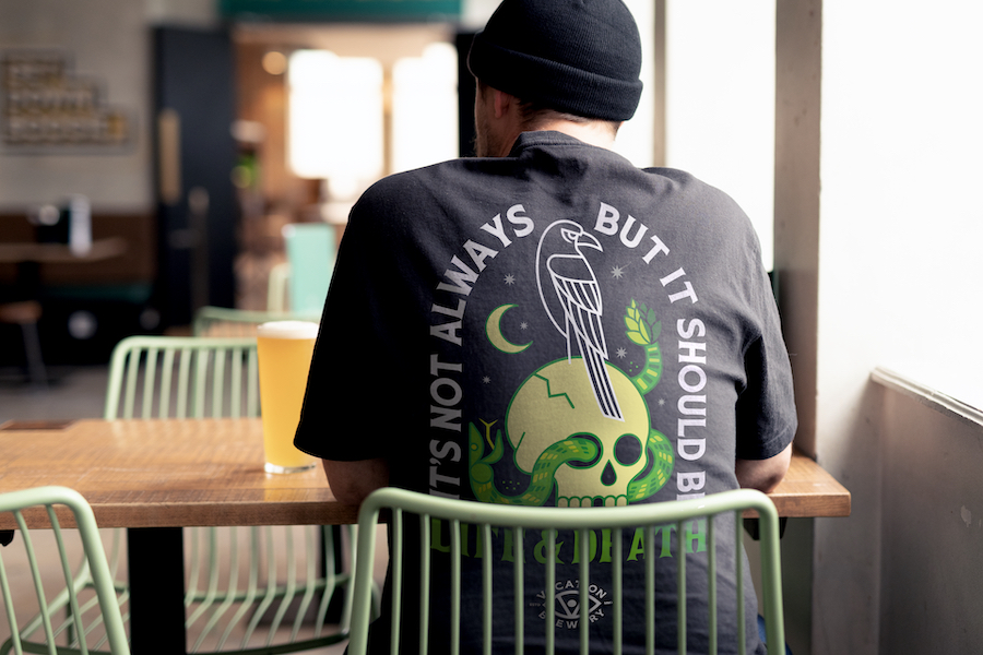
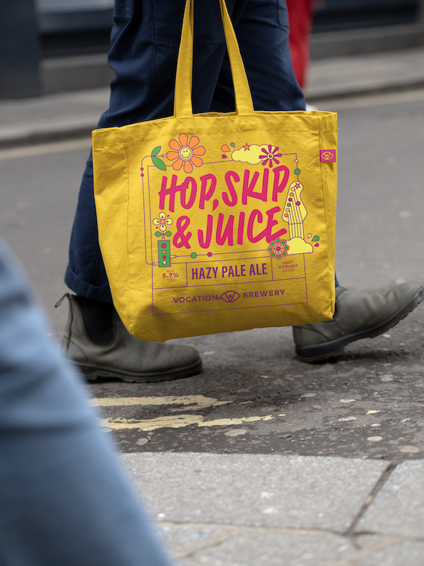
Turner Duckworth created new, meaningful illustrations for Vocation Brewery’s core range in partnership with illustrator Brian Steely to add more storytelling to the brand and elevate off-pack assets.
The designers maintained the existing colour palettes so that customers would still recognise different beers in the range (such as green and black for the Life and Death IPA and orange for the Love and Hate New England IPA), adding illustrations to give the designs “their own personalities and a true sense of occasion”. Thompson continues, “It’s a different mood but it still feels like the same beer. The brand is still grounded in the same meaning, just telling a new story.” Across the range the designs use illustrative nods to the brewing process, like imagery of hops and barley. “The whole can is a celebration of the process around crafting bold and flavourful beers,” Thompson adds.
Everyman language
The new tone of voice articulated by Turner Duckworth in the rebrand is based on Vocation Brewery’s pursuit to craft only exemplary beer, using more “understandable, everyman language,” says Thompson.
Relatability and accessibility were fundamental to the entire new identity. “We wanted it to feel more approachable – the sort of thing you’d hear in the pub when people talk about beer. The goal was to convey Vocation Brewery’s knowledge and passion of its craft without getting overly technical,” Thompson adds.
“We are incredibly proud of this work,” says Nicola Shellswell, Client Services Director of the Turner Duckworth London studio. “Working with Vocation Brewery has been a collaborative effort based on trust and has been one of those great projects where collaboration and partnership has been central to its success. The enjoyment we had working with Vocation Brewery really shows in the end product.”

CREDIT
- Agency/Creative: Turner Duckworth
- Article Title: Turner Duckworth’s Rebrand for Vocation Brewery Builds Meaning and Distinctiveness
- Organisation/Entity: Agency
- Project Type: Identity
- Project Status: Published
- Agency/Creative Country: United States
- Agency/Creative City: New York
- Market Region: Global
- Project Deliverables: Brand Design, Brand Guidelines, Brand Identity, Brand Redesign, Identity System, Illustration, Packaging Design
- Industry: Food/Beverage
- Keywords: craft beer, rebrand, cohesion, consistency, packaging design, storytelling, illustration, distinctive, dimensional
-
Credits:
Global Branding Agency: Turner Duckworth


