


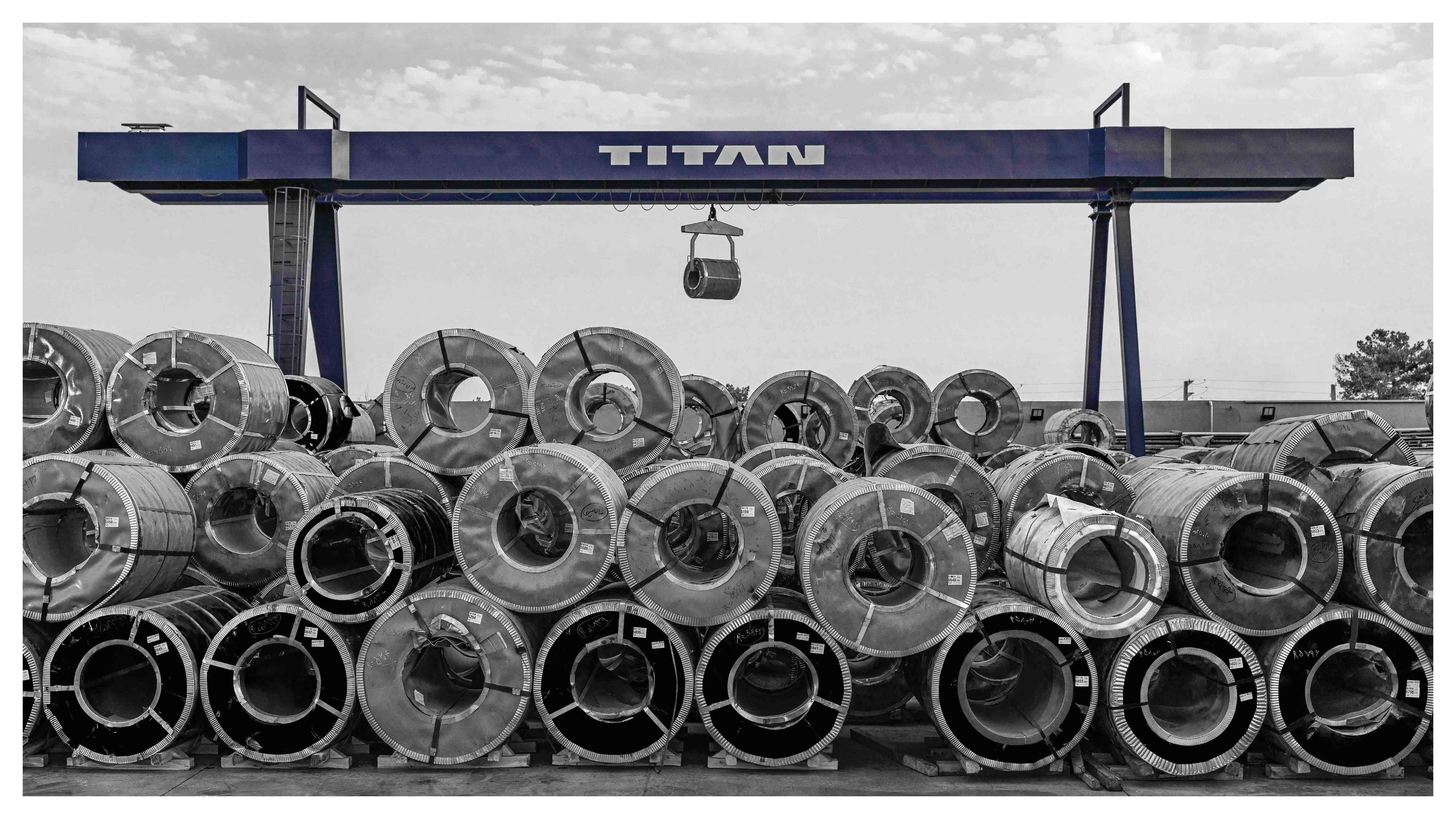
Brand Background and Heritage
Titan is the new identity of a brand that has been active in Iran’s stainless steel market for over two decades. Previously known as “Jahan Foolad pishro,” the company was one of the leading suppliers of stainless steel sheets, springs, and coils. The creation of the Titan brand aimed to redefine industrial experience and visual design in this sector, showcasing the brand’s power, precision, and innovation across all touchpoints. Today, Titan is recognized as the largest supplier of stainless steel sheets, springs, and coils in Iran.
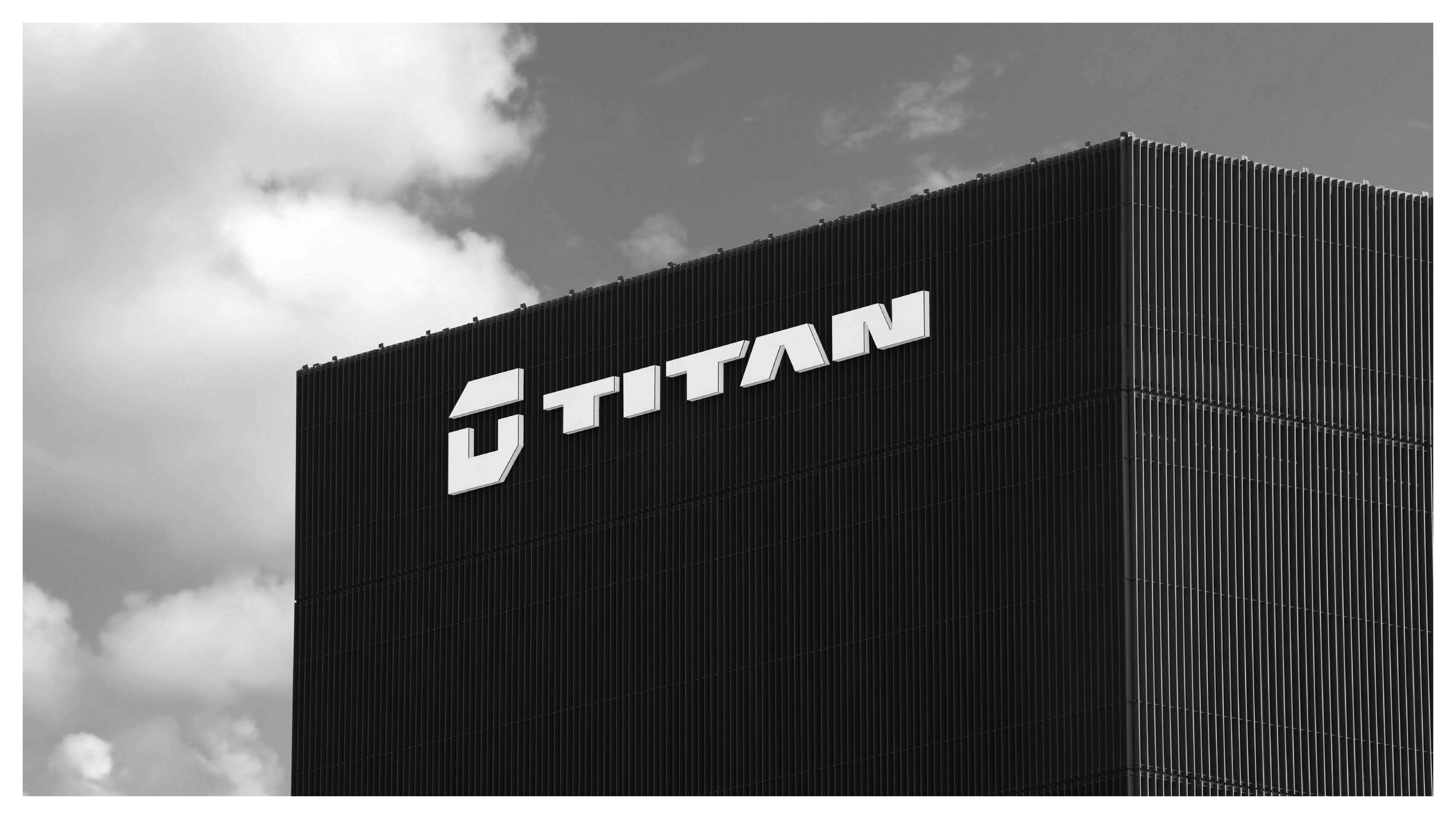
Architectural Spark | Reviving an 8-Storey Abandoned Grain Silo
The starting point for the brand transformation was the acquisition and revitalization of an 8-storey abandoned grain silo, a structure that had remained unused for many years.
Rather than demolishing it, the project team approached the building as a creative platform and a symbol of industrial heritage and brand resilience. The silo’s unique structural framework became the primary inspiration for Titan’s visual identity. The building’s structural lines, column rhythms, and cubic volumes formed the foundation for the logo, grid system, motifs, and even the brand’s sonic identity. The building became not just the headquarters but the DNA of the brand’s design.
Brand Strategy and Creative Concept
Titan’s identity was built around three main pillars:
Material Essence: Reflecting the physical characteristics of stainless steel: strength, durability, purity, and longevity.
Architectural Identity: Translating the structure of the abandoned silo into a cohesive, modular, and powerful design system.
Mythological Significance: Inspired by the name “Titan,” referencing both titanium and Greek mythology, symbolizing strength, immortality, and extraordinary power.
These three pillars guided all design decisions throughout the two-year project.
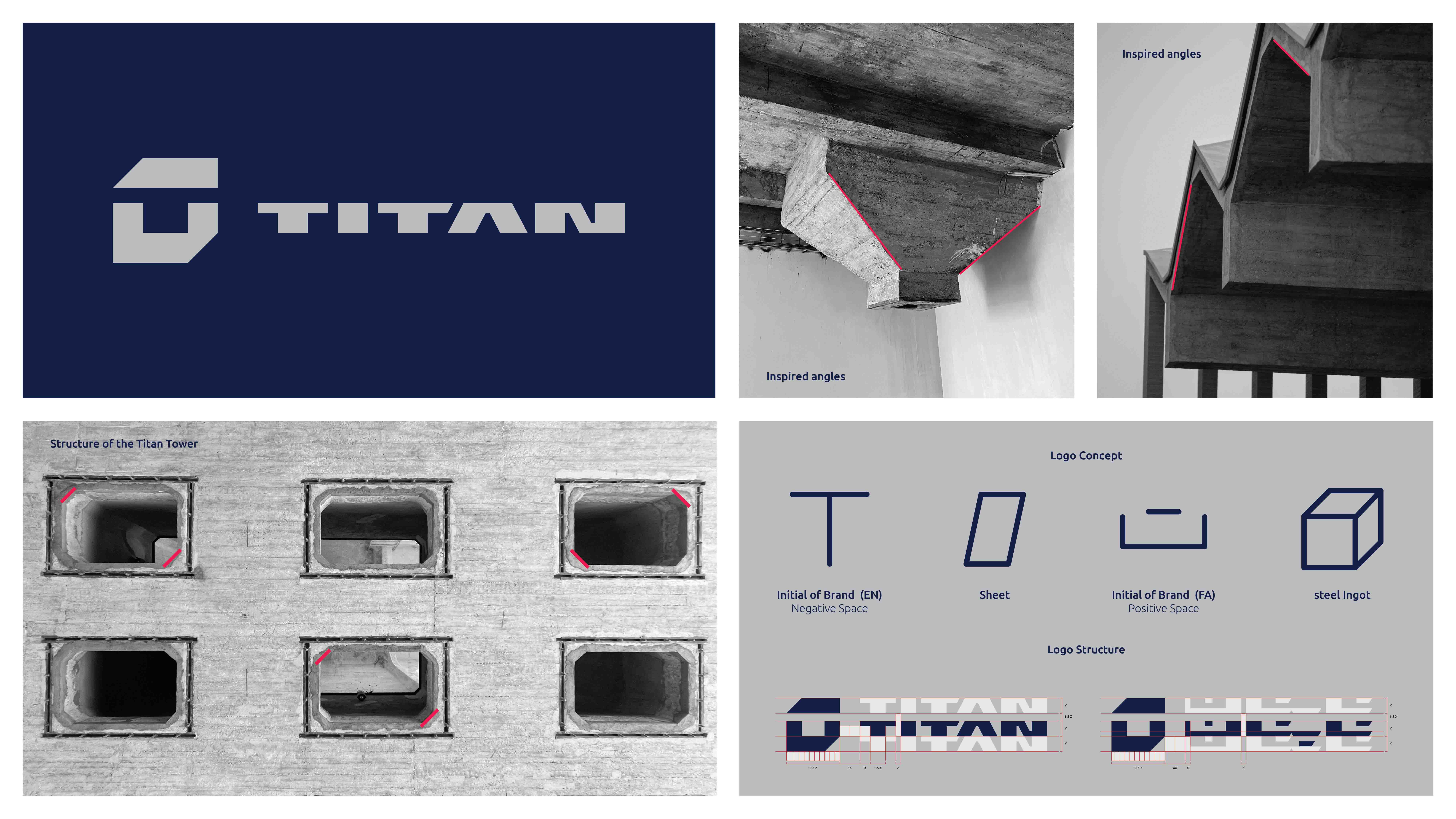
Logo Design | The Core of Visual Identity
The Titan logo is the most important and fundamental visual element of the project, combining the essence of material, architectural structure, and mythological identity.
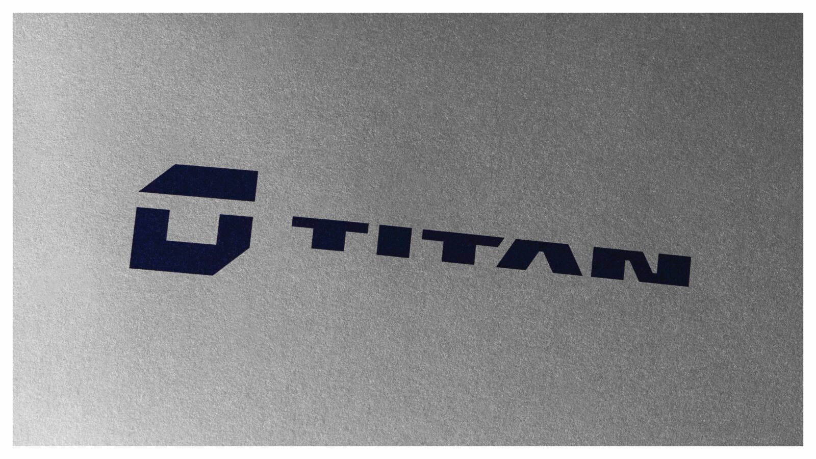
The logo merges the English letter T with the Persian letter ت within a cubic form, symbolizing the brand’s primary products, stainless steel sheets and coils, while also conveying stability and resilience.
The negative space forming the T became the foundation for the English logotype. The Persian logotype was precisely crafted using the same geometry and structure, ensuring complete coherence across both languages.
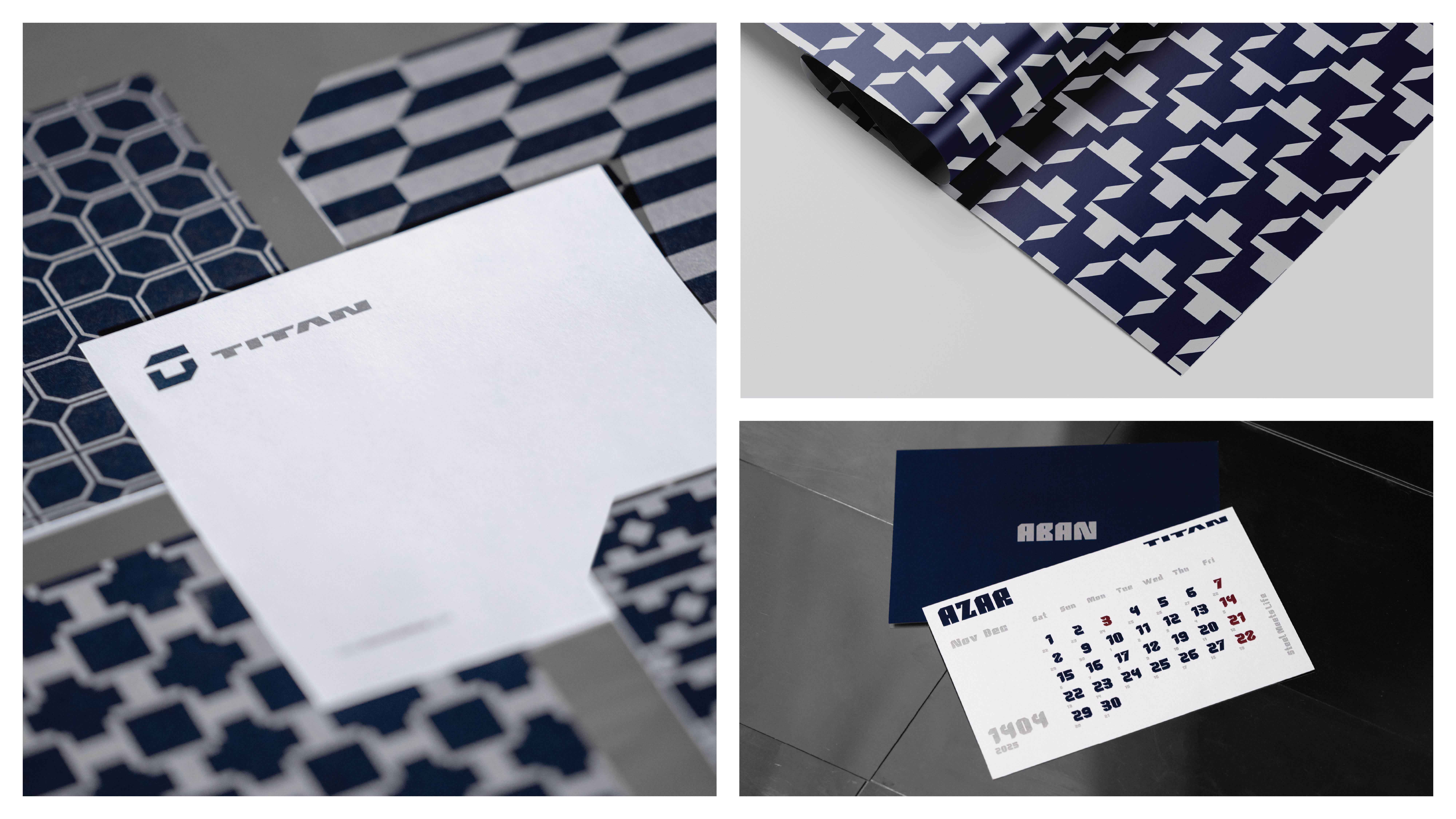
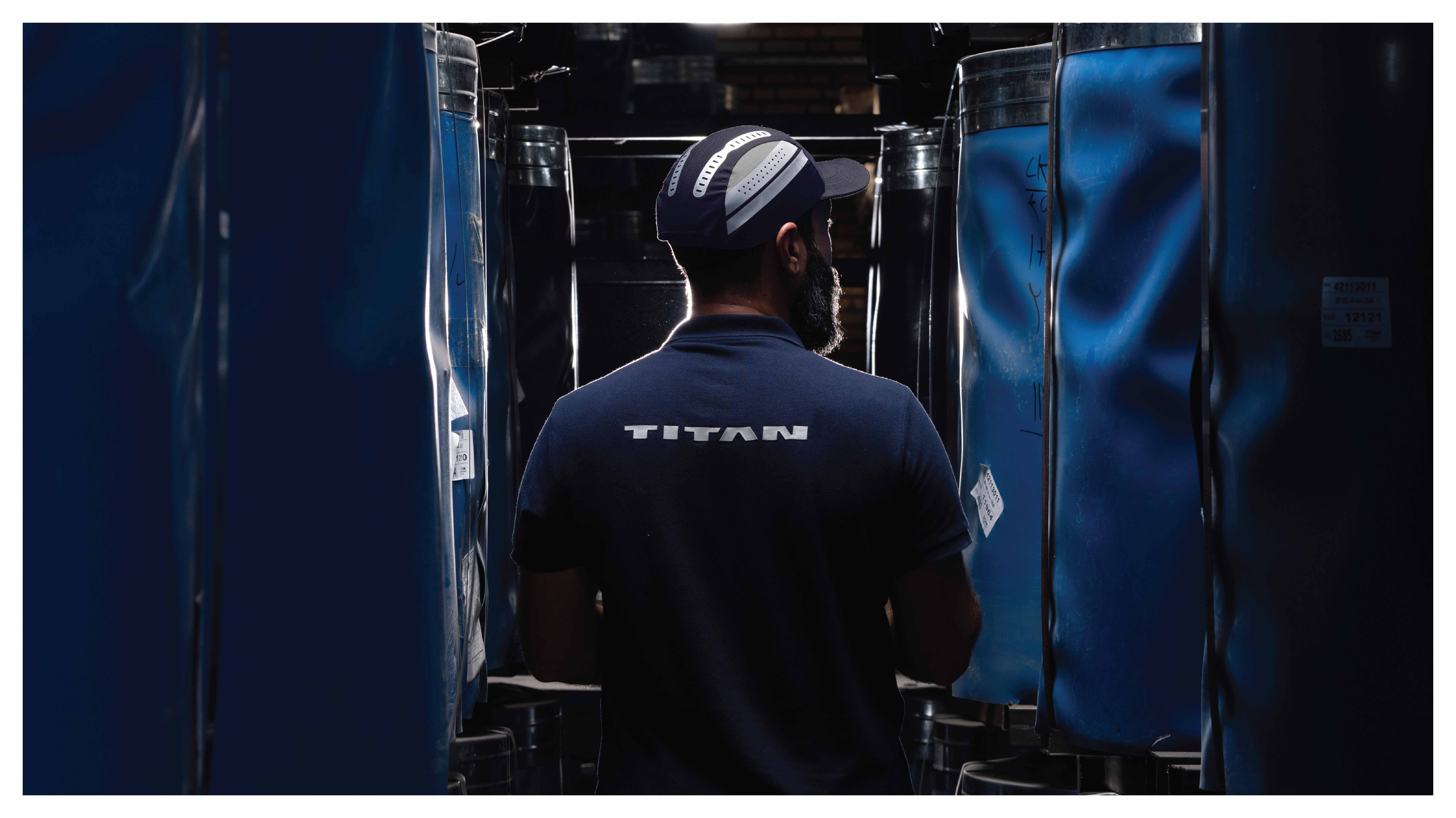
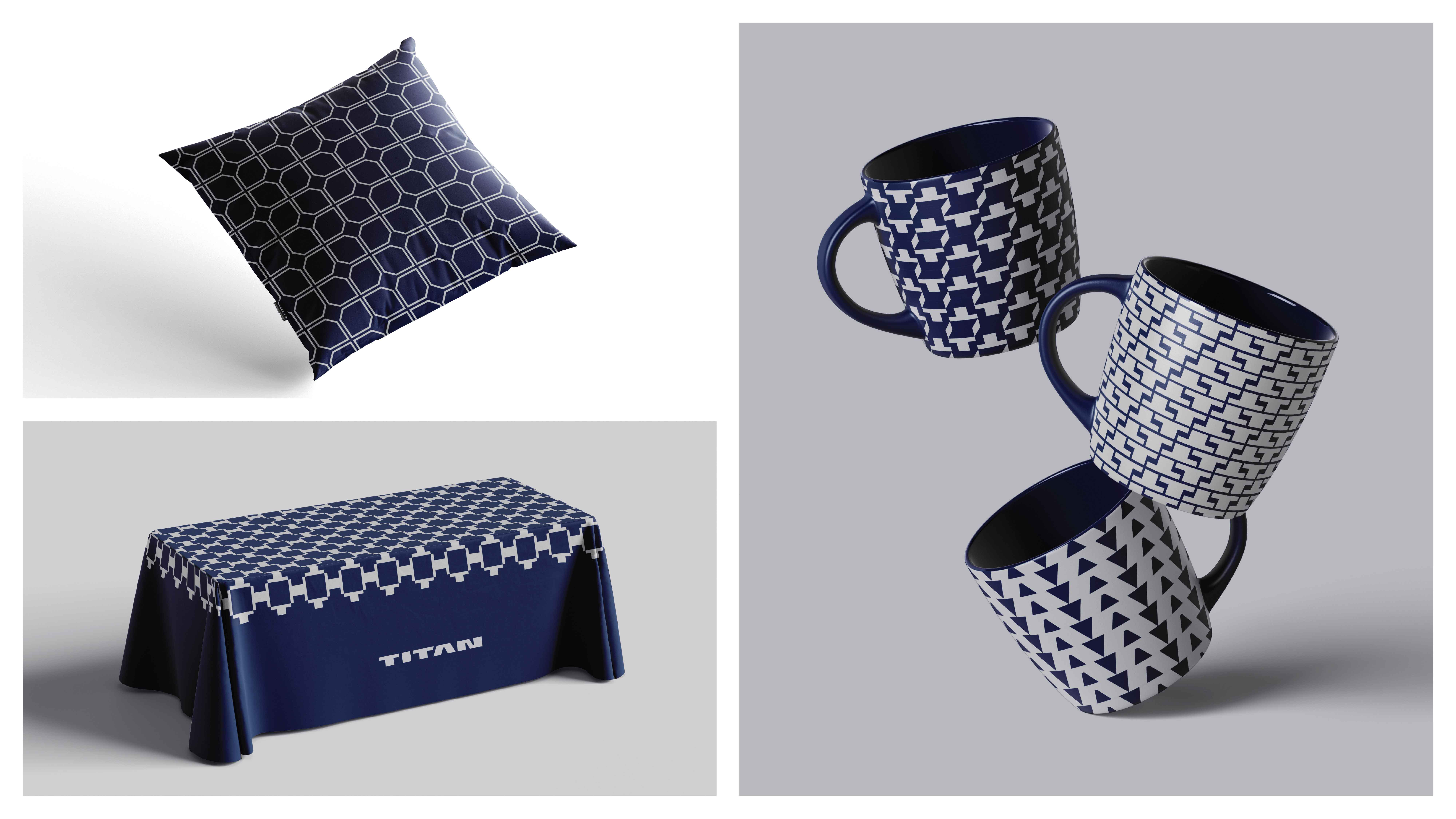
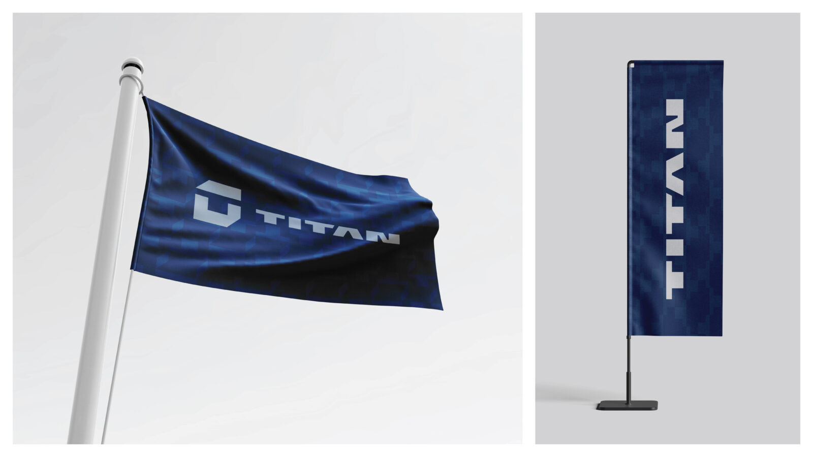
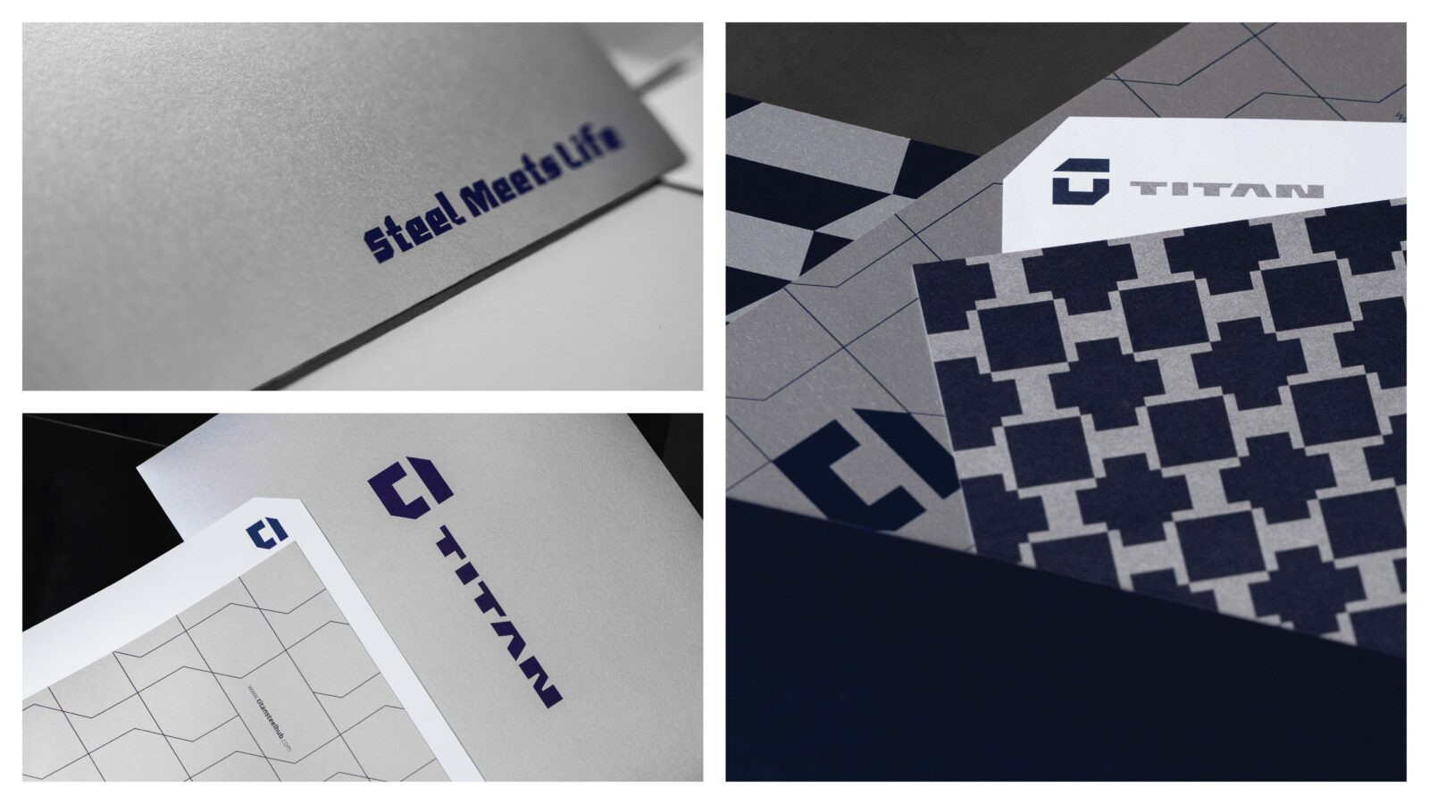
Color Palette and Design System
The brand’s color palette reflects Titan’s industrial and powerful identity:
Silver: representing the stainless steel material
Dark Navy: conveying strength, expertise, and trust
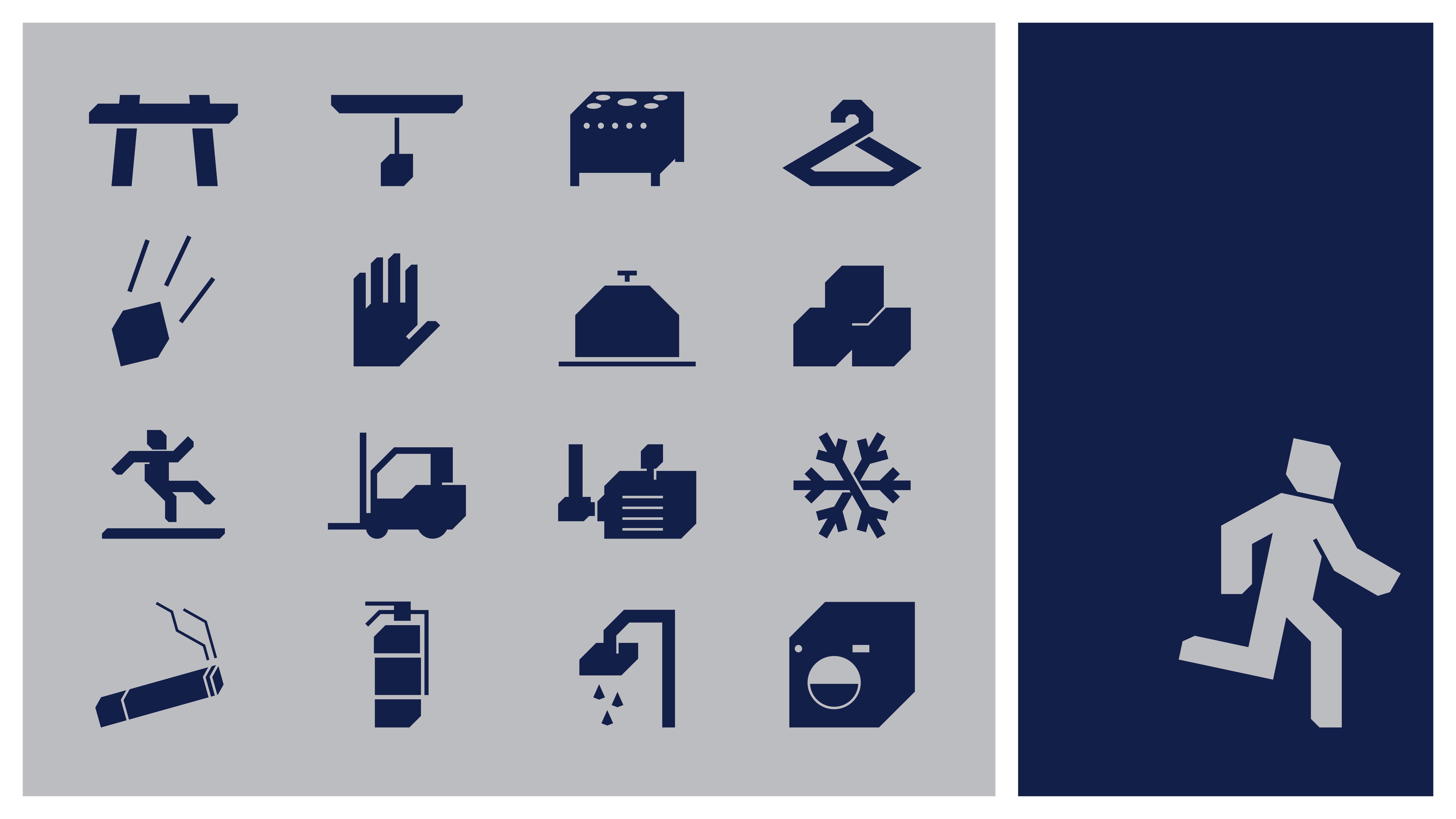
These colors serve as the foundation across all visual applications, from printed materials to environmental spaces. Motifs, patterns, textures, and design elements were all inspired by the cubic logo structure and the architectural rhythm of the silo, creating a modular and fully scalable design language.
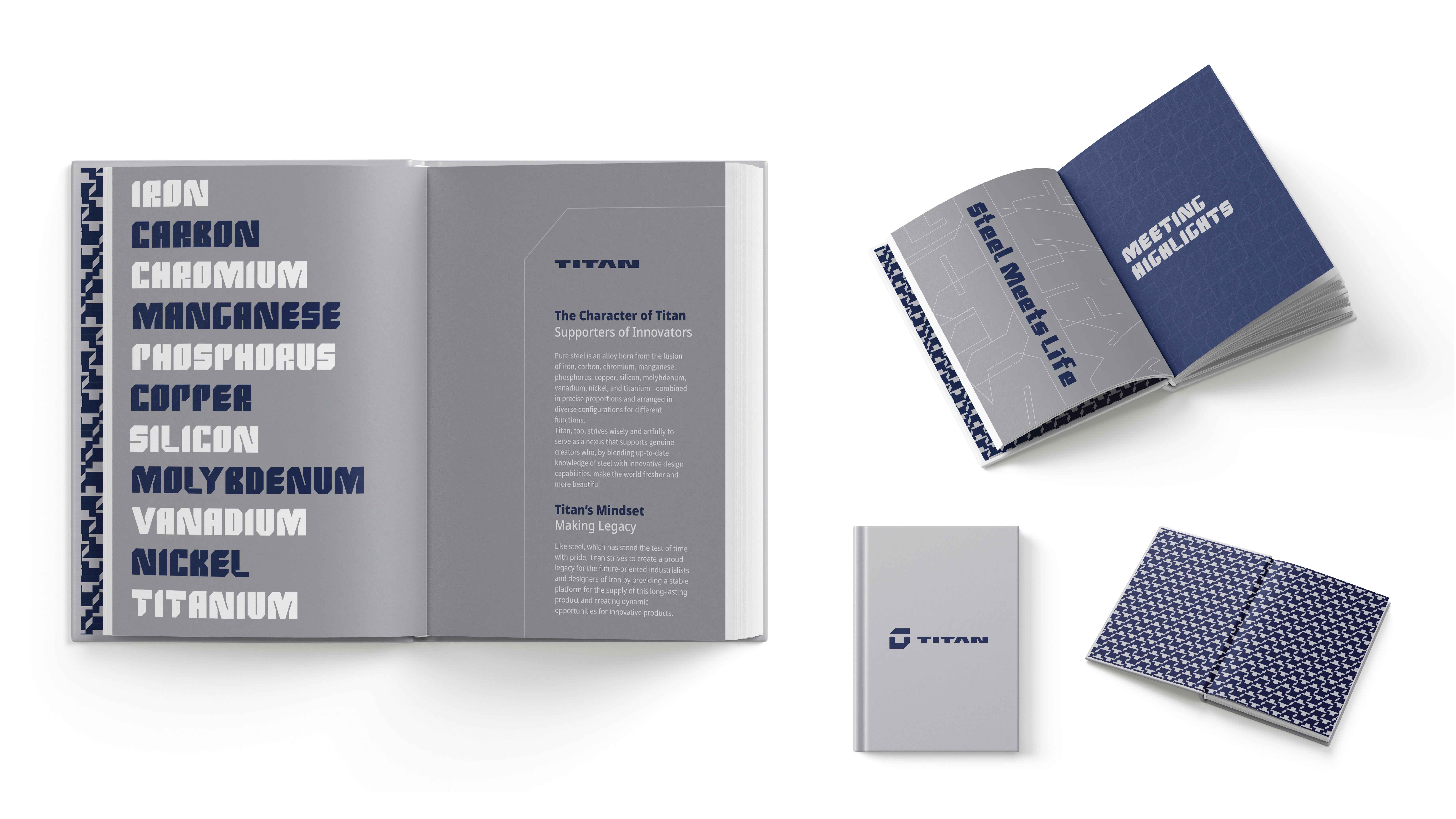
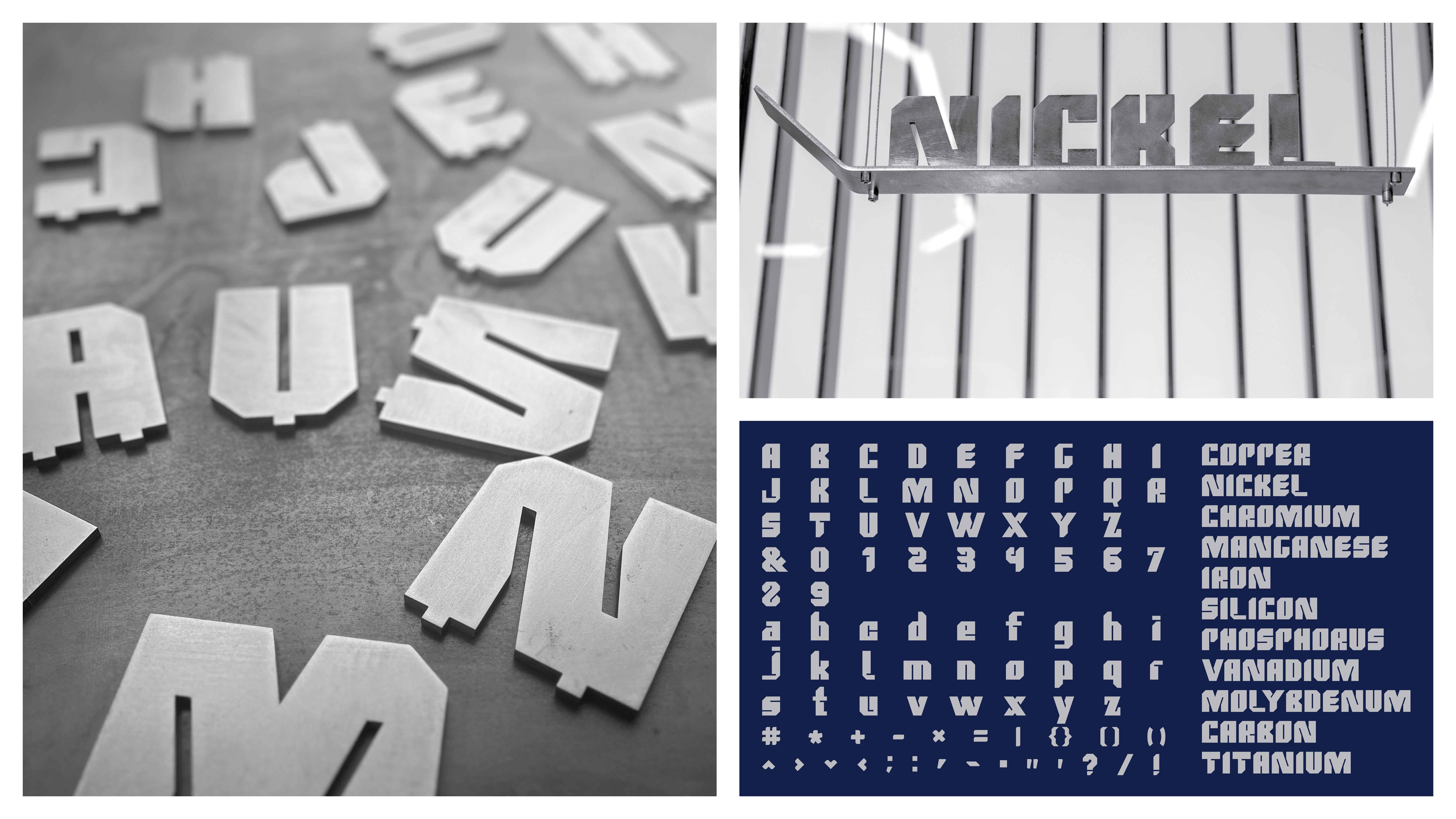
Custom Titan Typeface
One of the project’s most significant achievements was designing a custom English typeface for Titan.
The typeface structure draws inspiration from the logo’s forms, lines, and angles. This ensures that every touchpoint, from headlines to brochures or packaging, clearly reflects Titan’s visual identity.
The typeface allows the brand to communicate with a unique, industrial, modern, and powerful voice.
Sonic Branding | Titan’s Auditory Identity
Recognizing Titan’s position as a leading brand in the industry, visual identity alone was not enough. To create a multi-sensory experience, a comprehensive sonic identity was developed.
Titan’s sonic branding incorporates industrial sounds, metallic frequencies, and heavy rhythms to mirror the brand’s visual strength, resilience, and permanence in an auditory dimension. This sonic language allows the brand to maintain a distinctive voice across videos, events, environmental spaces, and digital communications.
Brandbook Completion | Creating a Unified Identity System
After two years of continuous development, the comprehensive Titan brandbook was finalized. The brandbook defines all rules, structures, visual behaviors, typography, color schemes, grid systems, motifs, applications, examples, and brand principles.
It provides a unified identity system that can continue to evolve over time while maintaining consistency and coherence across all brand touchpoints.
CREDIT
- Agency/Creative: Tunnel Design Studio
- Article Title: Tunnel Design Studio Introduces Titan’s Industrial Identity Rooted in Architecture and Mythic Strength
- Organisation/Entity: Agency
- Project Type: Identity
- Project Status: Published
- Agency/Creative Country: Iran
- Agency/Creative City: Alborz
- Market Region: Asia
- Project Deliverables: 2D Design, Advertising, Animation, Architecture, Architecture Photography, Art, Art Direction, Brand Design, Brand Guidelines, Brand Identity, Brand Mark, Branding, Creative Direction, Design, Environmental Graphics, Graphic Design, Icon Design, Identity System, Interior Design, Logo Design, Motion Graphics, Music, Pattern Design, Photography, Sound Design, Type Design
- Industry: Professional Services
- Keywords: WBDS Agency Design Awards 2025/26 , Visual identity, Brand Guideline, Logo Design, Logotype Design, Stainless steel, industrial, Graphic Design, Creative, Creative Direction, Brand book, Motion Graphics, Font Design, Pattern Design, Apparel & Merchandise, Sonic Branding, Animation, Photography
-
Credits:
Creative Director | Graphic Designer: Khashayar Teymoori
Logomotion Designer: Amin Haghshenas
Music & Sound Designer: Mohammadreza Asghari
Photographer: Ali Pourasad
Architectures: Raha Ashrafi & Marziah Zad
Production Artist: Saeed Talim Khani (Tashdid Co.)


