A new visual identity and packaging released for Sydney snack brand Tummy Gummies is reaping rewards, with stockists having doubled since the relaunch and the product selling out consistently at stores. Stockist numbers are set to increase again, with Tummy Gummies receiving more inquiries from across Sydney and interstate.
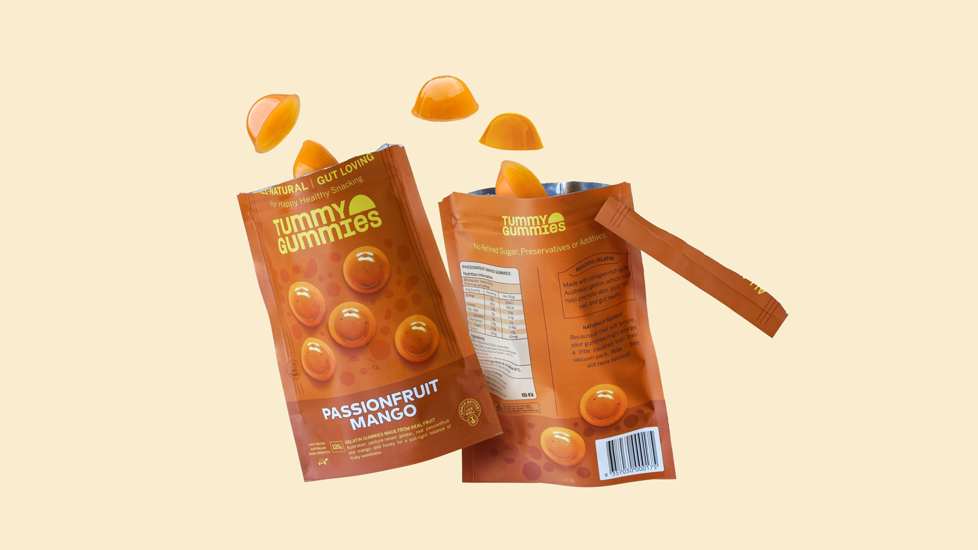
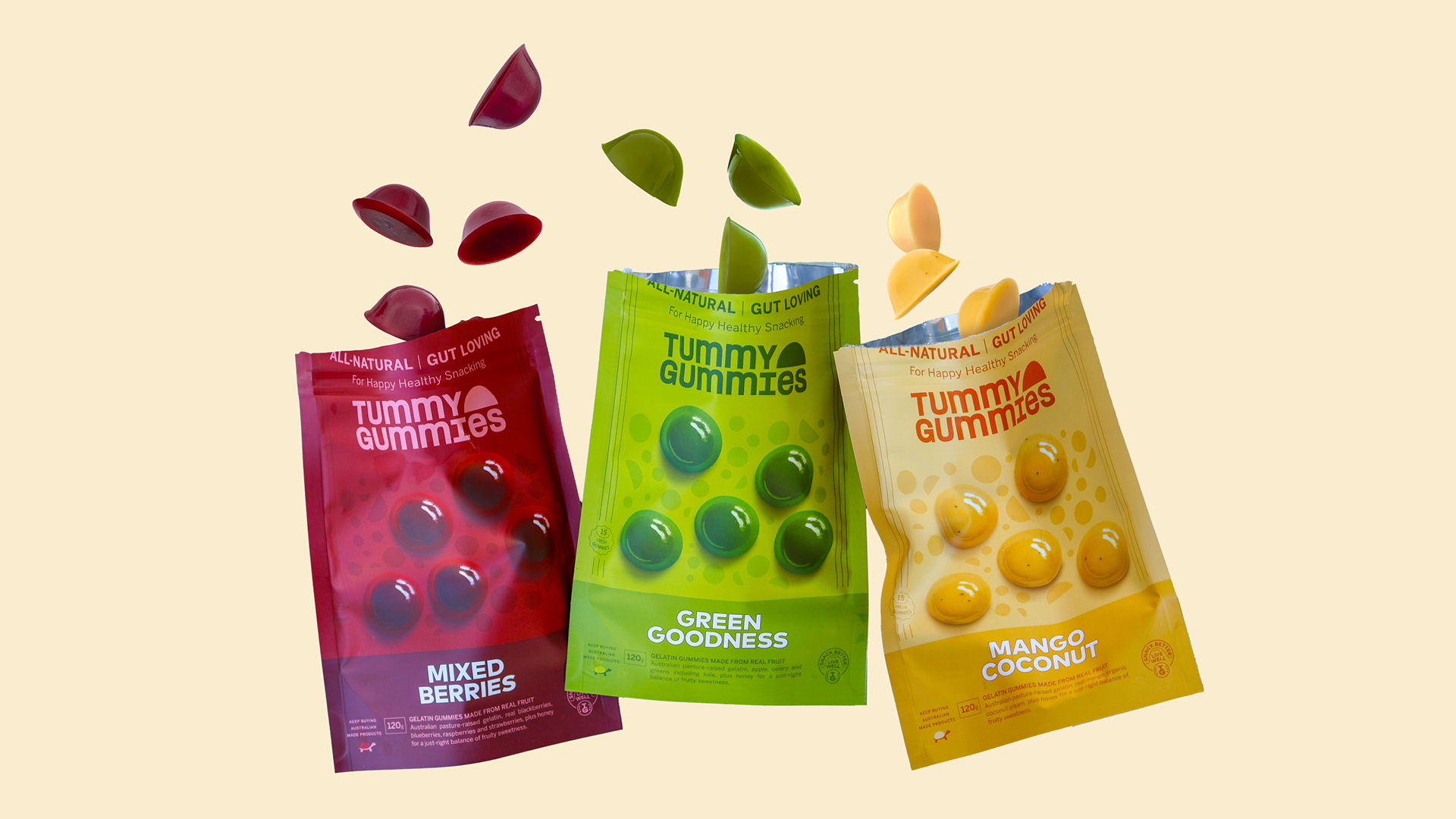
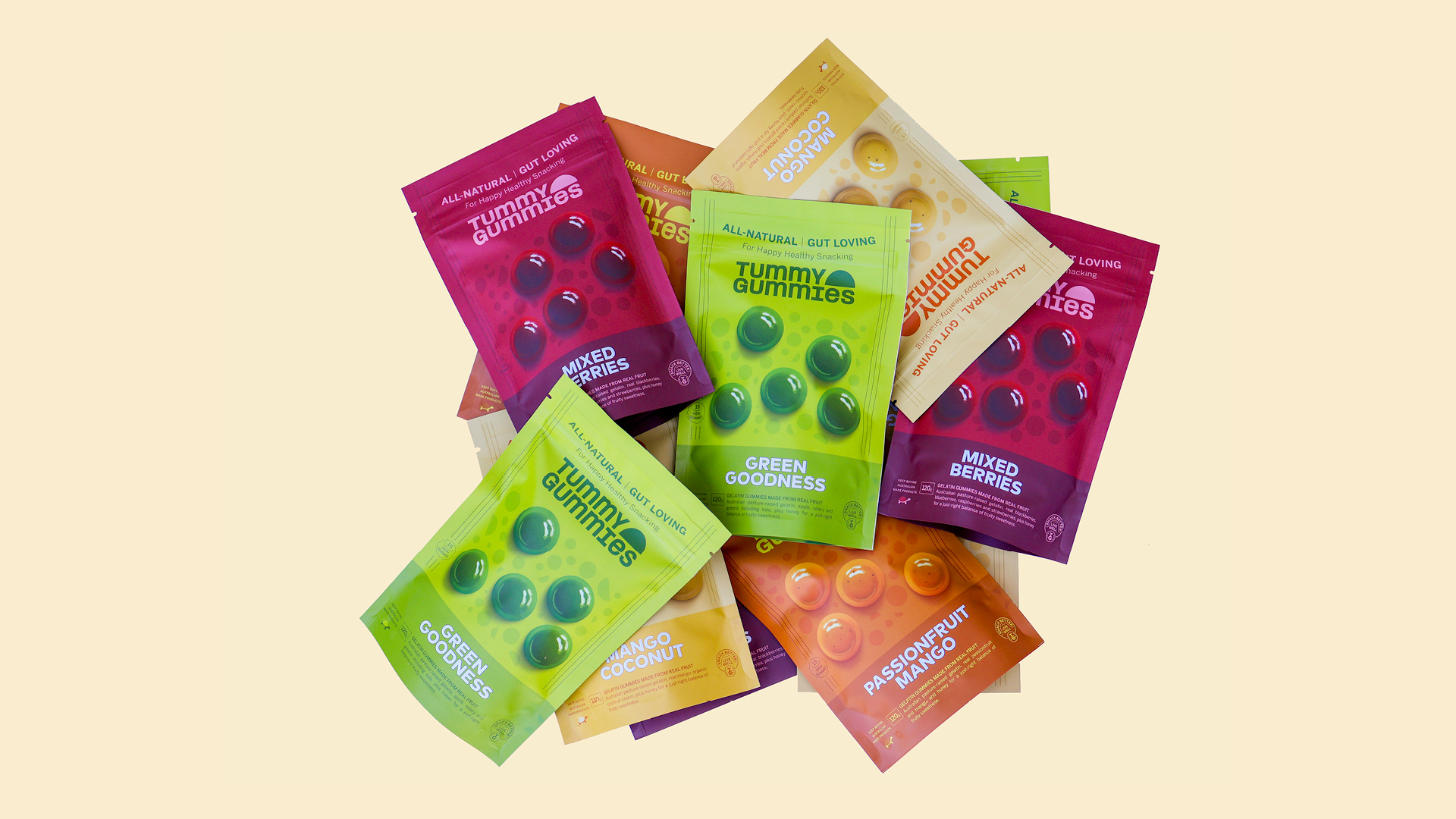
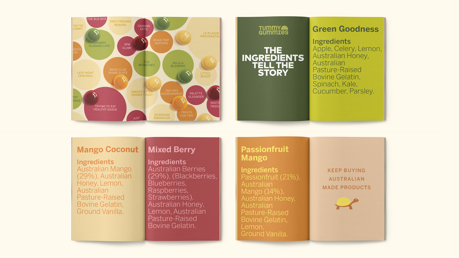
Tummy Gummies engaged Sydney-based creative studio The Offices to develop the work as part of their wider retail expansion strategy. The new pouch format is more lightweight and compact compared to the original glass jars. By extending shelf-life from two weeks to two months, the new format enhances supply-chain resilience and reduces risk for retailers. The vibrant work has been rolled out across four flavours and a range of marketing materials, with more in the works.
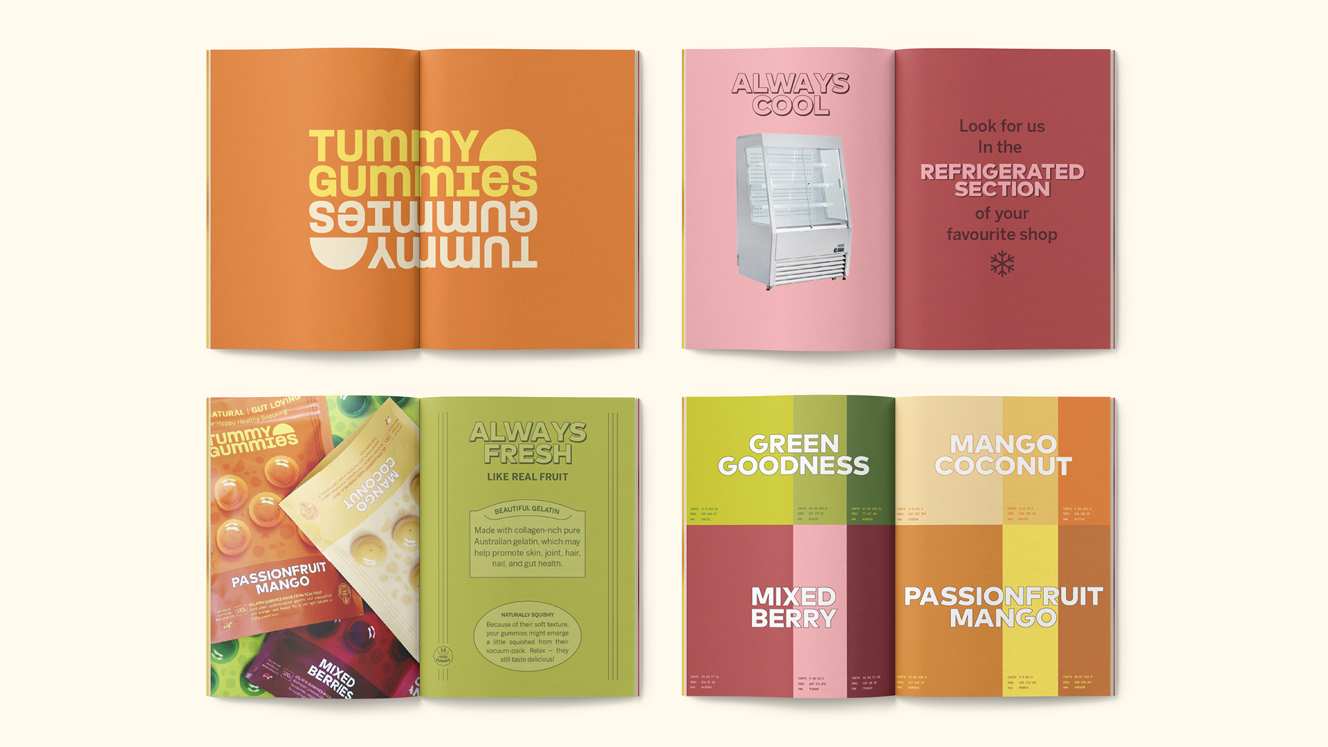
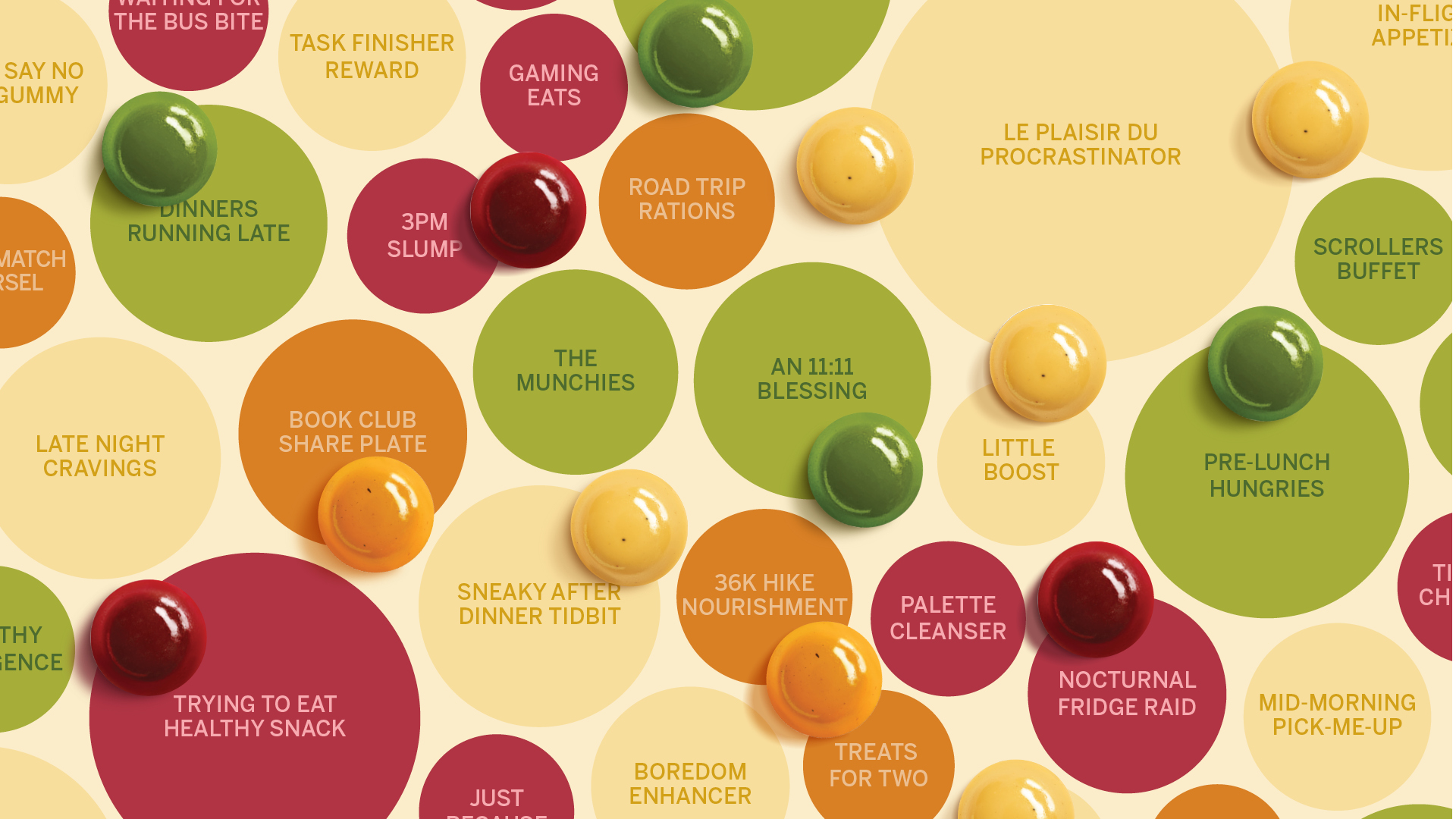
The work was designed and written to appeal to health-conscious customers with an appetite for fun yet naturally good products. After all, Tummy Gummies are preservative-free: so fresh they’re ranged in the chilled section of stores. They’re a treat to enjoy anytime, anywhere: pre-lunch hungries, palate cleanser, late-night cravings and beyond. No need to worry about calorie-counting or sugar highs.
Following a review of the client’s strategy, one of The Offices’ first outputs was to write the positioning statement: Snack better, live well. The studio also tweaked Tummy Gummies’ brand values to shape a clearer brand personality: innocent but not childish, gut-friendly but not medicinal, joyful but not over-the-top.
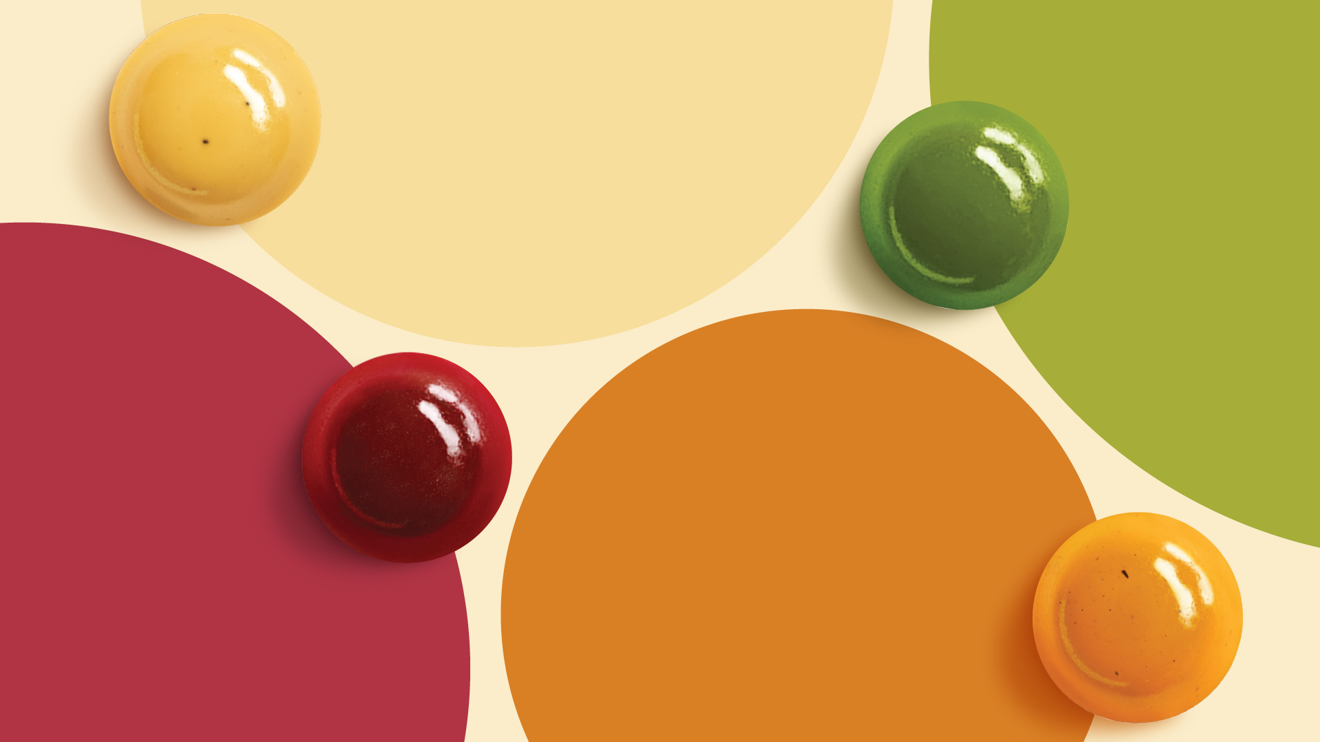
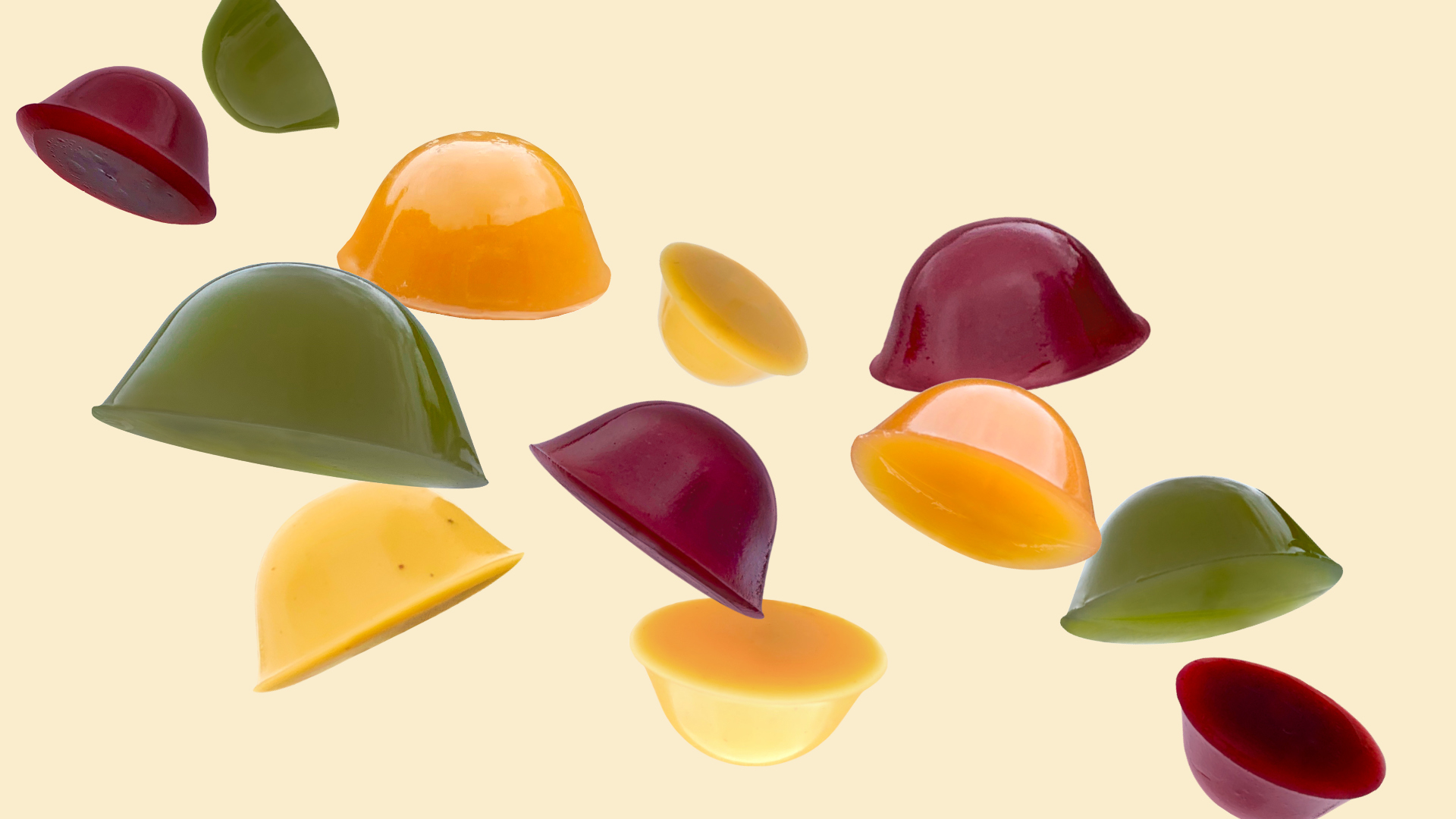
This foundational work set the tone for the simple, fun branding and packaging now in market. For example, the photography makes a hero of the product’s actual glossy and fruity colours, made bolder with the tonal background colours used on each flavour.
Complementing this are the vintage candy store-inspired graphics, and whimsical touches such as the slow-food tortoise icon. The copy is minimal and unadorned, in line with Tummy Gummies’ brand values.
‘Tummy Gummies are as old-school as they are delicious. We wanted the packaging to celebrate their classic simplicity, but with a fresh and modern update,’ said The Offices Creative Director, Jeffrey Oley.
‘Retailers are loving the eye-catching designs and improved flavour differentiation,’ said Tummy Gummies cofounder, Elaine Varipatis. ‘We are very happy with the work The Offices did.’
Based in Sydney, The Offices specialises in creating brands of distinction, and has particular expertise in food and beverage branding, packaging, websites and content creation.
CREDIT
- Agency/Creative: The Offices
- Article Title: Tummy Gummies New Packaging by the Offices Makes a Hero of Luminous Fruit Gummies
- Organisation/Entity: Agency
- Project Type: Packaging
- Project Status: Published
- Agency/Creative Country: Australia
- Agency/Creative City: Sydney
- Market Region: Oceania
- Project Deliverables: Branding, Packaging Design
- Format: Pouch
- Industry: Food/Beverage
- Keywords: packaging, snacks, branding, identity, food, colour,
-
Credits:
creative director: Jeffrey Oley
copywriter: Stephanie Oley


