


Trasbordo Wine – Cabernet Franc & Pinot Noir
Trasbordo has never been just about wine. It has always been about the act of crossing—an idea that lives somewhere between silence and voice, between tradition and disruption, between the weight of the earth and the power of myth. Trasbordo is both a passage and a promise: it carries the soul of the vineyard into a space where design becomes narrative and packaging becomes a storyteller.This year, the narrative expands with two new varietals that reimagine the spirit of Trasbordo. Each one is a translation of that crossing into a different voice—one loud, structured, unapologetic; the other soft, fluid, deliberate. Together they enrich the mythology of the brand and open new territories for its identity.
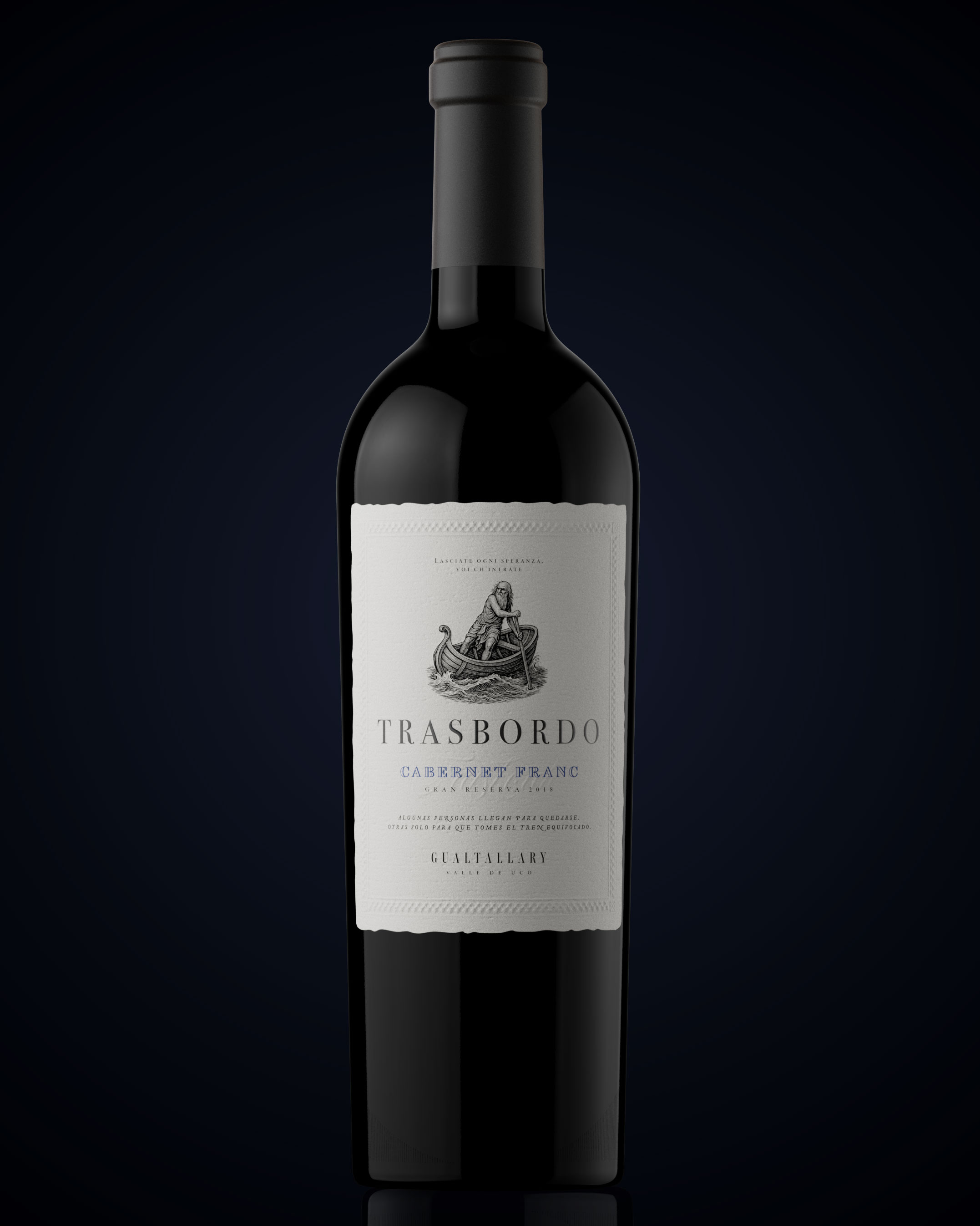
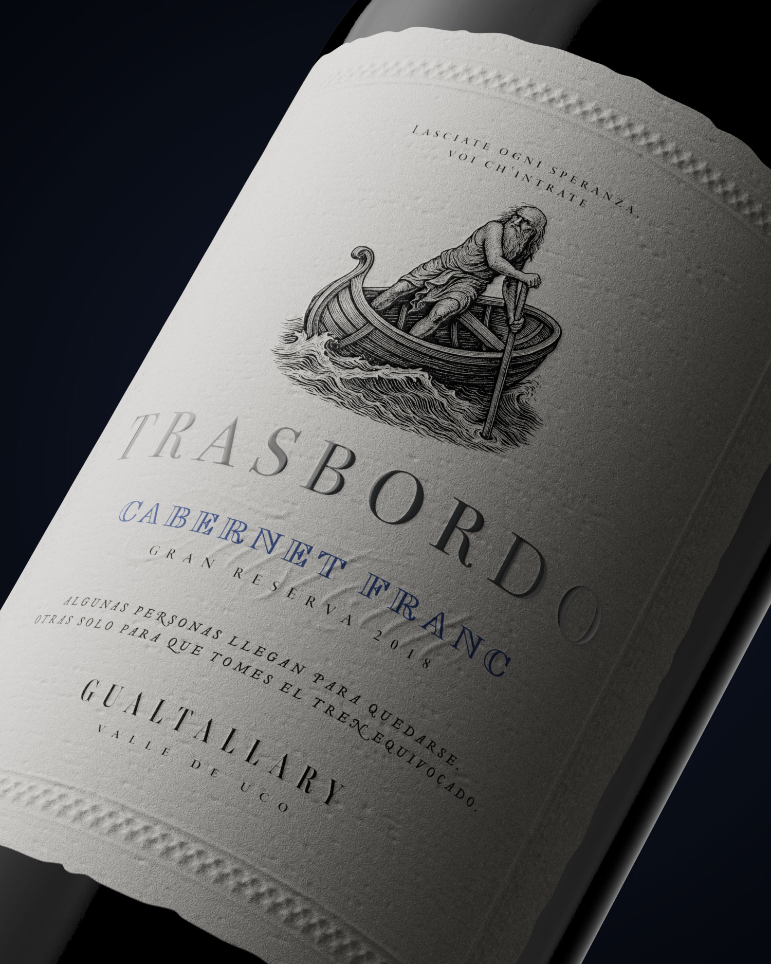
Cabernet Franc
Cabernet Franc emerges as a statement of strength. The design carries sharp edges and layered textures, a composition that feels almost carved out of endurance itself. Every detail of the label suggests resistance, resilience, and history turned into form. The typography speaks with gravity, while the layout is unapologetically bold, as if it were carrying centuries on its shoulders yet refusing to bow. Cabernet Franc is not only a varietal—it is the embodiment of permanence, the wine that acknowledges its roots and at the same time walks forward with determination and force.
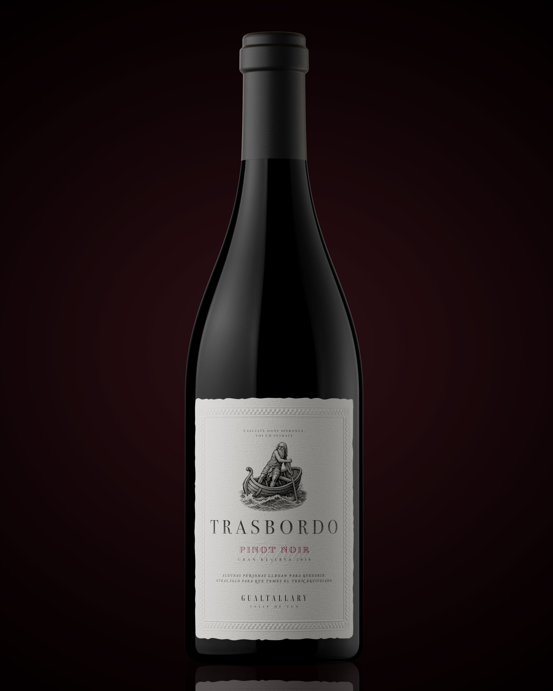
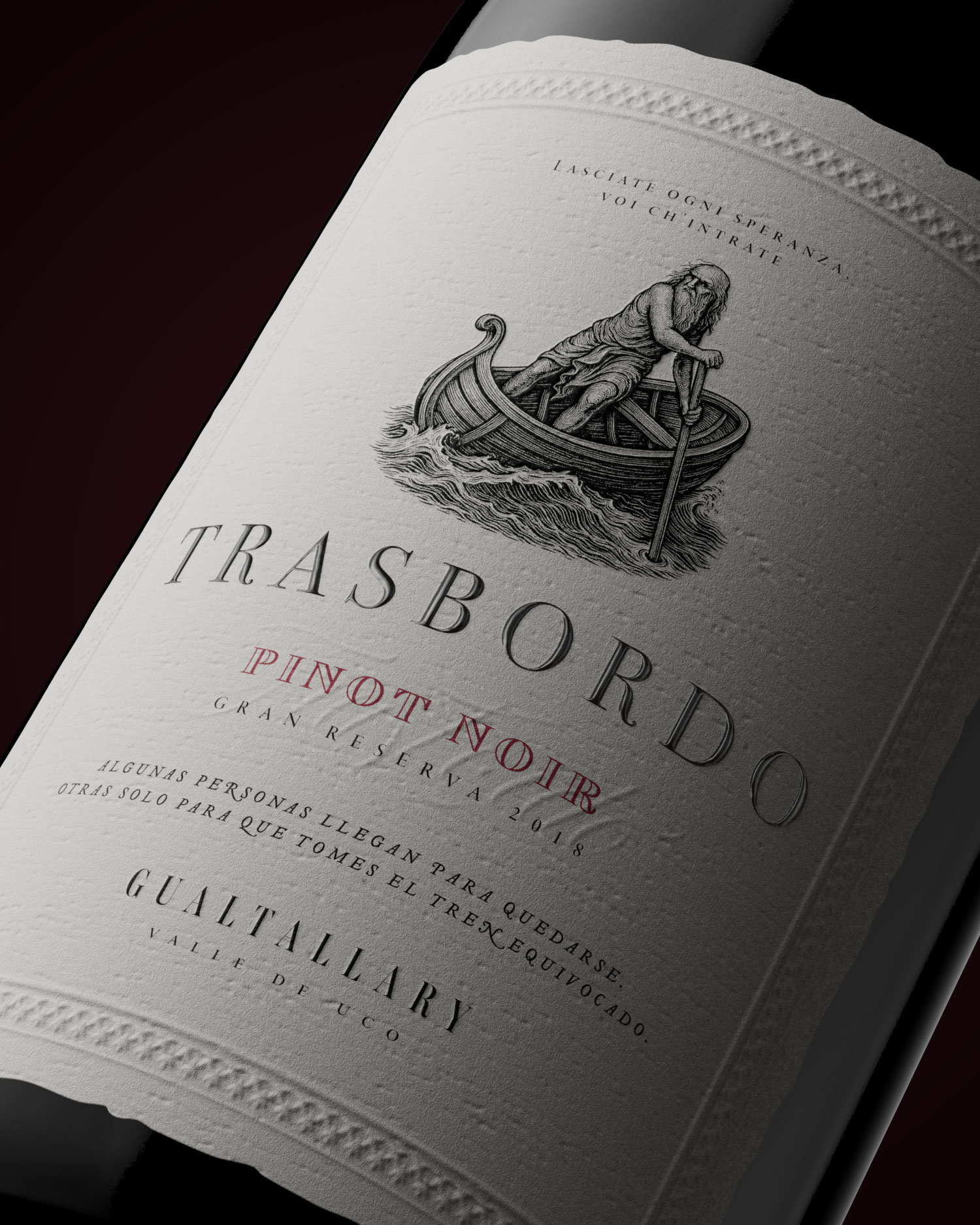
Pinot Noir
Pinot Noir, by contrast, is a whisper turned into form. Its design carries fluid lines, subtle contrasts, and a softness that does not ask for attention—it commands it with quiet authority. The label becomes a meditation on elegance: refined, understated, almost sculptural in its delicacy. This wine moves differently: where Cabernet Franc strikes, Pinot Noir flows. It becomes the silent anthem of Trasbordo, proof that true power can live in restraint, in balance, in the decision to let minimal gestures speak volumes. It is delicate, deliberate, unforgettable.
Design as StorytellingIn
Trasbordo, packaging is never decoration it is a vessel. Every label functions as a threshold, a symbolic passage that connects product and narrative. The iconography of Trasbordo acts as both anchor and bridge: every line is drawn with intention, every tone exists to carry emotion, every gold accent holds the memory of movement and the myth of resilience. This is design that dares to disrupt without losing its timelessness, design that makes the act of holding a bottle feel like holding a fragment of a larger story.Trasbordo insists that wine is not only consumed—it is crossed. To encounter these bottles is to move from one side to another, from the expected to the unexpected, from what is known to what is yet to be discovered. This is not a label you simply look at. It is a label you cross.
CREDIT
- Agency/Creative: Tuerca Studio
- Article Title: Tuerca Studio Creates A Storytelling Visual Identity For Trasbordo Wine Cabernet Franc And Pinot Noir
- Organisation/Entity: In-House
- Project Type: Packaging
- Project Status: Non Published
- Agency/Creative Country: Argentina
- Agency/Creative City: Rosario
- Market Region: South America
- Project Deliverables: 3D Modelling
- Format: Bottle
- Industry: Food/Beverage
- Keywords: wine, labeling, branding, identity, storytelling
-
Credits:
Director: Sebastián Petrich
Art Director: Luciano Quintana


