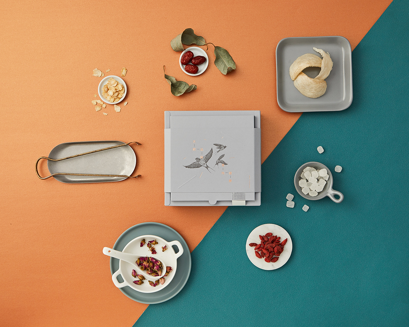
In traditional Chinese culture, bird’s nest has a place in people’s hearts. Gifting someone something as precious as a box of bird’s nest is regarded as a symbol of blessing, well wishes, and prosperity. If it’s presented to an expectant mother, it is sealed with a message of good health and well wishes from the sender. If the parents receive bird’s nest during the Chinese New Year from their children, they know that this is a gesture of love.
The act of consuming bird’s nest dates all the way back in history when it all started during China’s Tang Dynasty (AD 618-907). In other words, bird’s nest has a history of nearly 1,500 years. The market demands for bird’s nest throughout the years have always been on an all-time high especially in SouthEast Asia (with the well-to-do Chinese community consuming it more), given the health benefits that one is going for – better complexion, energy, immunity, sleep, and virility.
With a demand like this, there is strong competition among bird’s nest businesses for customers and publicity. Over the years, we’ve seen so many packaging designs, posters, and advertisements on bird’s nest (some with very expensive ambassadorships) come and go. They usually spot a tradidional and oriental look, no matter how different each one of the brand tried to achieve.
One of our clients – 8nests, who is in the business of manufacturing and selling bird’s nest in Malaysia, needed a packaging design that is “one of a kind” for their premium bird’s nest products. We proposed an unconventional concept that would launch their brand and capture the Western-thinking modern and young Chinese market through design.
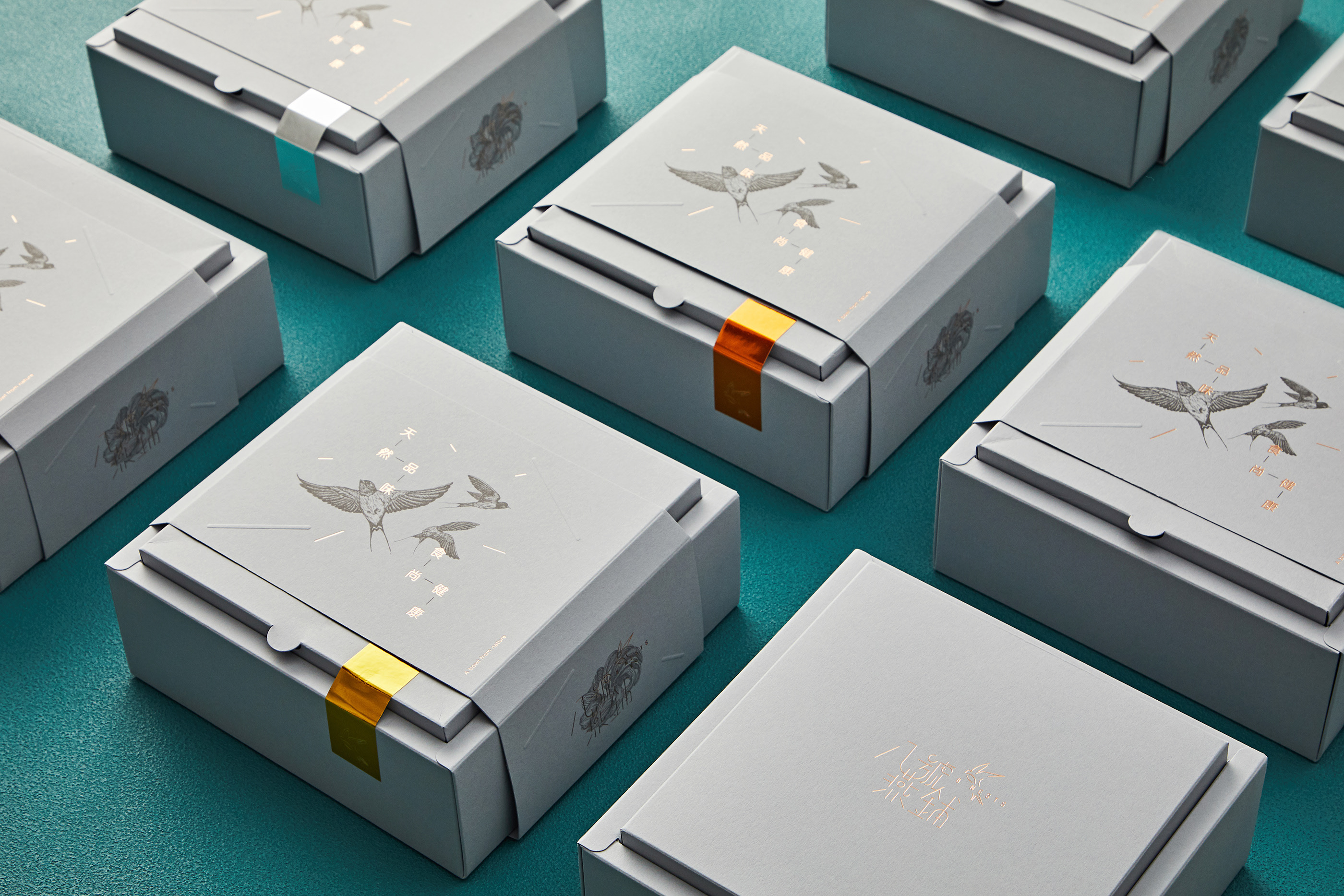
The birds, which were carefully drawn by hand stroke by stroke, and the irregular shapes that make up the entire illustration sends a simple but powerful message out there that the masterminds behind the 8nests brand consider ‘process’ as vital as ‘result’ in whatever they set their minds to do. Beige and grey are the primary colours of the brand as we believe that these colours exude an aura that people associate with being young, cool, artsy, and exclusive.
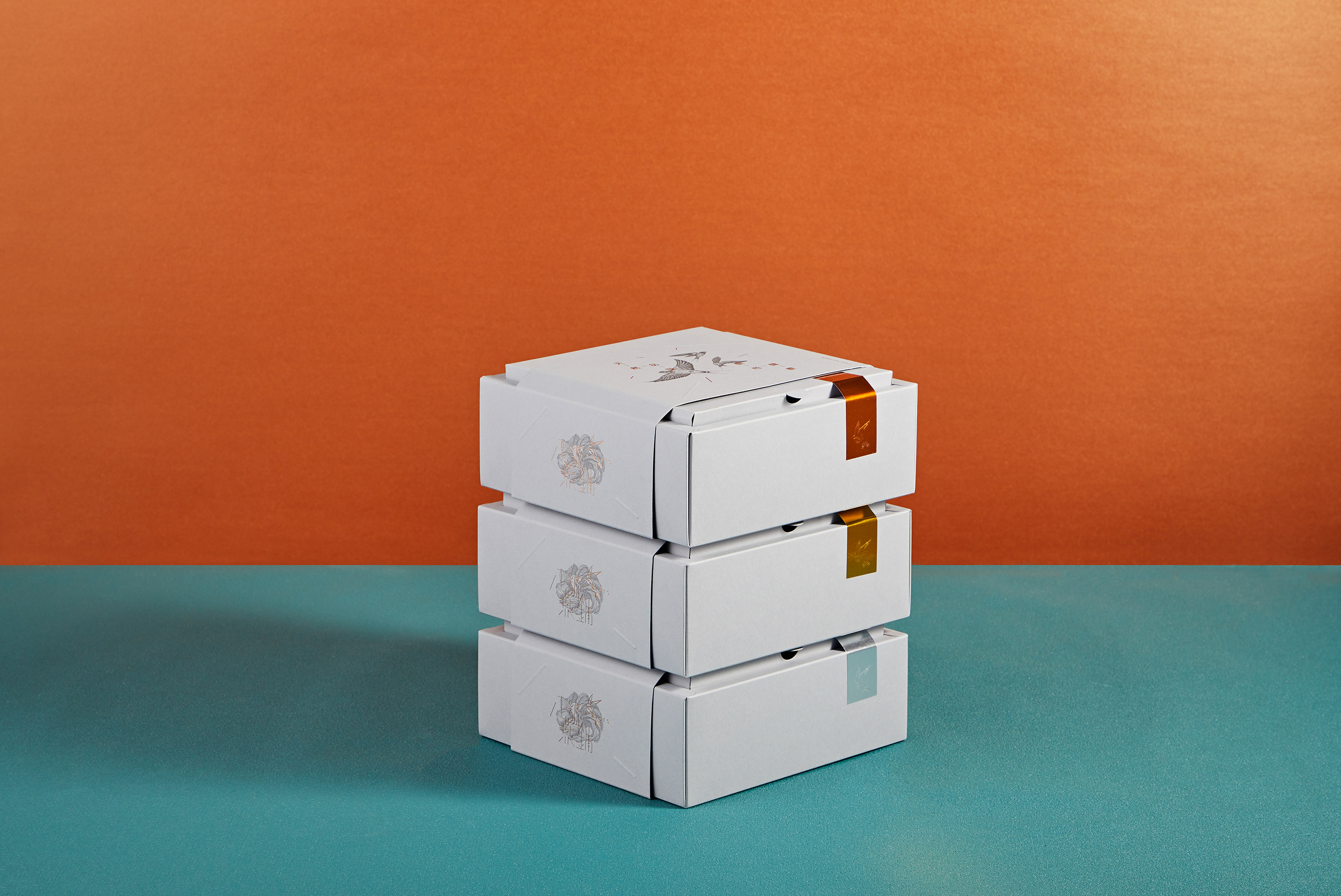
Bearing in mind that these colours and the graphic assets must harmonise together and ‘pop out’ nicely as a shared entity, we looked at different ways to create the packaging box for 8nests. The primary distinction that we wanted to make is between a premium item and a collectible. To achieve that, we used smooth and uncoated papers and boards under the Pop’Set series by Antalis. As the finishing details, we decided on using emboss to add depth onto certain areas of the box and foil stamping for a classic look. We also wanted every box to have its moment of luxury so the boxes each have a gold-like stripe sticker attached to one of its sides for the differentiation of ingredients used. Ultimately, the stickers, which come in several different colours, are designed for quick recognition of products and easy implemention of delivery.

CREDIT
- Agency/Creative: Tsubaki KL
- Article Title: Tsubaki Creates Bird Nest Packaging Design
- Organisation/Entity: Agency, Published Commercial Design
- Project Type: Packaging
- Agency/Creative Country: Malaysia
- Market Region: Asia
- Project Deliverables: Brand Creation, Brand World, Branding, Graphic Design, Illustration, Packaging Design, Research
- Format: Box, Wrap
- Substrate: Pulp Carton, Pulp Paper


