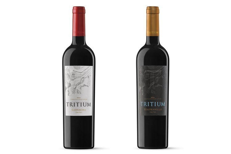
“TSMGO | The show must go on, as marketing and brand image experts, reconfigure the portfolio of the winery Tritium and renovate its brand.
A brand new range of products is achieved: a solid and commercially oriented one. Its products show a modern and strong presence which reinforces the values of the brand Tritium and its imaginary.
Project Summary Tritium winery is located in La Rioja Alta (Northern Rioja), where its vineyards harbour centenary vines of great quality. Tritium wines have grown and evolved, able to adapt to new consumption profiles with the aim of achieving a new reorganization of its products, more coherent and direct, strengthening commercially its brand.
The winery come to us to carry out the necessary reconfiguration of its portfolio and the renewal of its brand, so the image of its wines can get acquire the consistence and uniqueness needed.”

“Stategy– To unite the entire range of products by the creation of a new graphic code, rich in details, presenting the brand with a direct and catchy design.- To improve the presence of the bottles by a visual, powerful and modern solution.- To highlight the concept of terroir as the main brand asset.- To reinforce the brand Tritium by emphasizing in the design the letter T as a distinctive feature.
StorytellingTwo essential factors determine the quality of a wine: the winemaker imprint, final creator of the prolife of its land’s wine – and the terroir which provide the indispensable raw material, truly responsible of authentic wines.
The new Tritium image does a tribute to the outstanding value to its terroir, which finds its richness in every detail of its terrain, in every growing centenary vine of its land and in its varieties; in its precise location and altitude; in its ecosystem and in the capricious chisel of its climatology.
A differentiated range shows the result of the work of Tritium in three family of products: Classic, Premium and Top, devised to move us on its precious terroir.”

” Graphic SolutionOur suggestion follows a convincing, clear and modern aesthetic:We have created a standard “canvas” in the labels of all the range including illustrations that appeal to topographic maps of vineyards, getting to materialize the concept of terroir as a starting point for uniting the portfolio:
– The Basic range is the most accessible one. It captures the letter T of Tritium over the representation of the vineyard imitating a watercolour signature. This graphic presents different colour schemes according to the variety of wine which represents: white, rosé, six months-old red wine, crianza wine or reserva.
– The Premium range. It gives a more exclusive look to the different versions of Tempranillo and Garnacha, by the use of a longer and more enveloping background. The name of the winery is added in the foot of the bottle and the T acquires the standard tonality of the label while it is embossed in order to be emphasized.
– The Icon range. The most personal Tritium wines, El Largo and El Largo Graciano, presented in a Maxima Carré bottle. A delicate printing job in golden and aubergine tones designate the wine with the name of their creator, popularly known as El Largo (The long) for his impressive presence.”


CREDIT
- Agency/Creative:
Client: Bodegas TritiumStudio: TSMGO | The show must go onCreative Director : Ricardo Moreno RodríguezDesigned by : Marta Terrazas y José Luis CasaoPhotography: Dclick Estudio
- Article Title: TSMGO | The show must go on – Tritium
- Project Type: Packaging
- Substrate: Glass, Pulp Paper


