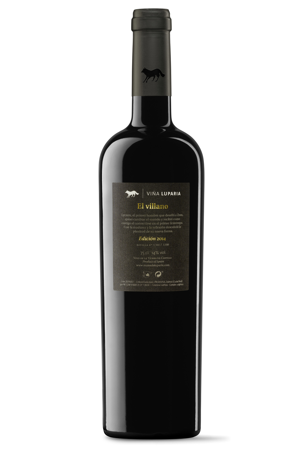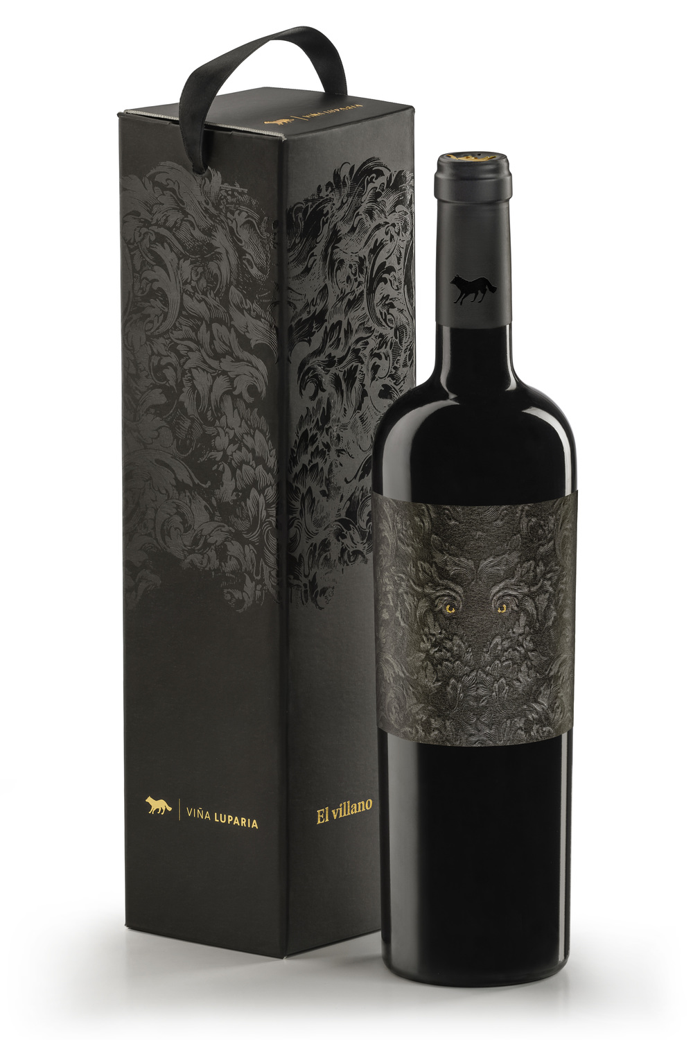
“Project Summary:The final wine to arrive at the Pack is also the most special and exclusive of its members. It is elegant, robust to the taste, well structured, complex: it is the counterpoint of maturity in the Pack. “The Villain” is the fruit of a very limited 2014 edition of only 3,100 bottles. This is, therefore, a unique wine; strong in character, whose singularity and interest could only be faithfully represented with packaging of similar characteristics.”
(Es) “Resumen Proyecto: El último vino en llegar a La Manada Luparia es también el más especial y exclusivo de sus miembros. Se presenta elegante, robusto en boca, bien estructurado, complejo: es el contrapunto de madurez en La Manada. “El Villano” es fruto de una edición 2014 muy limitada de tan sólo 3.100 botellas. Por tanto se trata de un vino único, de fuerte carácter, al que tan sólo un packaging de la misma singularidad e interés podría representar fielmente.”

“Strategy: Associate the wine with a potent, enigmatic character (Lykaon, the first werewolf according to mythology) which distances itself from the rest of the Pack, remaining true to its essence.-Find an evocative, disruptive, irreverent naming. (The Villain).-Create imaginary graphics inspired on the story of Lykaon, who breathes majesty and mystery. Storytelling Lykaon, the first man who dared to challenge Zeus, was punished with the fate of becoming the first werewolf. The metamorphosis occurred on each full moon, between howls for forgiveness. Zeus never thought that with maturity and reflection, Lykaon would discover the fullness of his new form, giving his ingenuity free rein for new adventures in an infinite land. Lykaon’s nature now enjoys freedom, at home among the shadows, awaiting any opportunity to break from the status quo. The villain gazes restlessly in the darkness.”

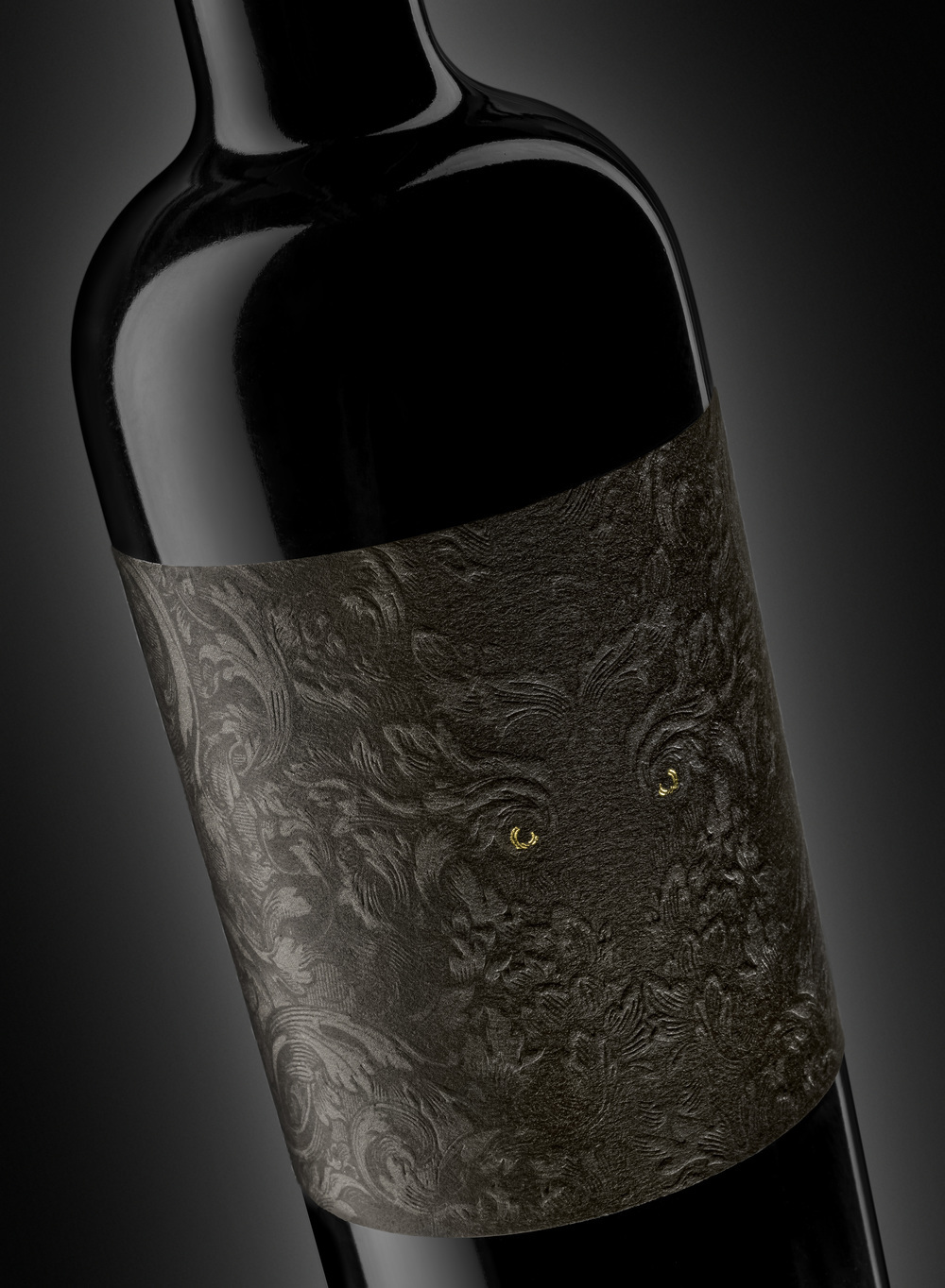
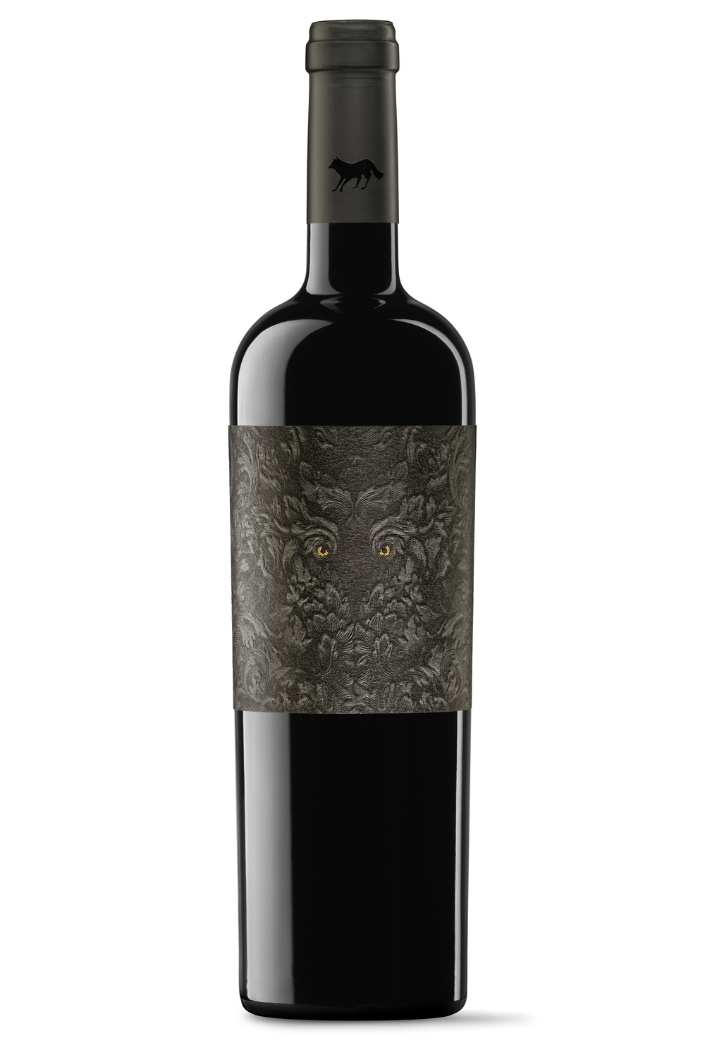
“Graphic Solution: The silhouette of the villain is constructed using few, technically complex elements:-A recreation of a motif of vine leaves in two very similar shades of black. With this play of black on black, one can distinguish the outline of the figure of the wolf and its mystery.-The cotton-like texture of the paper invites you to try the feel of the lushness of the motif.-The application of careful embossing work brings depth to the ensemble.-Finally, the printing of the villain’s eyes in gold creates great contrast, as an inescapable focus of attention.”

CREDIT
- Agency/Creative: TSMGO (The Show Must Go On) , Client: Viña Luparia , Creative Director: Ricardo Moreno Rodríguez , Art and Design Management: Marta Terrazas y José Luis Casao.
- Article Title: TSMGO (The Show Must Go On) – El Villano
- Project Type: Packaging
- Substrate: Glass


